Studying Saint Petersburg’s corporate identity and coming up with three concepts.
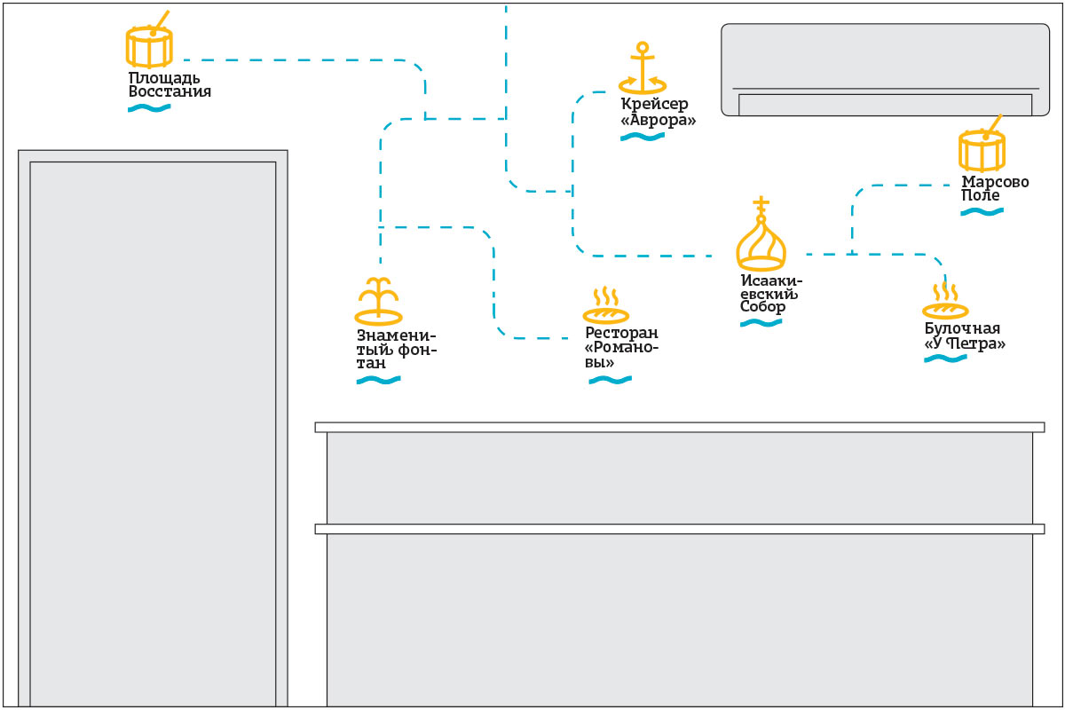
1. Saint Petersburg routes
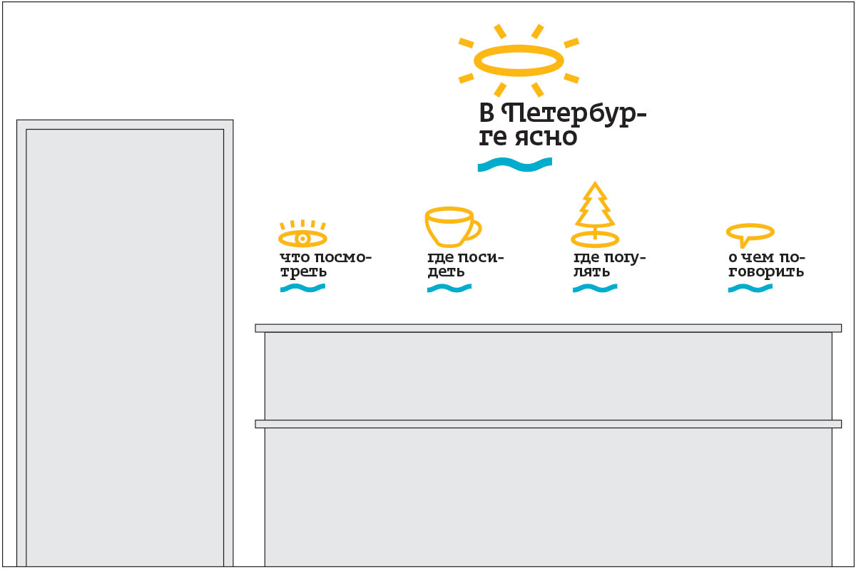
2. In Saint Petersburg it’s clear
3. Minimalism
Art director: OK.
Trying the ideas on real interiors and showing to the client.
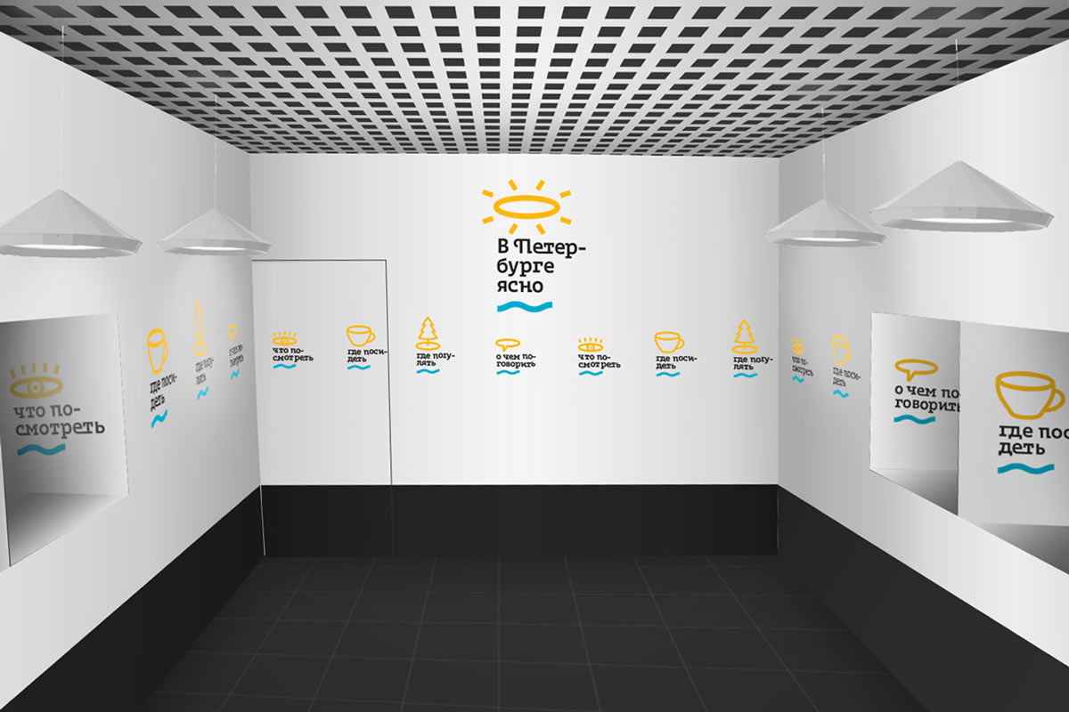
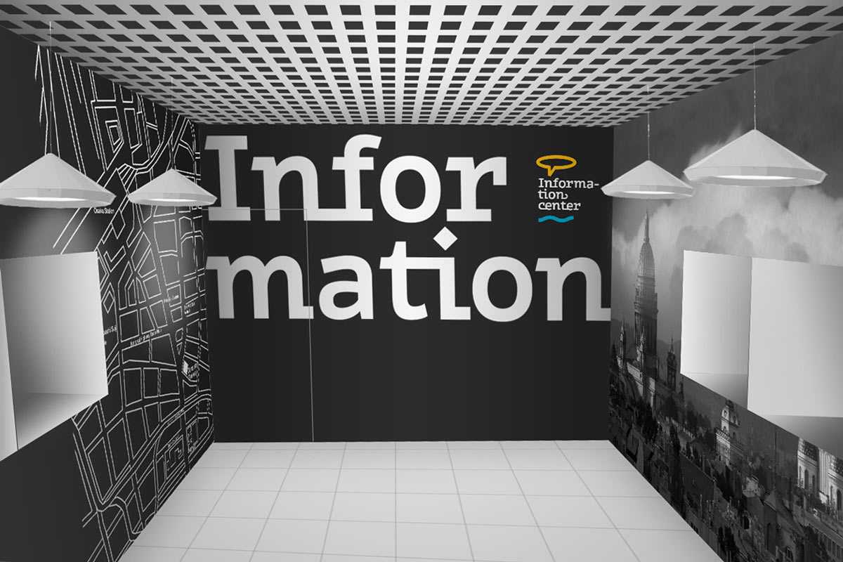
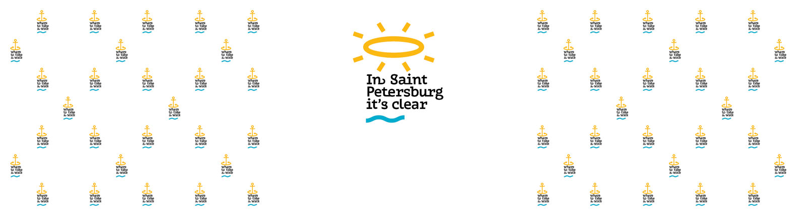
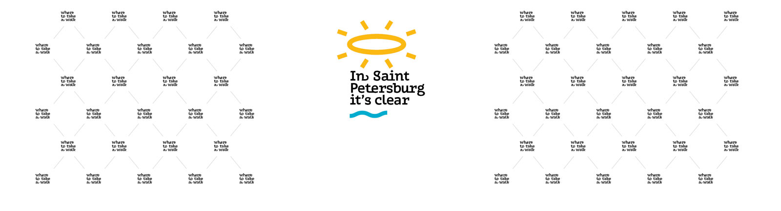
The client chooses the second concept. Thinking of the best way to decorate the walls. Simply writing the text in a line or two will look bland. Deciding to fill the walls with a pattern.
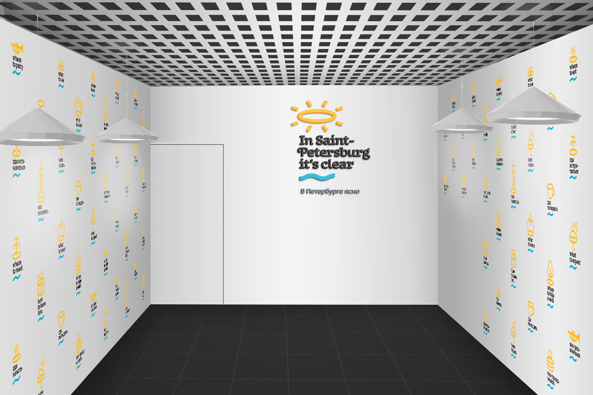
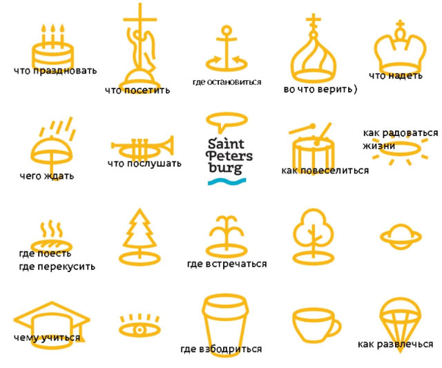
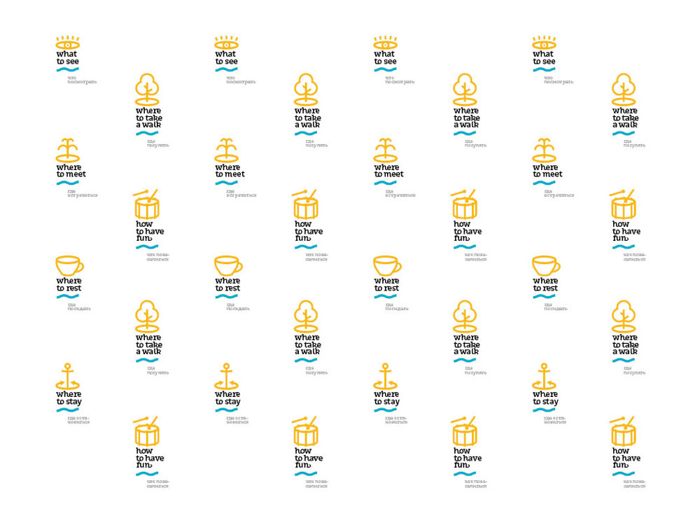
Asking the copywriter to come up with more phrases for logos in the pattern. Adding relevant symbols.
Trying different pattern designs.
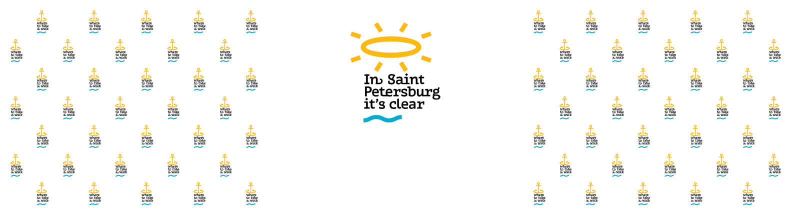
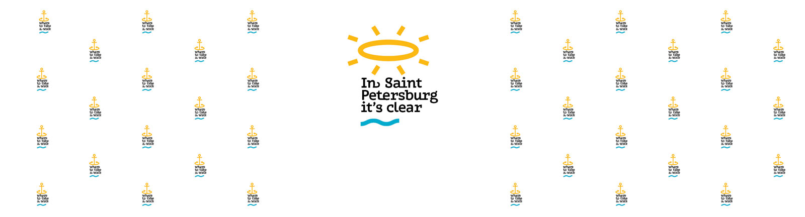
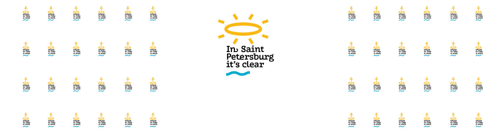
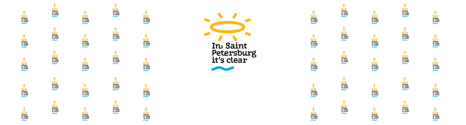
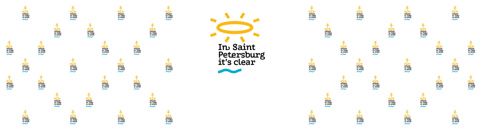
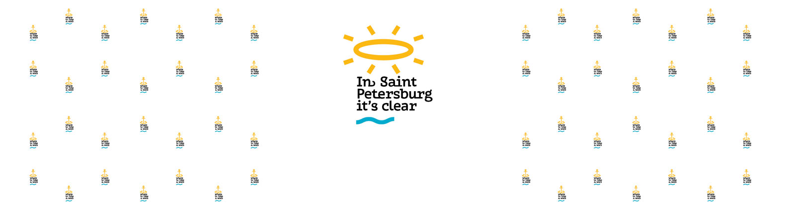
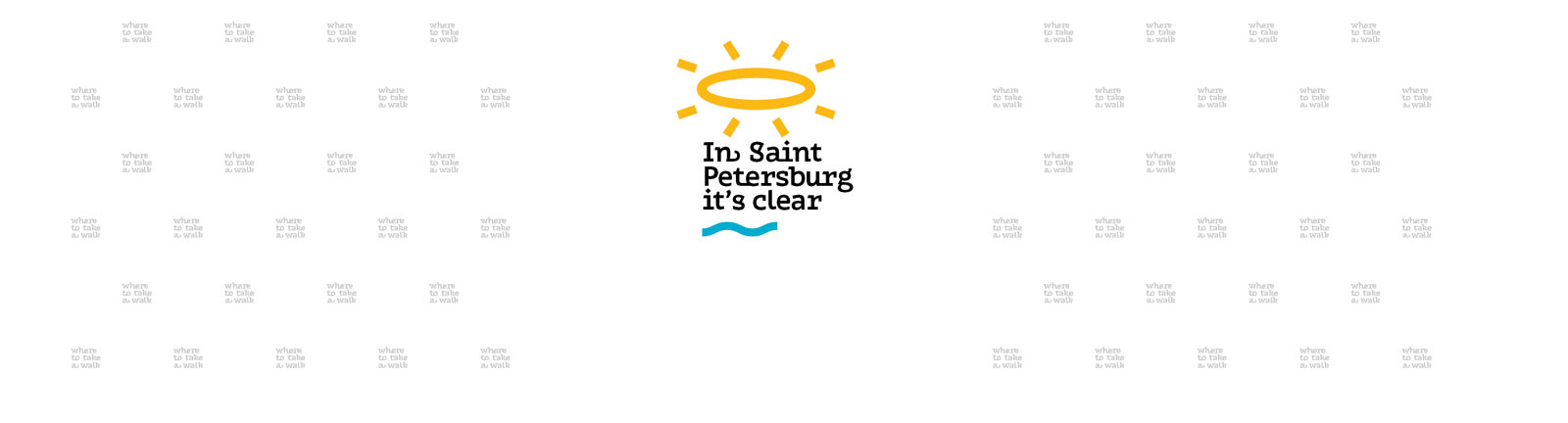
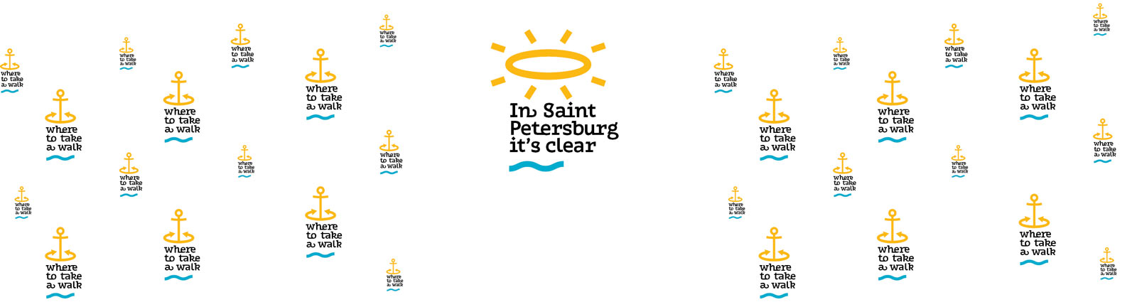
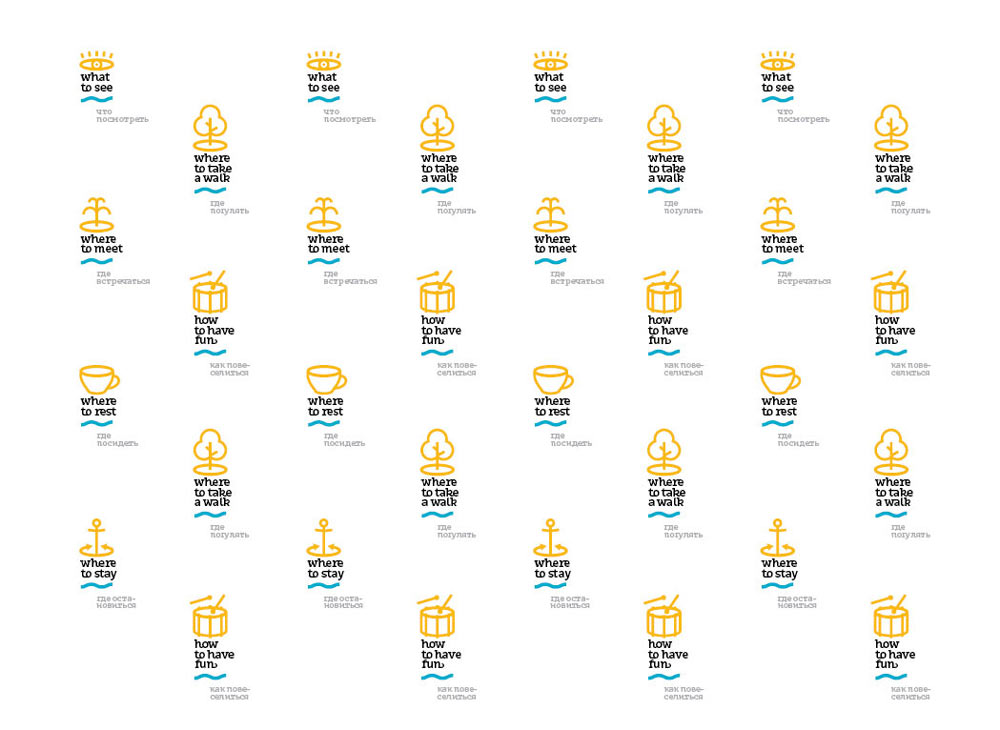
Choosing the checkered variant.
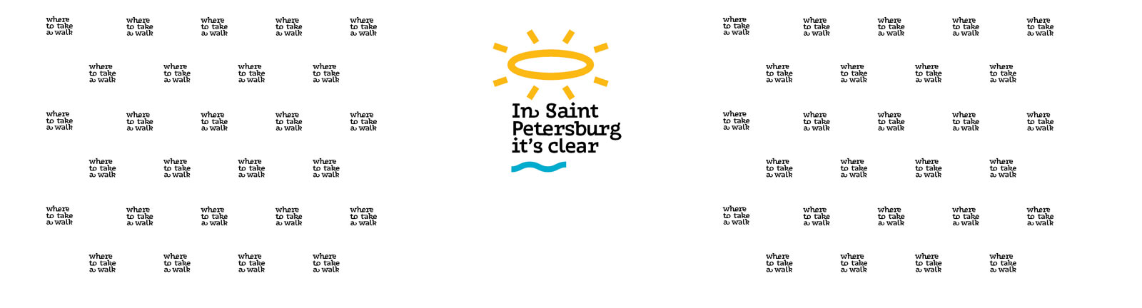
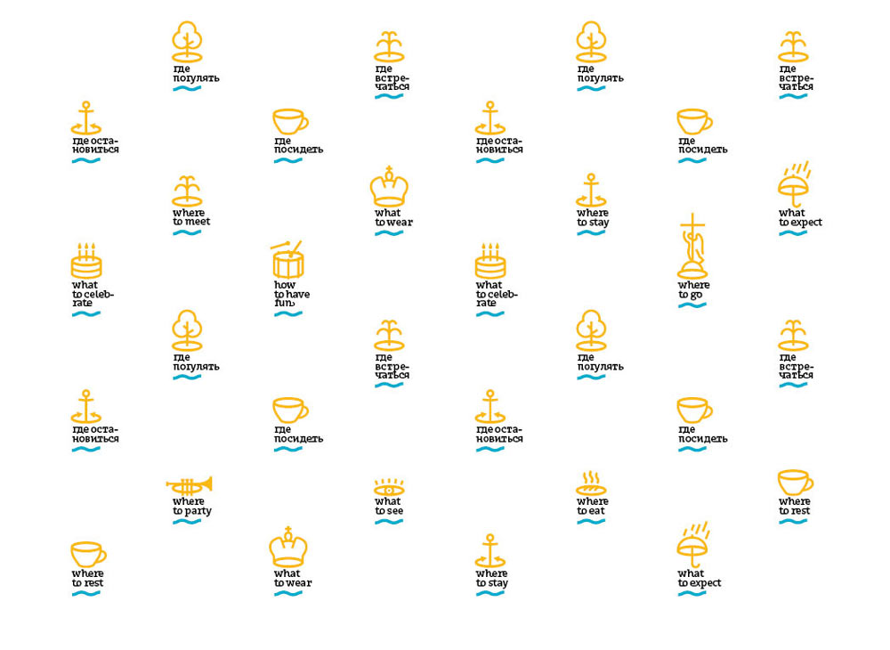
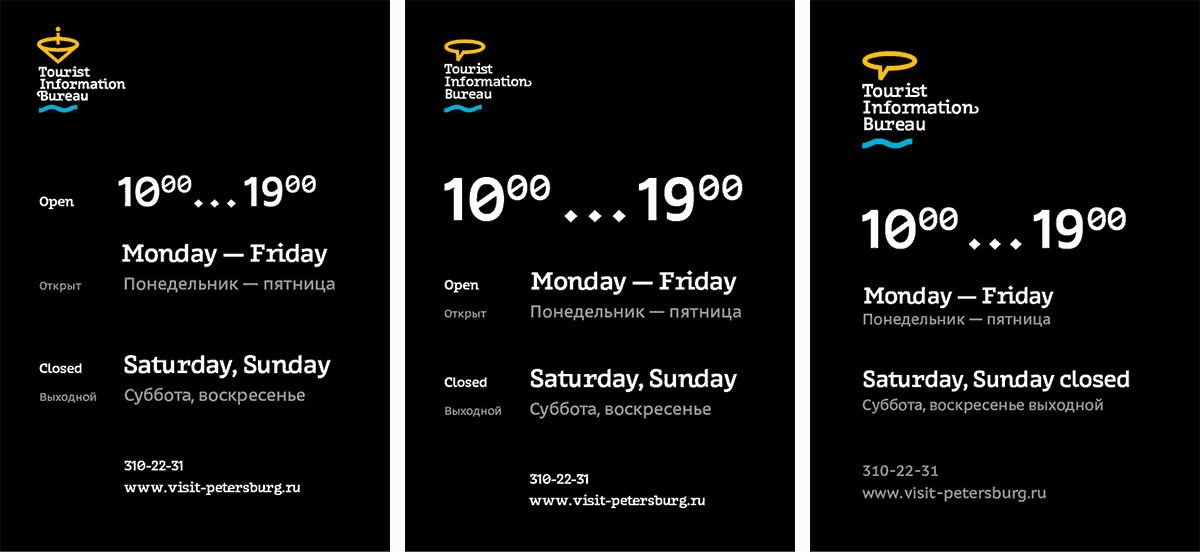
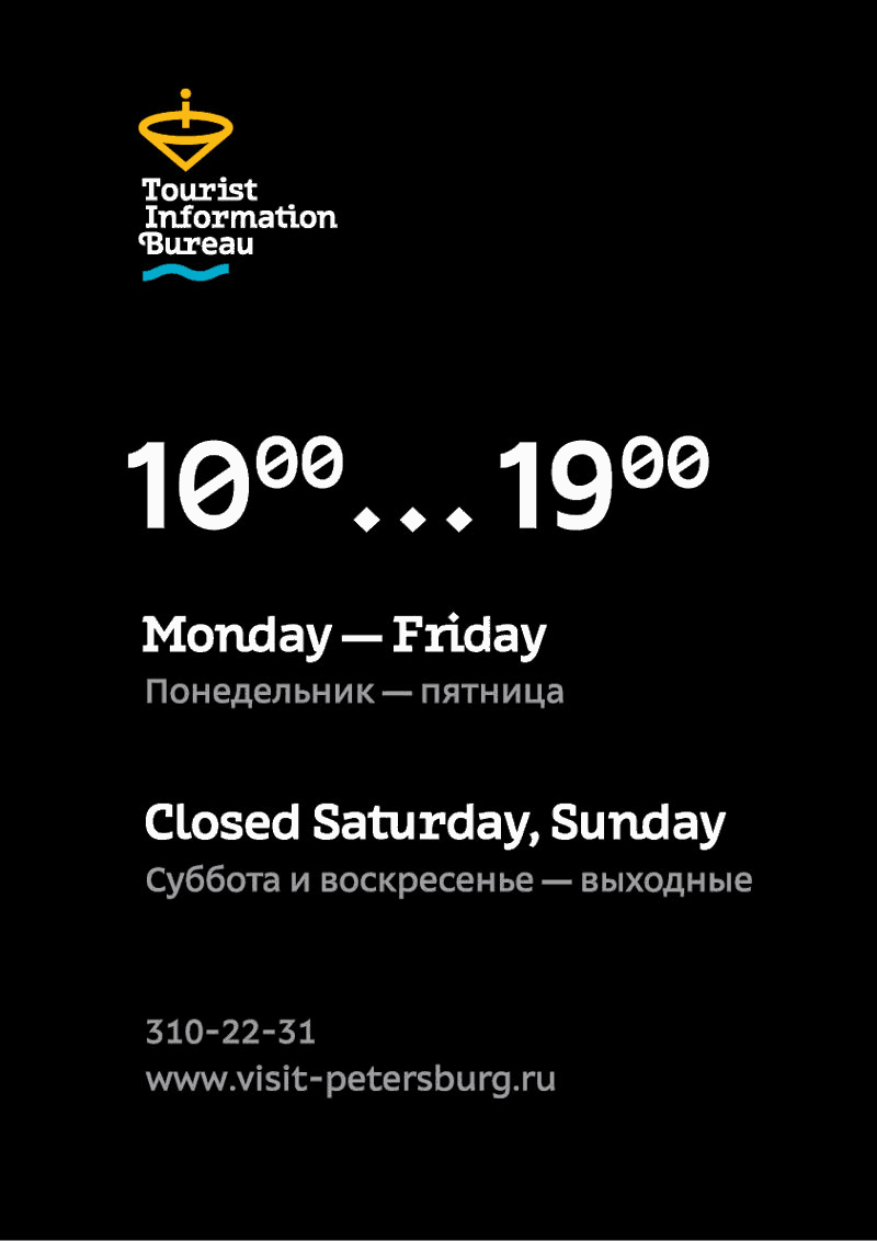
The client asks to think about international tourists and render the main logo and the pattern in Russian and in English. Trying different layout options.
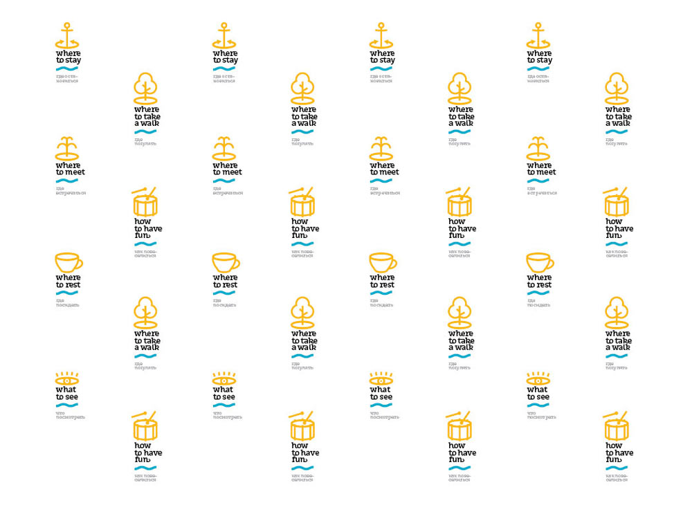
Deciding to keep captions only in the main logo. Mixing Russian and English text.
Typesetting the opening hours sign. Showing to the chief typesetter.
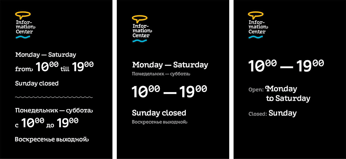
Chief typesetter: Looks clean but also boring.
Working some more.
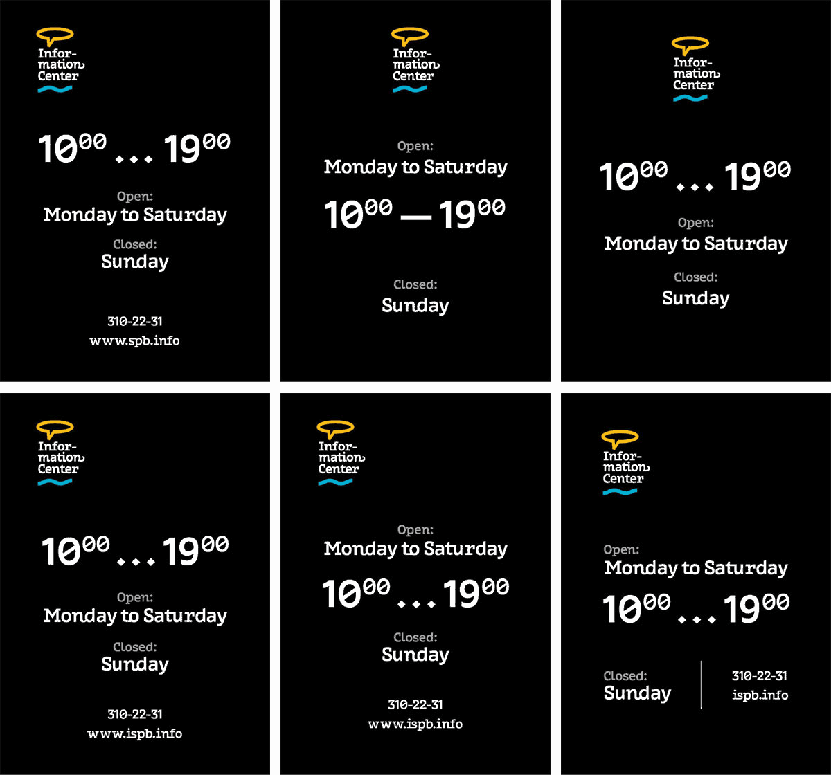
Chief typesetter: Chief typesetter: Center alignment doesn’t work for this project. Information items of similar significance should be brought together and rendered in the same size.
Showing more variants.
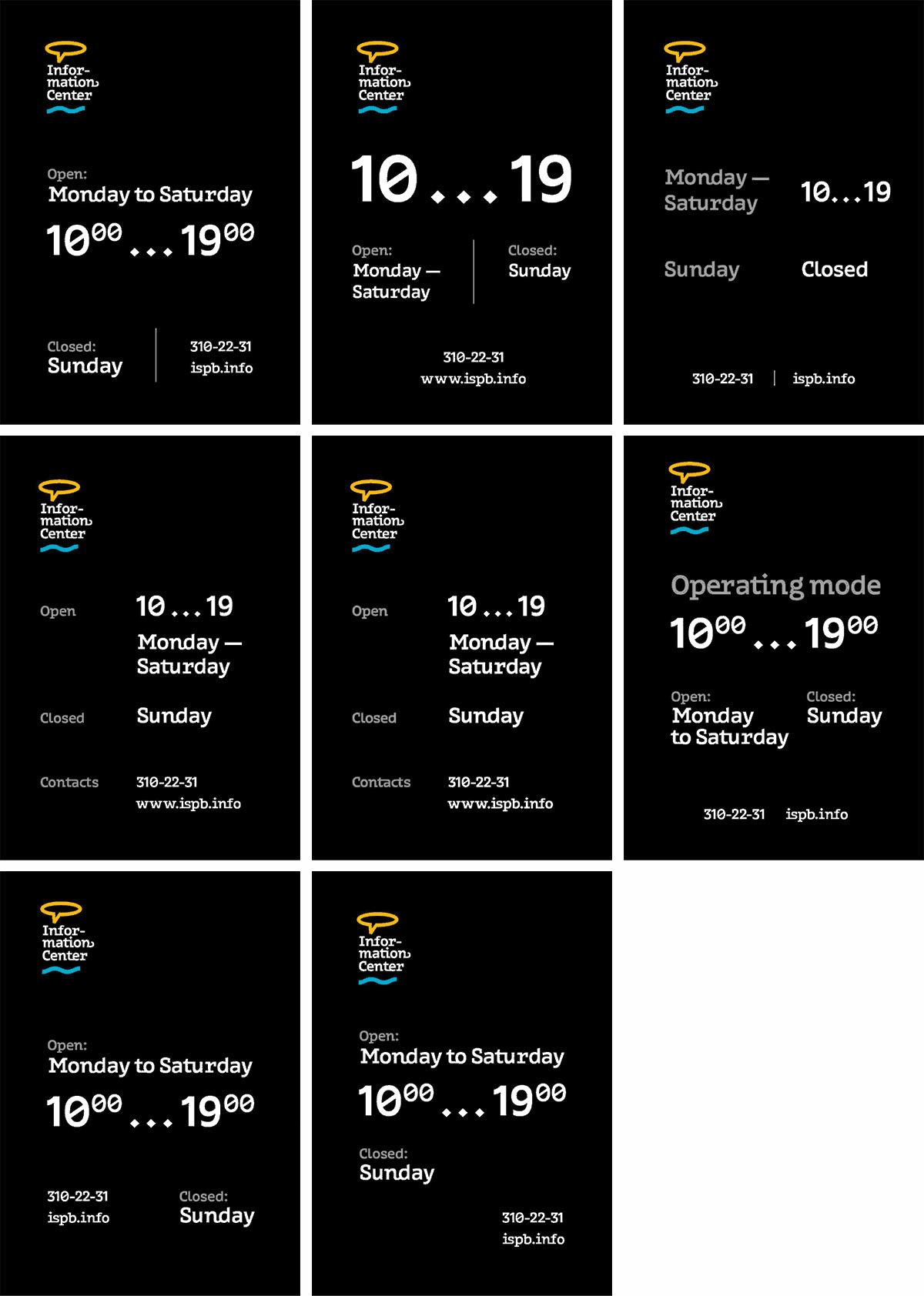
Chief typesetter: The opening hours would look best in the optical center of the page. You can also try a different typeface for the Russian text.
Remaking.
Chief typesetter: In some of these designs the composition looks bottom-heavy. Right alignment doesn’t work. It’s also better to write the phone number and the website address in two lines.
Making another attempt.
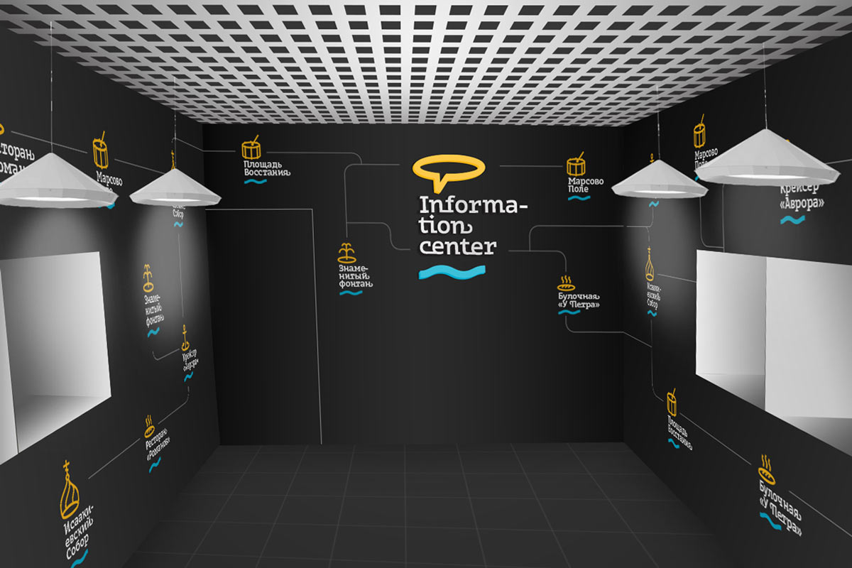
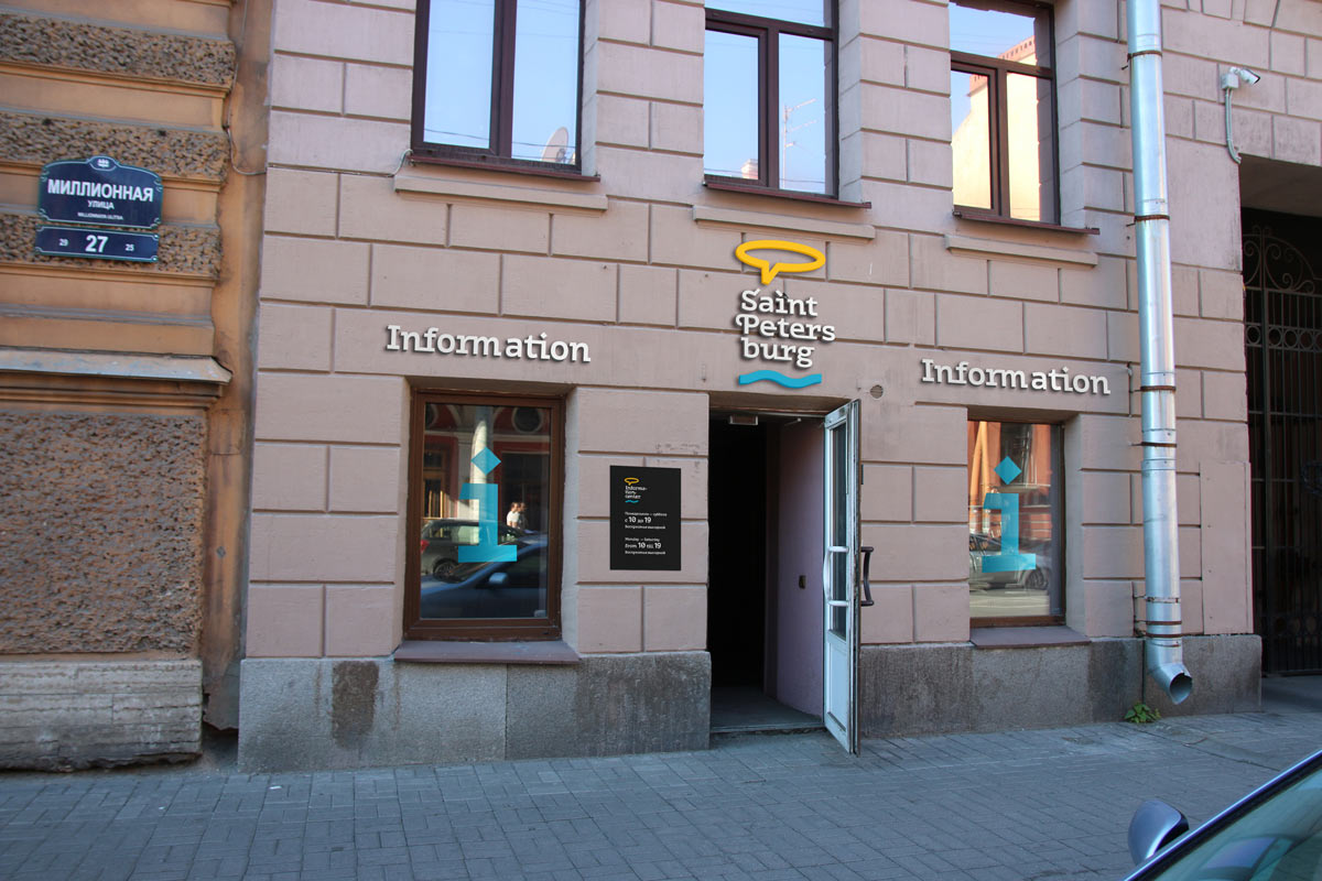
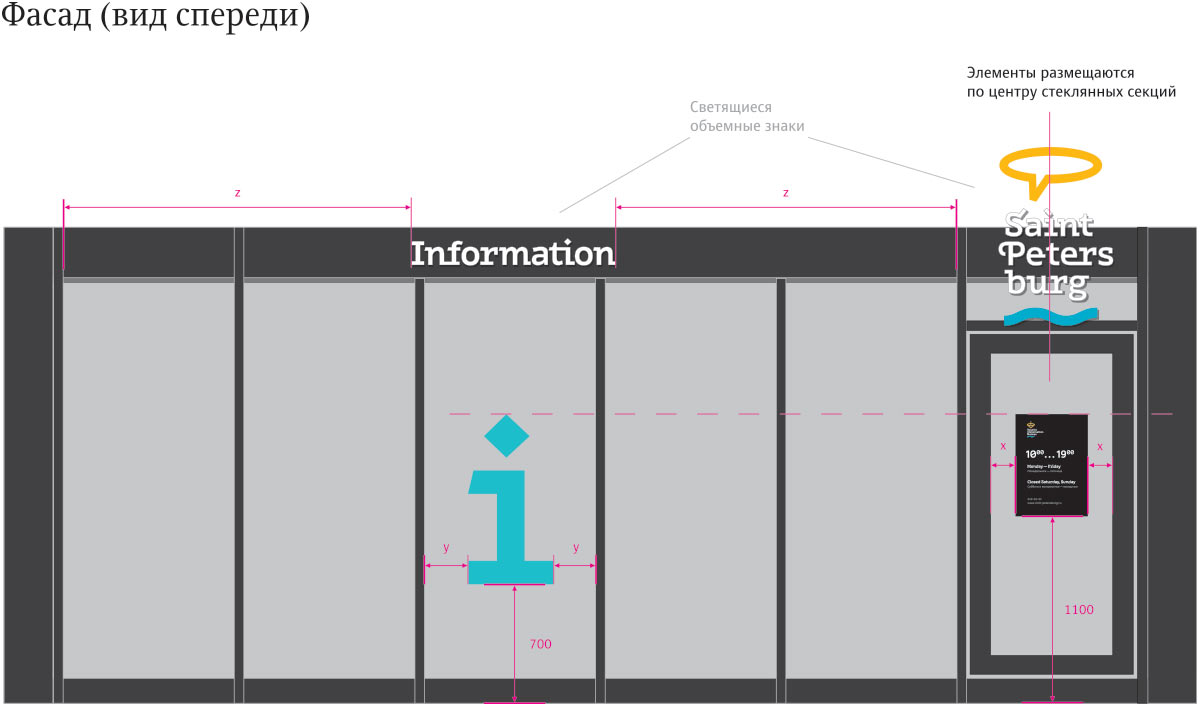
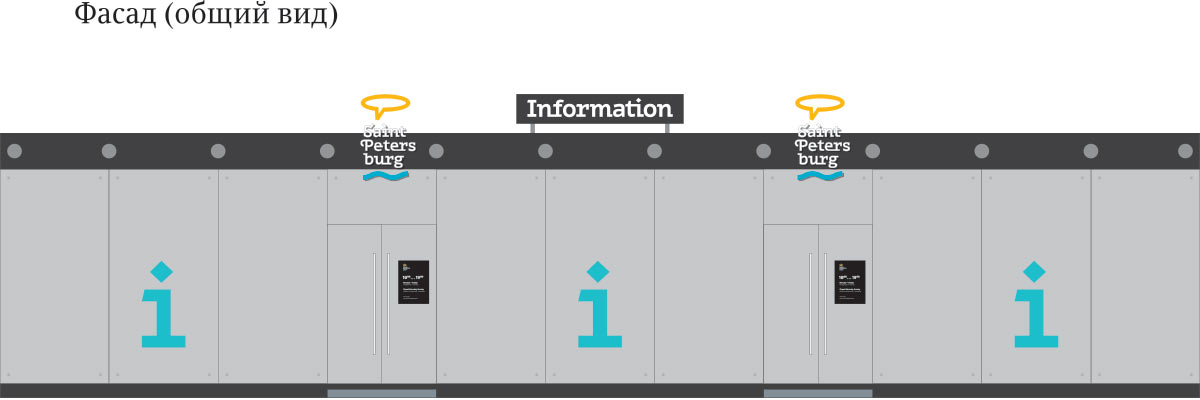
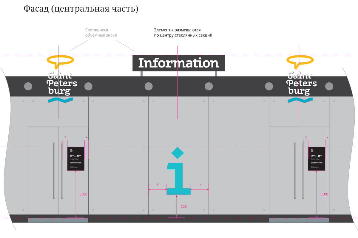
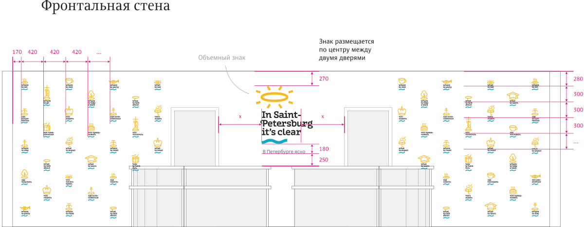
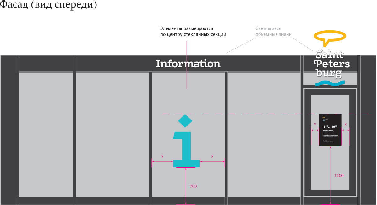
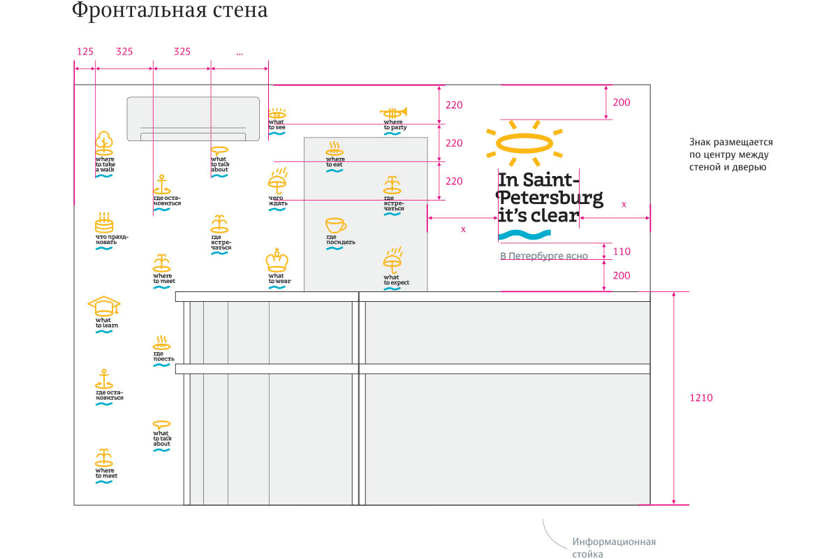
Right about this time the central office on Millionnaya Ulitsa is getting ready to open. Diverting all our efforts to it. Studying floor plans and drawing layouts based on real-life dimensions.
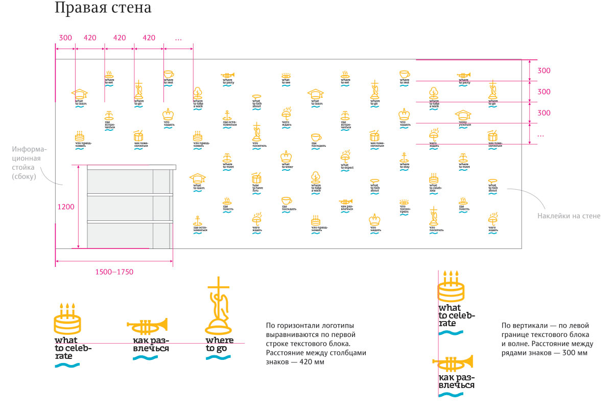
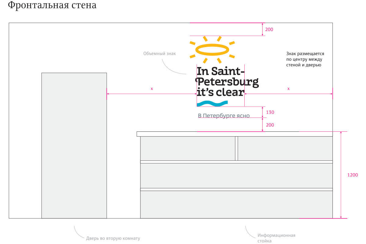
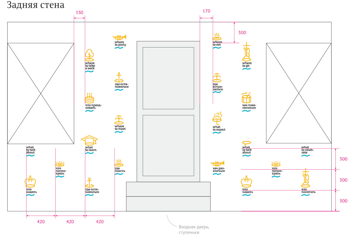
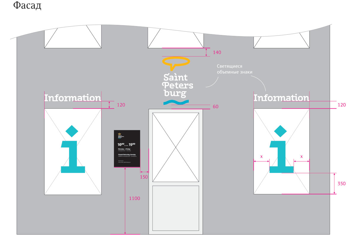
Getting blueprints for the rest of information centers from the client, most of them turn out to be of different layout. Studying floor plans and customizing positions of signs and graphical elements for each center.
Preparing files for printing, writing guidelines.
