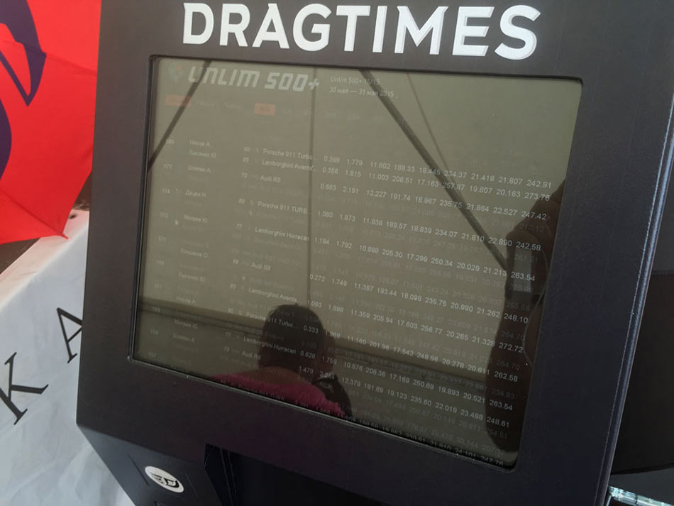
While waiting for the terminal to arrive at the studio, we receive a link to the web interface from the client. Looking at the current implementation, searching for problems.
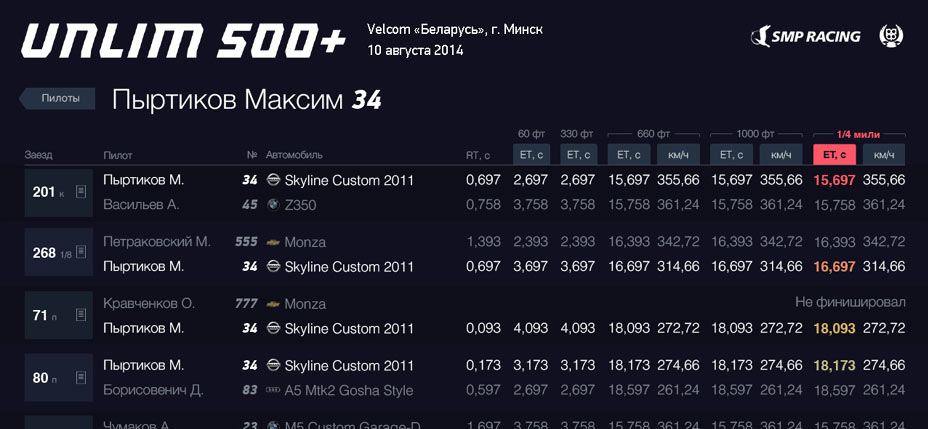
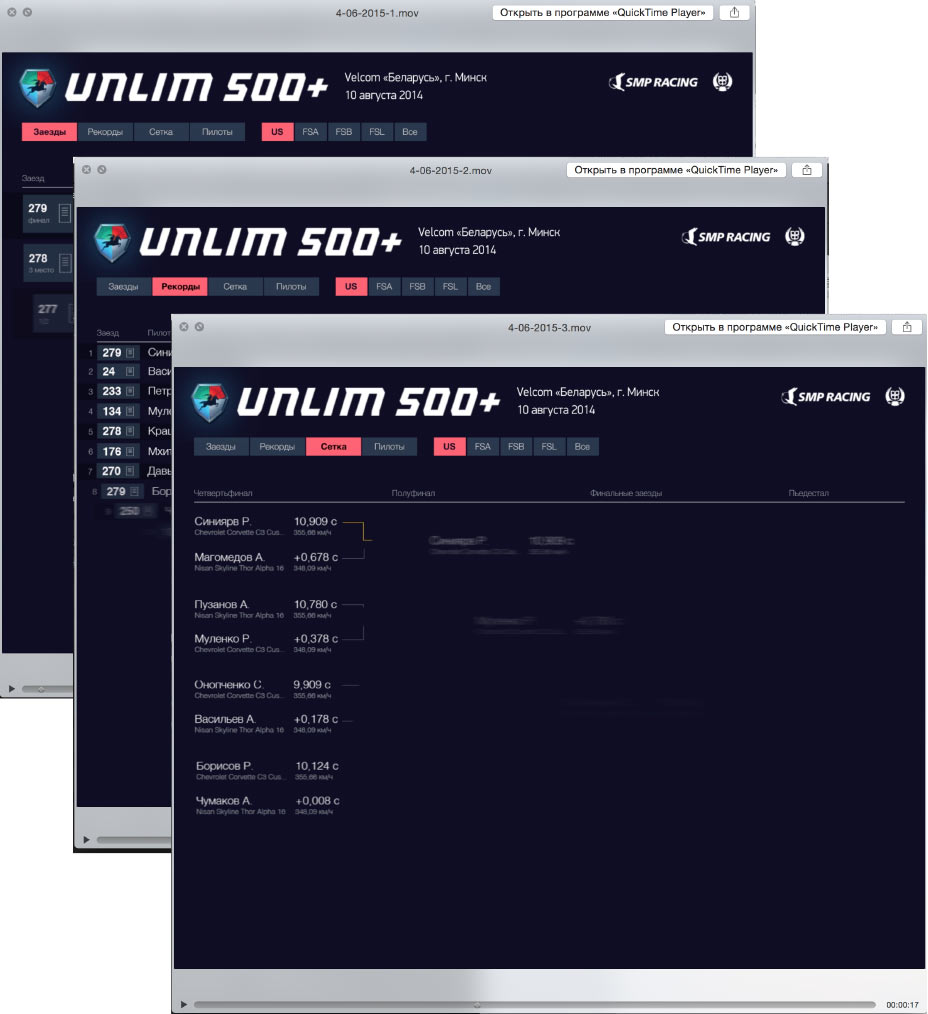
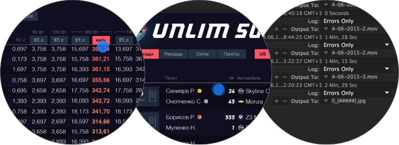
The Results tab is a list of all races at the event.
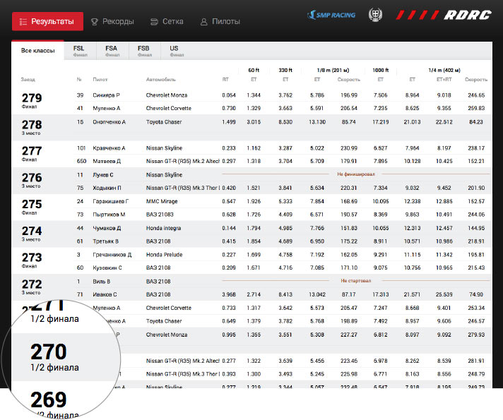
Race numbers are so large for a reason: they make it easier for drivers who remember numbers of races with interesting results to find them in the list and make a printout. How exactly printing is implemented is still unclear, so we keep on exploring.
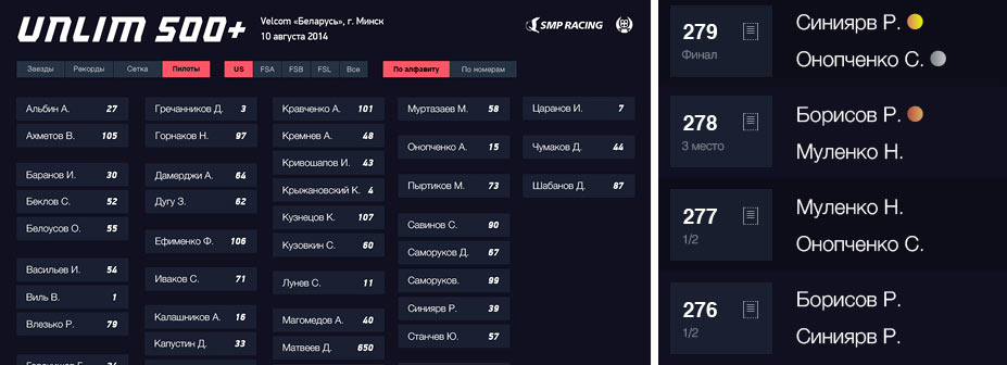
The Records table shows who and in which race demonstrated the best result in class by any of the measured parameters.
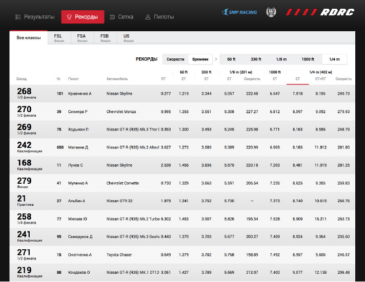
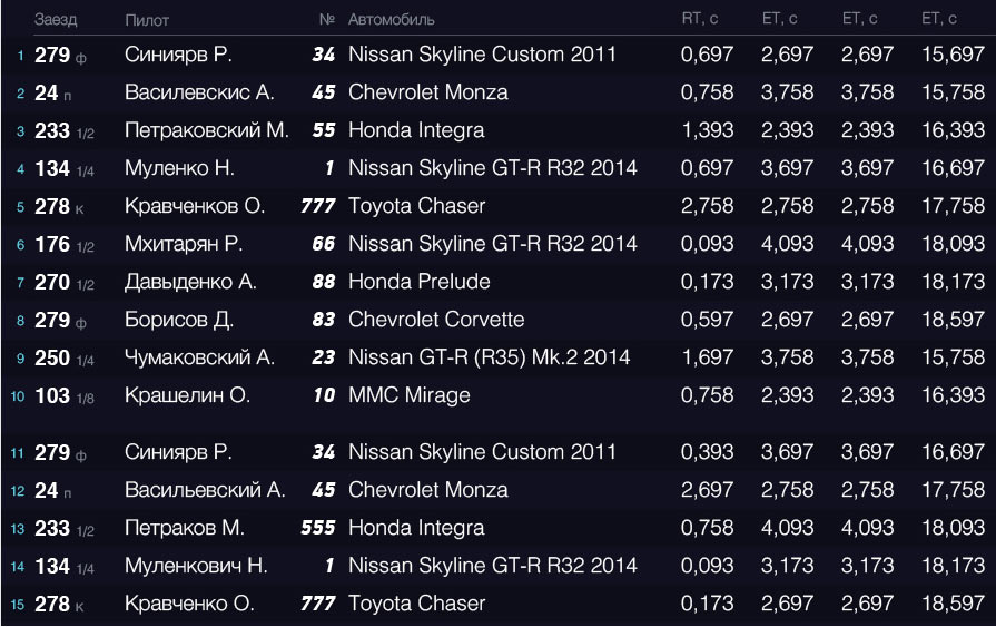
The races take place on a straight track. From start to finish, the drivers pass through a number of checkpoints along the track at which three parameters are recorded:
1. RT — reaction time at start
2. ET — elapsed time from start to the checkpoint
3. speed at the checkpoint
The first parameter is measured once, the second—at all the checkpoints, while the third—only at some checkpoints depending on the event type.
A number of switches allow to filter and sort the table.
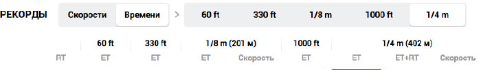
The table’s header row is located right below the switch line. One of the cells in the header row is highlighted to show the current sorting of the table.
A special formula is used in one of the cells.

The whole setup eats up too much vertical space. Coupled with the top menu, it comes up to almost half of the screen. We need to cut down the height and the number of repeating elements.
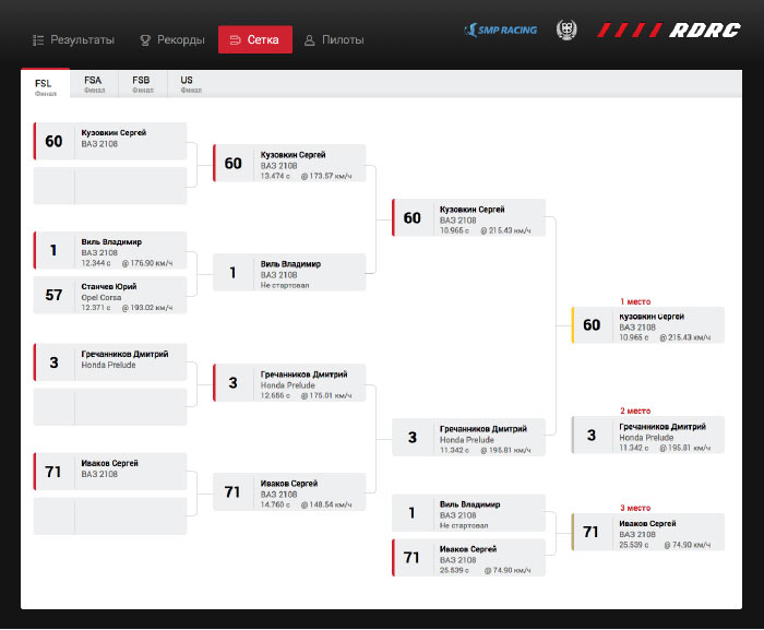
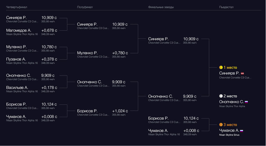
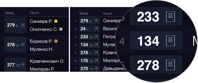
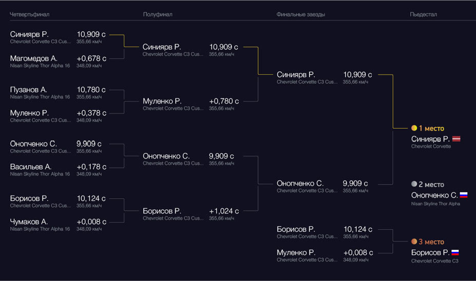
The grid presents less problems. It’s a simple shootout tournament table and shows only the pilots who have completed the qualifying races and who will be competing for the prizes.
The pilot list also has sorting switches that take up vertical space. They also need to go.
The terminal is often located in direct sunlight. The client has been complaining about poor legibility in such conditions.
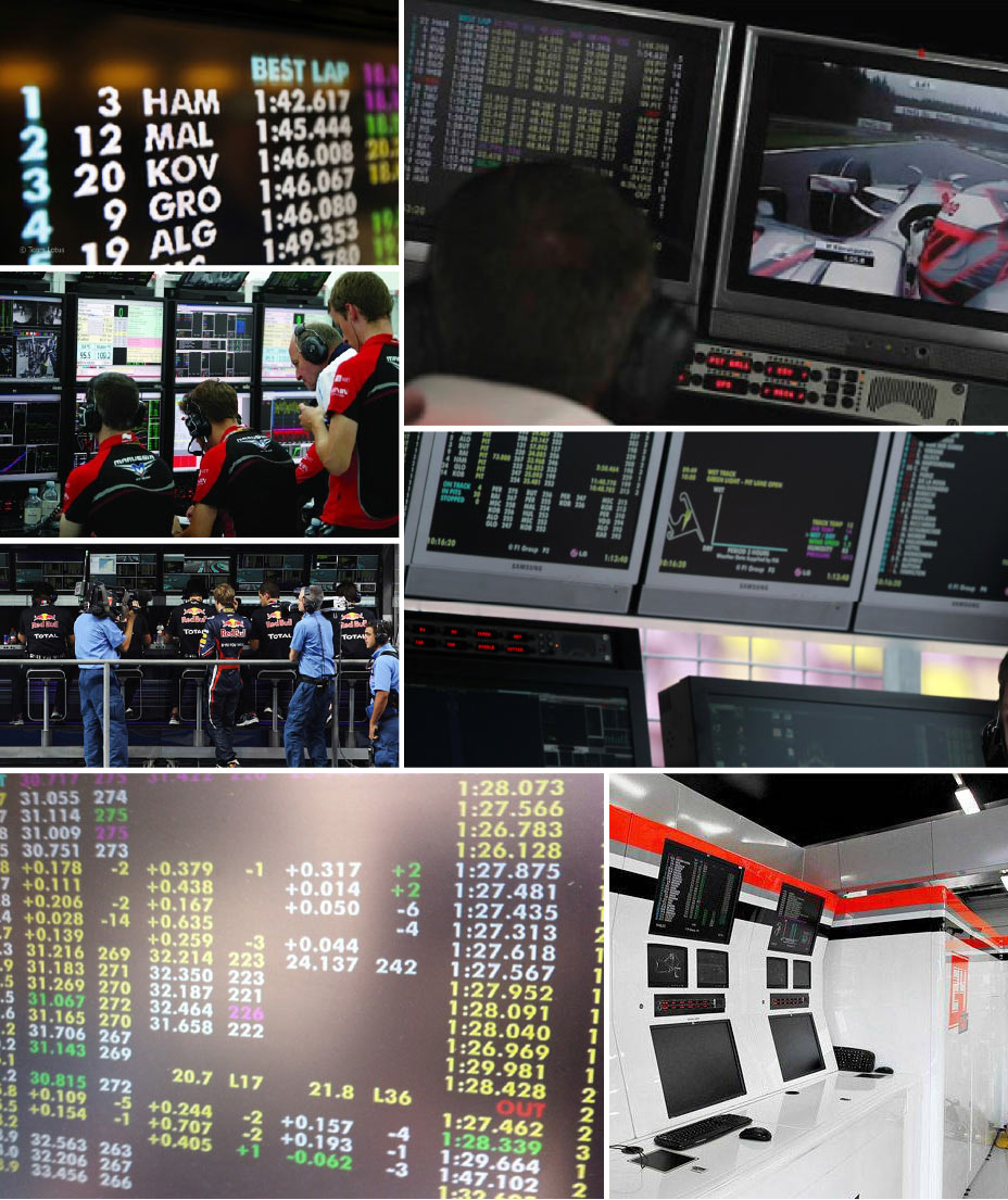
Looking at telemetry presentation of the leading racing series. Usually, they face exactly the same problems.
Everybody seems to prefer black background and strong contrast. Trying it out.
The colors and the contrast look good. Deciding to leave it like this for now. We’ll check it again later under the sun.
Moving on to navigation. Right now it takes up too much vertical space.
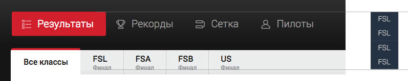
Putting everything in one line, decreasing the height and making the design more compact. We shouldn’t worry about adaptive design too much, which means that the screen width of 1280 pixels should be enough for all tabs, while the individual width of every one of them should accommodate even drivers in racing gloves.

Maintaining the left-to-right alignment in the header. Adding a couple of lines of information about the selected event and giving the top right corner to the event sponsors.
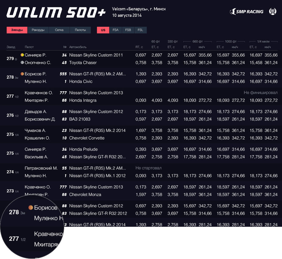
Abbreviating event number tags: ф (final), 3м (third place), к (qualification), п (practice), 1/2 (semifinals).
Keeping the varying coloring of alternating table rows for now but making it almost invisible.
Moving on to records. Deciding to use table headers for sorting by simply coloring them with tab styles. Marking the currently selected sorting column in bold and filling the values with a hot to cold gradient.
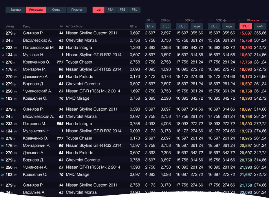
Moving the race positions to the left margin. Adding gaps between every ten results to show the best 10, 20 results and so on.
Removing all excessive decorations form the grid.
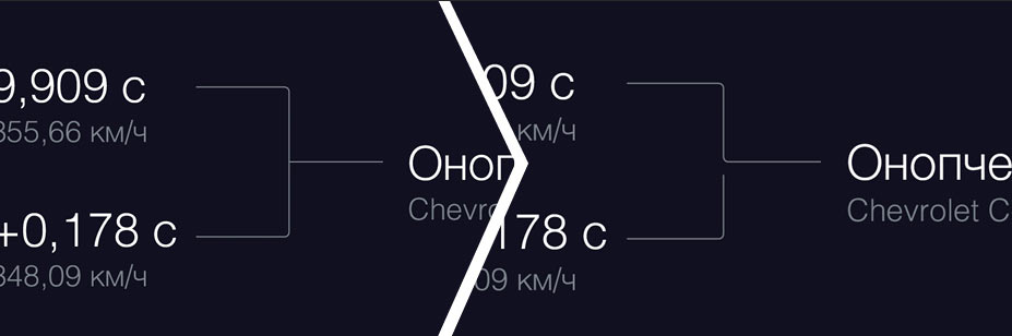
It’s important to know who took the prize and what the advantage was in each duel.
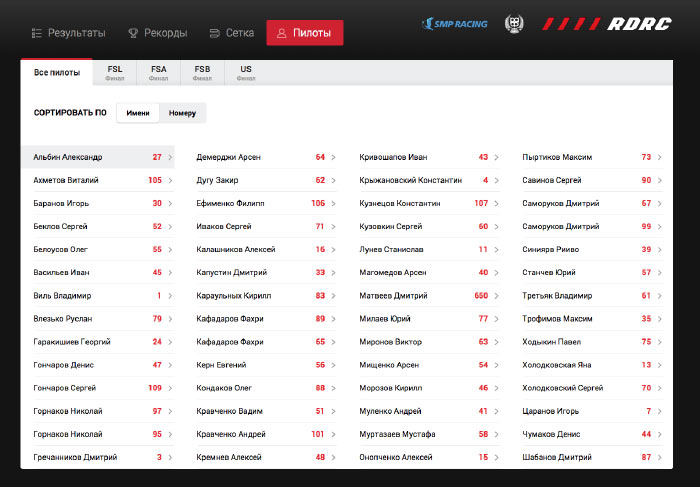
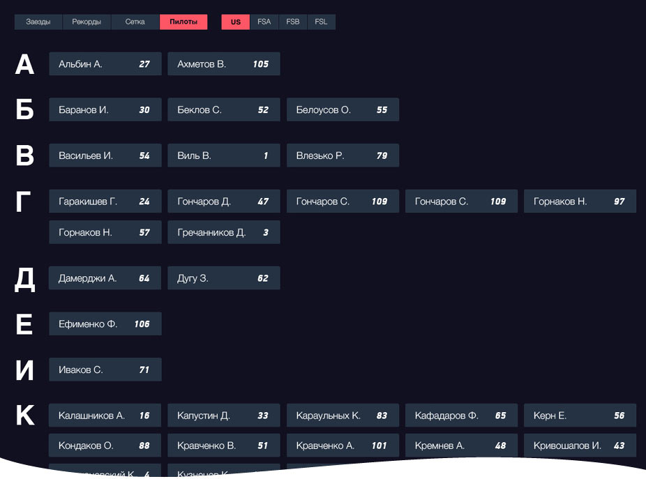
Breaking down the pilot list by alphabet.
Meanwhile, the terminal arrives to the studio.
Inside is an inexpensive PC with a UPS and a receipt printer. Turning it on.
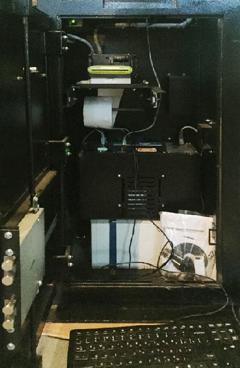
The browser launches in kiosk mode: no panels, no scrollbars, nothing. Testing.
Not bad. Which means we can make use of some visual effects. Assembling the mock-ups into a simple prototype and testing it on the terminal.
Deciding to use gif animation to demonstrate visual effects. Putting all the VFX together and using them to replace the JPEG files in the prototype.
Art director: Looks sporty enough. But it feels as though the terminal is old and struggles to load table rows. Let’s make it more high-tech.
Making the effects smoother.
Art director: OK.
The client sends a link to the updated interface. This time it features the print button, right next to the race number. Apparently, it simply didn’t load correctly in the previous version.
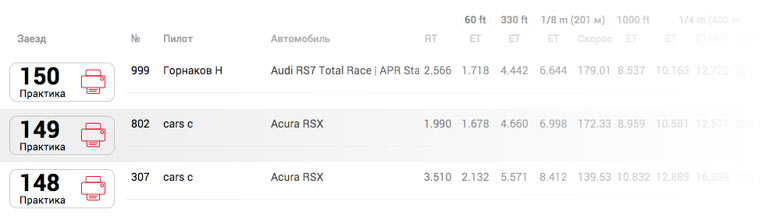
Deciding to leave it where it is: people must have already gotten used to its location. However, deciding to replace the printer metaphor with a generic printout icon.
Making sure the button height matches the line height in the Races table.
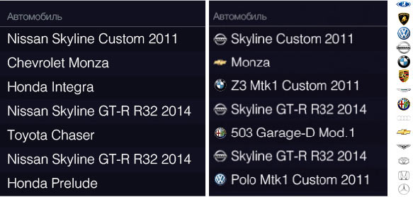
Looking at all the mock-ups again and fixing small bugs. Replacing the car make with a logo in the cars column: it’s more important to show the full name of a car, while the make should be evident enough as it is.
Cutting the connecting lines between pairs of races in the grid. It immediately makes it evident who passed over who on the road to the medal.
Highlighting the path to the first place.
Removing all tabs on the pilot page, adding a header in their place and a button to go back to the list of pilots. Making other competitors less noticeable even when they were first.
Refreshing the prototype and showing to the client.
Client: We like the effects and the fixed navigation. The black background also looks good. No questions about the race grid. You also need to implement sorting of the pilots by numbers. And remove the abbreviations under the races, people won’t understand them.
Adding tabs for sorting pilots, removing abbreviations.
Client: You shouldn’t make the print buttons in the race list so small, on screen they will be very close to each other.
Making the printout icons larger. Keeping abbreviations only for mixed results when it’s important to see the class of each race. Increasing space between print buttons in the records table.
Preparing source files for sending to the typesetter.
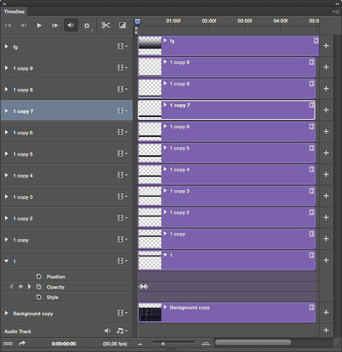
Creating appear/disappear animation for tables, as well as for switching between them. Creating the structure inside the application, cutting the table up into parts. Drawing most of the interface in a video editor, which should considerably expedite the process. Adding smoothness to transformations.
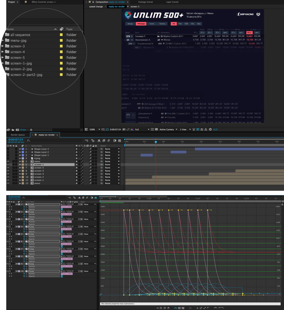
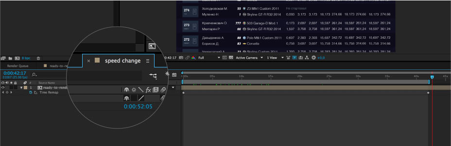
All the screens are now ready. Making test renders to choose the best animation speed.
The art director asks to make it faster. Doing so.
Adding navigation to the entire video. Enabling Motion Blur and running the render.
Going to the races to test the interface in the field.