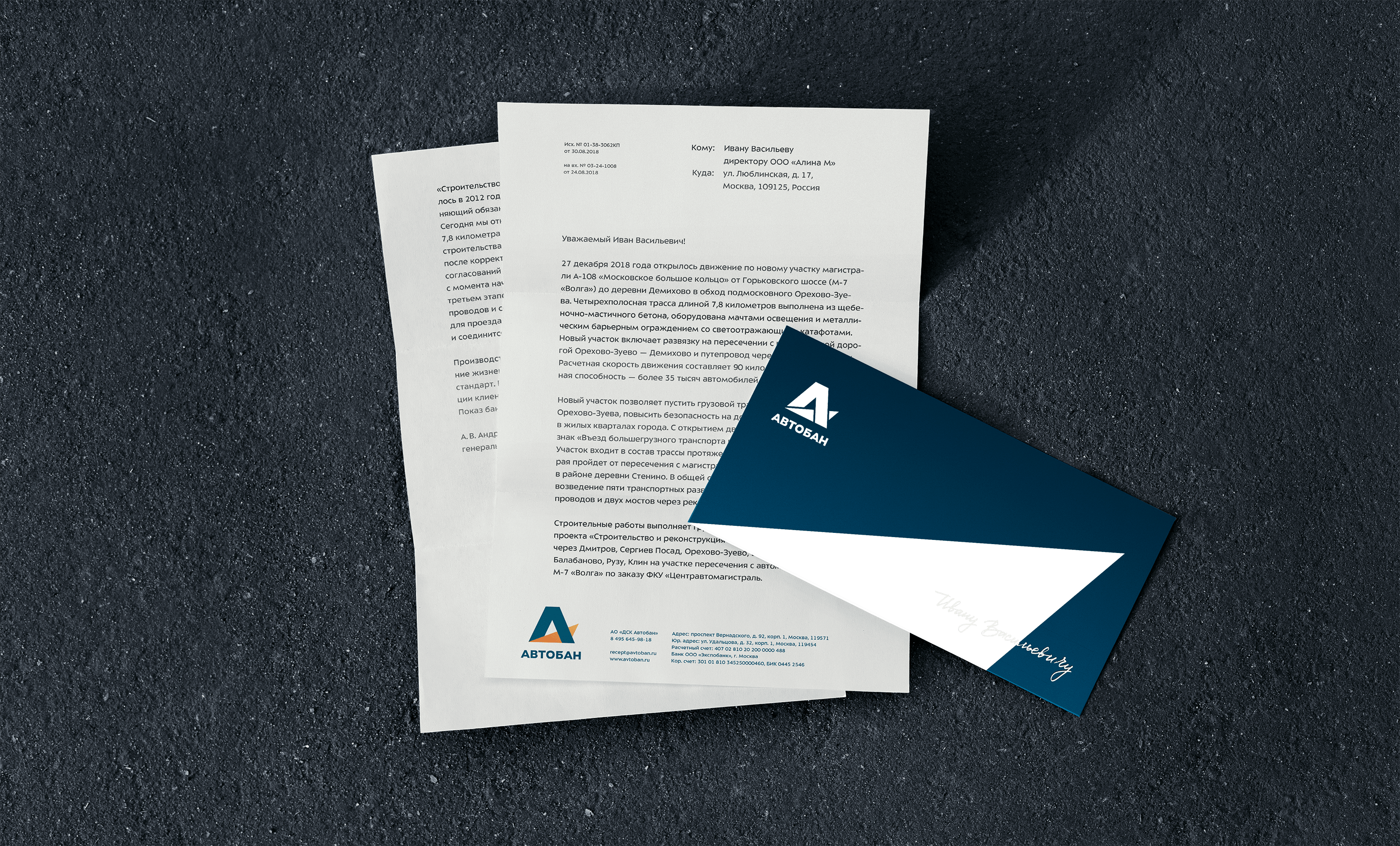
The company with the telling name Avtoban builds and repairs federal highways in Russia, contributing to the development of 15 regions and six federal regions. A brutal identity for the largest road construction company was created at the studio.
The sturdy logo stands on a road that vanishes over the horizon. The perspective of the road reflects the company’s future, career growth of its employees and influx of investment into regions where Avtoban operates.


Specifically for Avtoban, we created the extrabold style of Sector typeface. It is used in additional logos of the multitude of Avtoban’s affiliate companies as well as in advertising and on the website.
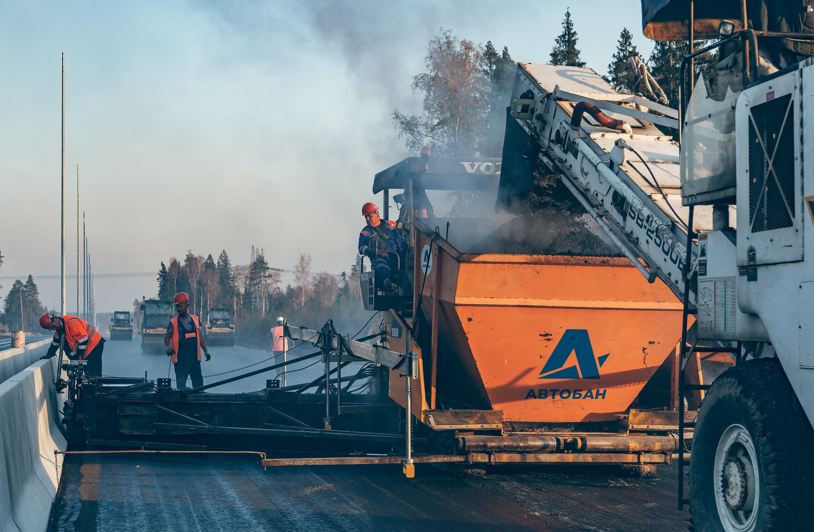
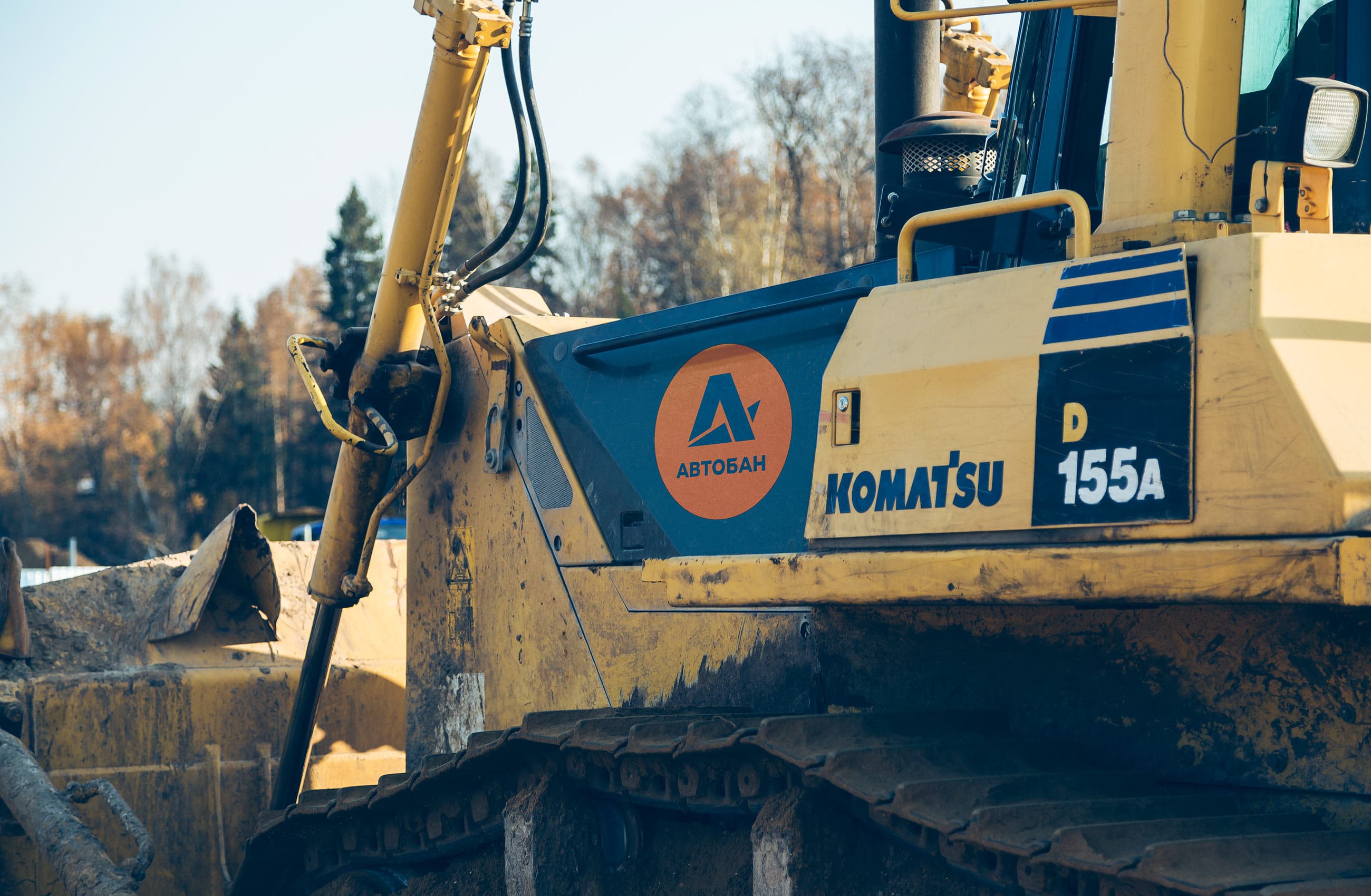
The company’s signature navy and orange colors fit perfectly in the harsh road construction environment. Any equipment painted in orange automatically becomes branded while rented equipment is marked by orange stickers.
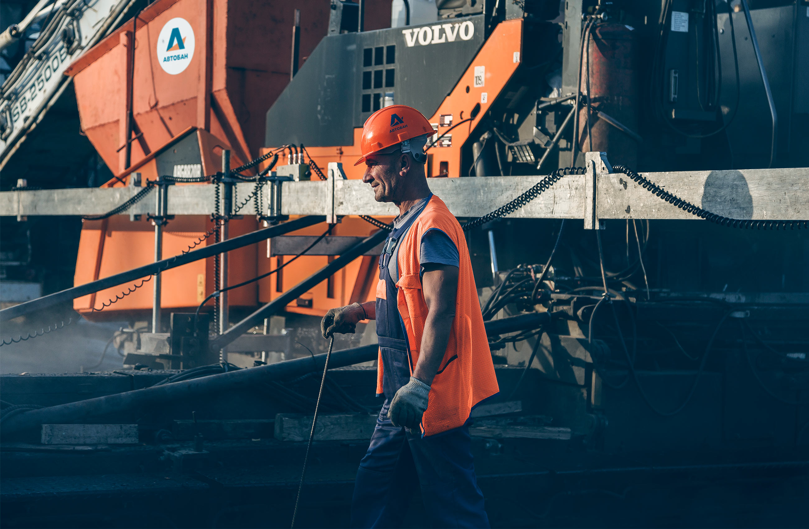

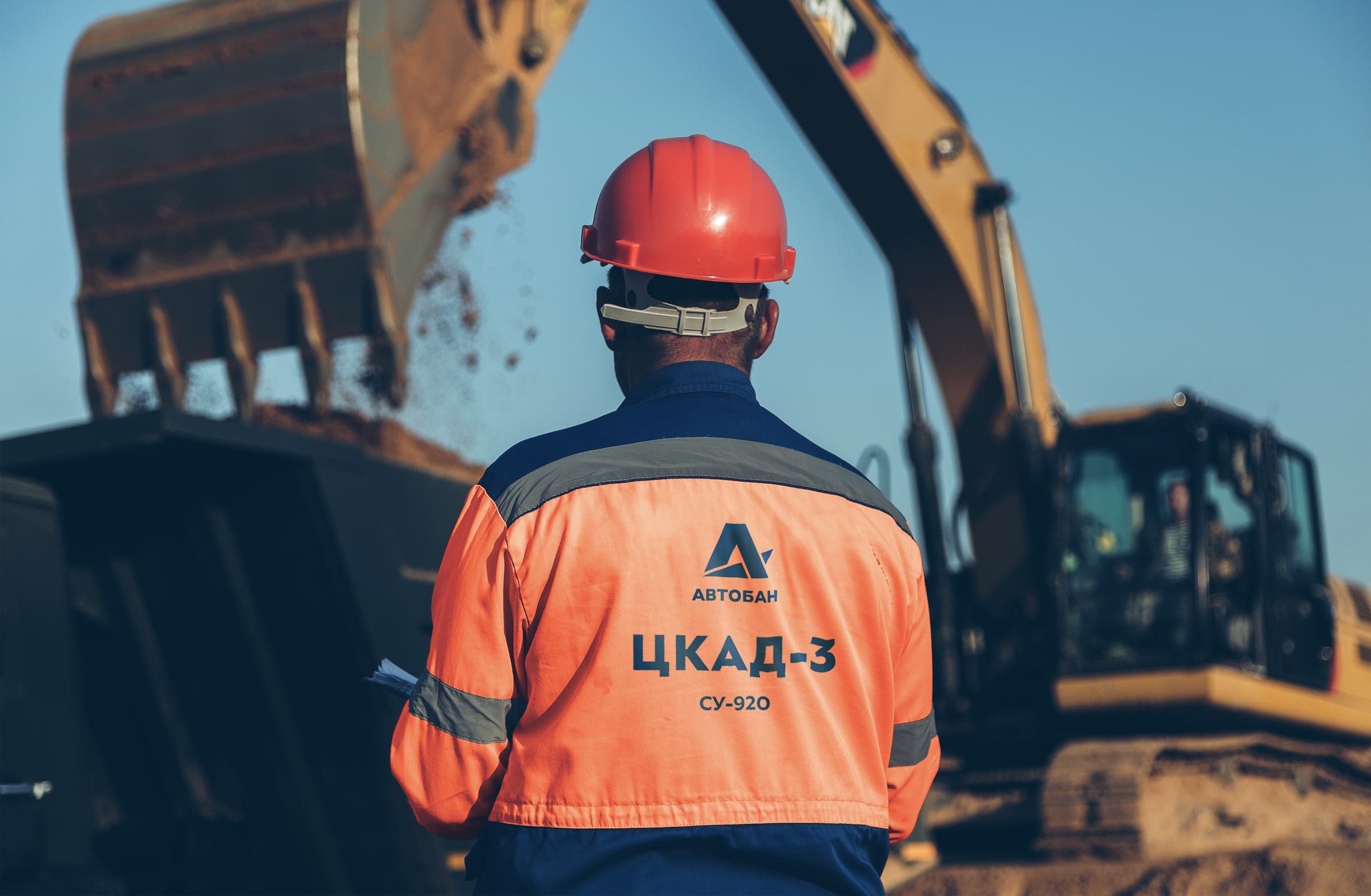
Avtoban’s logo is a rare example of a symbol that looks equally great on workers’ uniforms and suit jackets.

art director
type designers
- Taisiya Lushenko
- Ksenia Erulevich
