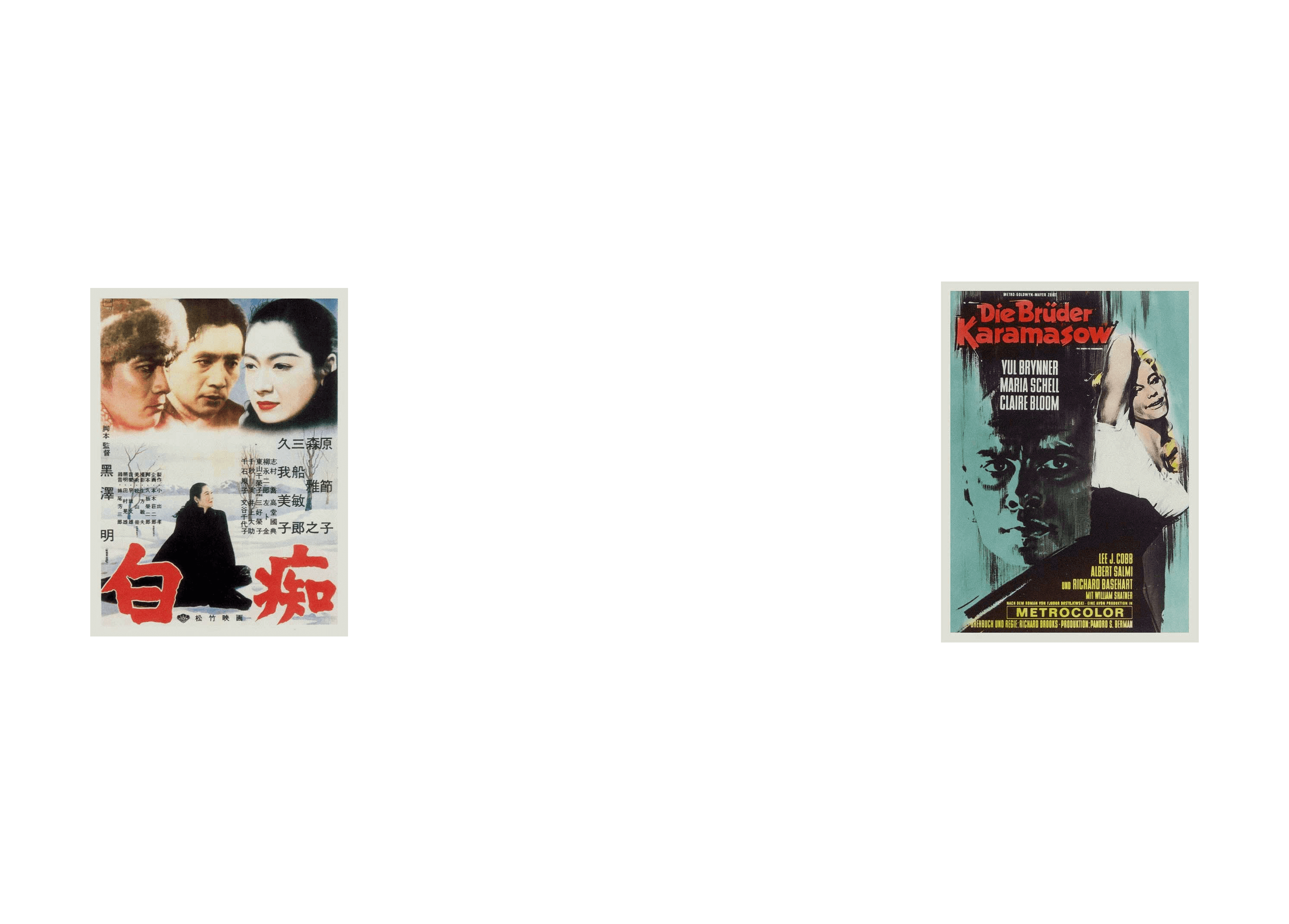
There is an apartment-museum of Fyodor Dostoevsky in Moscow. To celebrate the bicentennial of the writer, the museum launched the Dostoevsky World project that gathered widely known information and little-known facts from various sources. The project’s identity draws attention to the writer’s work, providing sophisticated admirers with many opportunities for thoughtful exploration.
A logo was created for Dostoevsky World that lives a very restless life and is always changing, just like the writer’s state of mind, emotions of his readers and destinies of his characters.
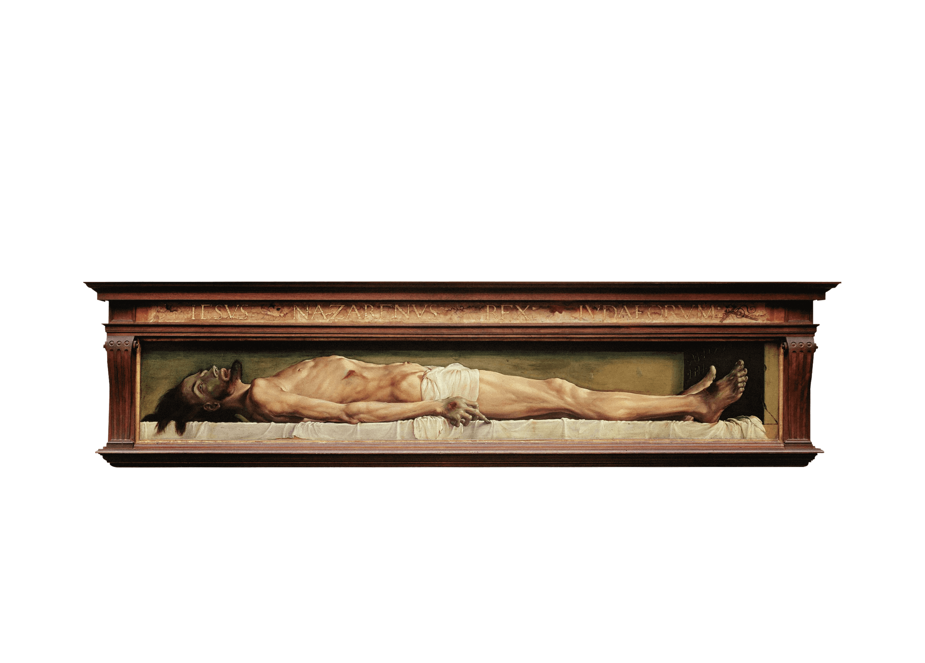
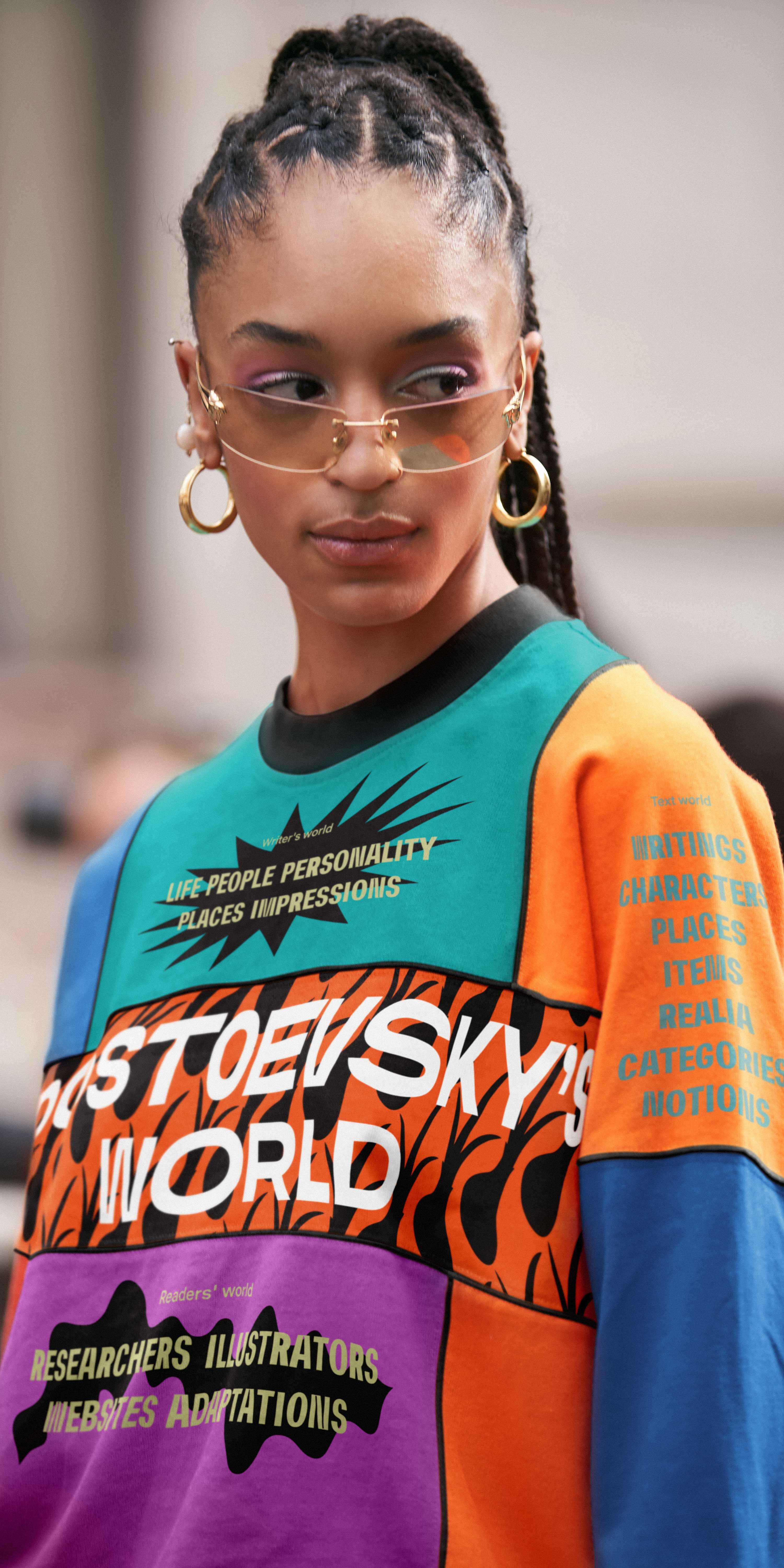
Dostoevsky’s universe is so rich and unpredictable that four worlds had to be created to contain all of its inhabitants. They differ in images, mood and content—that is, in almost everything. The worlds are connected to each other by an uninterrupted line of life.


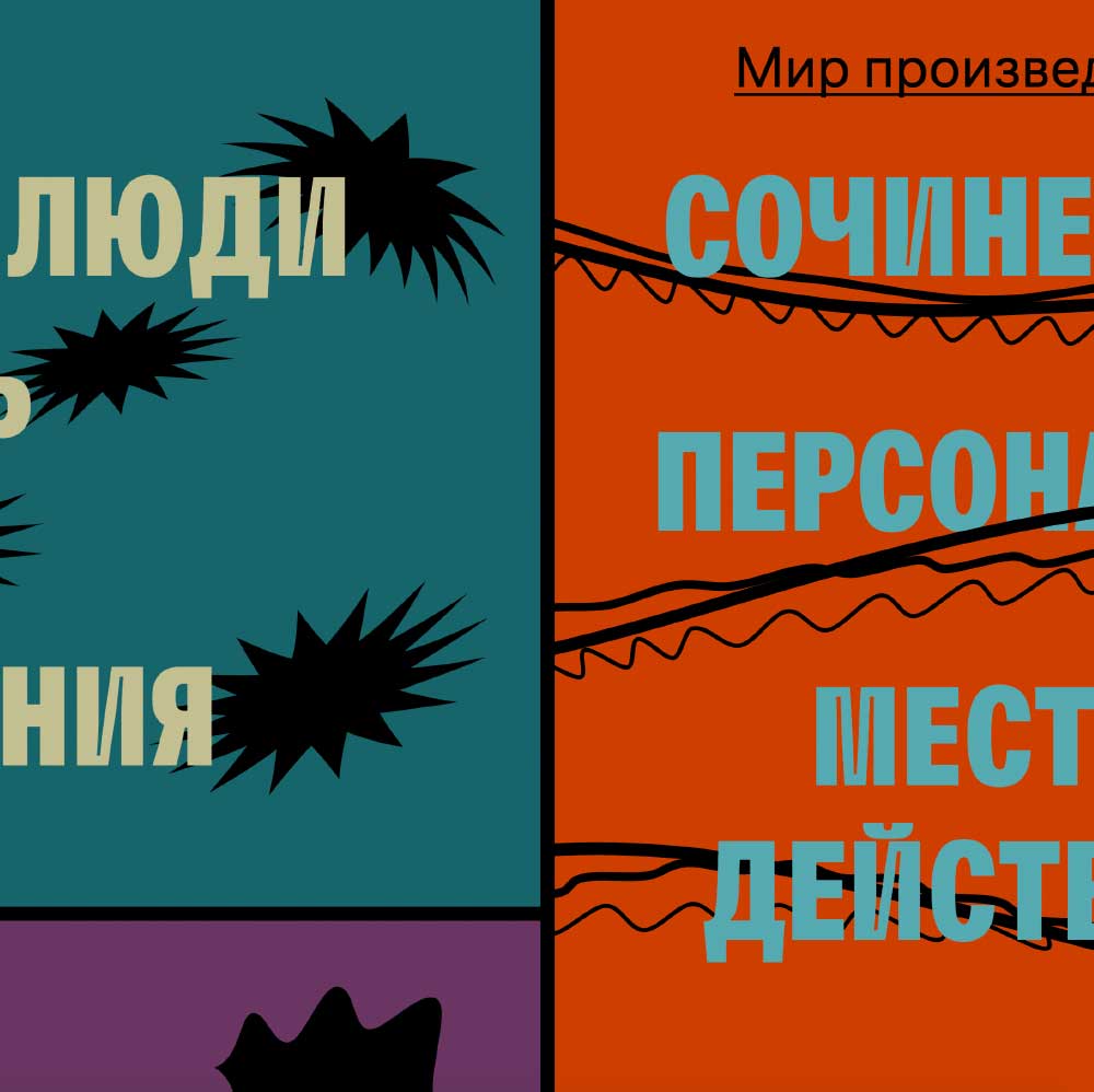
The world of the writer means never-ending alternation of calm periods and explosive feelings. It has upheavals, anxieties, intense joy, quiet sorrows, encounters with various people and general impressions of life. That’s why at the heart of the graphic theme of the writer’s world are powerful flashes that constantly appear on a smooth line.


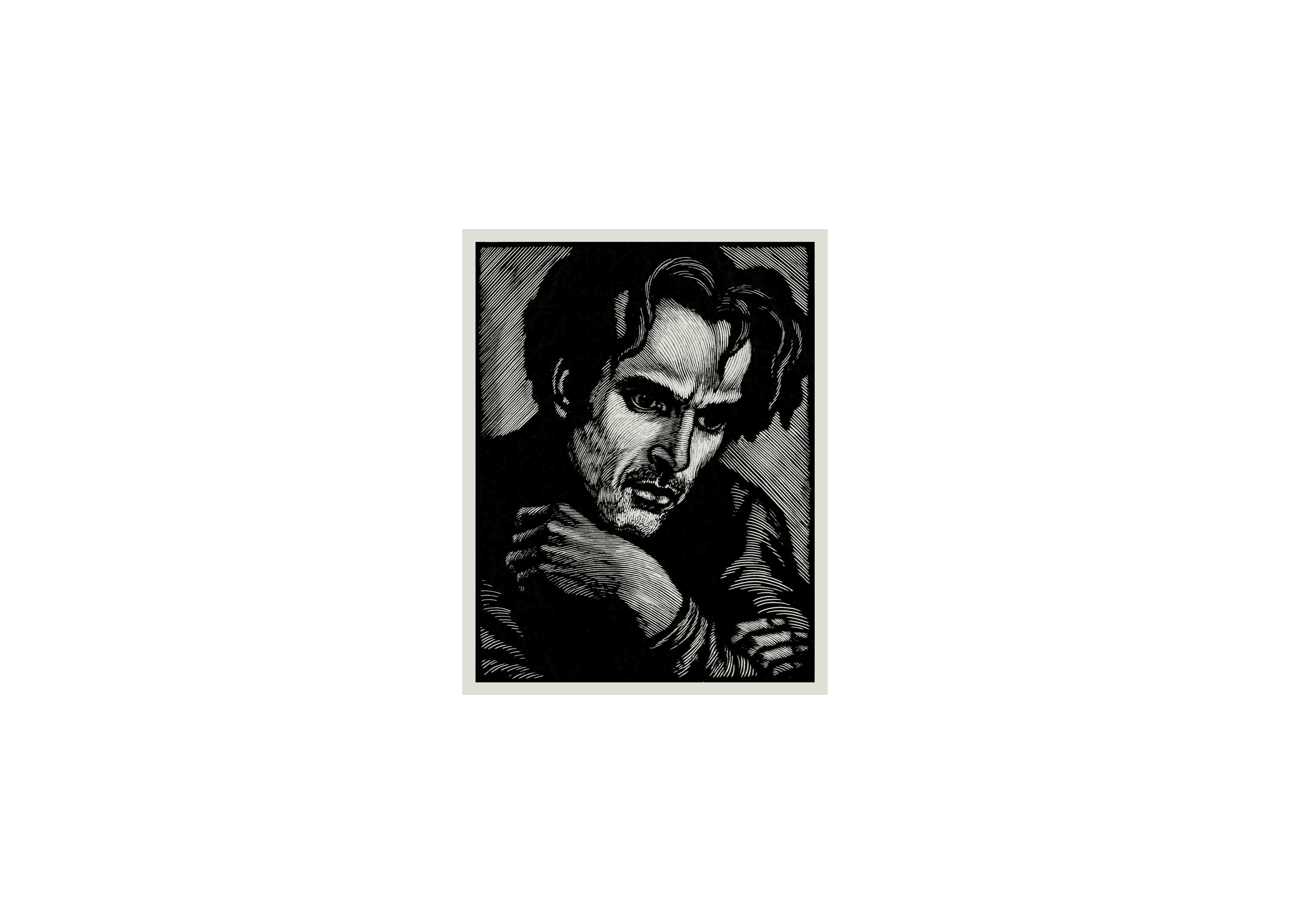
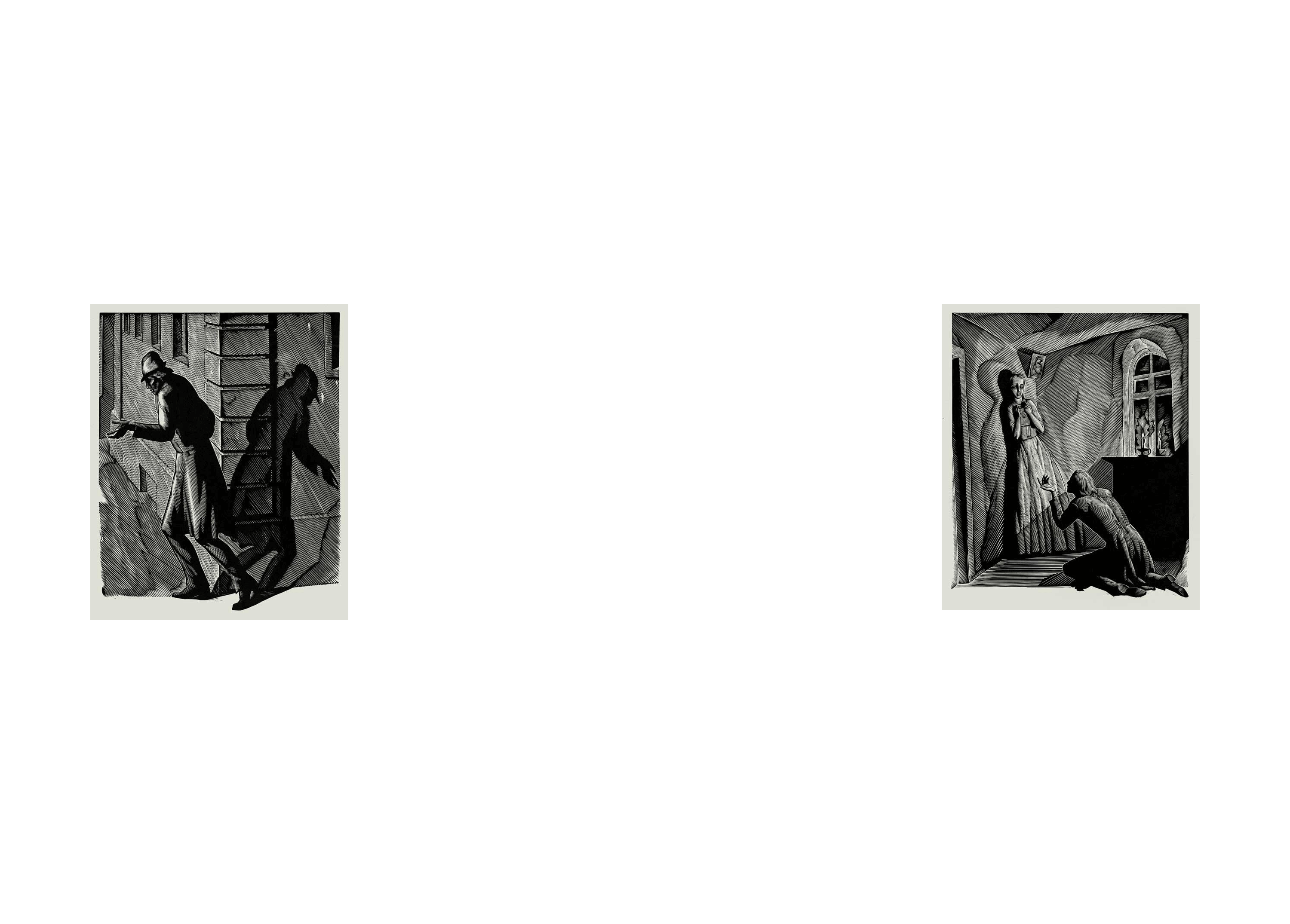
In the world of Dostoevsky’s texts, fates of characters intertwine to form strange compositions from separate lines. In them, you can see rapid pen strokes and creative pursuit. These lines twist and turn, break suddenly, curl up and change directions. In the end, the whole structure lives and breathes before your eyes.


The world of readers is all about buzzing discussions of the author’s work. Here, conversations never stop and voices can be heard at all times. Dostoevsky’s characters add to the choir from screens, theater stages and videos.


Familiar arrows guide visitors through the world of museums, always pointing in the direction where the exhibit continues.


The logo looks different in each of the worlds yet maintains its shape.

Try on a mask:
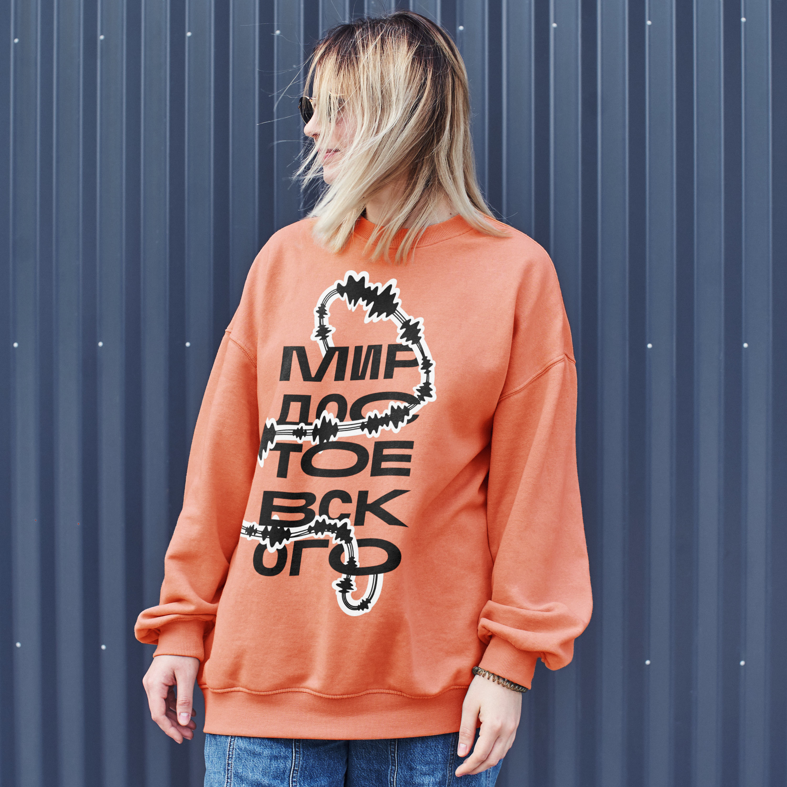
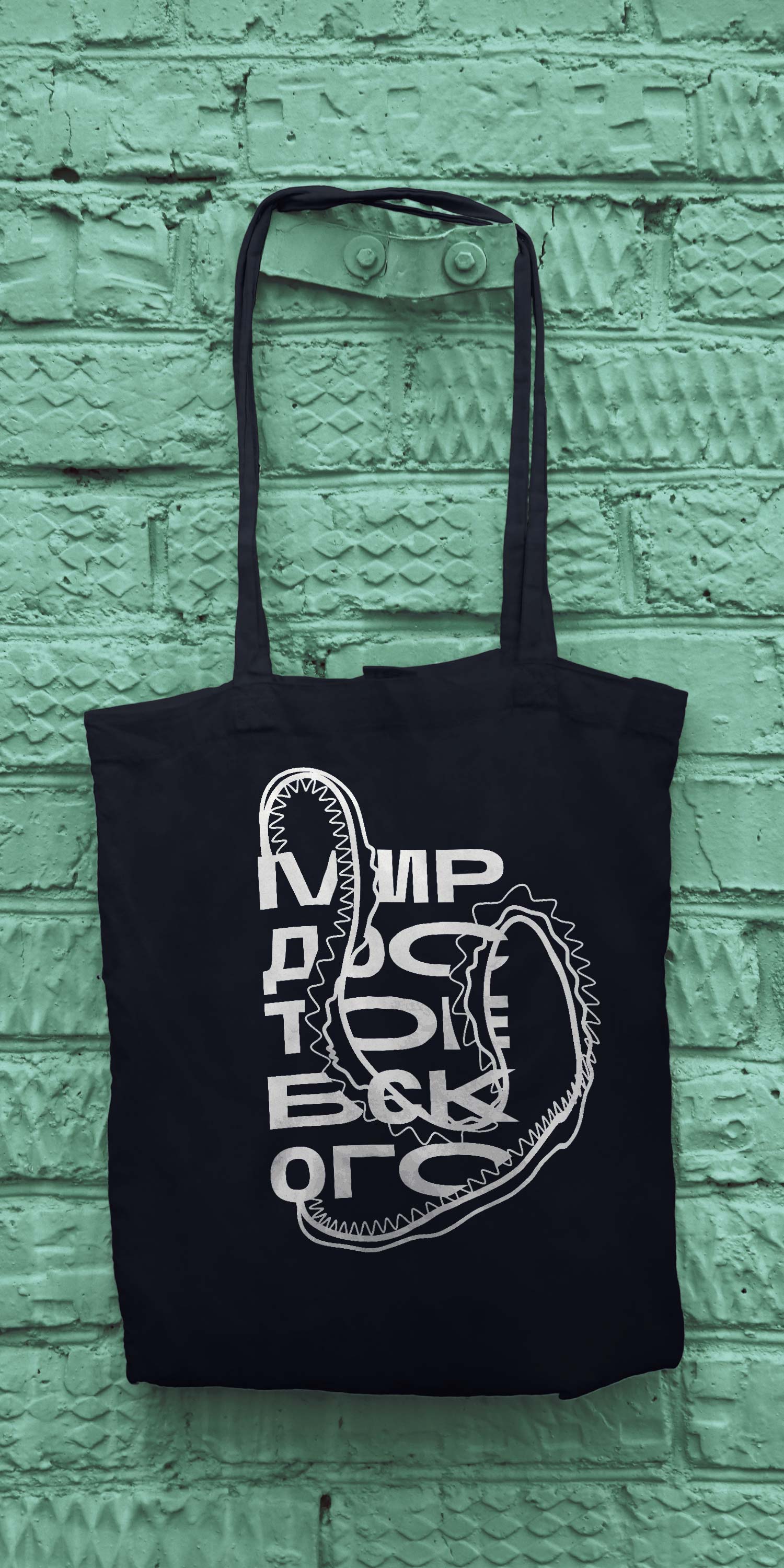
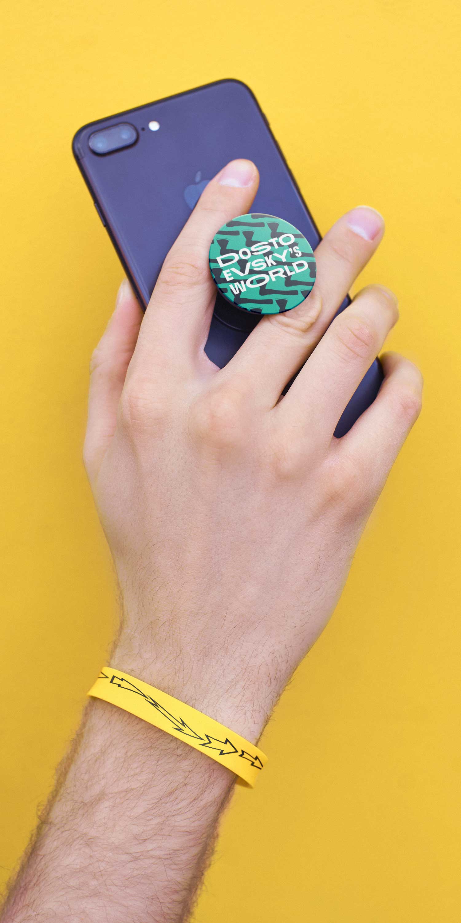
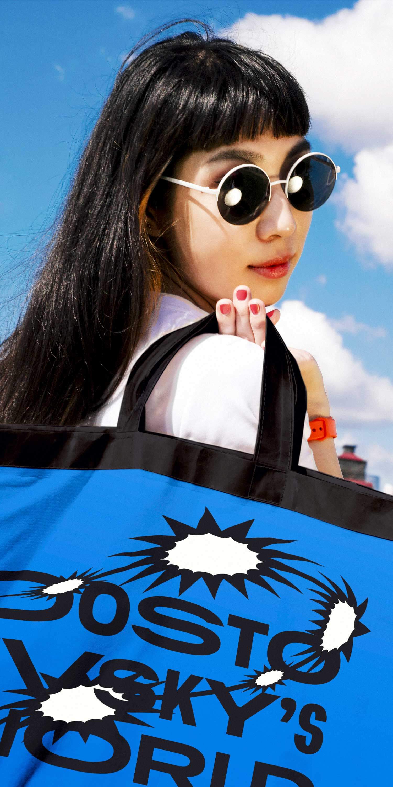
Elements of the identity look great on any objects and in any situations. Patterns with references to the writer’s life of various degree of subtlety were created to be used in the design of absolutely everything. Some motifs are visible, others are carefully hidden. But all of them are fun to look for, noticing regularities and constantly discovering something new.
Various elements of the style contain so many easter eggs that even the keenest connoisseurs will find hidden meanings in regular elements. It even has references to the “sacred disease!”
The logo of varying width was used to create two signature display typefaces. Headings are made of extremely wide and narrow letters that seem to intermittently accelerate and slow down the movement of the reader’s eye. This inconsistent rhythm creates additional tension, perfectly complementing the graphics.

For smaller print, a narrow version of the typeface was created with characteristic light diagonal strokes and bold ink traps that look like they were cut with an axe. The alternation of diagonal and vertical strokes reminds of books on the shelf. Display matter is typed with the wide typeface emphasizing the continuity of text flow.


art director
designers
- Maksim Rozov
type designer
- Taisiya Lushenko
editor
- Katerina Andreeva
project manager
- Anastasia Luneva
- Katerina Andreeva
- Anastasia Luneva
The studio wishes to thank the Dostoevsky Apartment-Museum department of the Dal State Museum of the History of Russian Literature for the help with their project
