“Indilight” is the largest Russian brand that, since 2013, has been producing a wide range of products made from fresh and chilled turkey meat and promoting a healthy and active lifestyle among its consumers.
In the studio, they designed a logo while preserving the brand’s recognizability.
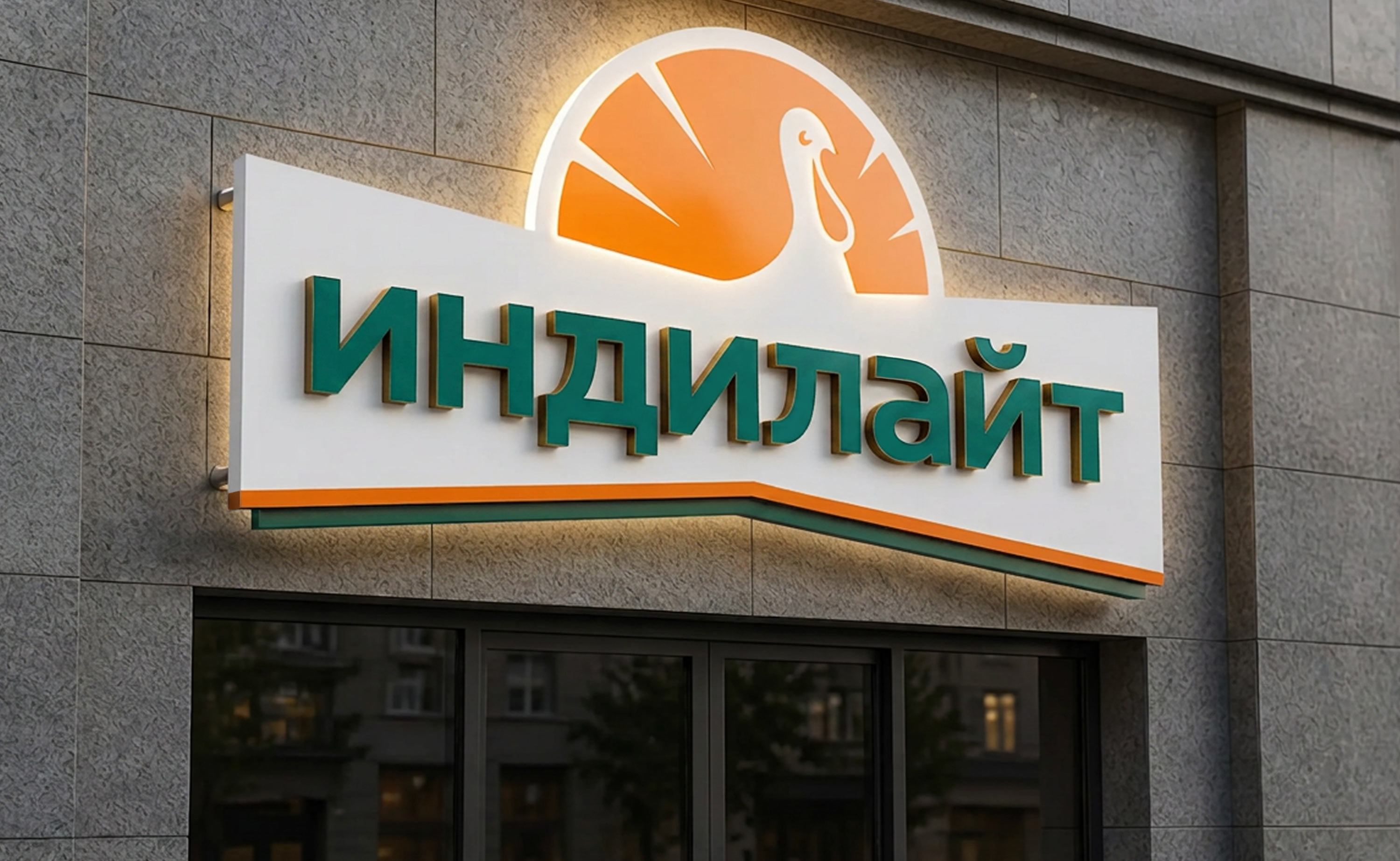
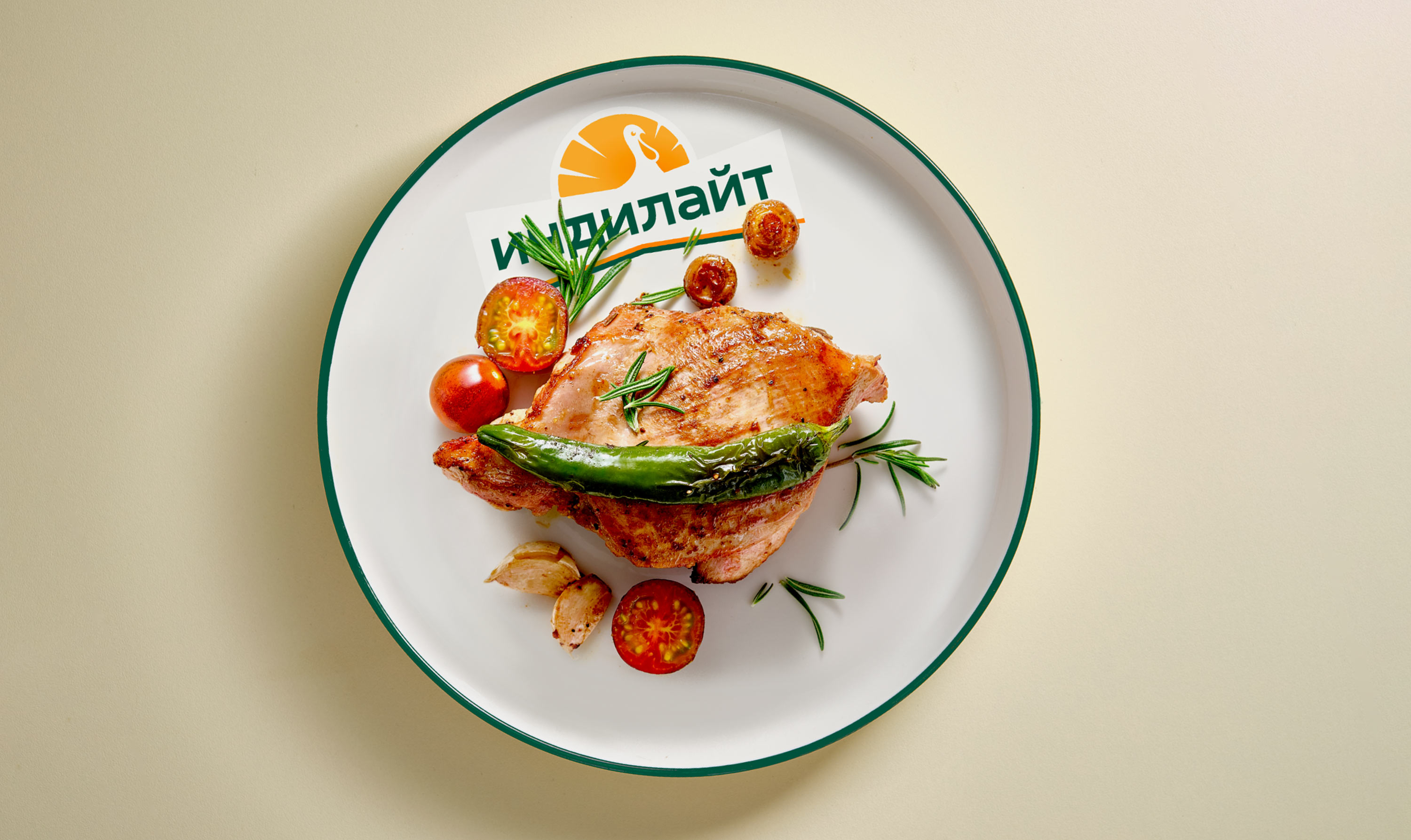
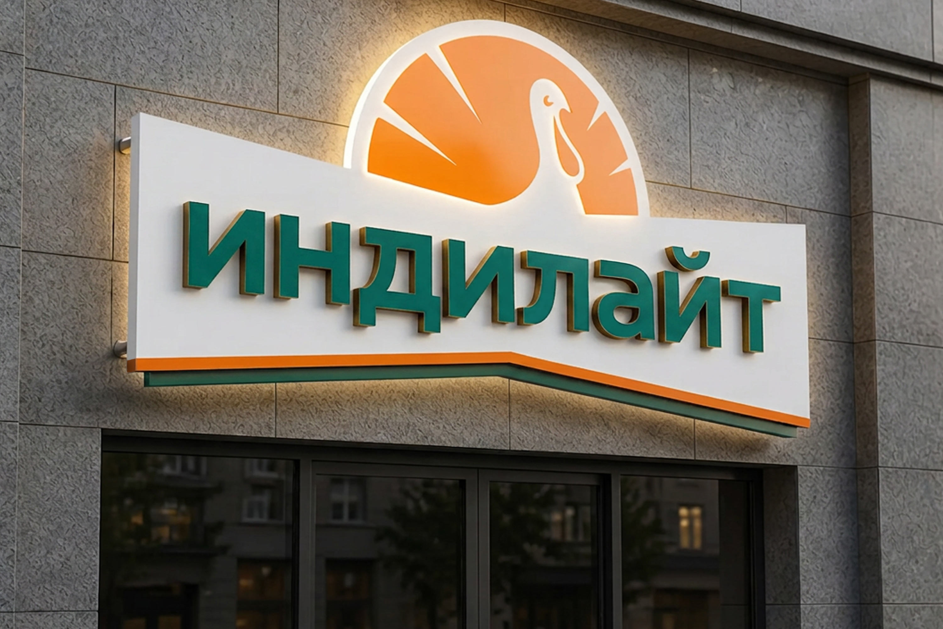
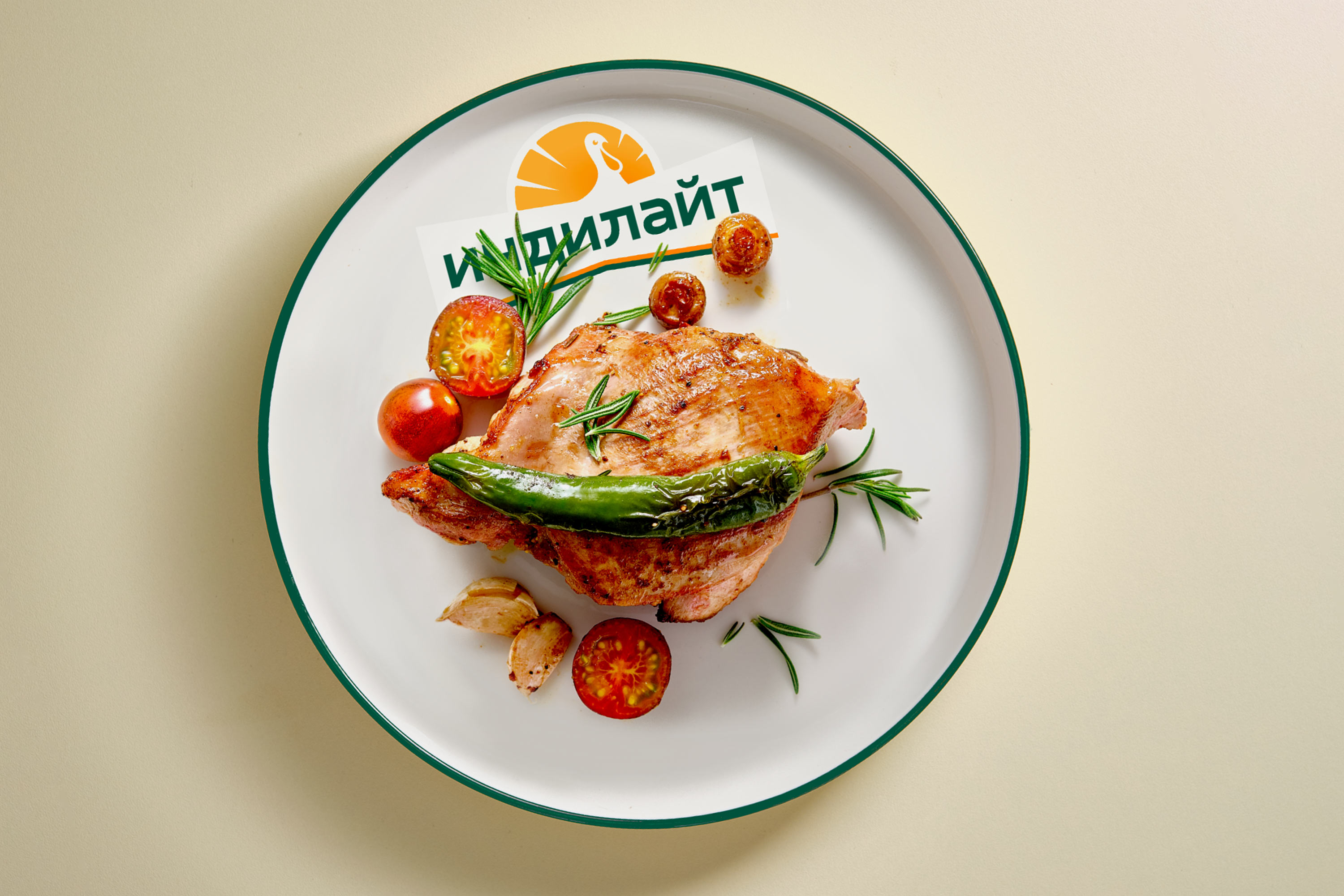
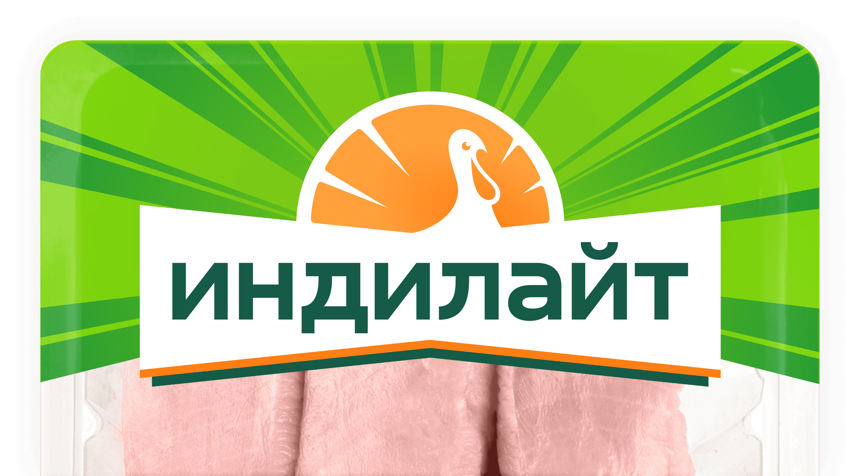
The turkey image in the logo is large and friendly. The tail silhouette is sun rays, a symbol of warmth and naturalness, referring to the southern regions where feed for Indilight turkeys is grown. The name is combined into one word, making the logo easier to read.
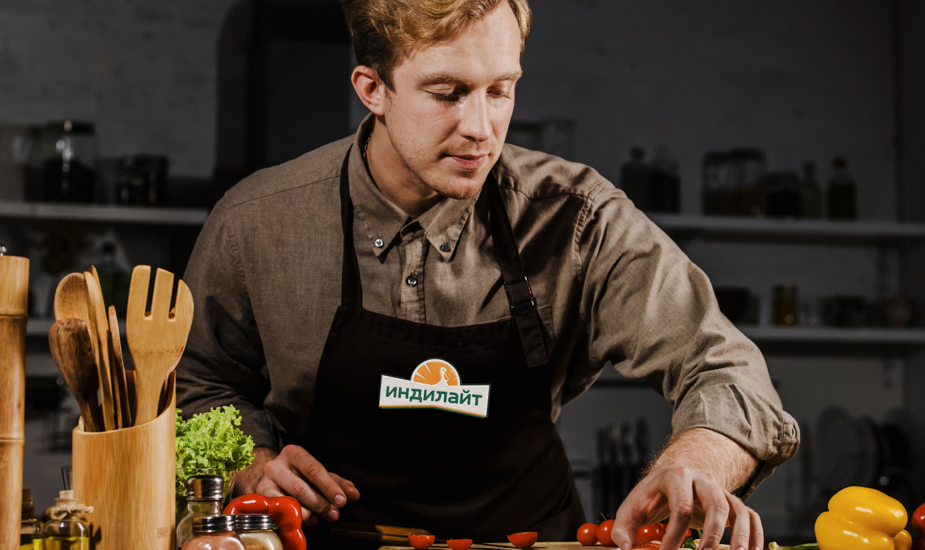
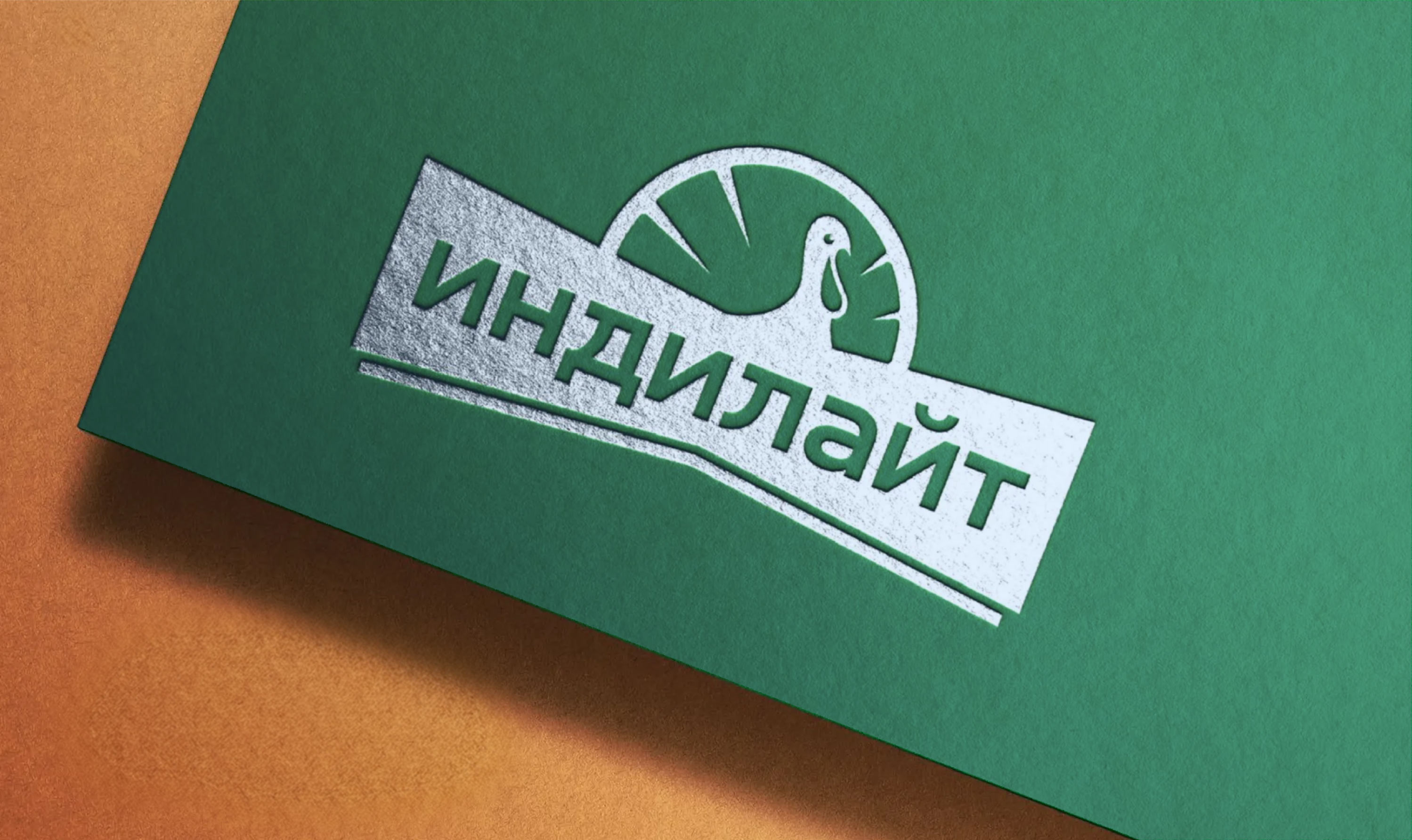
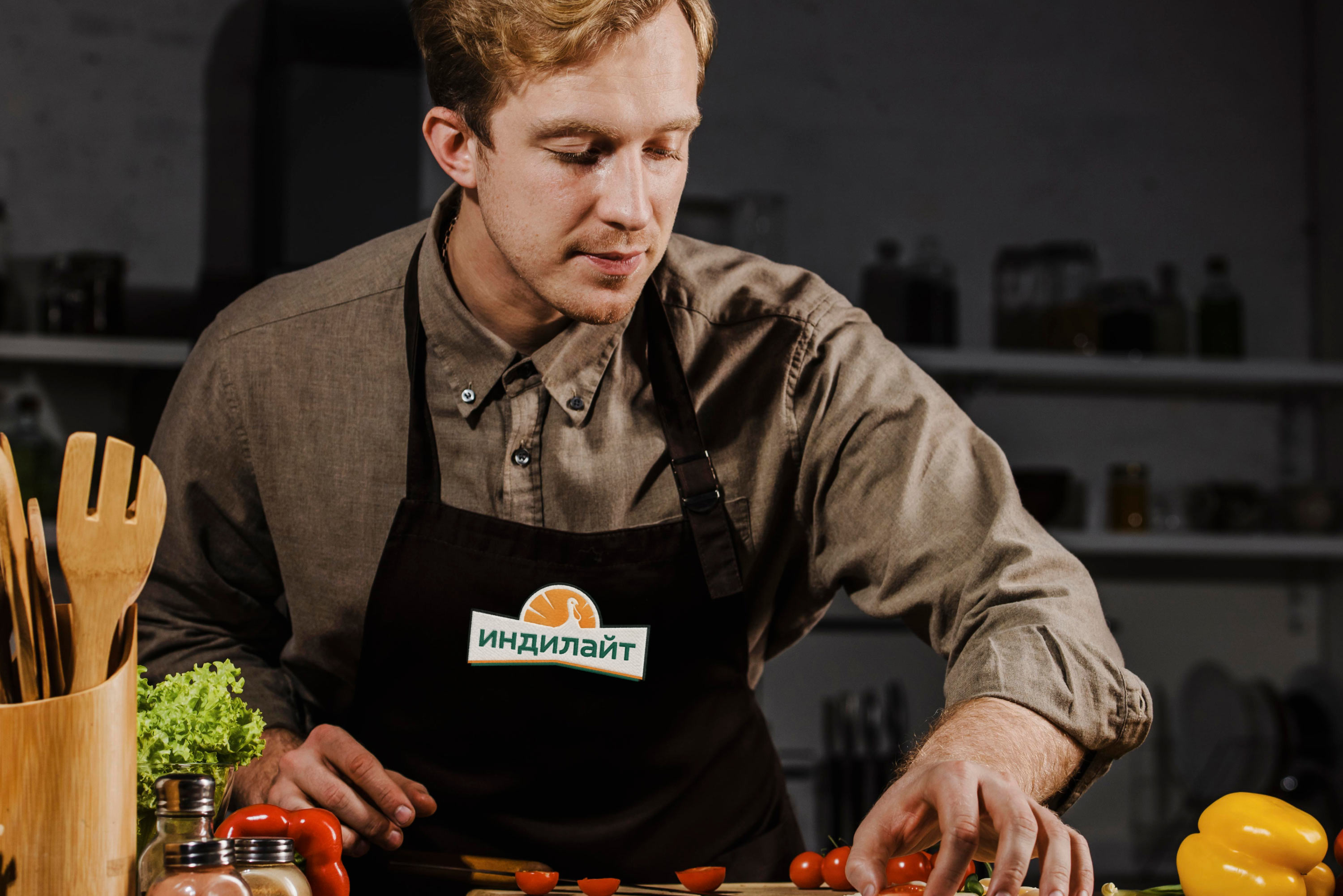
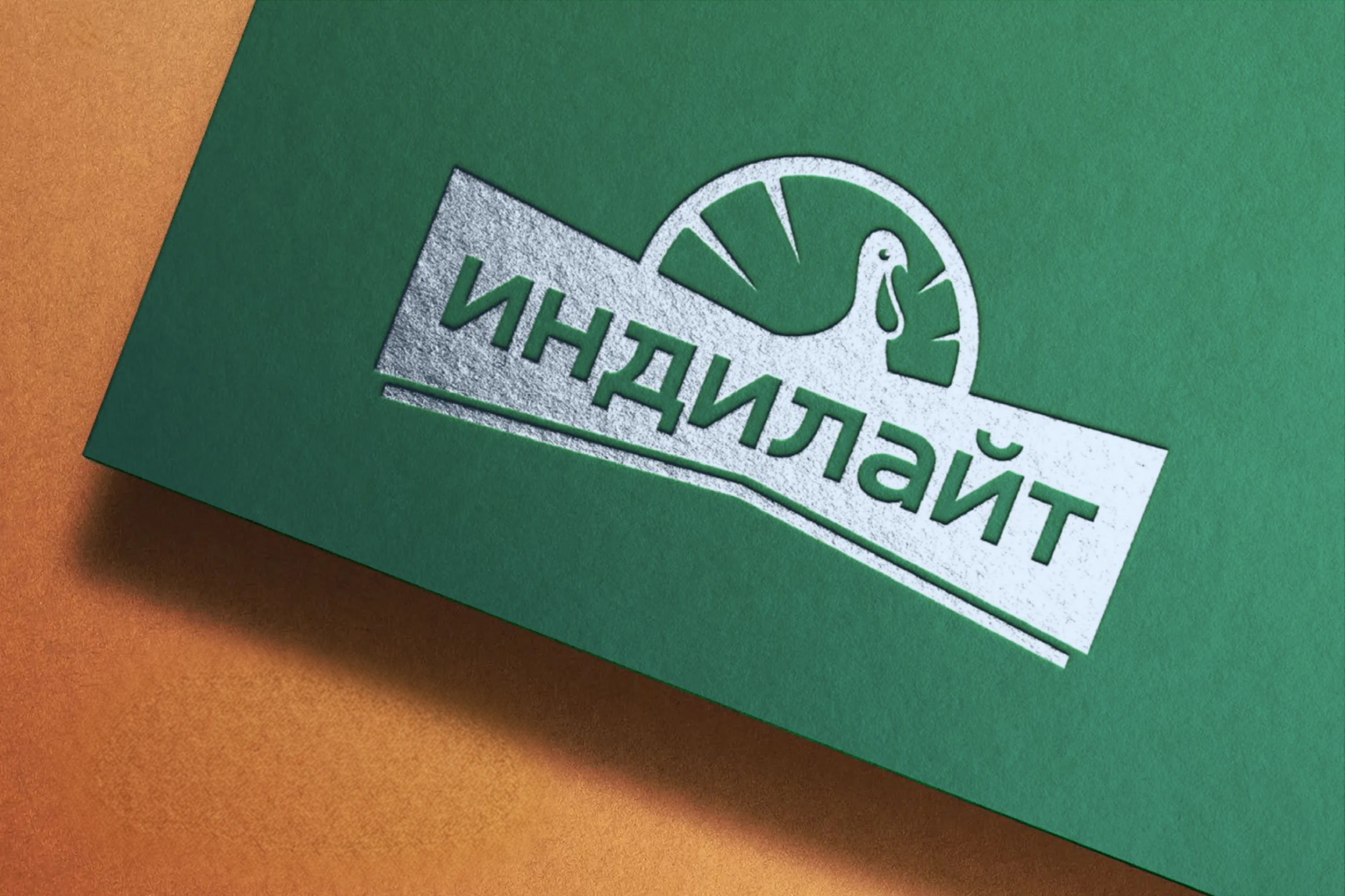
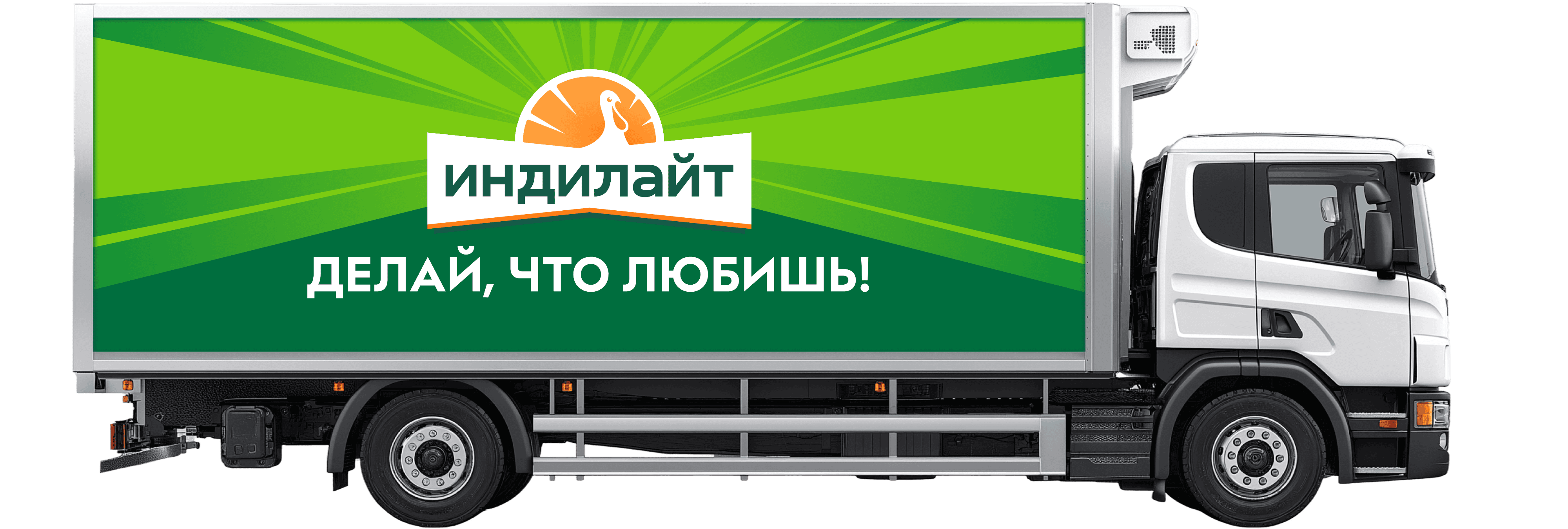
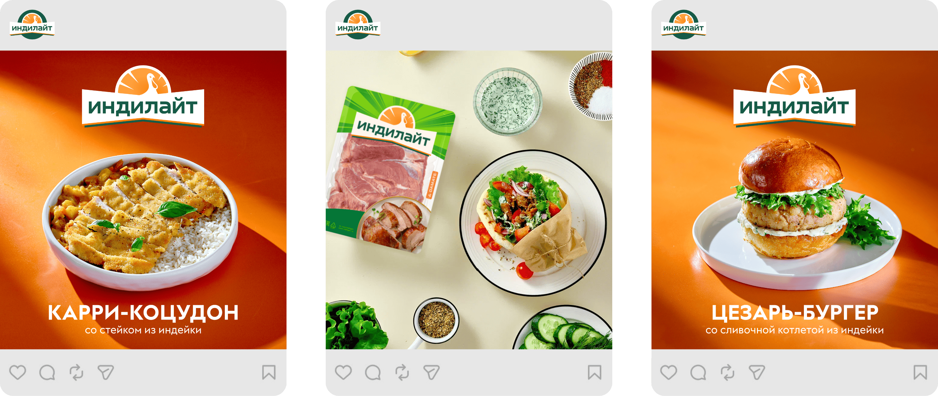
The brand palette is cheerful, rich, and modern. Green emphasizes the naturalness of Indilight products, while warm orange is associated with home cooking.
art director
designer
- Anastasiya Moskalenko
