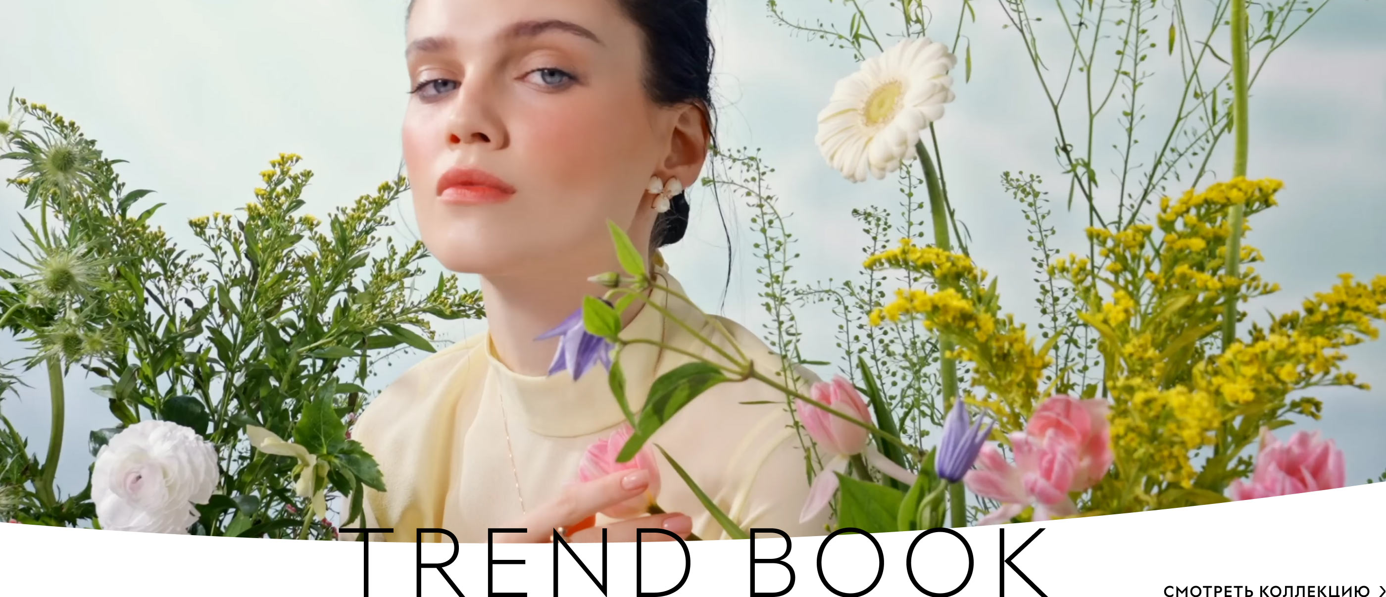
For the most famous Russian jewelry brand, the studio designed three concepts of an updated website with an online store. All of them help the company communicate warmly and gently with regular customers.
Concept No. 1
At the core of the visual style is the refraction of light, which leaves rainbow glares on the jewelry and shines on the page design elements. The result is simply brilliant communication!
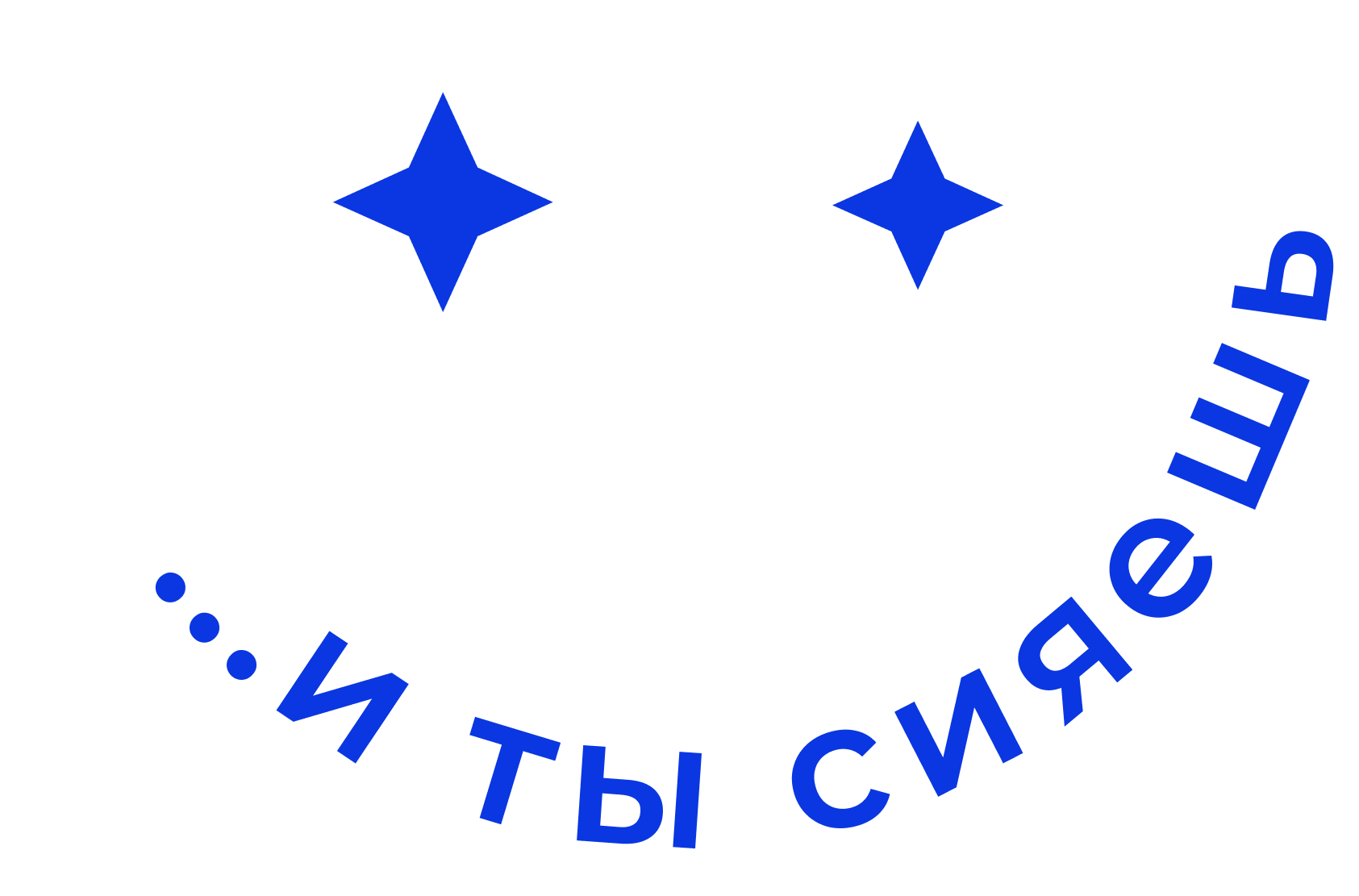
The main slogan of the company “And you shine too” literally comes to life on the website.

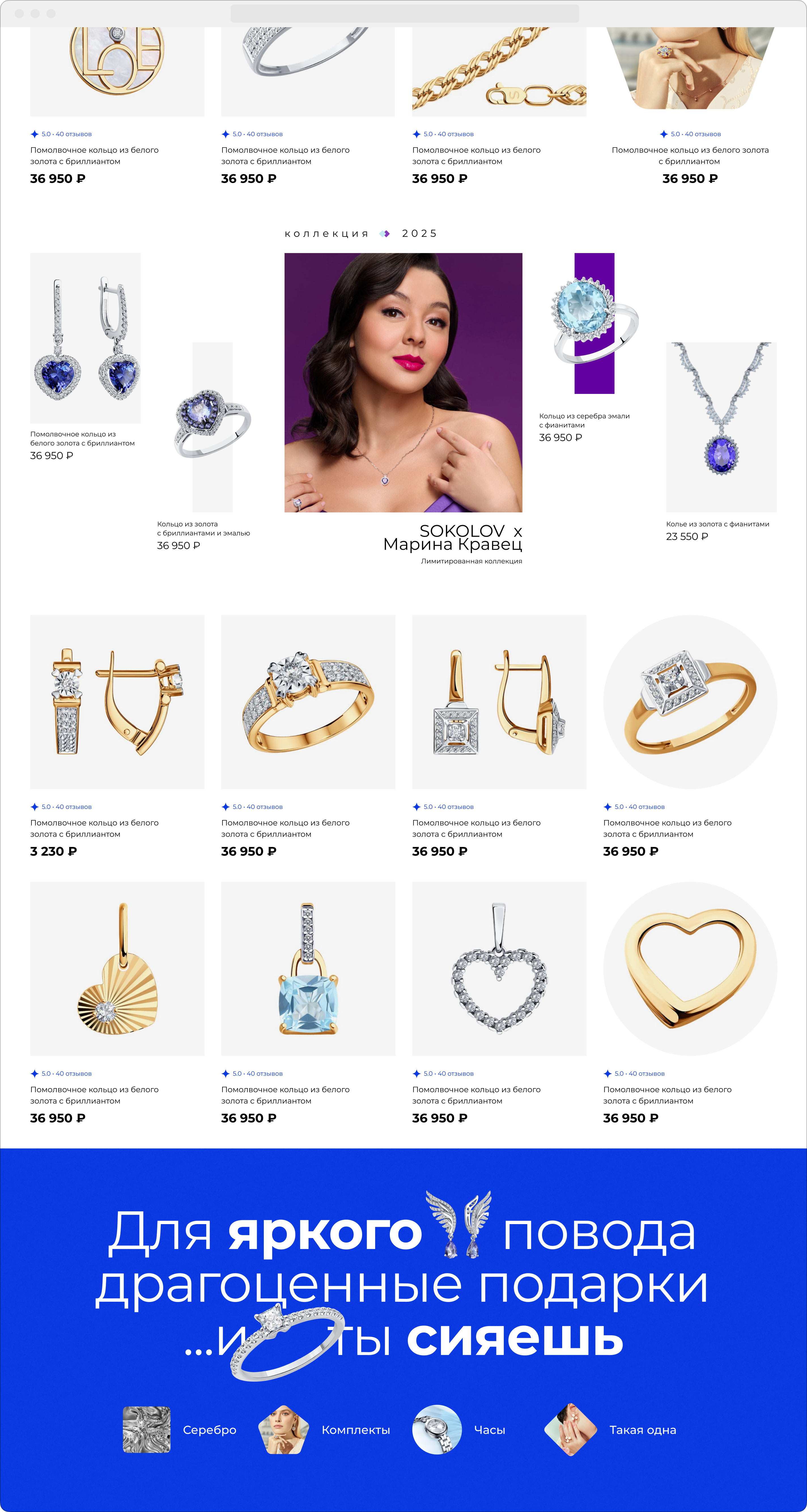
Catalog pages with an uneven grid and convenient filters demonstrate a rich selection of jewelry and draw attention to the most interesting options.
Tags that speak about the key features of the collections are neatly inserted into the cards without distracting from enjoying the beauty.
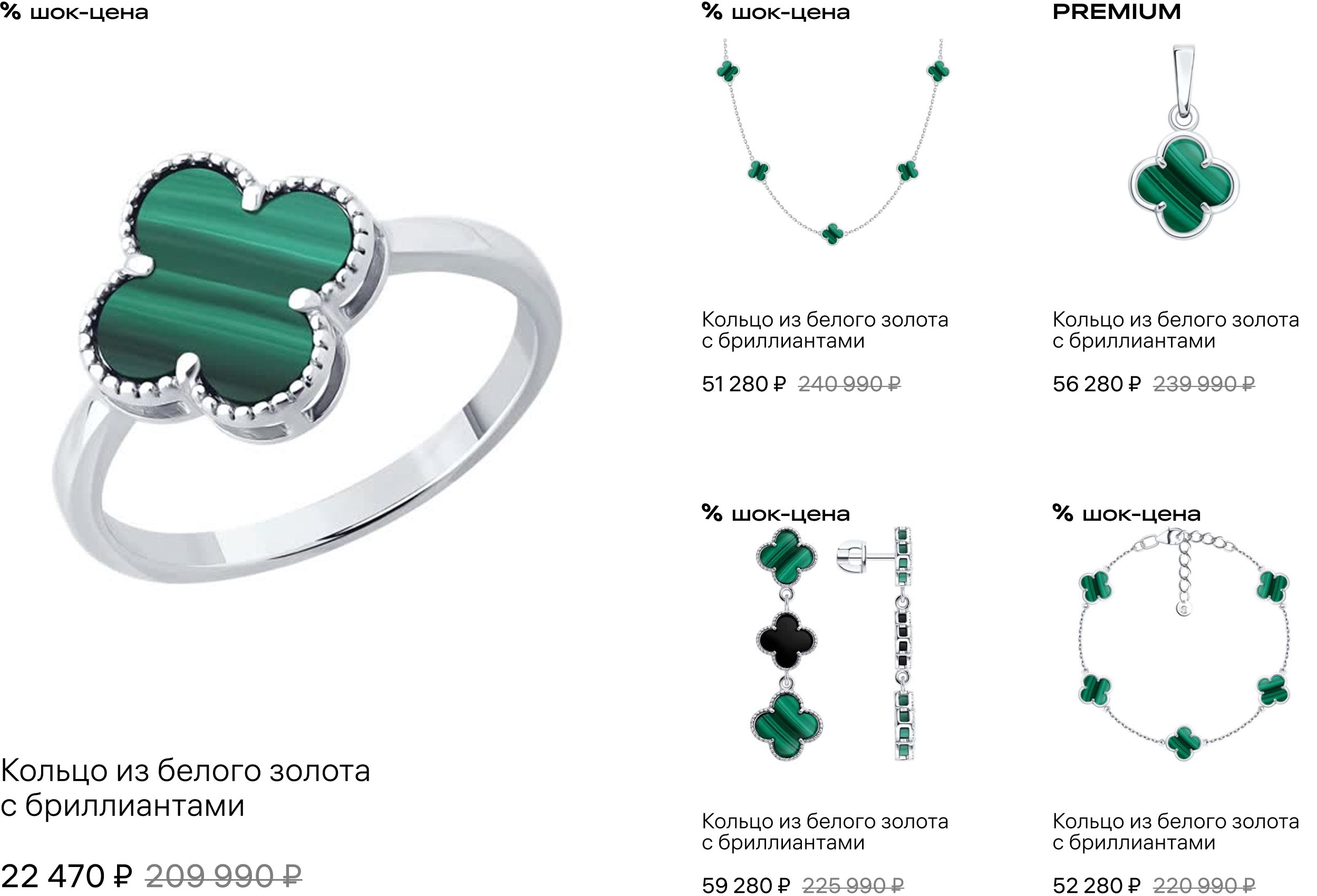
The jewelry looks brightest on the product pages. Large photographs show all the details of the jewelry pieces. Before adding an item to the cart, the visitor is invited to once again check its properties in a special interface block — the pre-check.
Tags in the cards repeat the shape of diamond facets, reflecting the light of the gems and adding beauty.
Concept No. 2
The main thing in communication with visitors is an open and friendly style, which is reflected in the graphics.
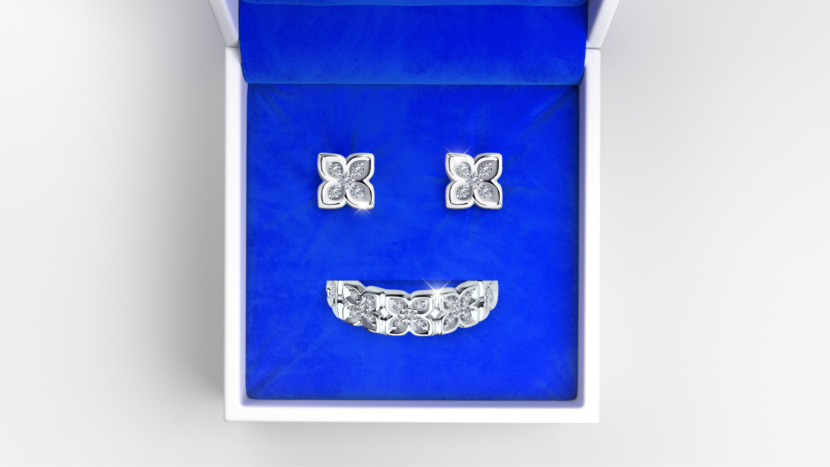
The concept actively uses blue, reminiscent of the velvet lining in a jewelry box. All the pieces seem to already lie inside, prepared for purchase. The visitor is not just observing; it is as if they are “peeking” into a magical world by slightly opening the lid.
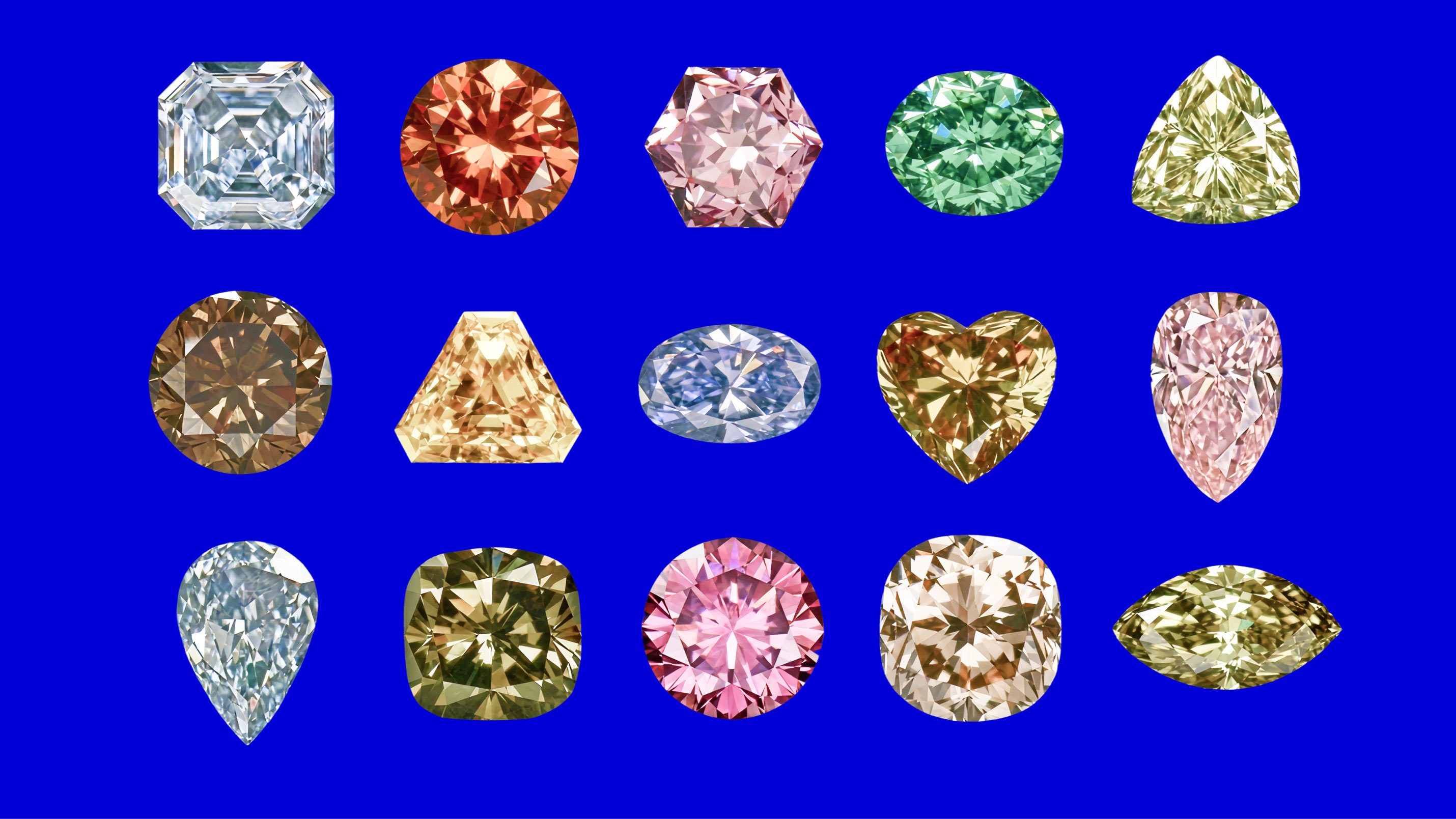
Once inside the “box”, customers carefully examine the quality of the cut, assess the brilliance, color, and shape of the stones.
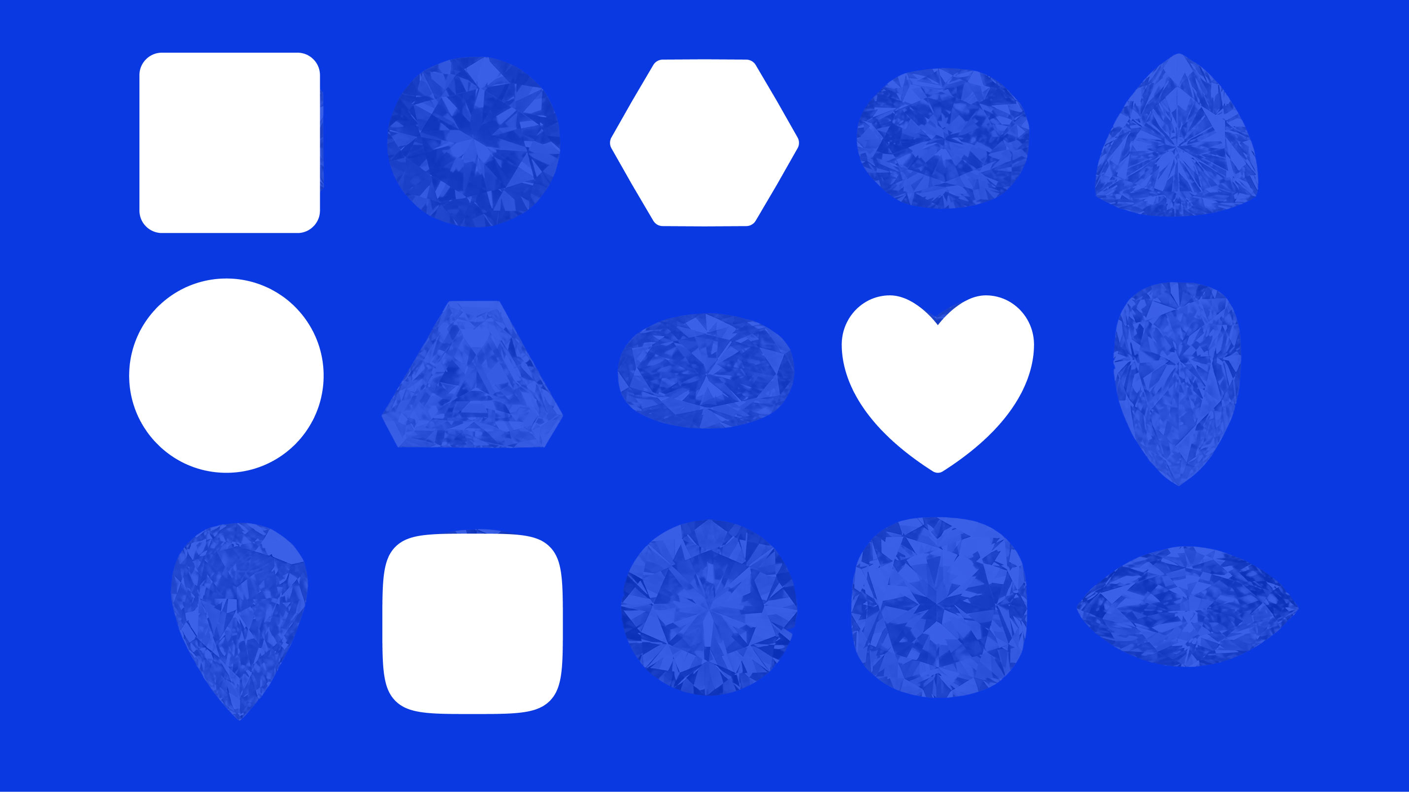
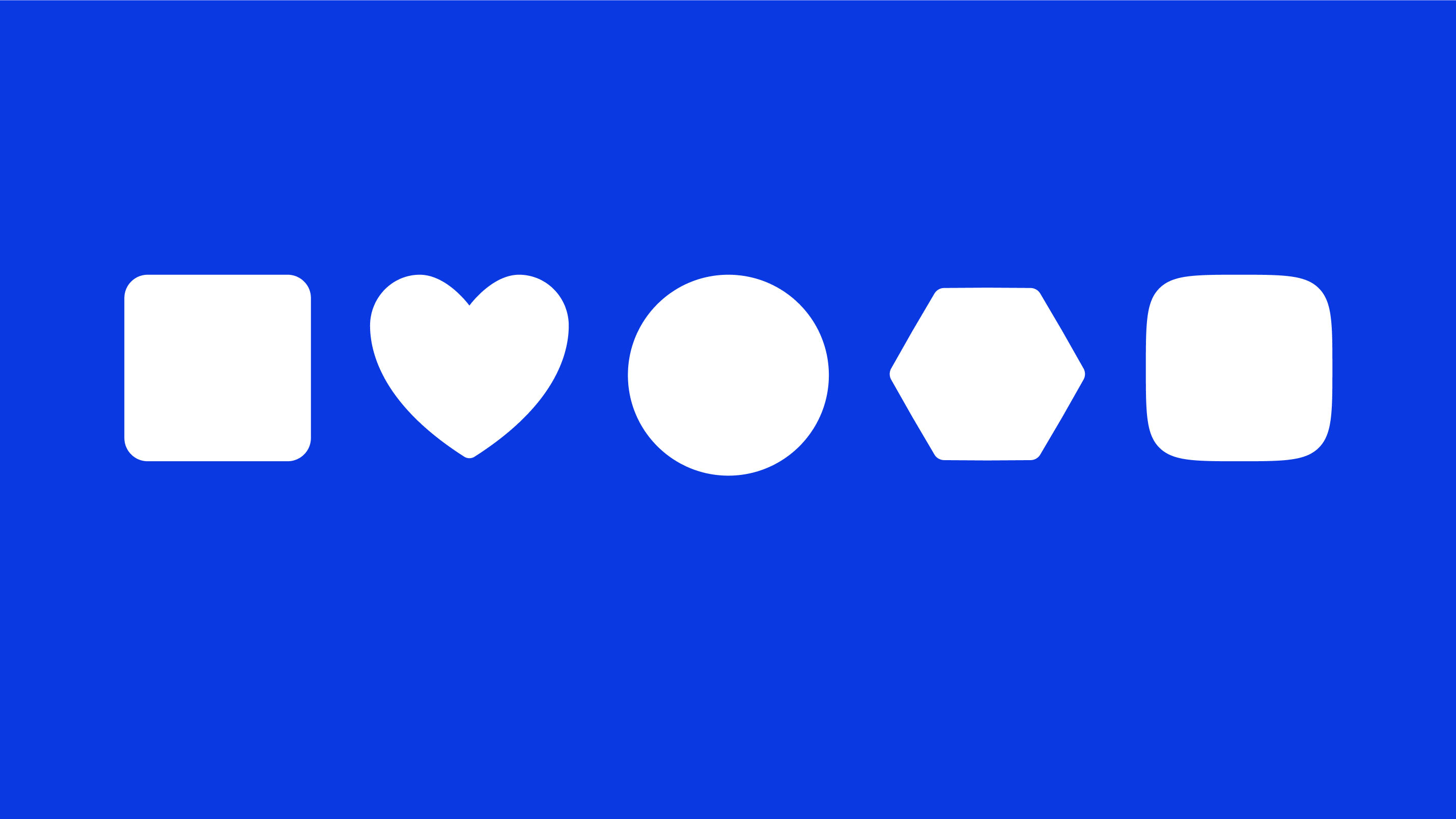
Key shapes form the basis of the visual system, defining the appearance of cards in the catalog and individual accent elements on the pages. This helps guide the user through the site without visually overloading sections. At the same time, the system remains lively and flexible.
The letters of the logo turn into style-forming elements that link all the pages of the site. The letter L works best, giving any imagery a clear rectangular shape.

The product page perfectly conveys the luxury of the jewelry and the purity of the stones, creating a sense of simplicity and accessibility of the product. On the left side there is a “fitting room” where the piece is shown on a model from all angles, allowing you to touch it even from a distance.
On the right is a functional pre-check with all the most important parameters.
Concept No. 3
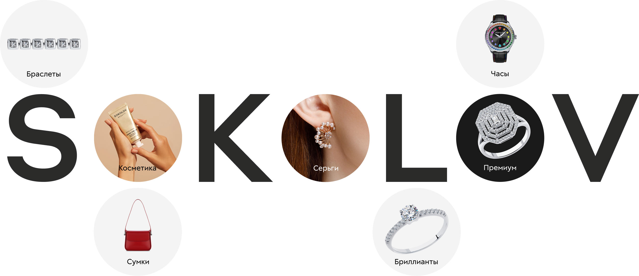
The style-forming element of the concept is the perfectly round letter O from the logo. It becomes the basis of the graphics and defines the design of interface elements.
The geometry of the logo letters forms the basis of a distinctive graphic technique that expands communication possibilities.
A dynamic grid, restrained colors, and minimalist typography create an impression of calm luxury.
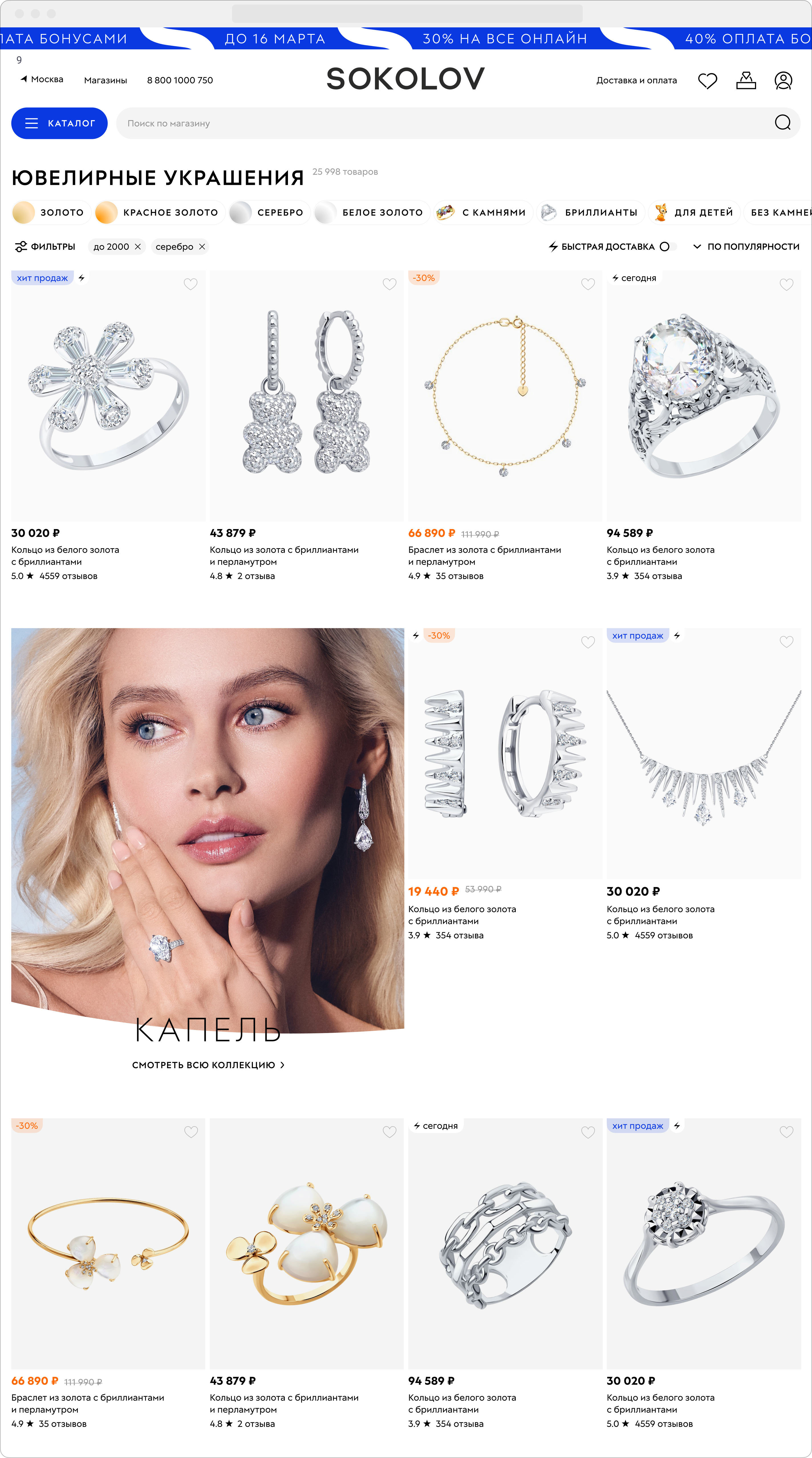
This approach allows the content to unfold in all its glory already in the catalog cards.
All visual techniques work as efficiently as possible on the product page. The brand colors, elegant shapes, and neat typography make the store recognizable, and the convenient pre-check favorably distinguishes it from competitors.
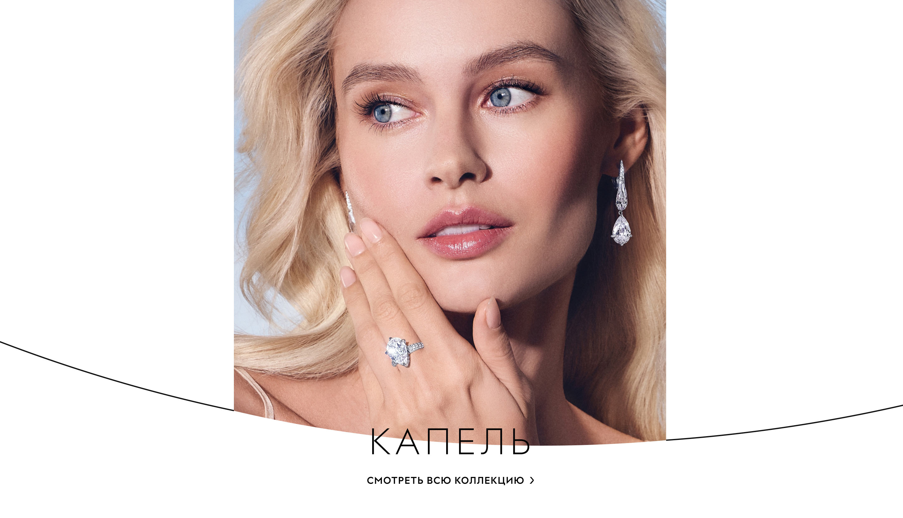
The most beautiful banners stand out with contrasting typography and add color to the laconic pages.
art director
designers
- Yana Alenina
illustrator
- Anastasiya Moskalenko
