“Indilight” is the largest Russian brand under which a wide range of turkey meat is produced. Since entering the Russian market in 2013, the brand has made turkey an affordable and beloved product for millions of families.
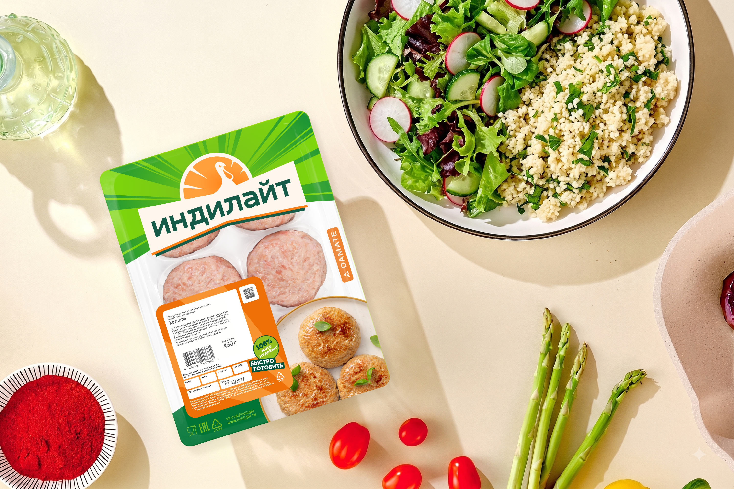
The studio designed the packaging, refreshing the brand’s recognizable features and signature color palette.
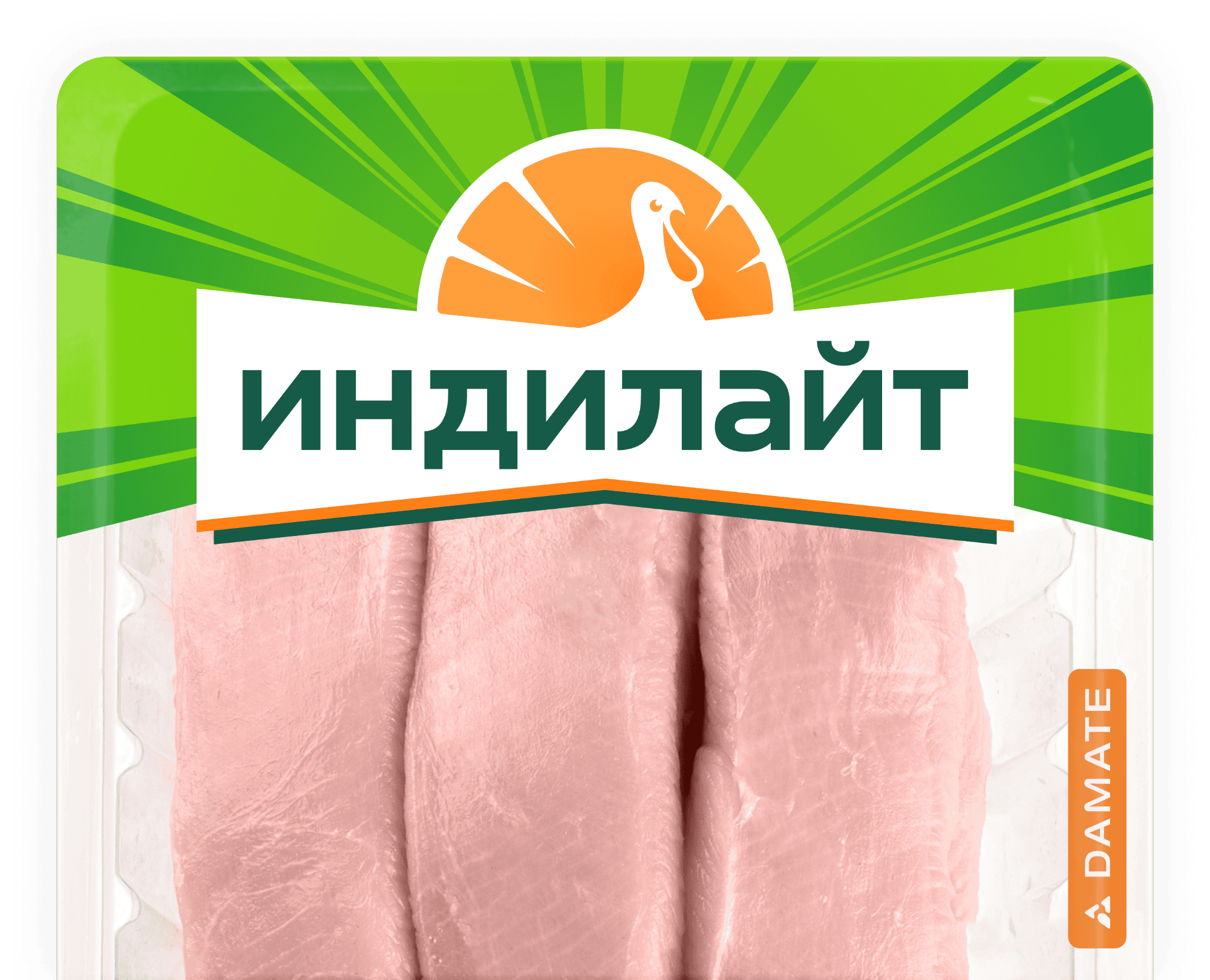



The logo in the central part gives the packaging brightness and expressiveness, literally shining in the midst of radiating rays.
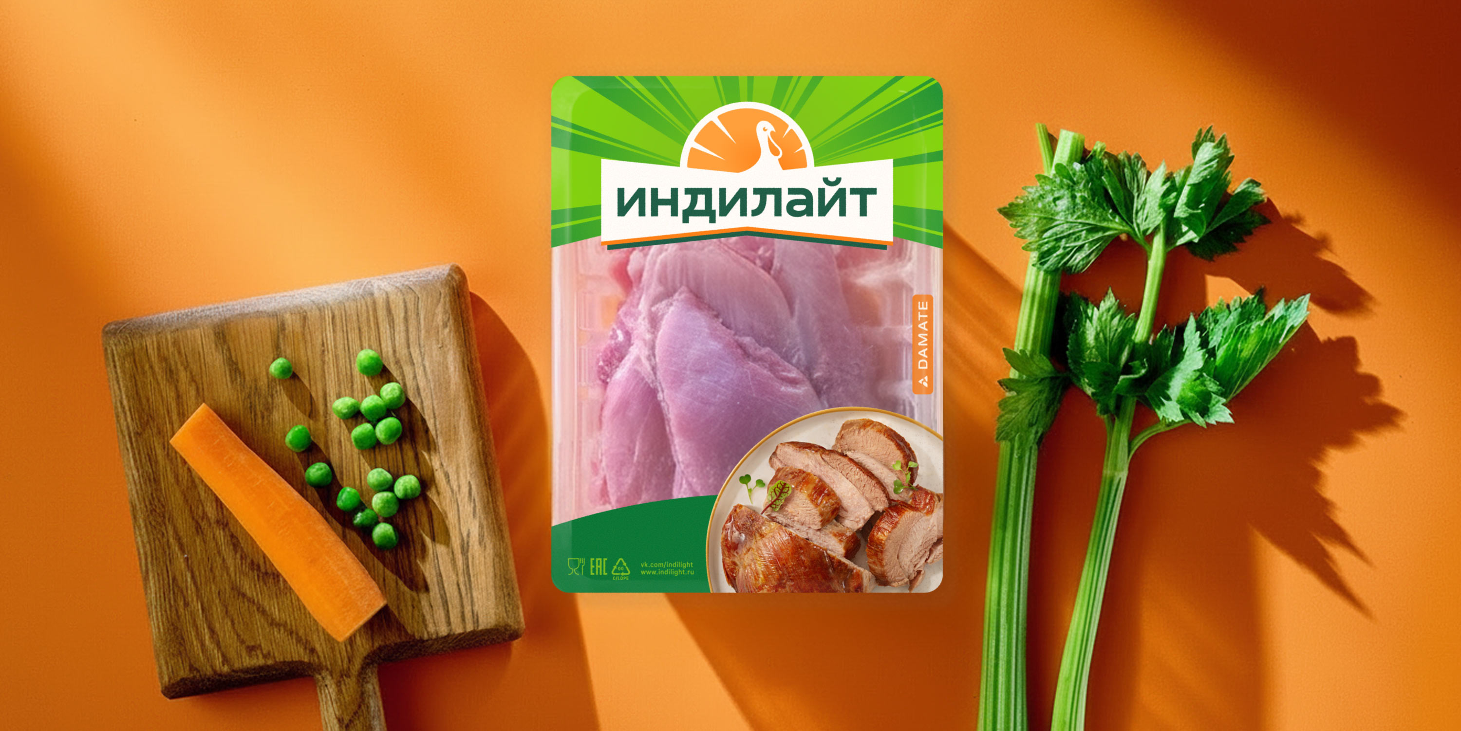
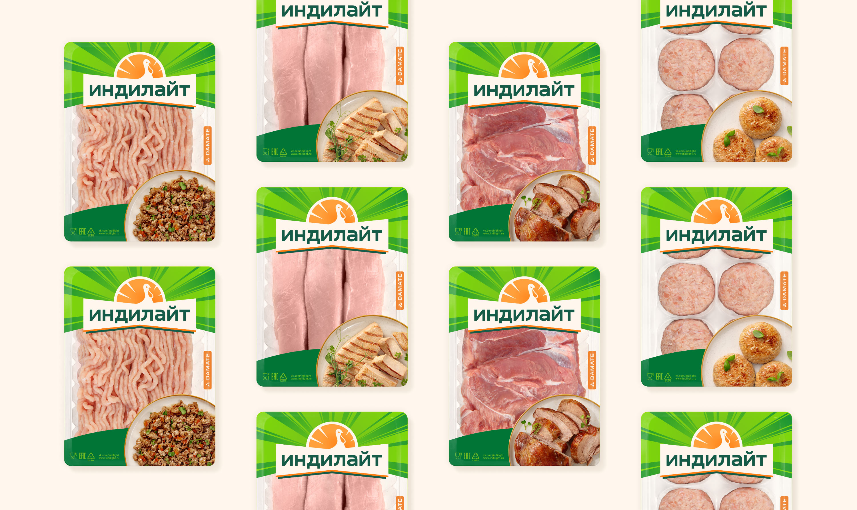
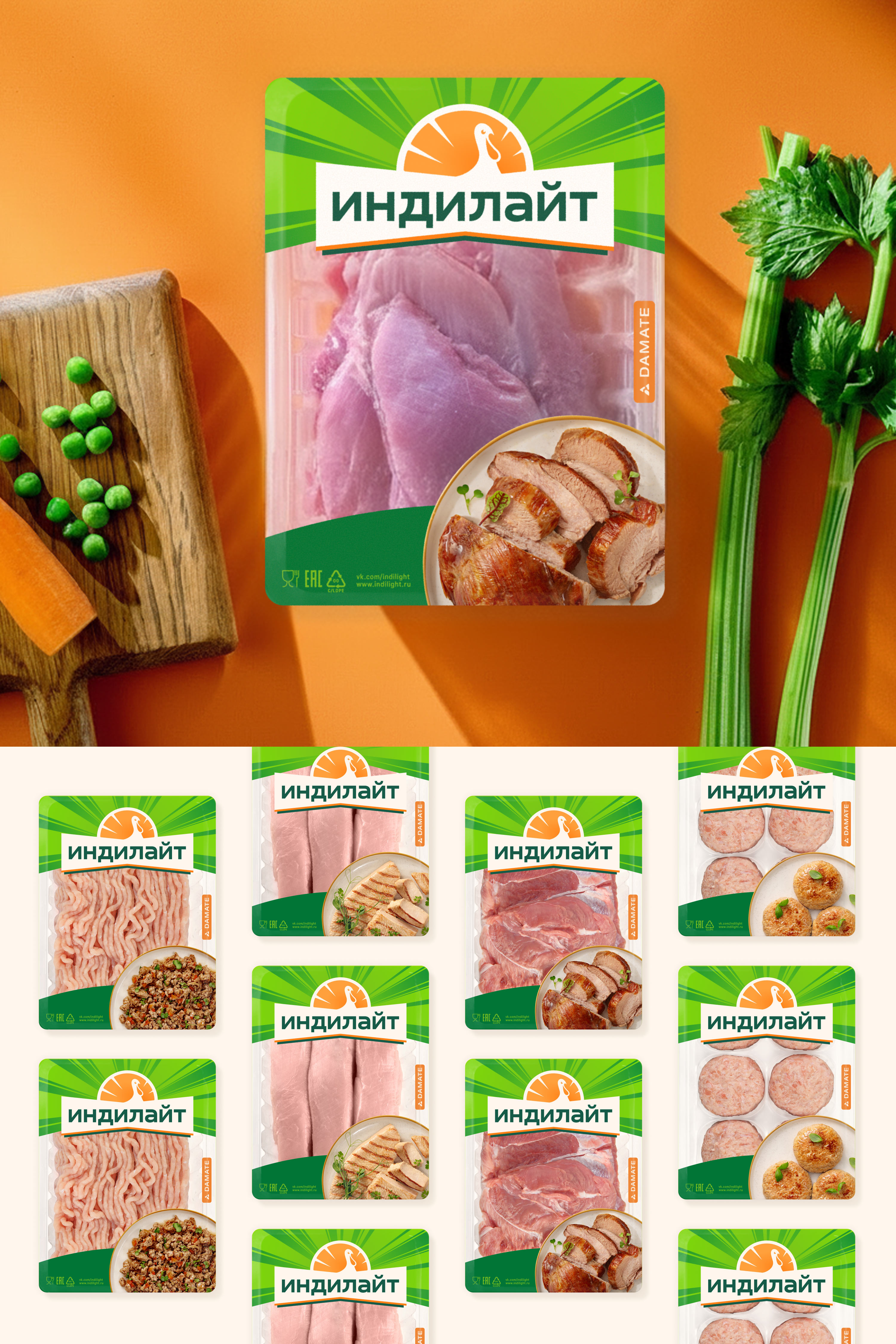
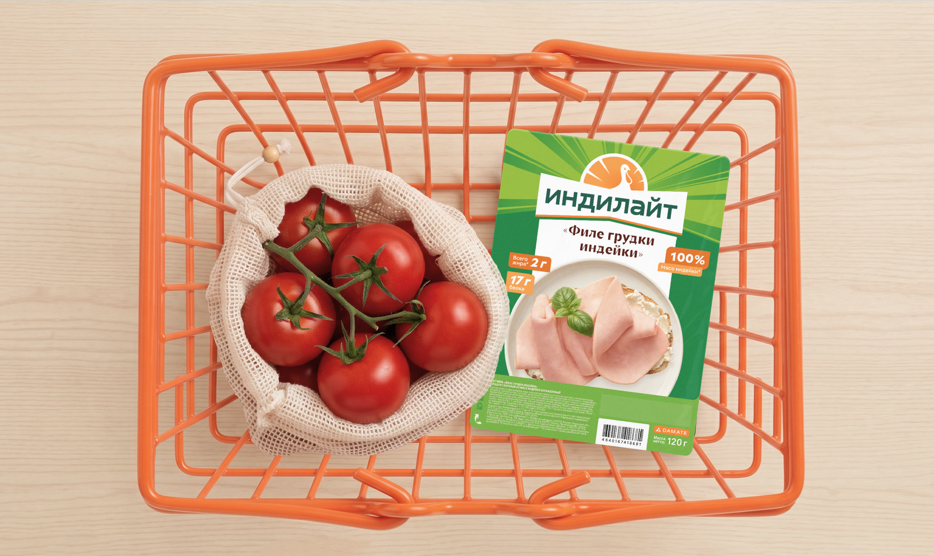
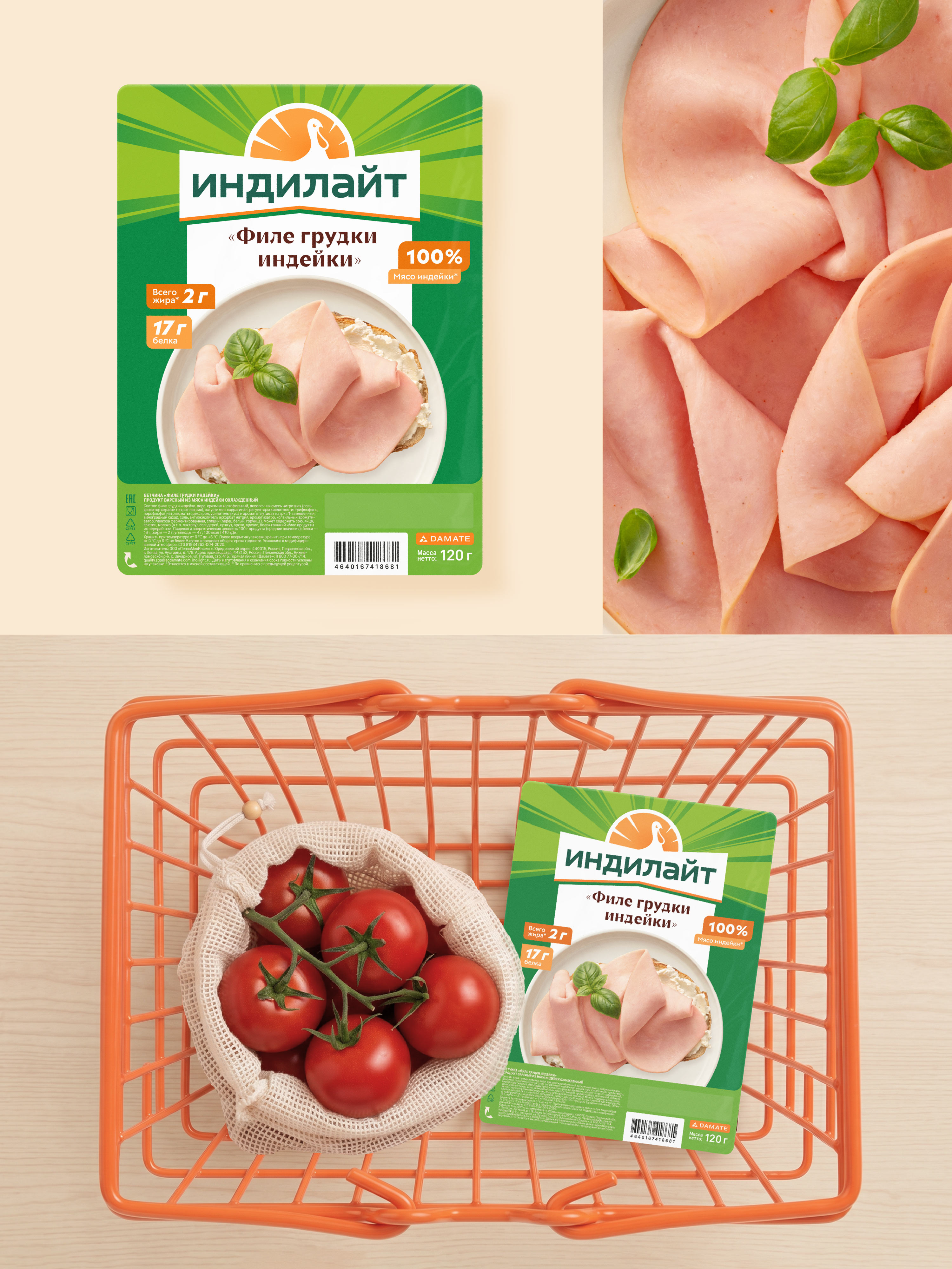
One of the key elements of the packaging is the food zone. A home-style round plate echoes the rays in the logo, and the appetizing photos of dishes make you want to cook them as soon as possible. Each product line has its own recognizable features that help customers quickly find their favorite product among others.


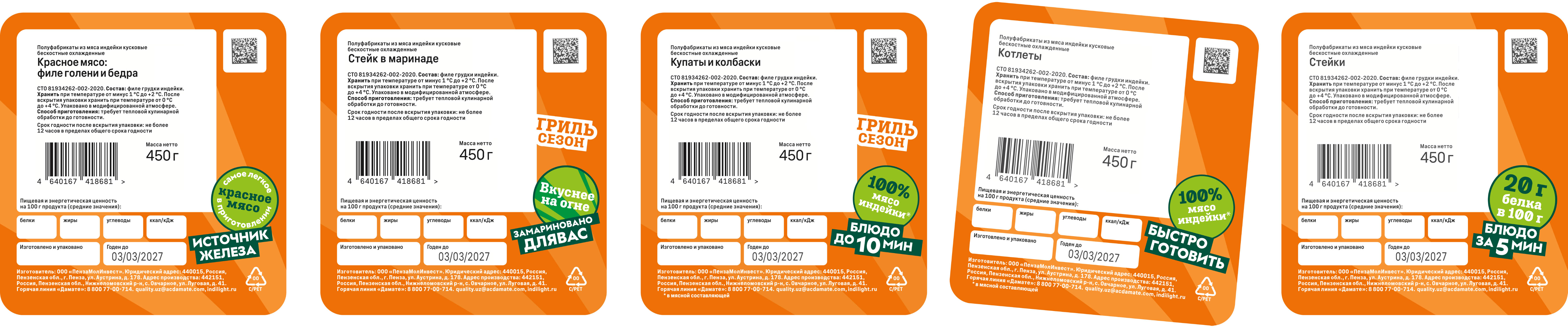
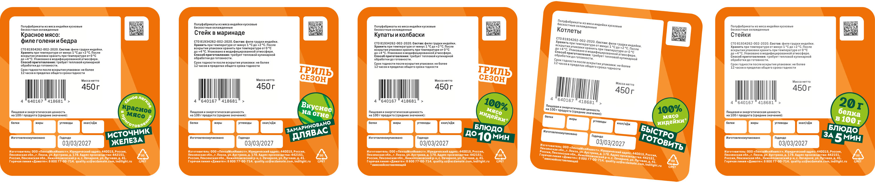
Advantages and characteristics on the thermo label are highlighted in large badges, and the technical information is arranged so that it is easier to find. Thanks to this, the label has become clearer and more convenient to perceive.
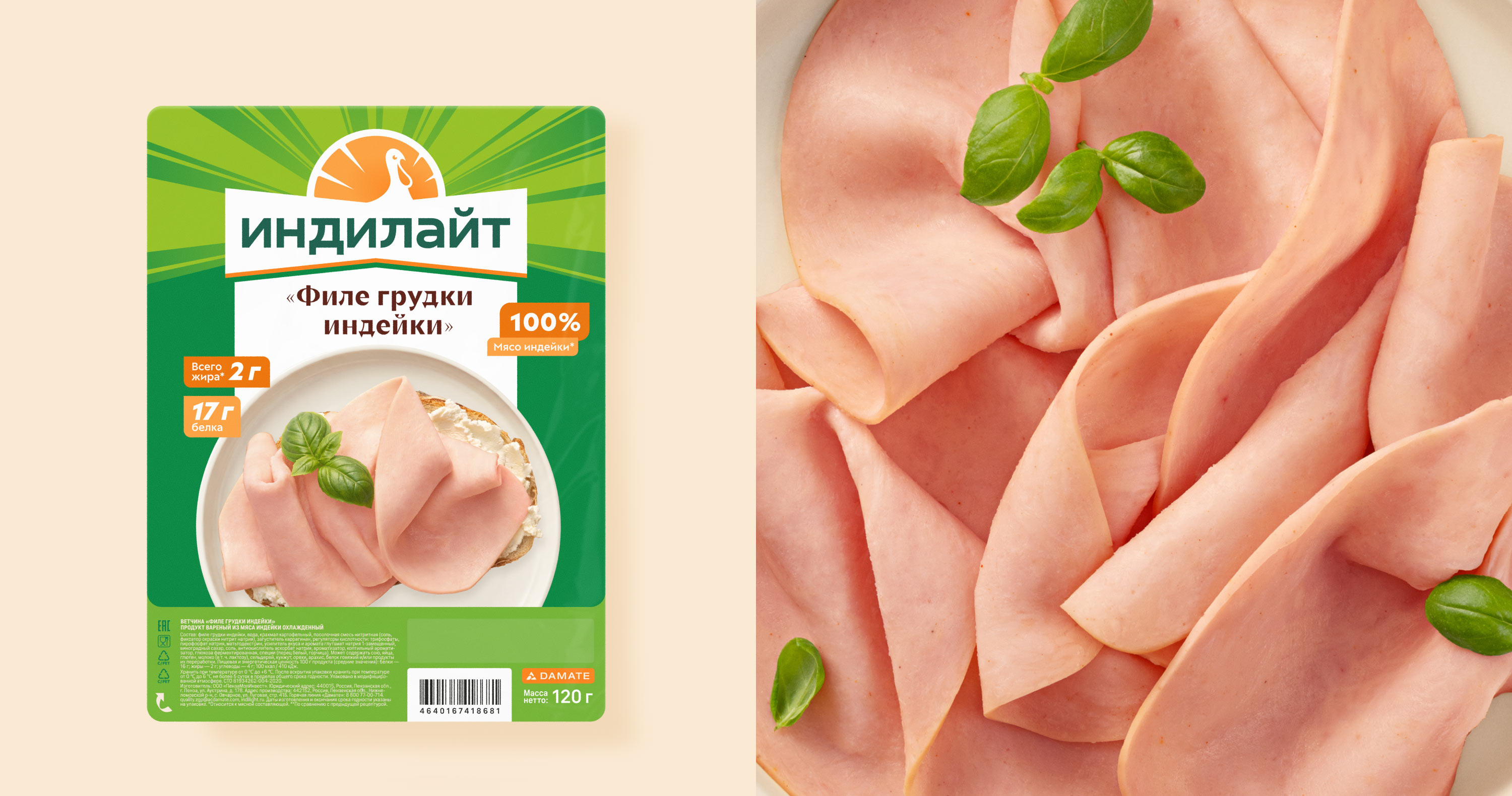
The ham line is distinguished by a bright green color and a large product name. The product’s advantages are highlighted in badges, and the technical information is placed at the bottom — as a result, the food zone has increased and the packaging has become more attractive.
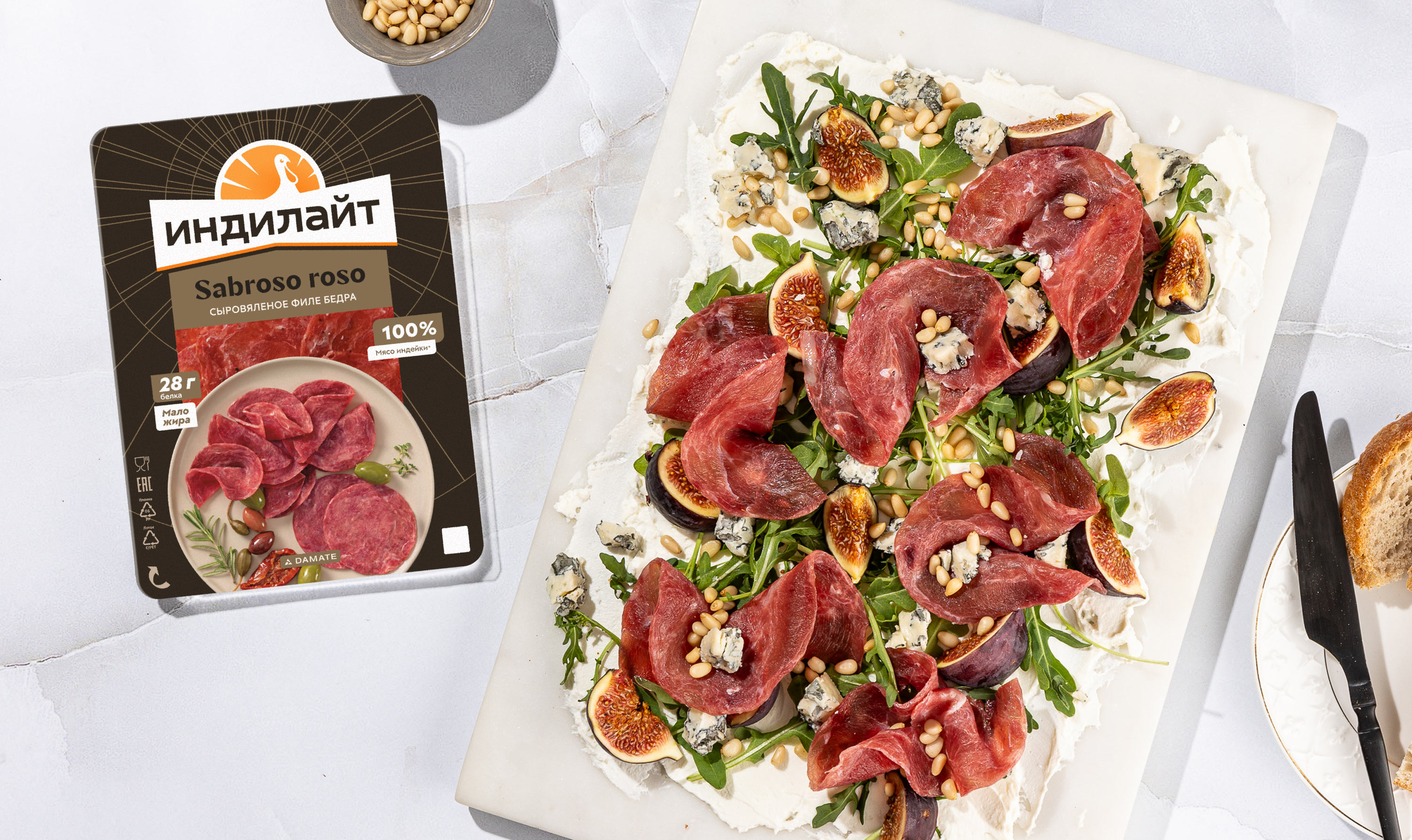
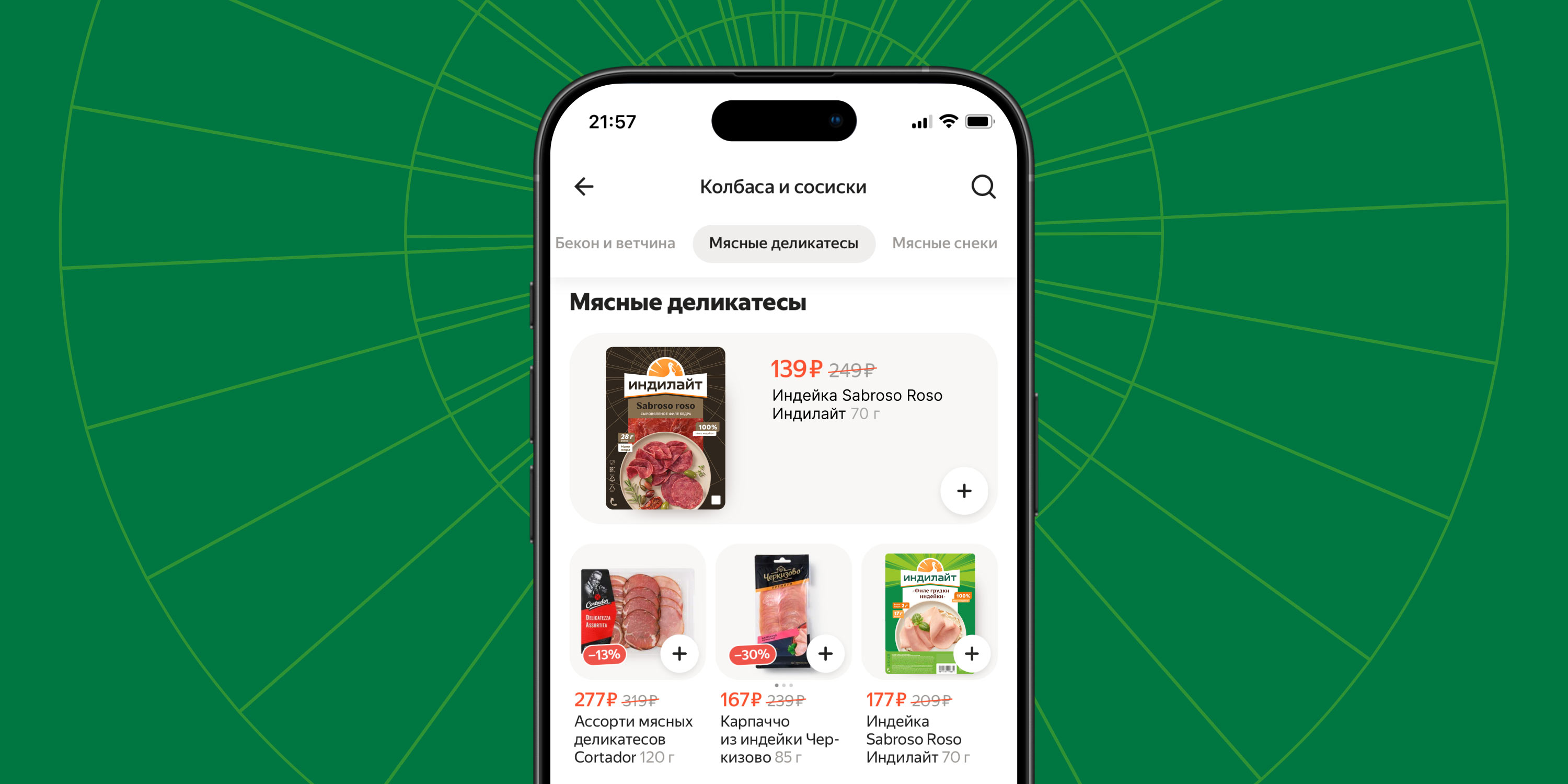
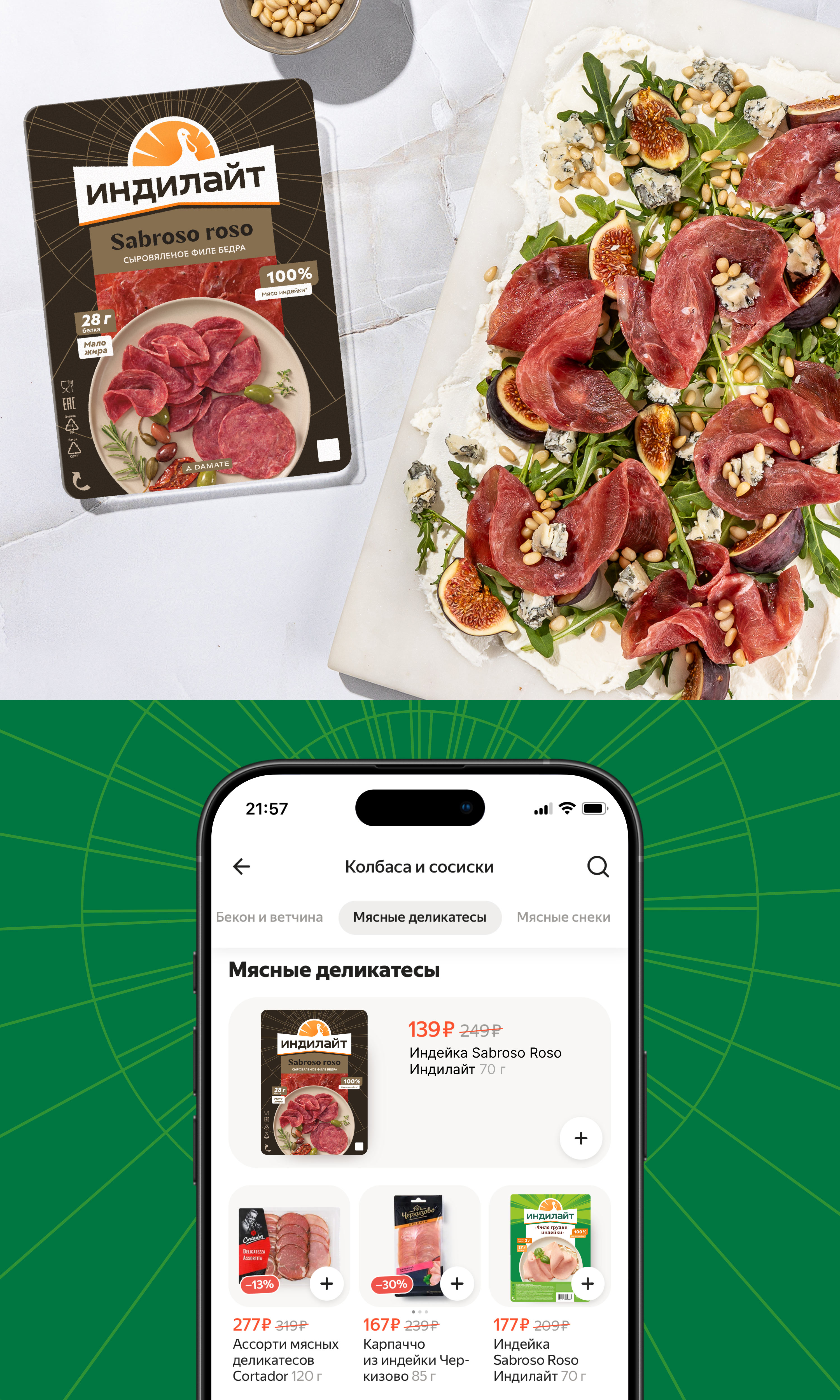
The dark background and the finer style of the signature rays give the “Sabroso Roso” line an obviously premium character. The packaging looks good both on supermarket shelves and in online storefronts, and the inscriptions are easy to read even in a small size.
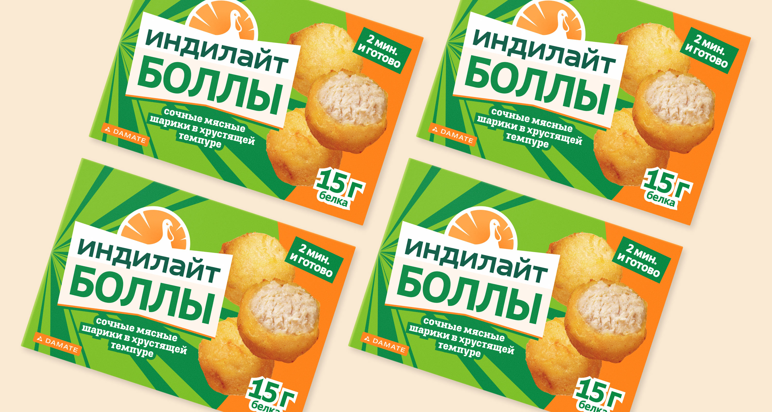
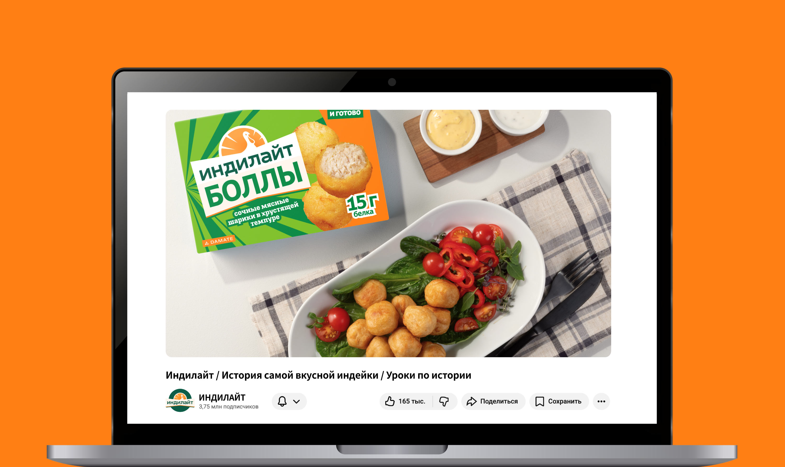
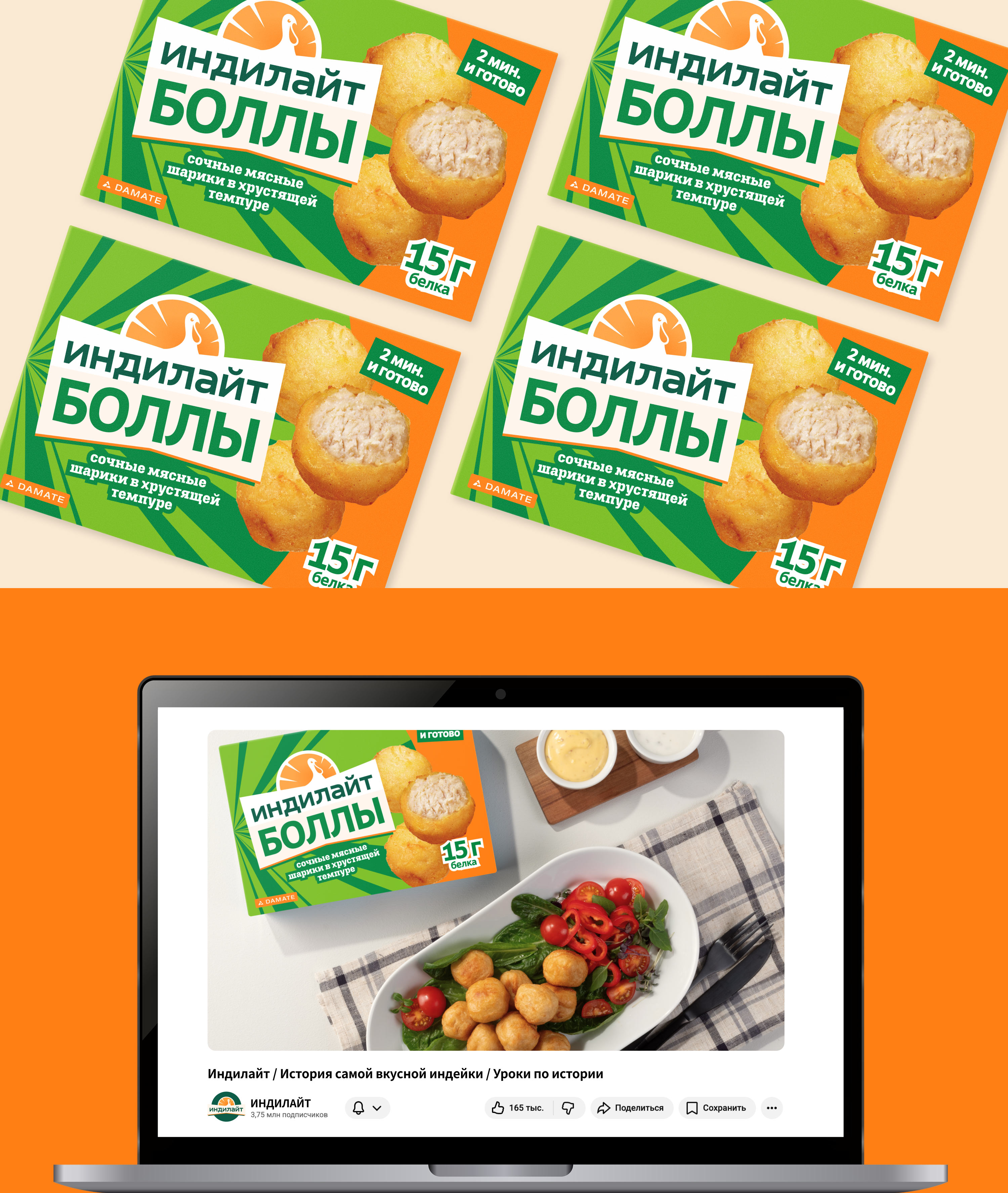
The “Indiballs” packaging combines Indilight’s signature colors and graphic elements. Expressive typography, dynamic highlights on the advantages, and an appetizing food zone convey the main idea: “Indiballs” are a tasty turkey protein snack that is convenient to take with you to heat up.
art director
designers
- Anastasiya Moskalenko
- Ella Dovnar
