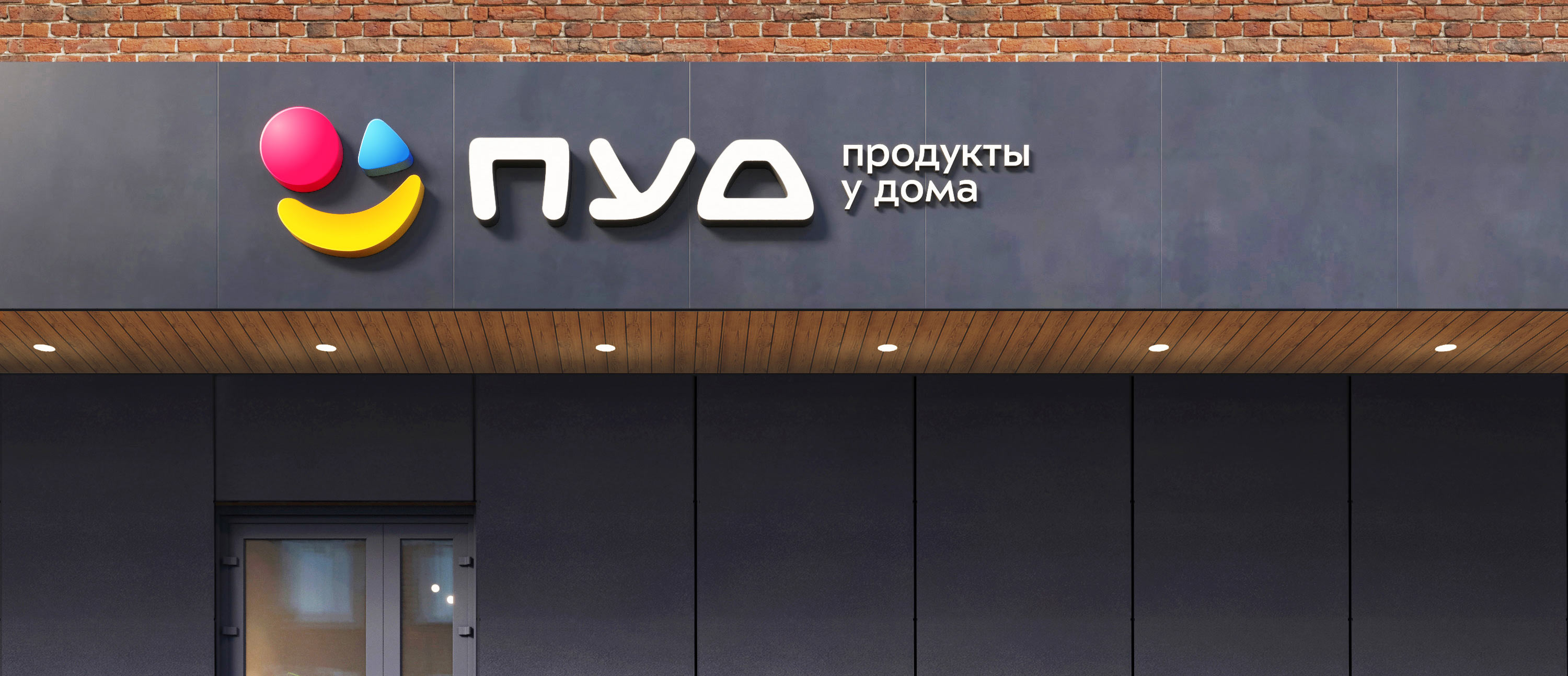
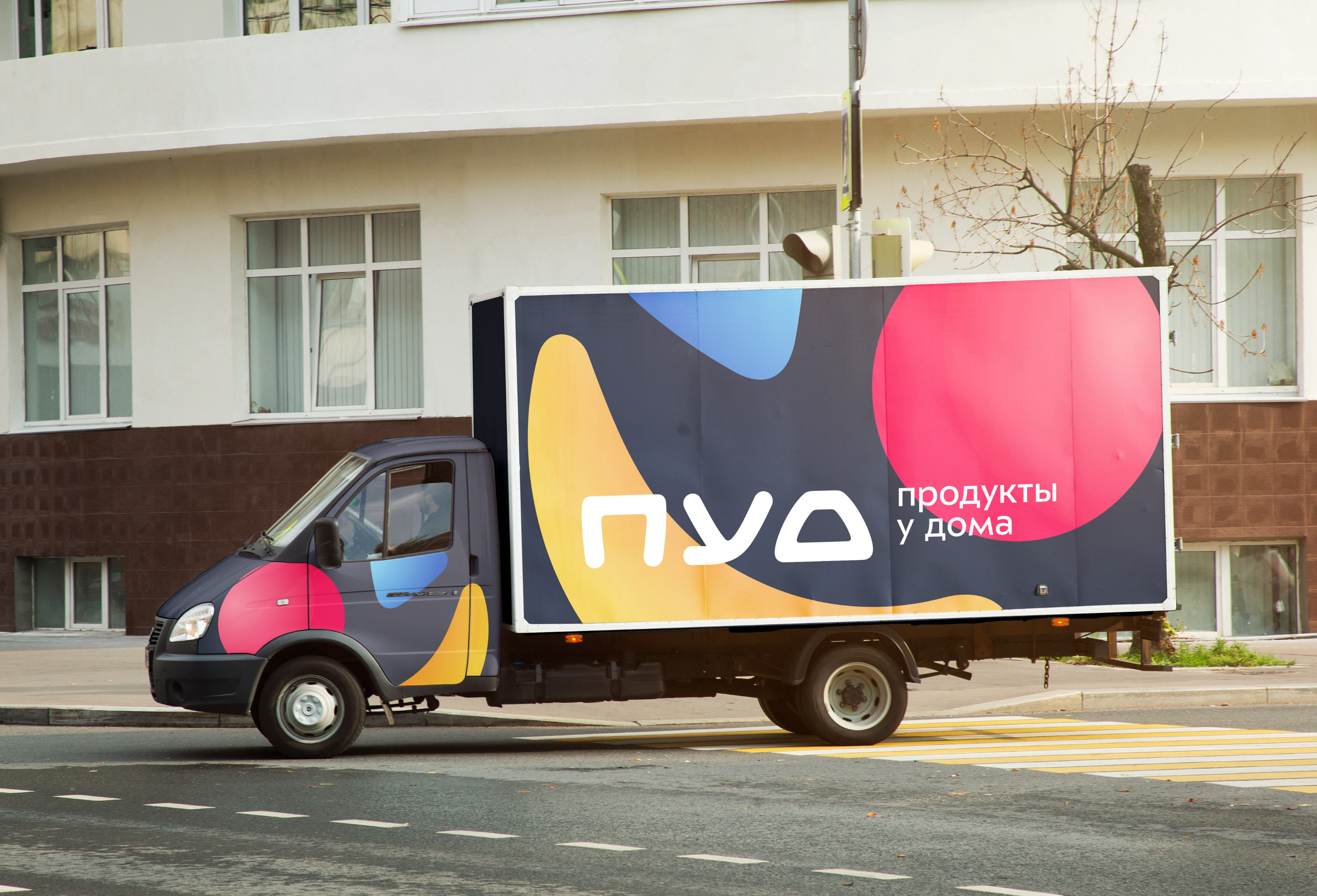
PUD is a Crimean chain of retail grocery stores. PUD’s logo literally represents the joy of shopping.
The logo is assembled from elements of foods: the red circle is a tomato, the smile is a banana and the blue triangle is a pack of yogurt.
The typeface used in the logo has a unique and memorable geometry. Corners of the letters are smoothed to match the symbol.
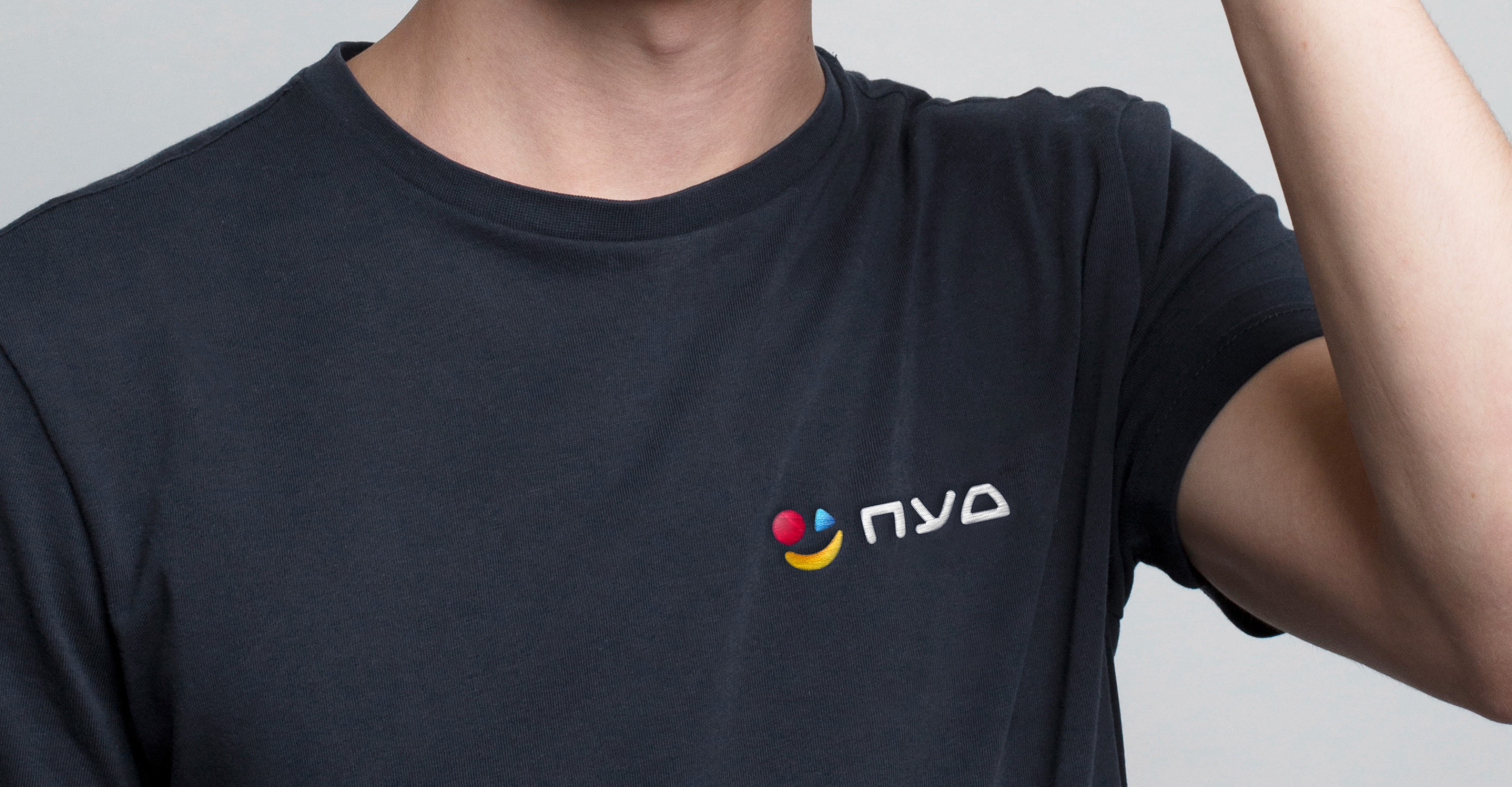
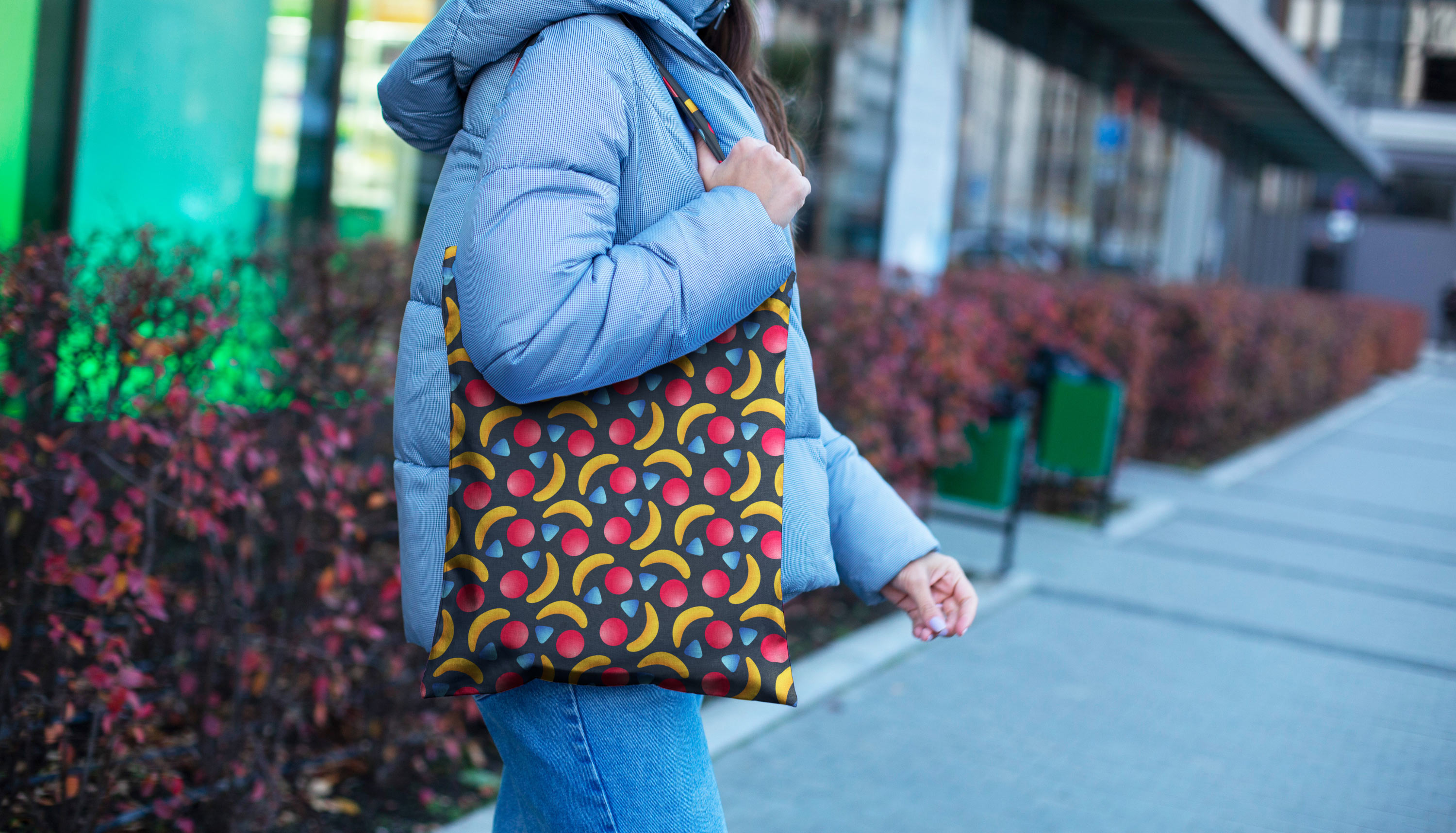
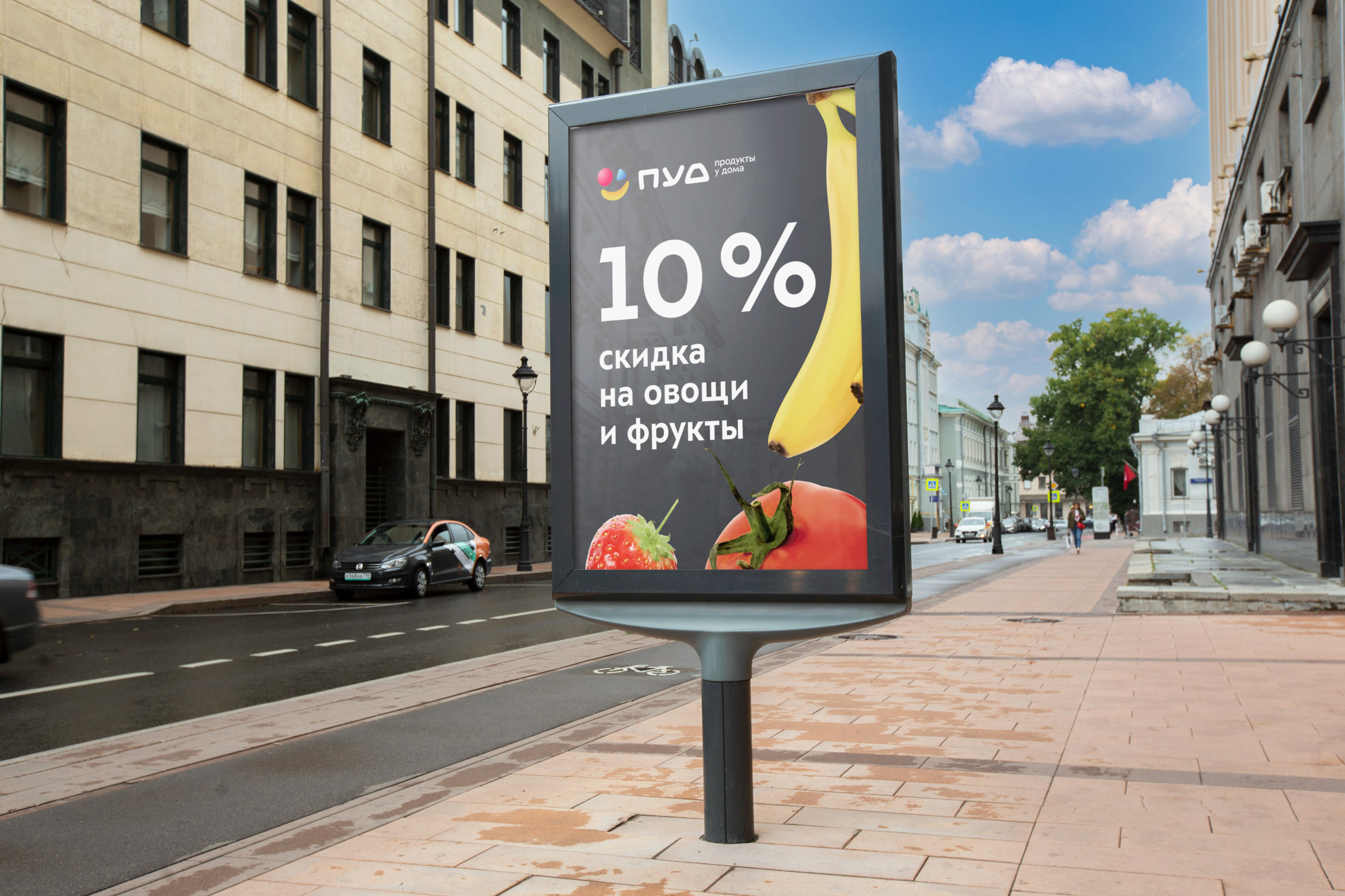
The brand’s graphic style is supplemented with a graphite background which makes the logo appear clear and contrasting. Graphite is used as the main color in the design of paraphernalia: on personnel uniforms, bags, shopping baskets, etc.
Gradient transitions give a light and pleasant volume to shapes and make colors more interesting.


The chosen colors are bright, harmonious, appealing and friendly.
The brand’s pattern looks great on different materials.