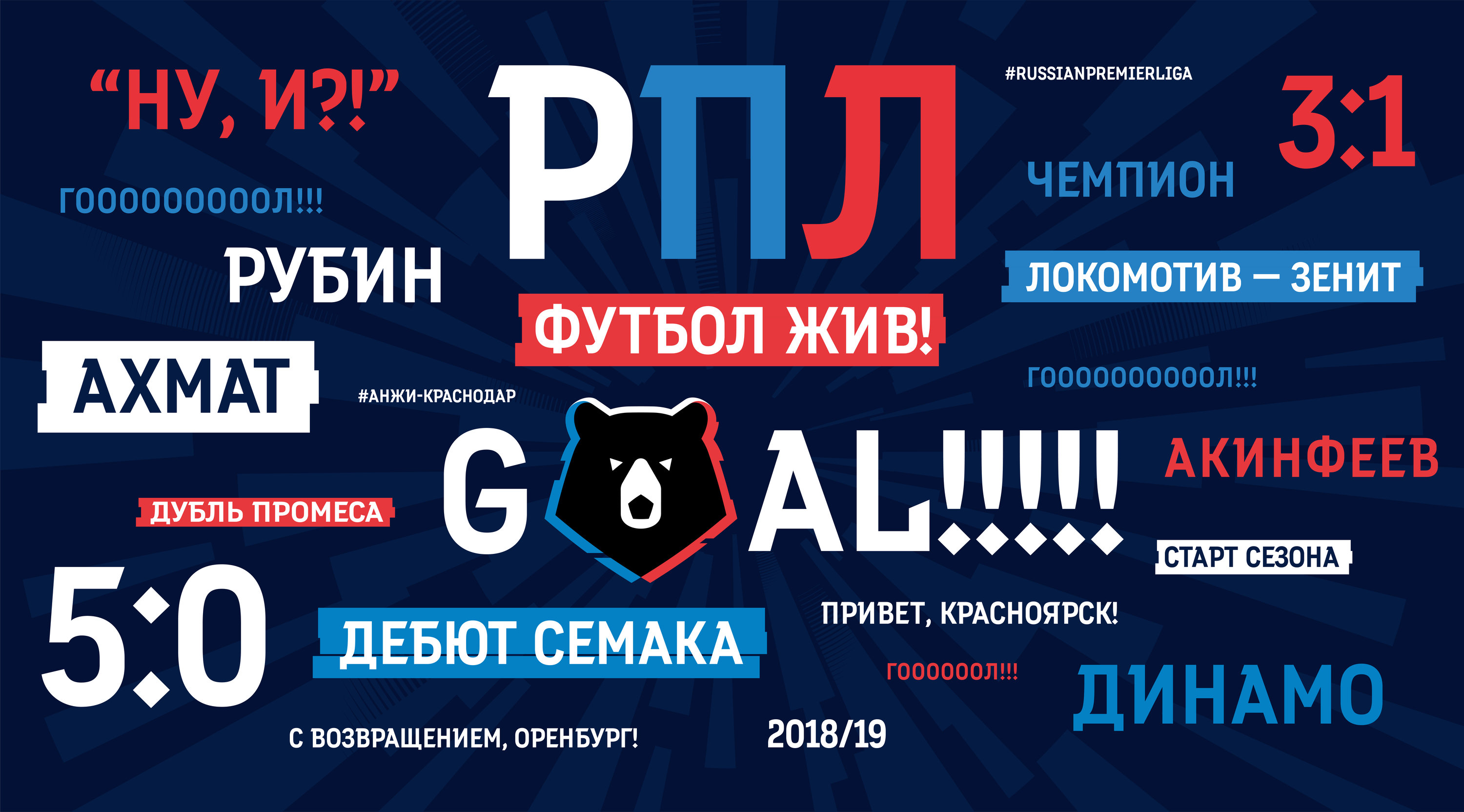
With time, a soccer championship acquires various attributes including original design for tickets, player uniforms, match announcement posters, TV broadcasts, social network pictures, banners and many other things. To make sure all these materials look coherent, a grotesque display typeface was created for headlines and large text.
Player names
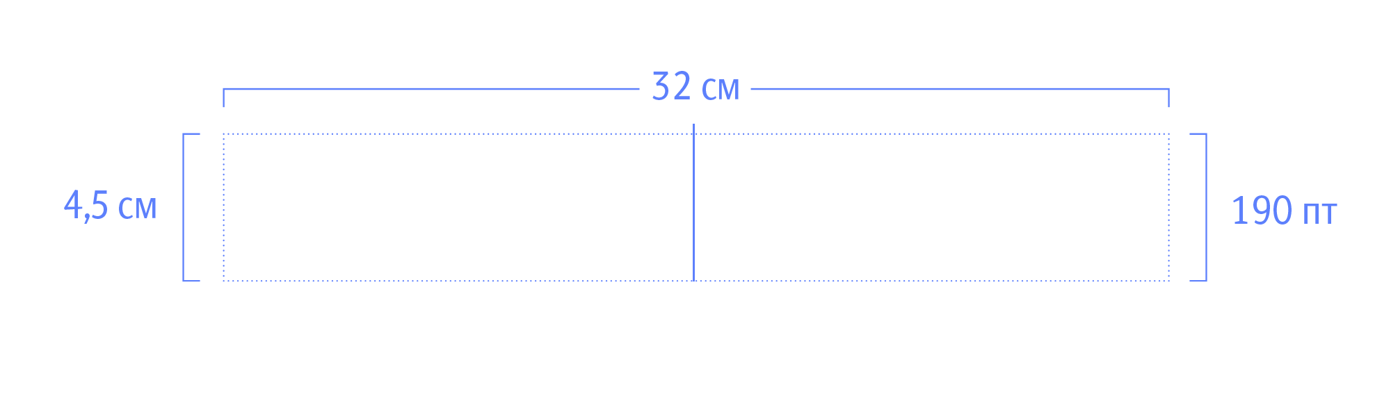
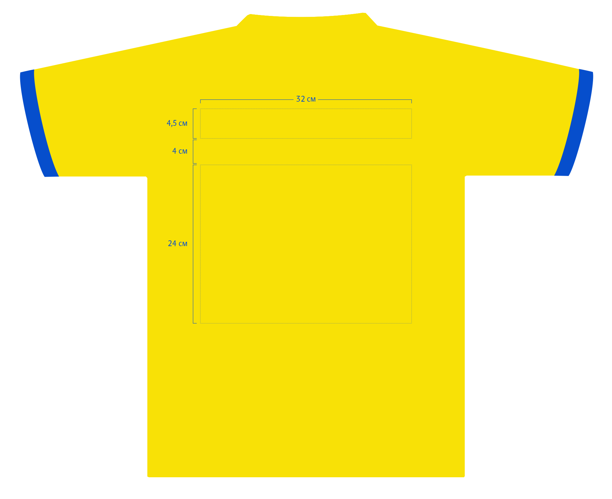
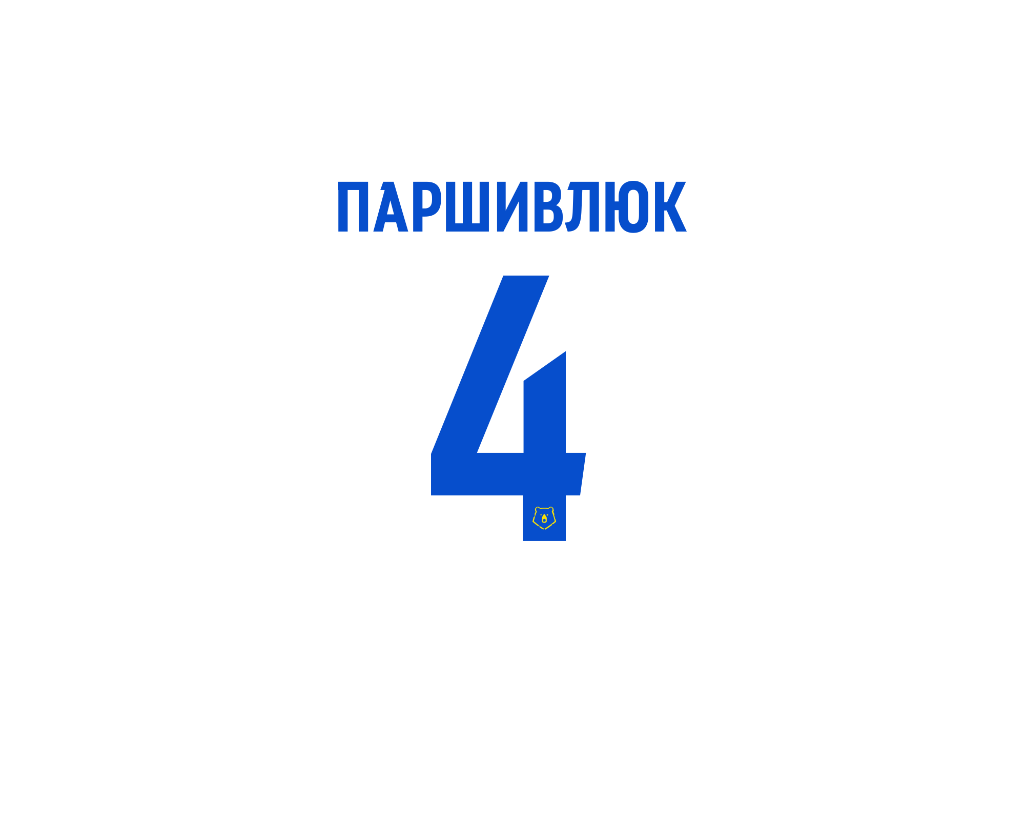
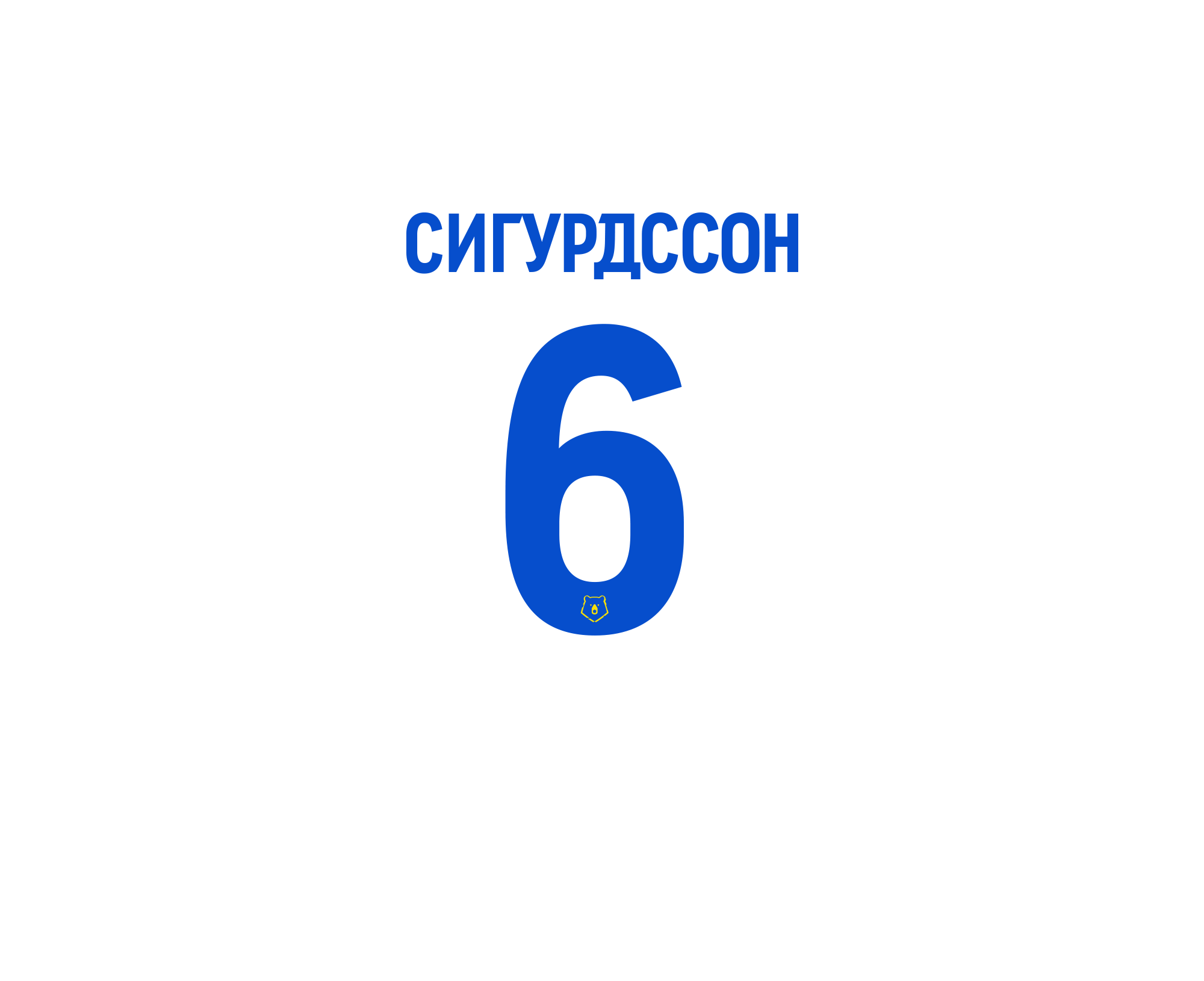
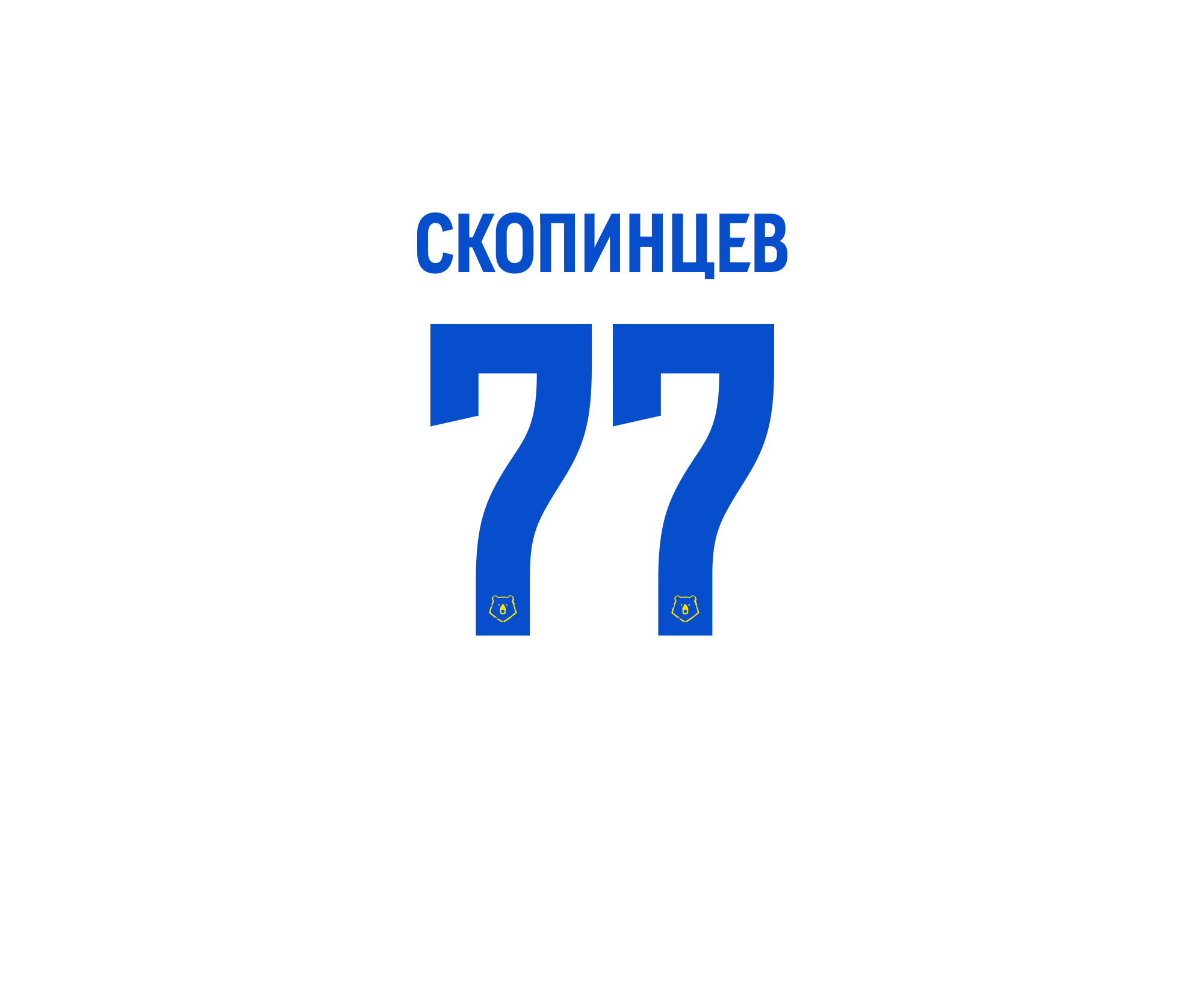
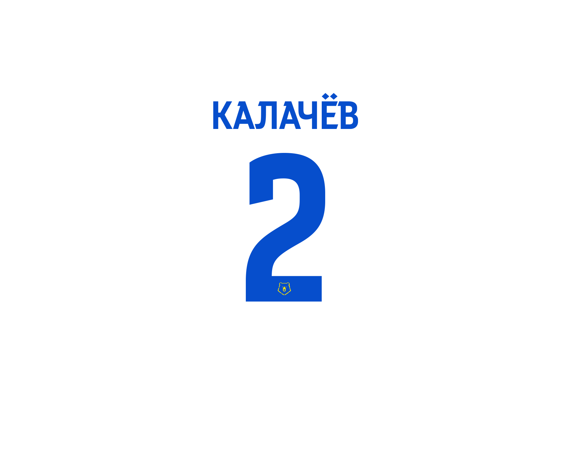
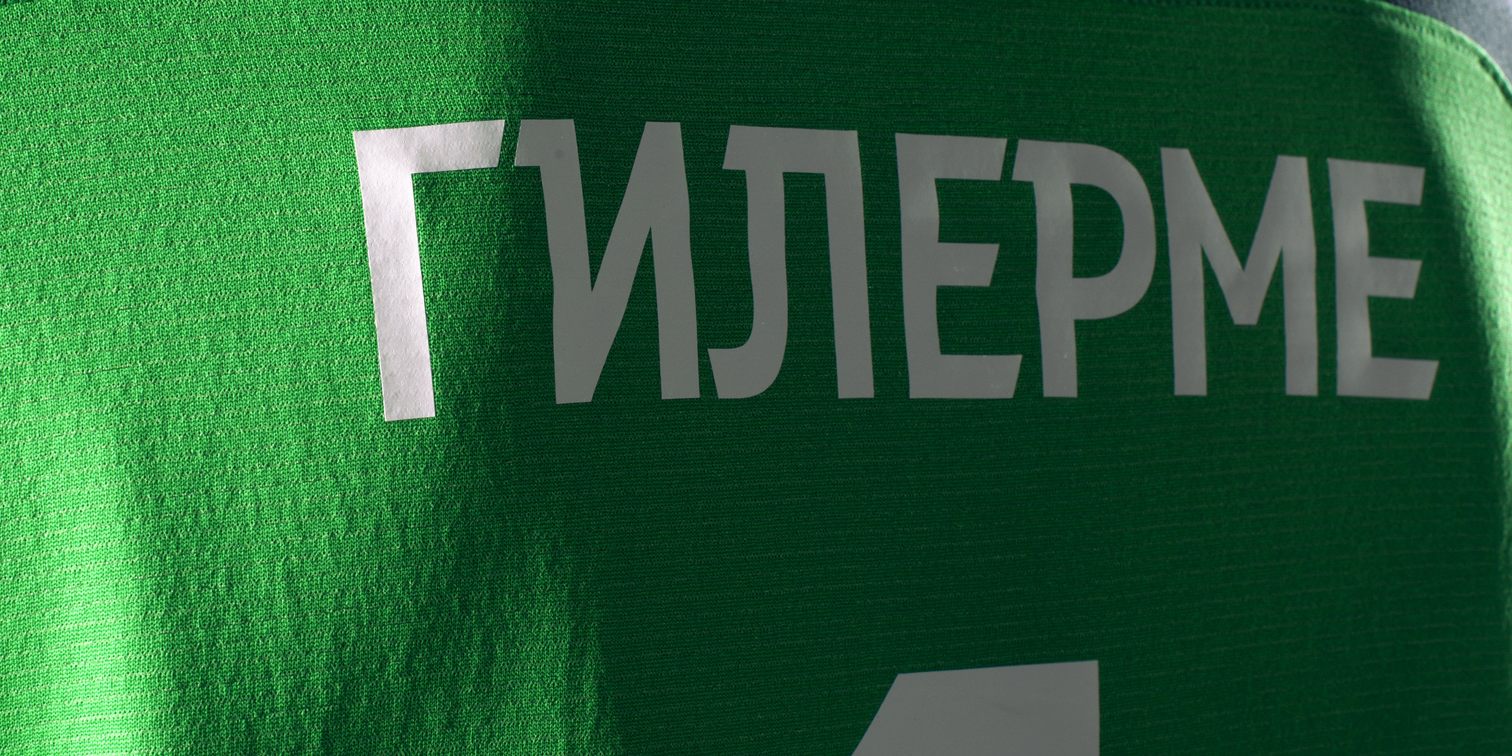
The typeface doesn’t require any adjustments to look great anywhere except for player uniforms. In this case, it’s all about limits on character height and text length. To fit names such as Zhamaletdinov and Smolnikov in the designated area, a special adaptive version of the typeface was created. After a certain number of characters, every glyph becomes 15% narrower.
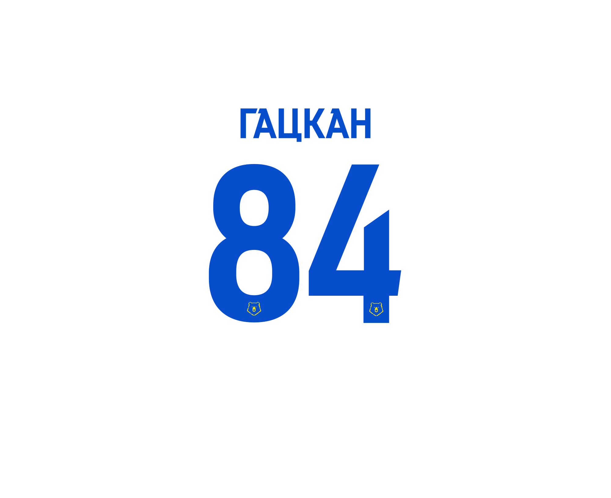
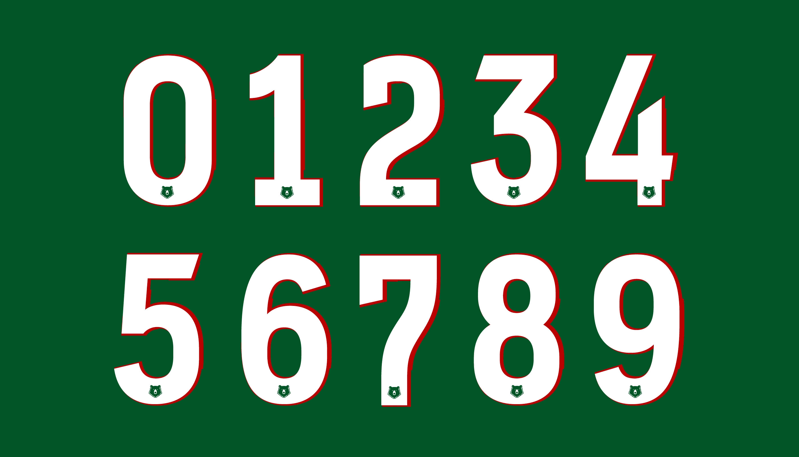
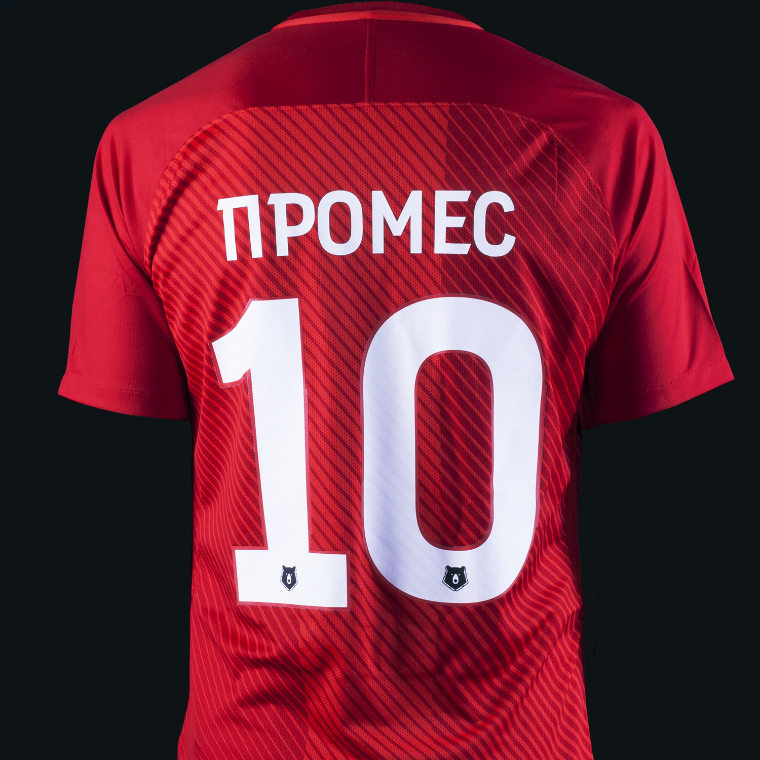
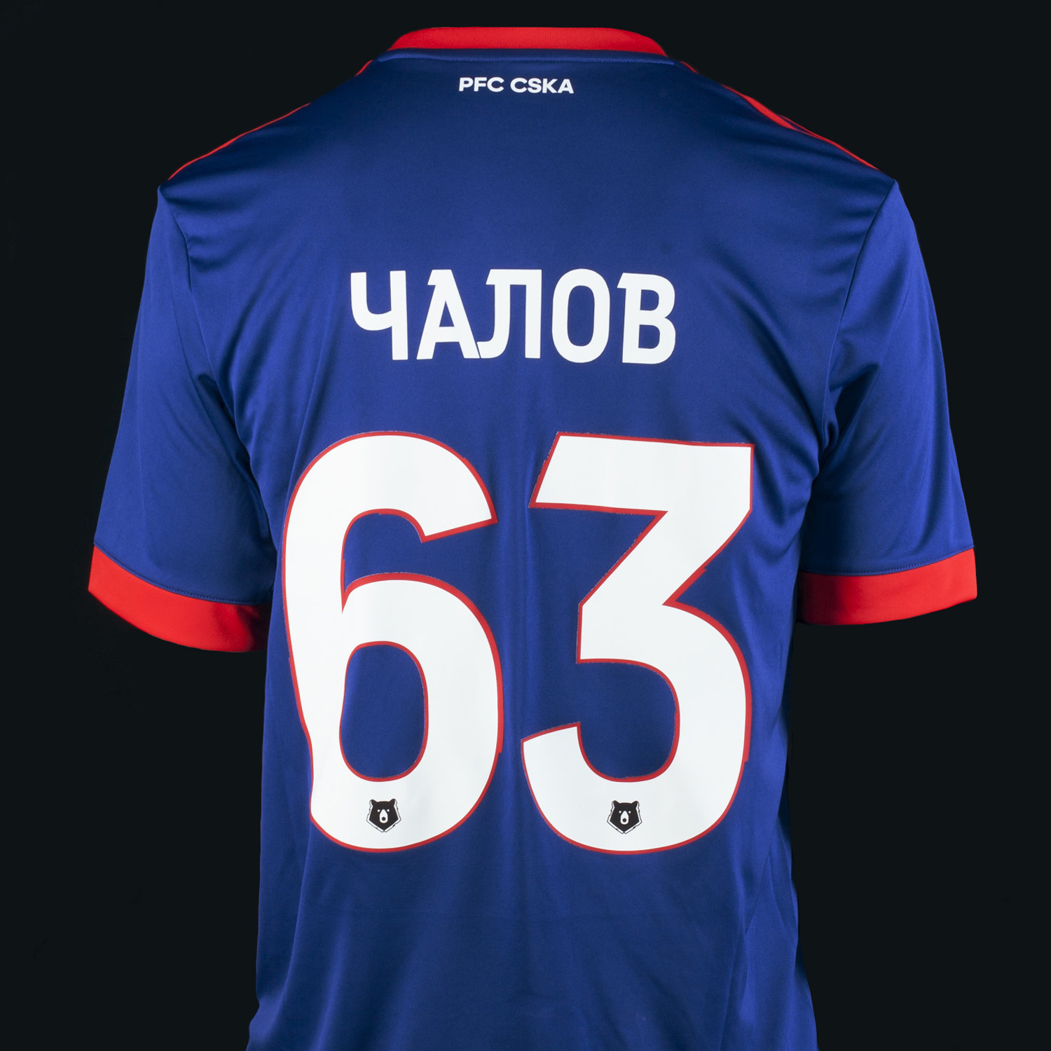
Player numbers
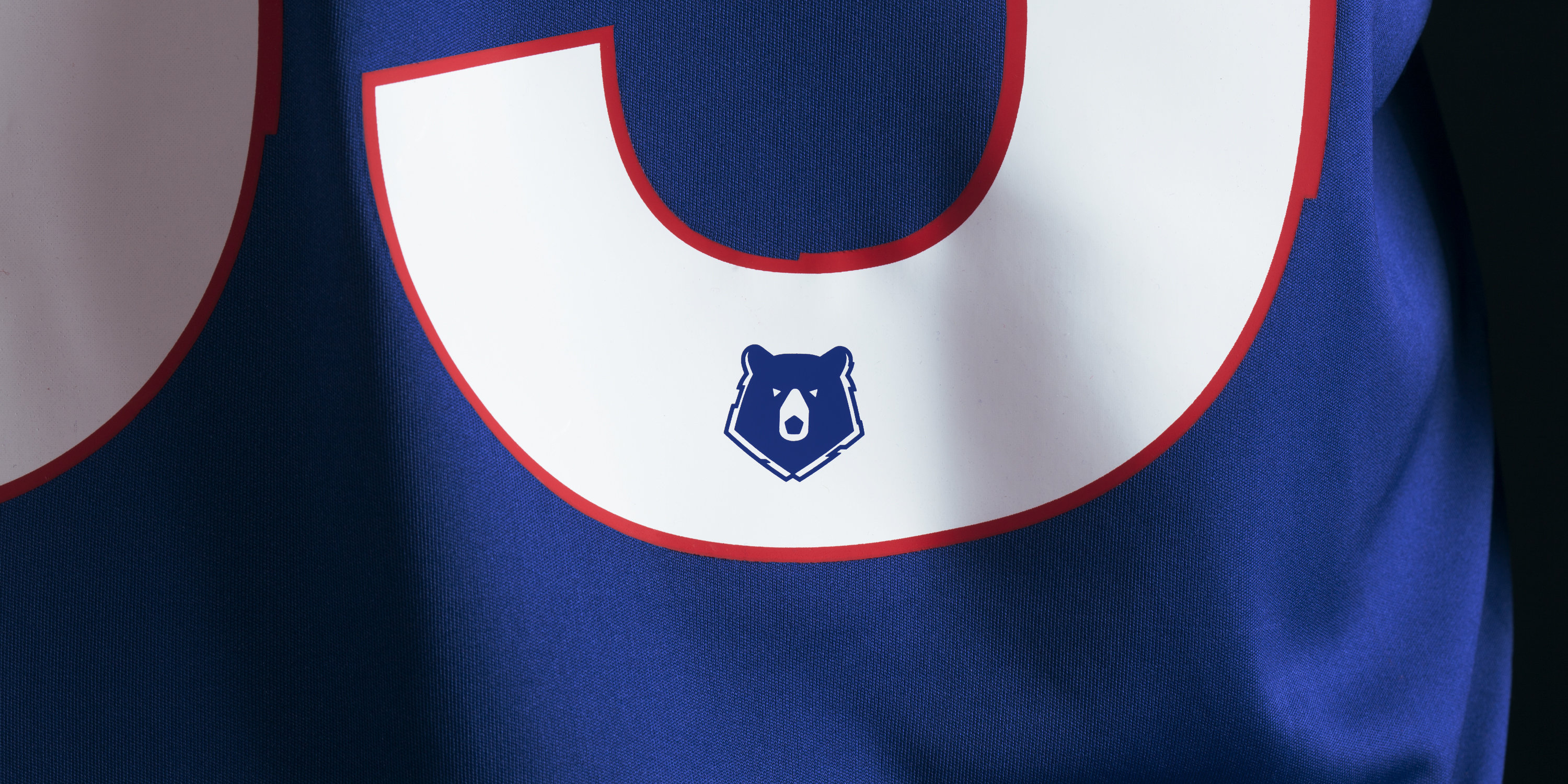
Player numbers required special care. To make sure the digits match the overall style, we created two options, monochrome and bicolor (in case someone needs an outline). Combinations were created for each kit of each club. Every digit has RPL’s signature bear at the bottom as a symbol of belonging to the League.
Lack of contrast and traditional glyph shapes allow viewers to read the text quicker and easier. Which is why the typeface works especially well in TV broadcast captions.
art director
photographer
- Igor Fatkin
