Corporate identity and packaging design for Saiver Shelanger Chemical Plant
The plant, which grew out of a forest chemical cooperative, has been operating in the Republic of Mari El for over a hundred years. Over this time, it has established production of paints, enamels, primers, as well as wood and metal varnishes. It all began with the production of turpentine and charcoal. Our studio created a logo and developed packaging design principles for the plant.

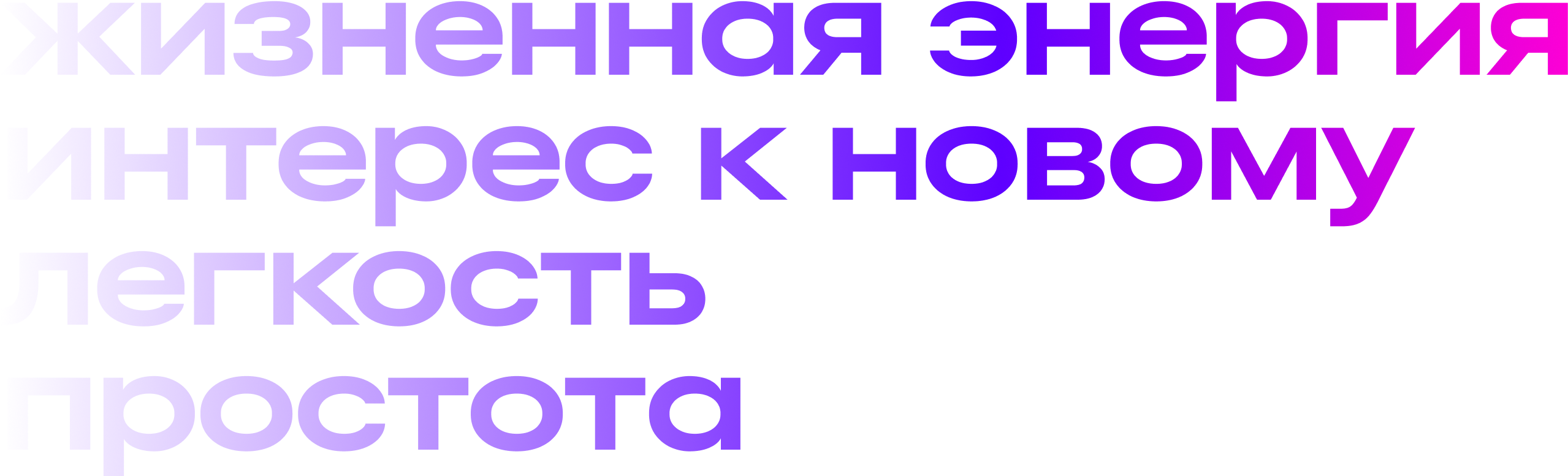
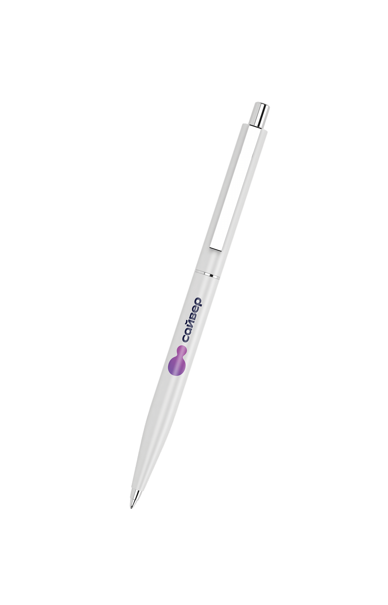
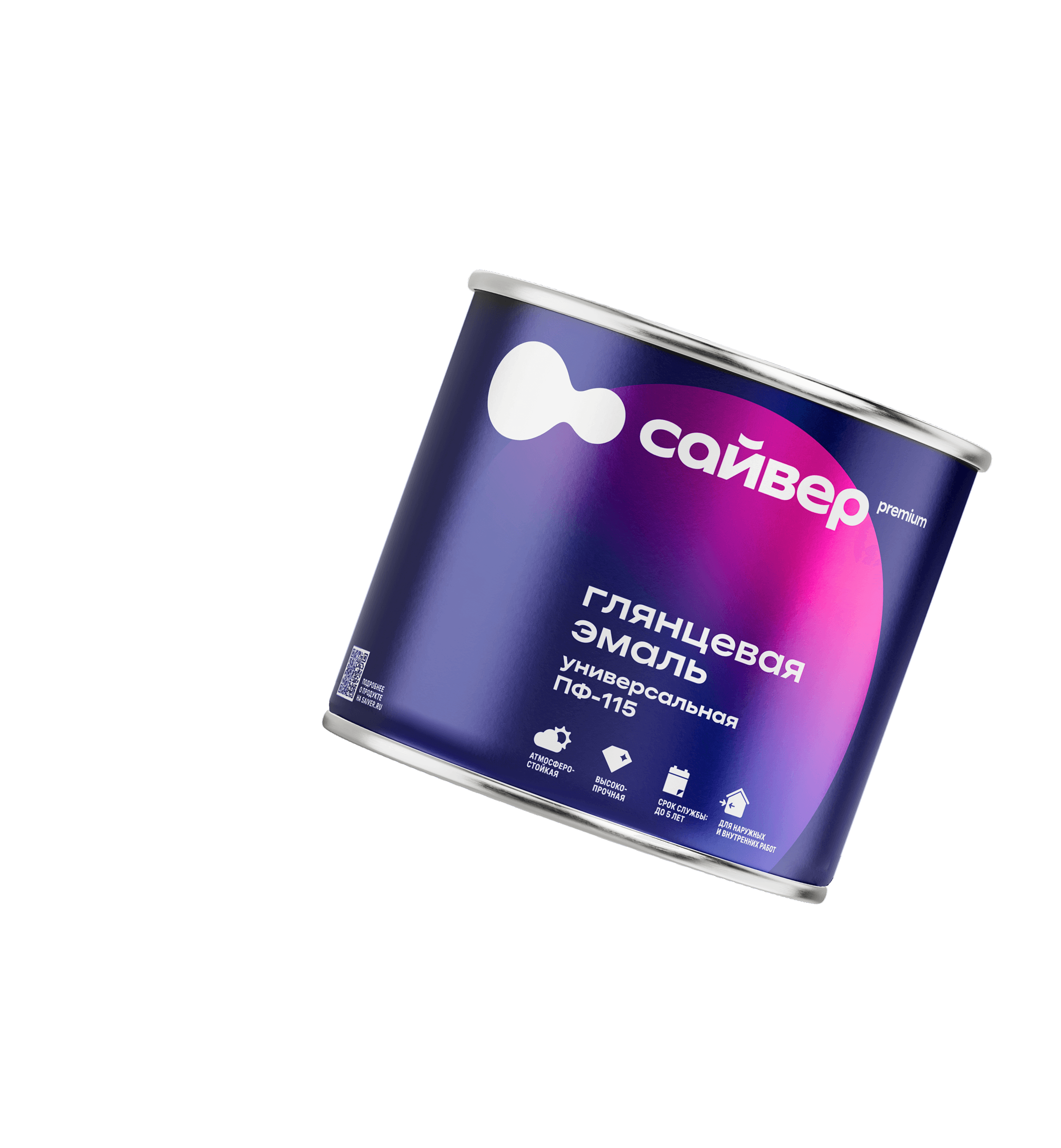
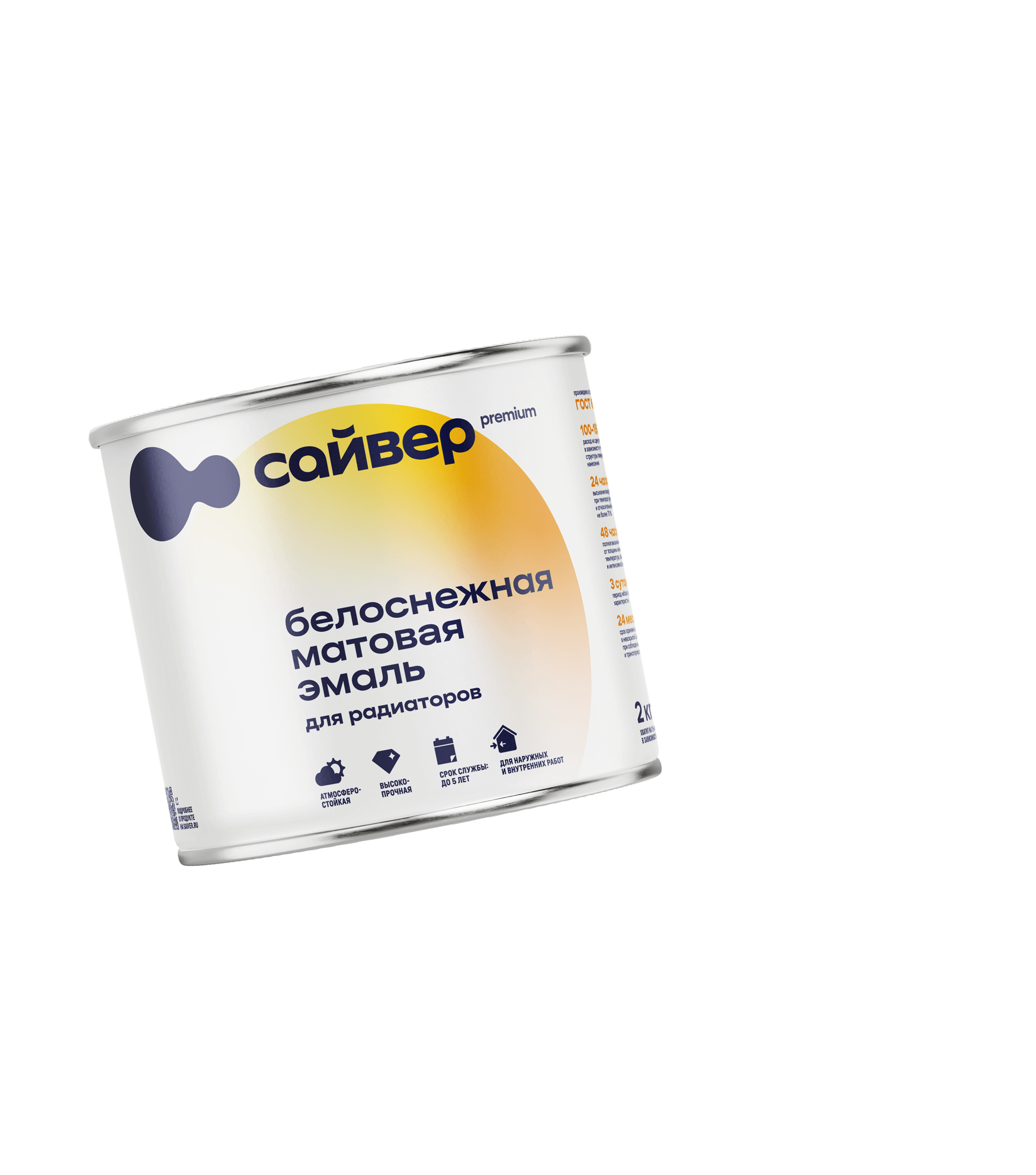
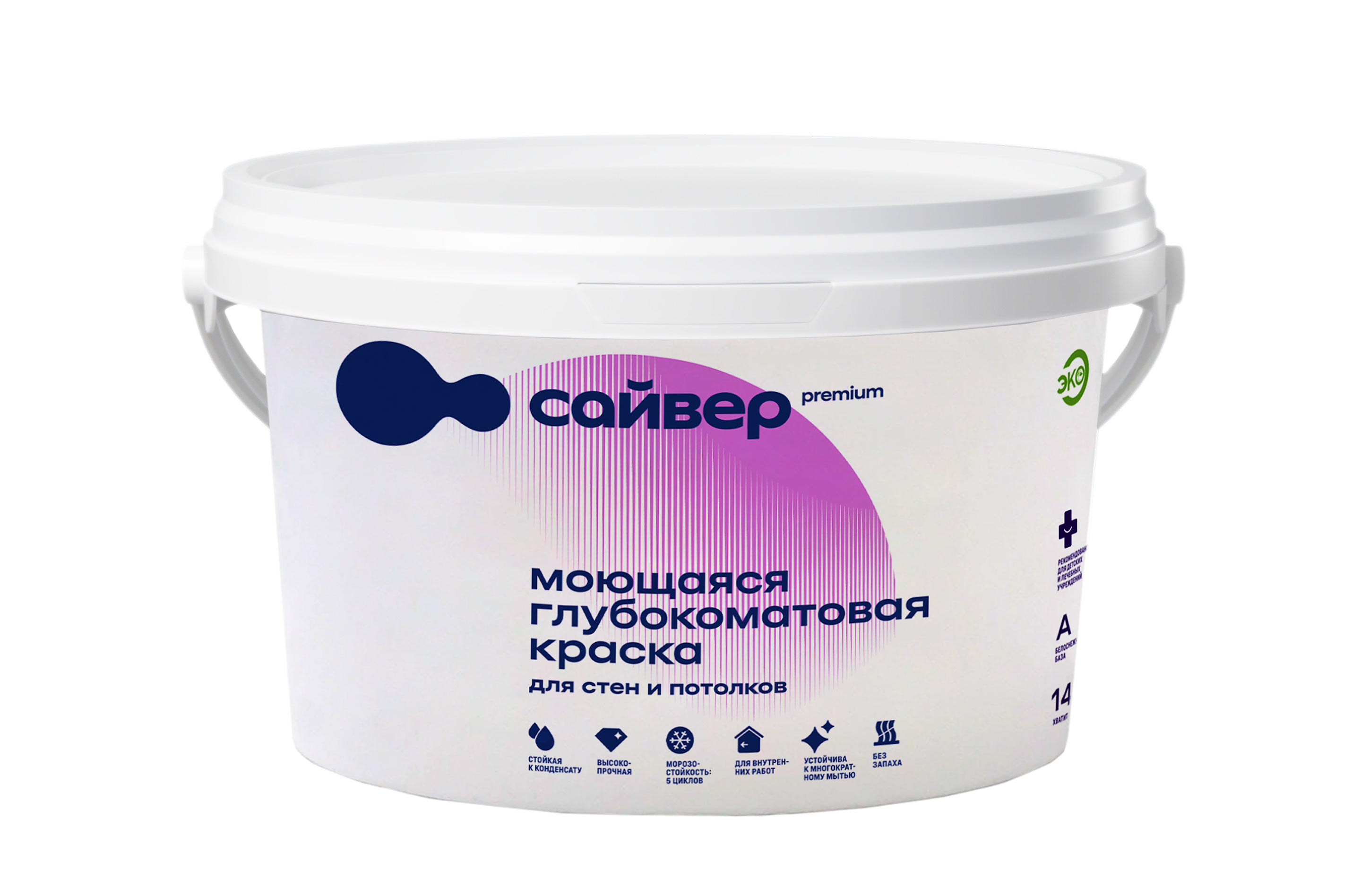
The logo consists of two drops of paint merging into one vivid gradient. This simple image reflects the company’s core mission: to become an accessible and innovative brand. The gradient colors are drawn from previous versions of the company’s identity, preserving continuity and visual recognition.
An additional identity element is a circle filled with paint, which changes color depending on the product type. With this light and appealing identity, any item can become bright branded media.


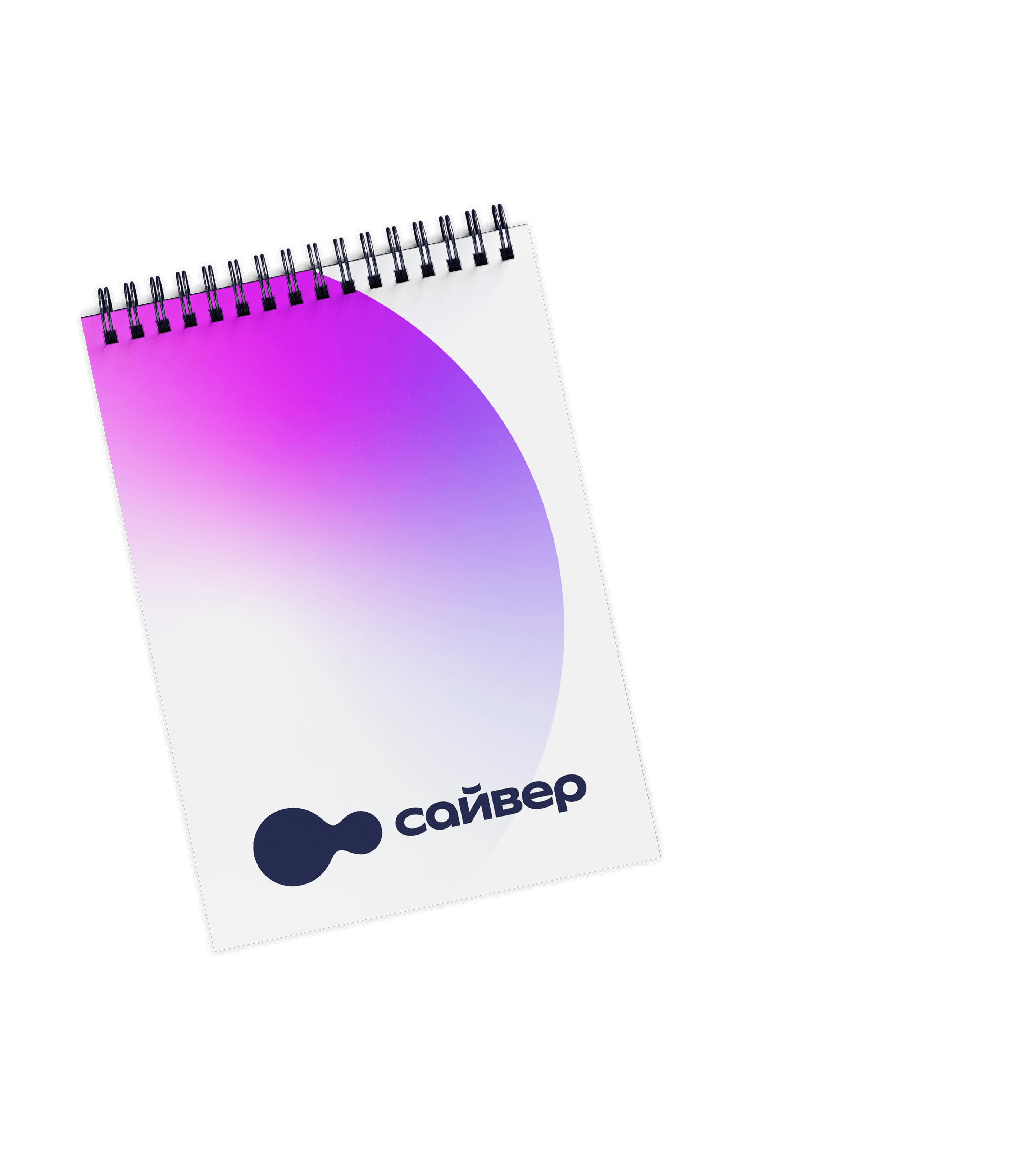


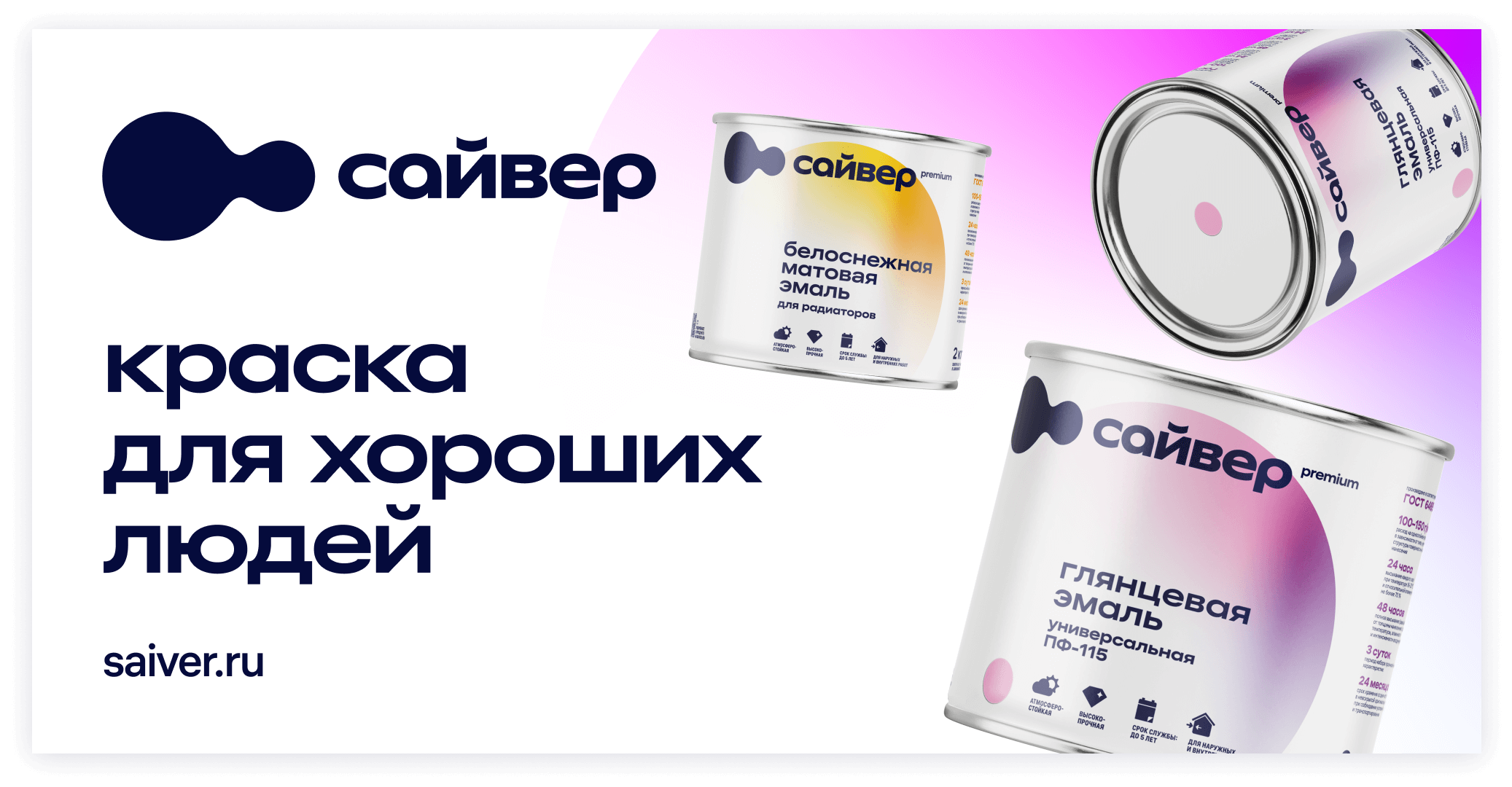
The minimalist logo and the vibrant gradient are actively used on cans, boxes, containers and other types of packaging. The result is simple, practical and very attractive.
The labels «speak» to customers in plain language, using pictograms extensively. This way, even someone unfamiliar with paints can instantly find the right product on the store shelf.
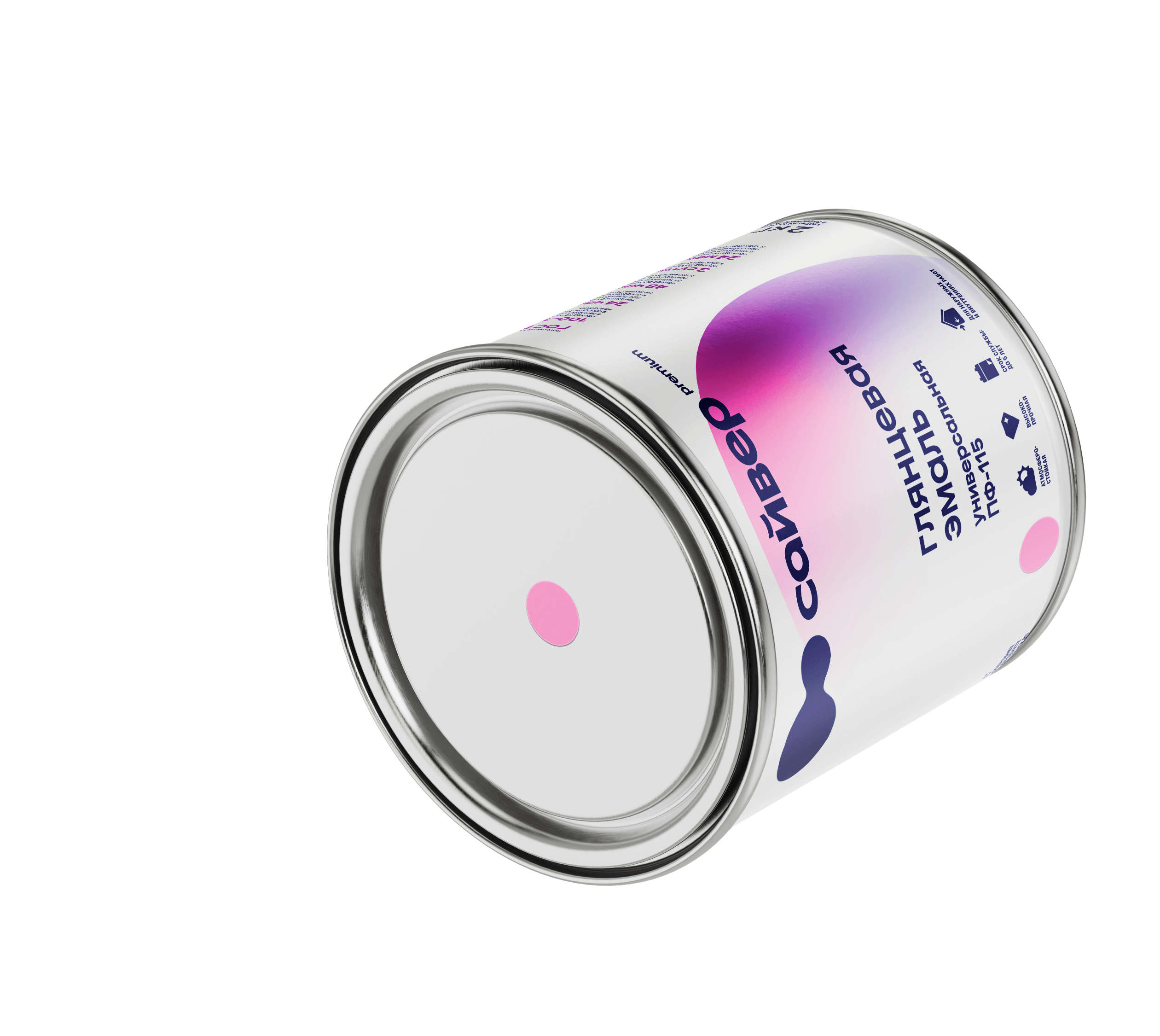
All paint in a can starts out white. The desired shade is mixed right in front of the customer by adding pigments. The final result is shown by a small circle on the lid, selected from an existing swatch.
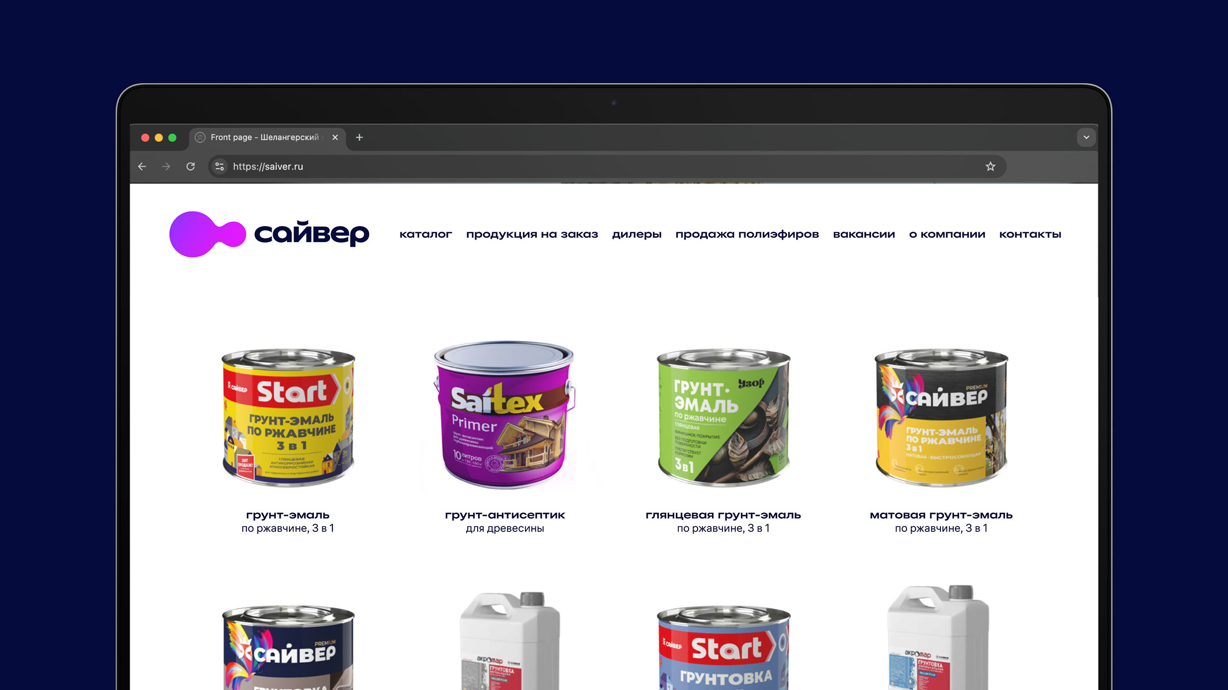
For offset printing, we created artwork that closely resembles the main graphic element.


art director
typesetter
- Vadim Musatov
