Territoriya are former telephone exchange buildings. Previously, city telephone infrastructure required large switching machines made of wires and relays, and a special multi-storey building was constructed in almost every district of Moscow to house them. The transition to modern electronics made it possible to rent out the huge spaces to small and medium-sized businesses. This means creating a comfortable environment of useful services and centers of attraction for each area in a location that is convenient for its residents. We came up with a unified style for all Territoriya buildings, created a memorable image and developed a communication system.
Key messages
The main goal of the key messages is to tell how the buildings have changed in the recent years, transitioning from concrete boxes with outdated equipment to modern centers with a variety of companies inside.
At the heart of the system are promotional messages. Each of them is addressed to a specific audience.

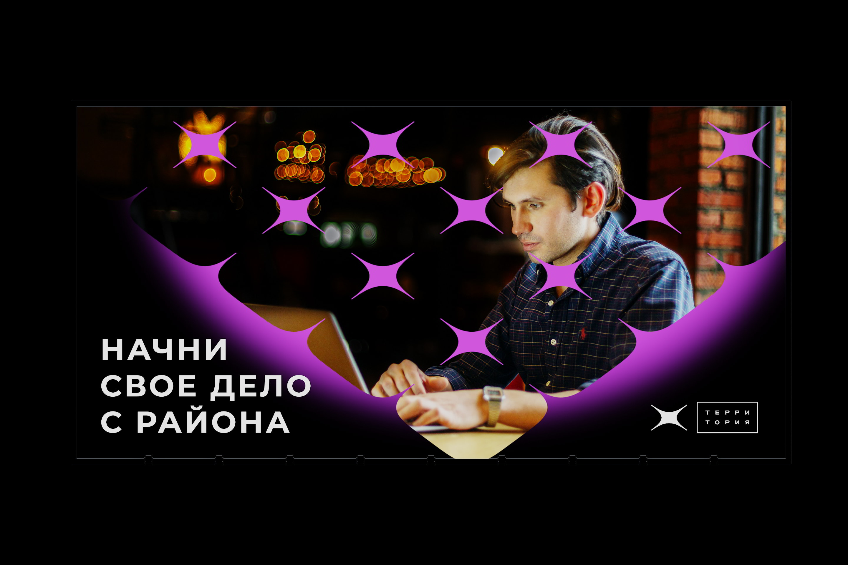
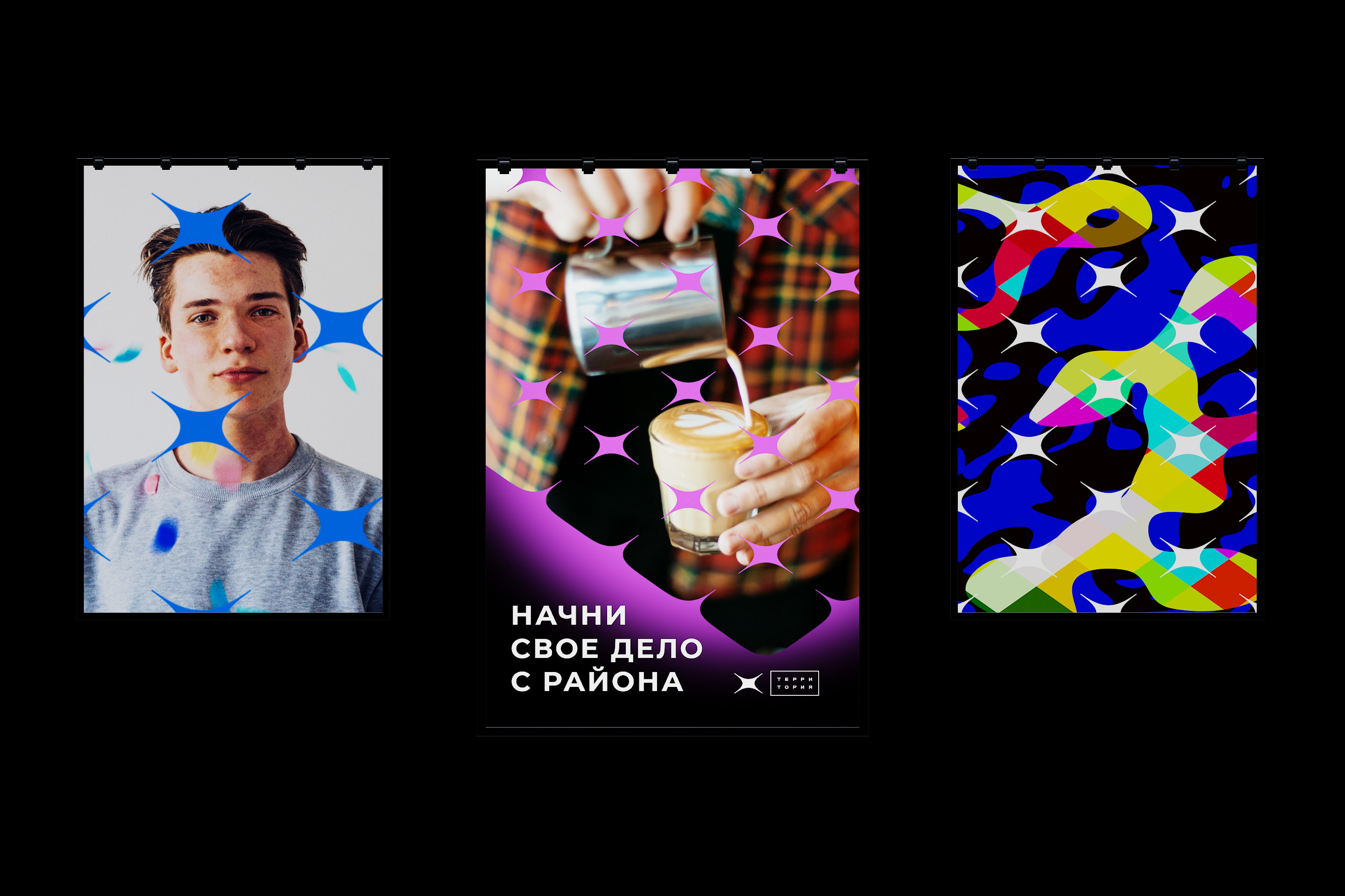
“Start your business in your neighborhood” is for young local entrepreneurs. Territoriya offers them a comfortable environment for starting a business close to home.
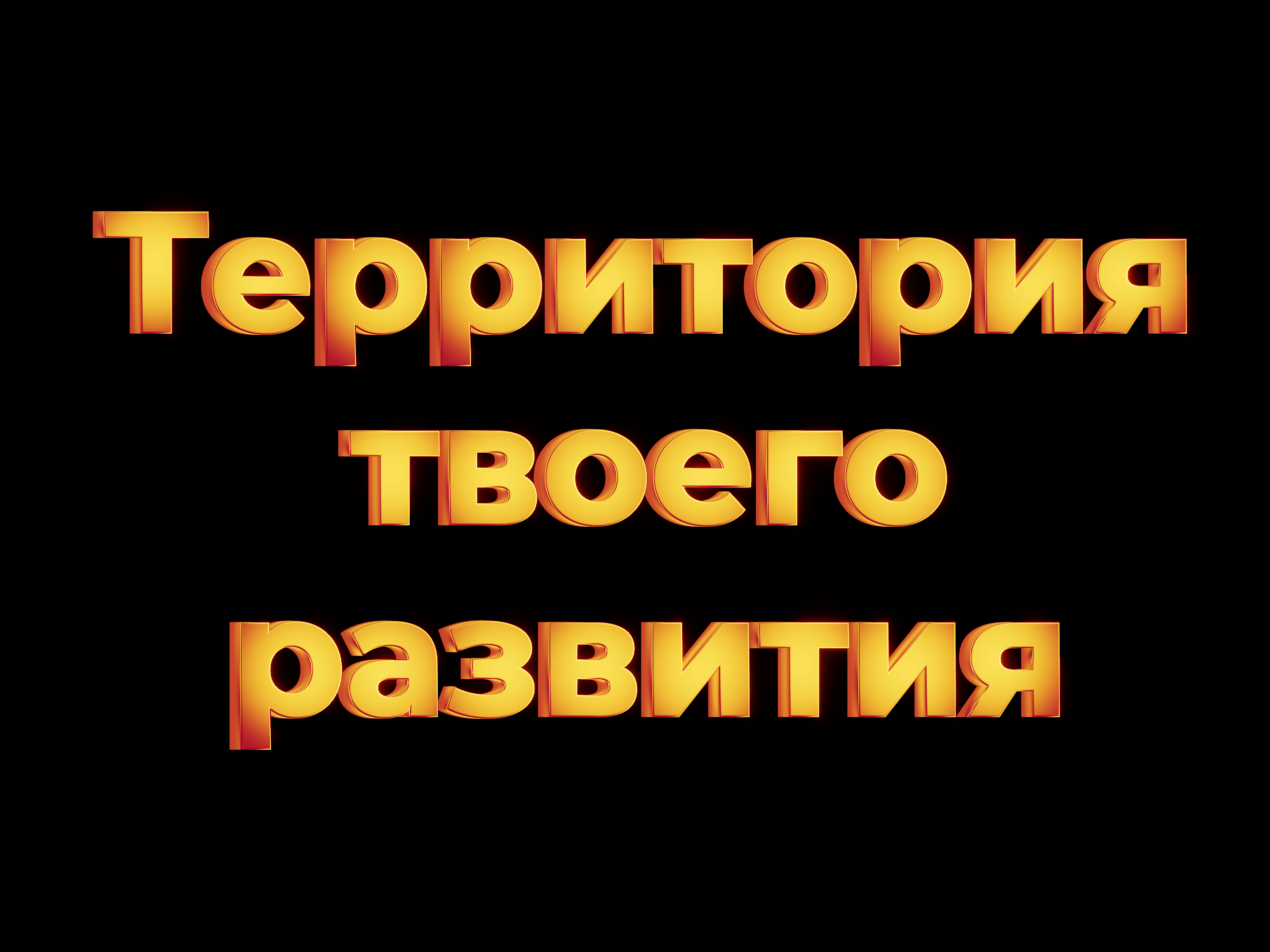
“Territory of your growth” is for large and medium-sized businesses opening new branches. It is a good choice for a beauty salon, a dentistry, a fitness club or a retail location such as a grocery store, a pizzeria or a pharmacy.
The promotional messages will be used in different situations and different areas of Moscow. It is important that each message remains attractive to its target audience.
We came up with a phrase builder that will help adapt the messages for any situation and will keep the historical connection with the buildings, as all phrases are assembled from the abbreviation “ATX.”
Key visual
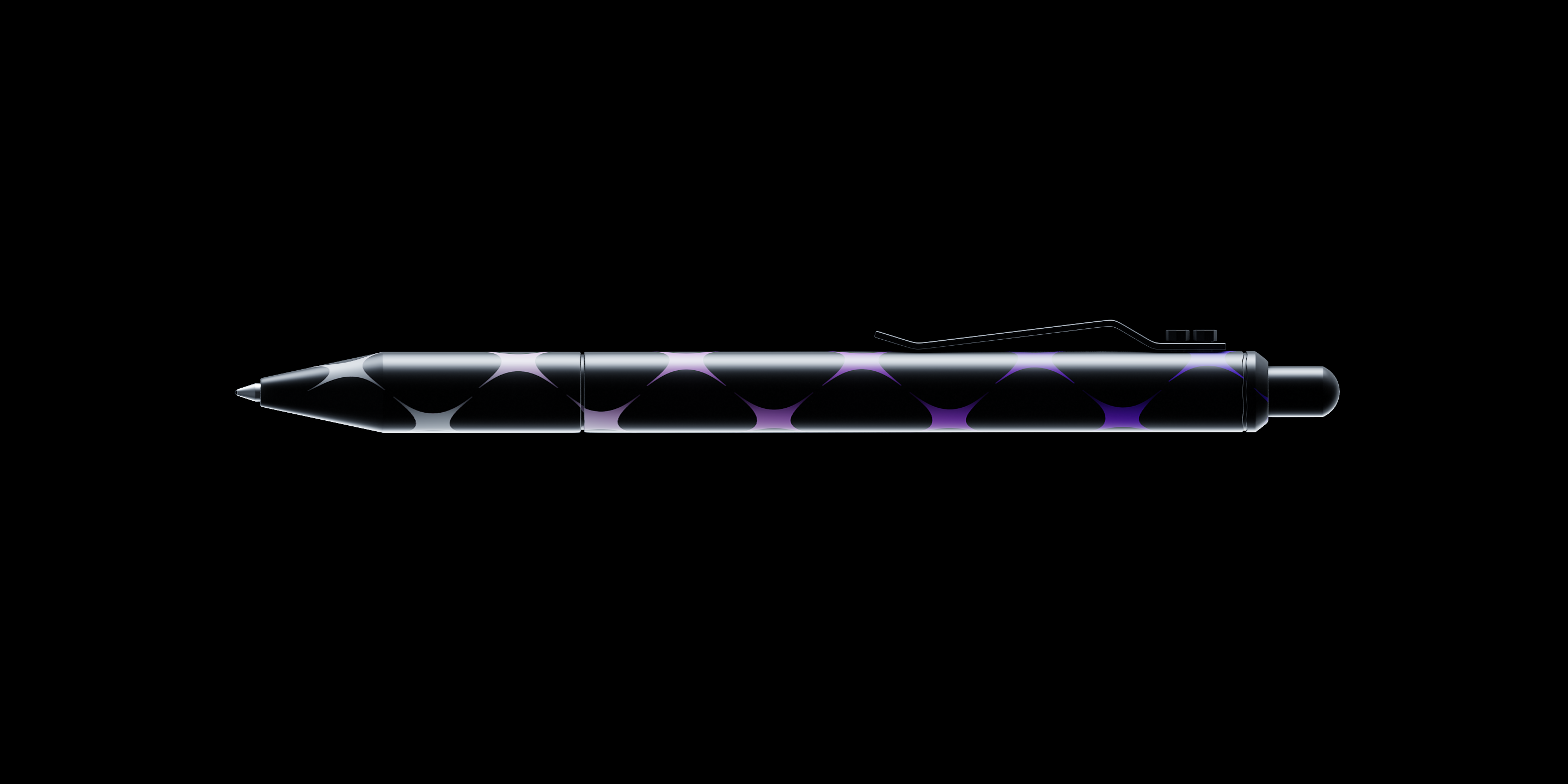
The main symbol of Territoriya is a four-pointed star. Its rays are pointing in different directions, showing that the goal of each Territoriya building is to become the center of attraction and magnetism in its area.
The star contains a reference to the era when telephone subscribers were connected by a central switchboard.
The star is a symbol of growth and development. Stars in the sky form constellations, and the stars of Territoriya form a single network. The pattern made of stars is similar to an area plan, so it also echoes the name of the brand.
The image of a star contains an endless number of positive associations: the center, the glow of the sun, celebrities, accomplishments and many more.
We have incorporated a star into the existing identity of Territoriya. It became an addition to the brand and enriched it with new meanings.
The Territoriya star is instantly recognizable and perfectly readable on any medium and in any format.
The star is a source of ideas. It inspires new solutions.
It can be used in different contexts and situations to create fundamentally new things and meanings.
It is flawless in its dynamic, sleek and smooth lines.
Renovation
designer, 3D designer and programmer
- Misha Grin
- The studio wishes to thank Artemy Marinin, Maria Dorokhova and Marina Krapivina for their help with the project
