Tikhoye Yasnogorye naming and identity
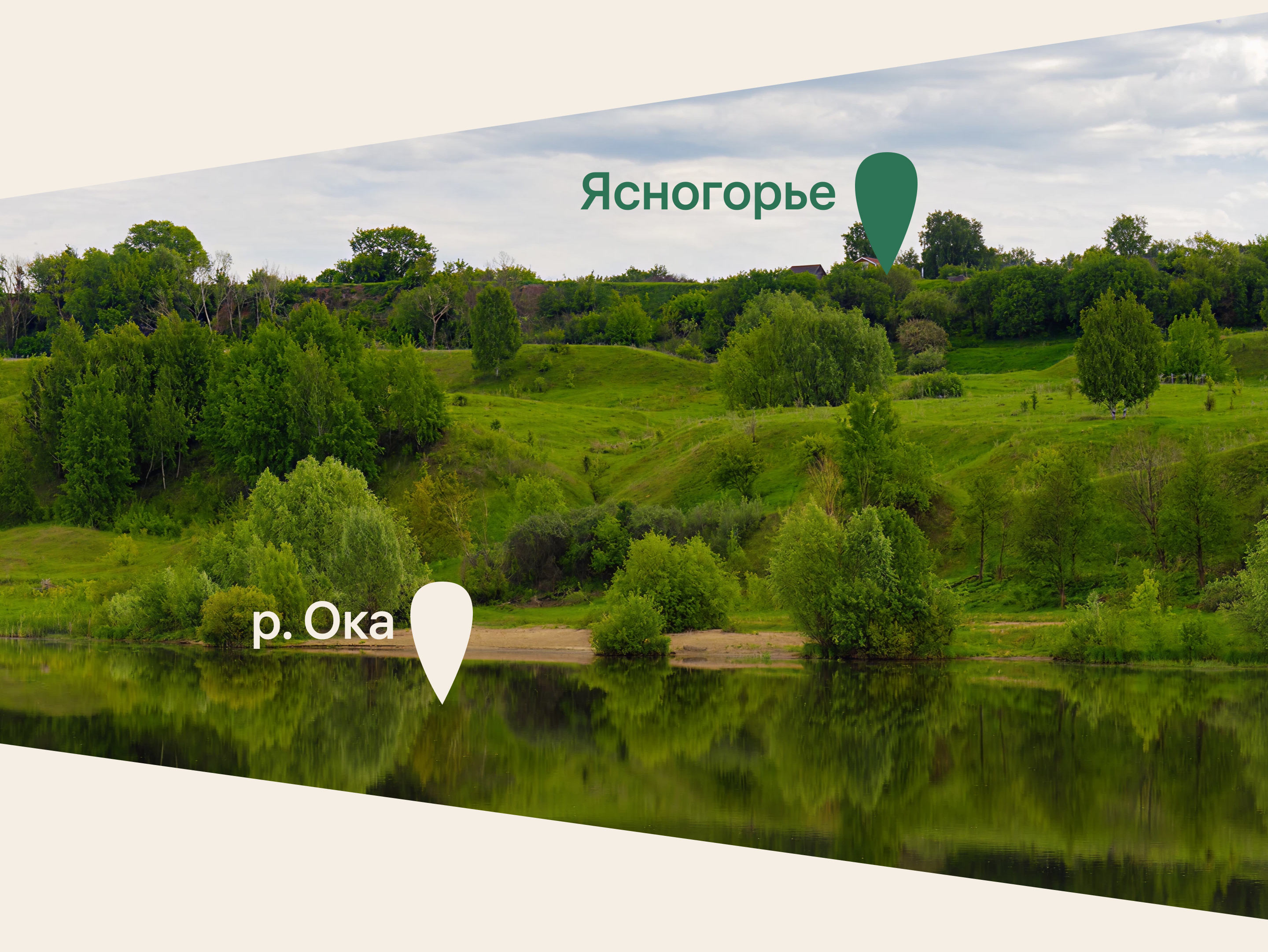
Park Hotel Tikhoye Yasnogorye is located in Tula Oblast, an area known for its dense coniferous forests, scenic rivers and remarkably clean air. In the 19th century, landowners built estates here, went fishing and organized hunting trips. Today, the area is seeing the development of glamping spots, resorts and various hotels. For one of them, a name and a sunny visual identity were created in the studio.

The name for the new park hotel was inspired by the local toponym: the Yasnogorye area is well known to residents for its meadows, excellent ecology and proximity to one of the Oka River’s tributaries. The word “Tikhoye” (meaning quiet) in the name reflects the opportunity to escape the noise and bustle of the city.
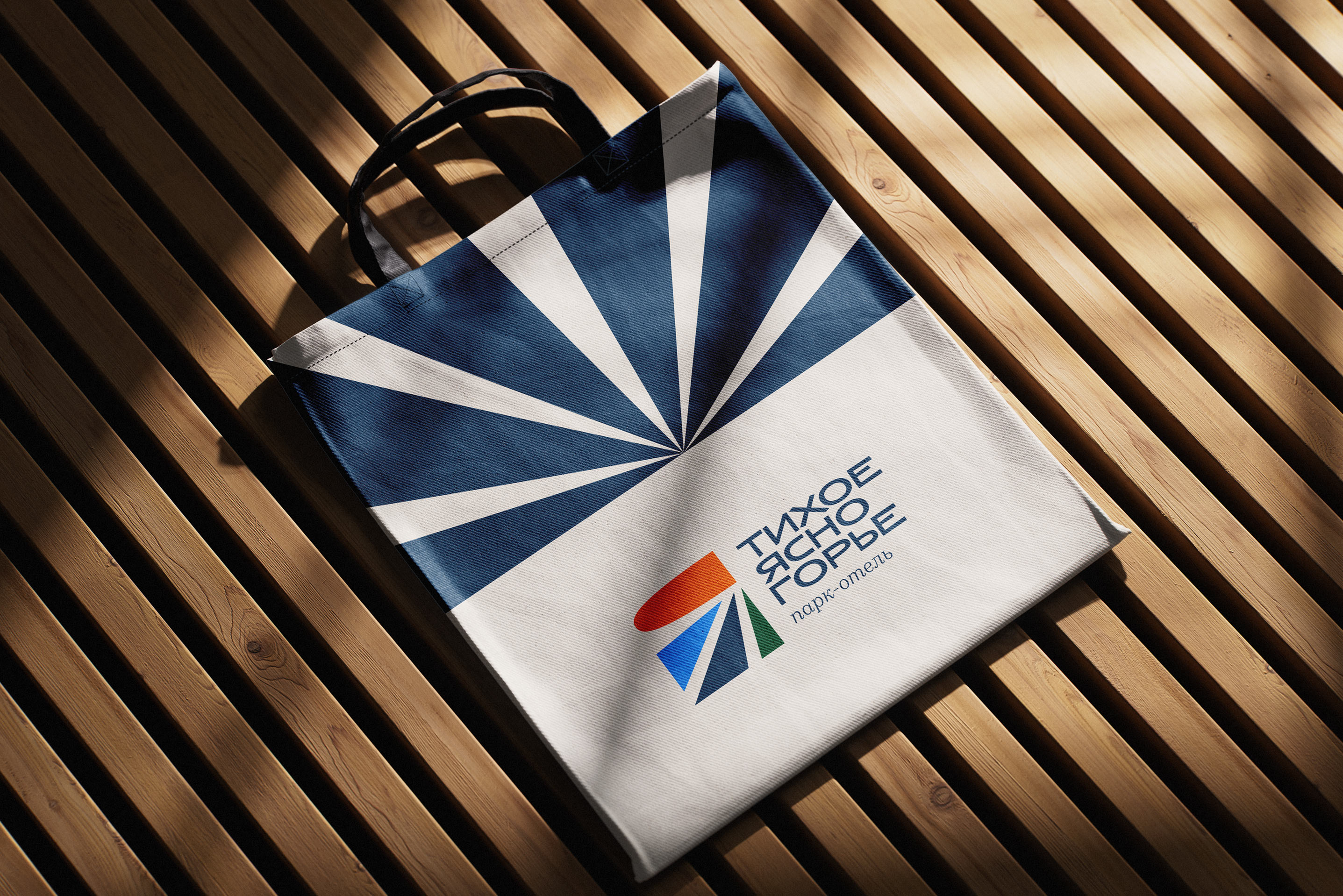
The logo clearly depicts a sunlit landscape: sky, water and forest. All the elements convey a sense of calm and serenity, coming together to form the first letter of the name.

In addition to the hotel, the complex is planned to include entertainment zones: a bathhouse, swimming pools, a spa center, a breakfast café, a children’s area, an event center and a restaurant with a scenic view. These venues will be operated by different providers, but thanks to the unified identity, the park hotel will function as a cohesive complex.


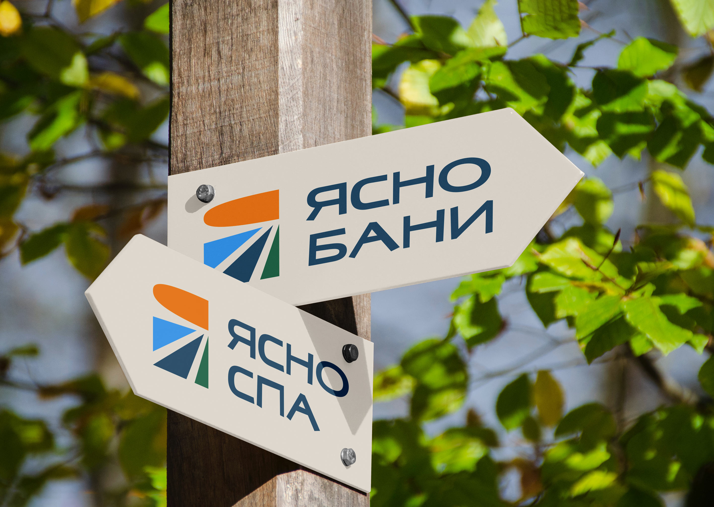

The rays from the logo serve as the basis for a distinctive brand graphic system.

All materials are designed using a customized version of the studio’s Zet typeface.