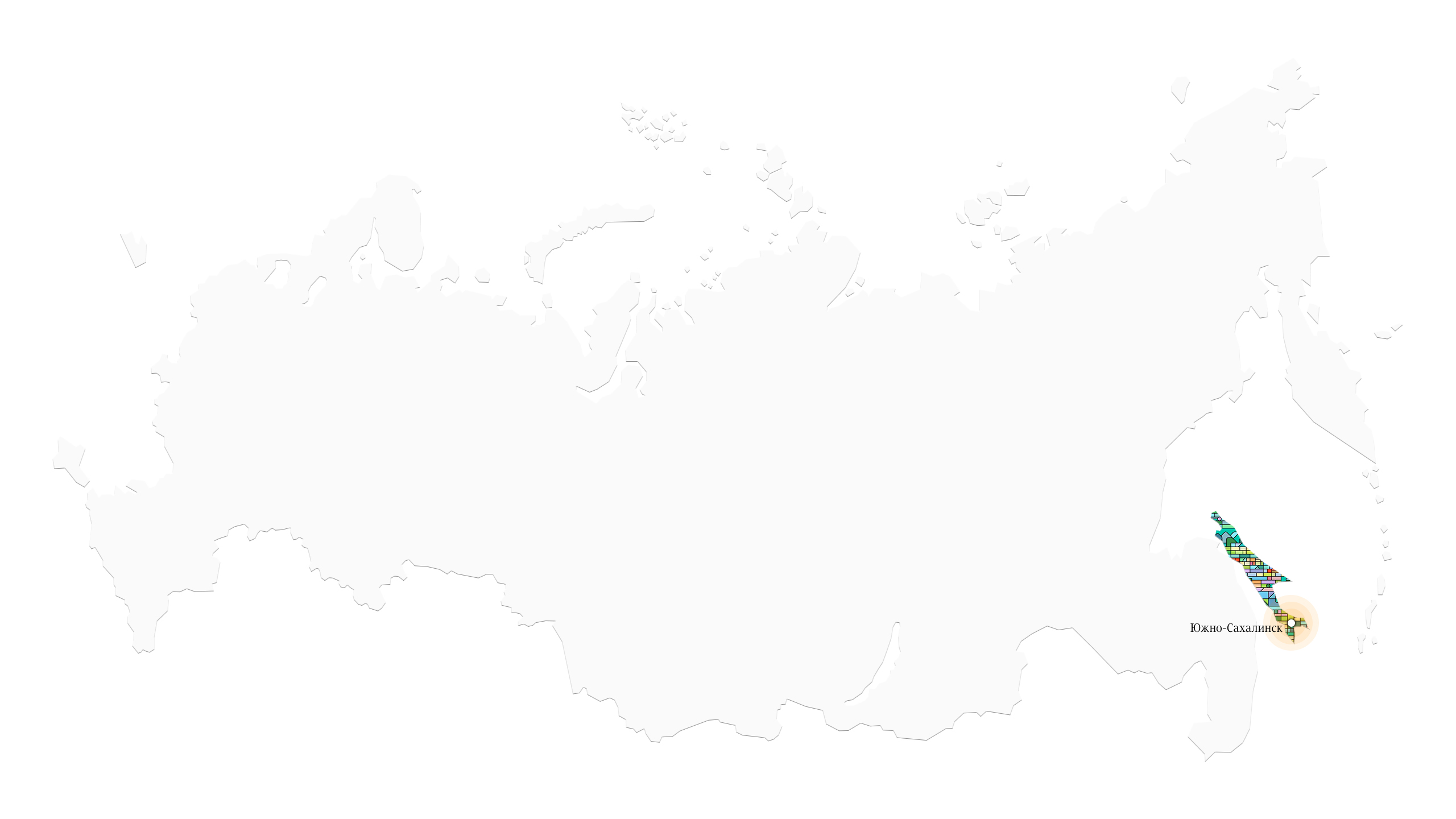
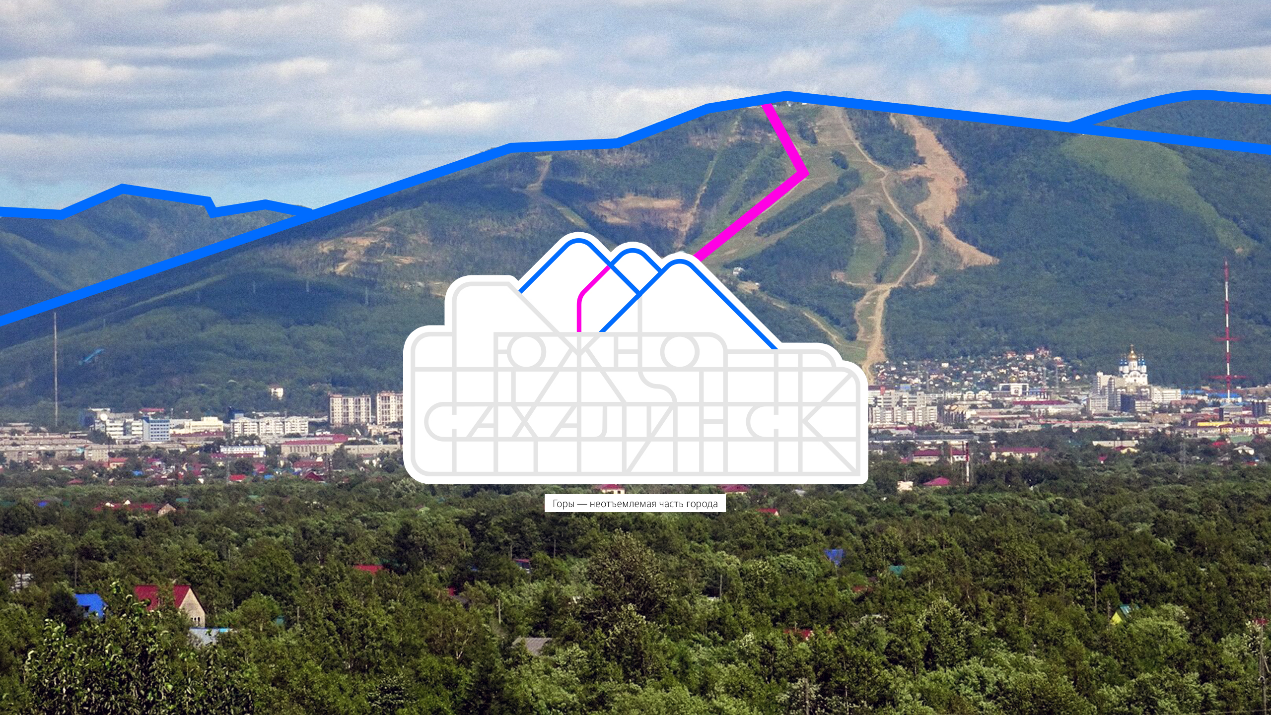
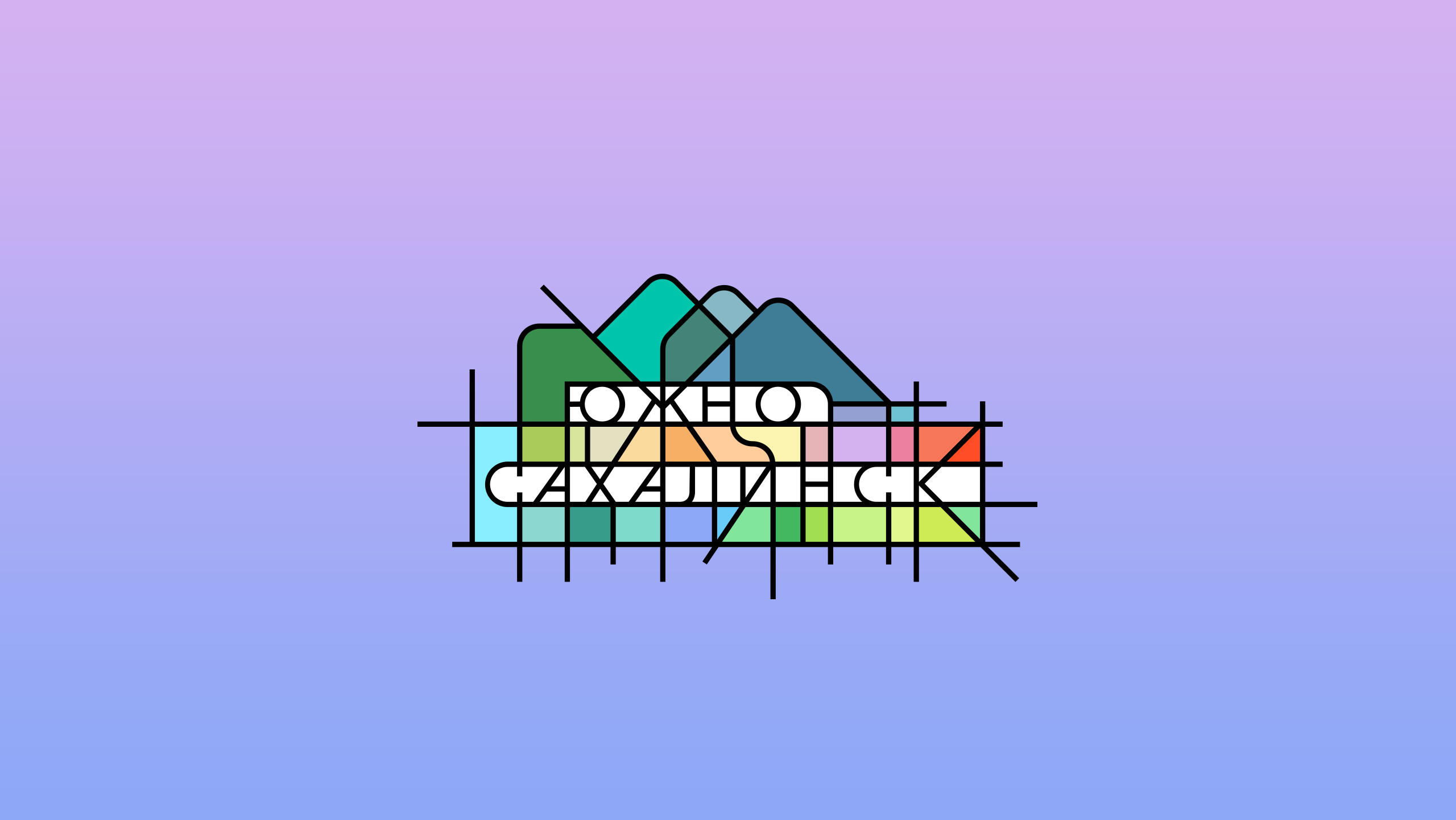
Yuzhno-Sakhalinsk is a city in the Russian Far East with a rich history and a very special appearance that blends together two different cultures, Asian and European. The city is surrounded by pristine nature and stunning mountain landscapes that attract travelers from all over Russia and the neighboring countries. An identity reflecting the unique features of both cultures and emphasizing the city’s vibrant personality was developed in the studio.
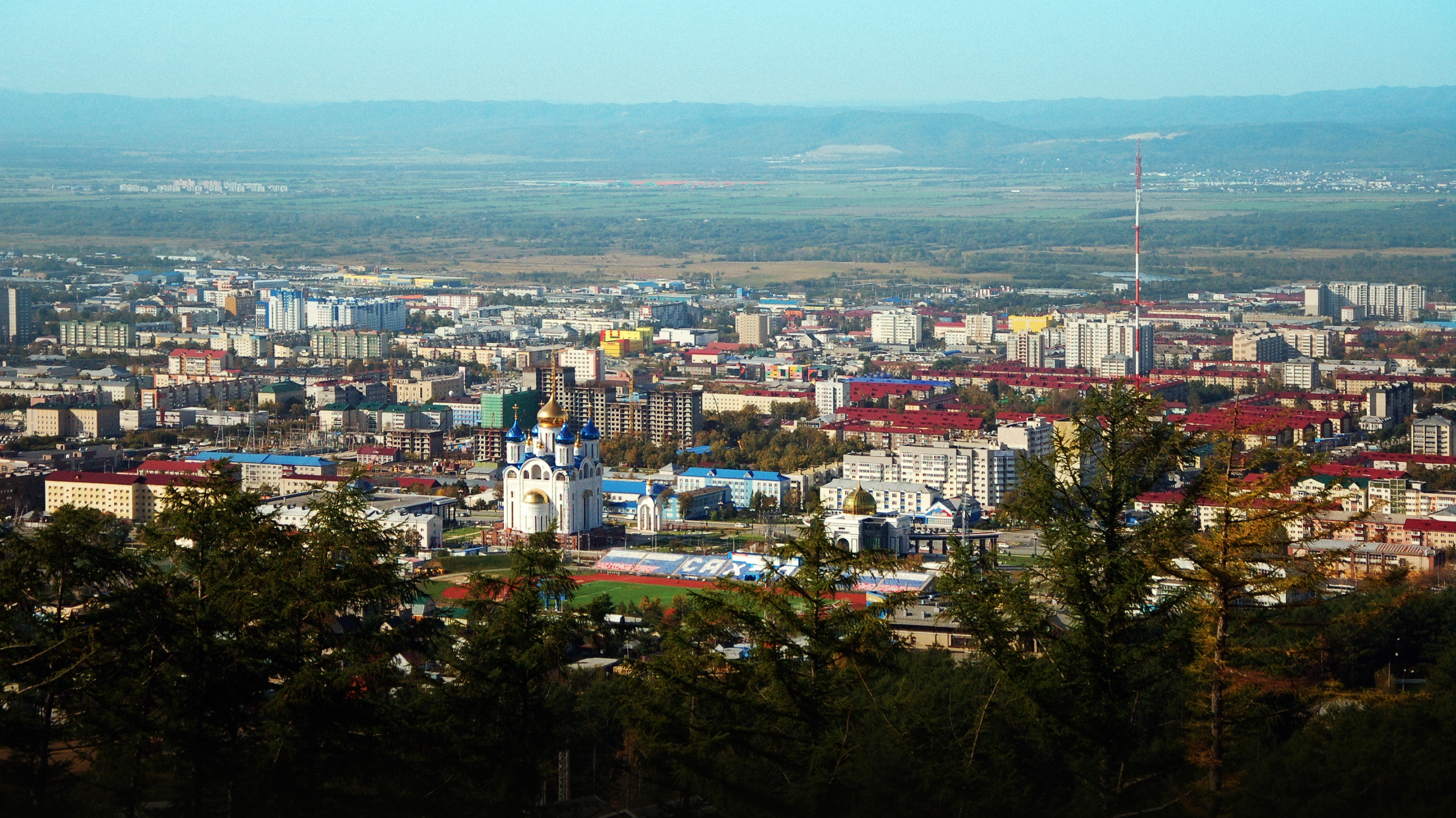
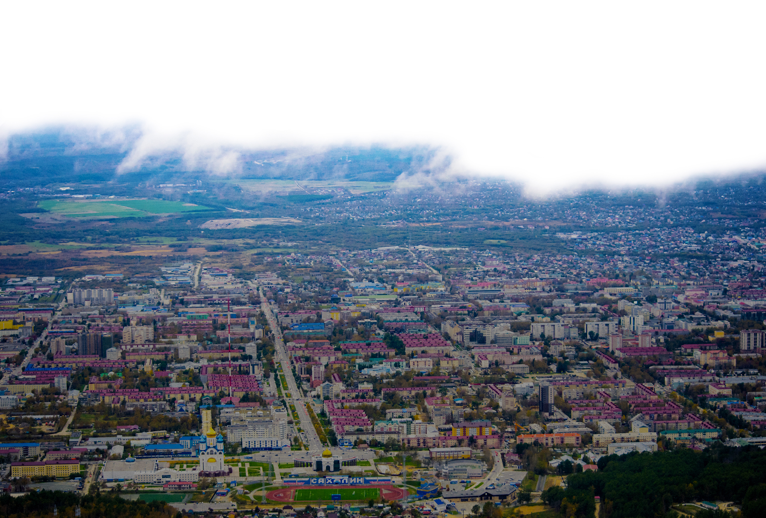
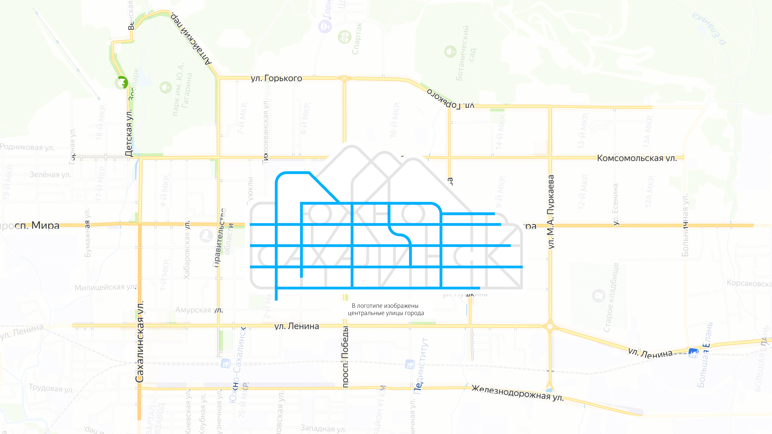
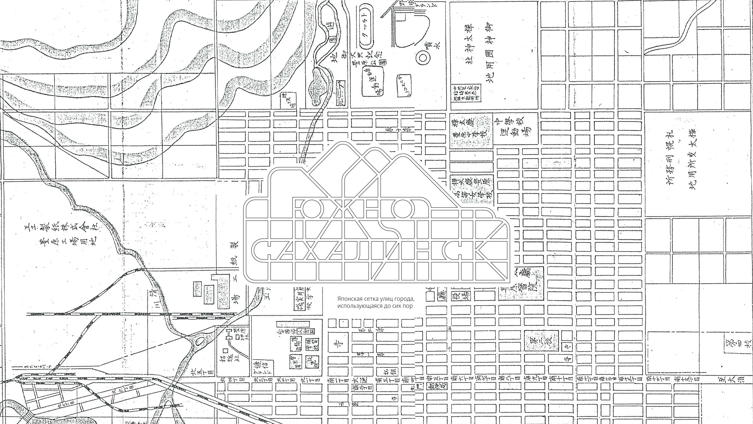
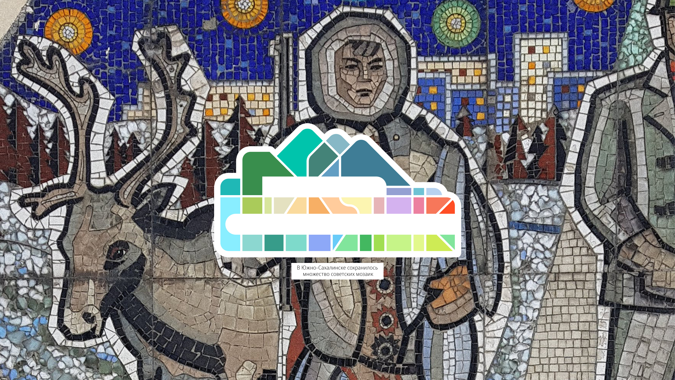
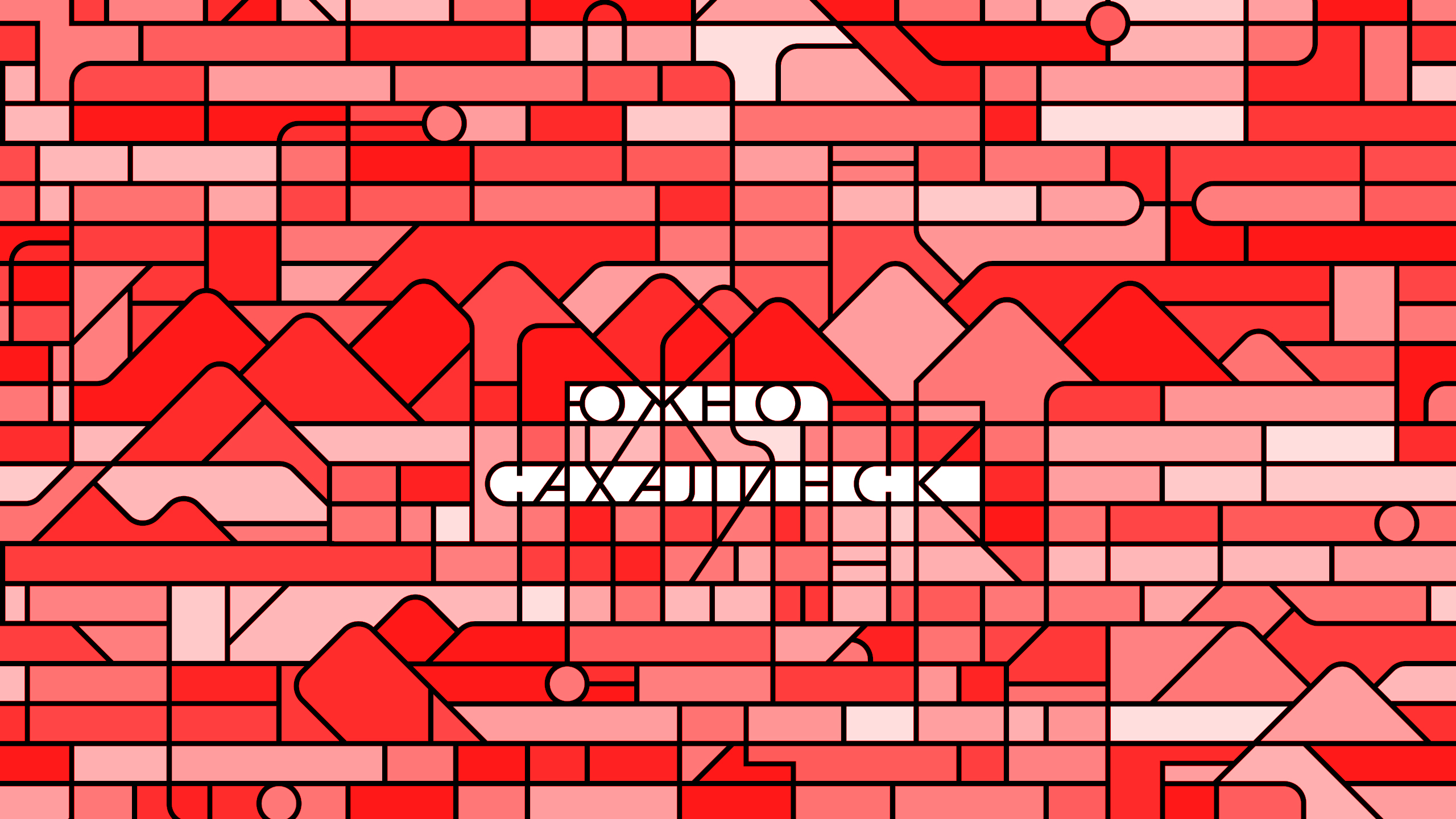
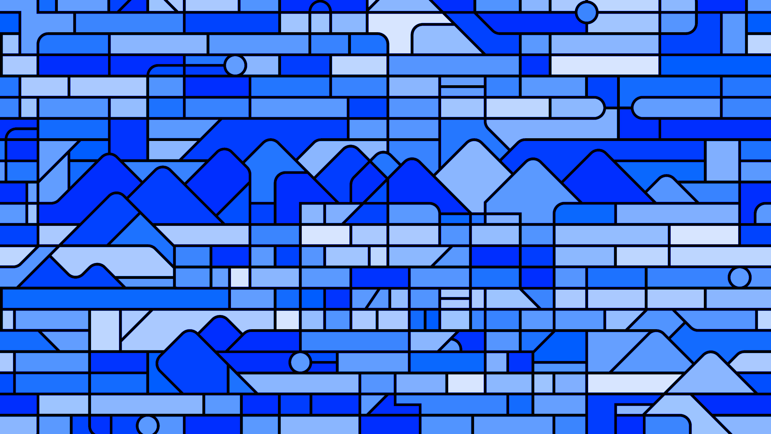
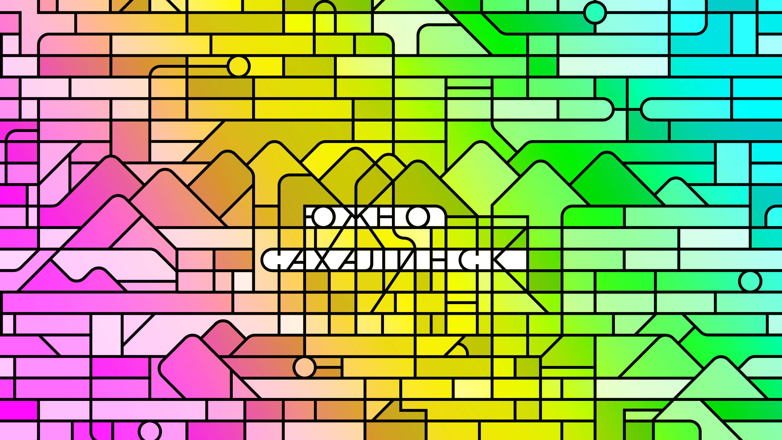
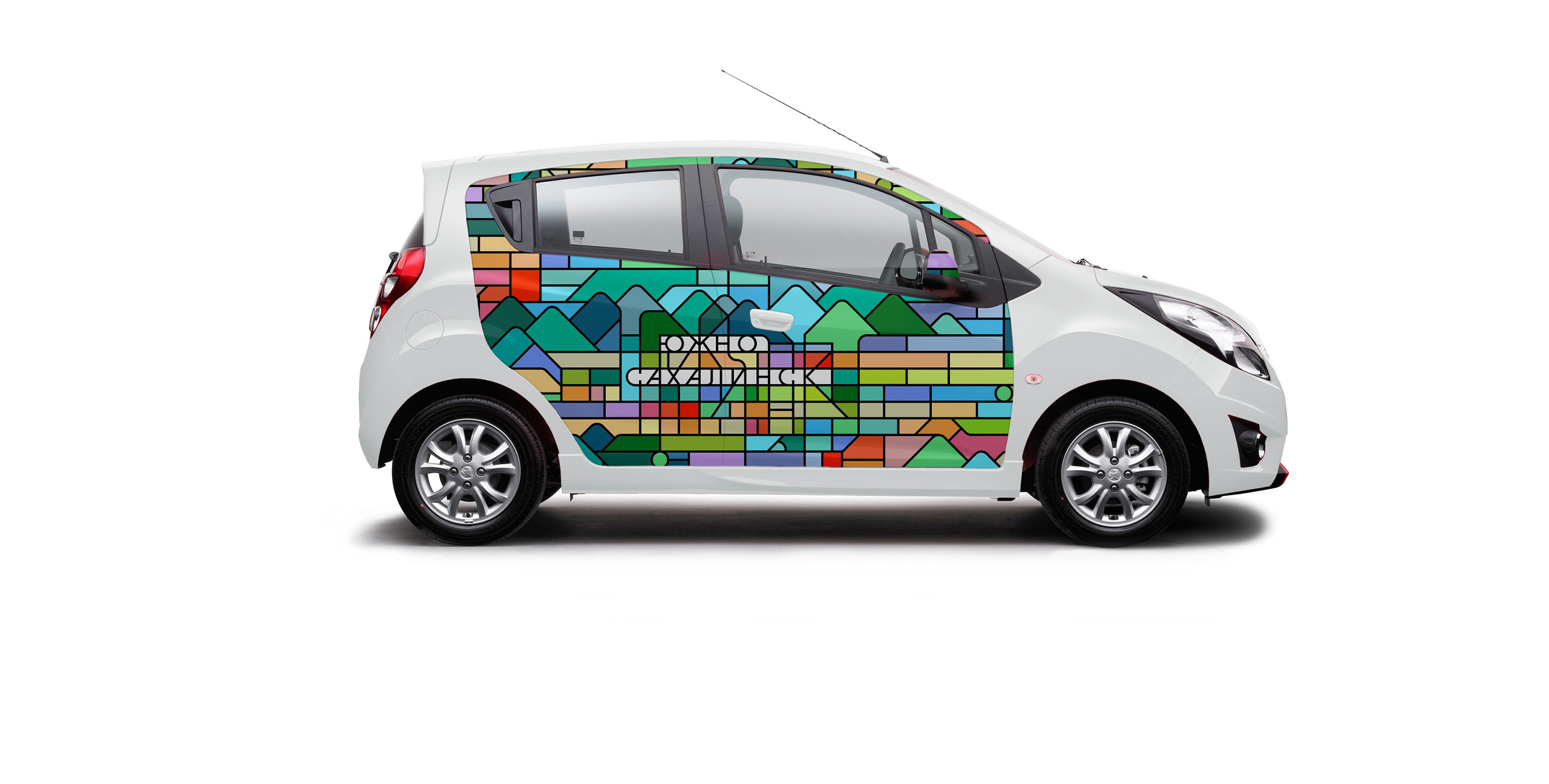
The logo of the city features picturesque mountains and a grid of city streets at their foot. The view from the top is very characteristic of the city since it is from this angle that the city reveals itself to anyone who climbs Bolshevik Mountain. The logo combines two views of the world: the frontal image of the mountains refers to the European perception of the world, while the view from the top references the Asian aesthetic. The rich palette of the symbol reminds of colorful houses and roofs, as well as the vibrant Soviet mosaics of which there are still many in the city.
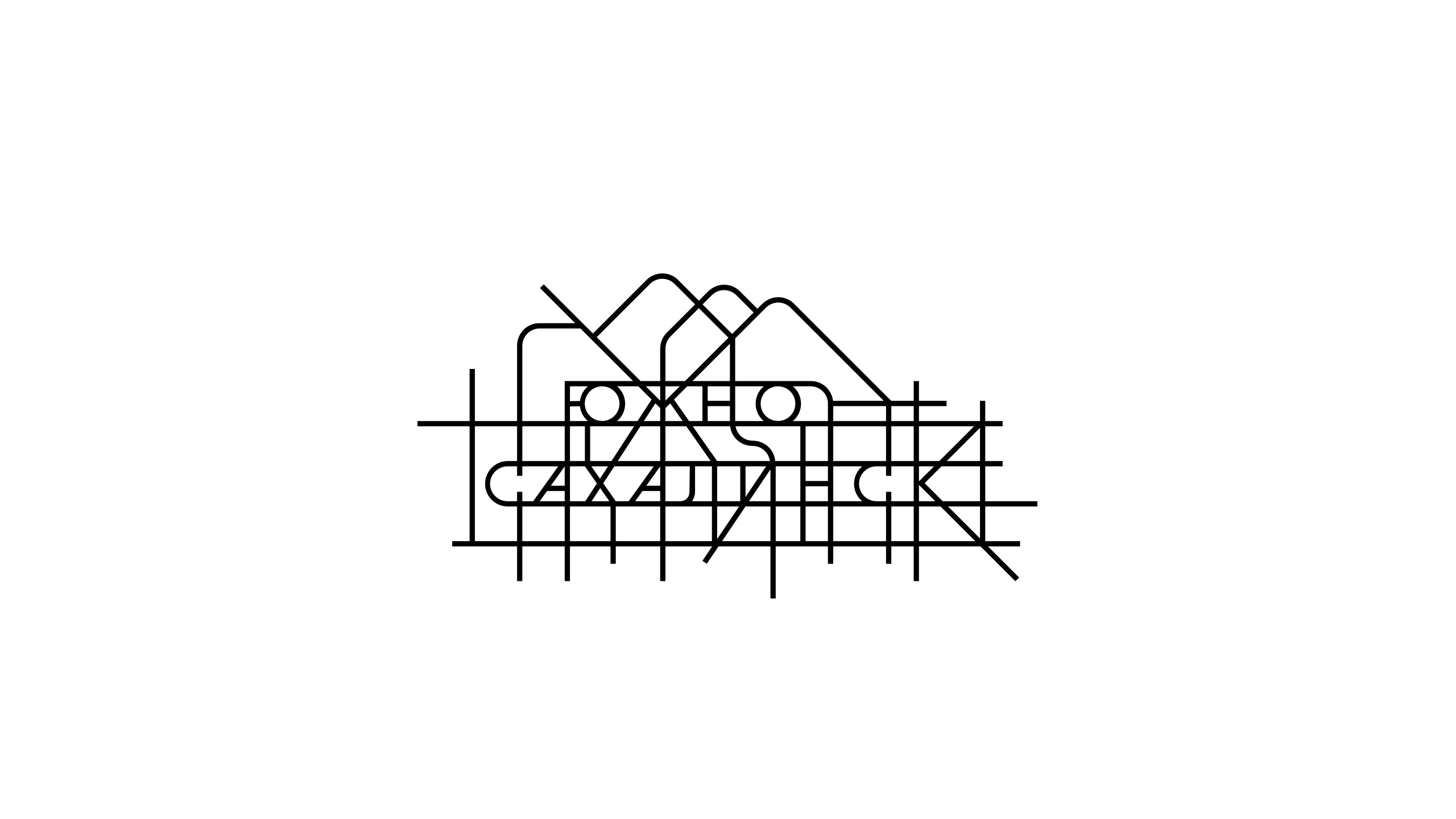
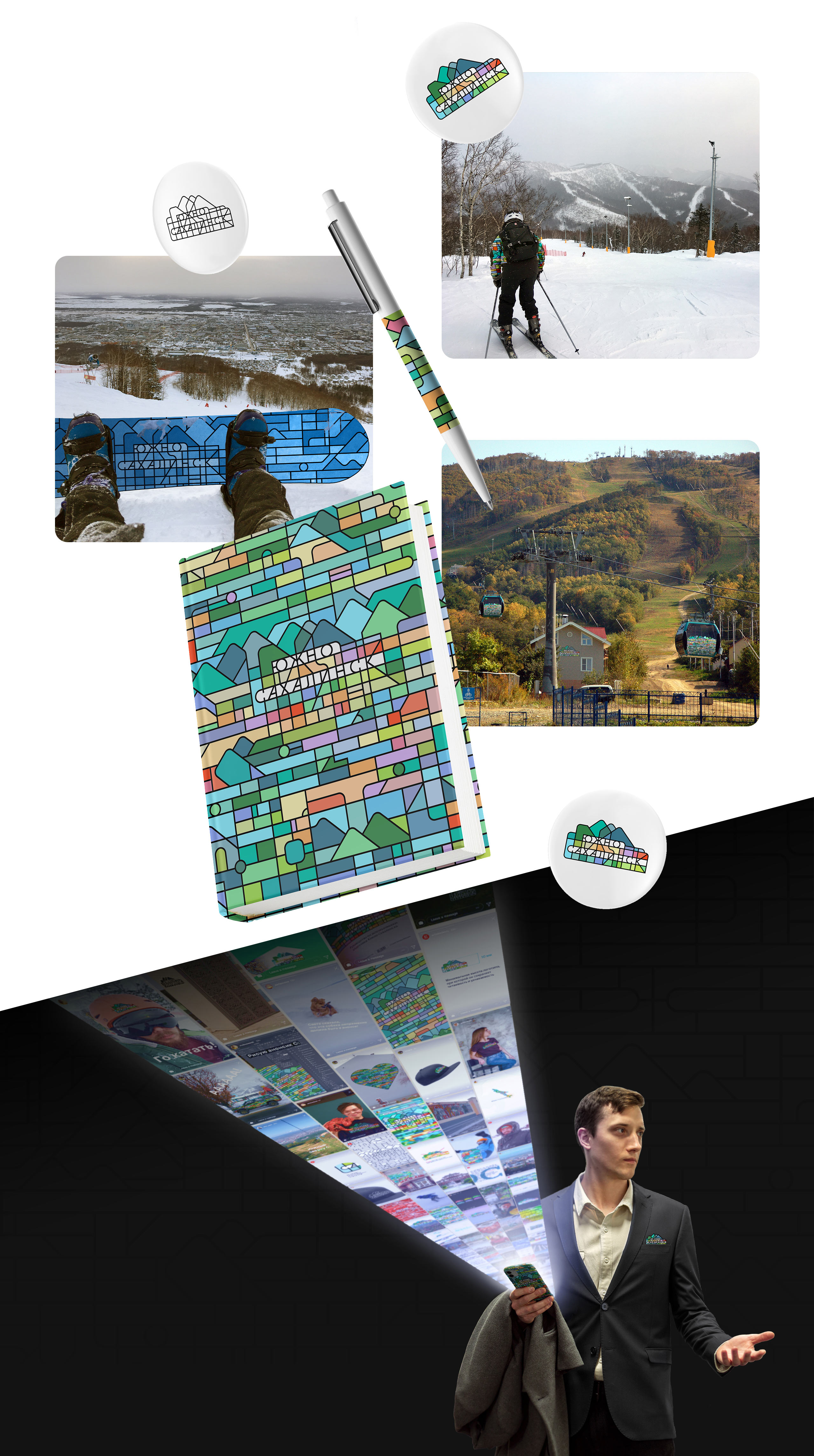
The logo has two versions: the primary strict one, and the dynamic one with through streets, intended for use in the design of less official informal events.
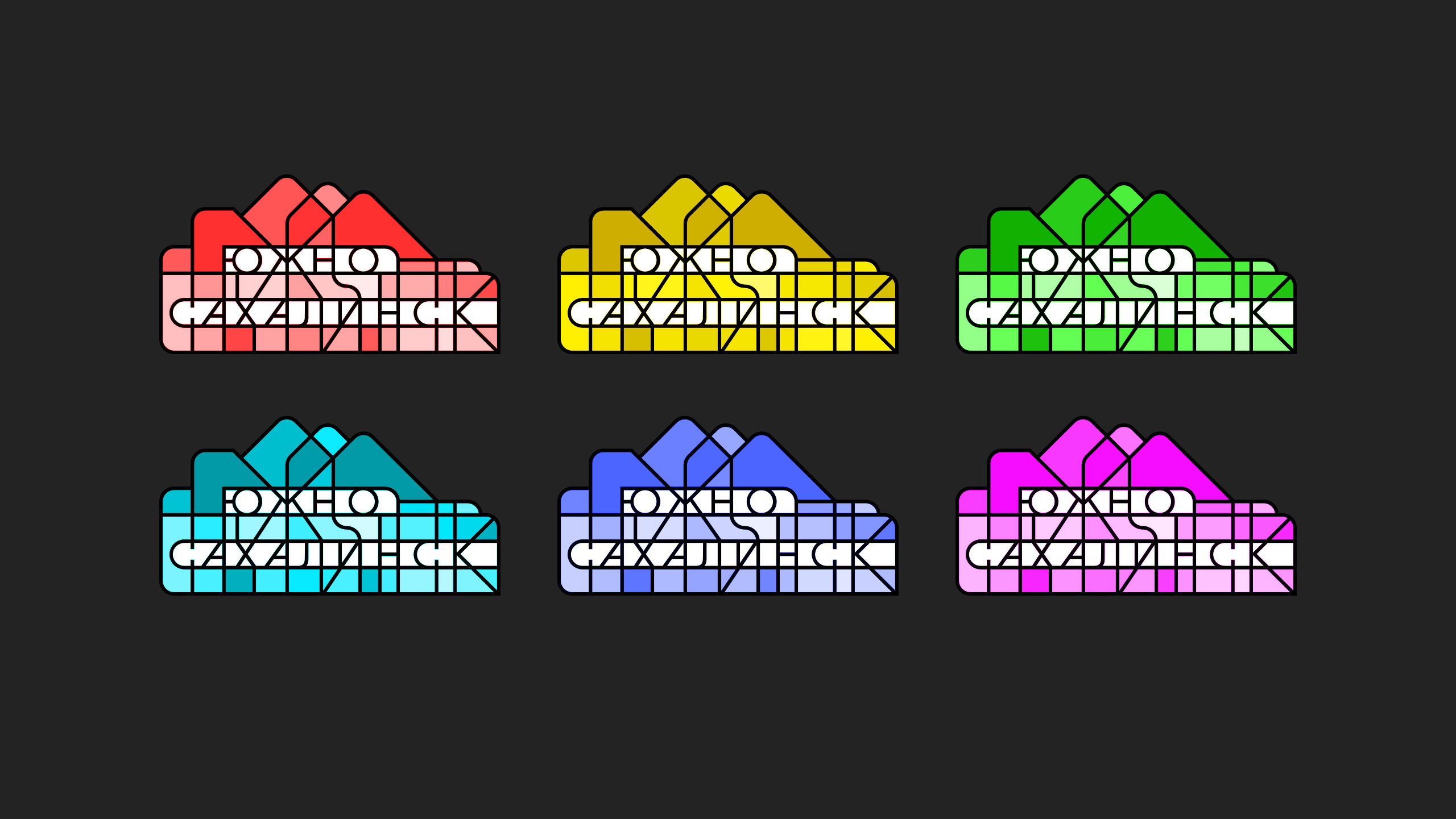
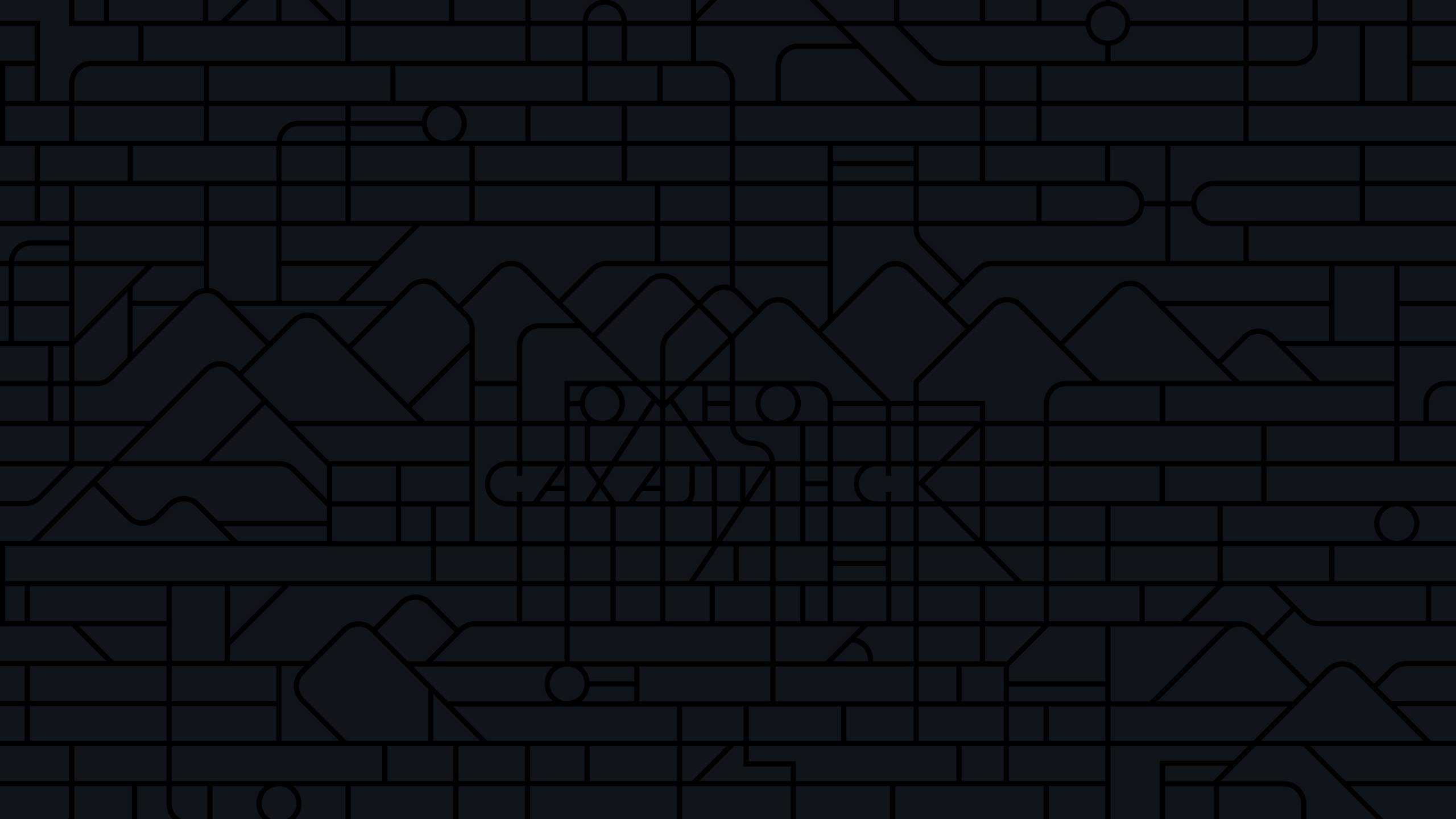
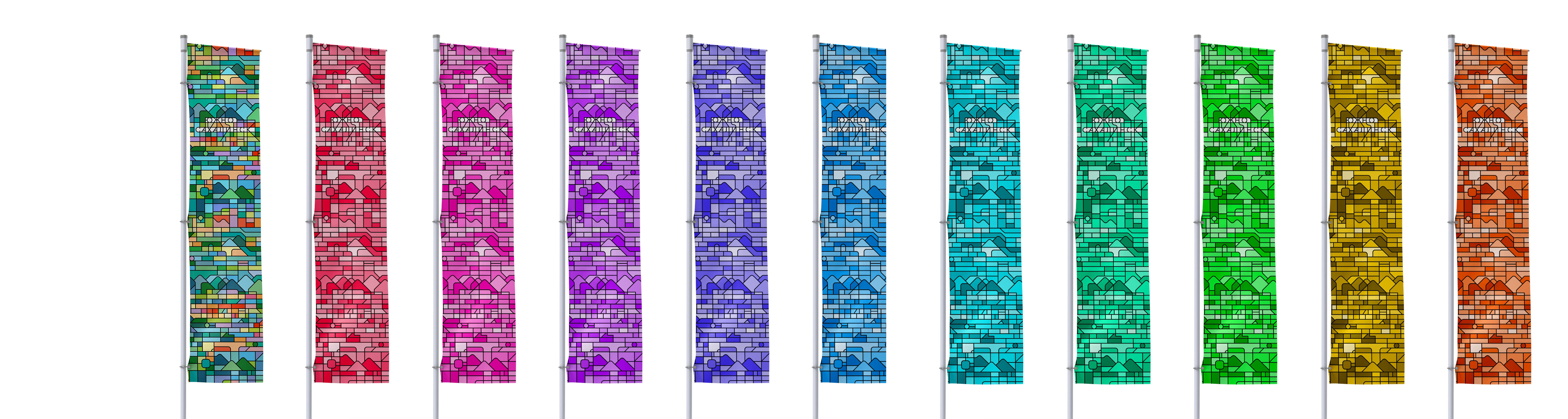
The colors of the logo can be easily changed depending on the design task, allowing various city organizations to use their own color schemes. The symbol remains just as expressive in monochrome.
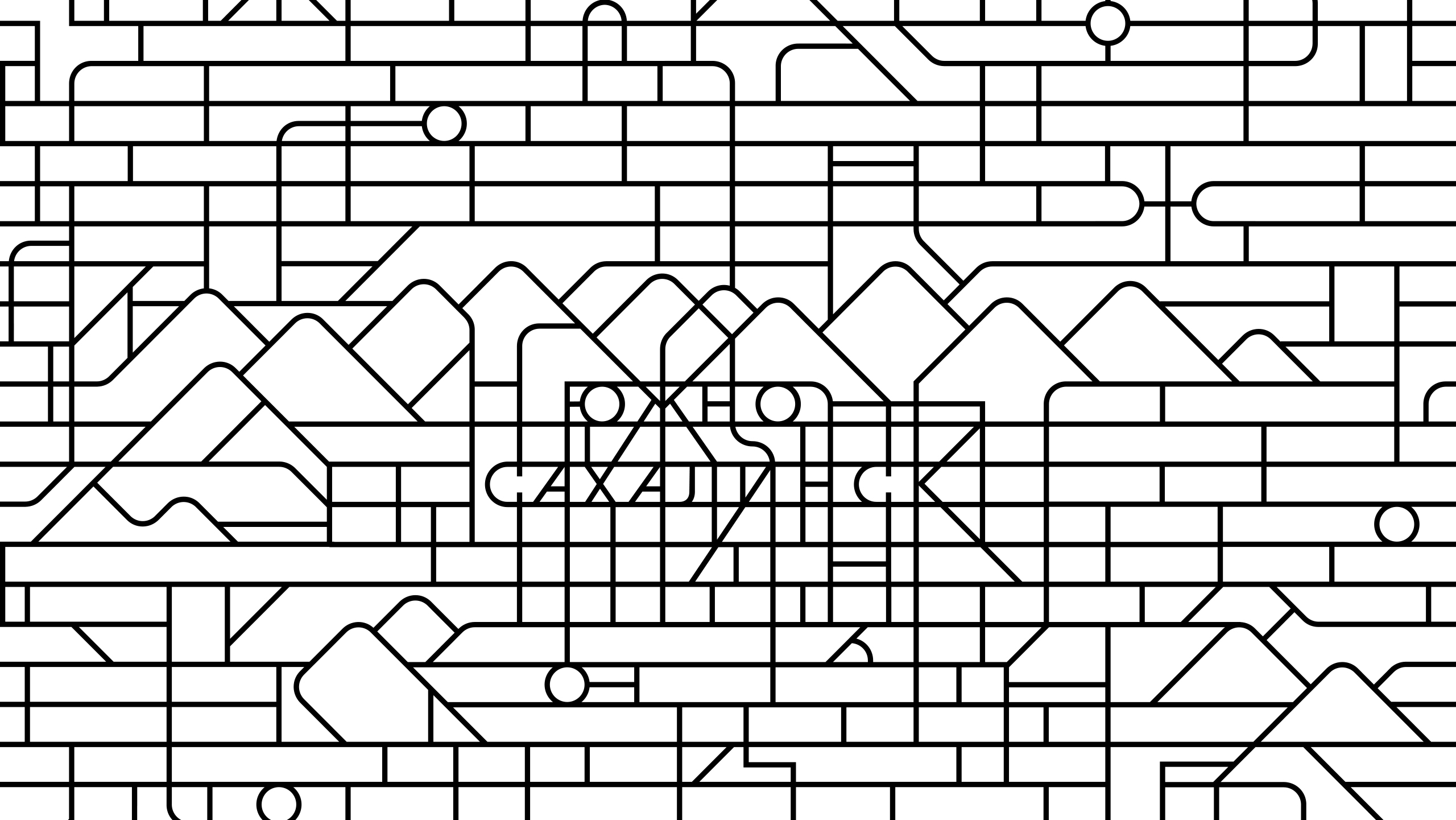
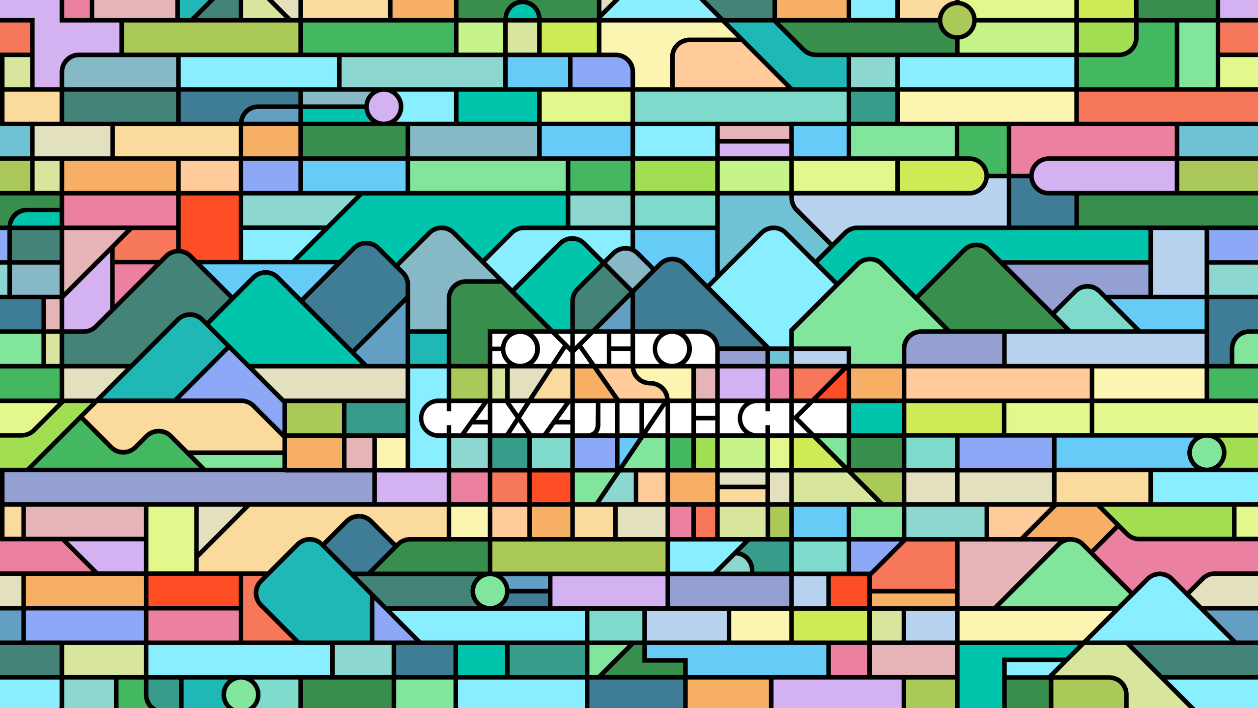
The pattern is based on the repetition of the grid of city streets and the outlines of mountains. Just like Soviet mosaics, it looks monumental and impressive.


art director
designer
client and general designer
- RTDA
general client
- Department of Architecture and Urban Planning of Yuzhno-Sakhalinsk
