
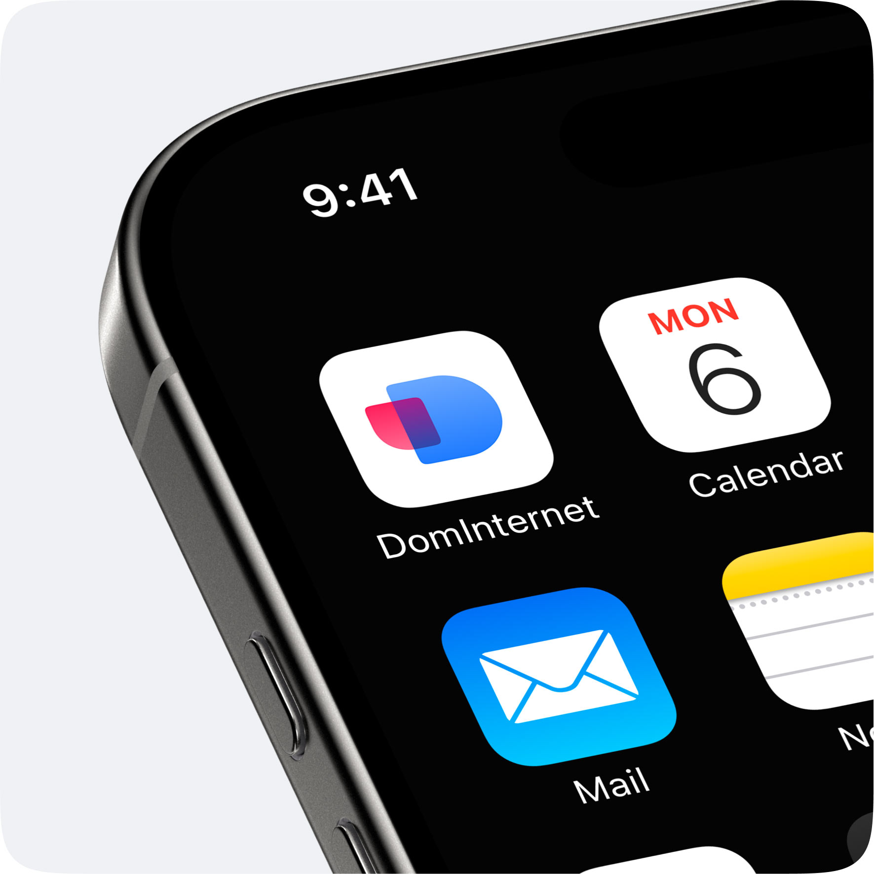
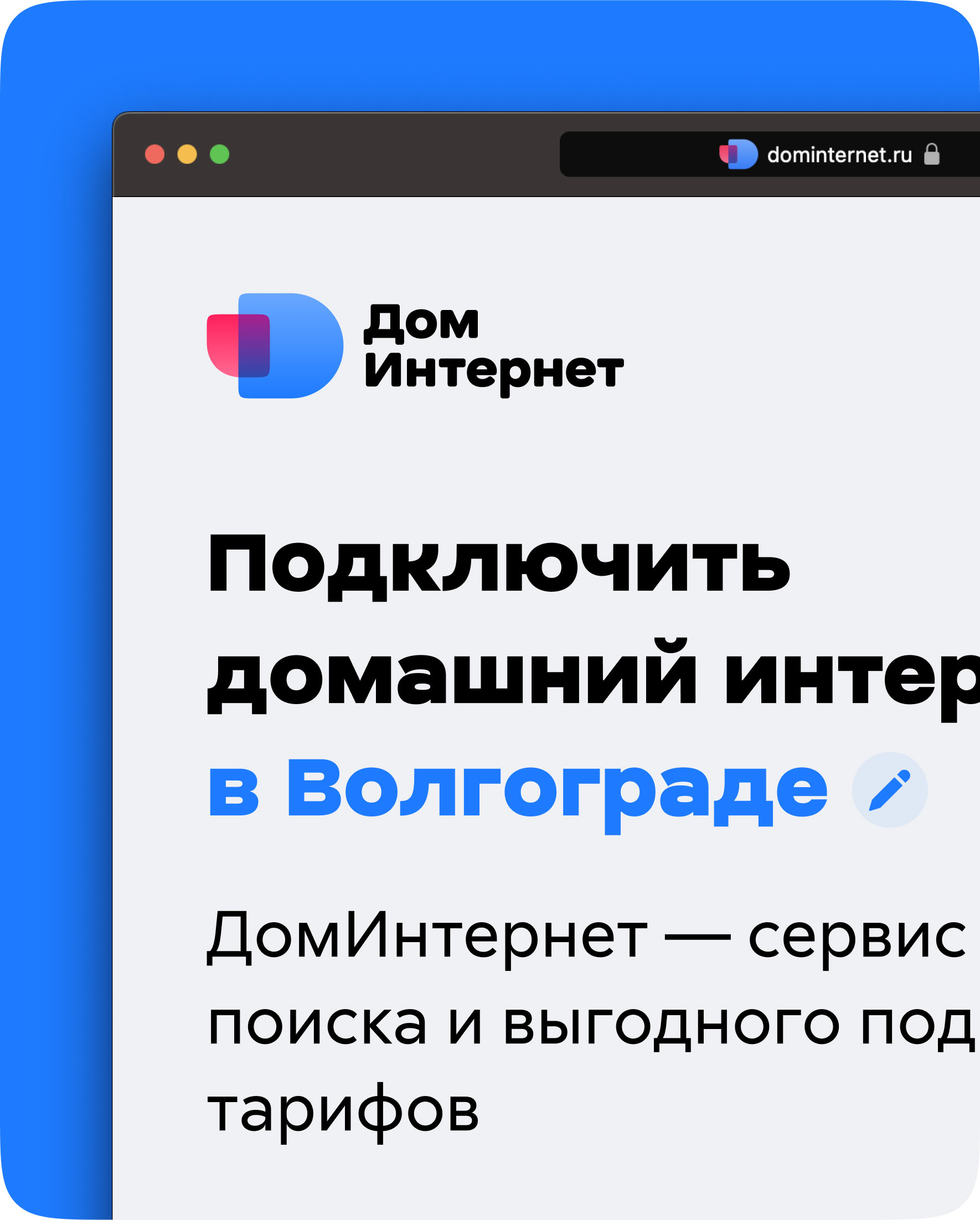
DomInternet is a digital services marketplace. It helps users find reliable internet providers, choose digital TV packages and connect smart home services. Any new offer from a partner provider is instantly available on the aggregator’s website. A brand platform and a transparent logo for the marketplace were developed in the studio.
Brand platform
We studied the Russian telecommunications market, researched the marketplace’s audience, identified key user needs and articulated the brand’s mission and essence. DomInternet makes access to digital services simple, secure and cost-effective for every family, enhancing people’s quality of life.

Four core brand values are described in detail within the platform and represented through simple, intuitive icons.

Identity
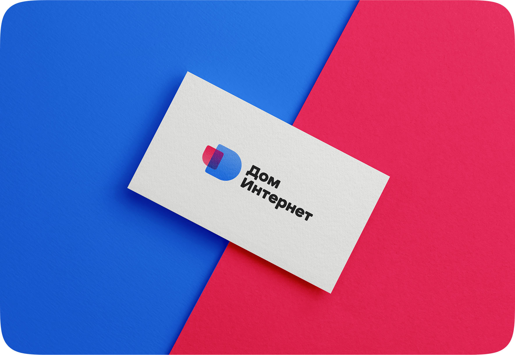
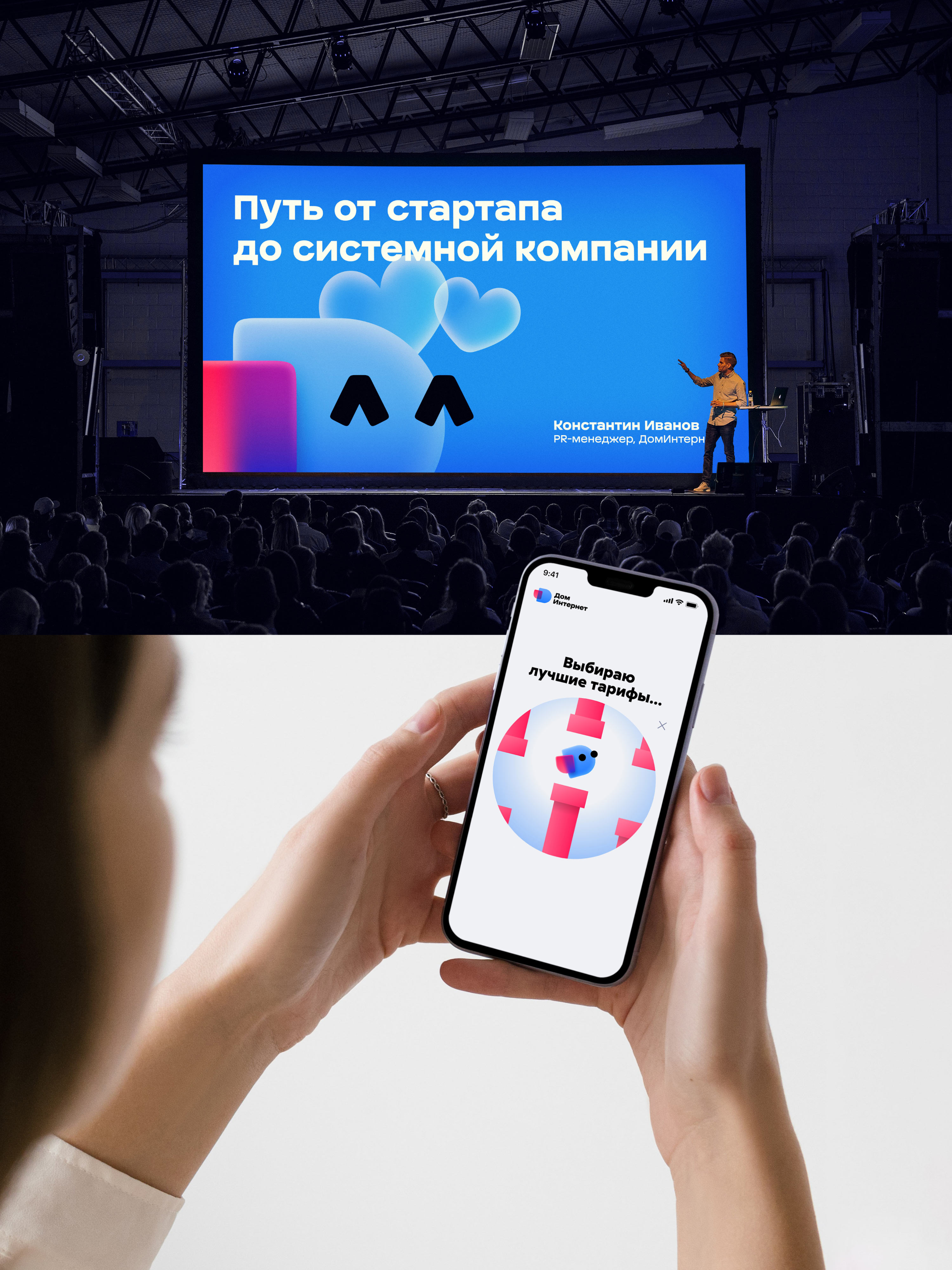
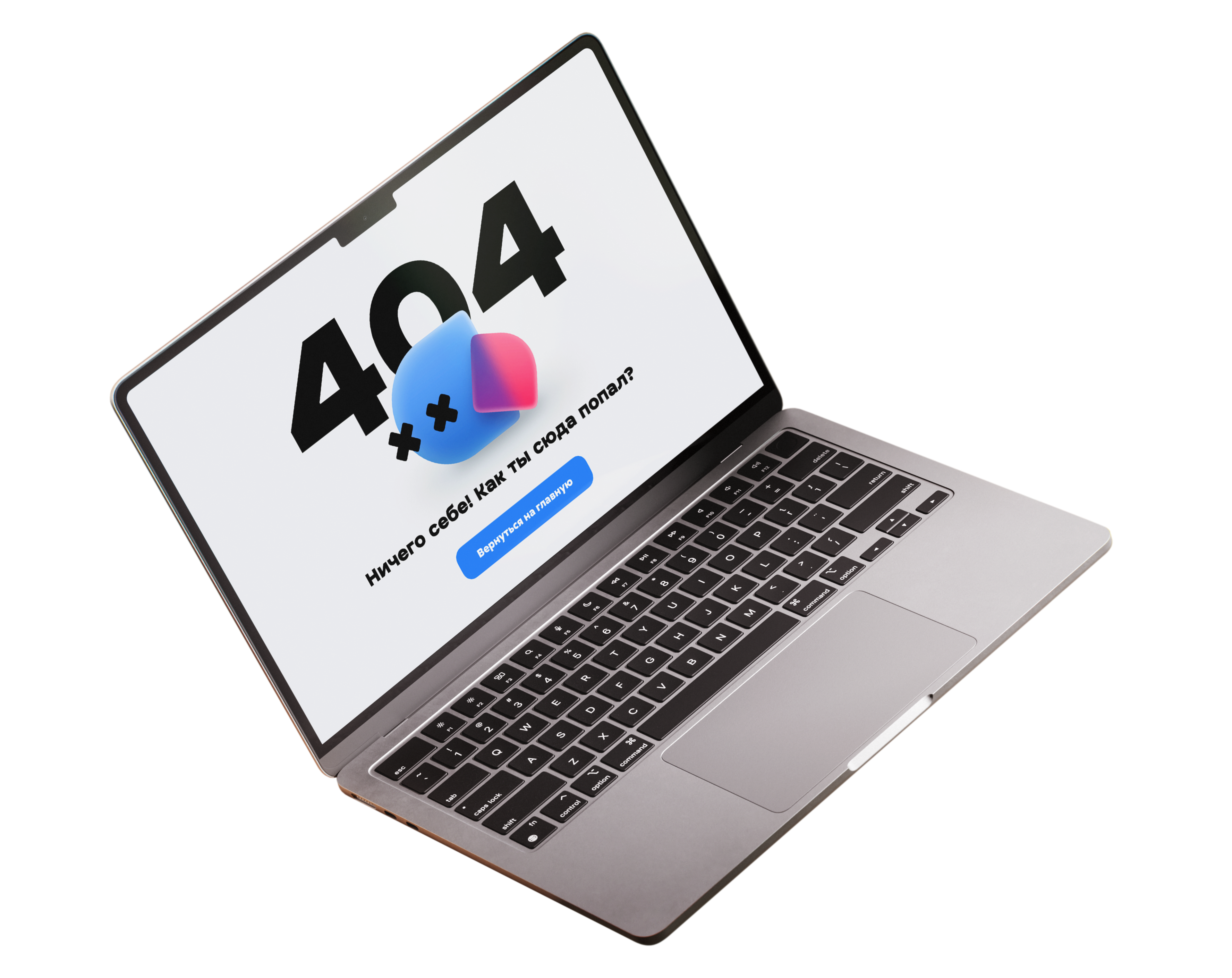
Based on the brand platform, we created the visual identity for DomInternet. The logo is built from gradient letters Д and И, which intersect to form a metaphor for the company’s interaction with its customers within a unified ecosystem.
This tech-forward logo, with its smooth and flowing shapes, conveys the speed and comfort of a stable connection. Its forward motion emphasizes the company’s ongoing commitment to progress and innovation.
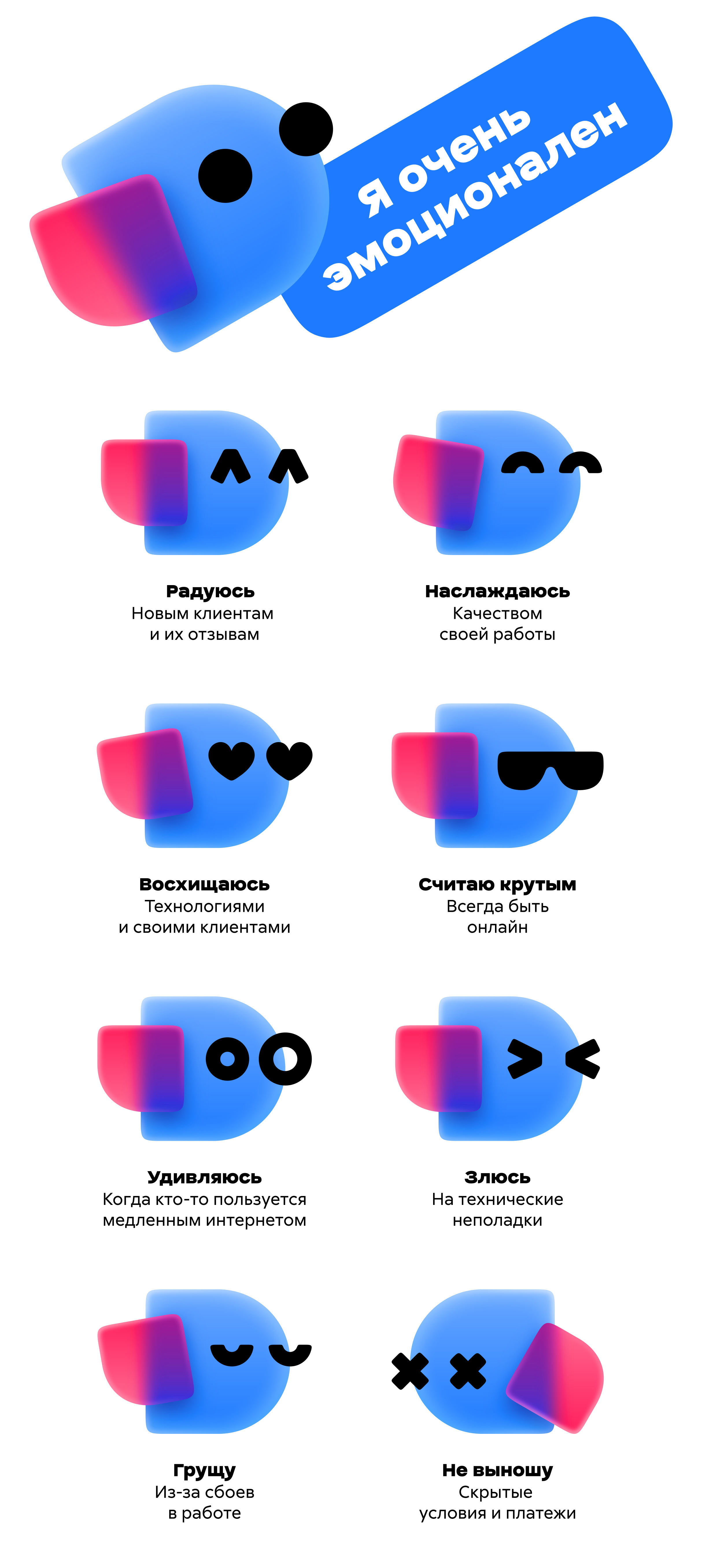
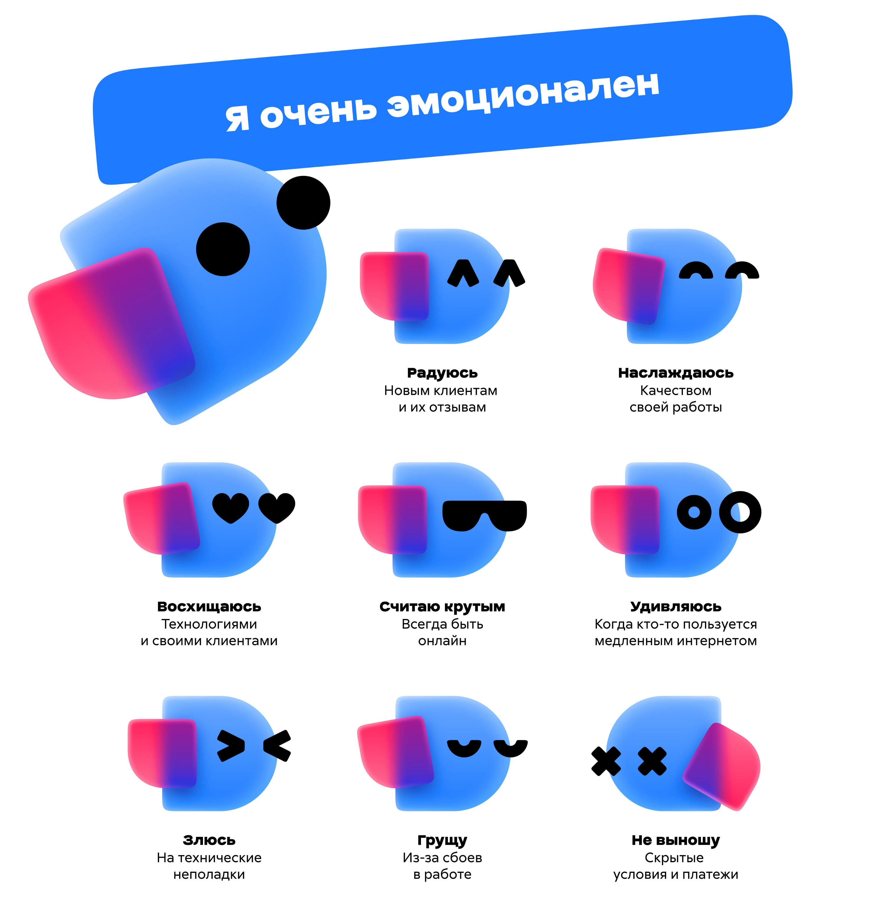
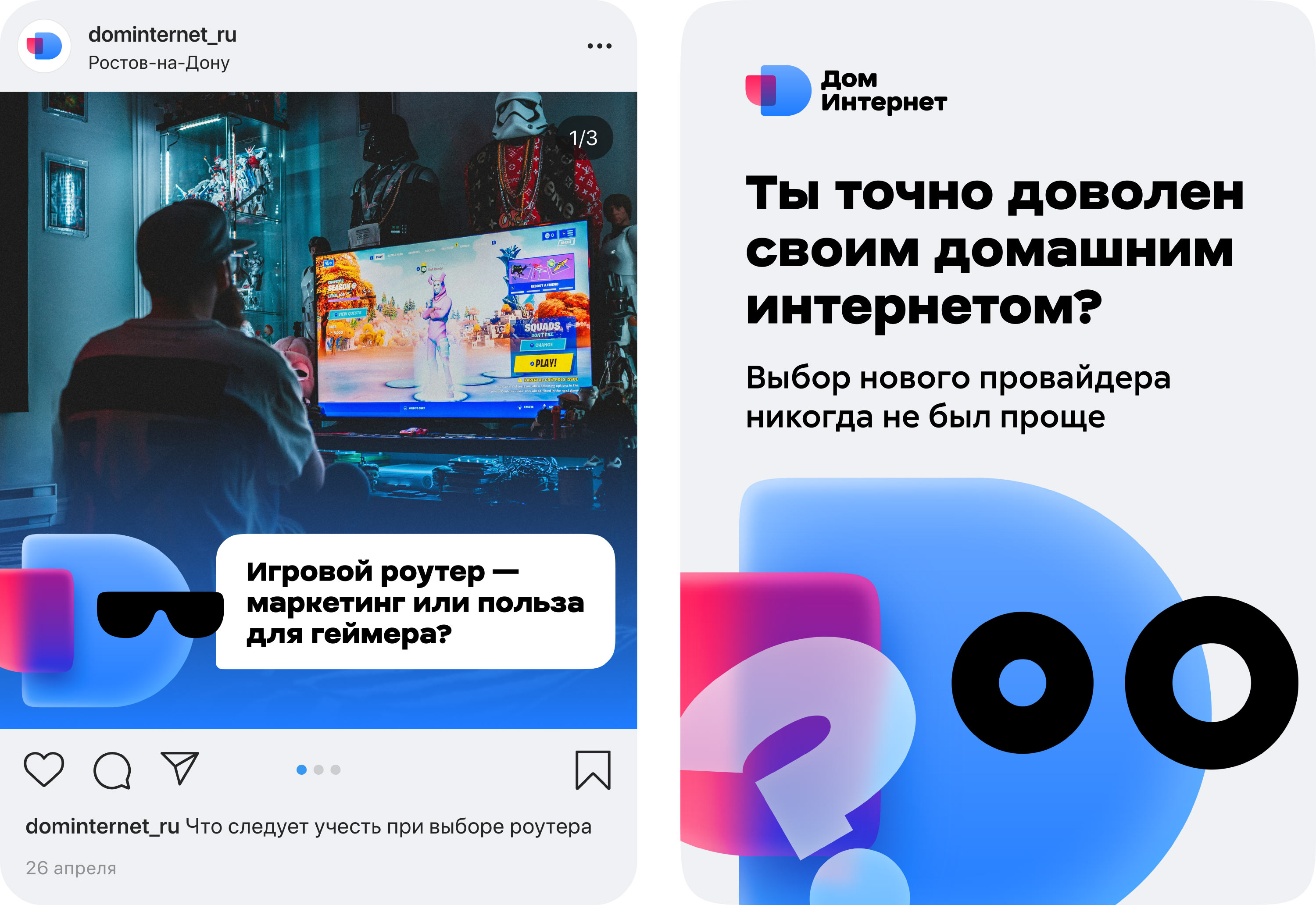
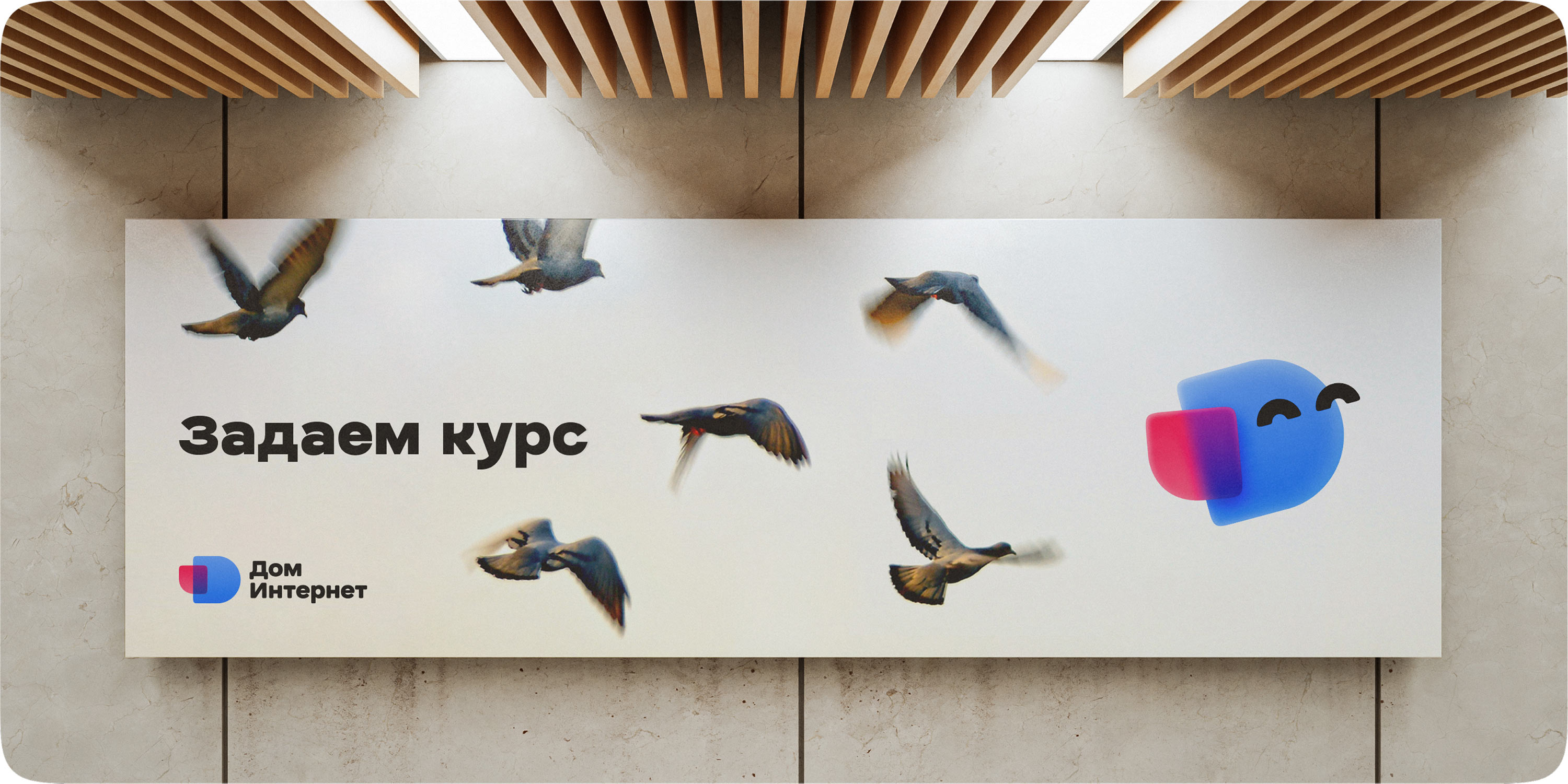
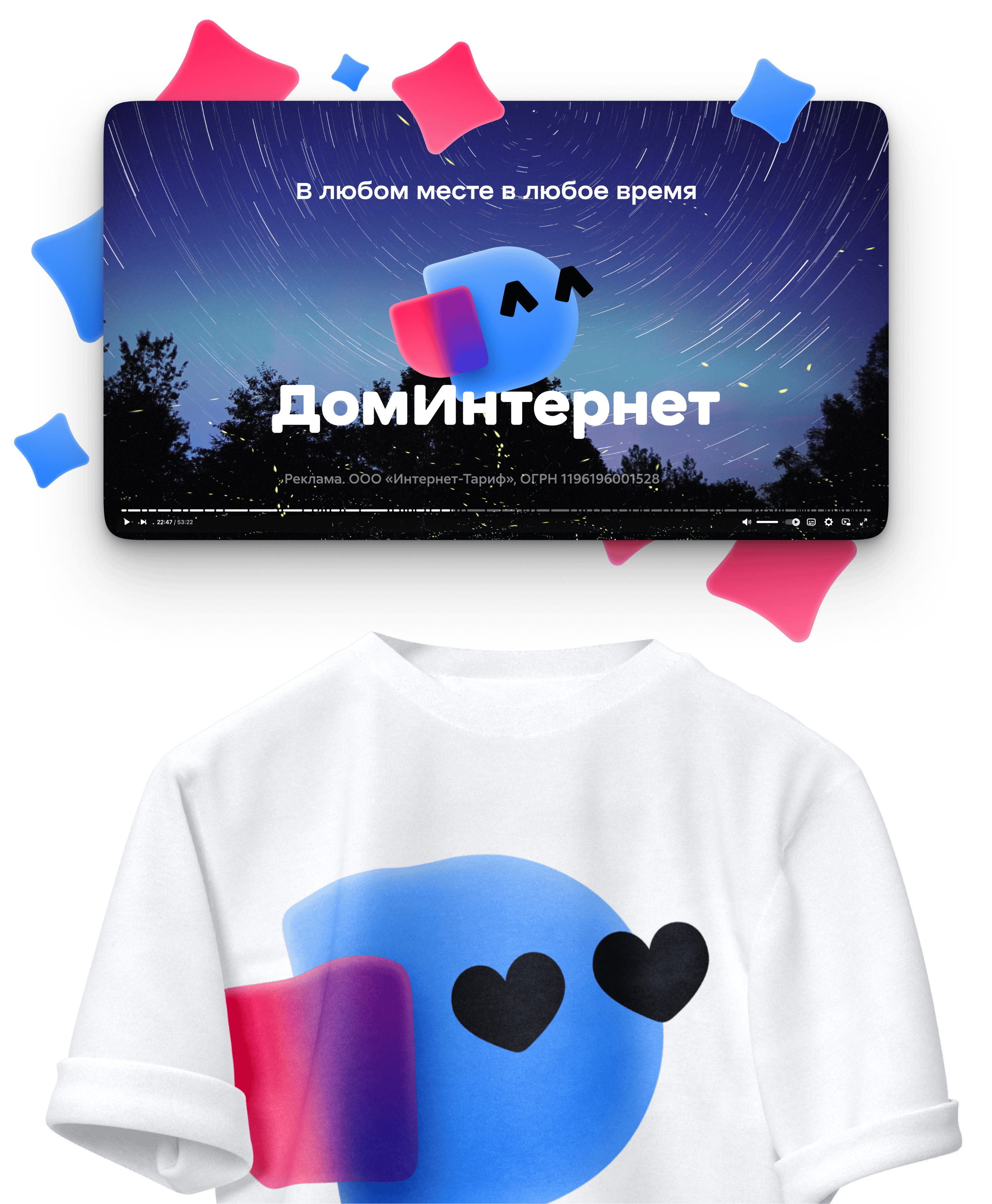
When visitors need practical advice, the logo transforms into a helpful character—a smart and nimble bird. This mascot is quick-thinking, responsive and always on the move.


Jet, the mascot, communicates in a friendly manner, actively expresses emotions and makes user interactions with the service more engaging and enjoyable.

art director
designer
- Ruslan Poklonskiy
