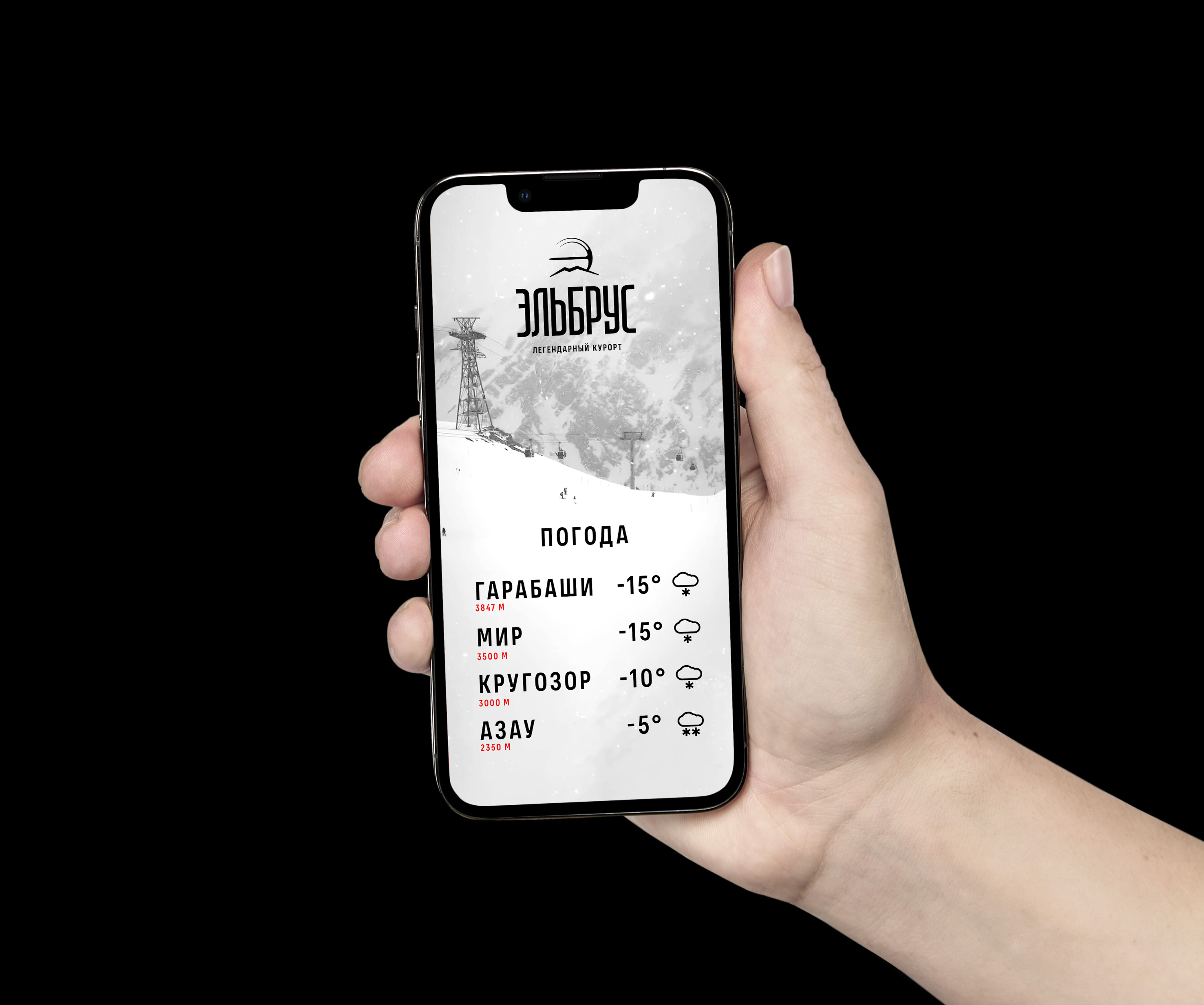
Elbrus resort identity
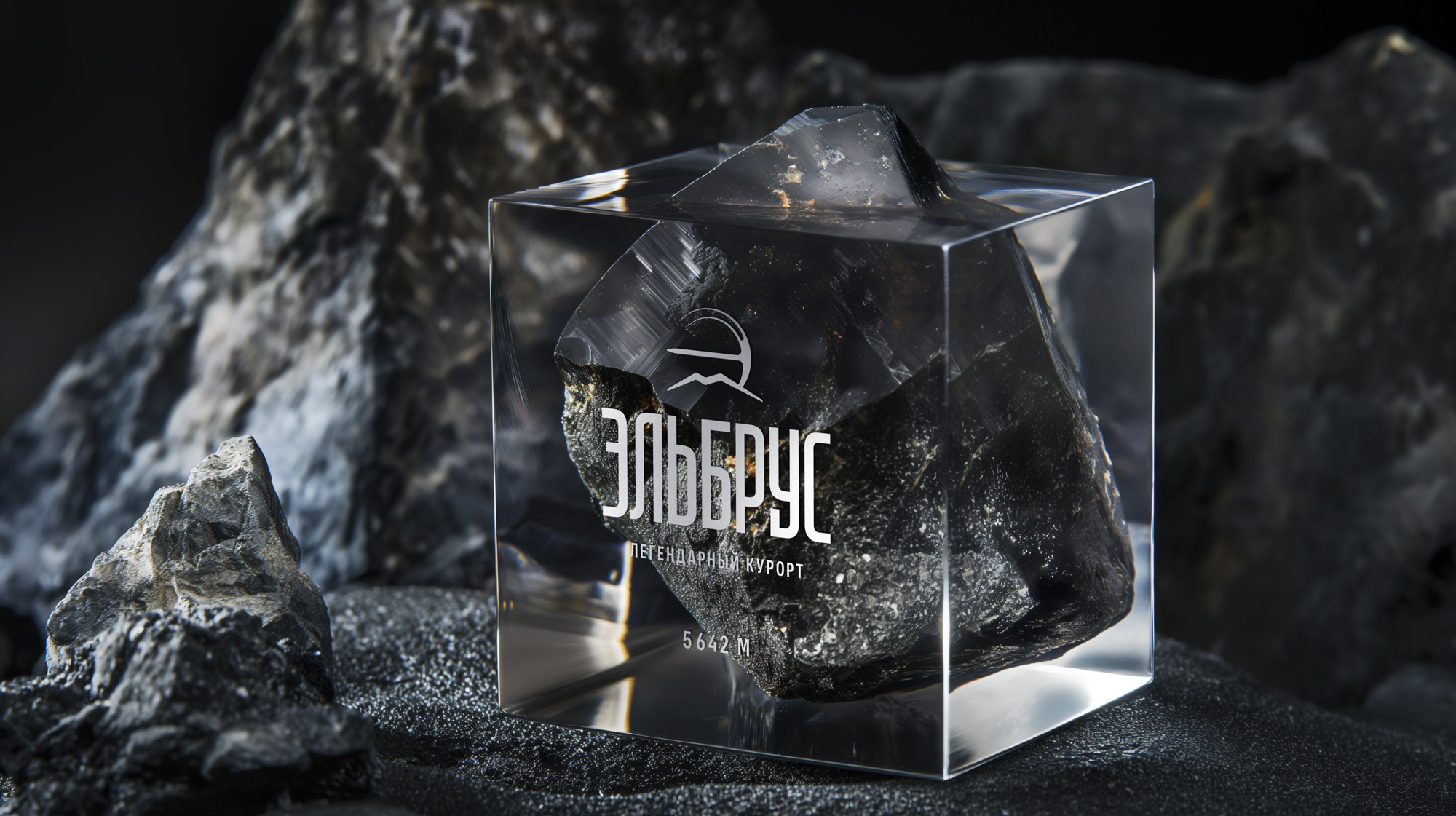
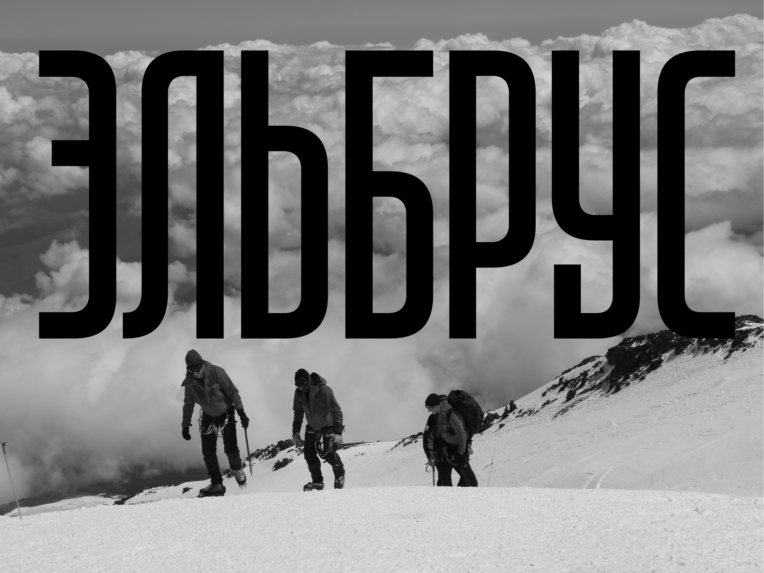
Elbrus is one of the greatest peaks in the world, standing at a height of 5,642 meters. It is the highest mountain in Russia and the whole of Europe. Today, the local infrastructure is developed to such an extent that Elbrus is happily visited by Russian and foreign tourists, athletes, climbers and lovers of breathtaking beauty.
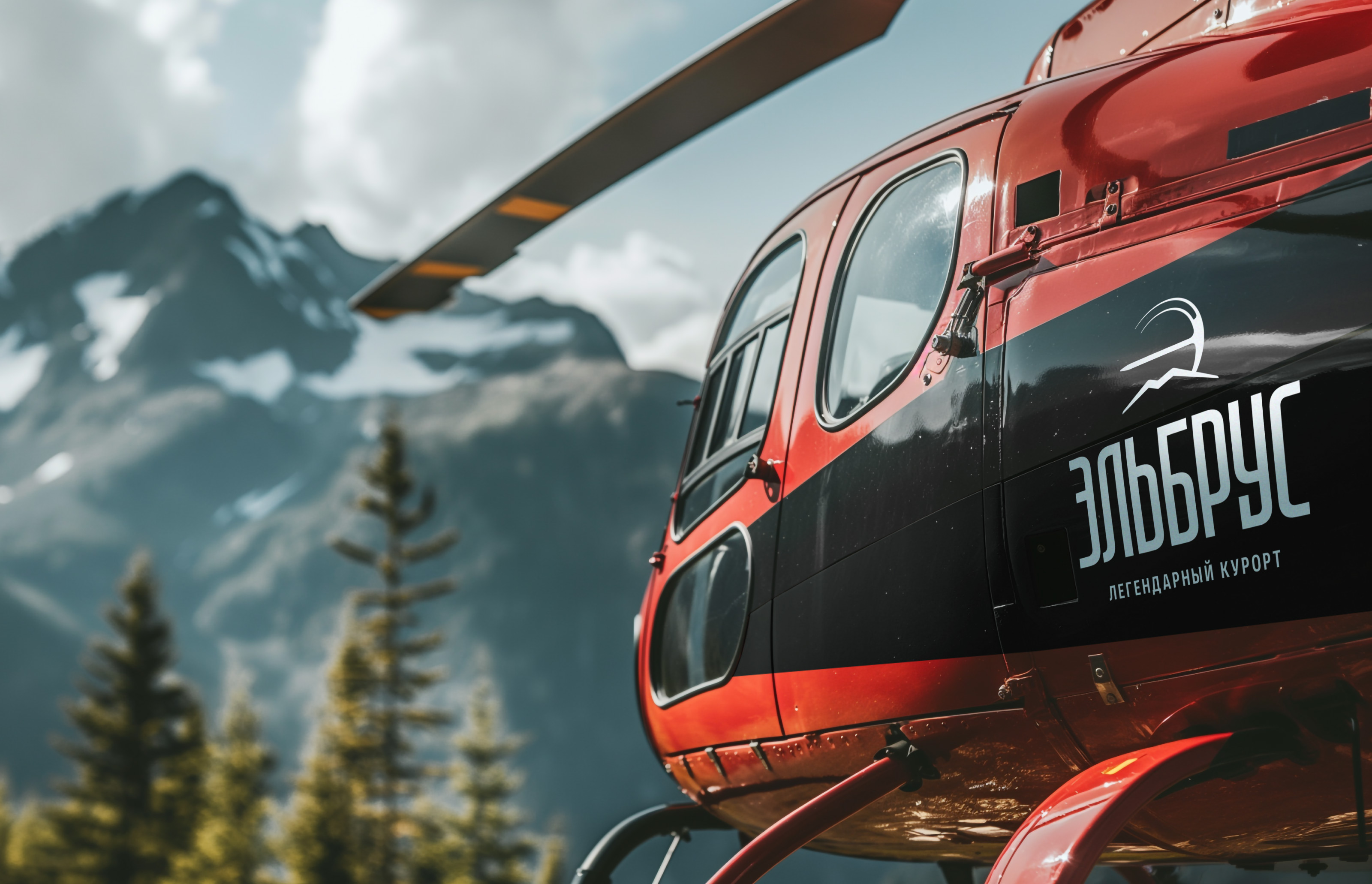
With the launch of the construction of the cable car in 2016, a new stage in the development of the resort began. We have developed an identity that reflects the character of the place and accurately conveys its atmosphere.
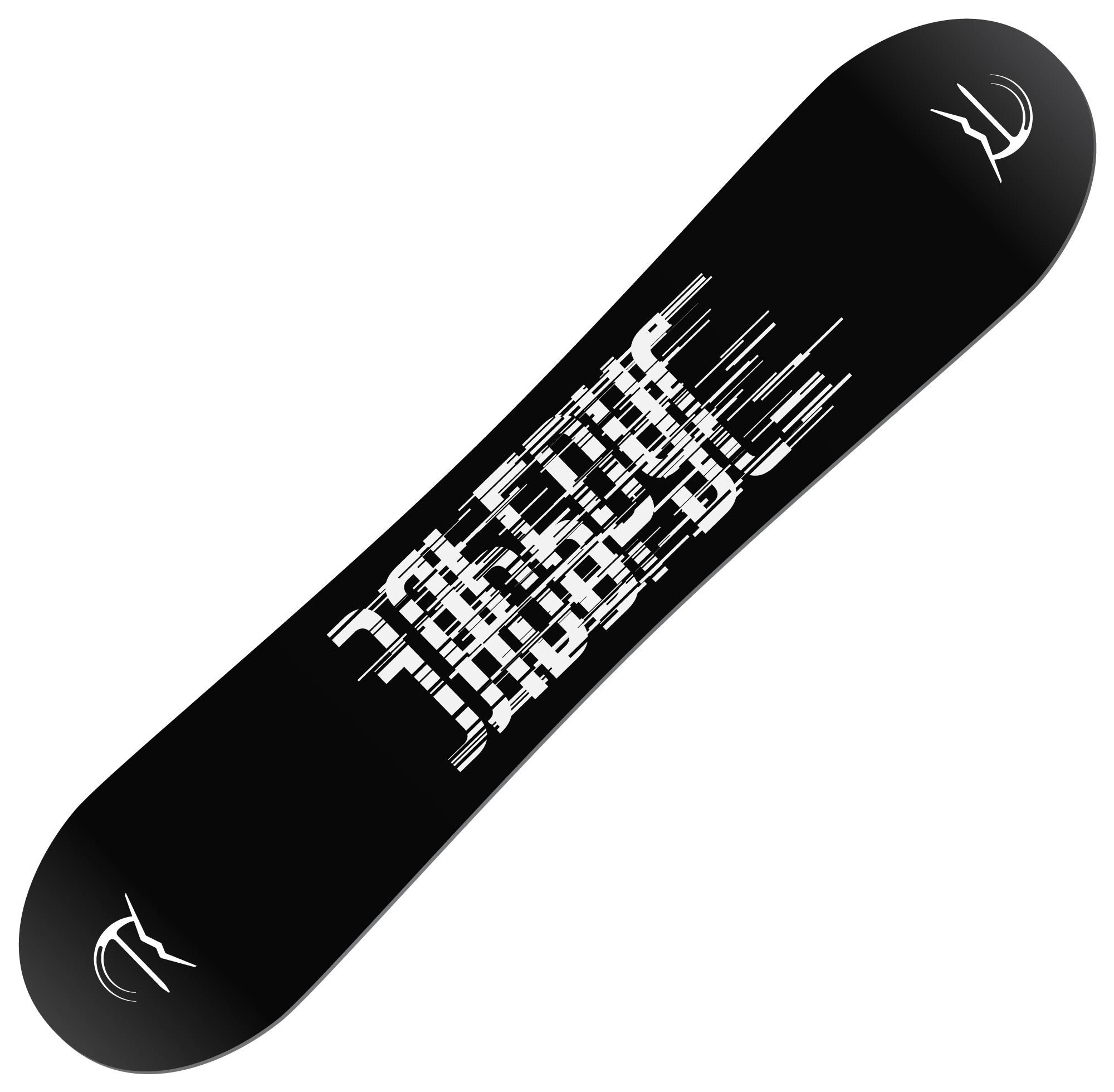
The symbol, reminiscent of the letter “E,” combines the recognizable peaks and an ice axe, an attribute of thrill-seekers.
Thanks to the narrow design of the text part, the logo strives upwards, towards the clouds. The consistent thickness of the stroke emphasizes the severe yet incredibly attractive spirit of the resort, while the multi-level horizontal elements resemble slopes.
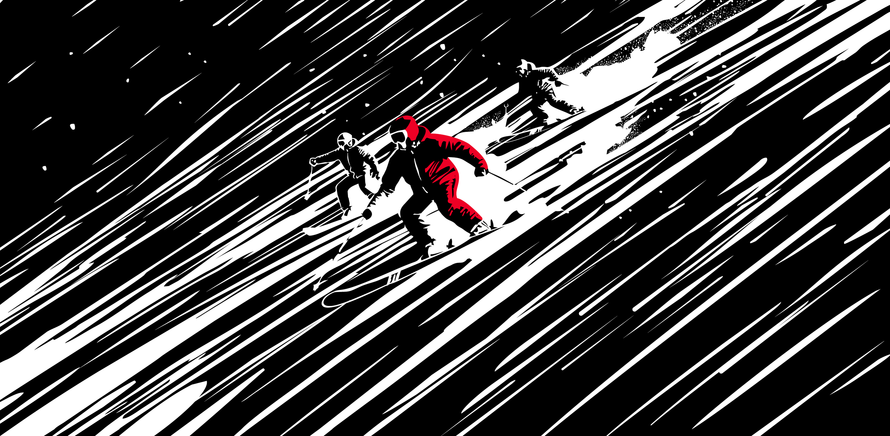
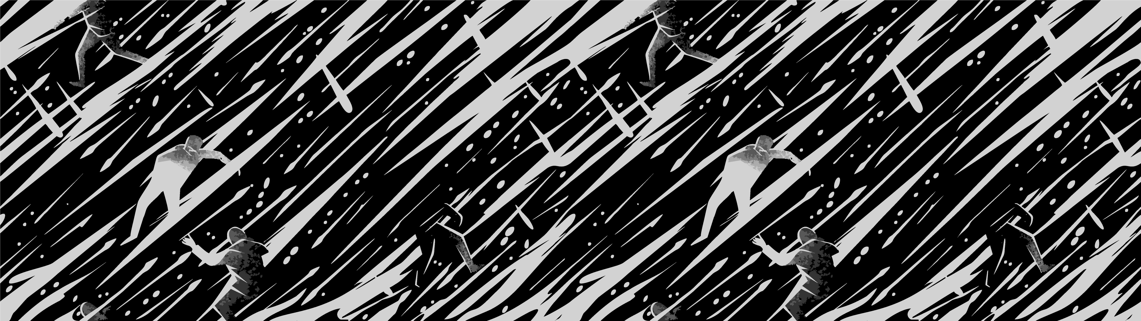
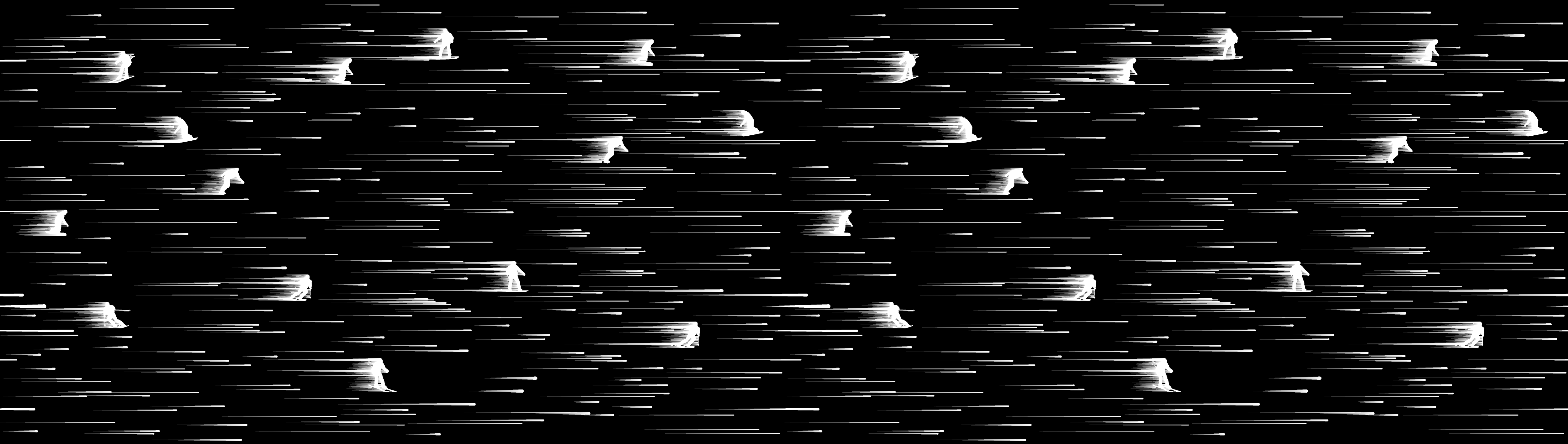
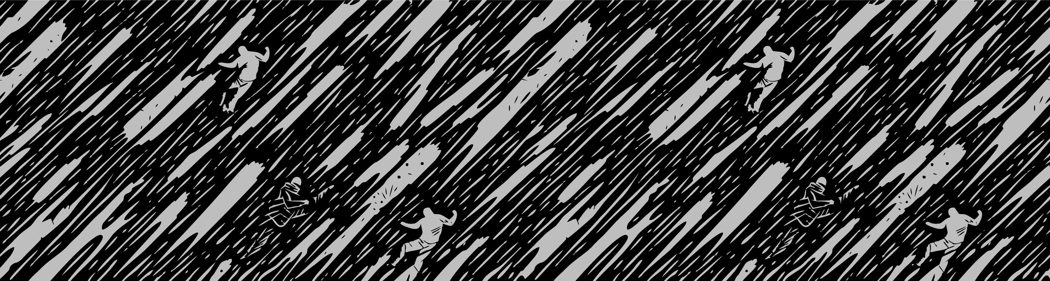
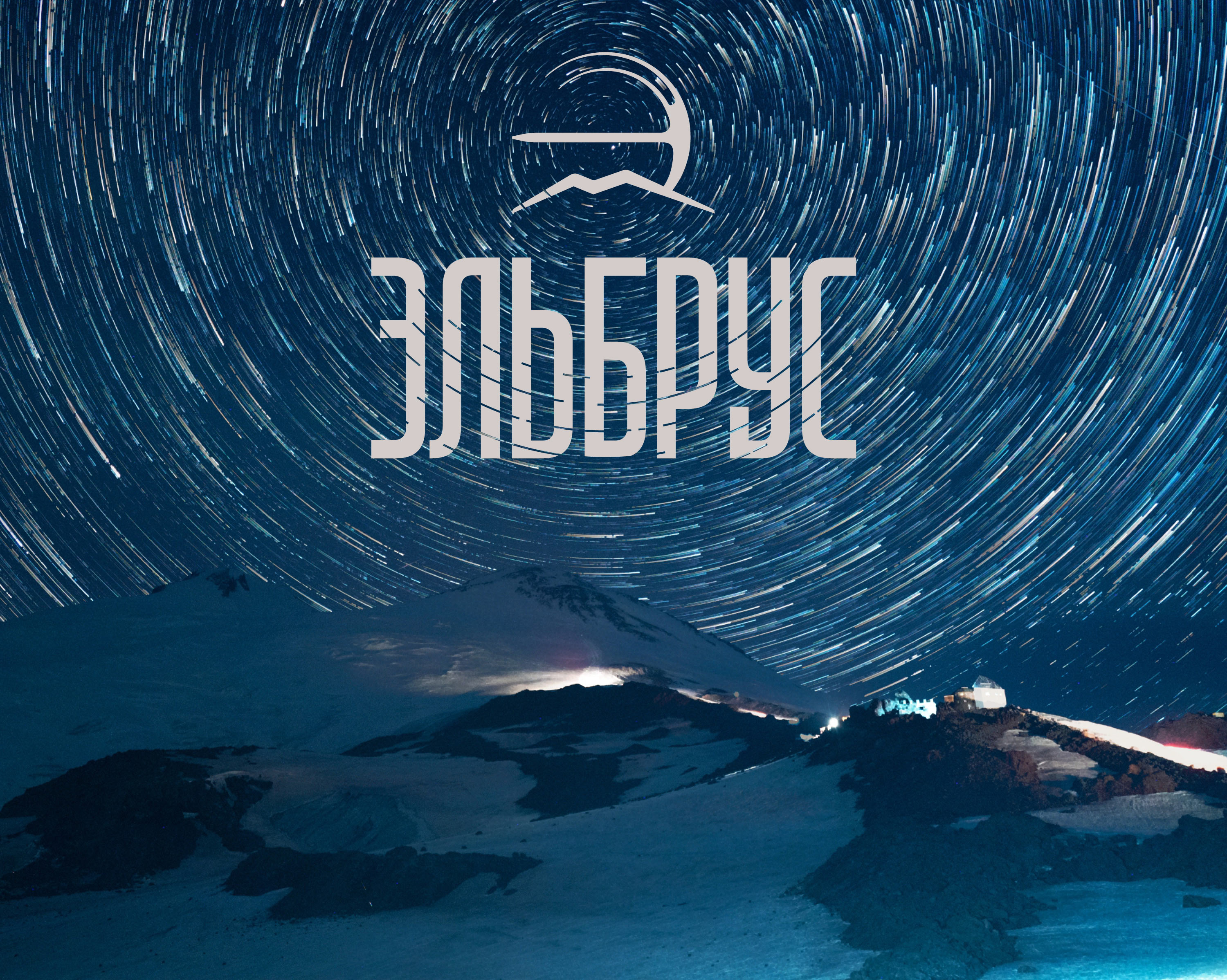
The overall execution of the logo changes, like the weather in the mountains: calm snowfall is replaced by a fierce blizzard.
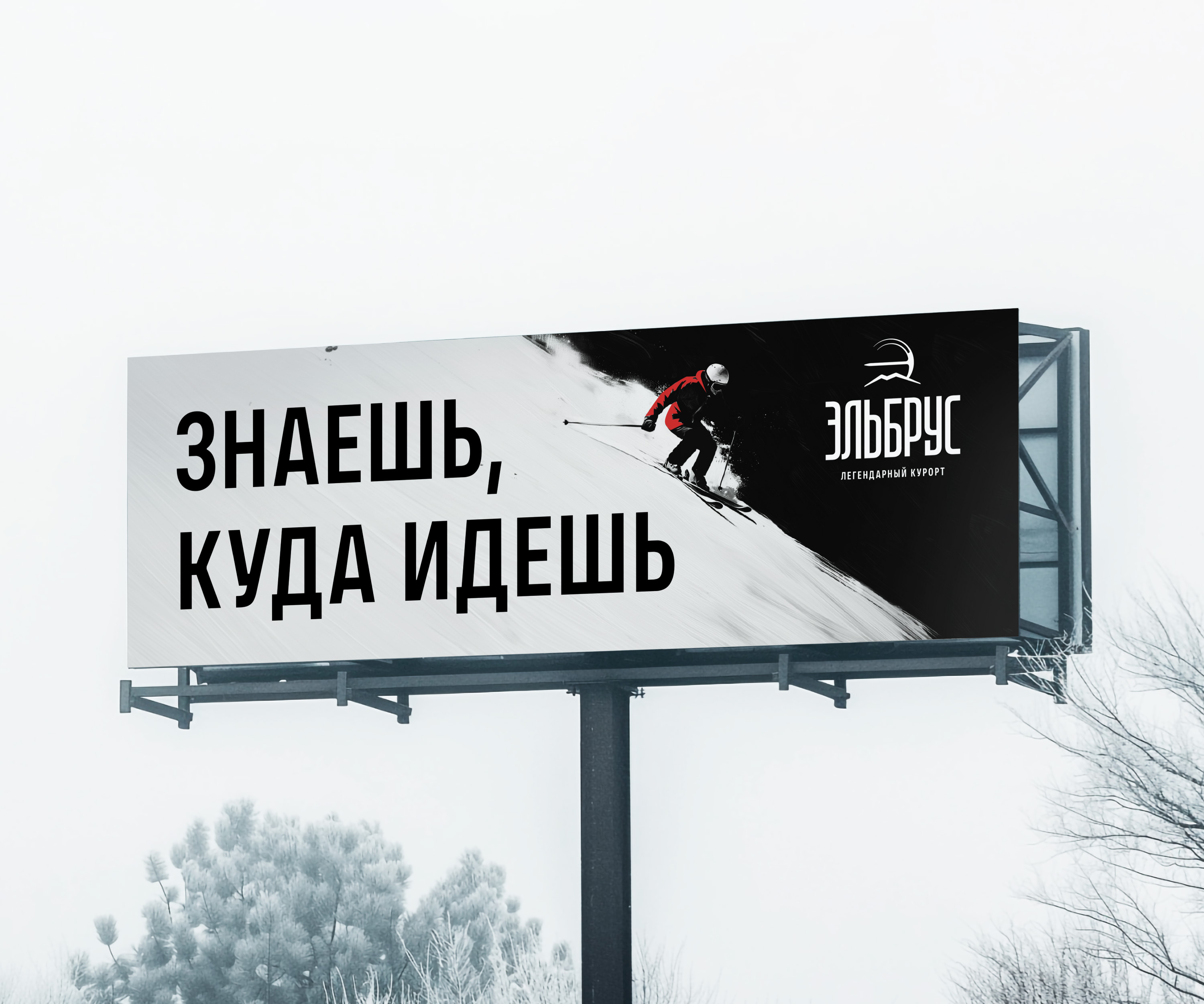
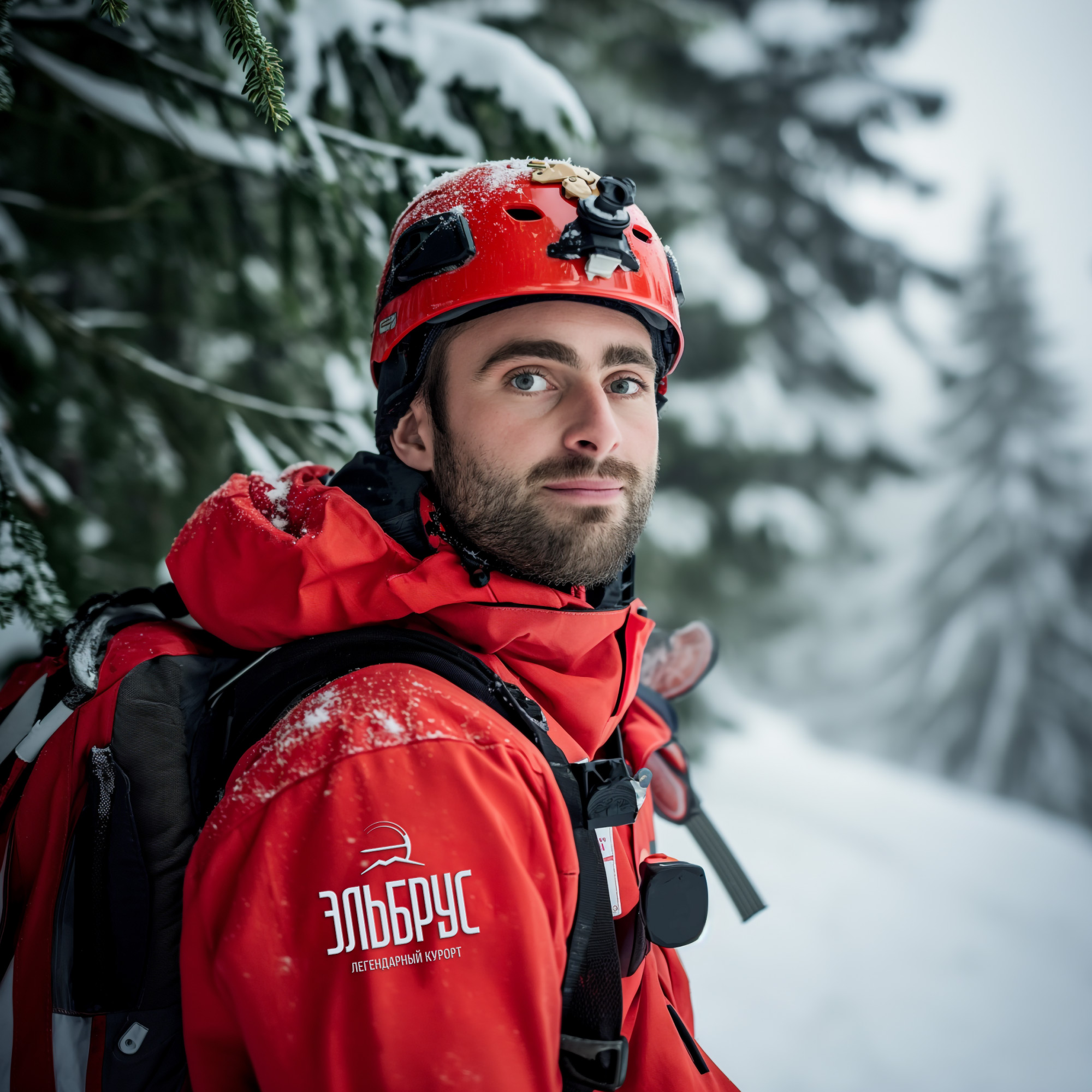
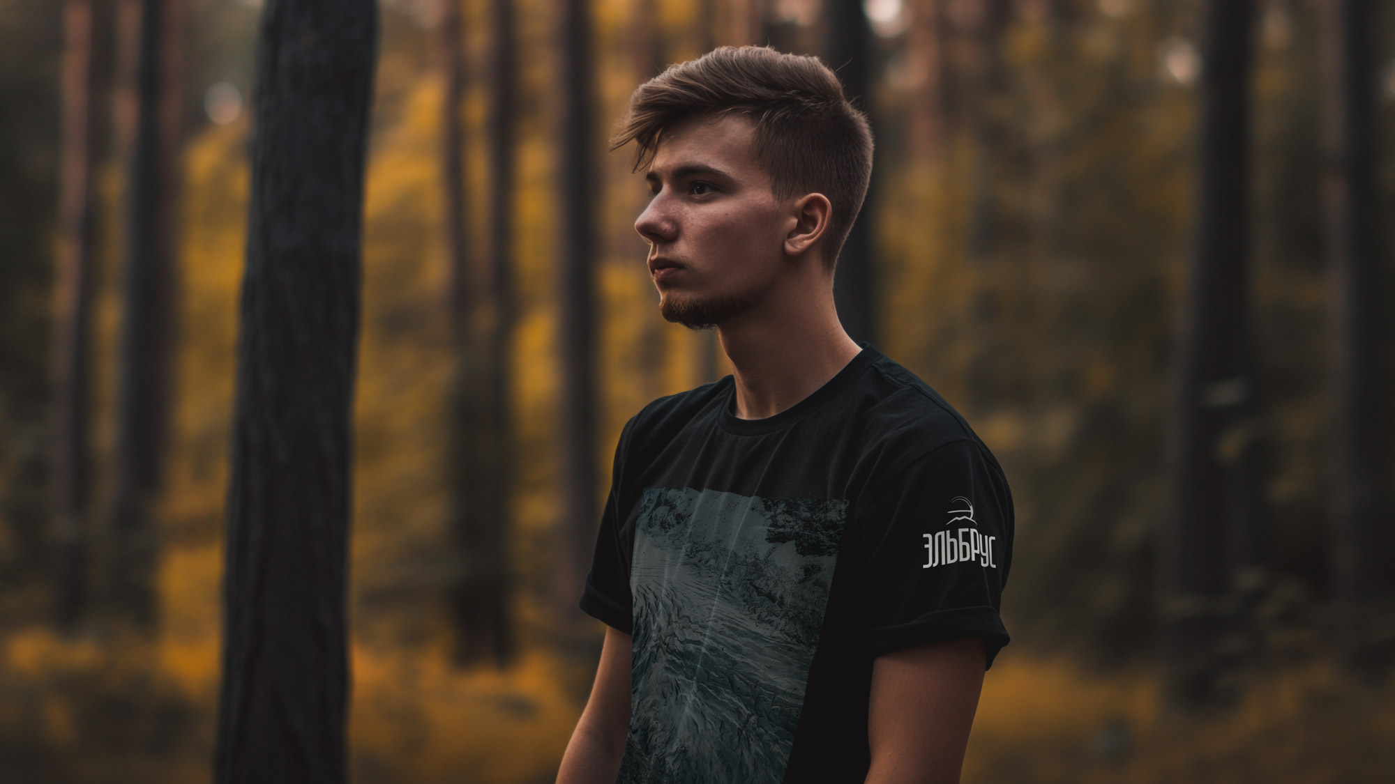
The color palette is simple and universal: the black and white colors are complemented by a bright accent, such as red.
On dynamic and cheerful patterns, small figures blend with the elements, boldly and persistently moving towards the set goal.

art director
designers
- Valery Tolchanov
- Kydana Ignateva
type designers
- Taisiya Lushenko
- Alexey Malkov
