For thirty years Ekaterina Markovna walked her usual route past the grocery store, the kindergarten, the unfinished swimming pool to the local polyclinic of the Cheremushkinsky district. There she, as always, left her coat in the crowded coat room, walked up the shabby stairs to room seventy six where doctor Marina Leopoldovna would listen to her complain by the script she perfected over the years. Every single time all of this happened in the same depressing atmosphere. But on March 15, 2019 something changed, and the changes were initiated by the Moscow Department of Health.
At the entrance to the Cheremushkinsky District Polyclinic, Ekaterina Markovna was greeted by a new logo.
As it turned out, even more things changed inside.
Printed materials
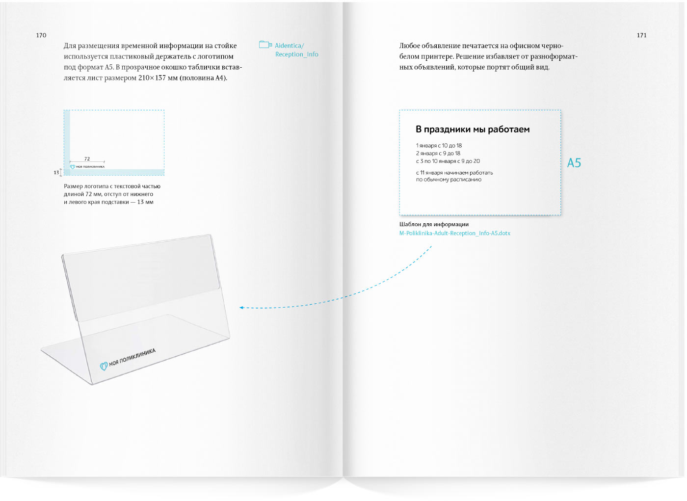
All of a sudden, the polyclinic became friendlier. The walls are now adorned by beautiful, nicely typeset announcements about seasonal shots and instructions on how to prepare for checkups (Ekaterina Markovna even paused to read about Alzheimer’s). Large icons make the nature of the message obvious from a distance.
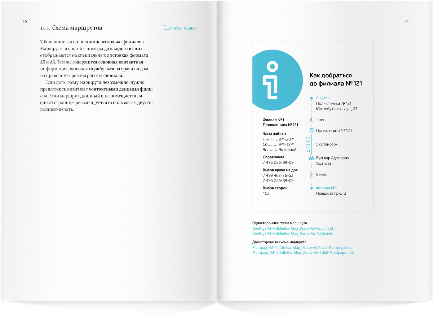
There are clear guidelines on how to get to other medical facilities. It often happens that you have to go to the other end of town to get your X-ray and it’s up to you to find your way there. No more: now it’s all simple and clear.
Appointment tickets were also updated, they now have the most important information—appointment date and time—printed in large type.
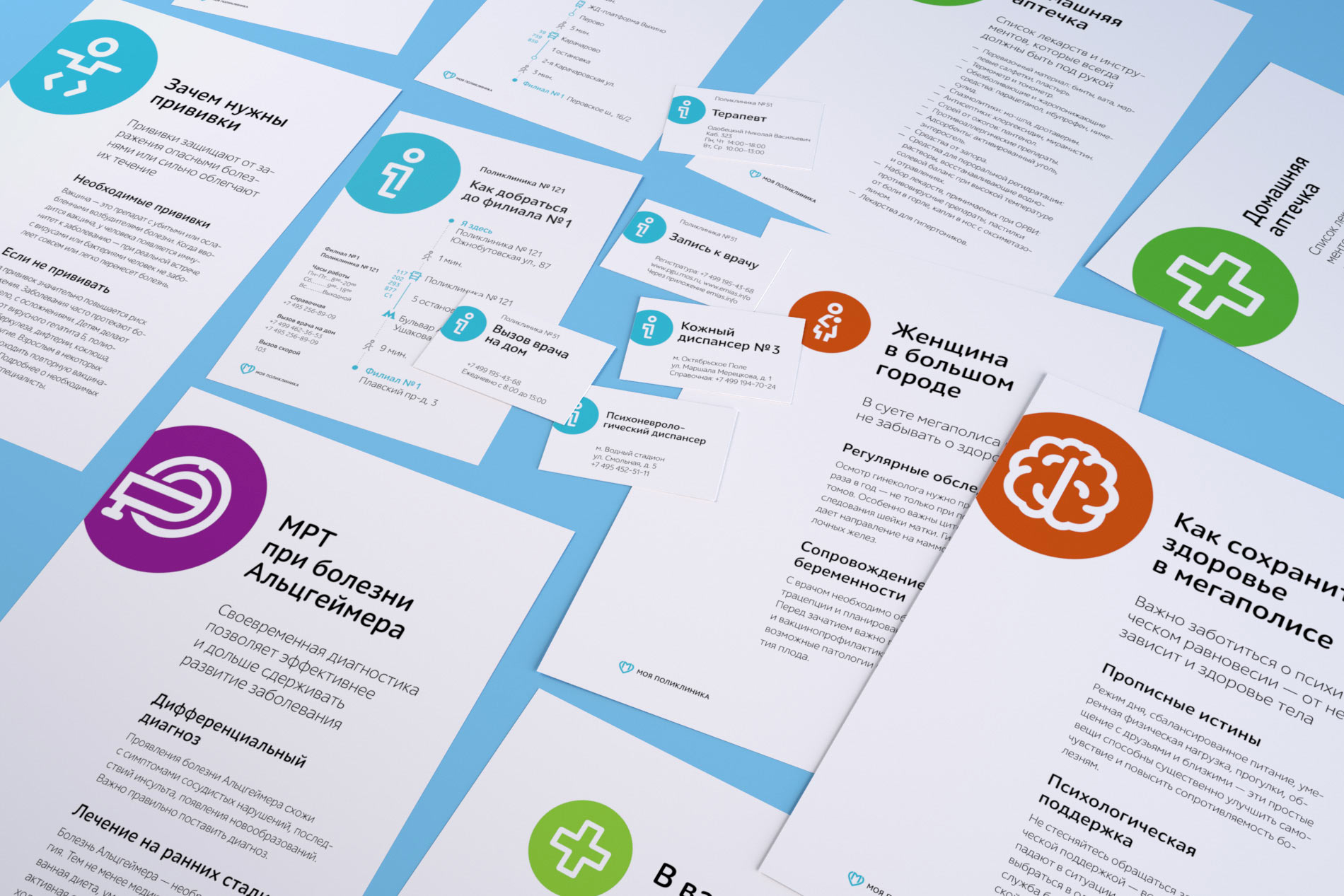

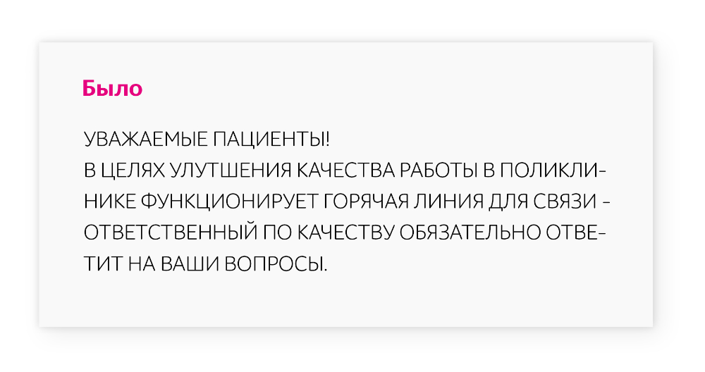
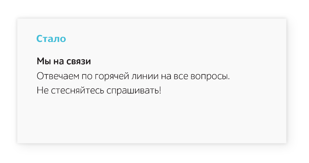
The announcements are now written in plain language. Everyone suddenly realized that the simpler the message, the easier it is for everyone to understand it (really, all texts are now written according to special recommendations that explain how to write clear and concise messages that people would want to read).
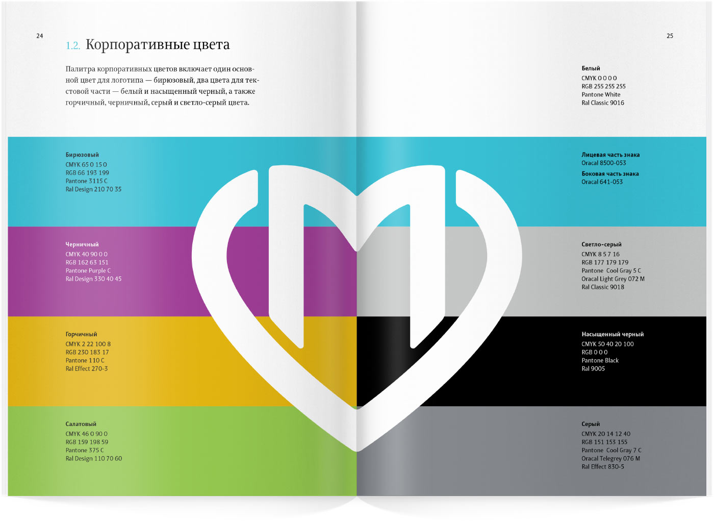
Colors
The updated adult polyclinics have turquoise as the primary color (and salad green in children’s polyclinics).
Staff at reception abandoned their coats in favor of vests, blouses and jackets of a pleasant mustard color. Instantly, the sad hospital atmosphere just vanished.

The medical staff uniforms also changed. Doctors now wear coats with turquoise collars while nurses’ collars are mustard-colored. Stripes of corresponding colors are duplicated on identification badges. Now even Ekaterina Markovna can tell apart Tanya the nurse from Marina Leopoldovna the doctor.

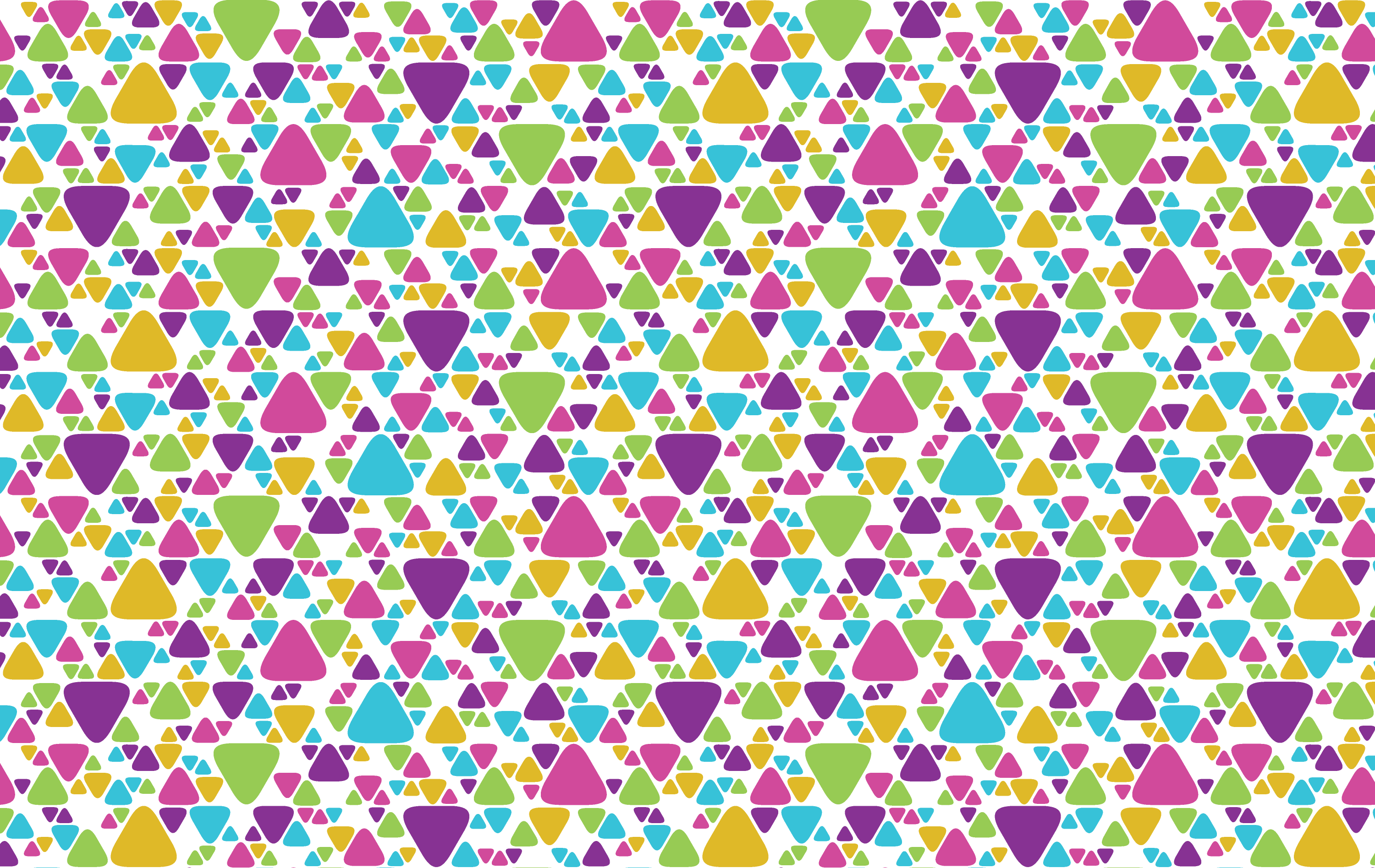
Pattern
Walls and documents are decorated by a pattern made of rounded triangles. The soft shapes make the interior calm and relaxing.

Rules for the use of the logo, colors, typefaces, patterns and other beautiful elements are given in a multipage brand book.
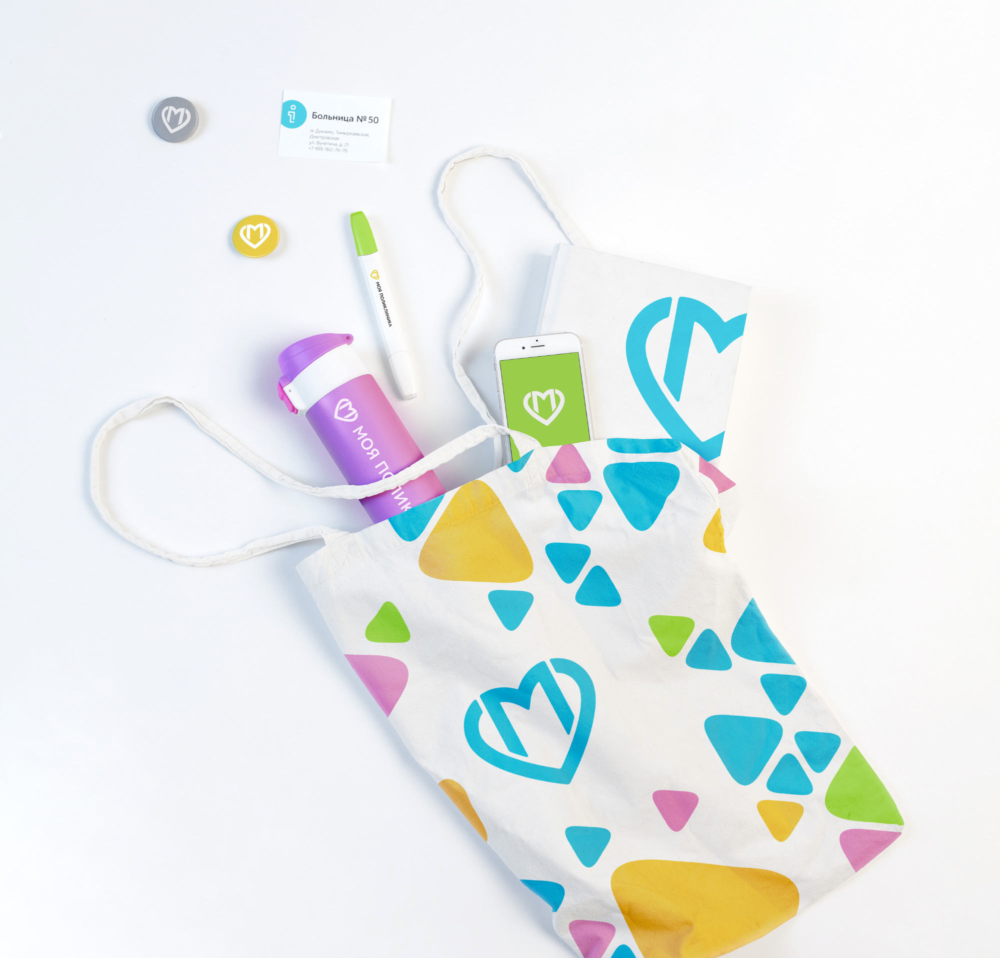
Souvenirs
The My Polyclinic identity is so beautiful that it looks cooler on accessories than many modern prints (and of course, Ekaterina Markovna now has a new grocery bag).
architects
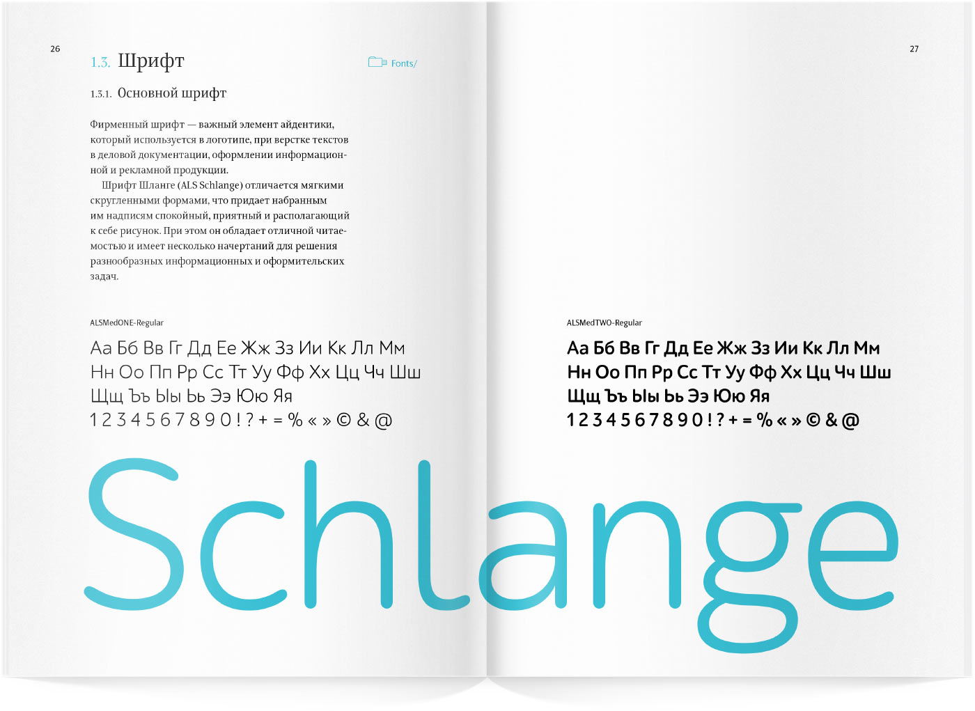
- Shlange typeface
- The studio wishes to thank the team of the Moscow Department of Health and personally Marina Davydova for their assistance with the project
