QazaqGaz identity
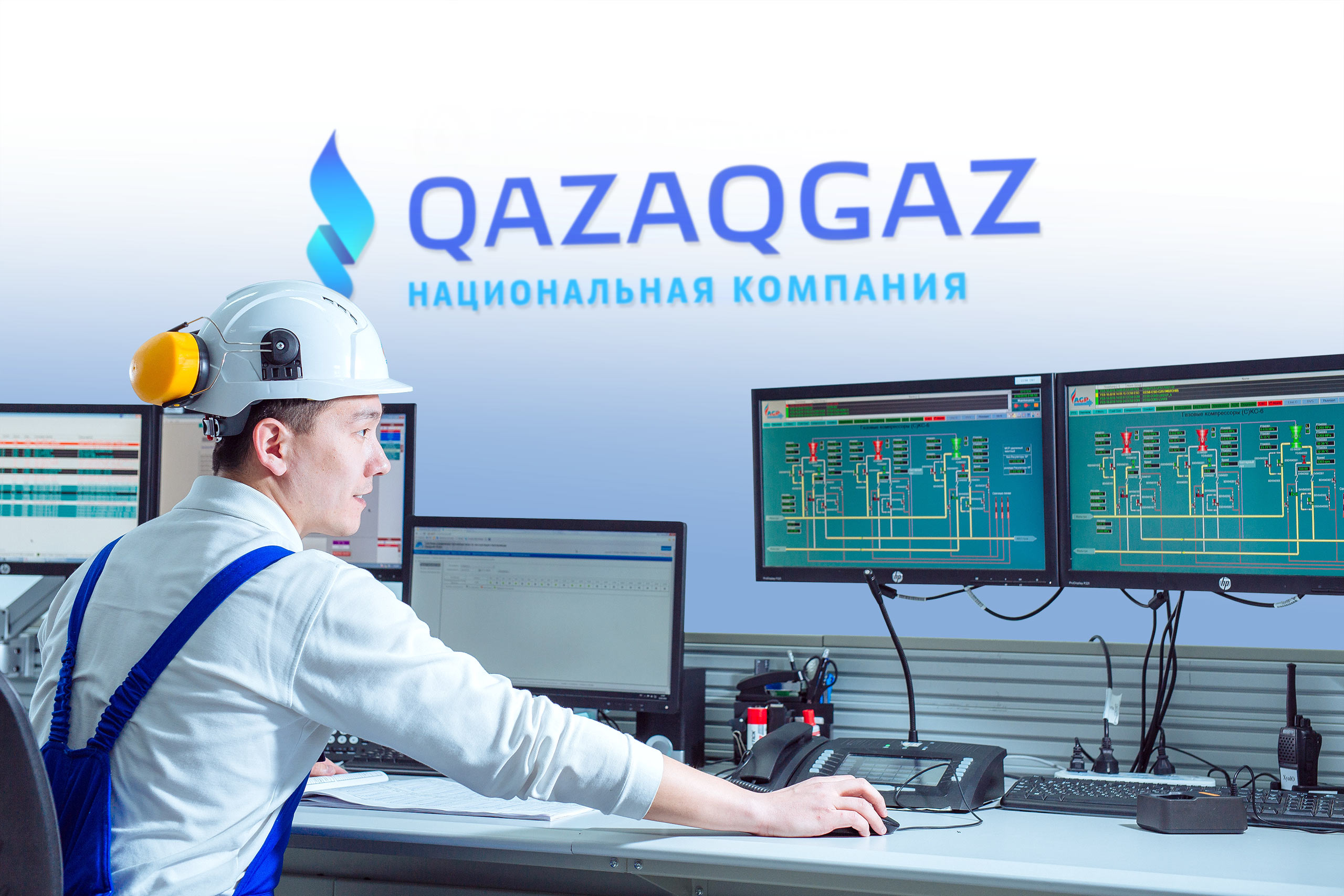
At the end of 2021, QazaqGaz received its current name and status of a national company. After the rebranding, the company needed a stylish and modern logo that would demonstrate the scale of its operations. QazaqGaz approached the studio, and in December of the same year the new logo was born.
The identity is based on the image of a flame bringing warmth and comfort to people’s homes. Since ancient times, fire was perceived by the people of Kazakhstan as a living being with its own temper. The symbol in the logo also has a character: it rushes upwards, symbolizing the continuous movement of the company into the future and reflecting the rich nature of the energy source.
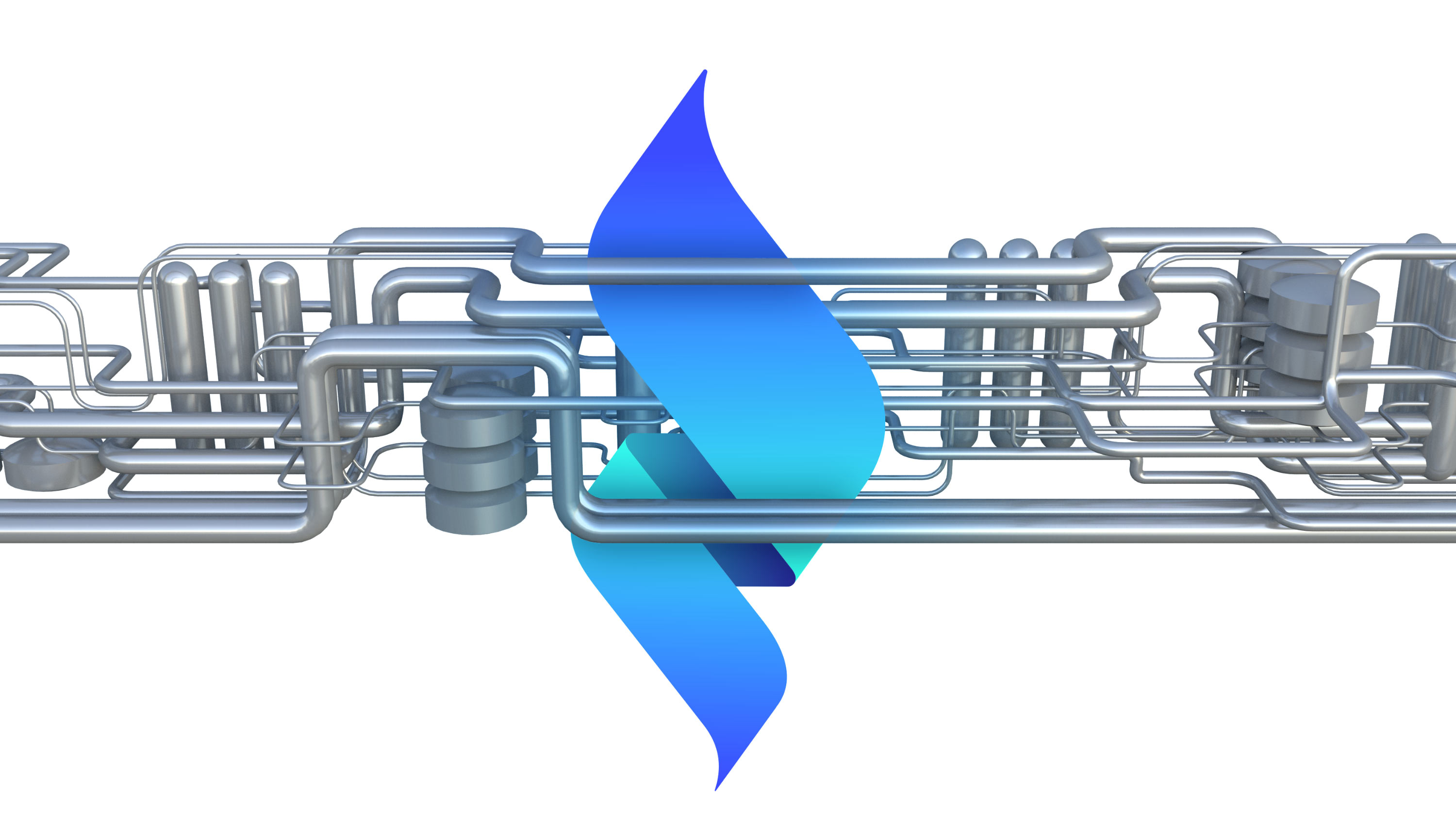
The most obvious «gas» colors, blue and turquoise, were chosen for the logo. Additional green shades imply that the company is also concerned about ecology.
The new logo looks great on electronic and physical media, as well as on monochrome, uniform and gradient backgrounds. It is equally pleasing to see on the roof of a building, a page of a website, or in interior.
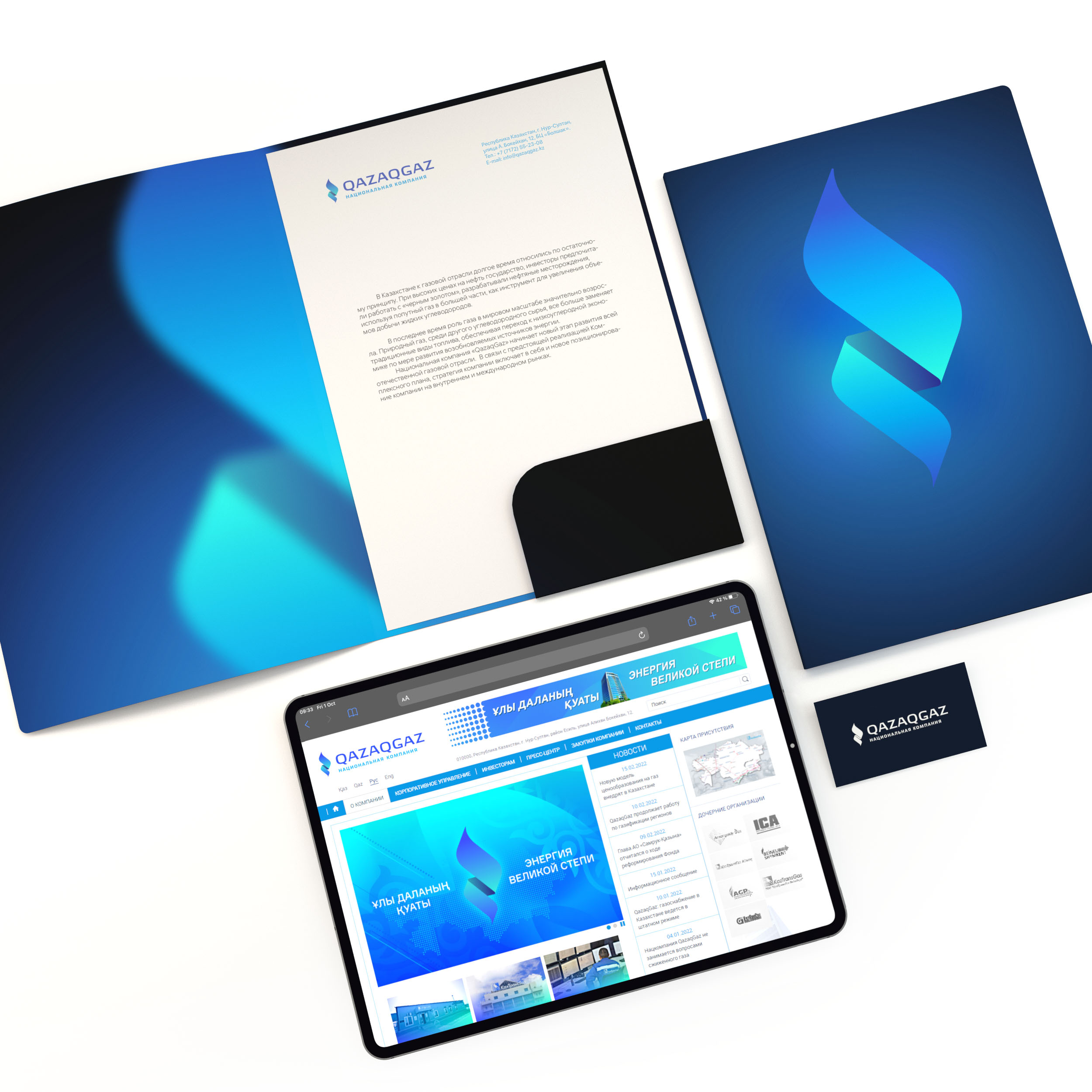
Depending on the situation, one of the three language versions, Kazakh, Russian or English, is used.