Citymatic collects, transports, processes, recycles and buries solid municipal waste, as well as builds and develops related infrastructure in eight Russian regions. The company also has a network of Vtormatic eco-points which accept recyclable waste. The studio created an expressive identity for the company that makes life in big cities more comfortable.
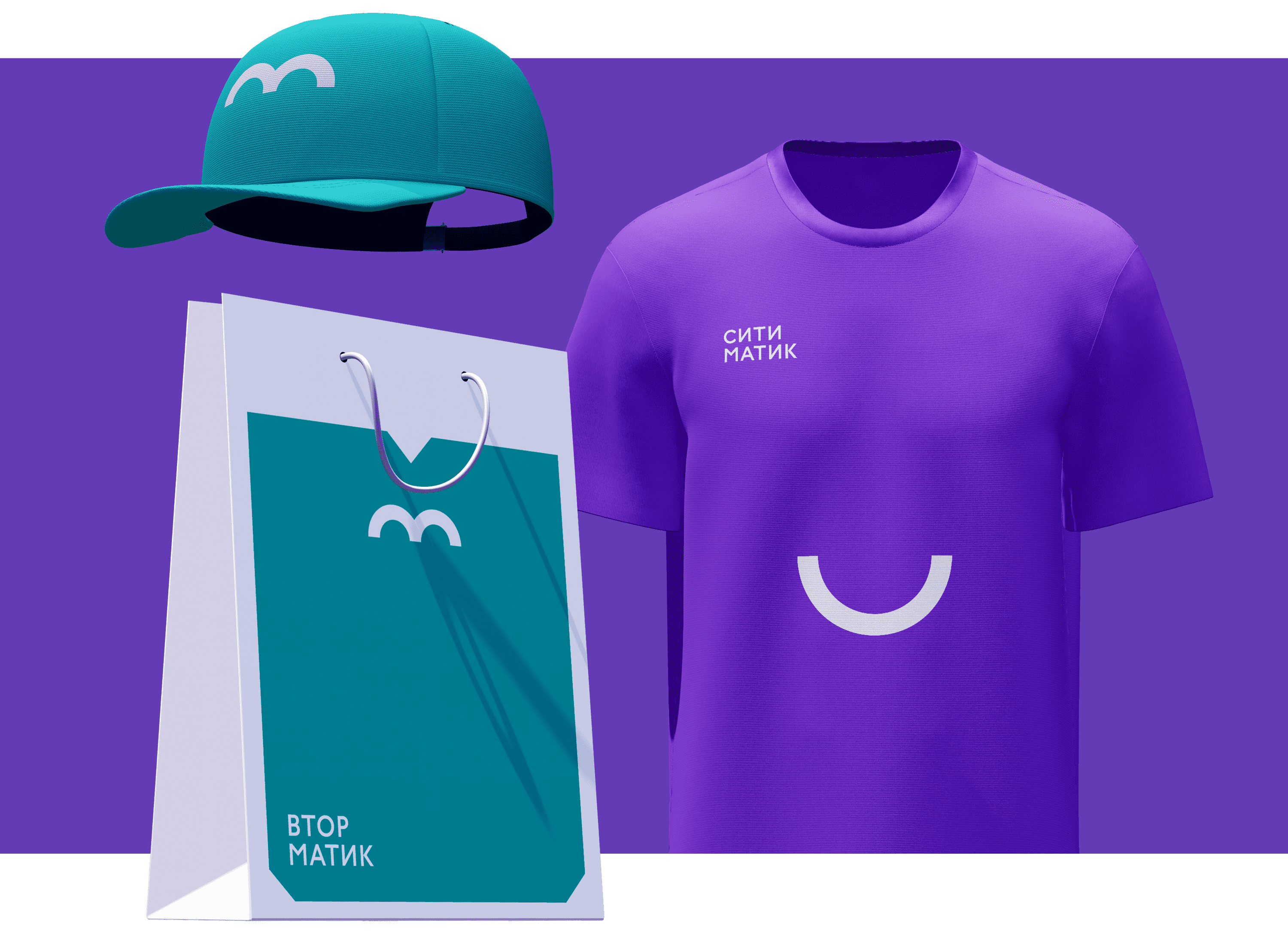
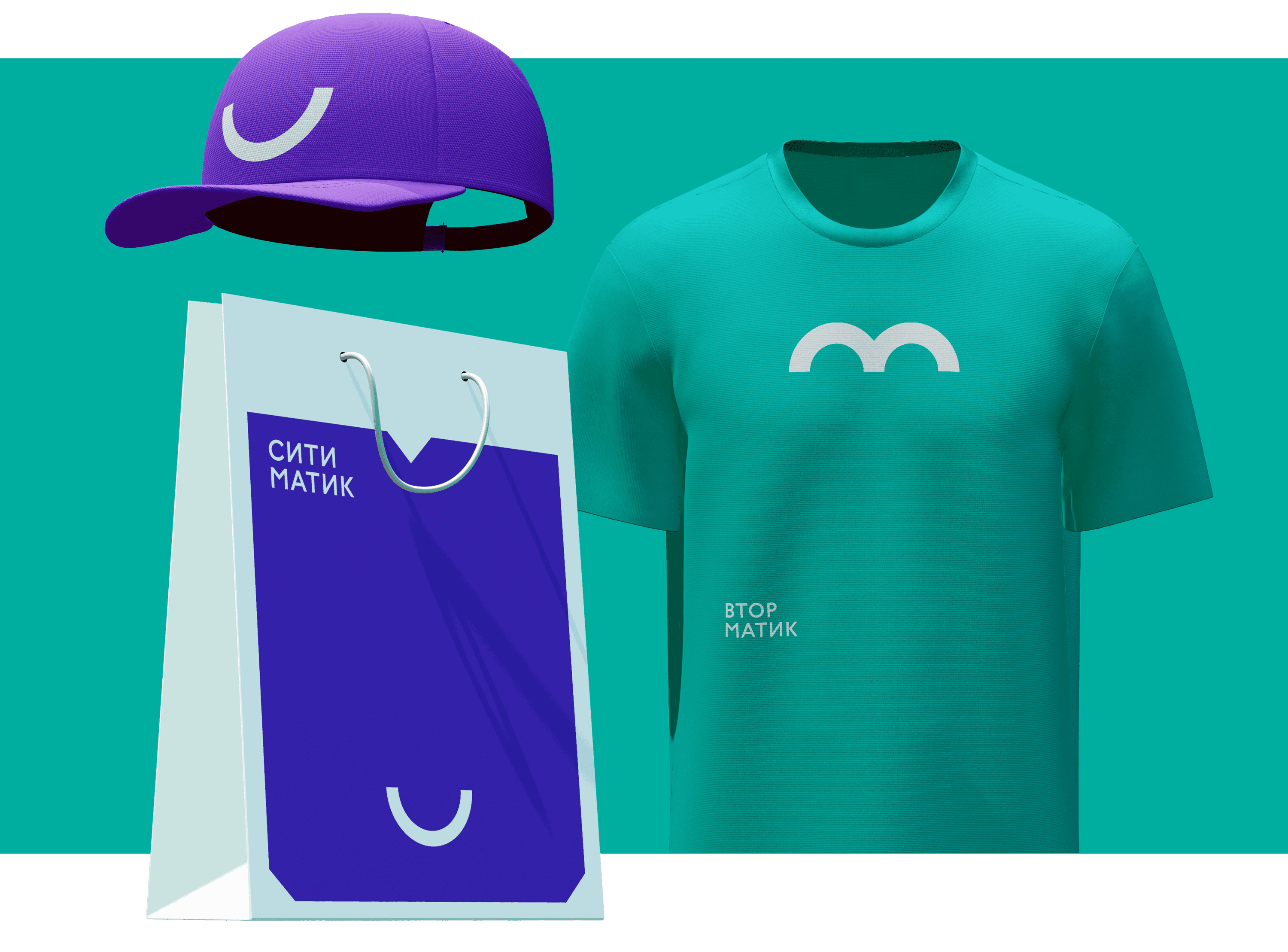
The logos of the company and the eco-points clearly show the good mood of people in the cities of Citymatic’s presence. The shapes of the smiley faces play off the first letters of the names.
The symbol turns into a charming transformer house and creates a friendly image of the company which is open to communication with the audience.
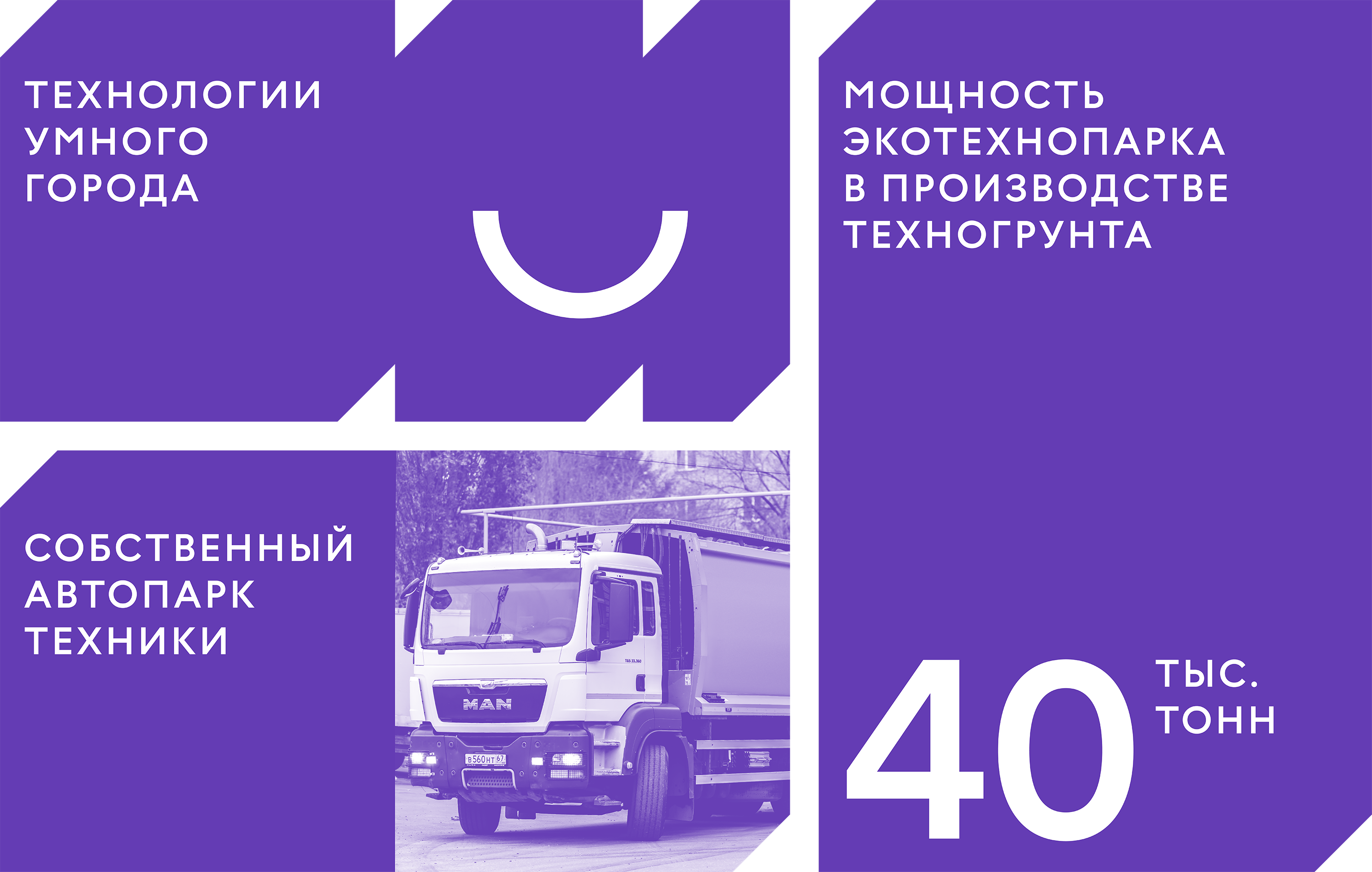
It easily adapts to any medium depending on the task and looks cool on souvenirs, as a mascot or as a container for images. The varied silhouettes of the background bars, combined with the large accent typography, are great for creating promotional and presentation materials.
Utility media such as garbage containers and trucks make use of the same simple and flexible technique. Large colored stickers fulfill two roles simultaneously, providing branding and simplifying communication. Icons for different types of waste continue the laconic style of the logo.
Citymatic not only deals with waste, but strives to improve the urban environment overall. The versatile identity helps the company maintain an innovative image and declare itself in new areas of work.