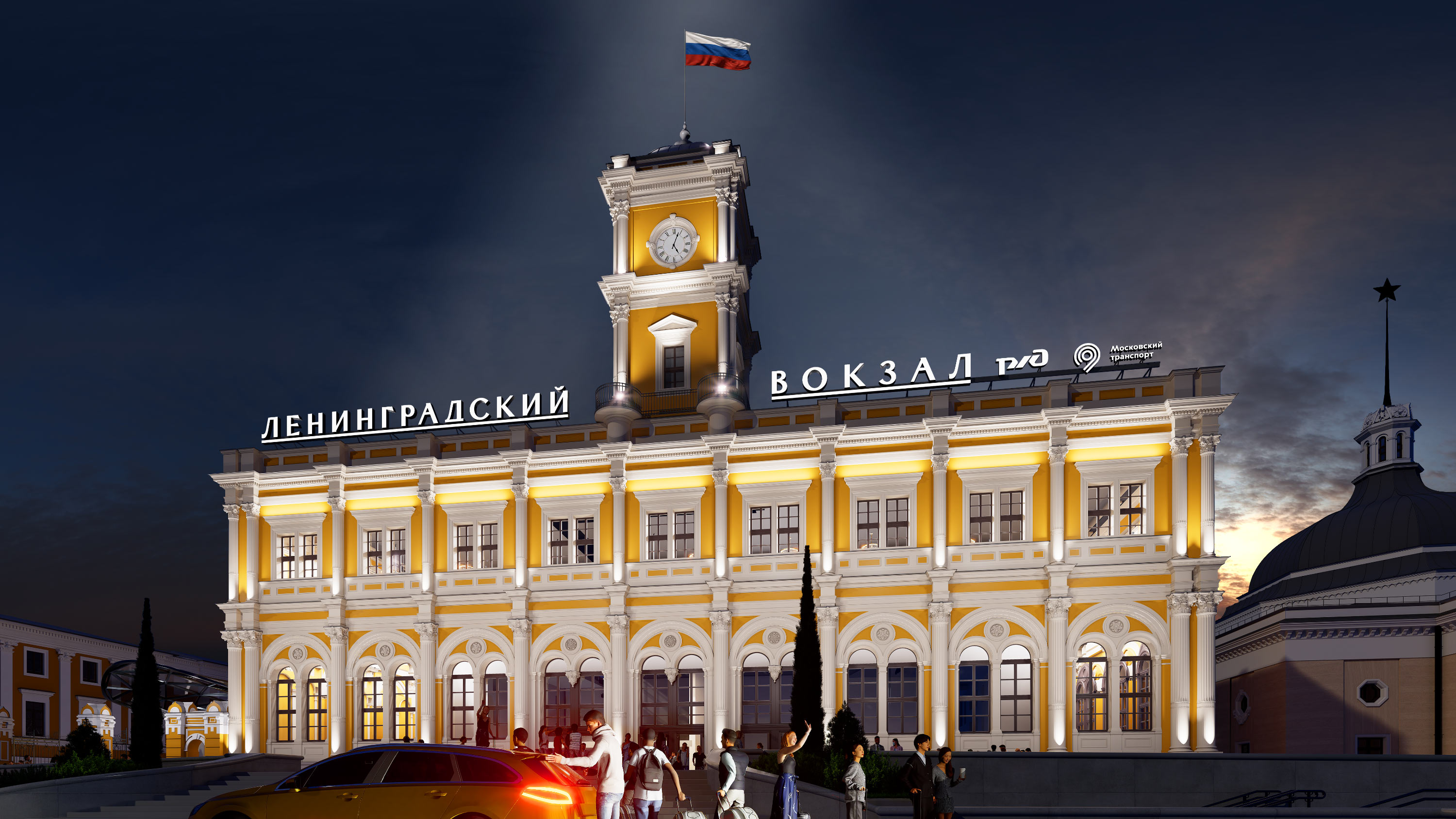
Rooftop sign of Leningradsky railway station
Leningradsky railway station in Moscow was closed for major renovations and transferred under the management of Moscow Transport. After the completion of the work and its reopening, it became more modern and convenient. Among other things, the appearance of the facades changed during the project. In the studio, a rooftop sign was designed that adorned the capital’s first railway station and became the face of the building for the coming decades.
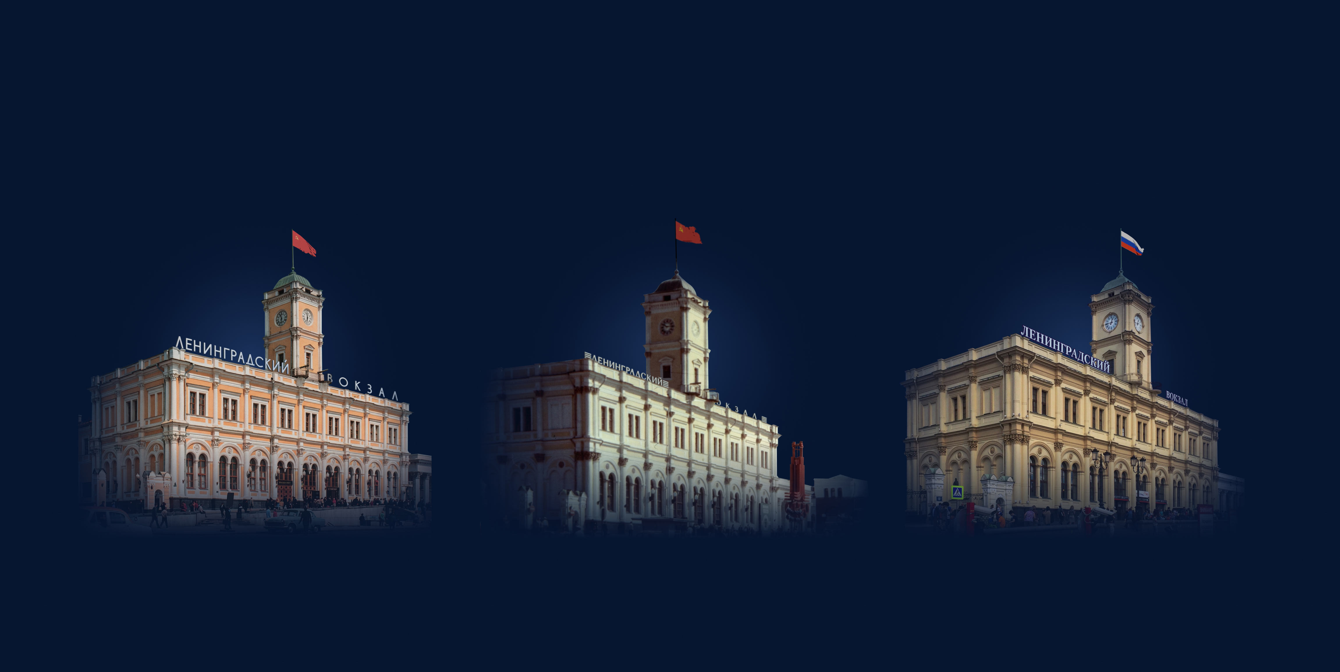
We took as a basis the “Olympic” version from the late 1970s. The inscription is executed in ribbon antiqua: this typeface combines as naturally as possible with the architectural style of the building constructed in 1851. The contours of the letters were reconstructed from archival photos, after which modern elements were added to them.
We redrew some outdated forms from scratch, making them feel closer to contemporary Cyrillic.


As a result, the inscription retained its recognizability, but acquired a contemporary character and gained many interesting details. At the same time, some letters almost completely repeat the variants from the sign of the seventies.

The angled cuts of the strokes are a direct reference to the historical version, but now the elements have become sharper and more pronounced
The letters N and K make clear the overall distribution of contrast in the inscription
Other letters were made more plastic in those places where this followed from the overall logic of the typeface.

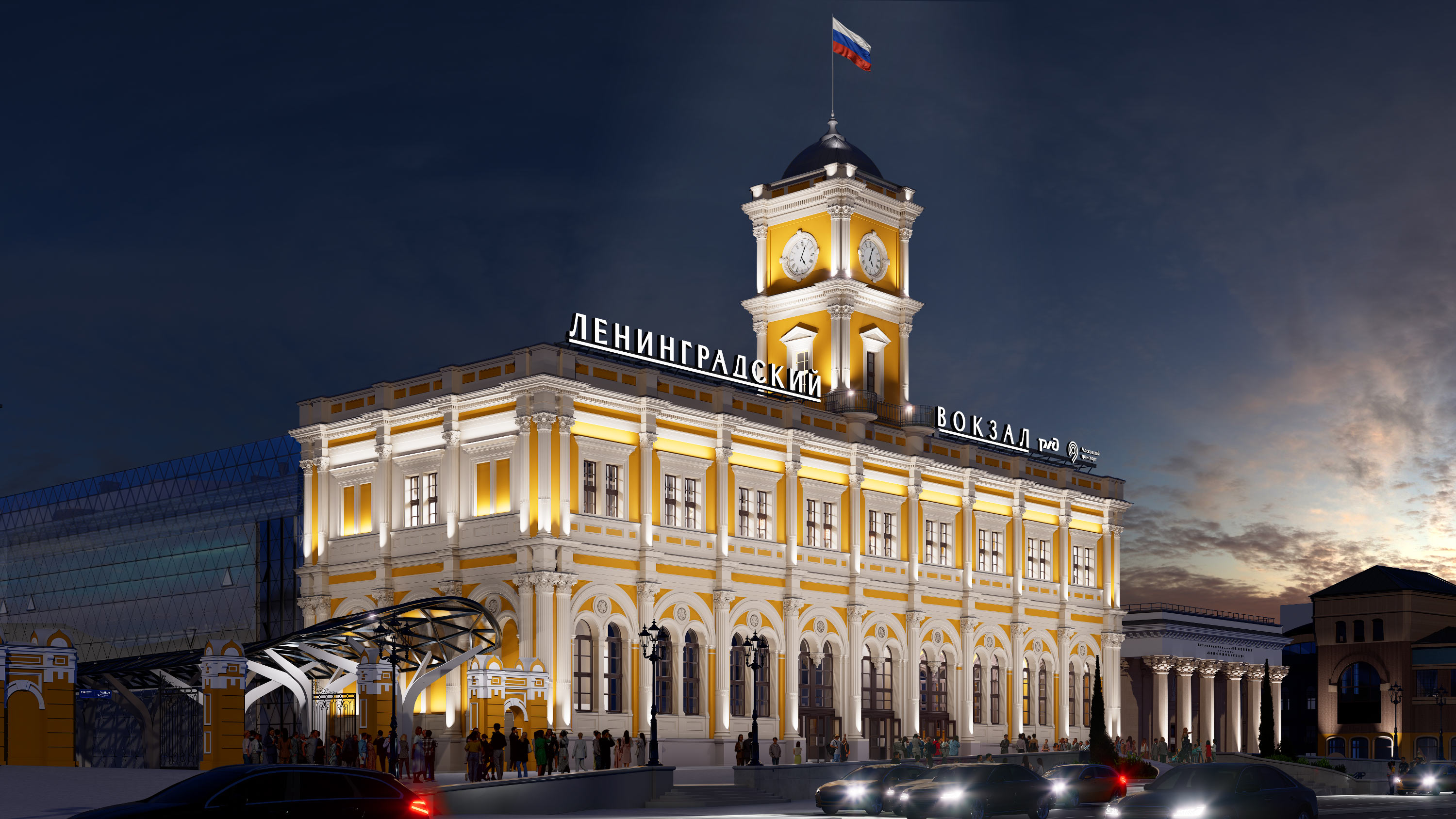
To further emphasize the kinship between the new version and the previous one, and also to make the composition more solid, an underline was added to the inscription.
In addition, the sign now includes the logos of Russian Railways (RZD) and Moscow Transport, to reflect the station’s new status.
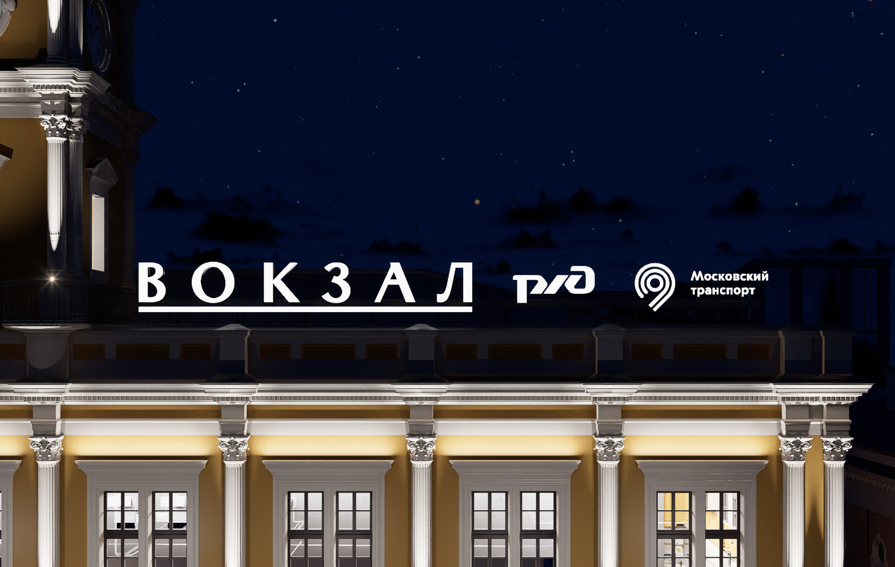
The sign does an excellent job with its navigational function, adorns the renovated building, and invites you on a pleasant journey.