Kazakhstan Petrochemical Industries produces polypropylene of various grades which has an extremely wide range of uses from the production of films, bags and plastic cups to the manufacturing of equipment parts, pipes and electrical insulation. The studio modernized the company’s logo and developed a new identity.
The arrow refers to the structural formula of polypropylene, the primary produced material. The endings of strokes in the symbol and corners of the letters are rhymed. Thanks to the new corporate colors and variability, the logo looks solid and high-tech.
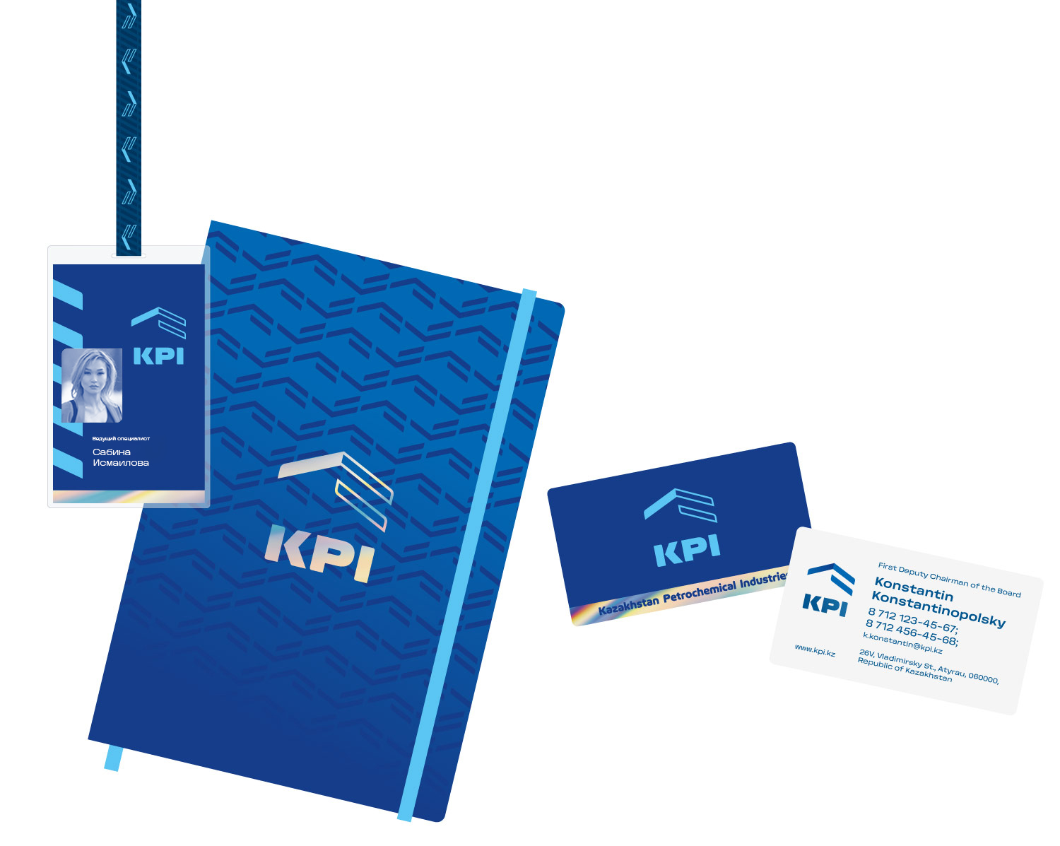
The symbol forms the basis of a universal pattern. It is repeating, so it can cover surfaces of any size. The pattern brightly brands corporate media and clearly indicates the company’s presence at any industry event.

Specially for the company’s intranet, simple and clear icons were created for all occasions, including palm trees for vacation requests and bugs for the antivirus.

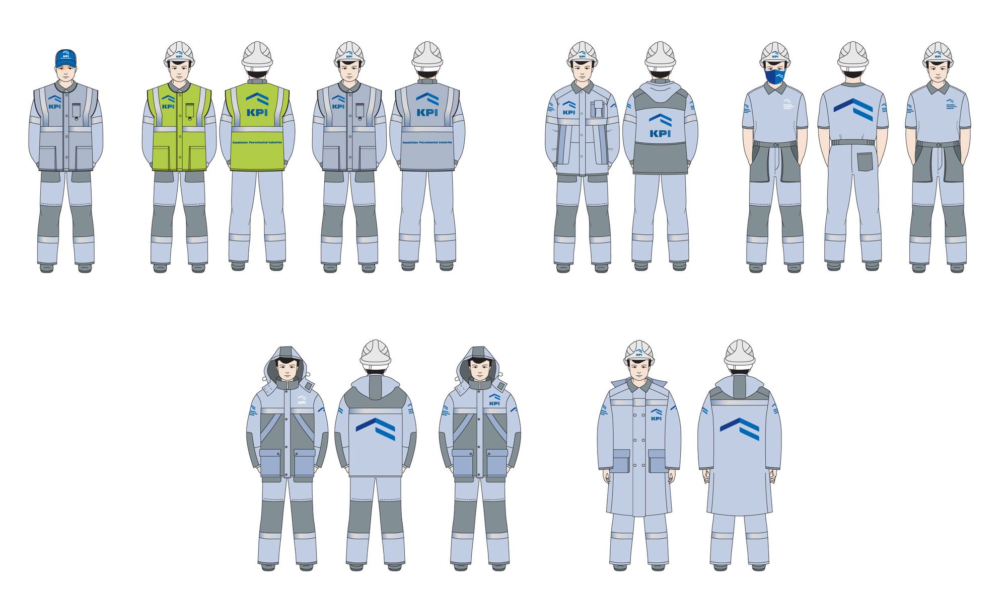
Uniforms are designed with a strict taste.
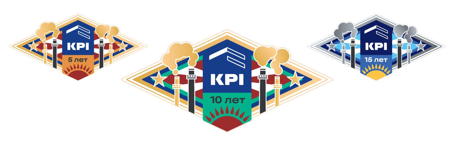
Award pins were created for long-time employees.
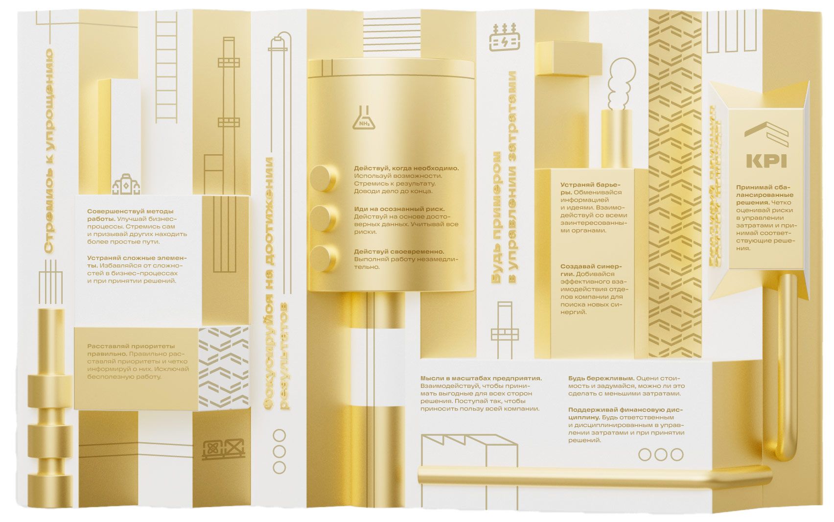
The hall is decorated with a volumetric stand which showcases the company’s values in a bright and unusual way.

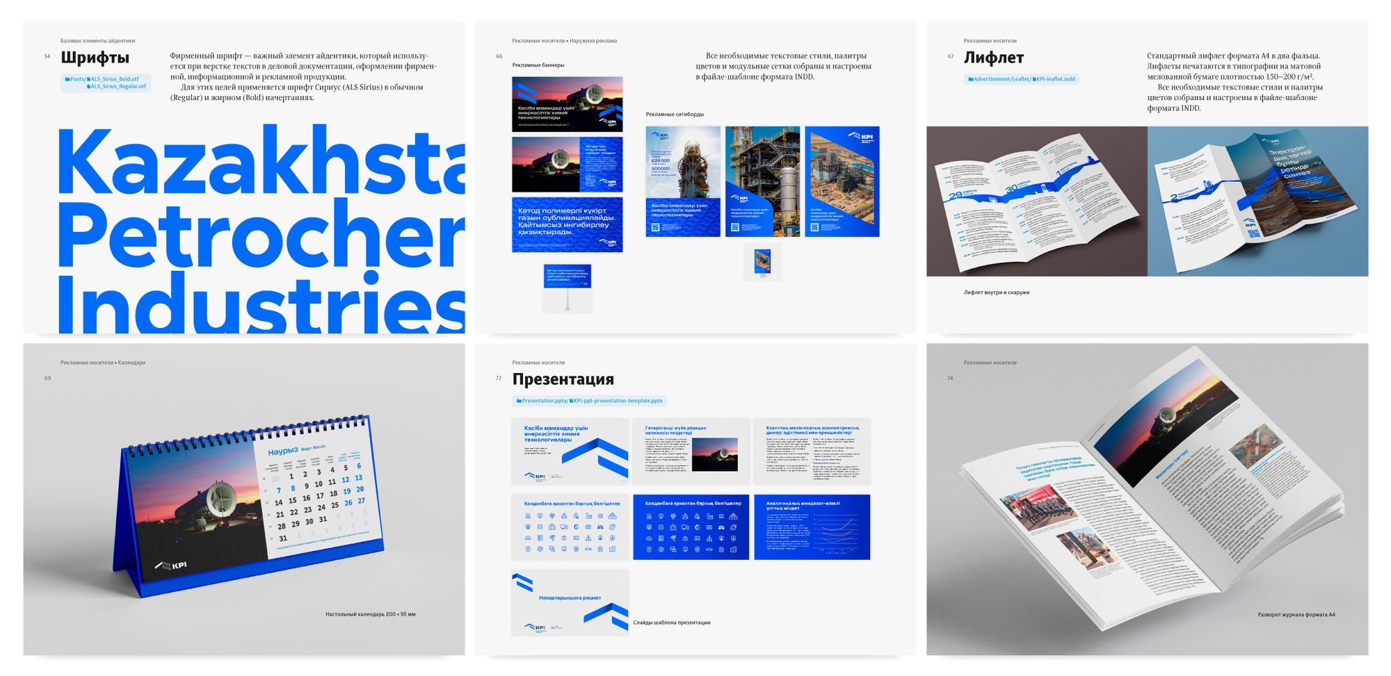
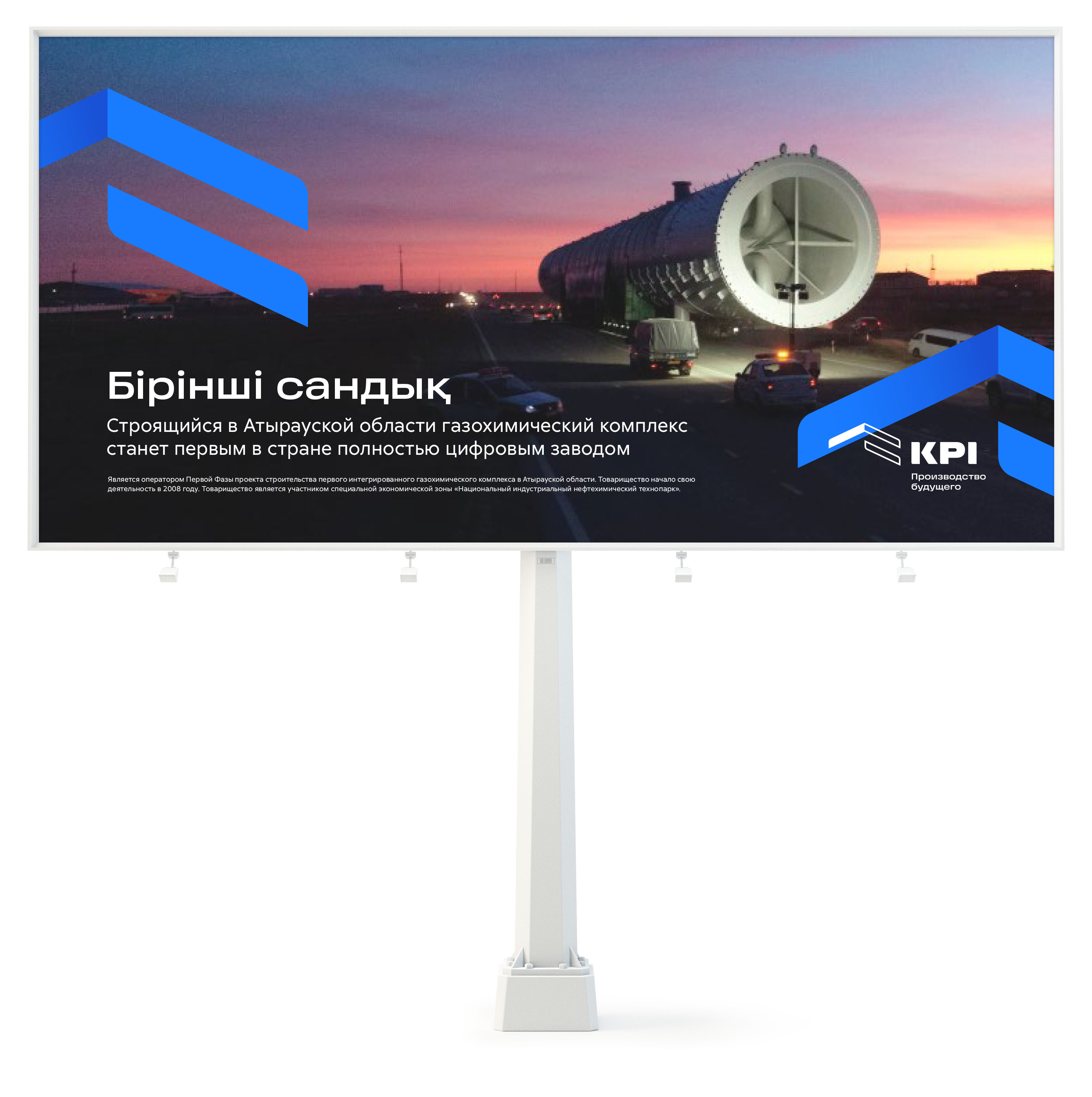
All rules for using the new identity—from mail signatures to outdoor advertising—are compiled in a detailed brand book.