The VK headquarters is a place where thousands of specialists work on projects every day, meet with colleagues, do sports, and relax. The office occupies 26 floors and 30,000 m². There are workspaces, meeting rooms and gyms, a venue for mass events, a music room, a doctor’s office, a beauty salon, a cafeteria, and a fresh bar.
For this large-scale and multifunctional space, the studio developed a holistic navigation system: from signs to principles for numbering workstations and color coding.
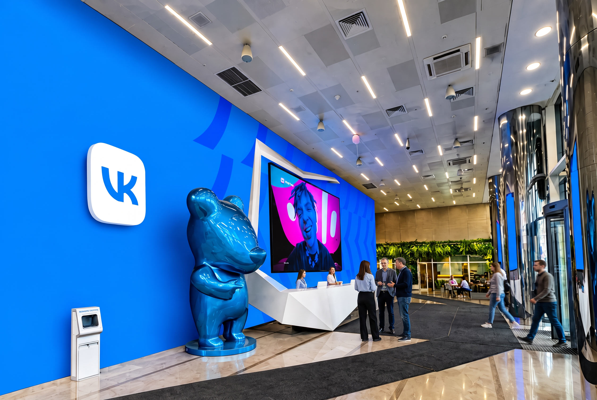

Simple and bright shapes from the digital environment are transferred into the physical world and become the basis of navigation.
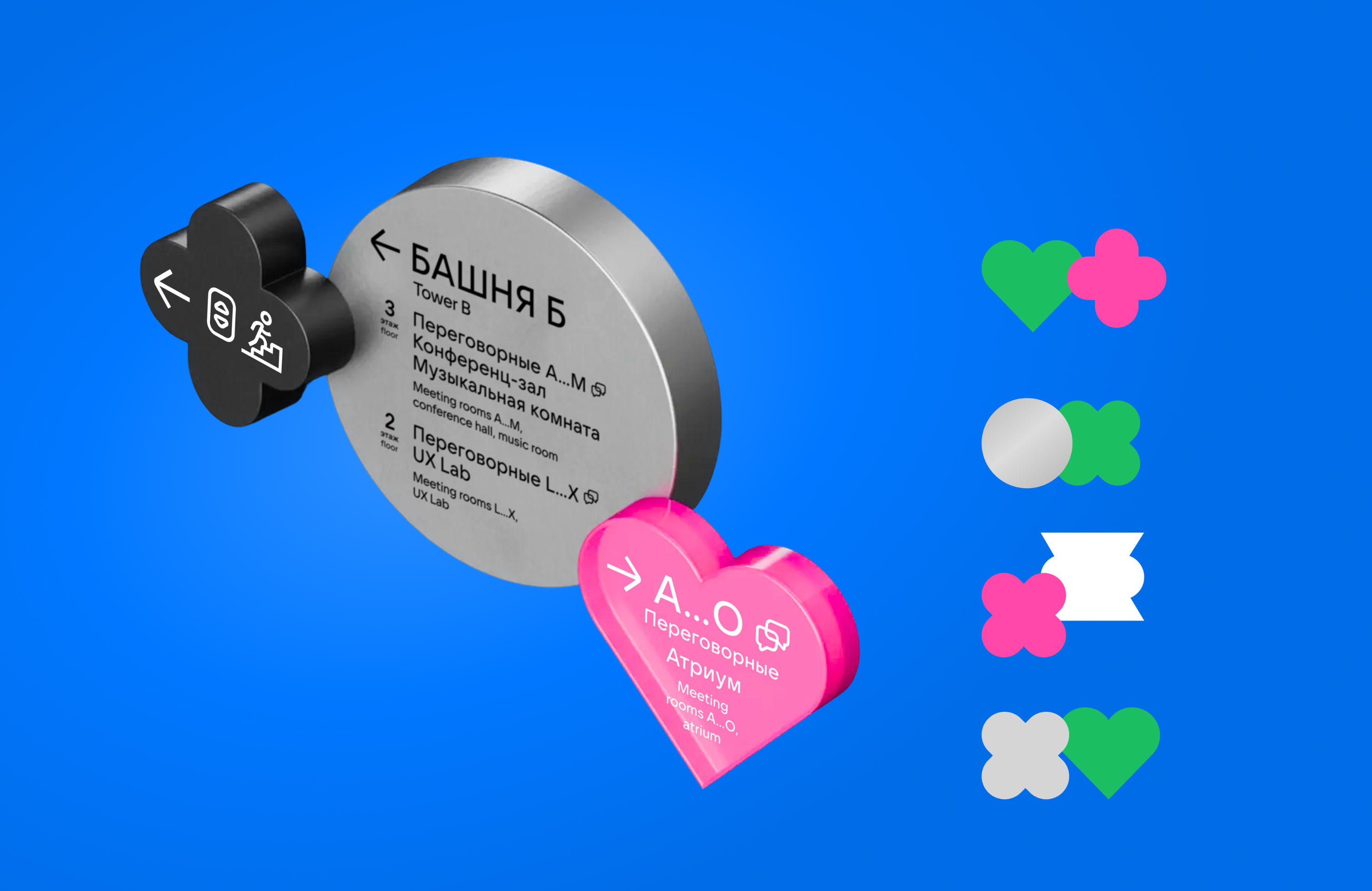
Each navigation carrier receives its own form, and together they form expressive compositions.
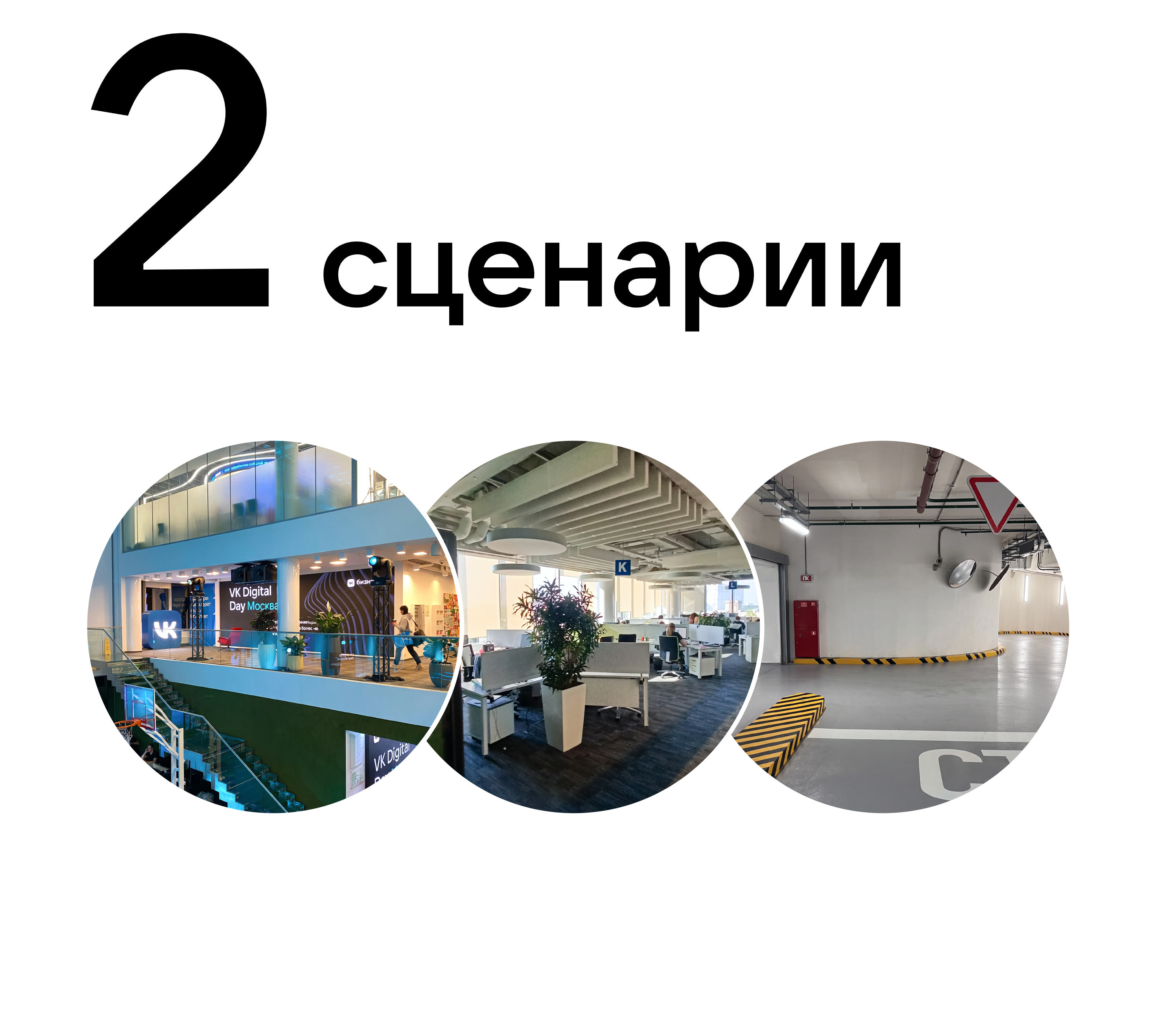
Each zone has its own scenario.
Stylobate
Here employees and guests look for the cafeteria, main reception, gym, beauty salon, and lecture hall
Work floors
Here employees look for colleagues’ workstations and available meeting rooms
Parking
Here employees and guests look for available parking spaces and the exit to the elevators
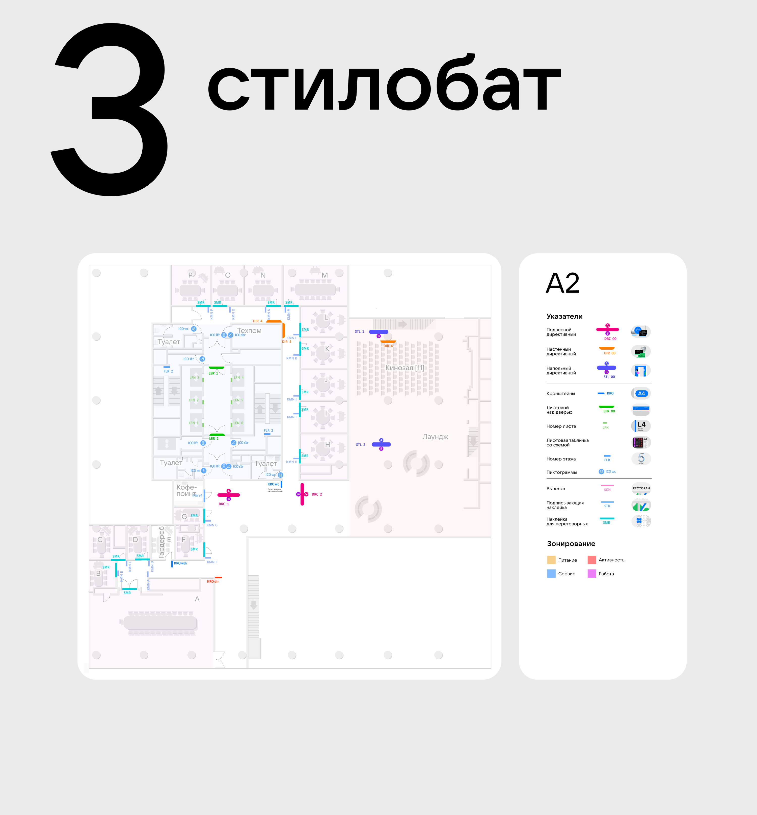
Directive signs are placed at decision points — at the intersections of user routes.
A single color is used for repeating information.
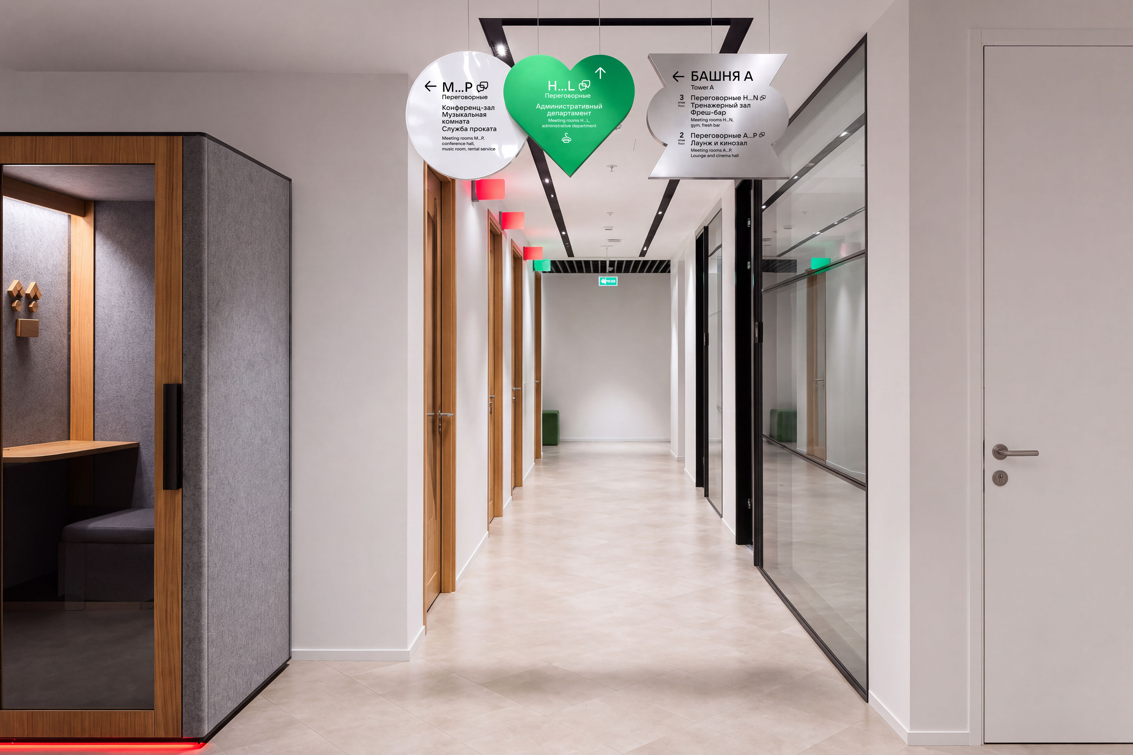
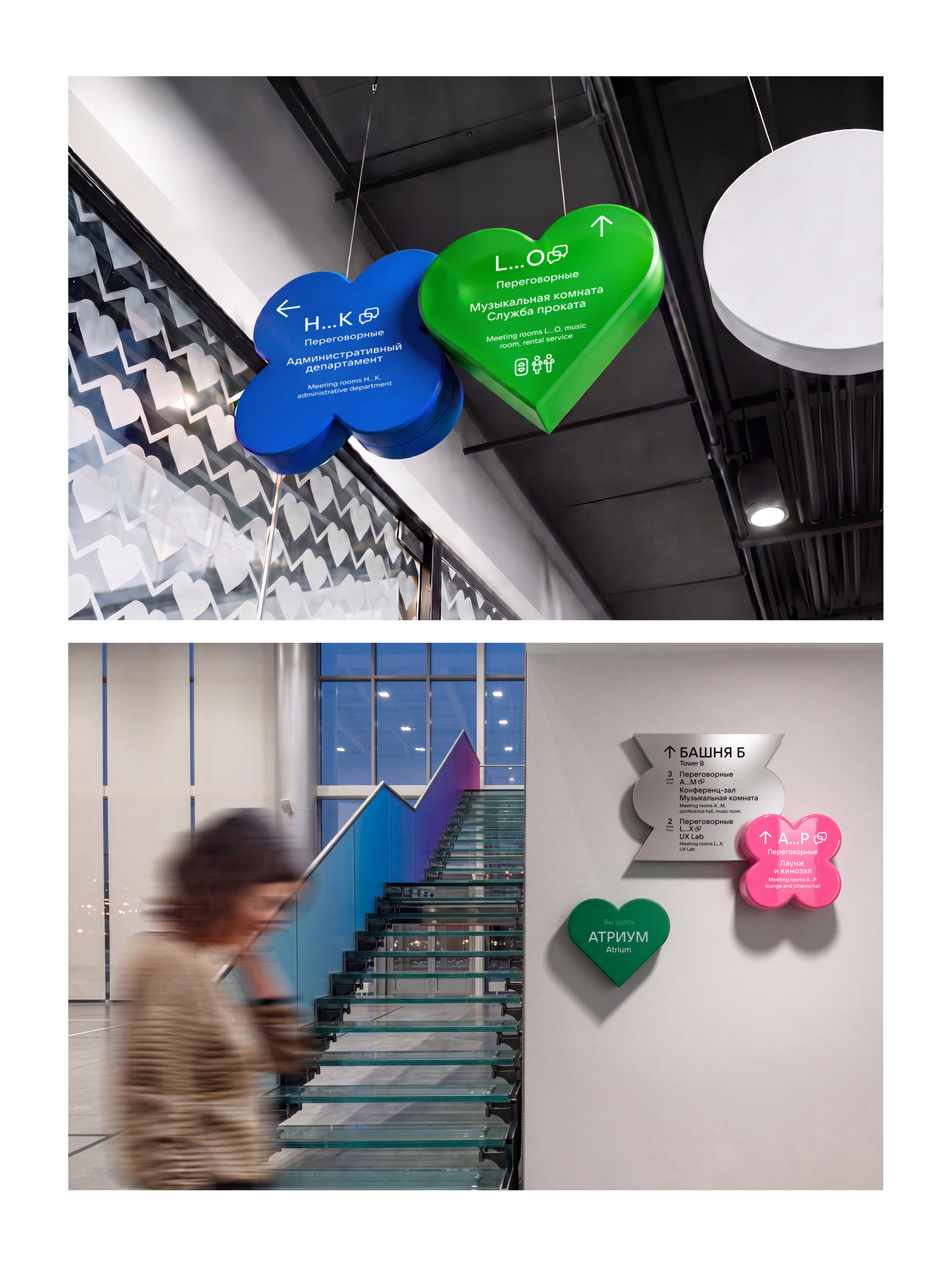
All signs form a series of functional carriers with unified construction principles.

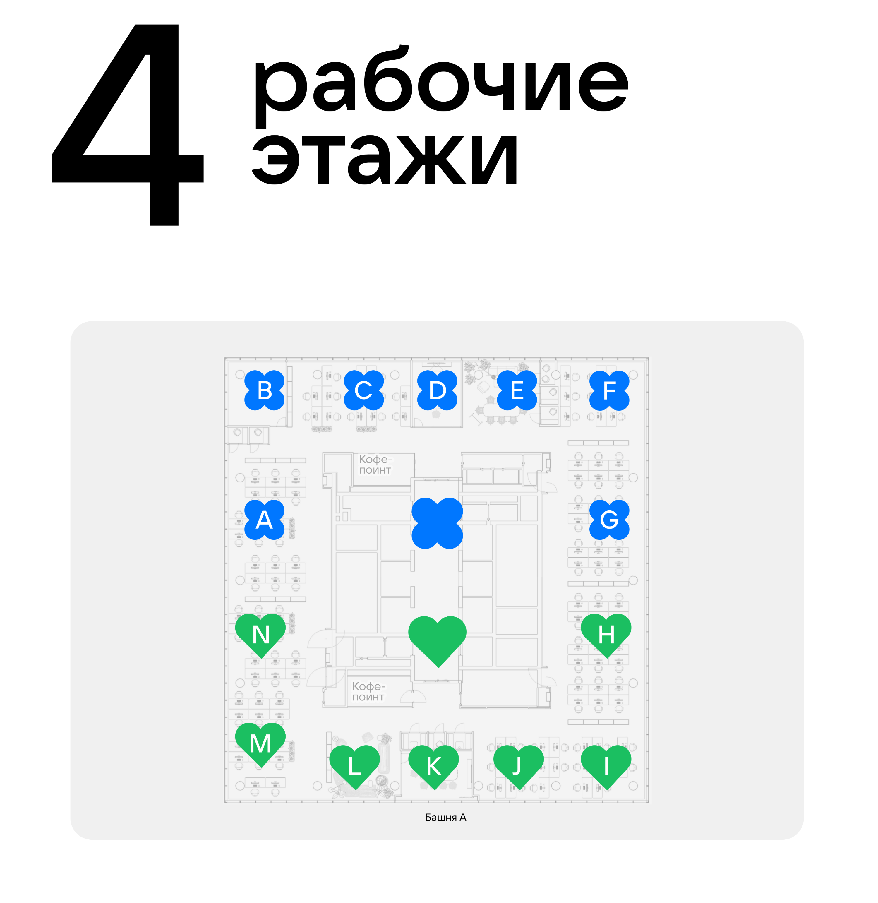
The work floors are designed as ring corridors with an elevator lobby in the center and two exits in opposite directions.
Zoning is done with color: each half of the floor has its own color.
Half of the floor is distinguished not only by color, but also by the shape of the carriers
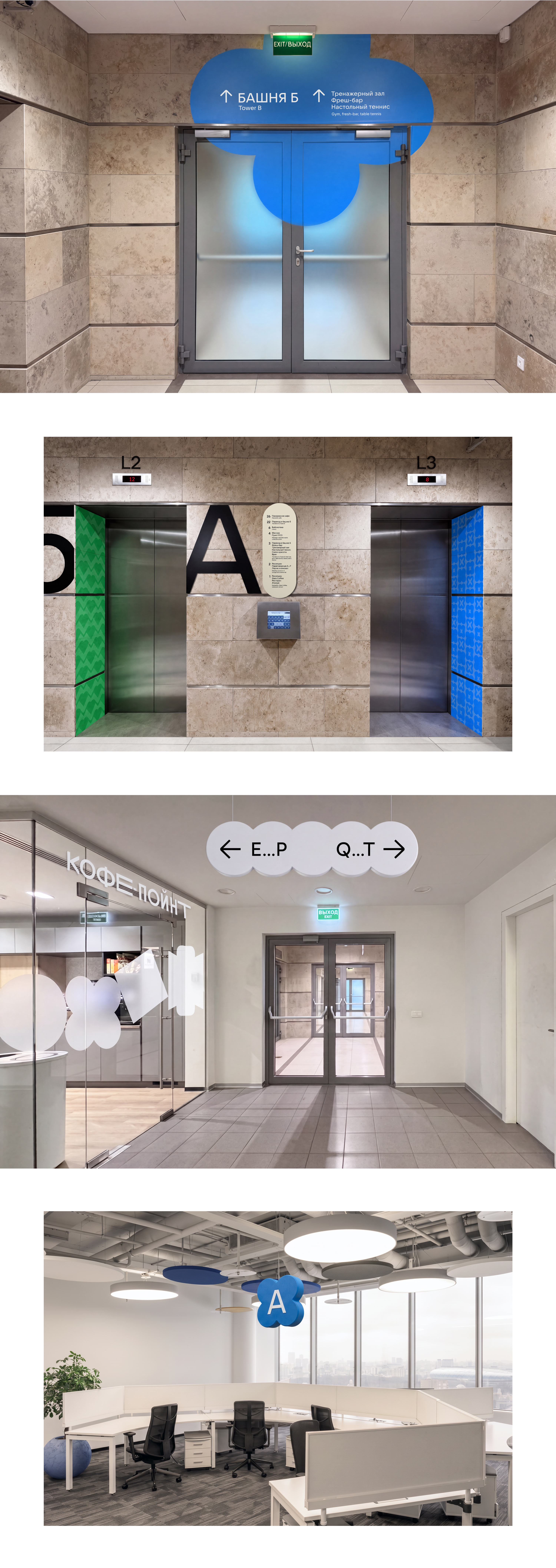
There is a clear hierarchy on the work floors: workstations are the main subject of navigation, so color is used for them. The remaining signs are done in black and white.

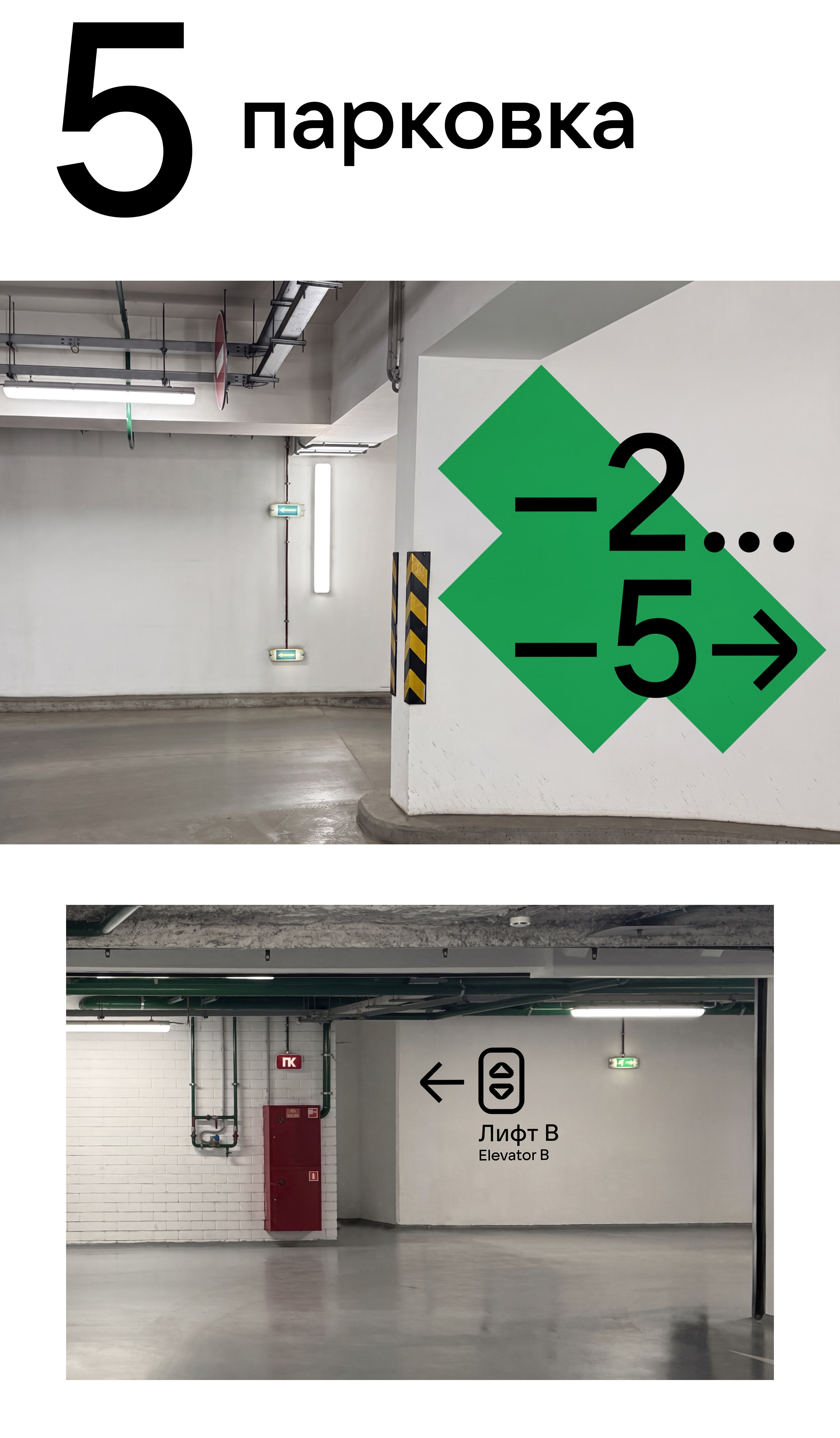
Navigation in the parking area takes into account the speed of moving cars: large, noticeable signs are placed in the direction of movement.

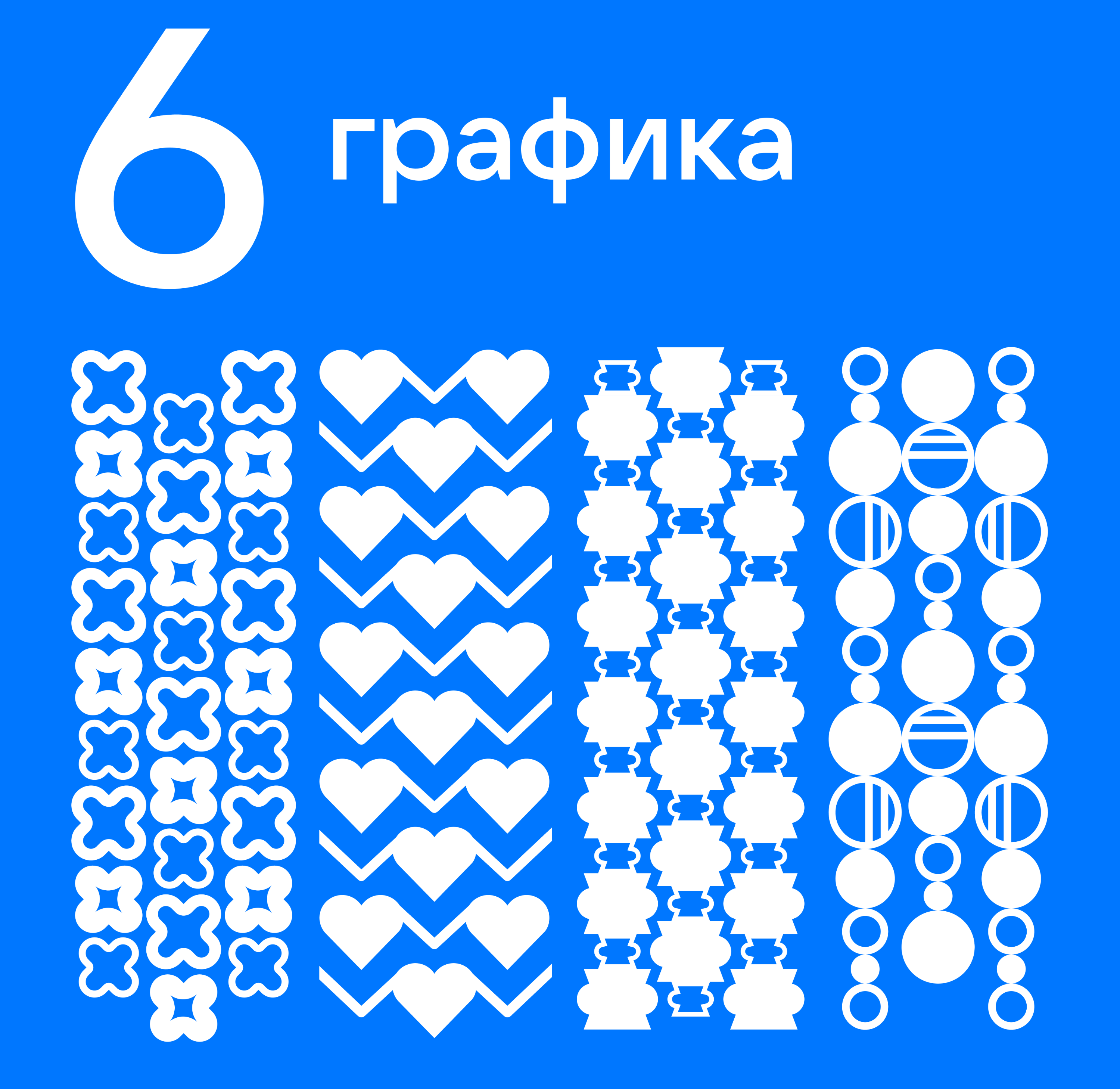
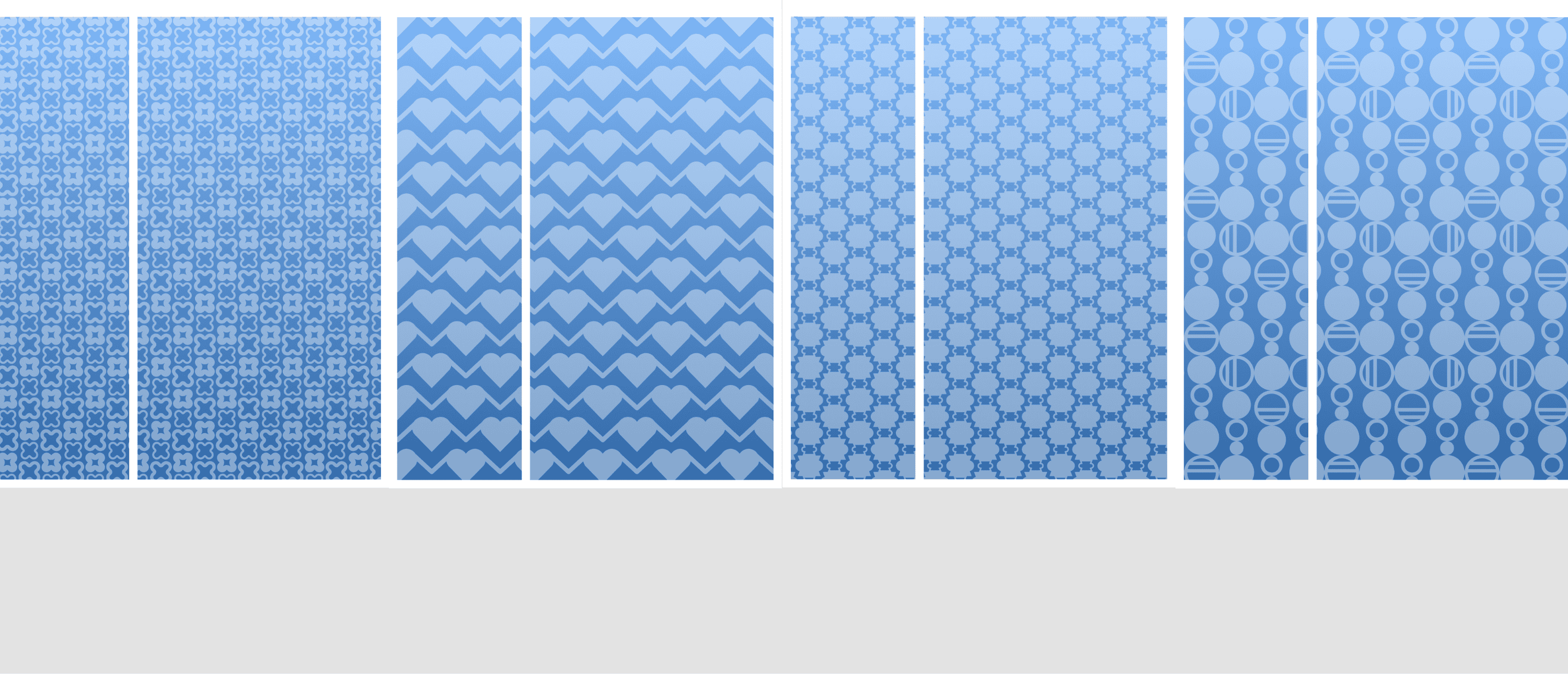
Patterns for tinting meeting rooms are based on the geometric forms from the navigation.
The density of the pattern depends on the level of privacy of the meeting room: the higher the privacy, the denser the pattern.

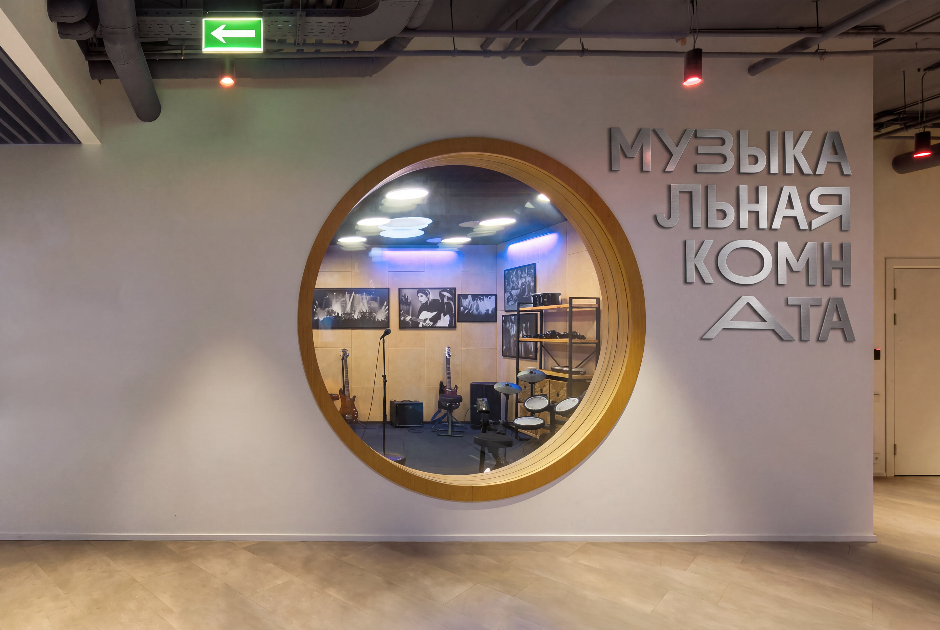
A display typeface with variable letters gives each sign its own character.

The weight axis makes it possible to select the typeface saturation according to the type of room.
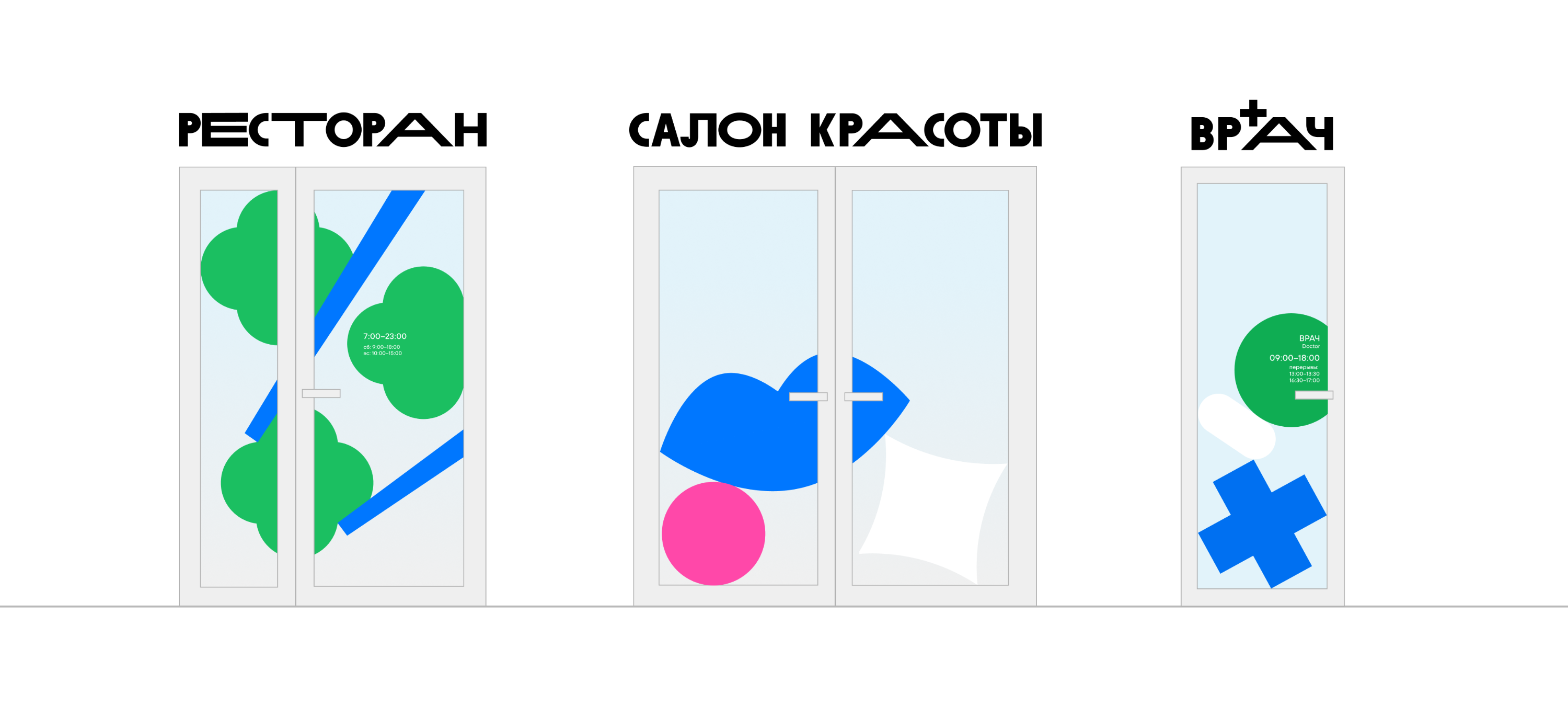

The icons are in tune with the geometric figures — they repeat the characteristic roundings and the principle of overlapping forms.
A separate, more detailed version of the icons is provided for placement on doors at a large scale.
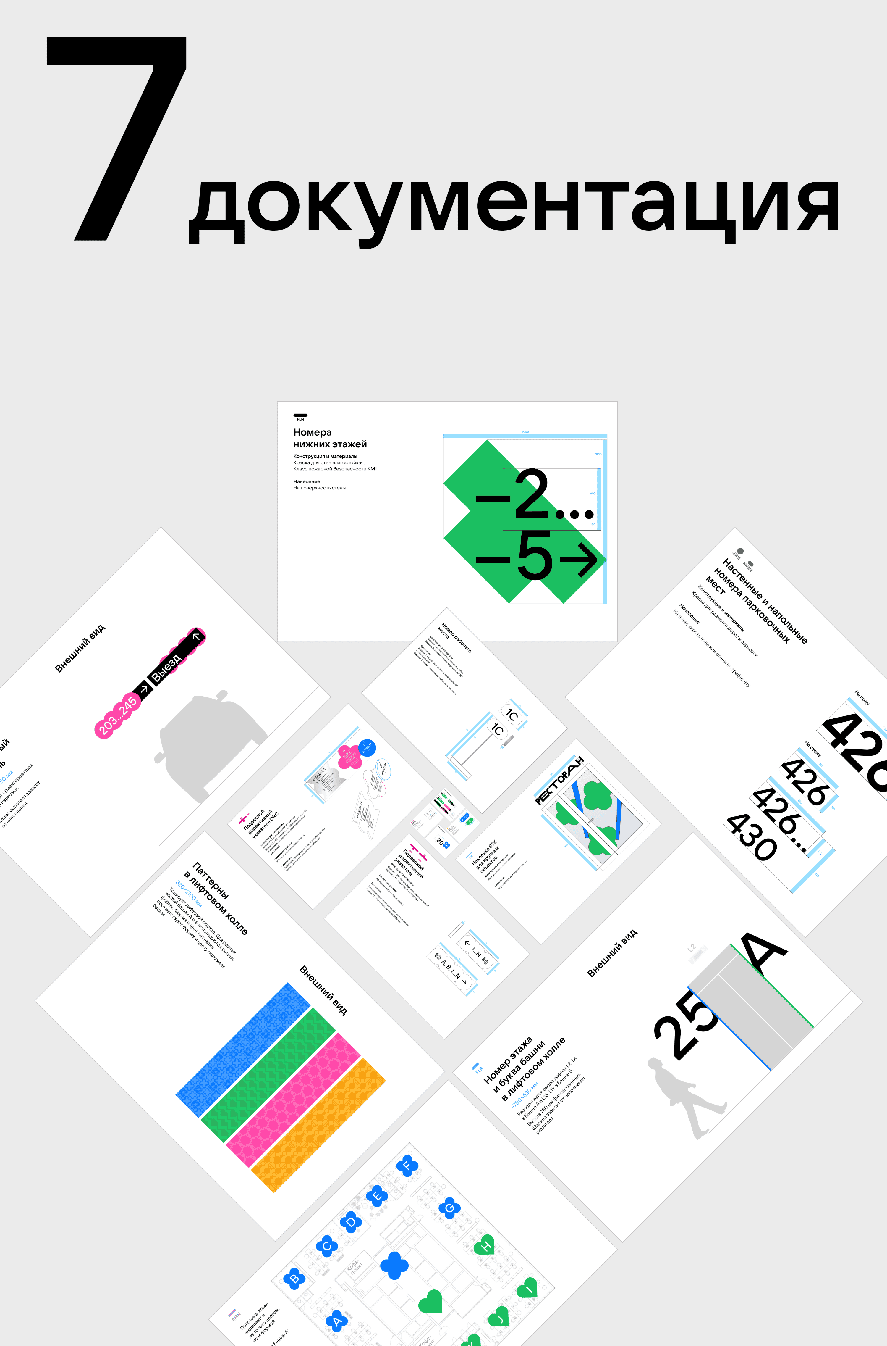
The guidelines describe in detail all types of carriers: rules for placement in the office space, suitable materials for production, and installation specifics.
art director-in-chief
art director
designers
- Valery Tolchanov
- Ruslan Poklonskiy
