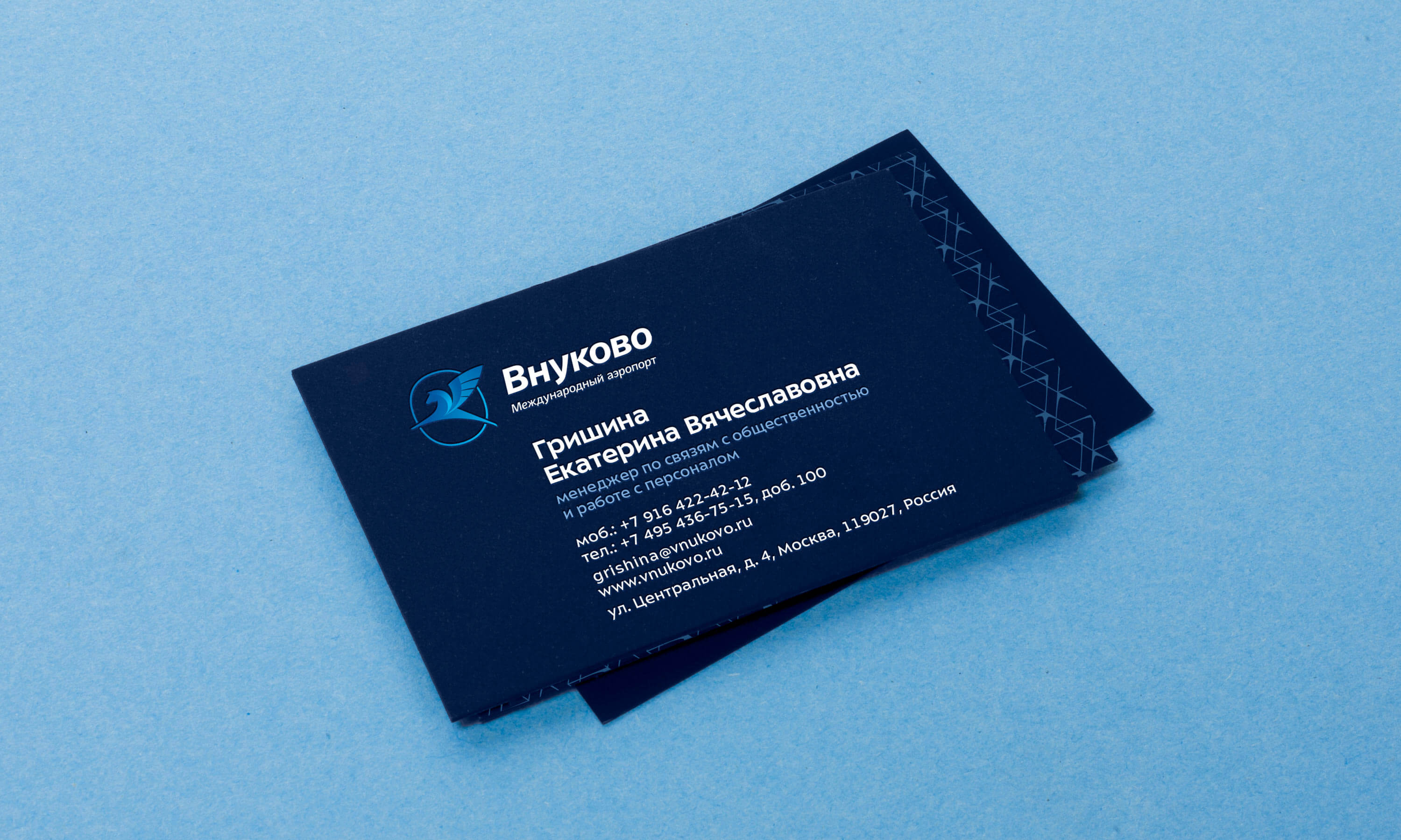
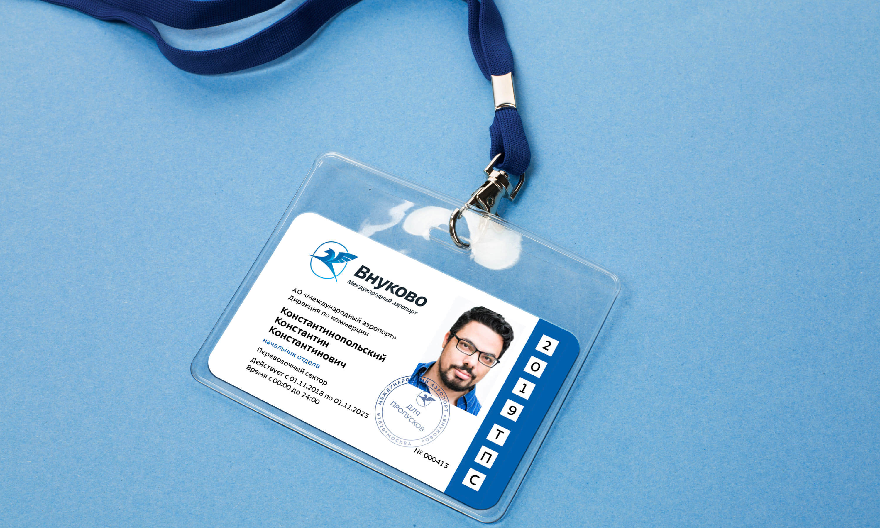
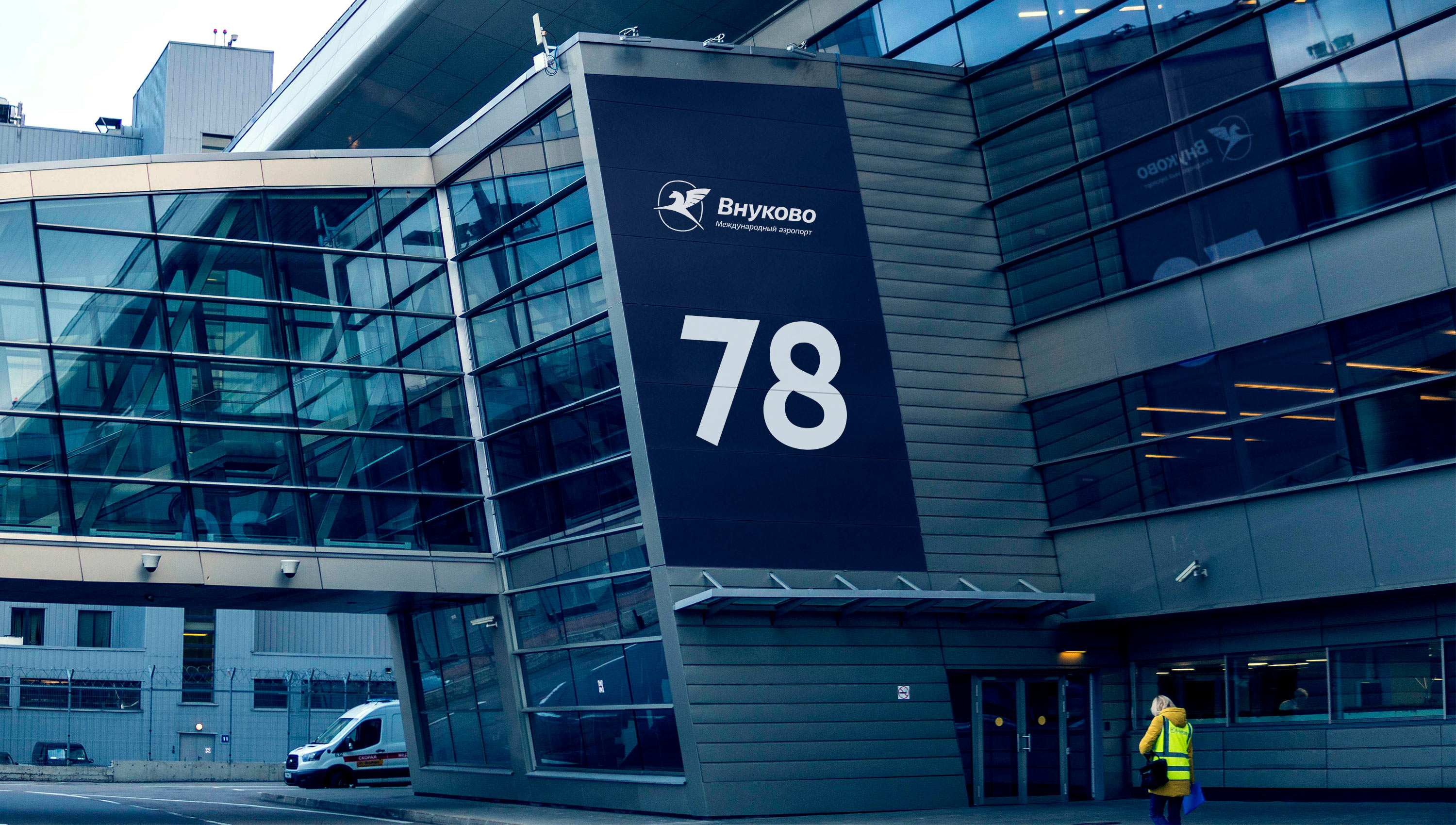
Логотип и айдентика аэропорта Внуково
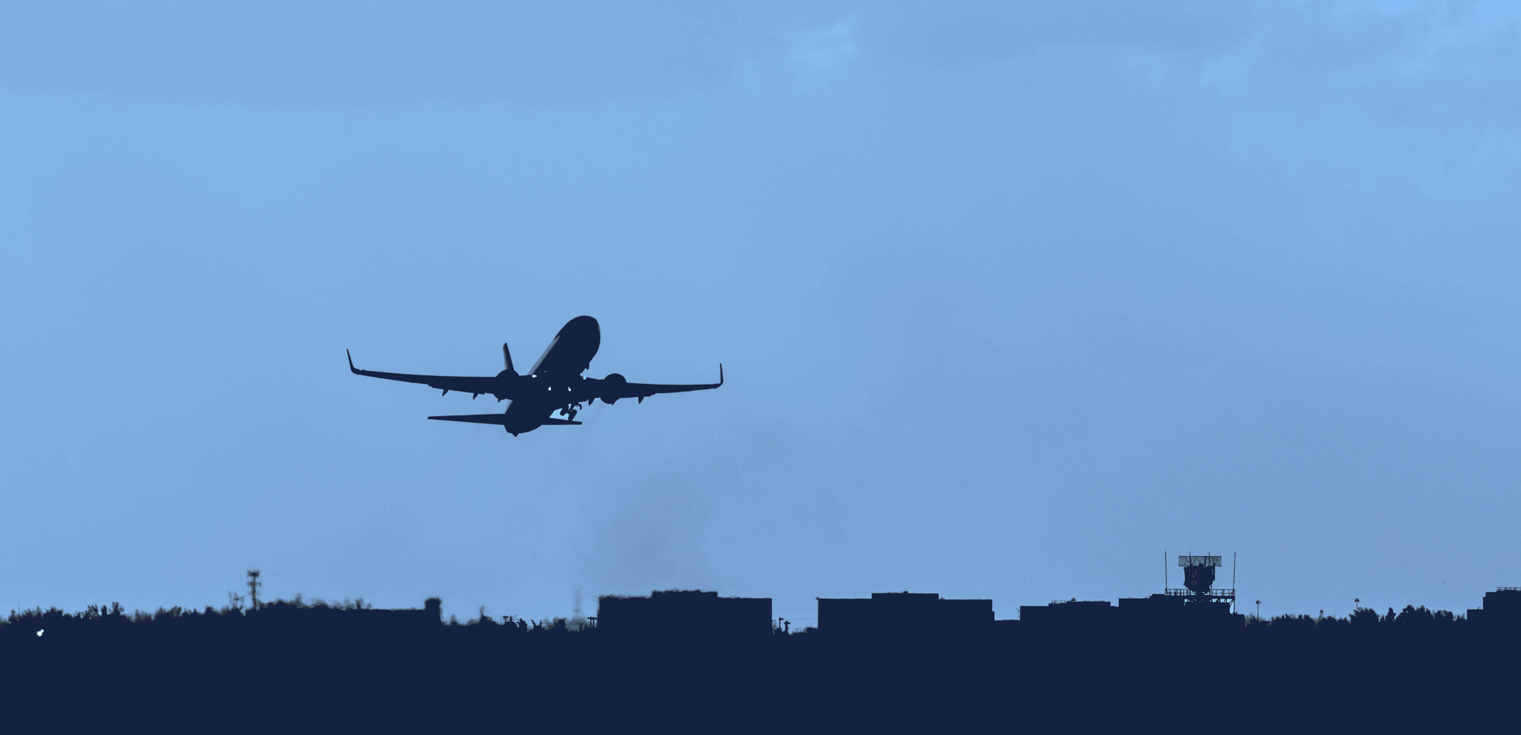
Vnukovo is one of Moscow’s main airports. It is closely connected to the history of our country and Russia’s civil aviation.
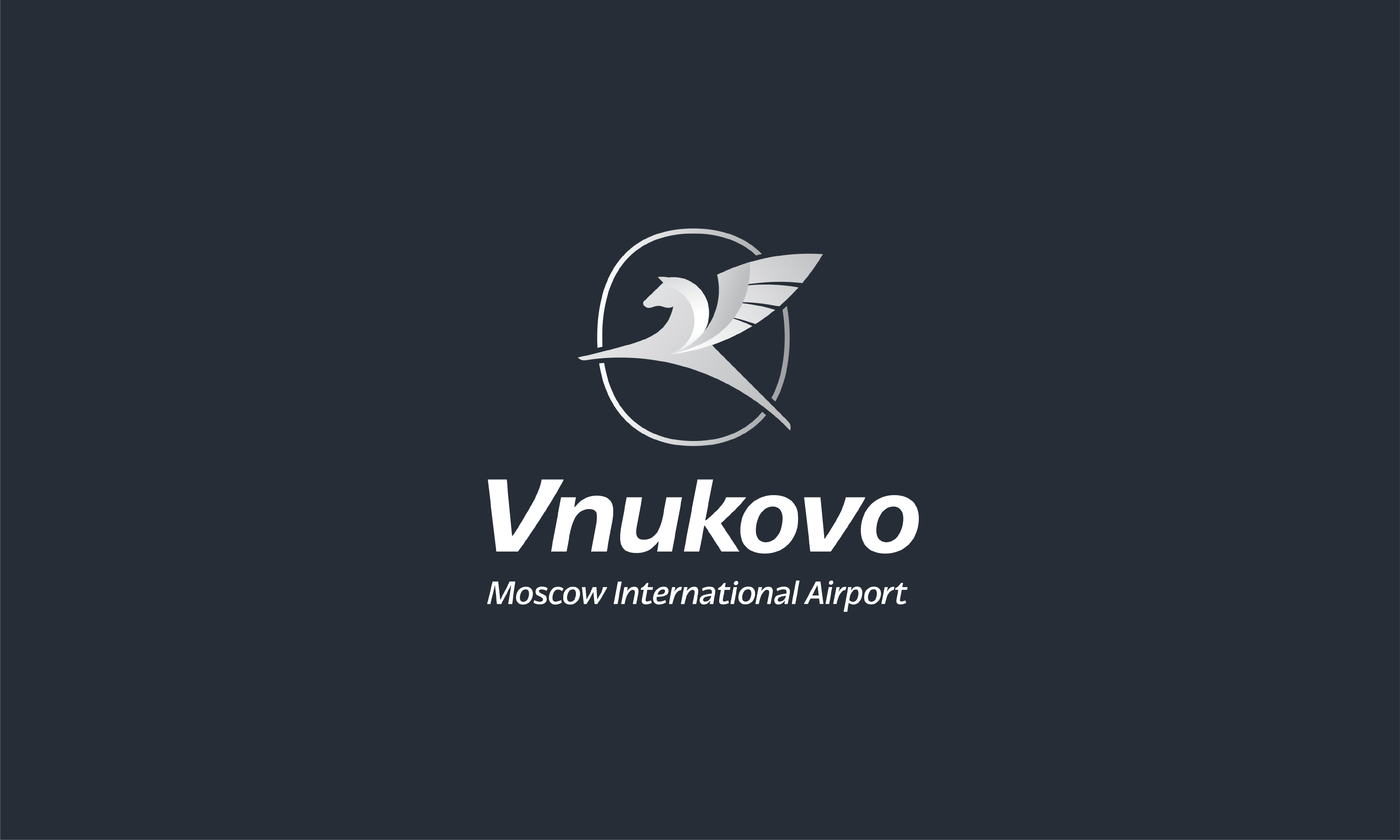
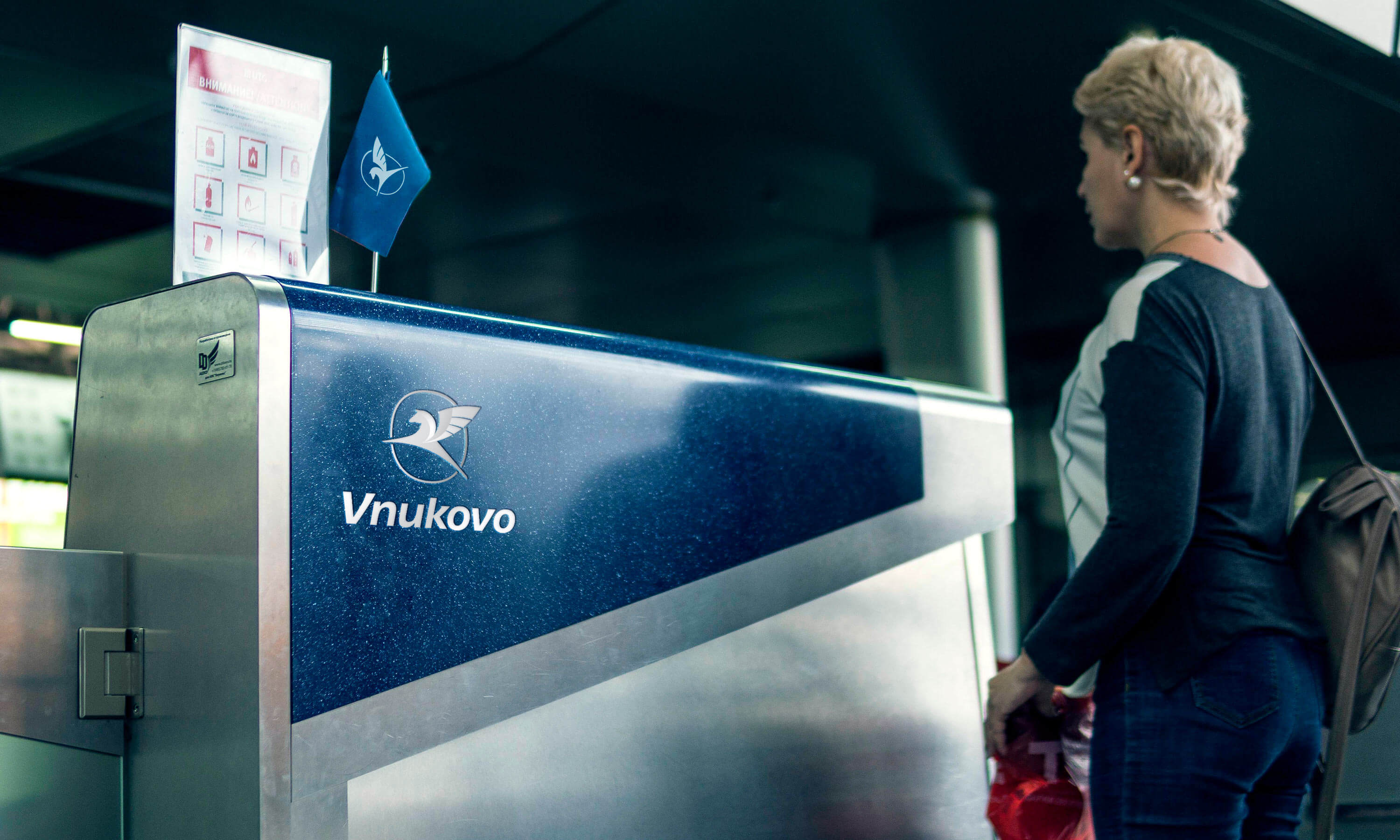
The airport’s logo has always used the image of a fast and strong Pegasus, but it had to be updated and modernized. We freed Pegasus from the frames that held him down, added volume as well as bright, pure colors. The rapidly flying logo is supported by a slanted typeface.
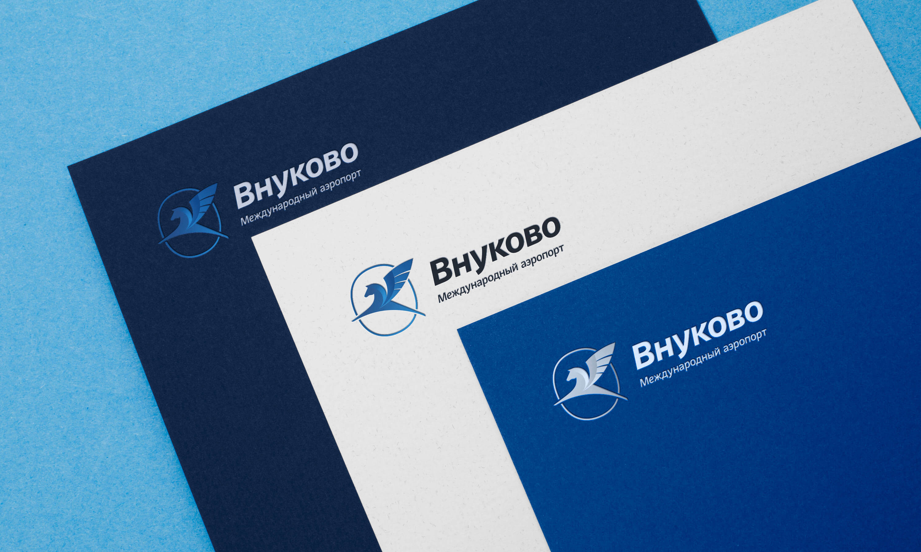
Gradients emphasize the letter V, the first letter of the airport’s name.
The logo can be mirrored to face right. Rotating it produces additional meaning and a new emotion. The window symbolizes Moscow, and it also looks like Pegasus is flying out of Vnukovo.
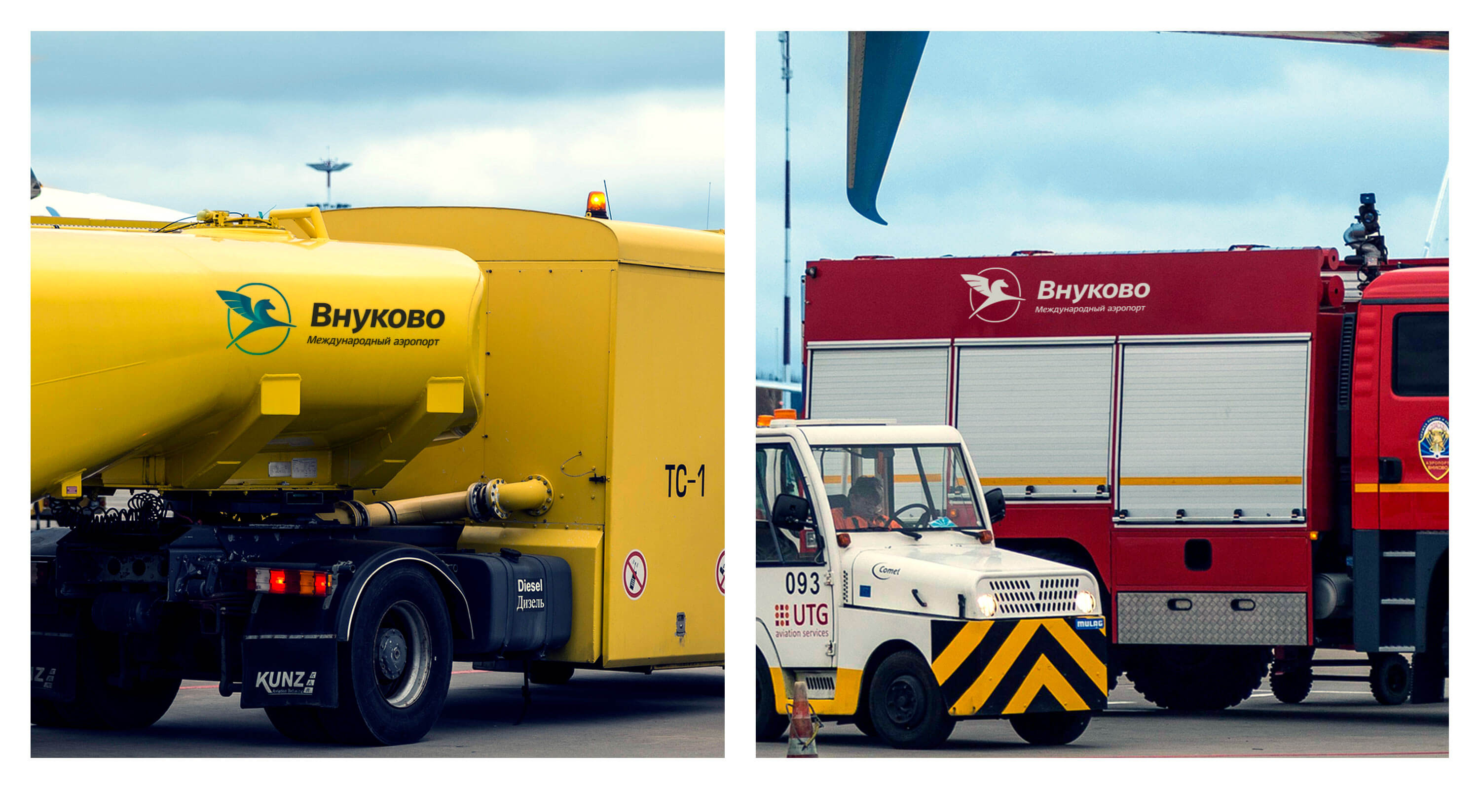
When the logo is placed on vehicles, it faces the direction of travel.
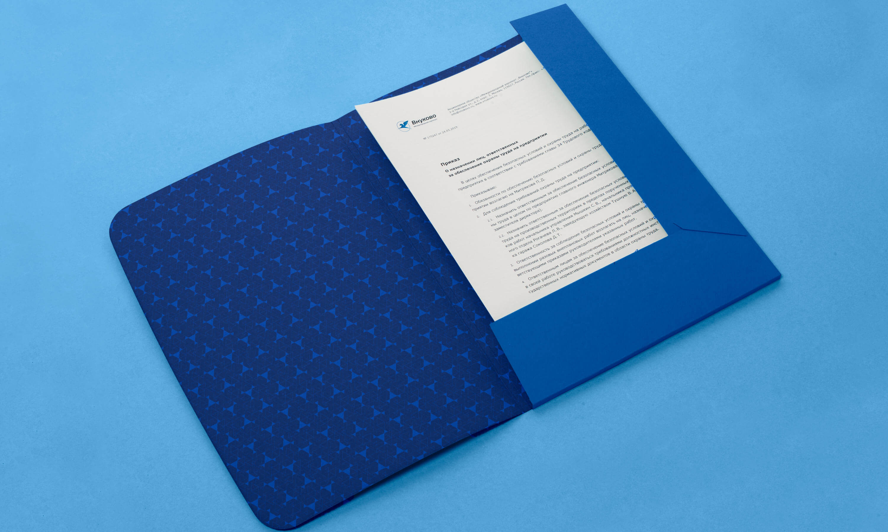
A dynamic pattern creates an impression of continuous movement and is perfectly suited for use on jacquard suit fabrics and for embossing on leather chairs and accessories.
A triangle is a symbol of movement and flight. It is traditionally used in navigation apps and serves as a simplified representation of an aircraft. The triangle is also the main motif of the pattern on the ceiling of Vnukovo airport.