People who try to save on construction materials for their home, buy siding and bitumen shingles. In pursuit of their attention, manufacturers use similar marketing and design ideas trying to outshout each other. Their websites are characterized by infinitely complex navigation, fussy rhetorics and unaesthetic surrogates in place of real products.
Döcke’s new website revolutionizes the aesthetics and usefulness of budget construction materials and distances the company further away from competition.

Story by
Maksim Rozov
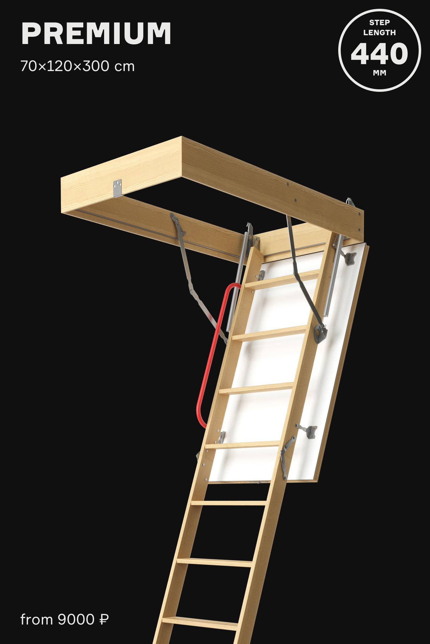
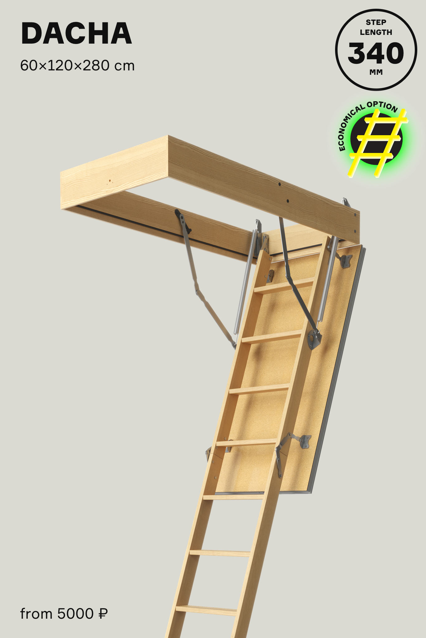
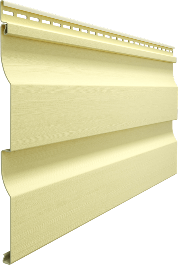
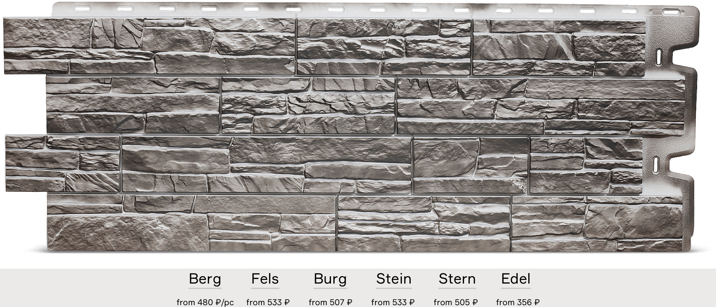
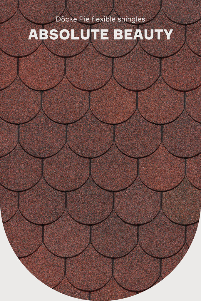
➀ People want to live in beautiful homes, even if everyone has a different idea of what that means. Instead of talking about beauty, the website of Döcke, a manufacturer of finishing materials, simply shows it. The website uses three presentations of products:
- product display
- result
- addition
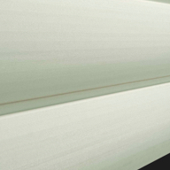
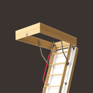
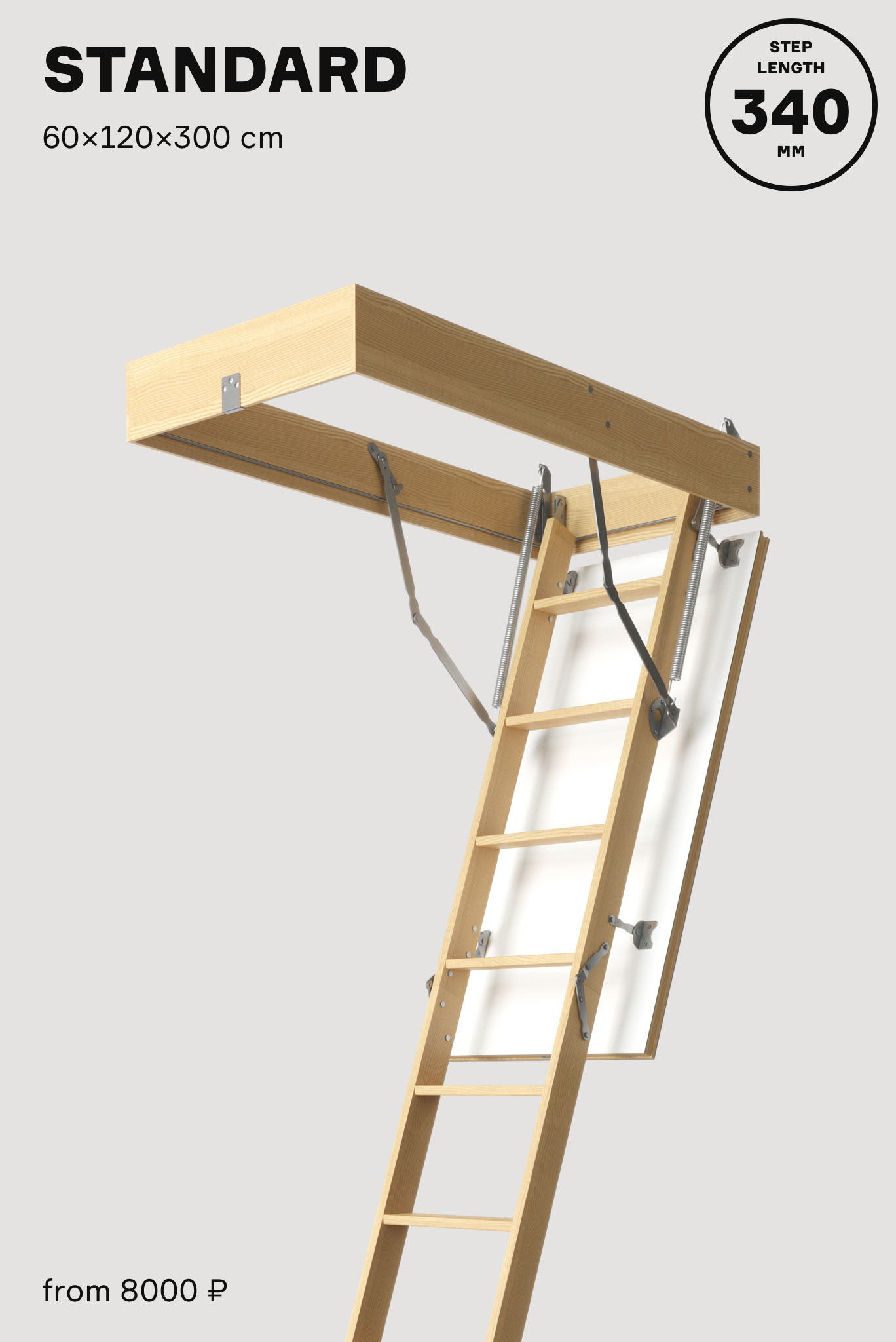
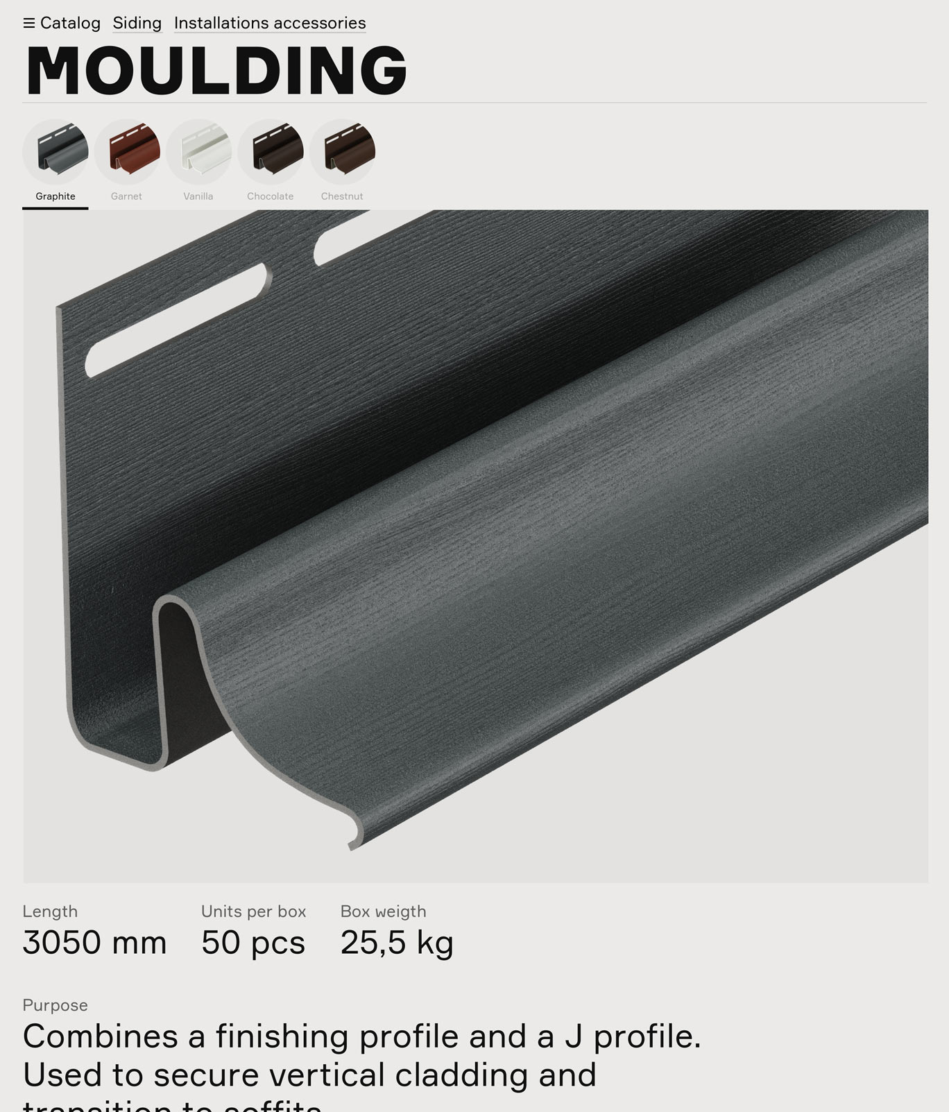
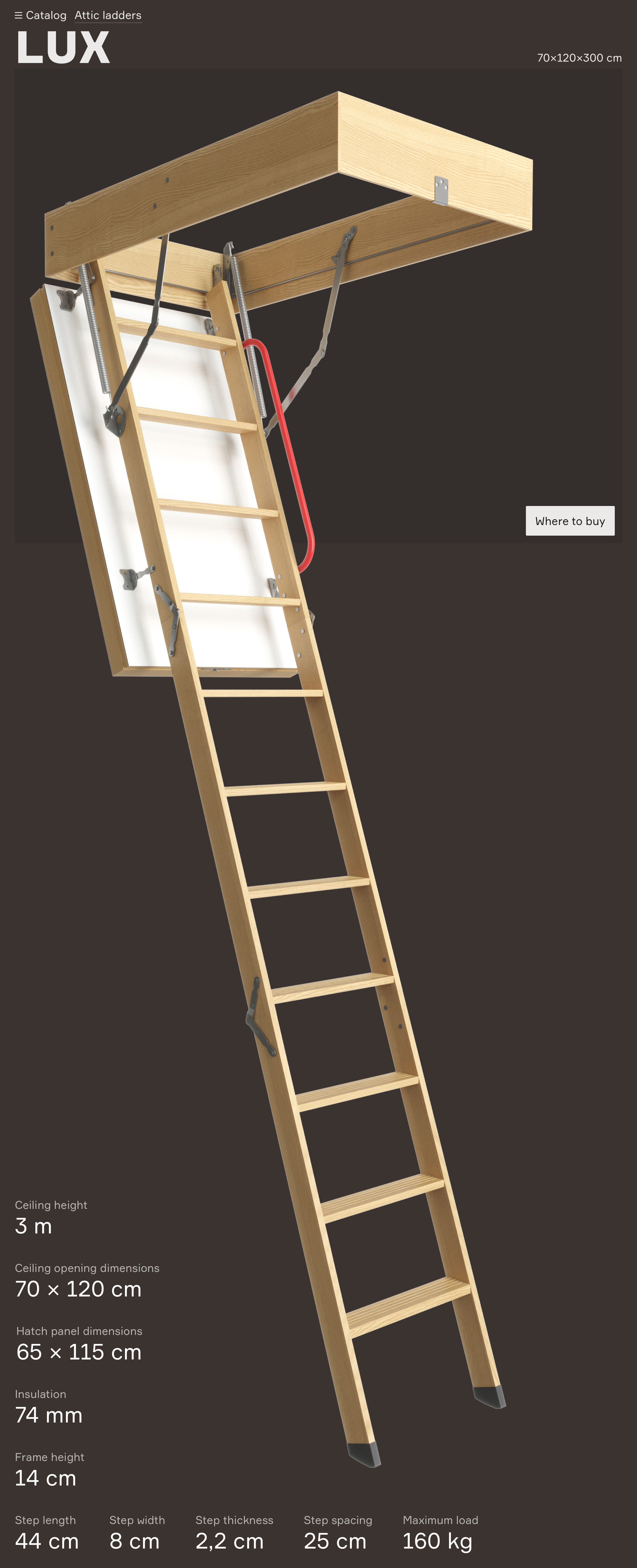
➁ Product display is the main view of the object of purchase. Here, it is very important to accurately convey the shape, color, texture and sometimes even the function of the product. This view is always placed up front and is tasked with creating the first impression, something that it does perfectly.


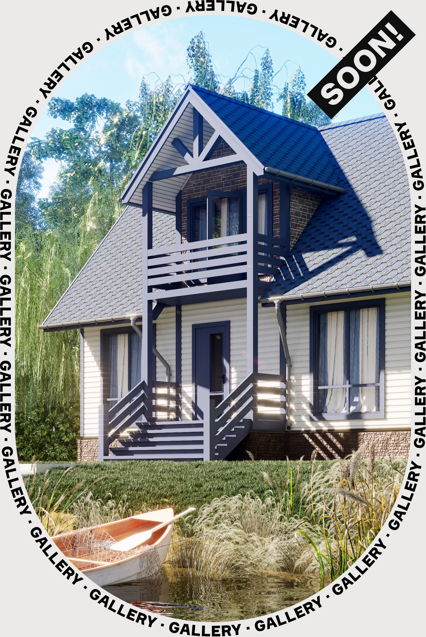
➂ When the first impression is created and all the necessary facts are presented, the result comes into play. It allows to understand what need a person will satisfy by buying this product. The result of buying any construction material of course is always a home, a home you would want to live in and one that would become the subject of envious gossip of the neighbors.
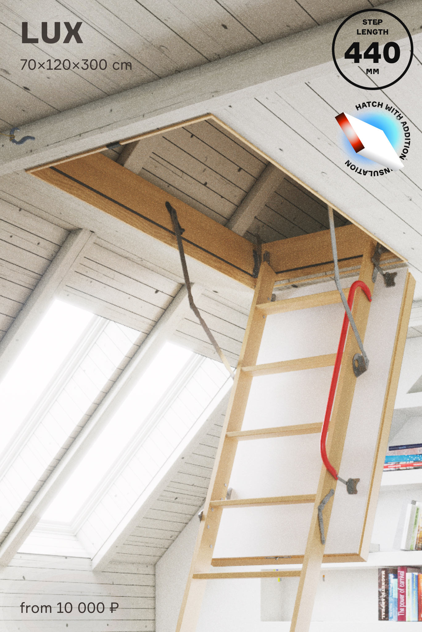
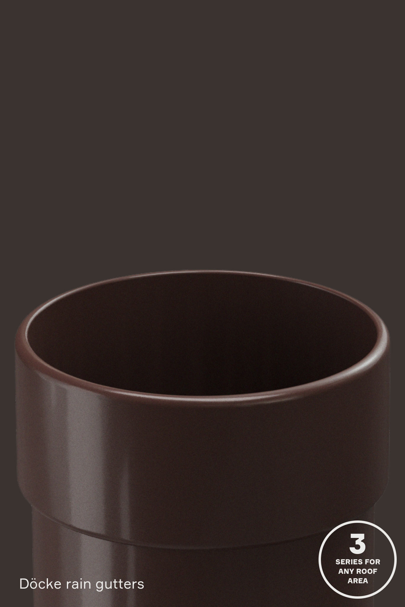
➃ Emotional additions help complete the image. These are various things that are not directly related to the product but speak perfectly about its properties. Their other task is to help the company stand out. The variety of additions for each product is generated using a mood board.
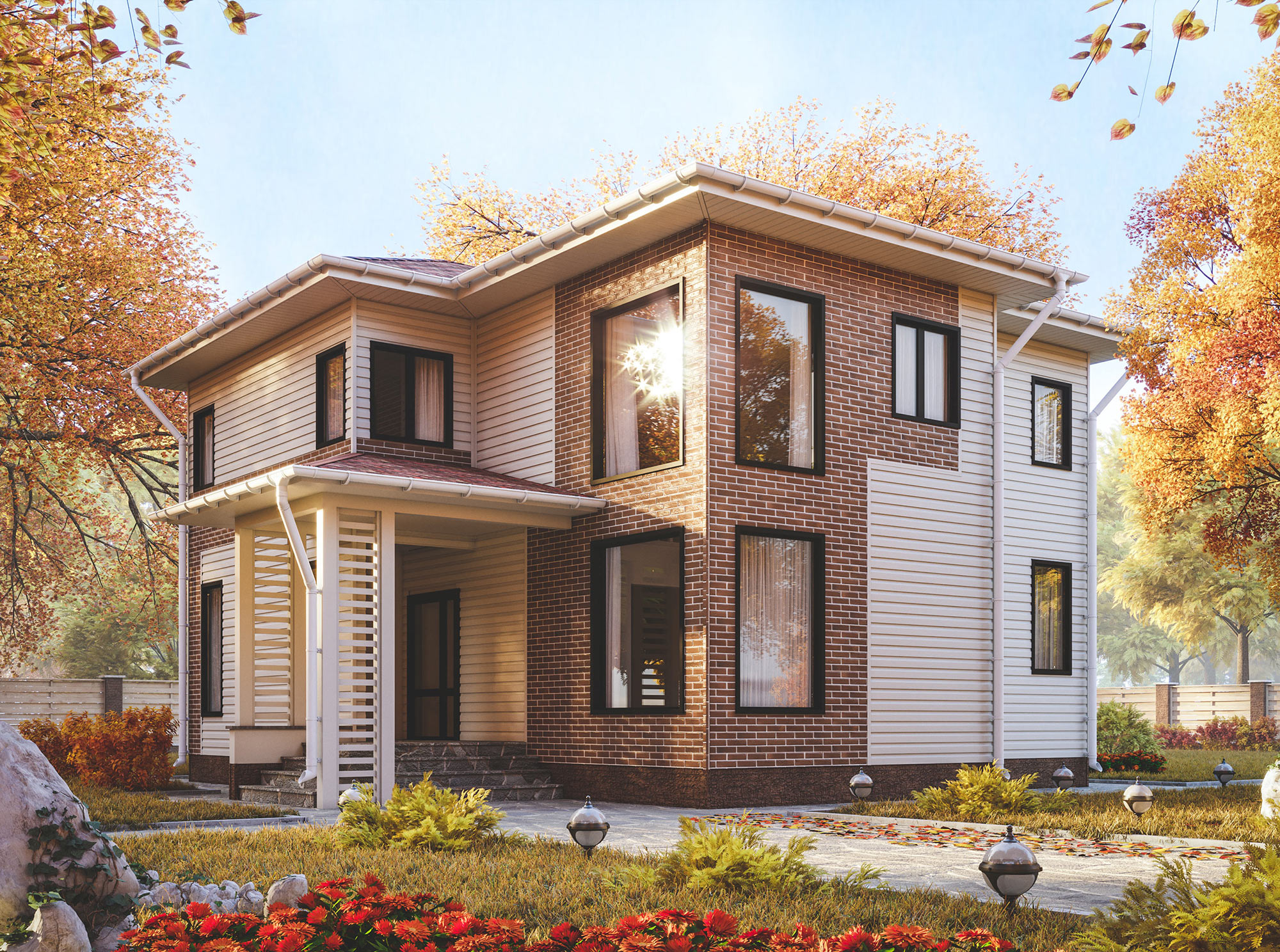
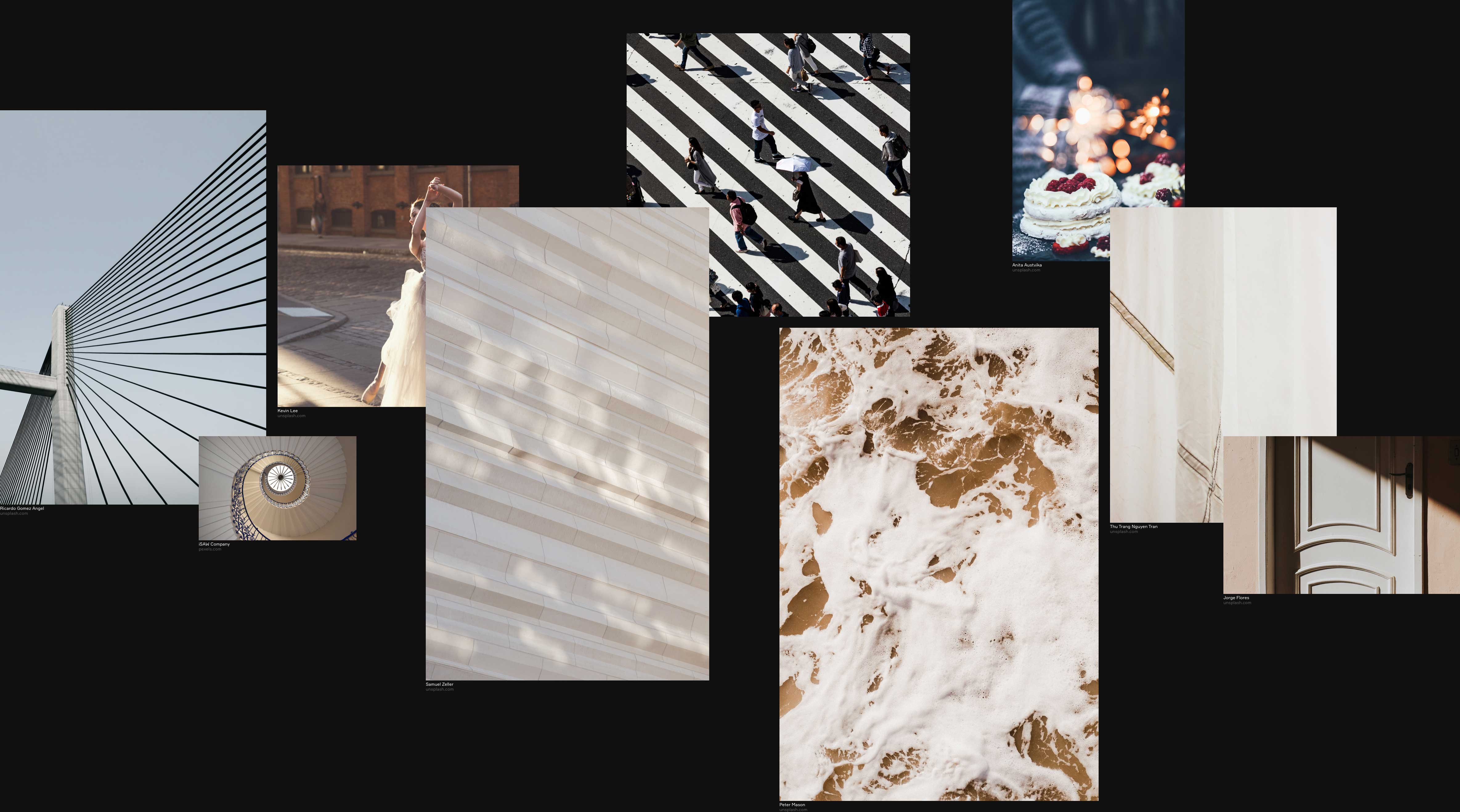
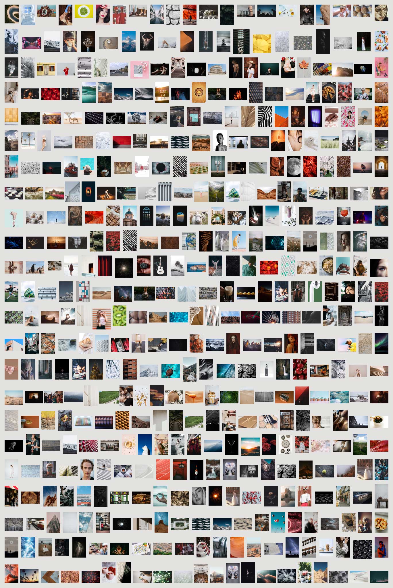
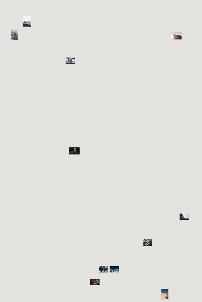
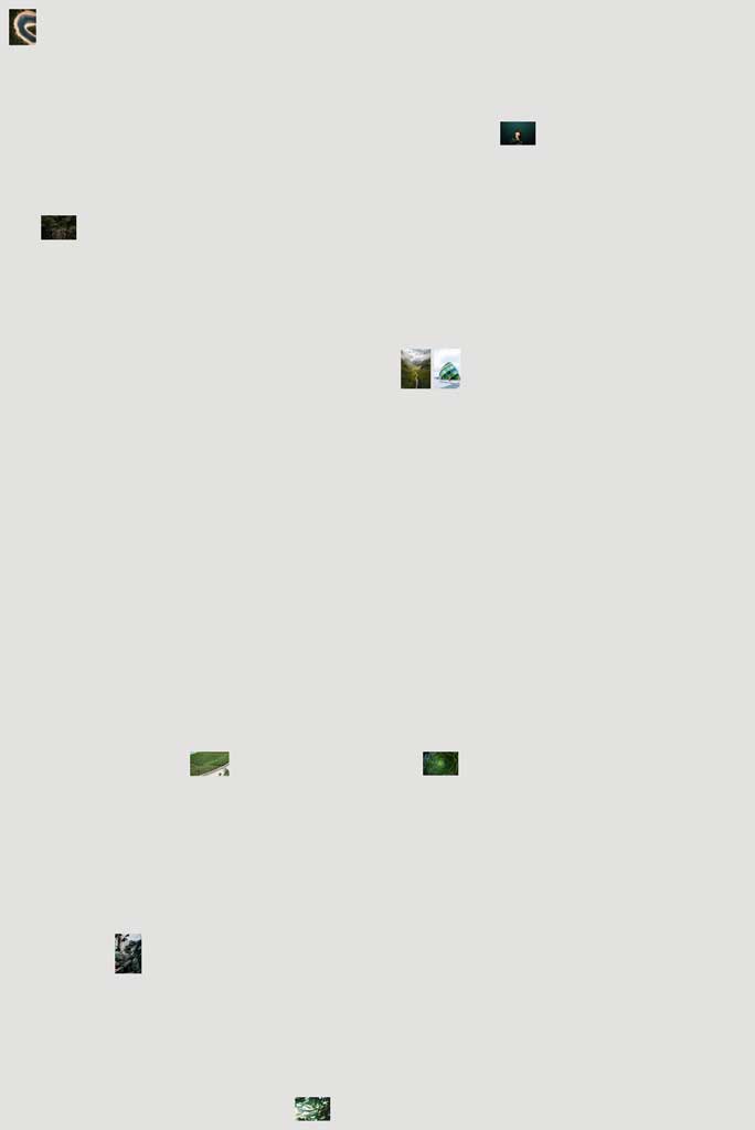
Mood boards are always built automatically, so there are never two identical sets. Images for the boards are preselected and grouped according to their texture, color, category and product price. Over 1,500 pictures were prepared for 890 products.
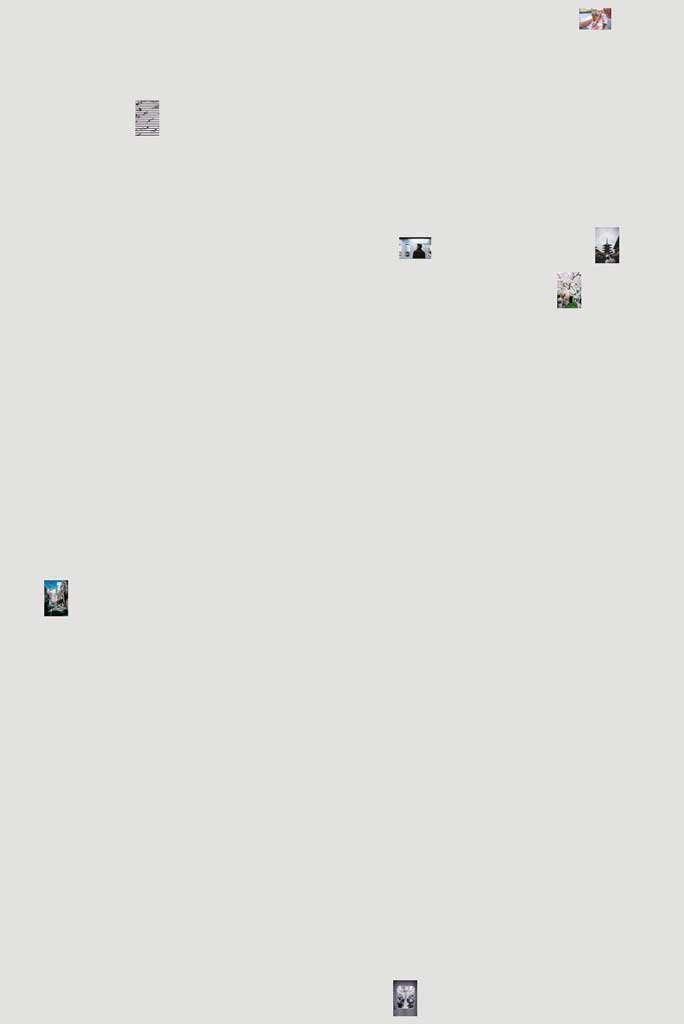
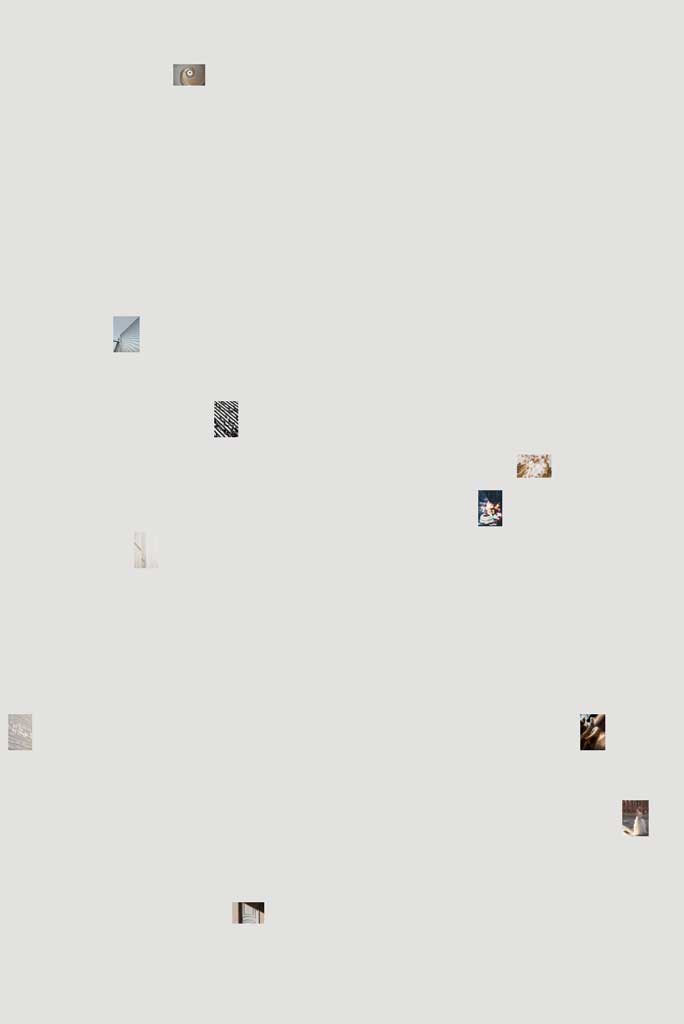
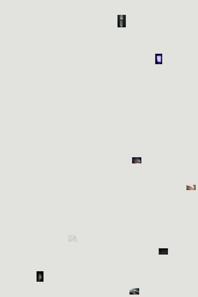

➄ When it comes to the beauty of a home, everything is important. Which is why the pages of the website show all fittings in as much detail as the major products. Even such a “secondary” thing as a box of nails becomes more attractive, making you want to look at it closely.
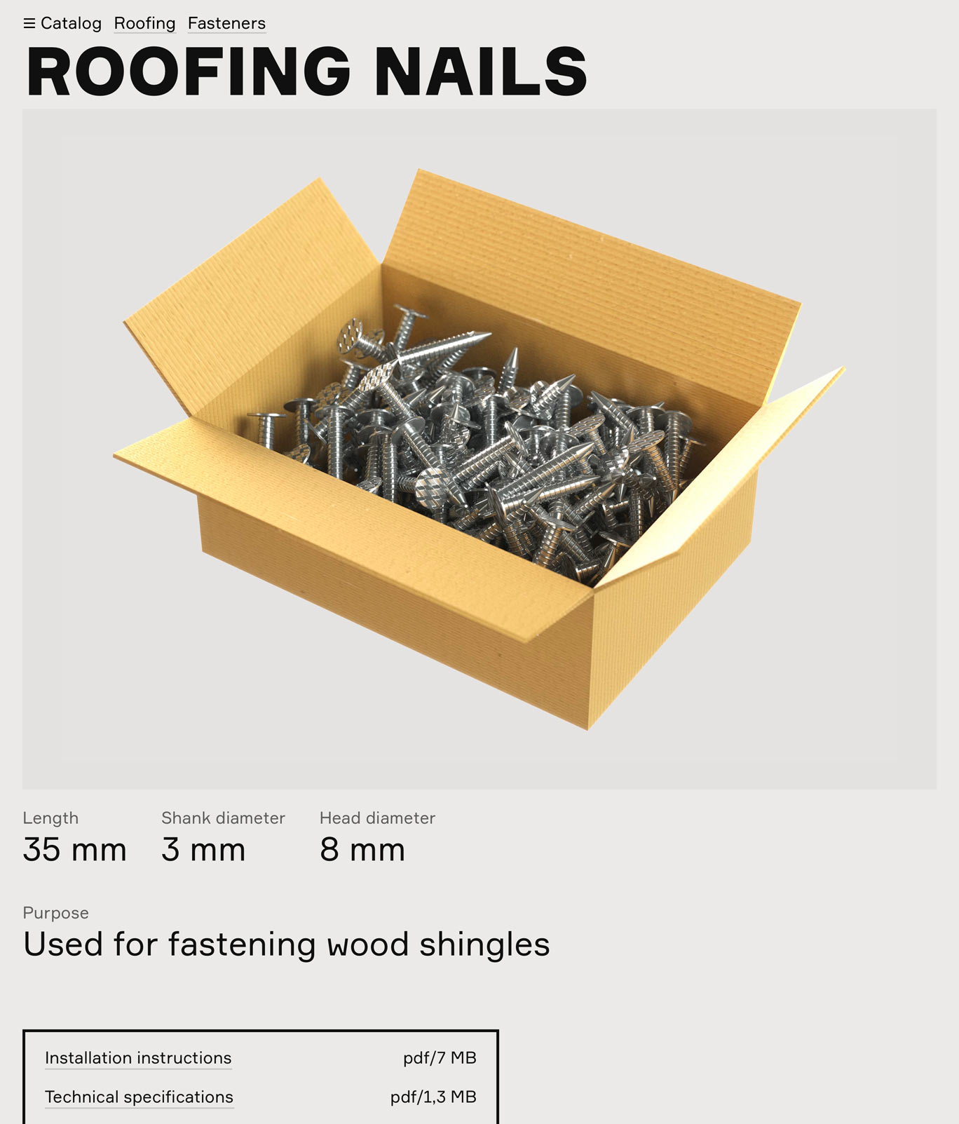
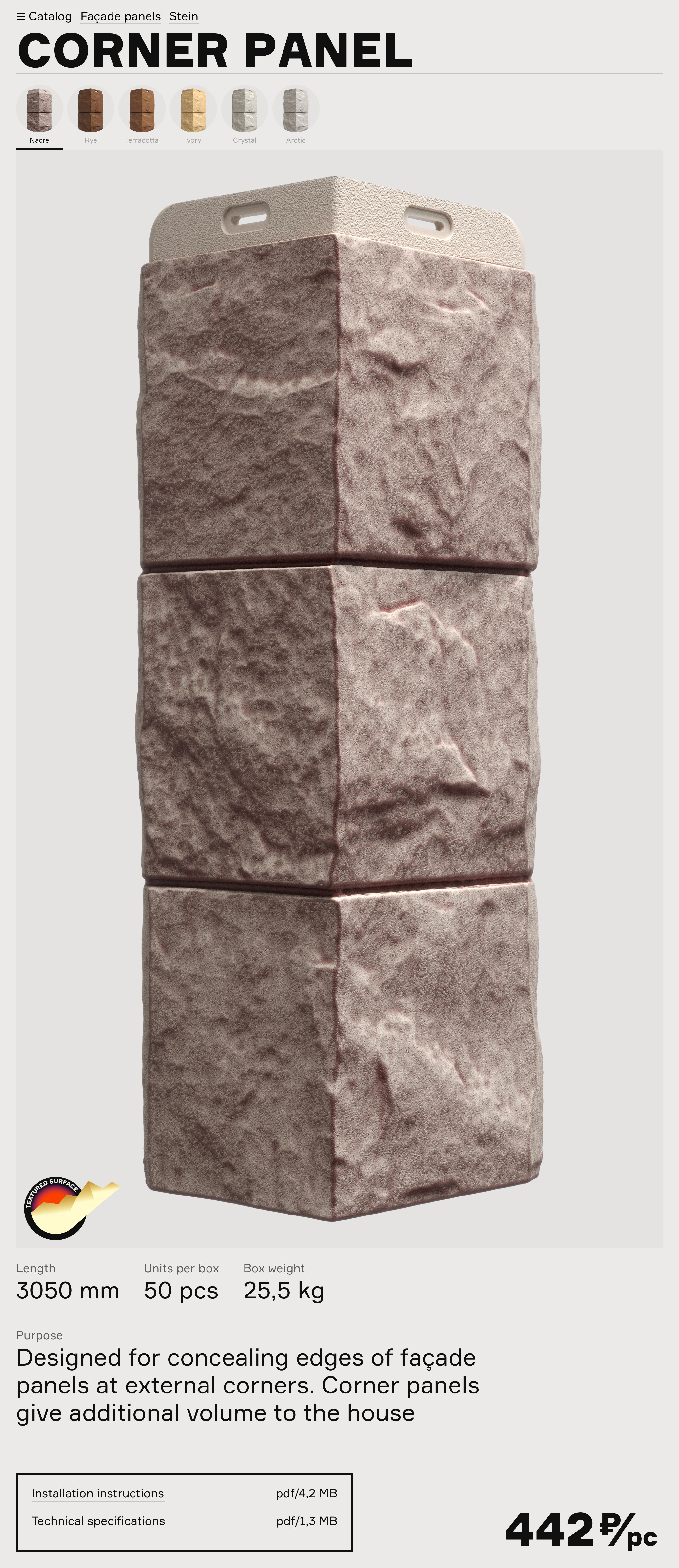
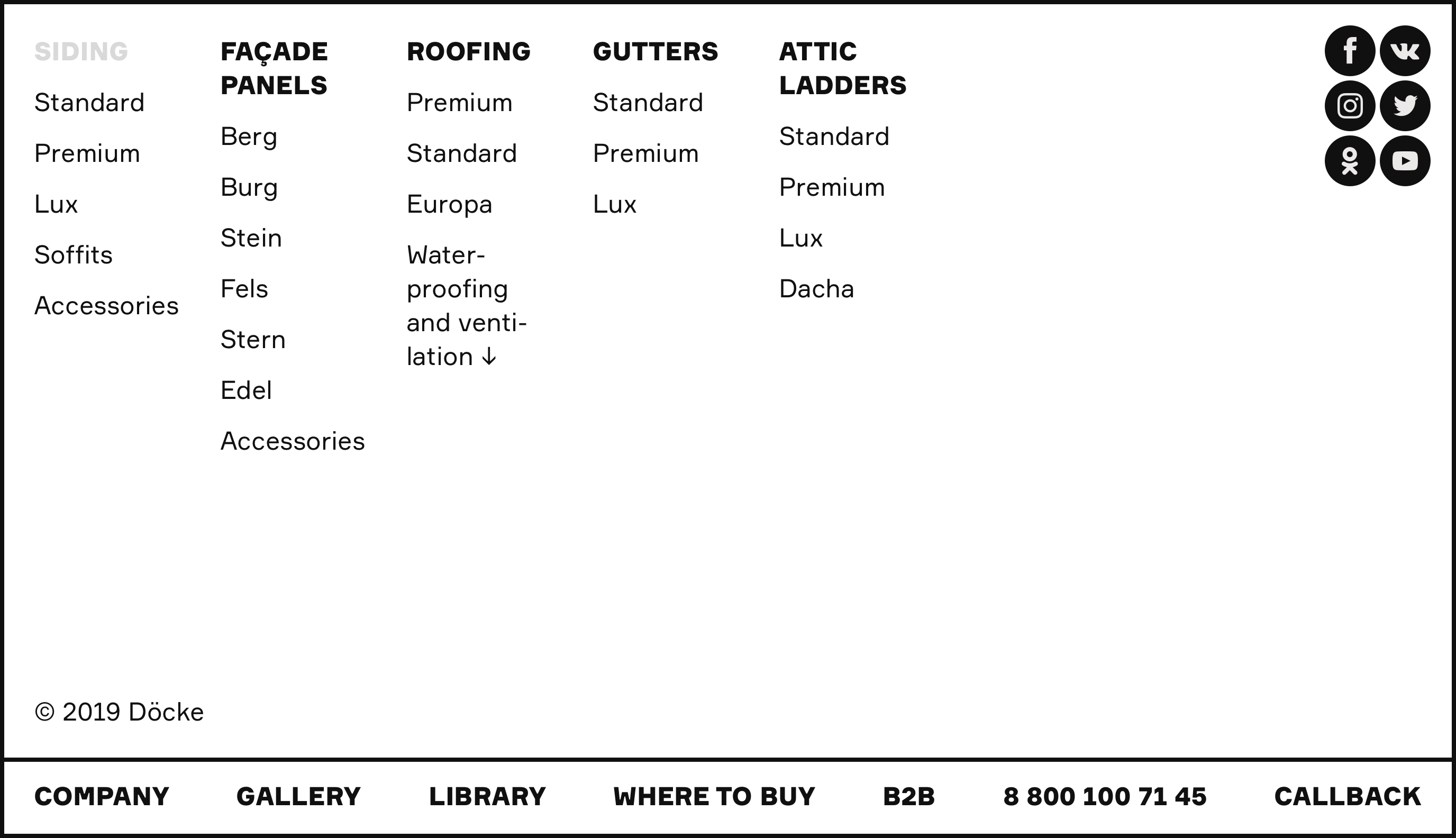
➅ We made the decision to abandon multi-level navigation that is traditional for online catalogs. All it does is just confuse visitors, making them follow endless links, as if when asked to show a specific product, the seller would give the customer a tour of the entire store.

With Döcke, everything is different. All products are available in a single click.
➆ Manufacturers really like to talk about wide product ranges. This leads to websites with dozens of pages with verbose descriptions of product series. In offline, however, all products can be seen at the same time.
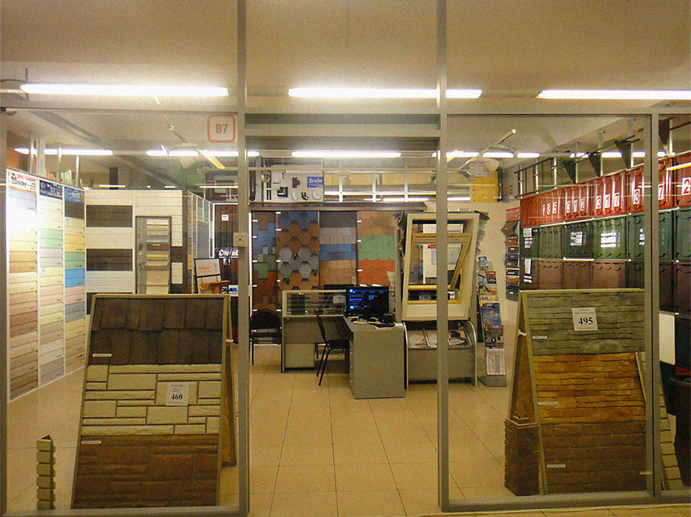
In a real store, no one hides the goods behind the door with a Catalog sign.
Instead of talking about a wide selection, the website demonstrates it. The customer examines the catalog in the same way they would a shelf in a store.
At the right moment, the website provides gentle hints about differences between product series, better ways to choose a product, requirements for its installation and potential alternatives.
Since customers often choose construction materials by color, similar combinations are located close to each other. This makes even the slightest difference in shades obvious.

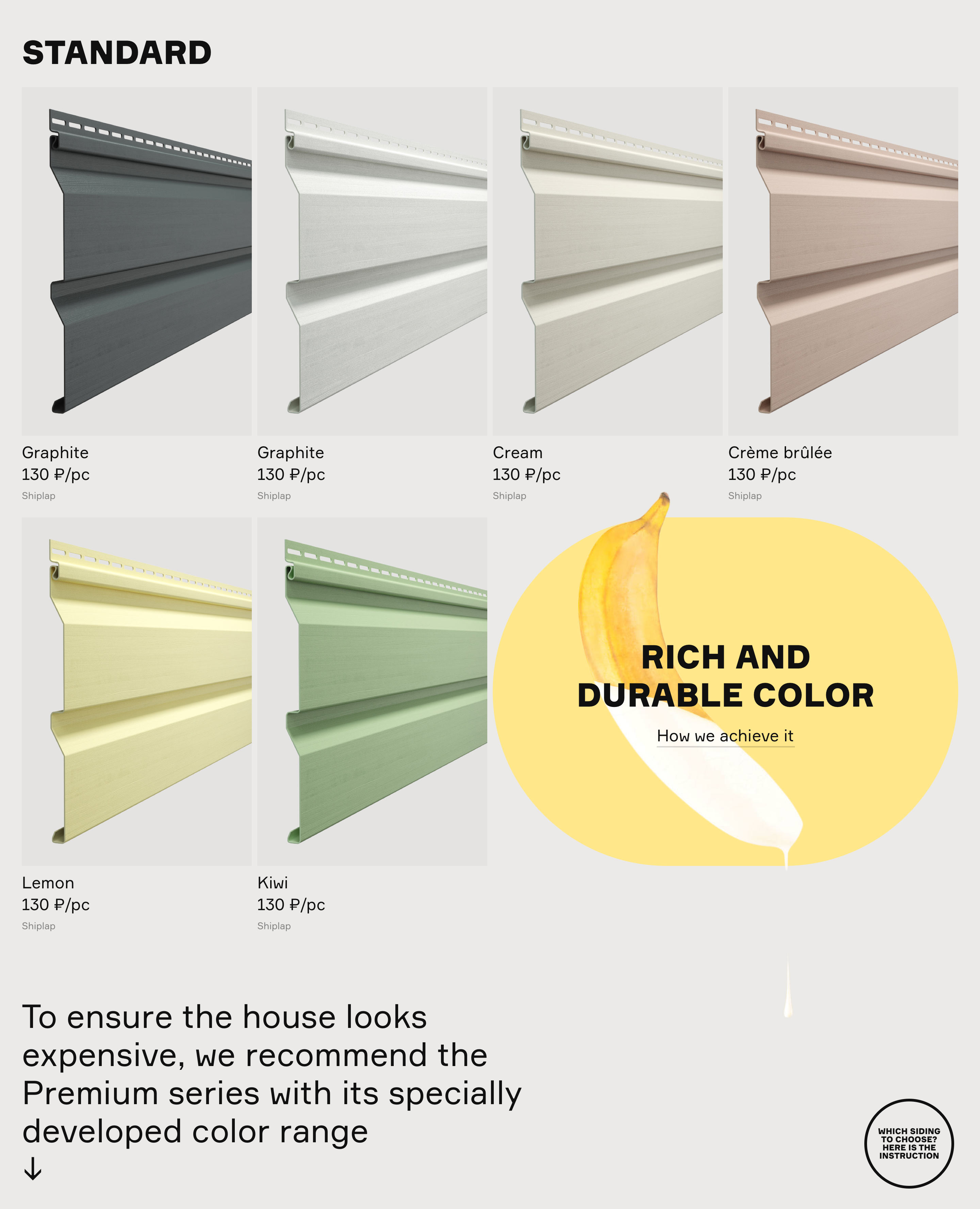
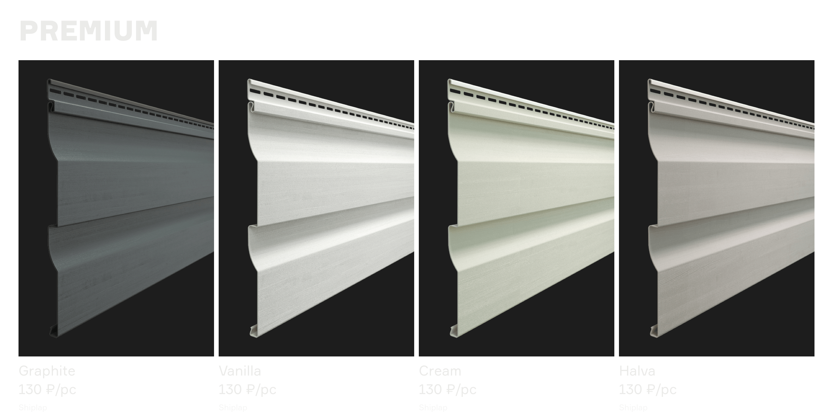
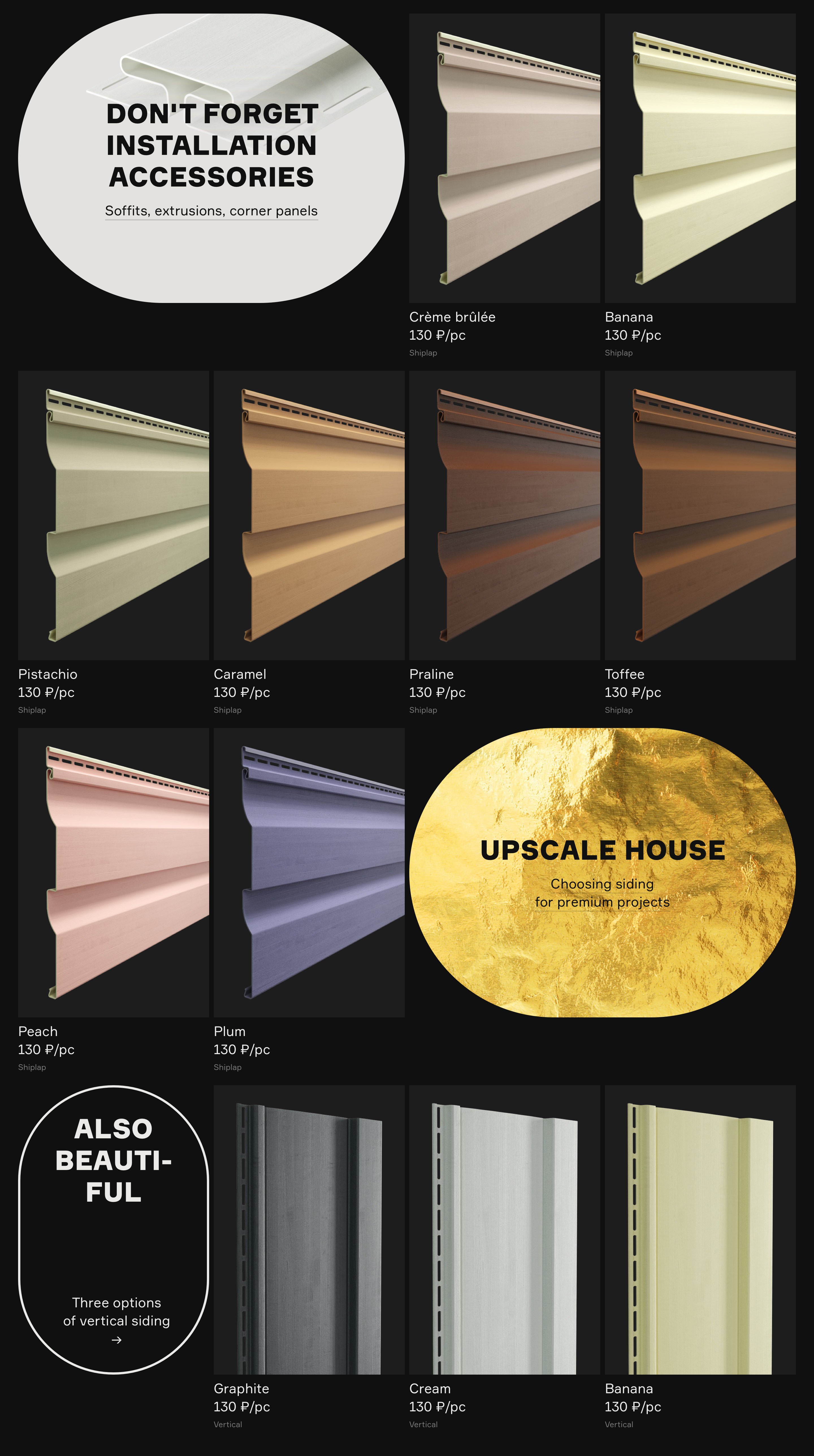



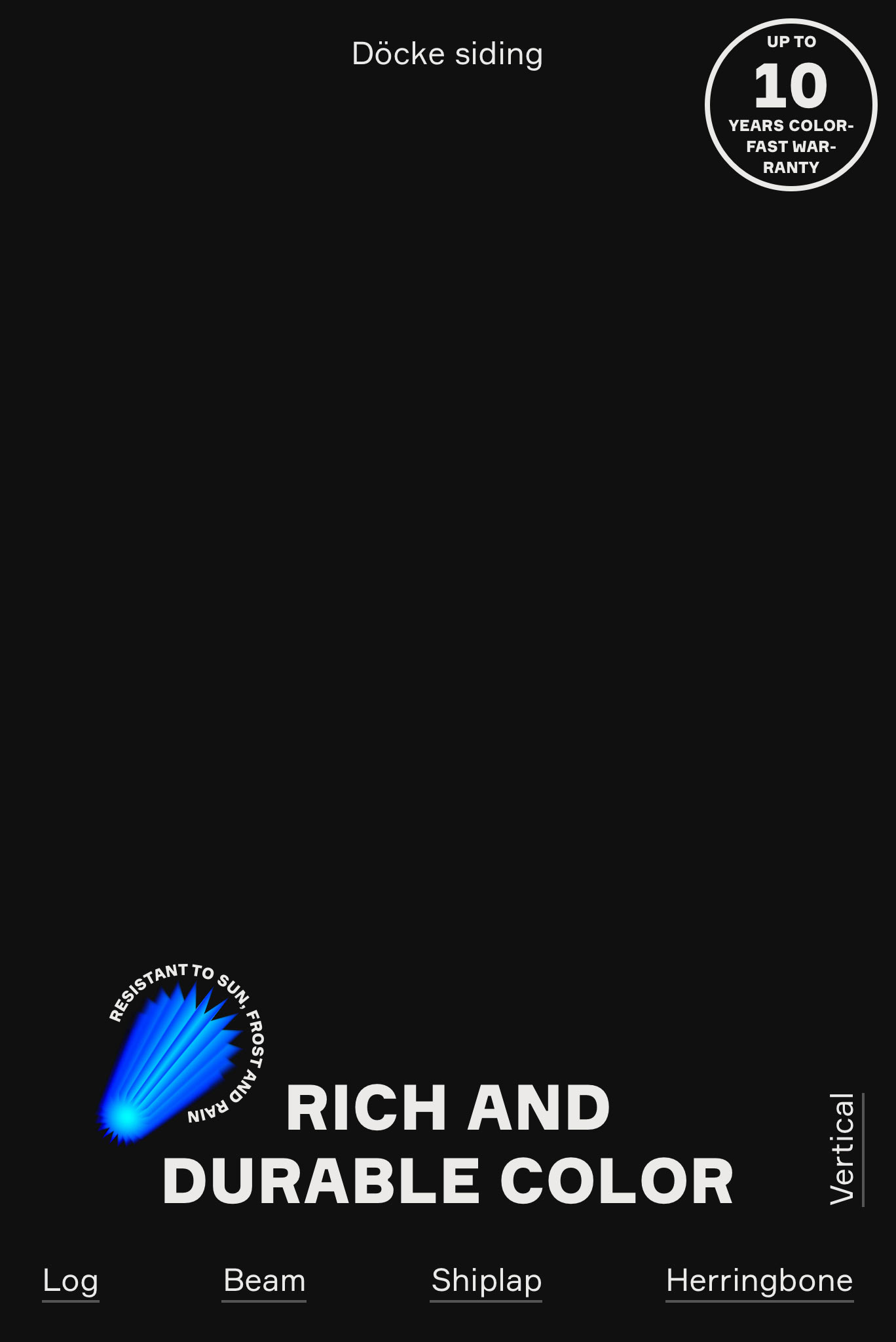
➇ Bright stickers and attractive labels draw attention to key properties of products, help make a choice and set the mood. In addition to width, product ranges acquire depth, too.
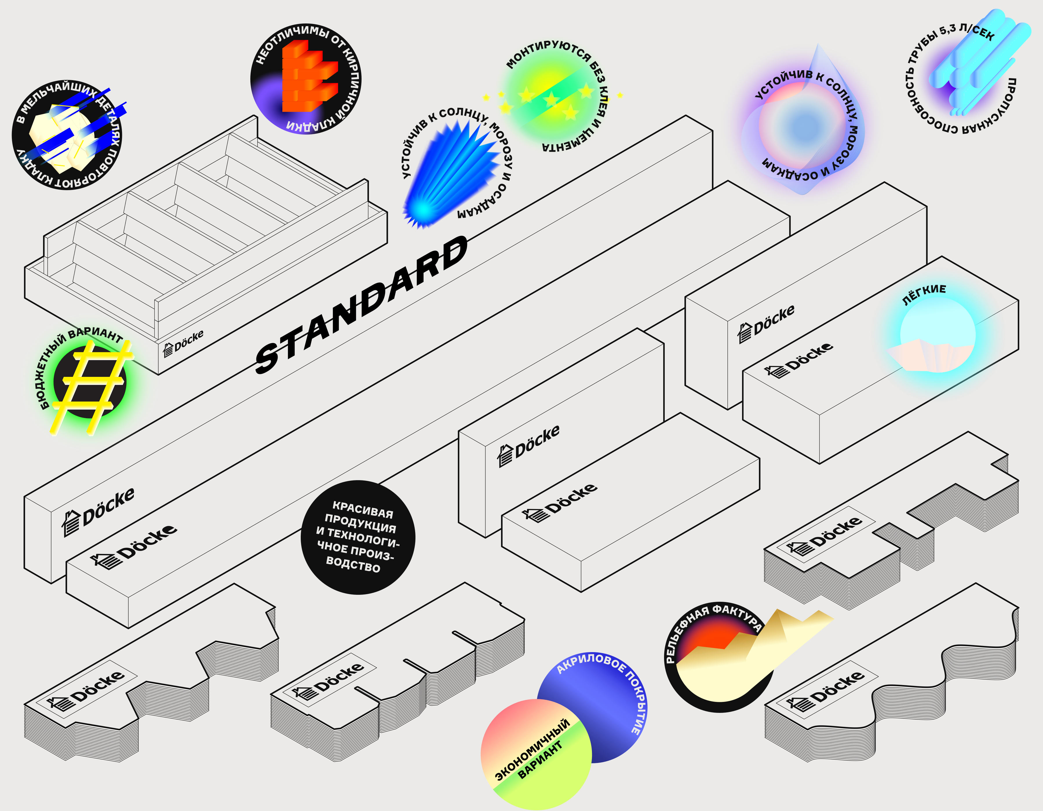
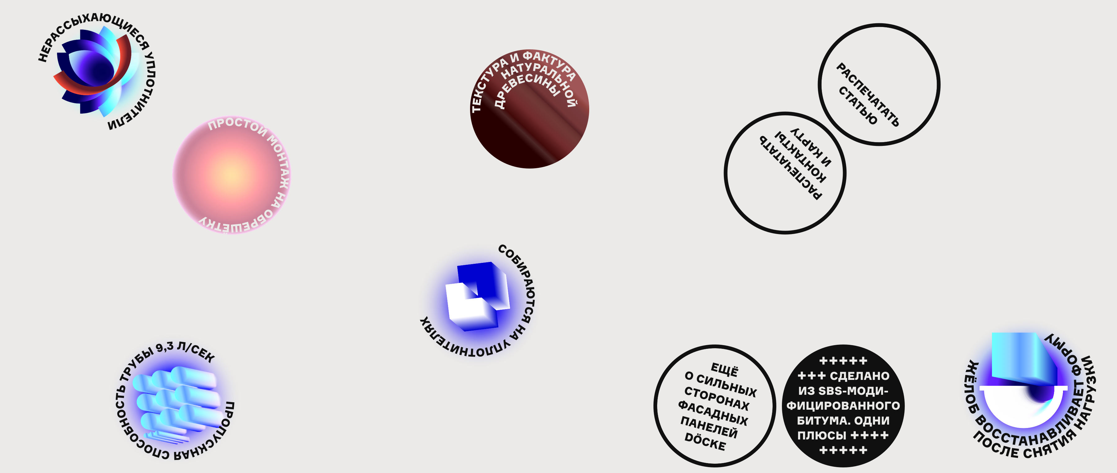


➈ Specially for the website we chose the right words that clearly convey the facts and along with the carefully planned design help formulate the character of the brand. This is how a competent consultant talks to a customer.
The texts perfectly complement the images, enhance advertising slogans and complete the overall picture. As a result, even simple visual metaphors become memorable.
➉ There are no standard pages on the website, only non-standard ones. Information that many have come to see as formal, secondary and uninteresting becomes an independent unit of meaning and works to enhance the image of a website. All we had to do was add a little design.
Even the Library section is transformed.

illustrator
- Albina Gainullina
type designer
- Taisiya Lushenko

