Gazprom Neft corporate typeface
Gazprom Neft regularly launches new products and projects. Each of them needs a logo that would have a unique character but still fit in the general corporate style. The typeface designed for this purpose allows to create text logos for different areas quickly and cost-effectively.
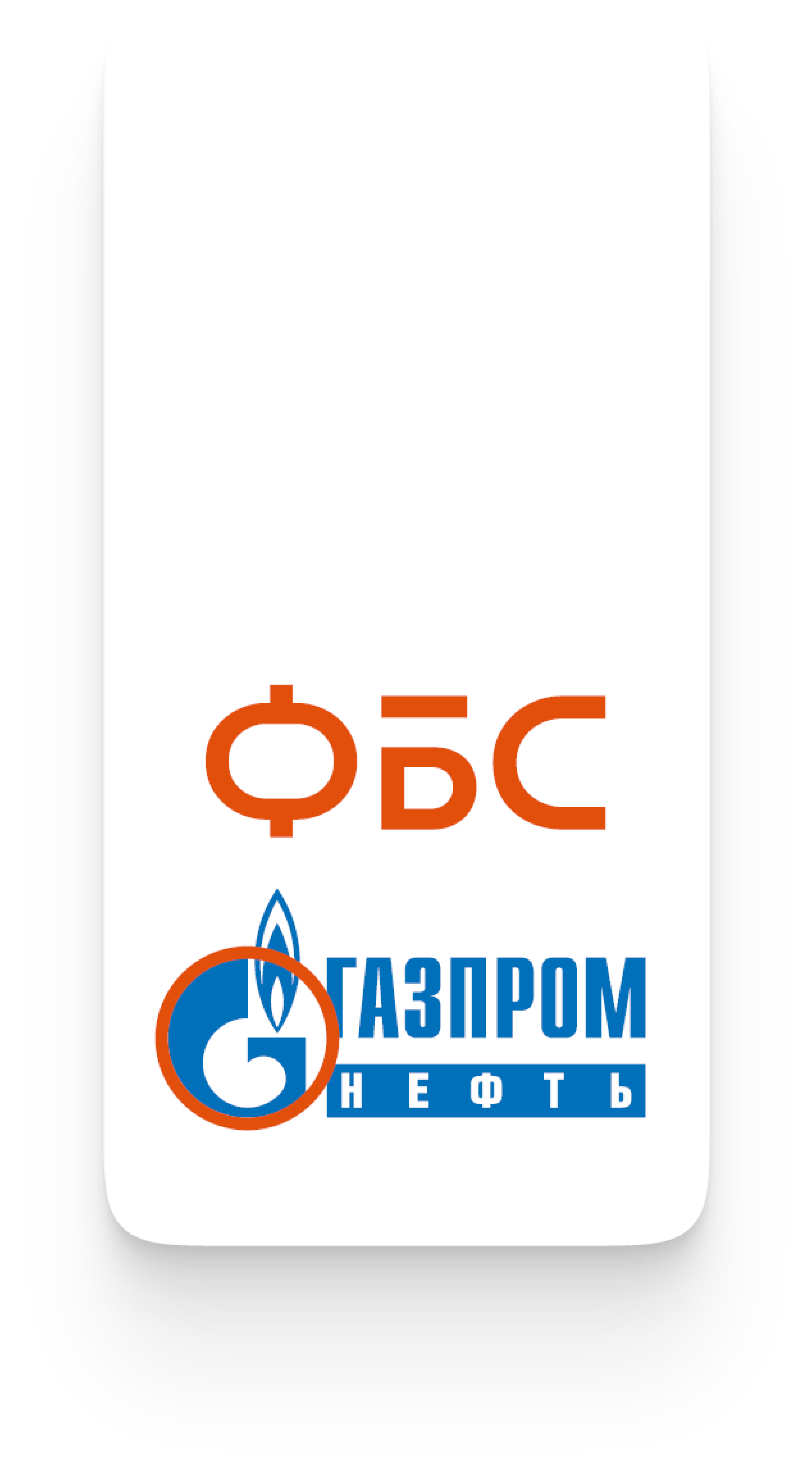
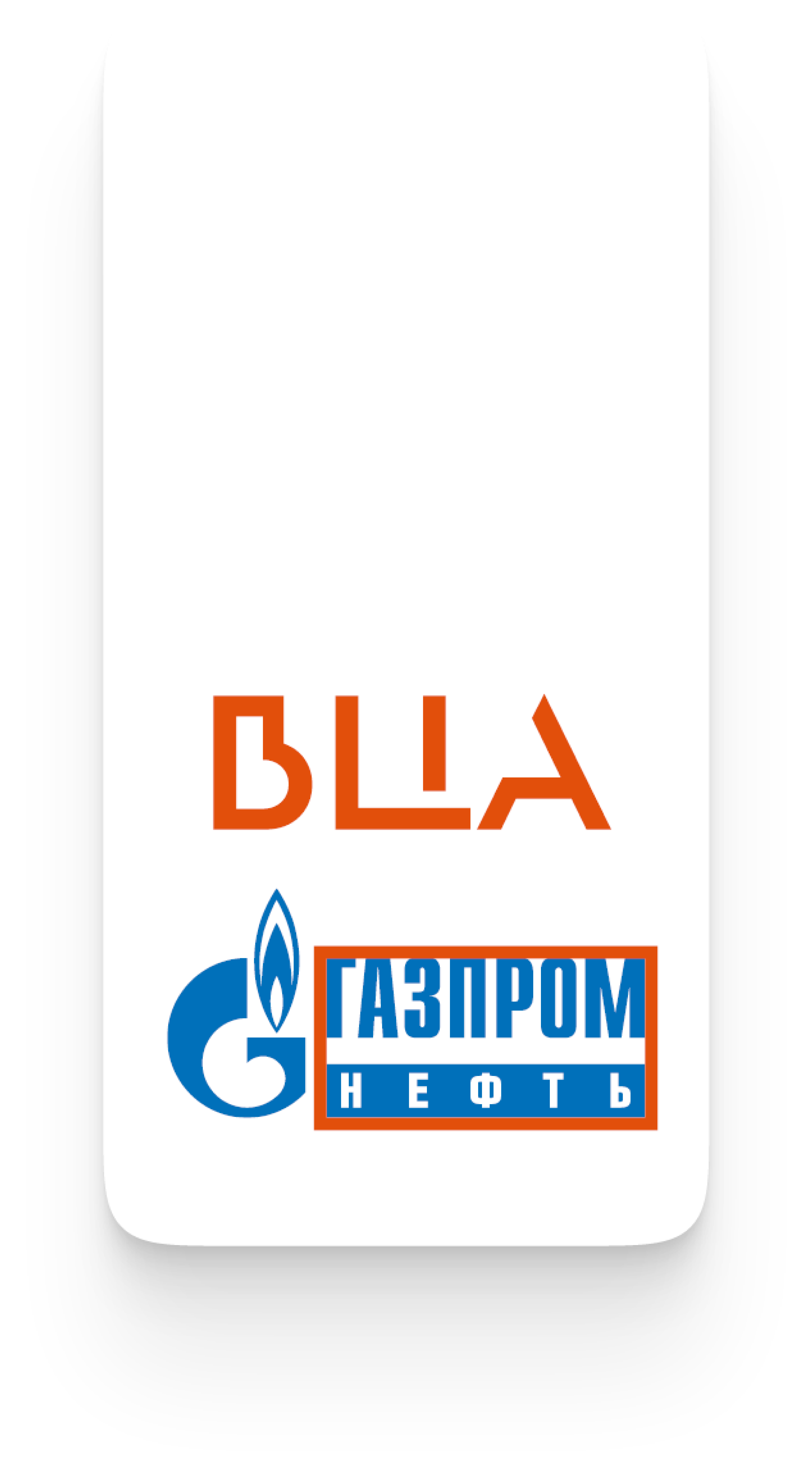
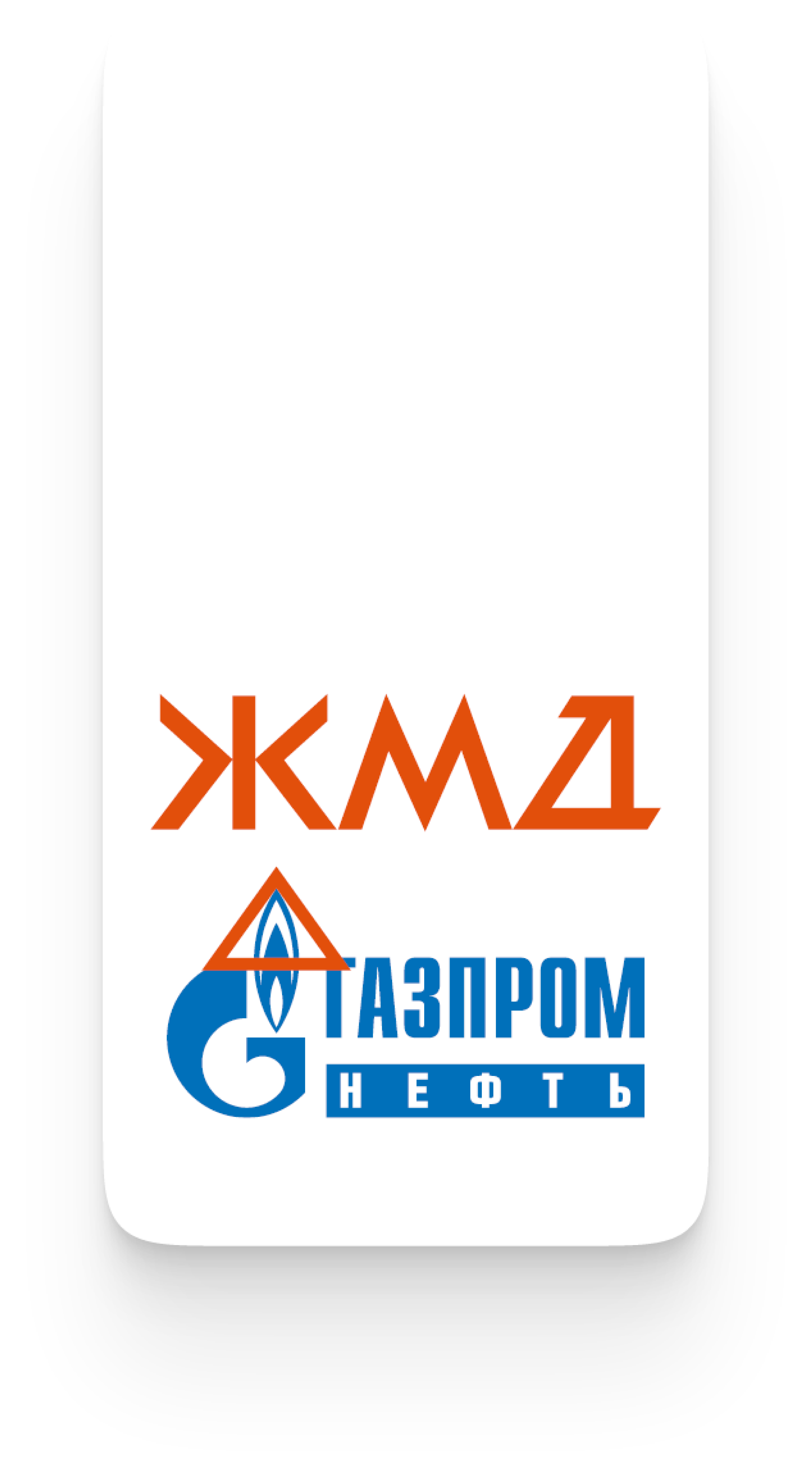
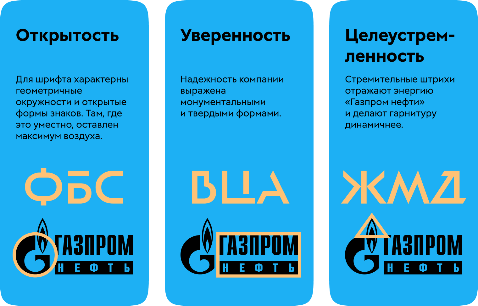
The corporate typeface is designed to be open, confident and purposeful, allowing it to attract attention without being flashy.
The basic set and two display sets become an excellent tool for creating text logos for a wide range of tasks. The variants are based on the same geometry: character width, stroke thickness and roundness remain the same with the only differences being in the shapes of characters.

Clear geometricity is combined with sharp beveled strokes. The typefaces work great individually and together.
The basic set is extremely universal but doesn’t rely on bright stylistic techniques. At the same time, it has its own character which allows it to feel at home in long headings and descriptors.


The open set is based on increased apertures, expressing character geometry to the fullest. Stability combined with openness emphasizes the utilitarian nature of products for which it is used.


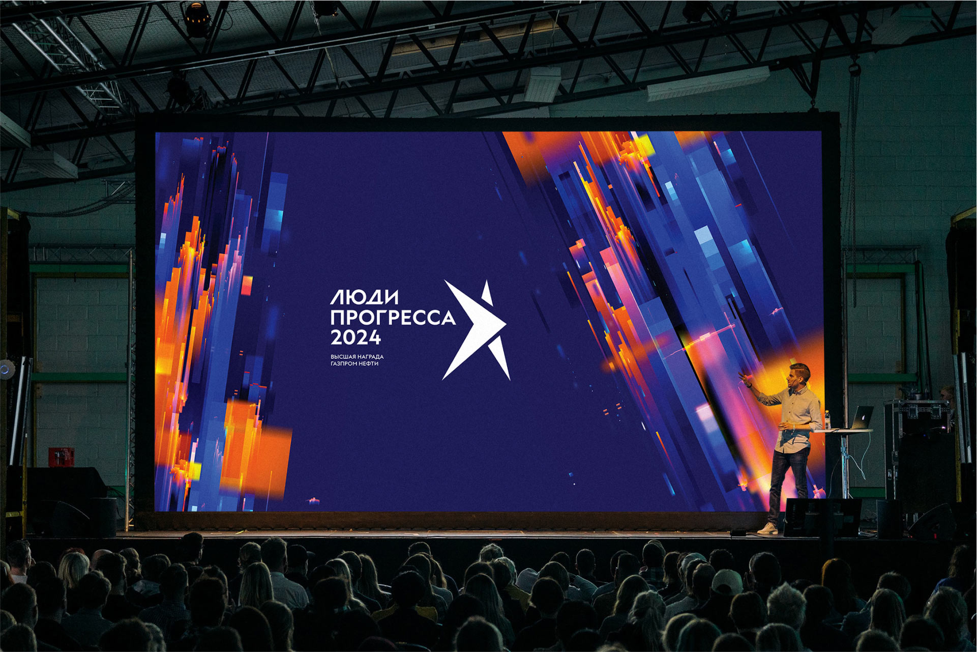
In the “energetic” set the signs have pronounced dynamics due to beveled strokes and sharp corners. This set gives the names of corporate projects and events a swift and charismatic character.


The typeface includes unicase versions of all alternative characters. This expands the possibilities of variability which is necessary for creating logos.

The characters of the typeface can change their saturation, allowing for maximum creative freedom.

art director
type designer
technical designer
- Ruslan Poklonskiy
