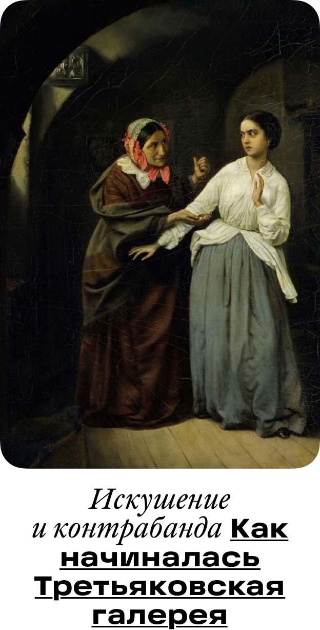
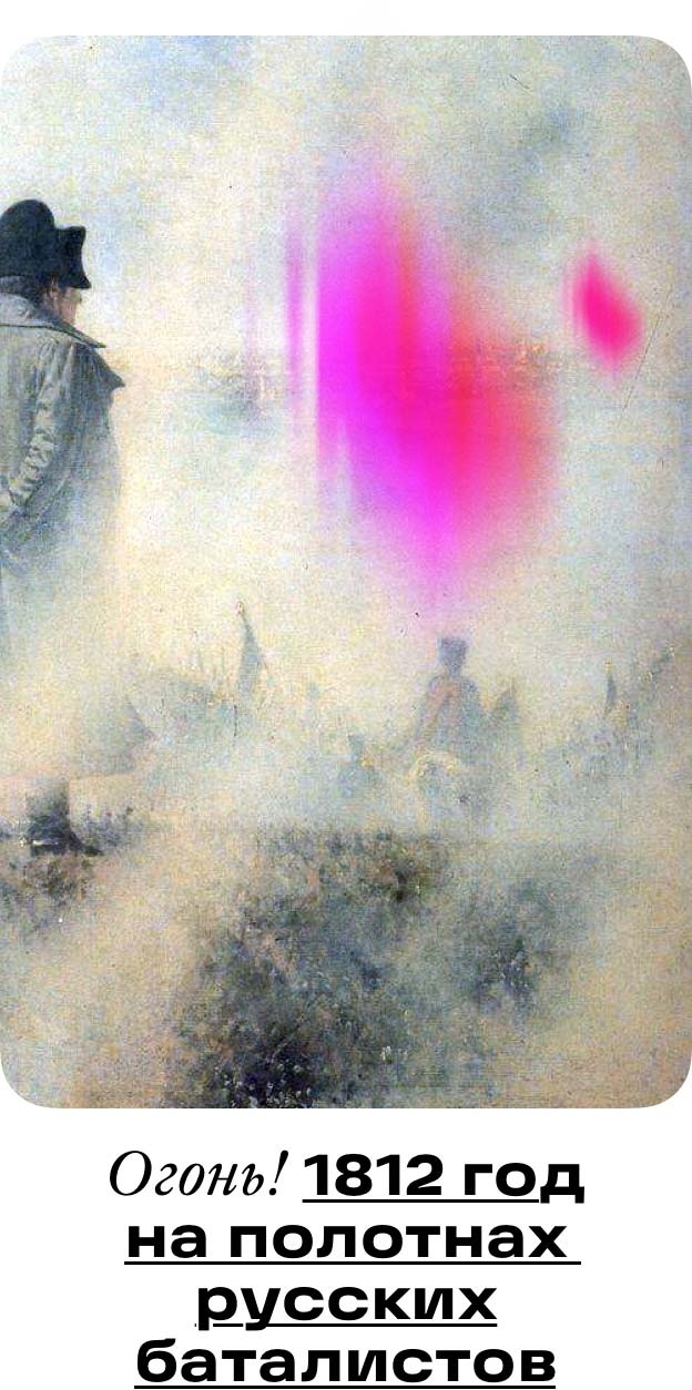
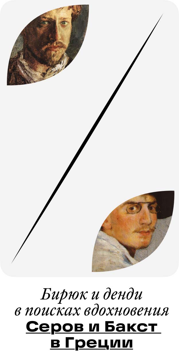
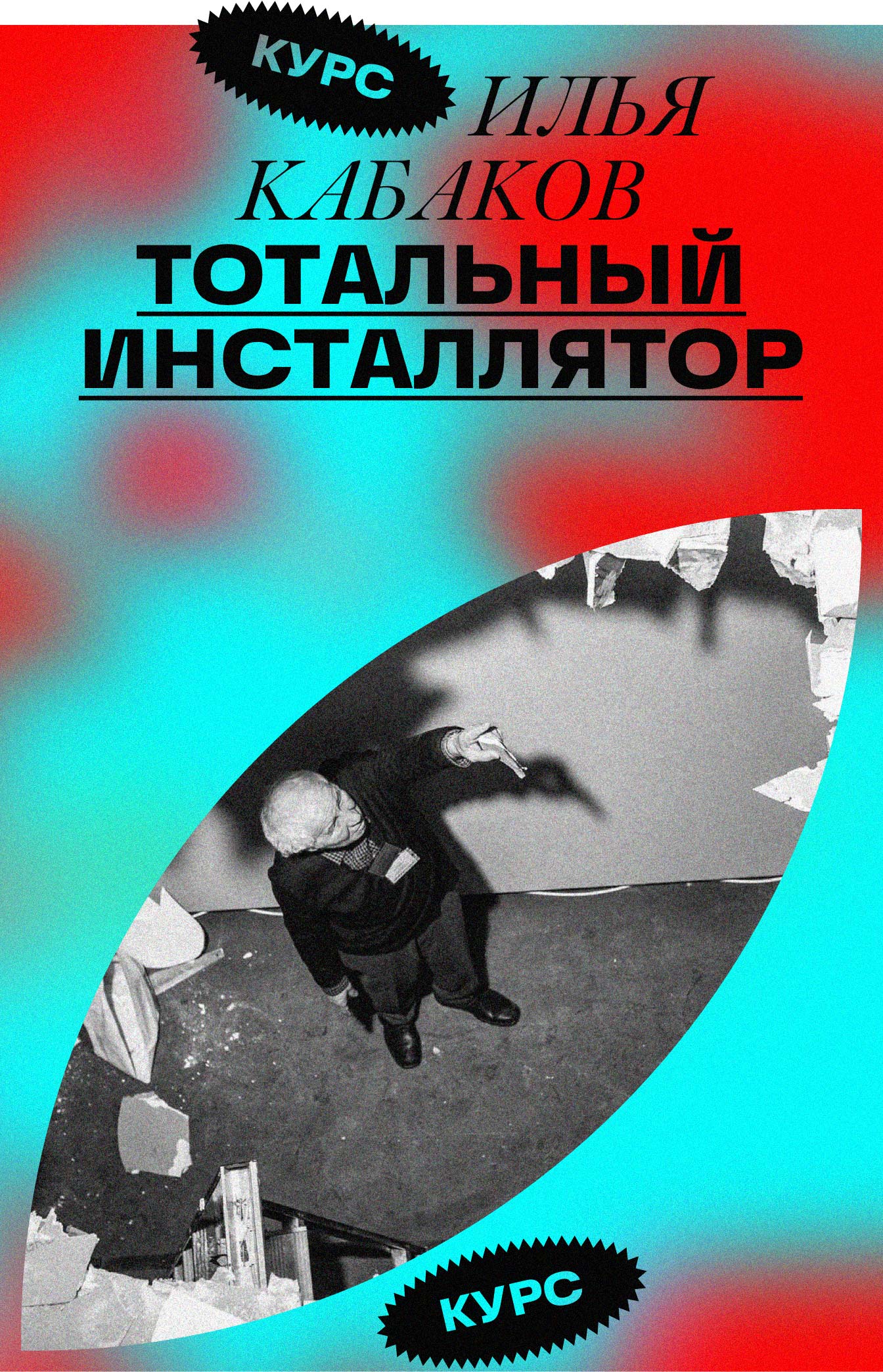
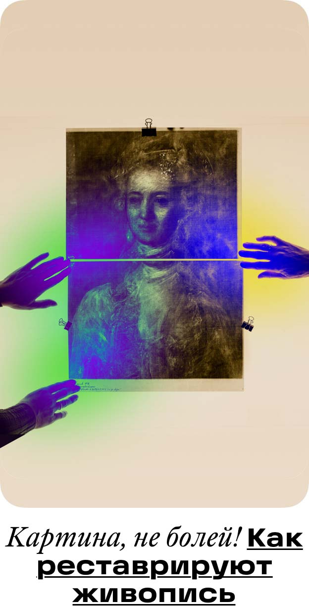
Over the one hundred and sixty-three years of its existence, the Tretyakov Gallery has collected a tremendous number of the most valuable works of Russian art. In addition to that, the gallery also has another hidden treasure, the unique knowledge of its experts and curators.
To share all this with people, to enlighten and inspire them, the administration of the gallery decided to launch its own media project. A brand strategy, a name and a logo for the project were created at the studio.
Brand strategy
The brand strategy combines the efforts of the gallery’s employees, PR specialists, educational professionals and multimedia experts, presenting their work on a single electronic platform.
The brand strategy defines what, how and to whom to tell, what the content and the language of created materials should be, how to prepare them and, most importantly, how to evaluate the effectiveness of the project.
As a result, all the knowledge that was previously stored chaotically gets a clear structure, is neatly arranged and is used at the right time. It becomes clear when to use it, how to present it and who will benefit from it.
Naming
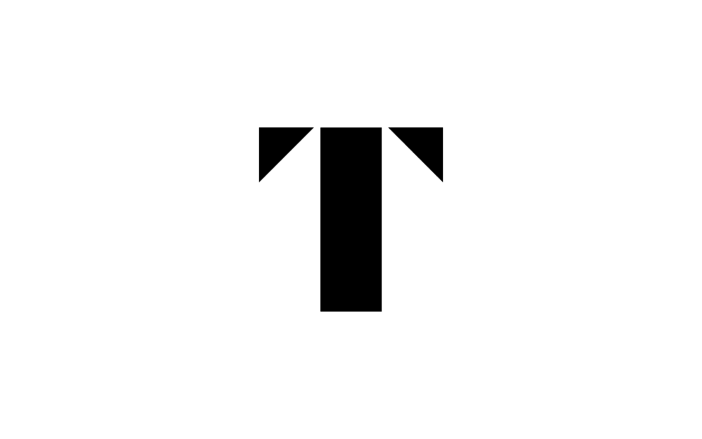
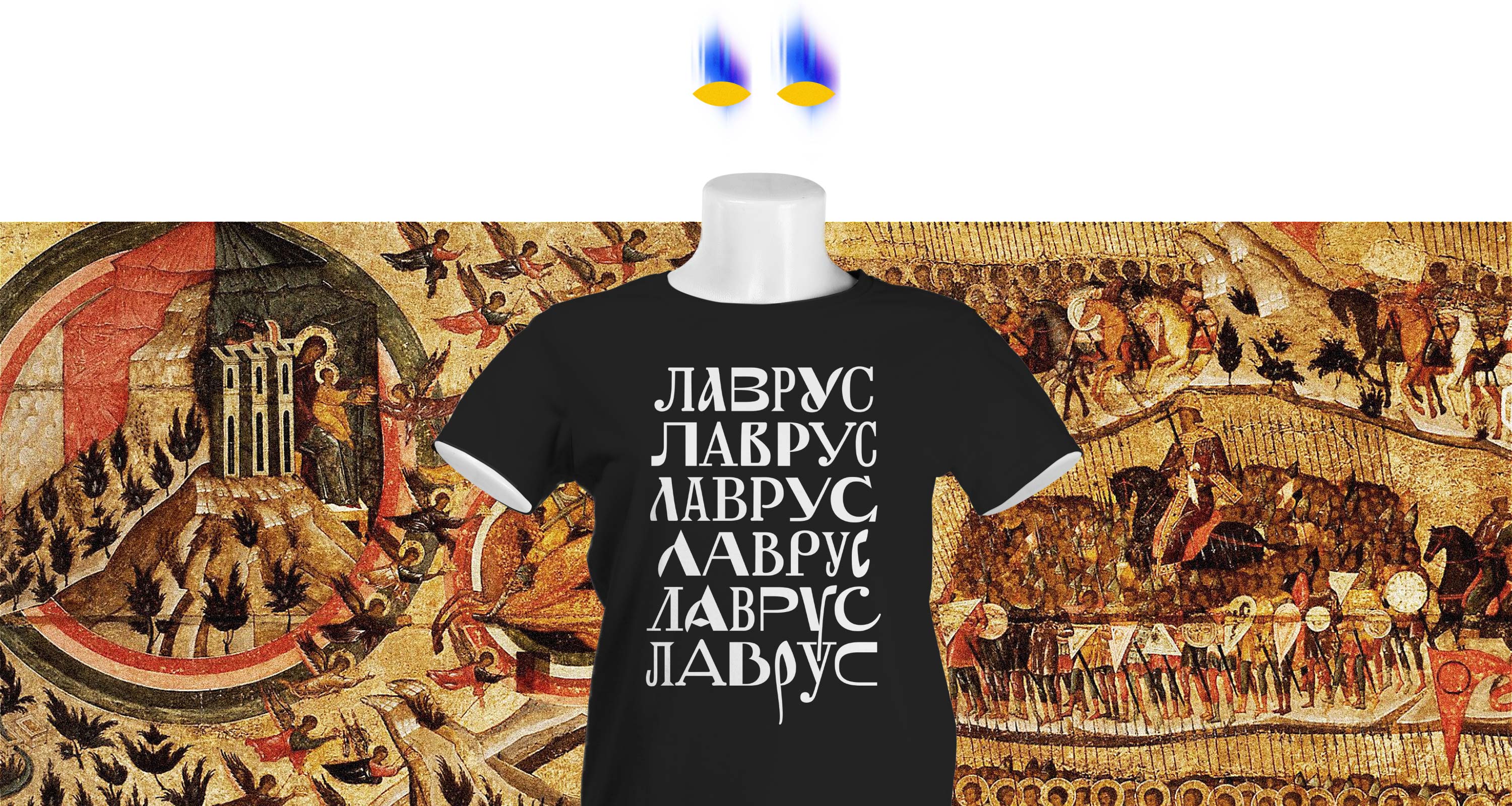
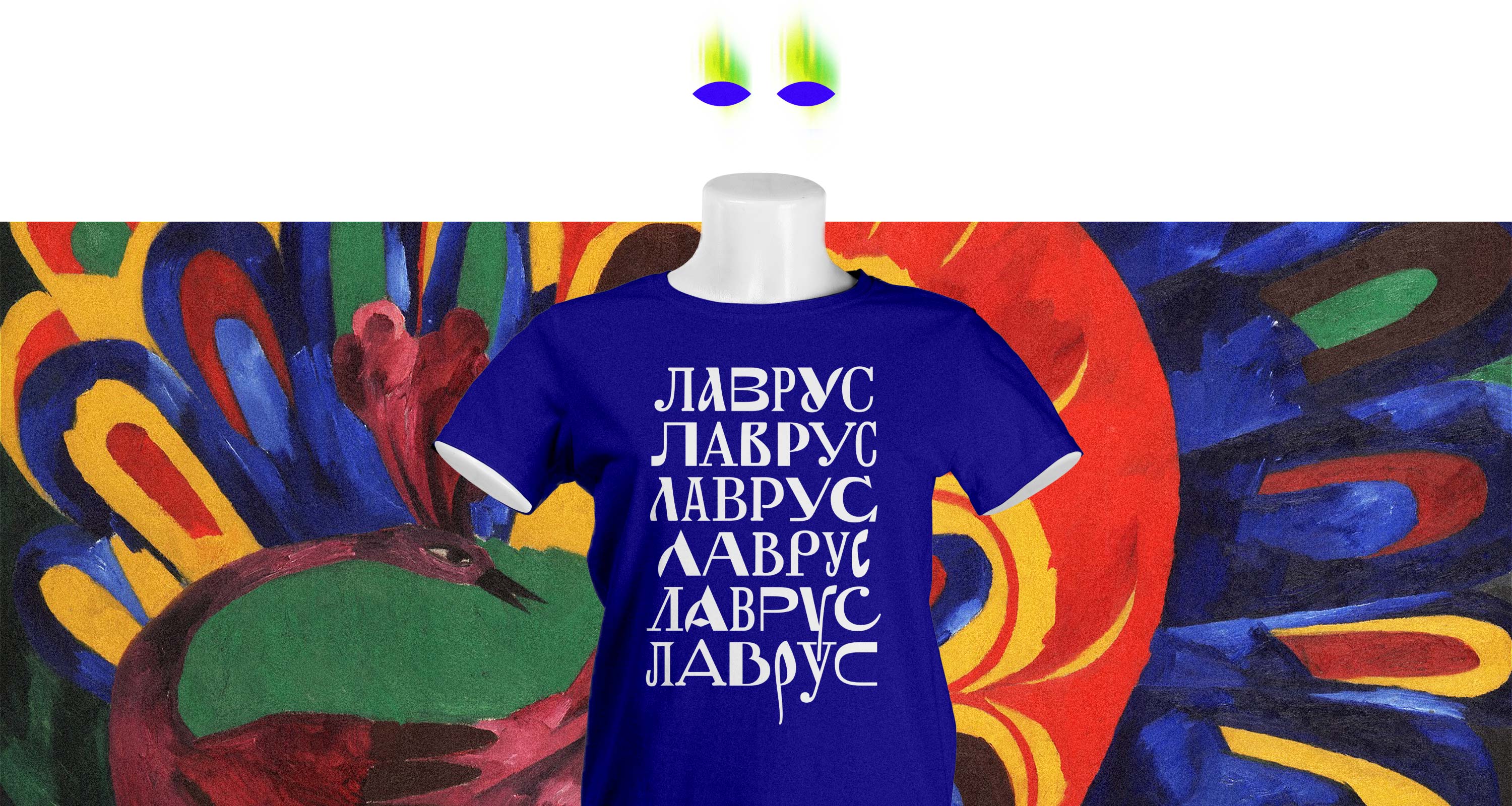
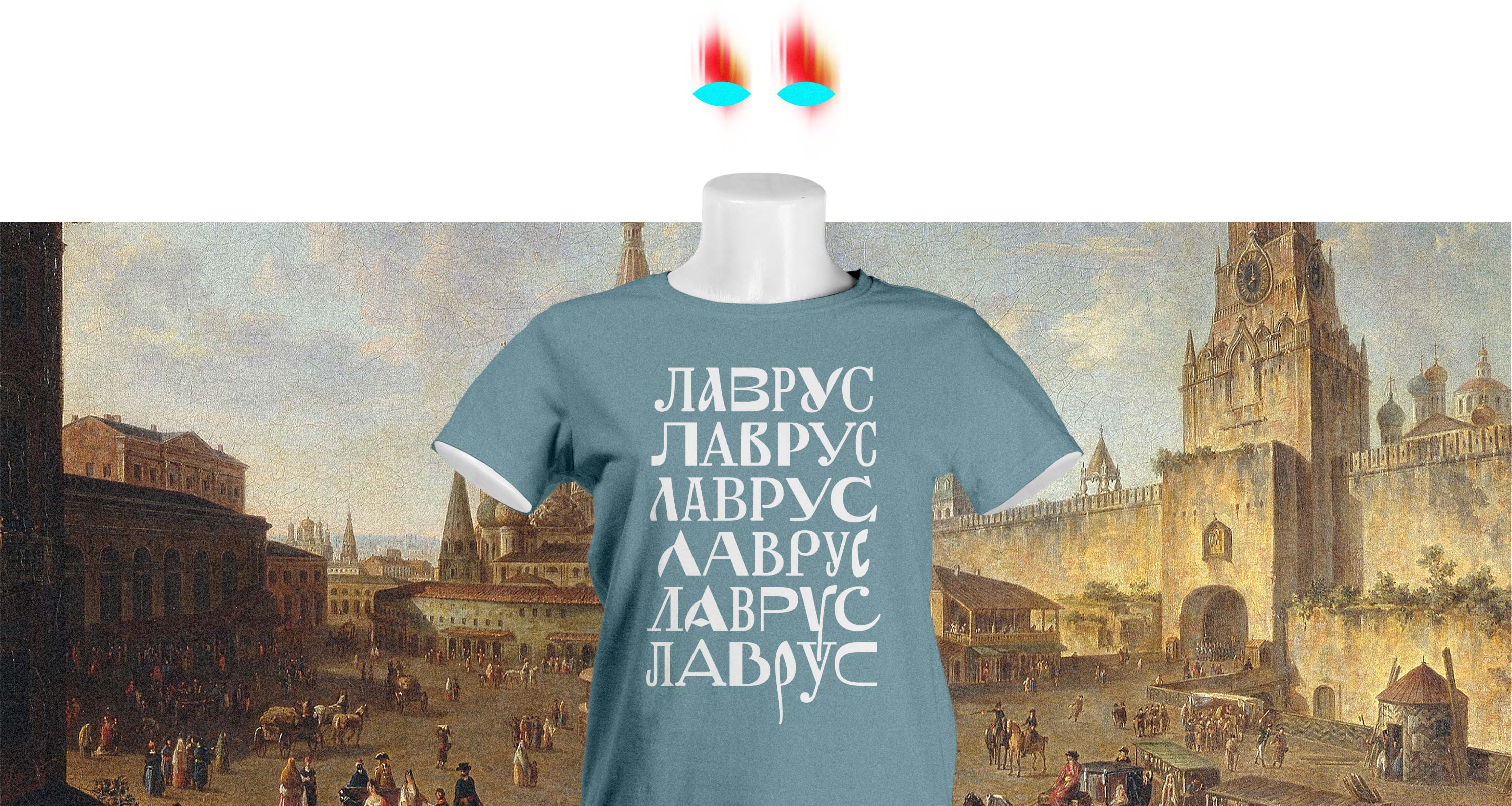
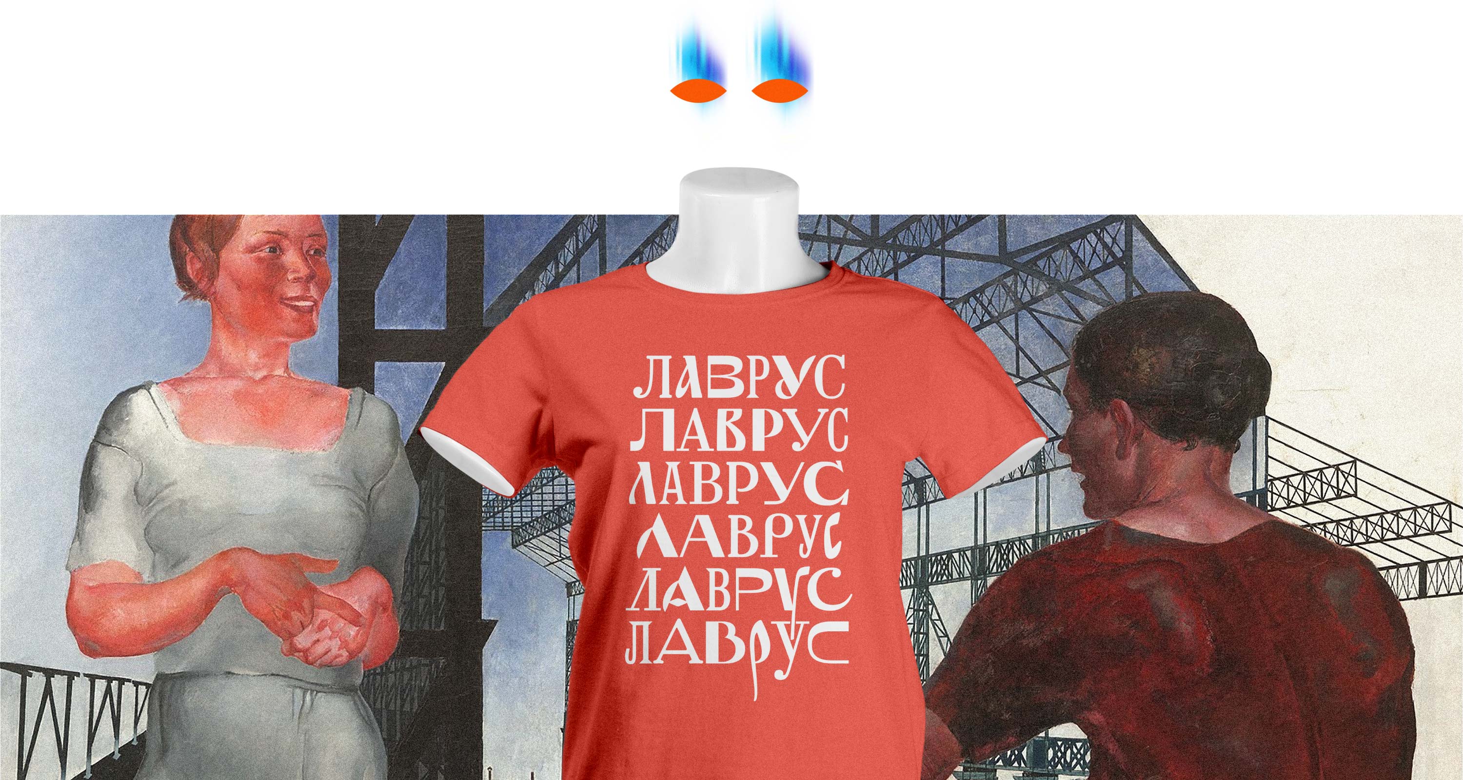
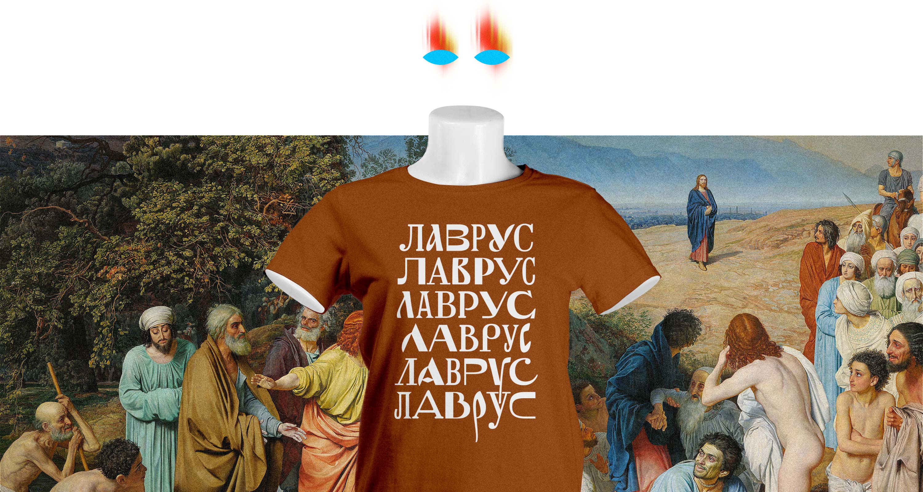
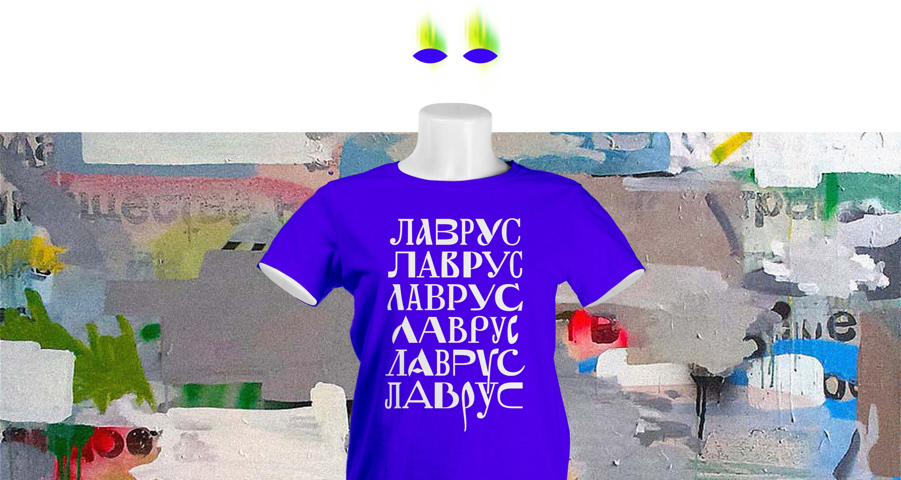
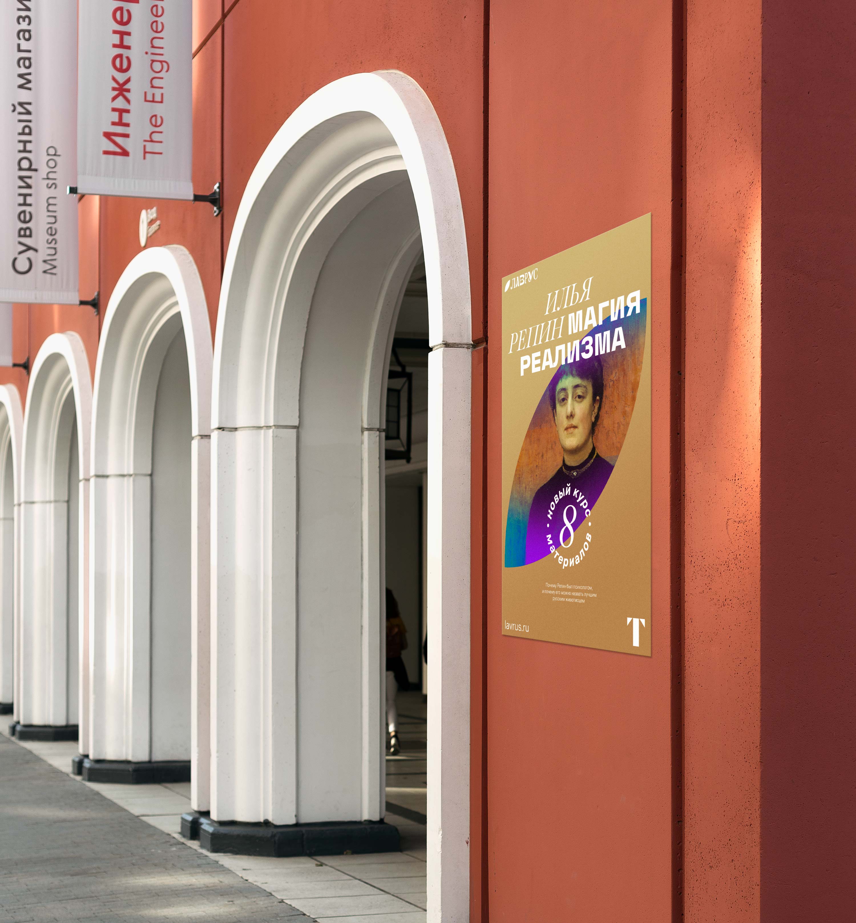
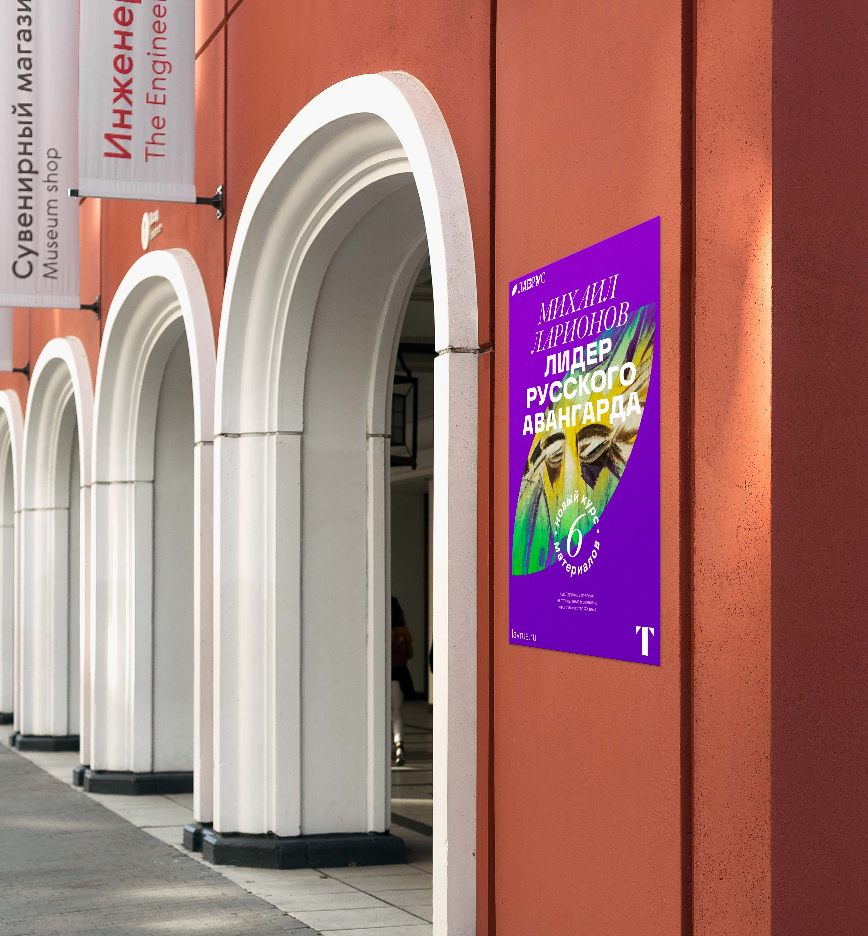
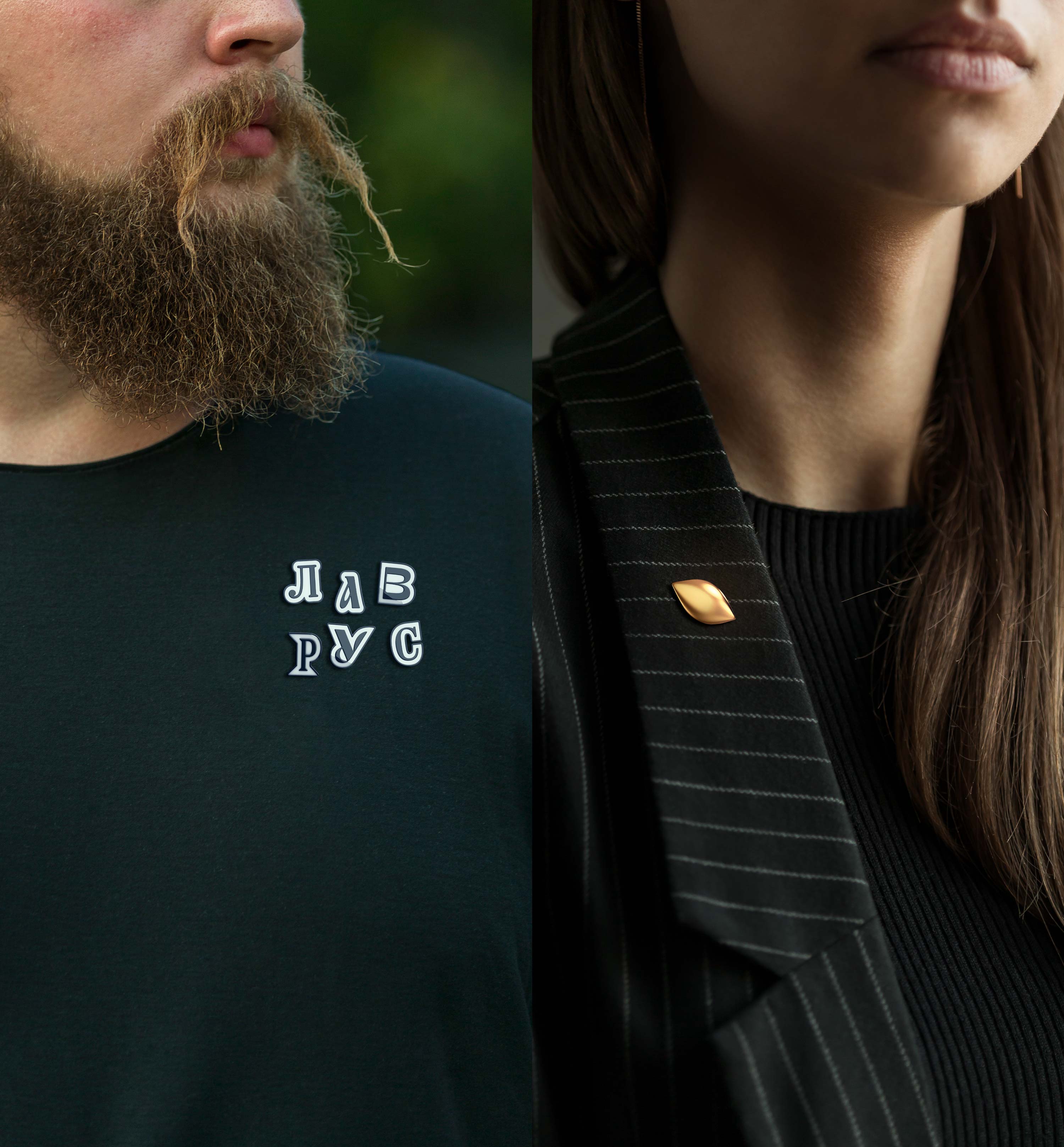
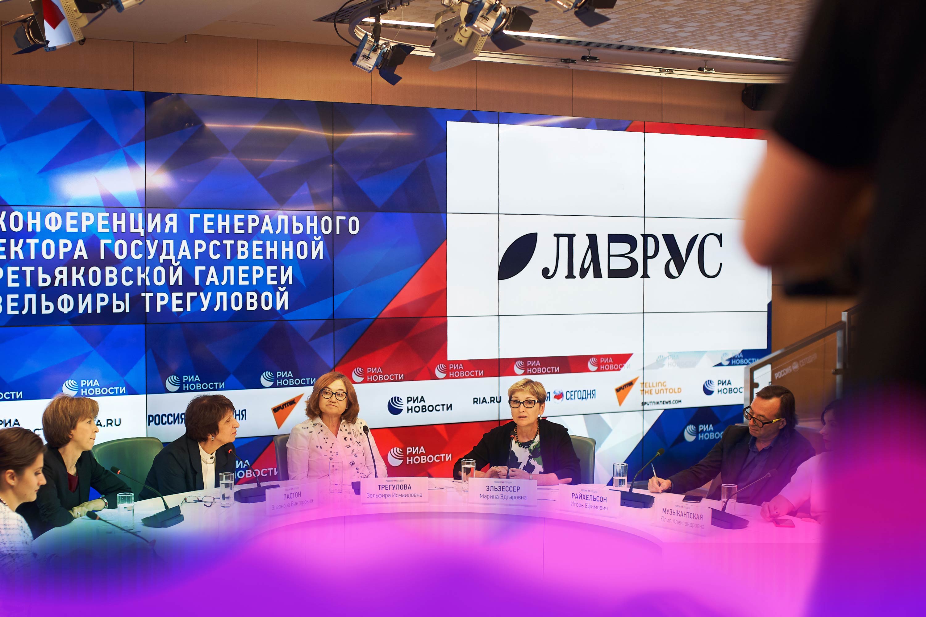
The Tretyakov Gallery’s media project was proudly named Lavrus.
The name combines several important meanings. Lavr means spirit, scale, grandeur. Rus indicates the connection with Russian art. And also Lavrus means love to Russia.

The name also alludes to Lavrushinsky Lane, the place where the Tretyakov Gallery started and which became the setting for so many events important for Russian art.


Logo and identity
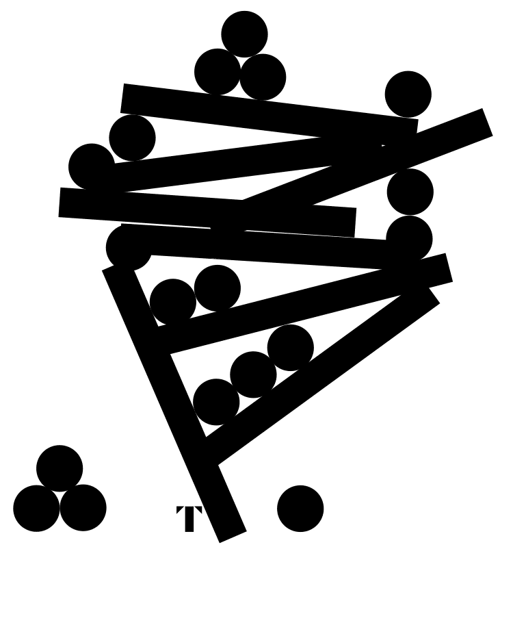
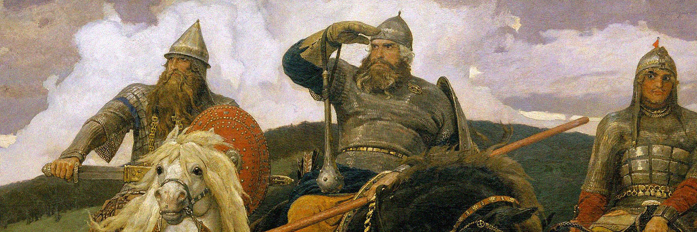
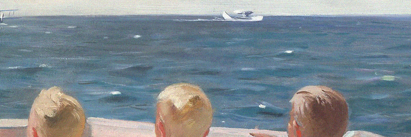
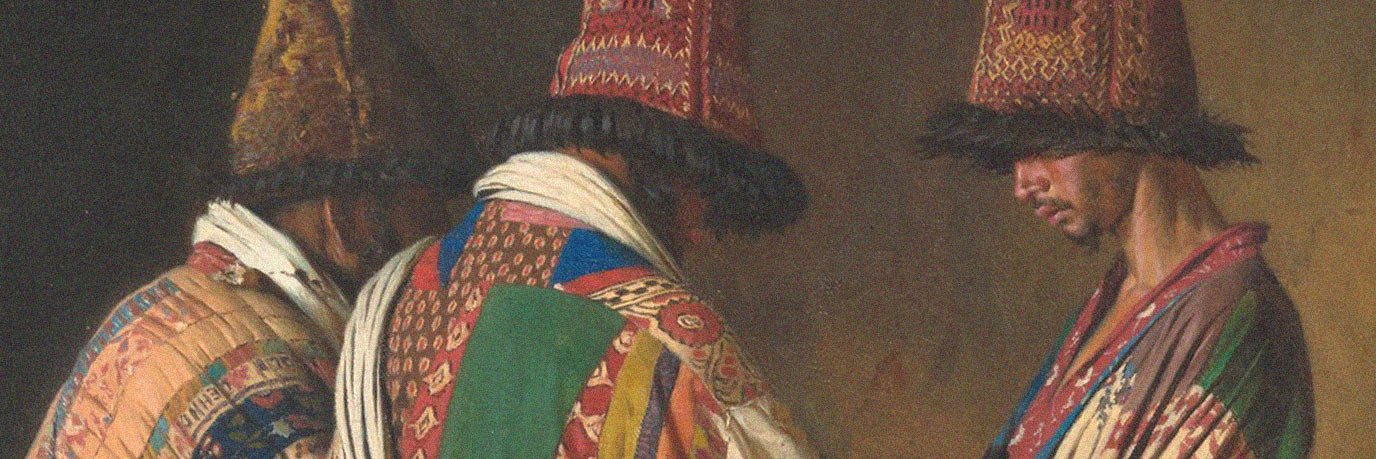
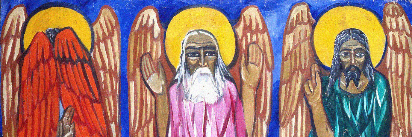
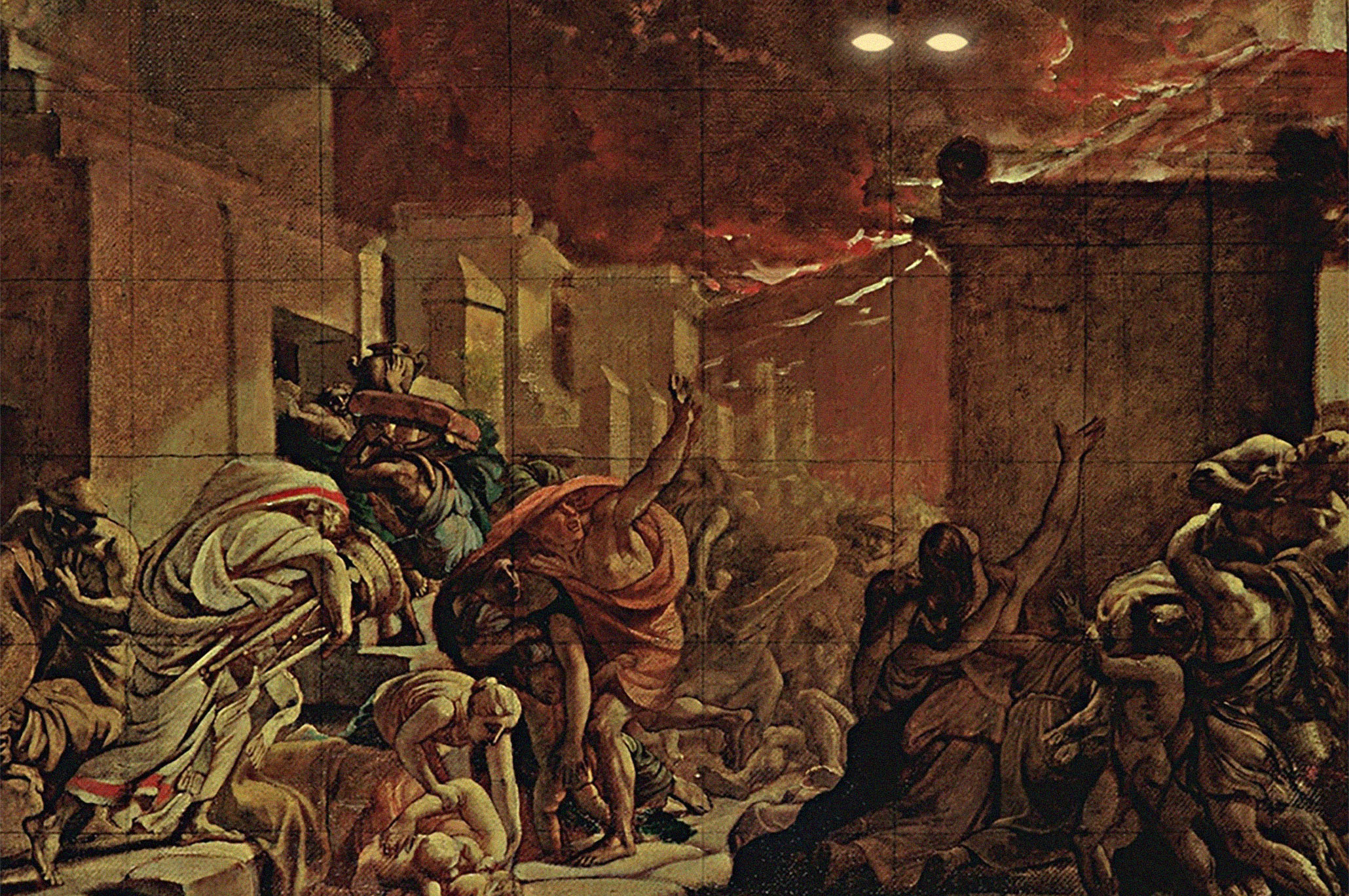
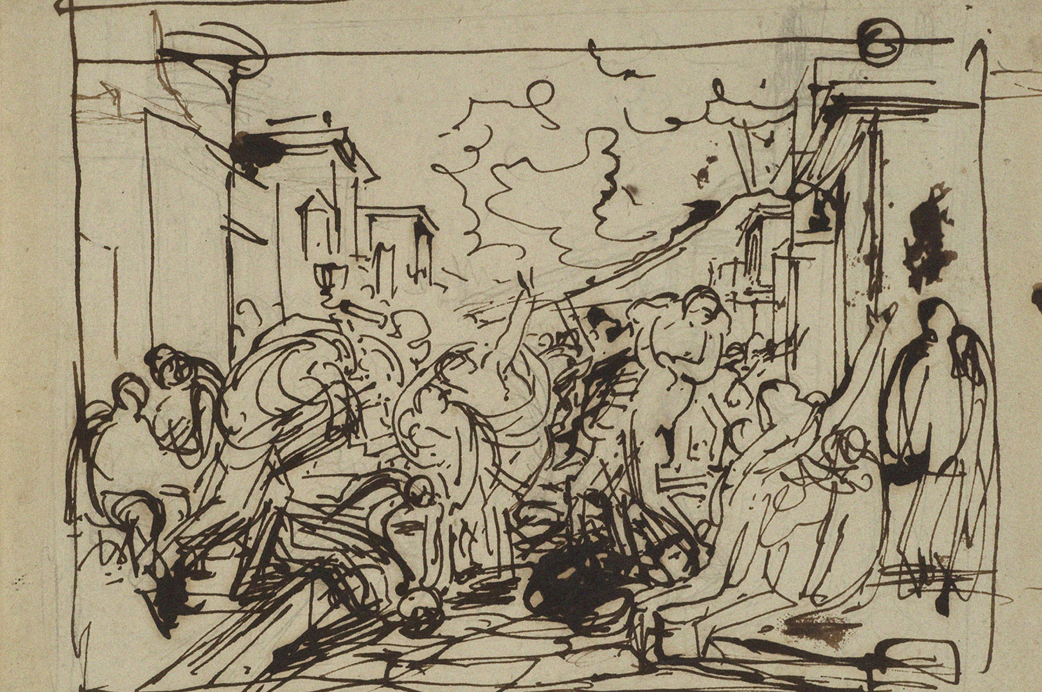
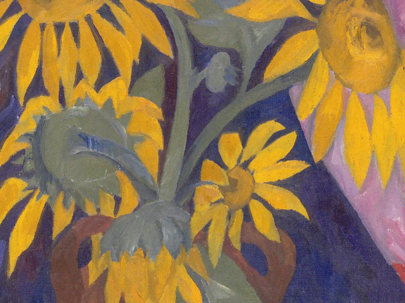
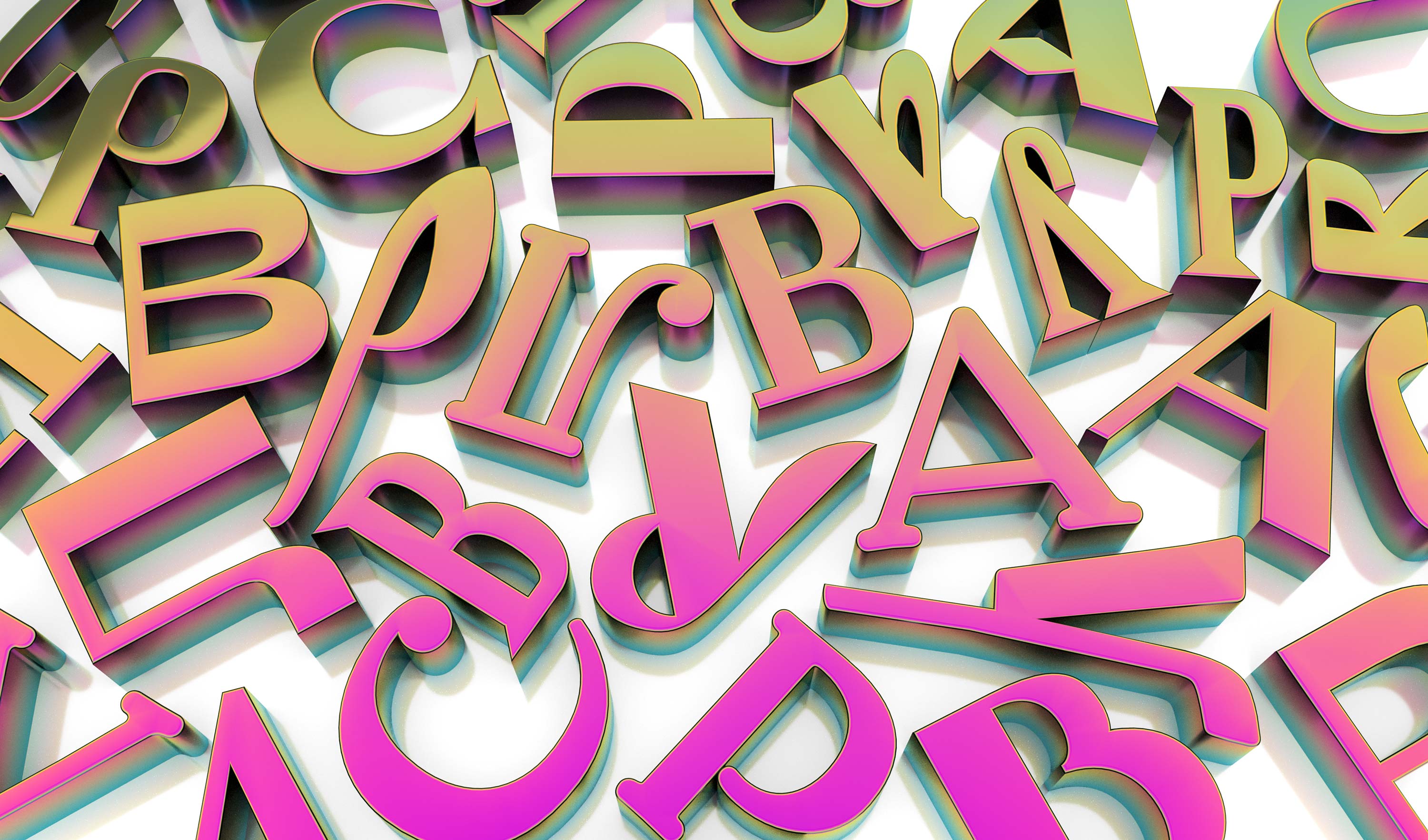
Russian art is very rich and diverse. At the same time, it is clearly divided into several important periods. Each of them is represented by a distinctive typeface.
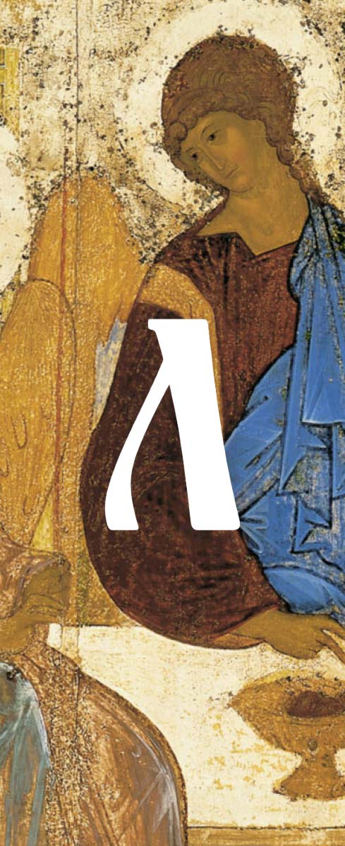
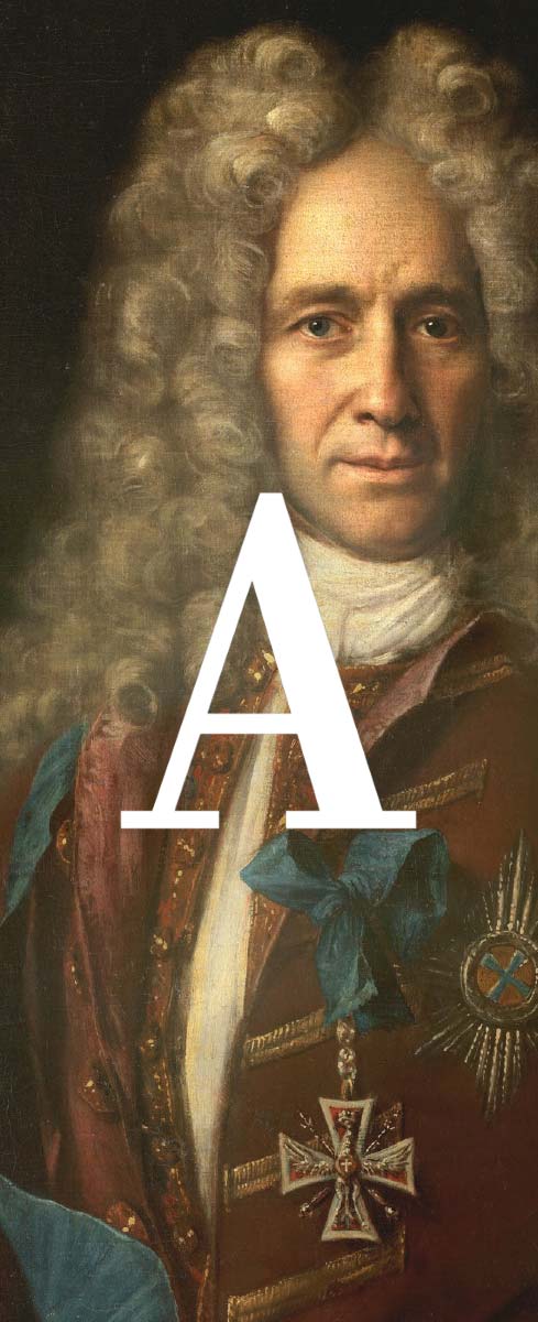
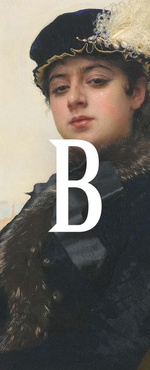
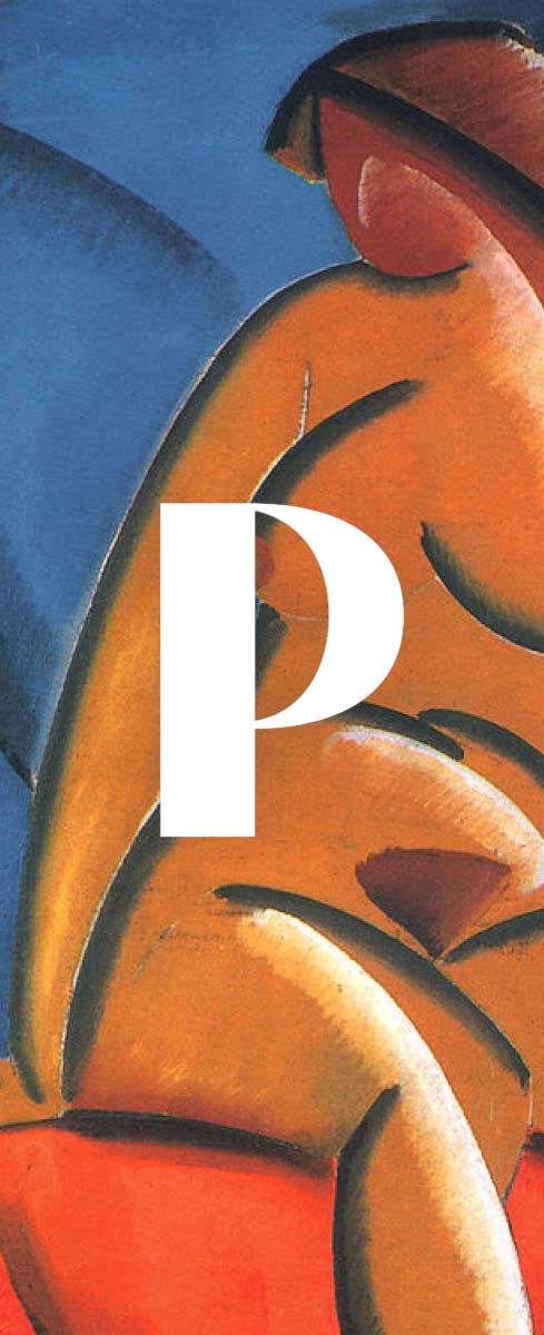
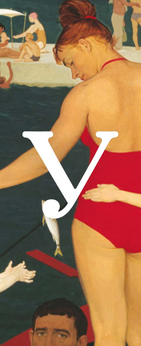
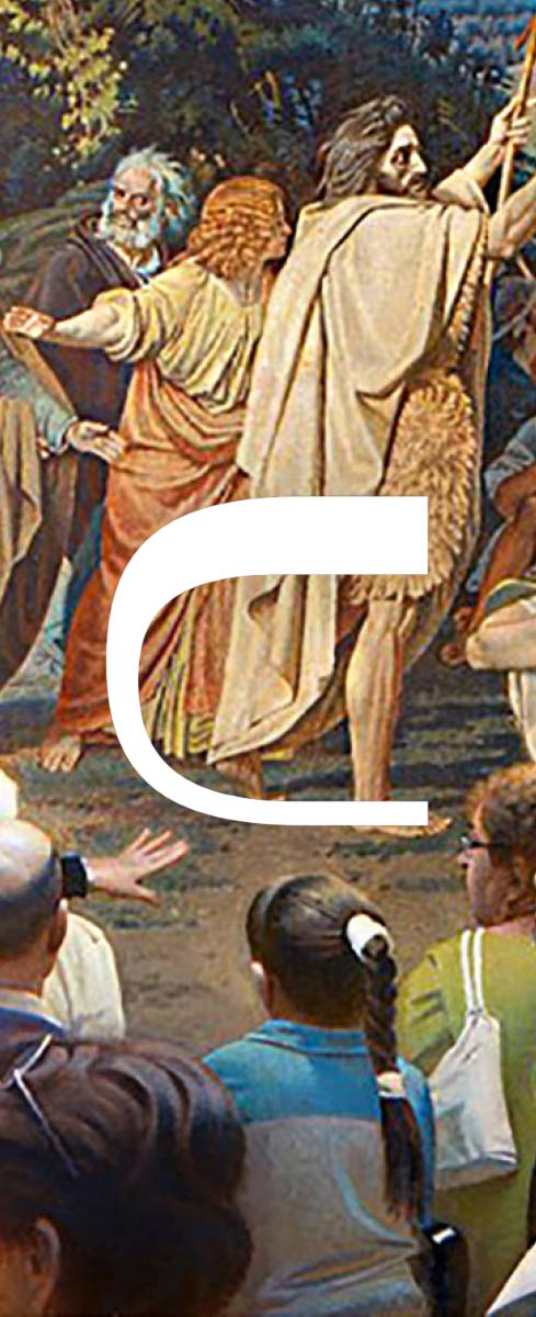
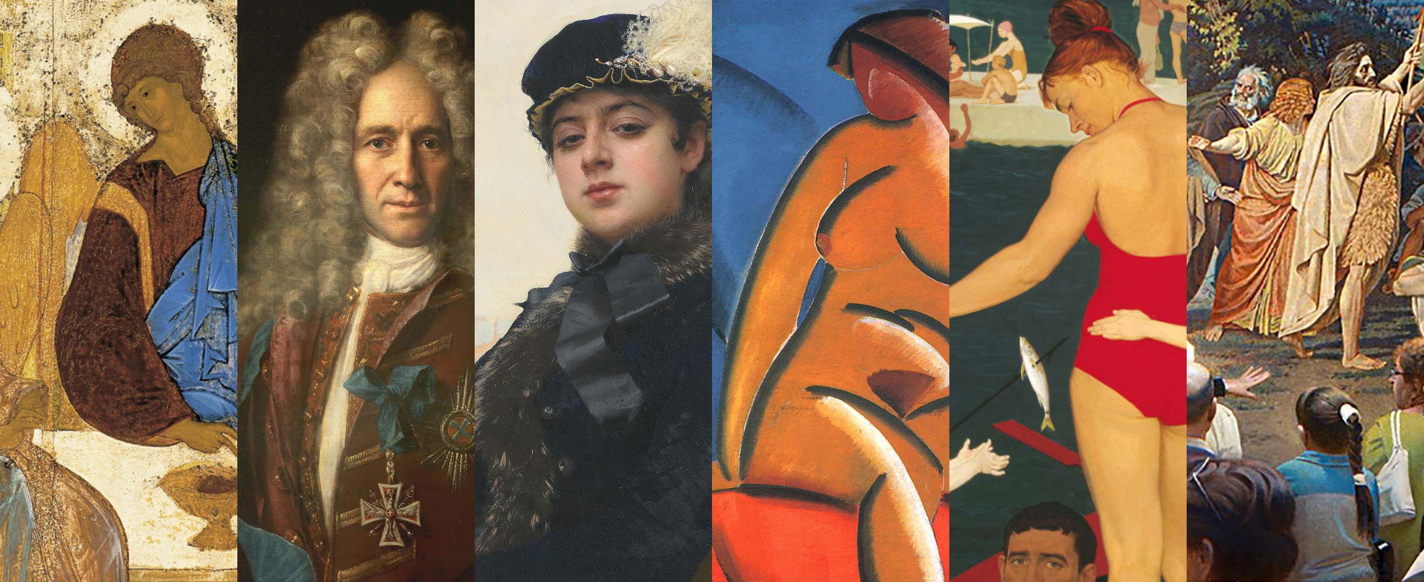
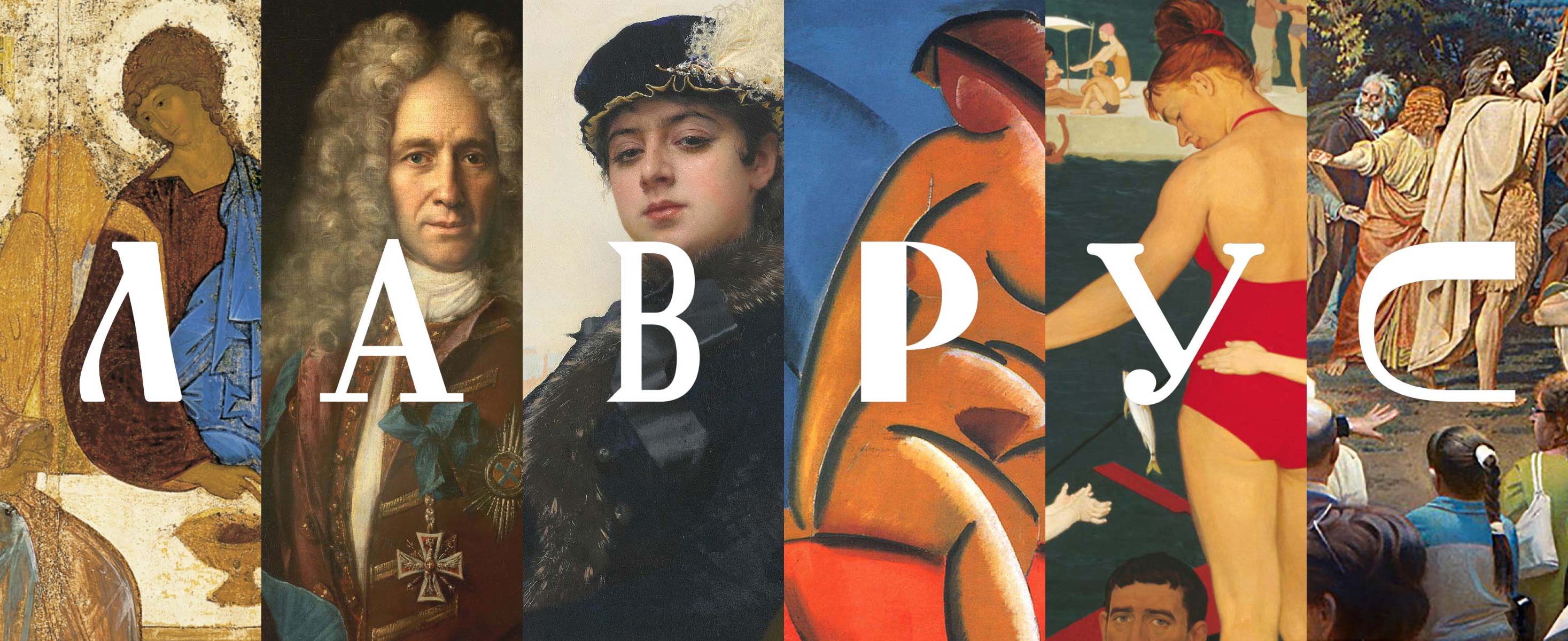

Different in their dynamics and proportions, the letters combine to form the logo that is just as diverse as the work of Russian artists.
Elements of the variable logo transform from one state to another, showing that art lives and reacts to everything that happens around it.
The logo seems to guide the viewer
The logo seems to guide the viewer through the rich and diverse history of Russian art.

Additional versions of the logo remain recognizable even when the characters are rearranged. All variants are united by the characteristic combination of letters that are different in proportions and density.


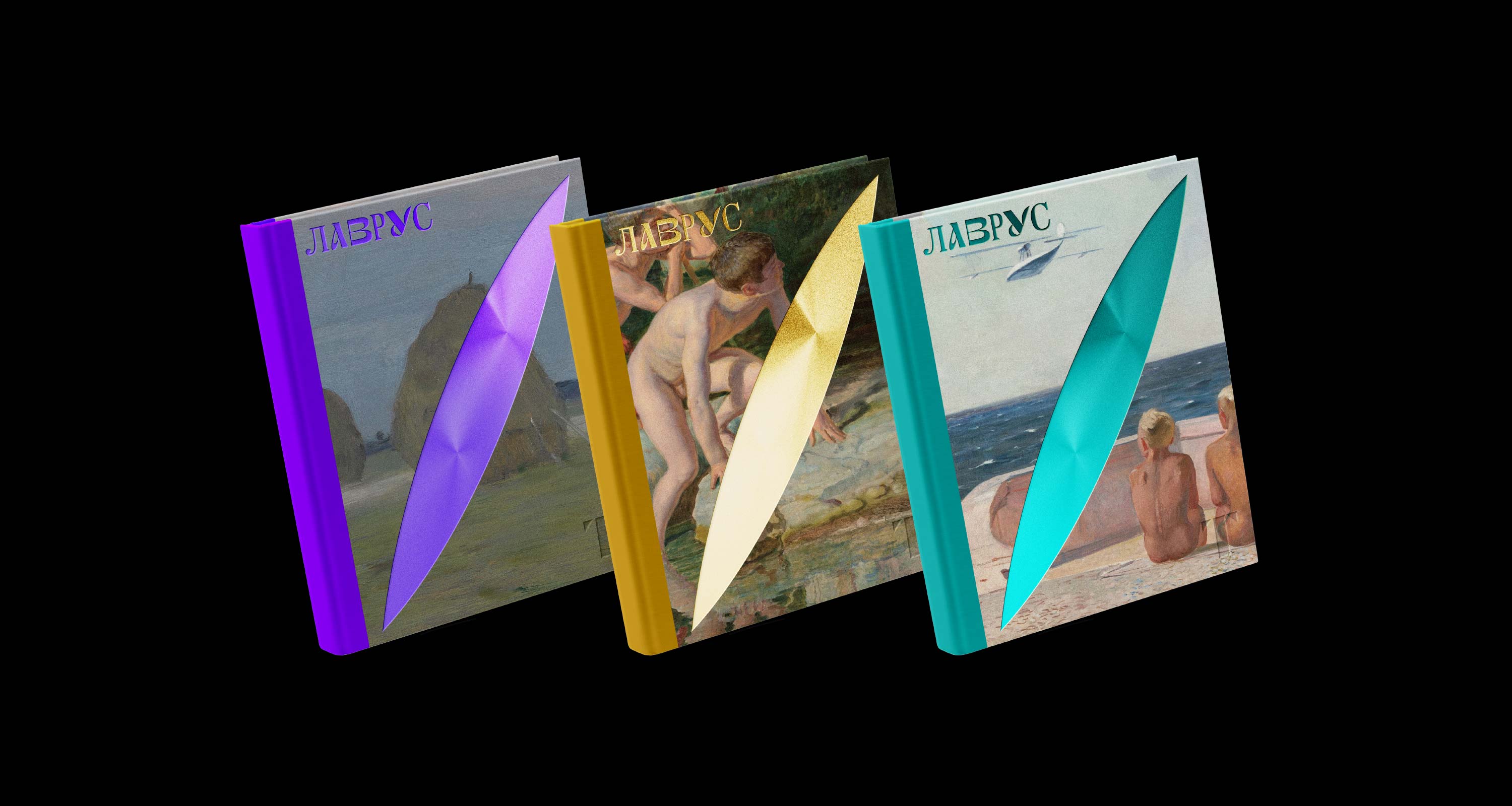

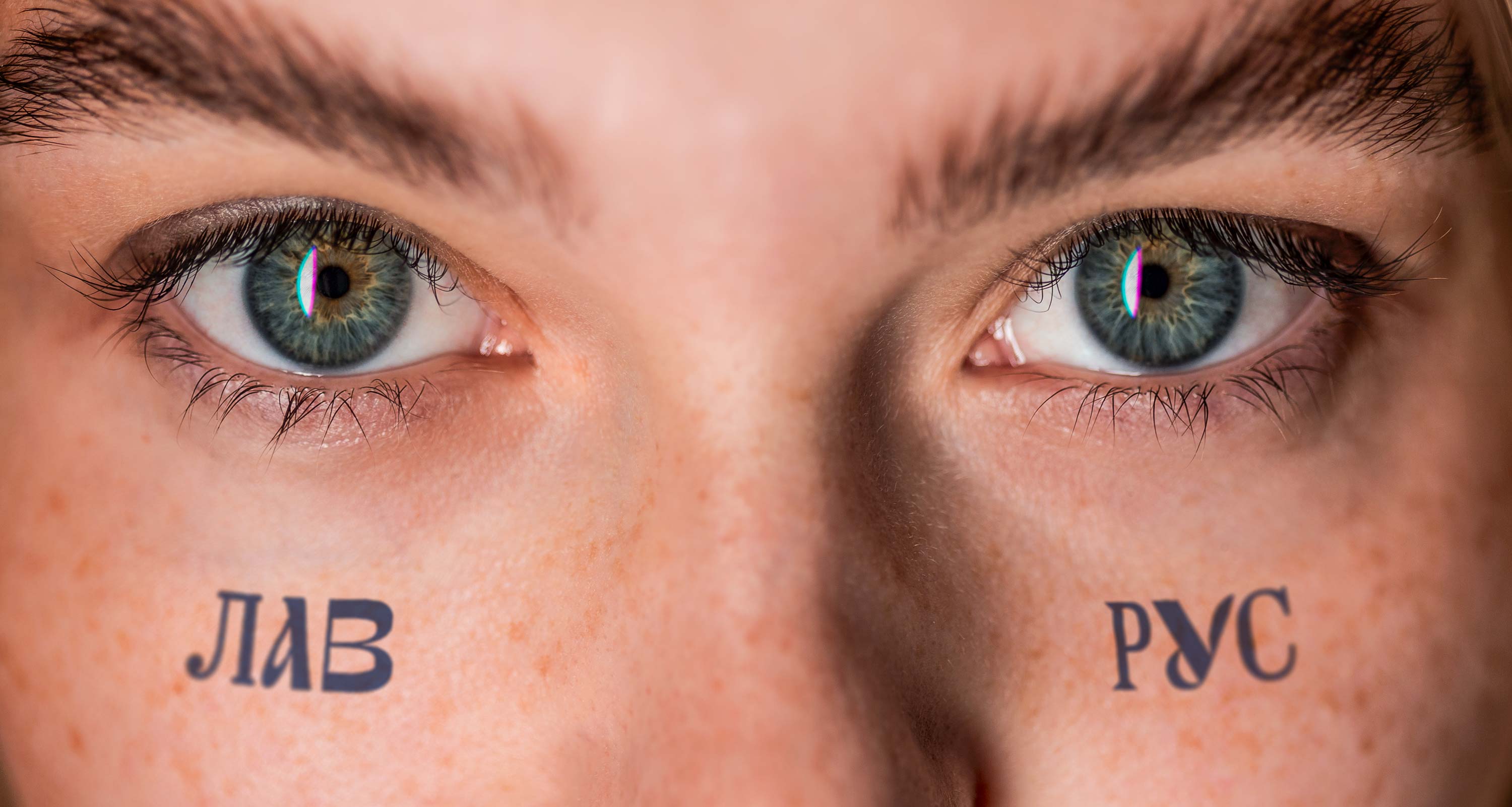
Lavrus makes it clear that any fact in life can be viewed through the prism of Russian art, always revealing something new.

art director
designers
- Maksim Rozov
- Evgeny Panov
type designer
- Taisiya Lushenko
