Brinex sells tires, wheels, batteries and other automotive products to Russia’s largest companies operating in various industries, automotive manufacturers and dealership networks, as well as services corporate fleet vehicles at its own service centers across Russia.
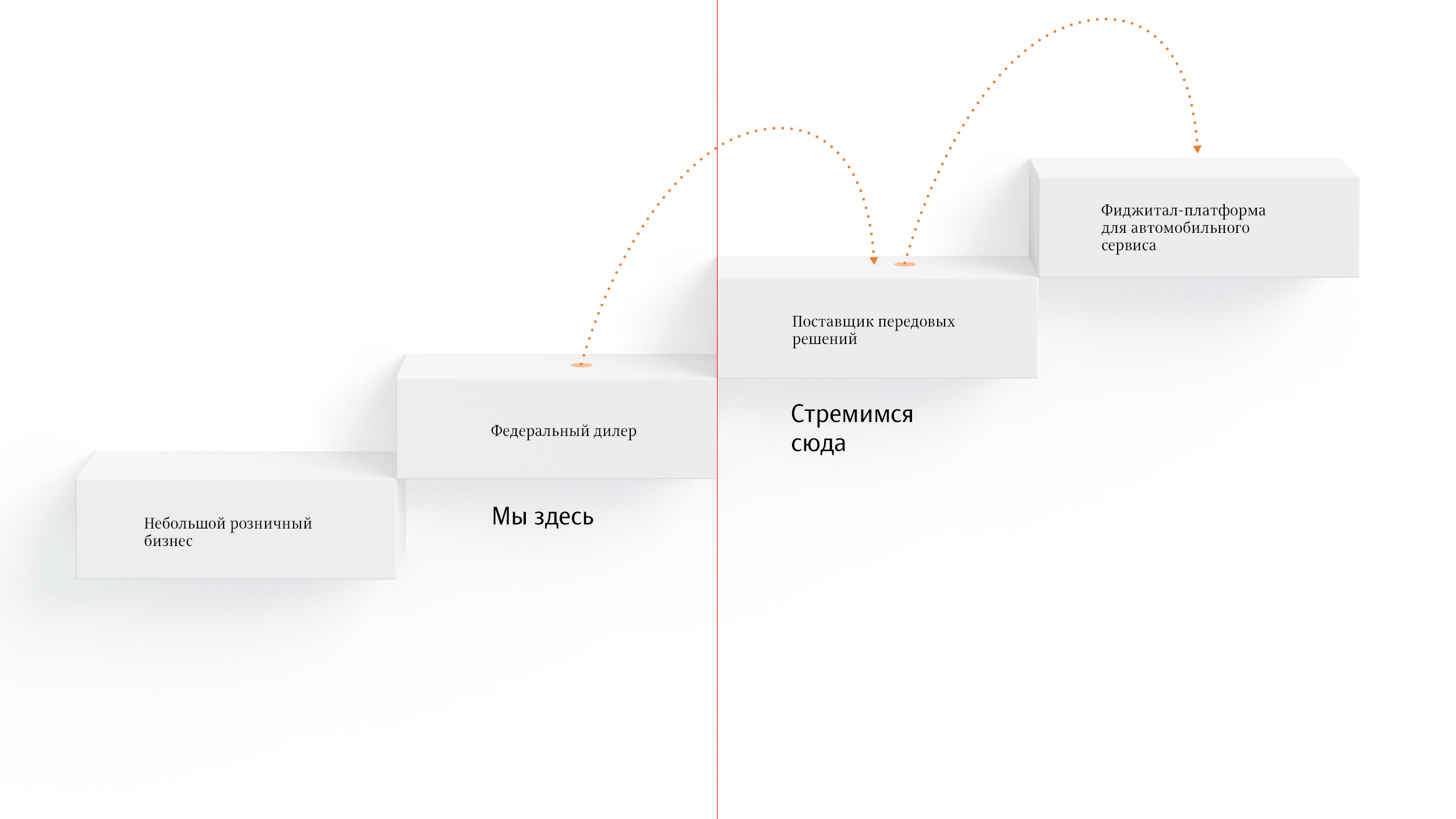
Having achieved a national scale of operation, Brinex intends to take a new step: to become a supplier of leading solutions in its field, removing the boundary between offline and online.
The study conducted at the studio identified six target audiences whose interests should be considered in the positioning.
of a wholesaler
of a wholesaler
in a corporation
of a retail company
When communicating with these audiences, it is especially important to find values that will help build strong relationships.
The brand platform reinforces Brinex core values: the company shares its expertise for the benefit of its partners, takes part in the development of their businesses, is able to cooperate beyond profit generation, tries to minimize any risks, considers and manages all processes systematically.
As a result, Brinex doesn’t simply offer services to its clients, but rather helps large and small companies to move forward.

The constant movement which Brinex offers to its partners is the goal of the company.
That’s why the main idea of the brand is Sense in Movement.
The identity supports the idea of the brand. The logo in the shape of an infinity symbol formed by two arrows resembles a road junction and symbolizes continuous movement.
The text rhymes with the symbol thanks to the wavy elements in the letters. The smooth and solid shapes convey the confidence and peace of mind that result from working with Brinex.
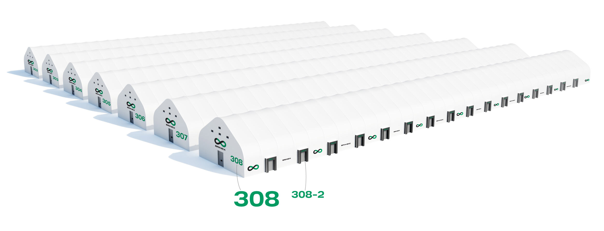
The logo looks great on any equipment and can decorate any façade.
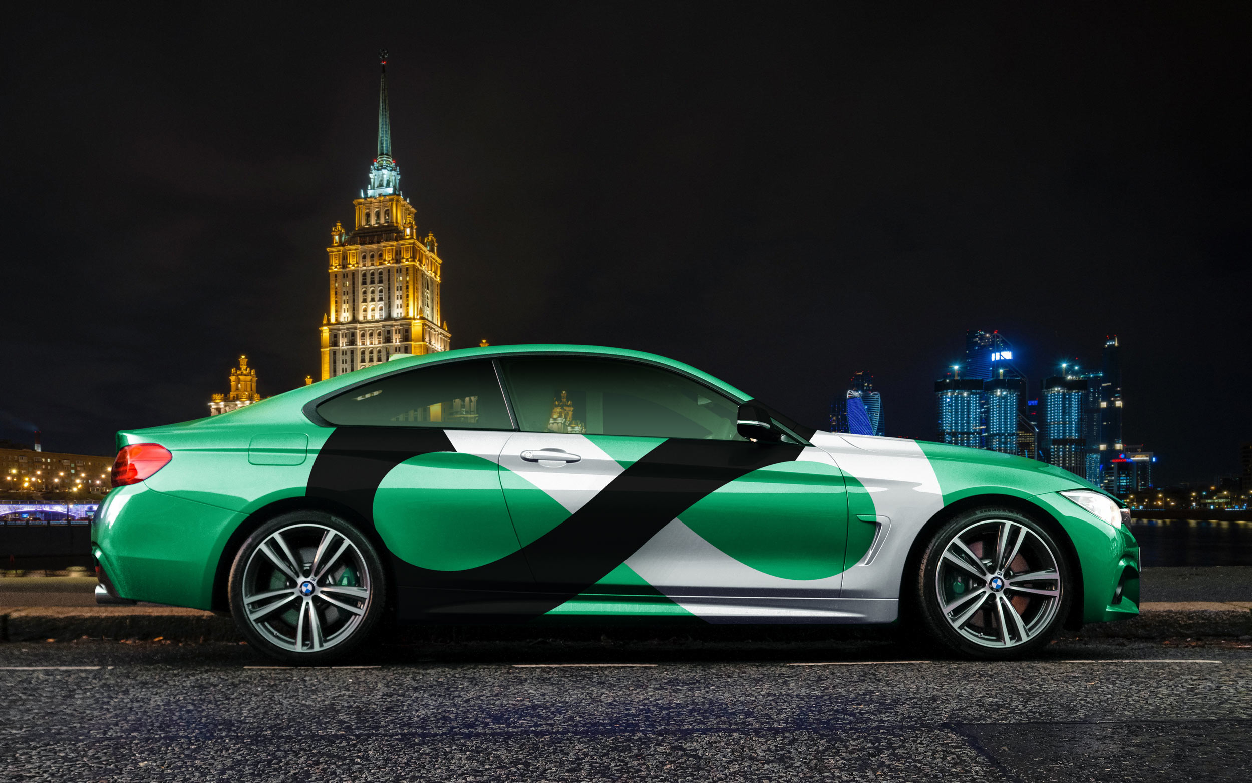
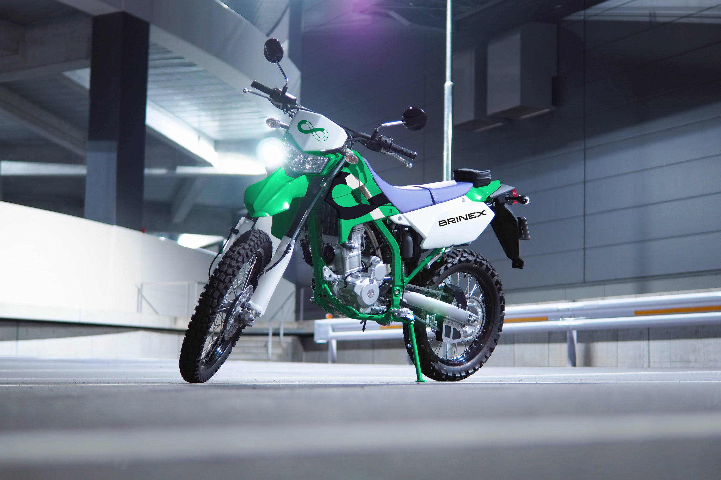
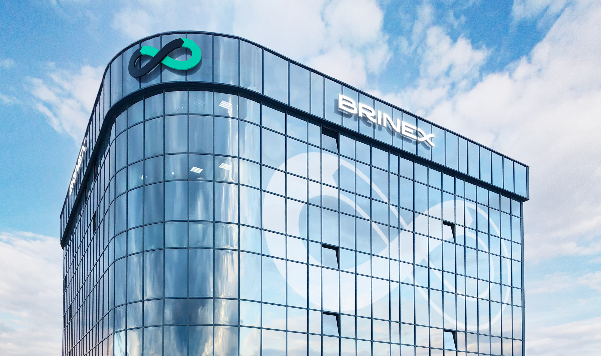
The strict pattern made of road arrows continues the theme of movement.





designer
- Sergey Steblina