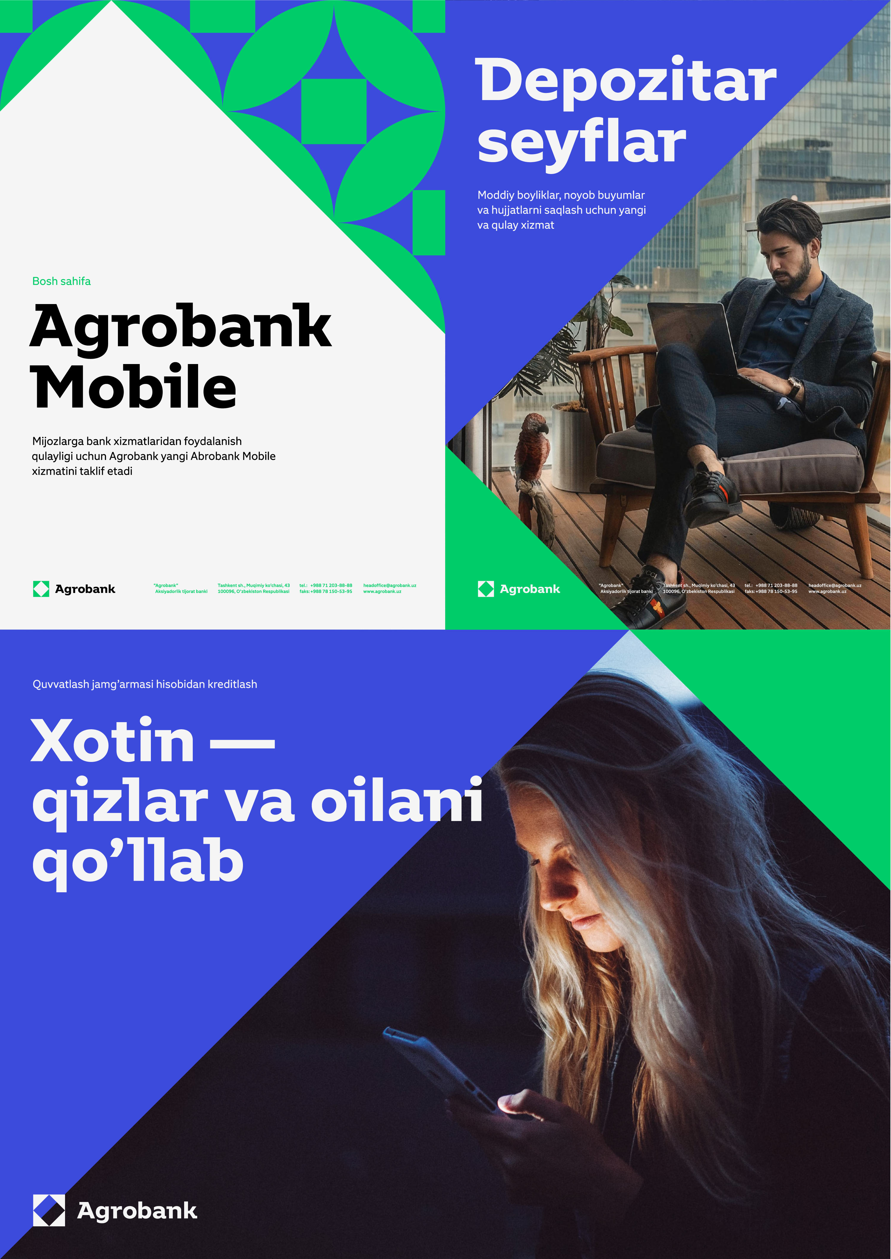
The corporate typeface of the Uzbek commercial bank Agrobank continues the concept of the logo and the pattern, supporting their clean geometric shapes.
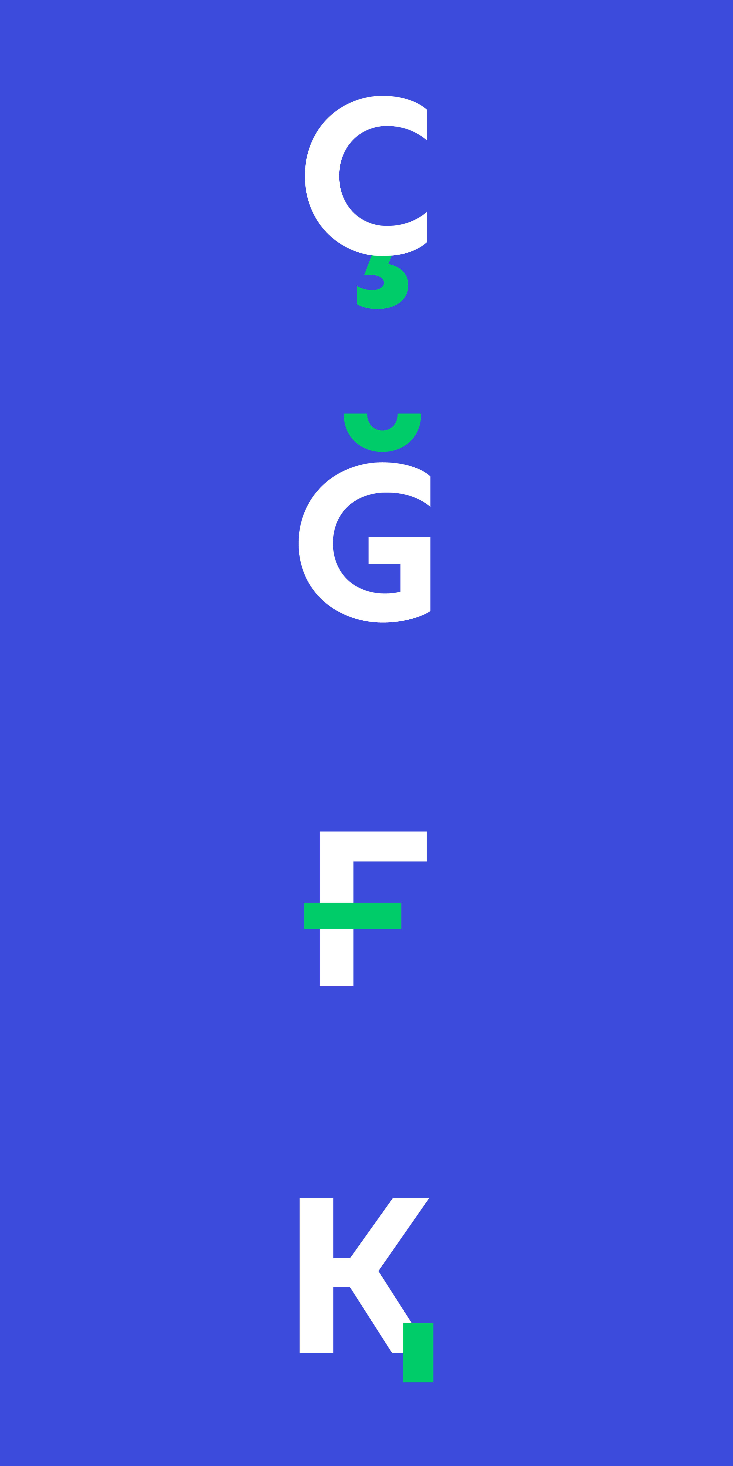
The letter a gives the type a special empathic character, while the Q has an unusual tail which, in turn, echoes the arc of the a.
Large open apertures of round characters and vertical cuts of the strokes give text rigor and conciseness.

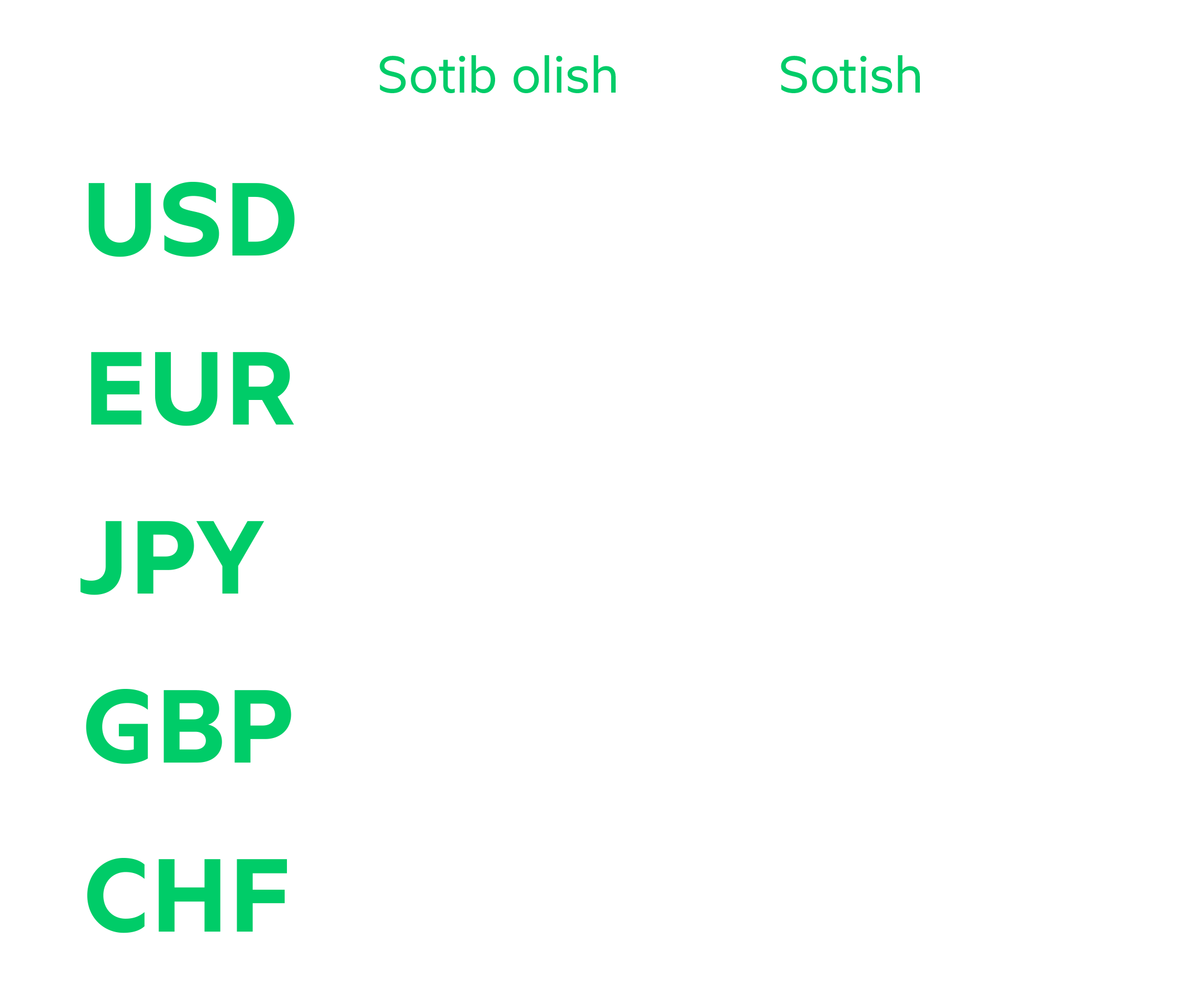
The typeface is great for tabular layouts which makes working with large volumes of numbers and currency signs a pure pleasure.
The typeface takes into account unique features of the Uzbek script.
Text styles are compact and clearly distinguishable.
The jobbing style has wider proportions and larger bar serifs which make it seem powerful and invigorating.
Four text styles and one jobbing style cover all scenarios of typeface use, from web to outdoor advertising.
The typeface is neutral and understated, because it was made for a bank, but also friendly and charming, because it was made with national traditions in mind.
art director
type designers
- Alexey Malkov
- Taisiya Lushenko
