Pyaterochka has all kinds of signs for different places, situations and product categories. We studied them carefully, determined what creates visual noise and figured out how to make wayfinding efficient and interiors cozy.
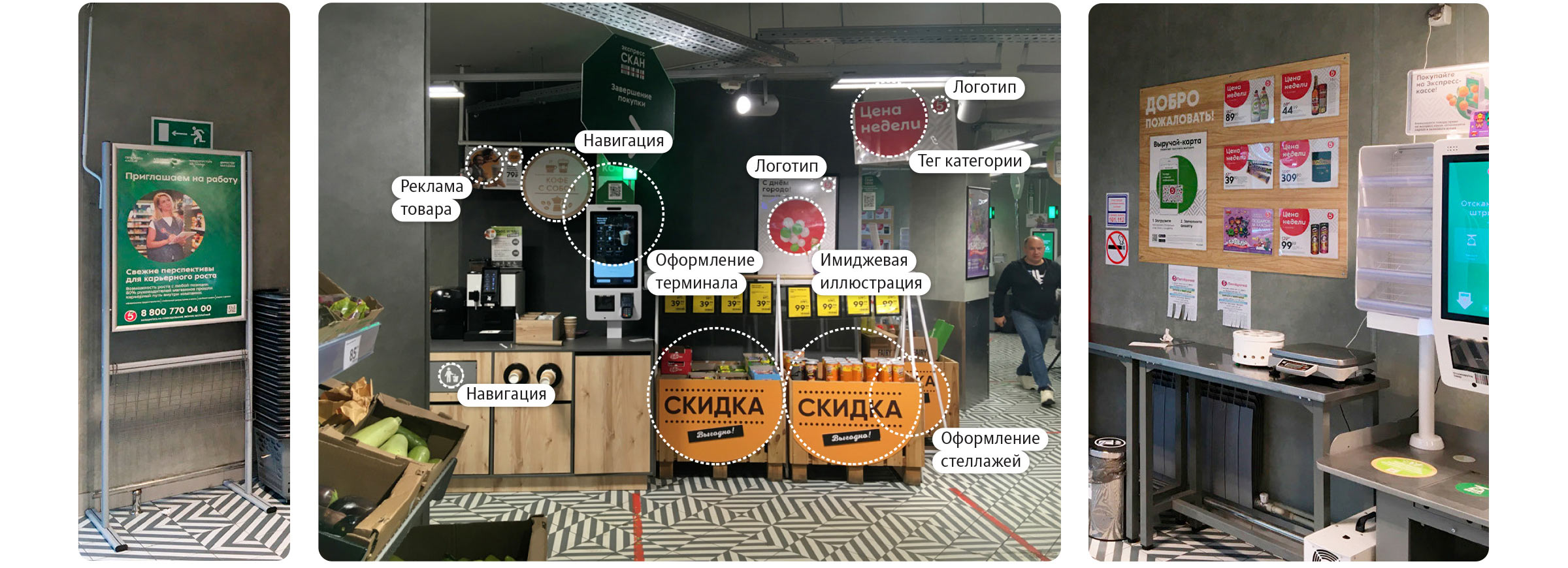
In order to make it easier for customers to interact with the store, we developed a complete communication system. It is based on the things that customers value most about Pyaterochka: fresh produce, cool discounts and convenient service.
The signature pattern transforms from a formal fill into an independent tool and complements the traditional rounded shapes, making everything look friendly and attractive.
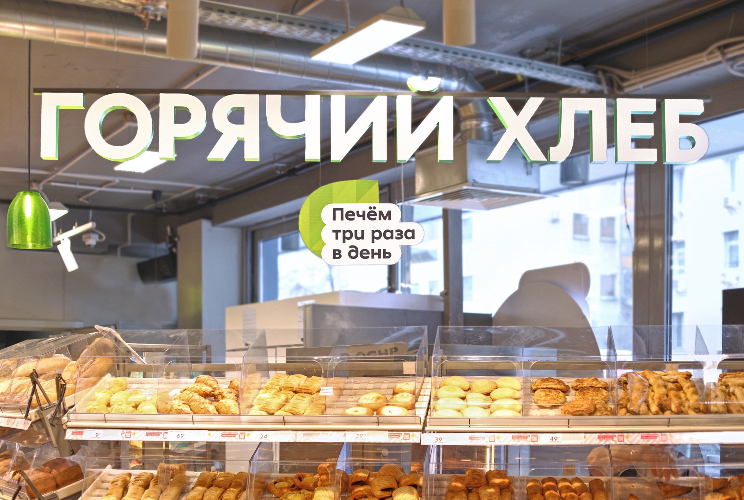
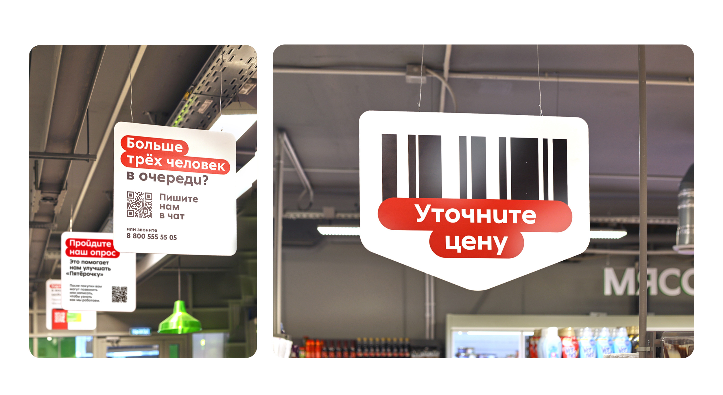
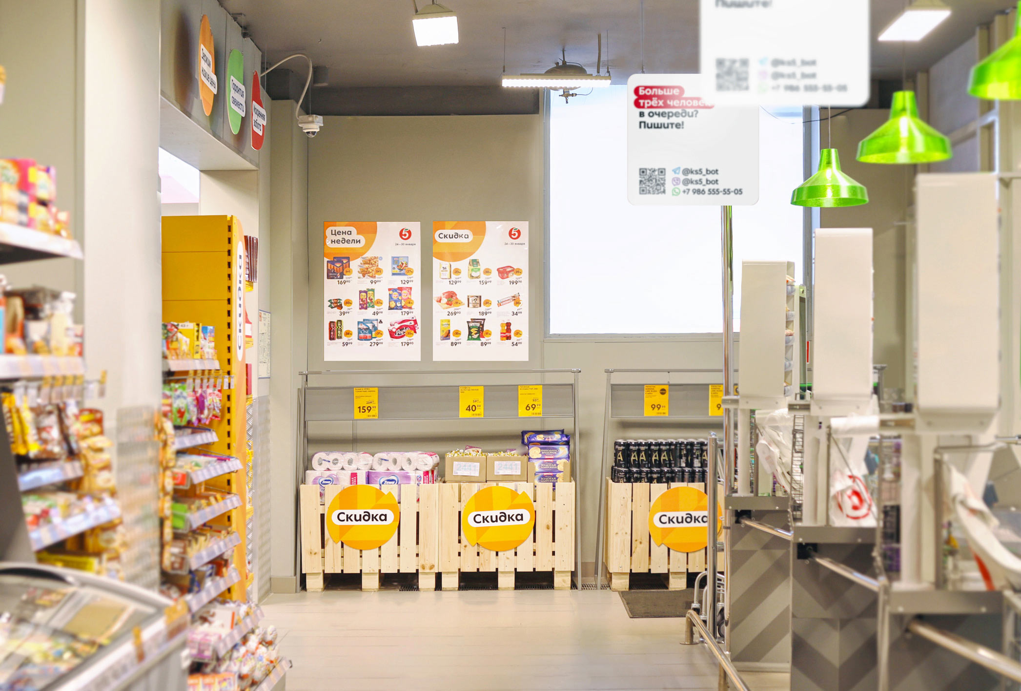
Hanging signs at the entrance set the rules of the game, introducing customers to the key colors and shapes.
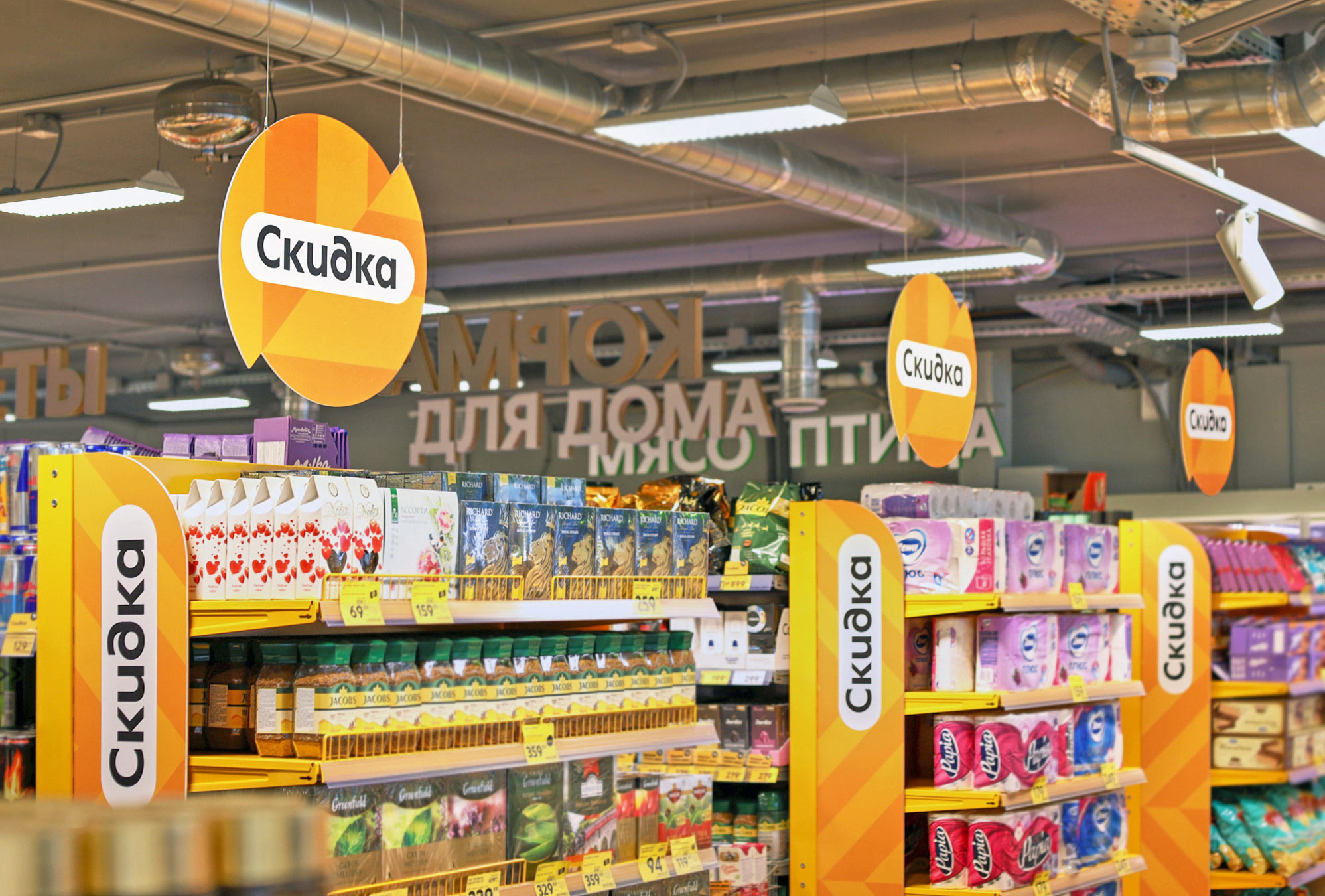
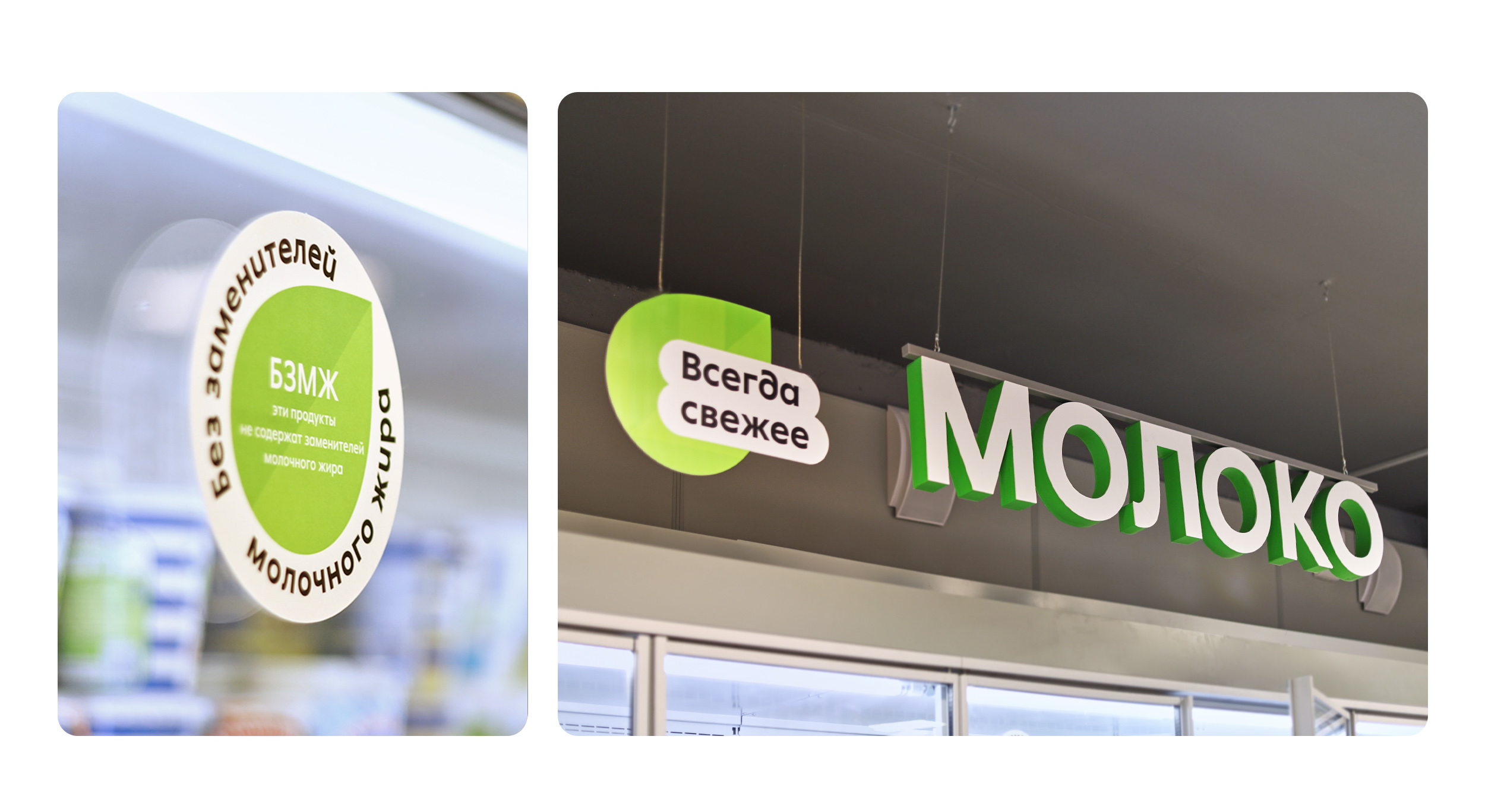
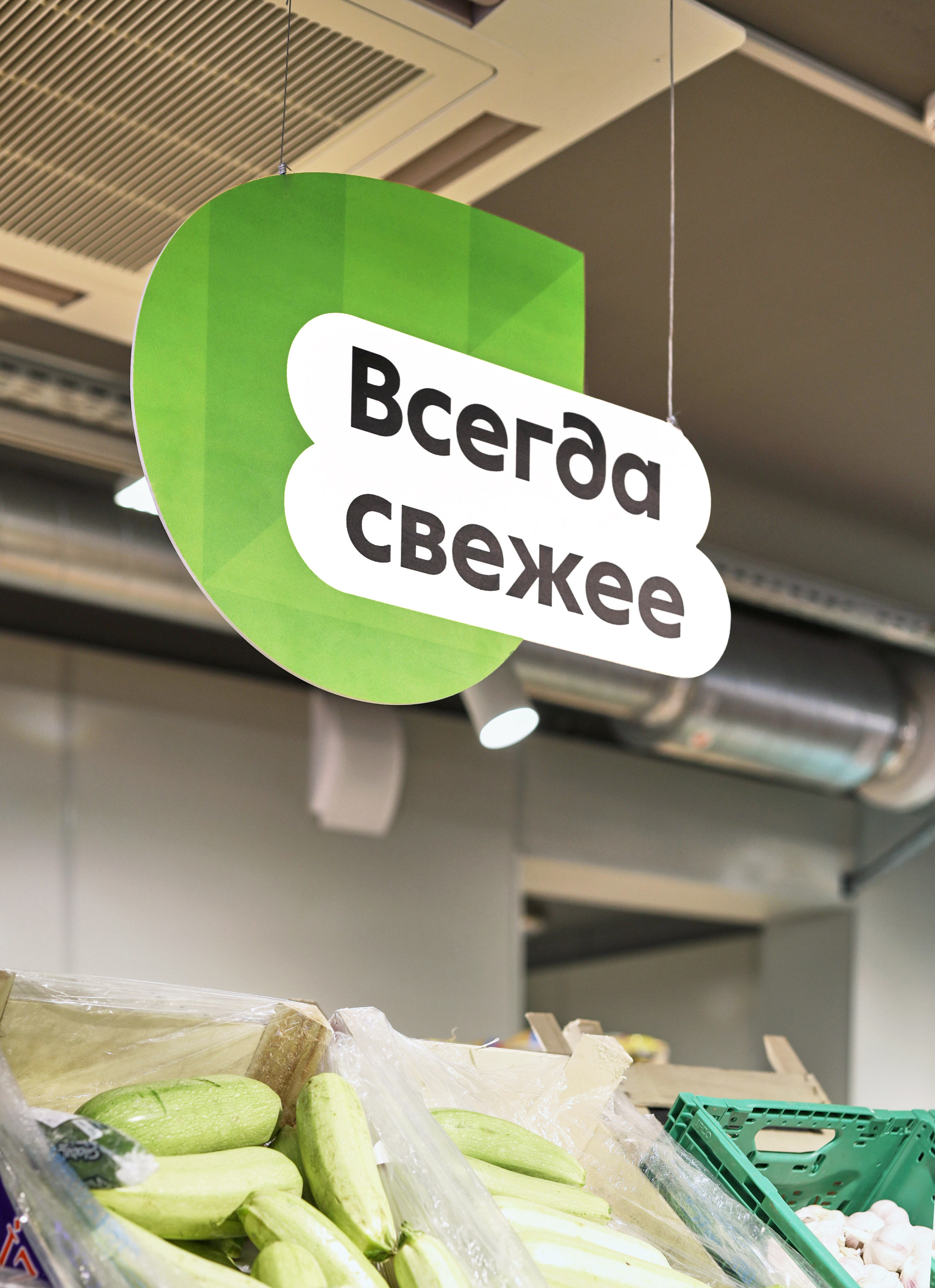
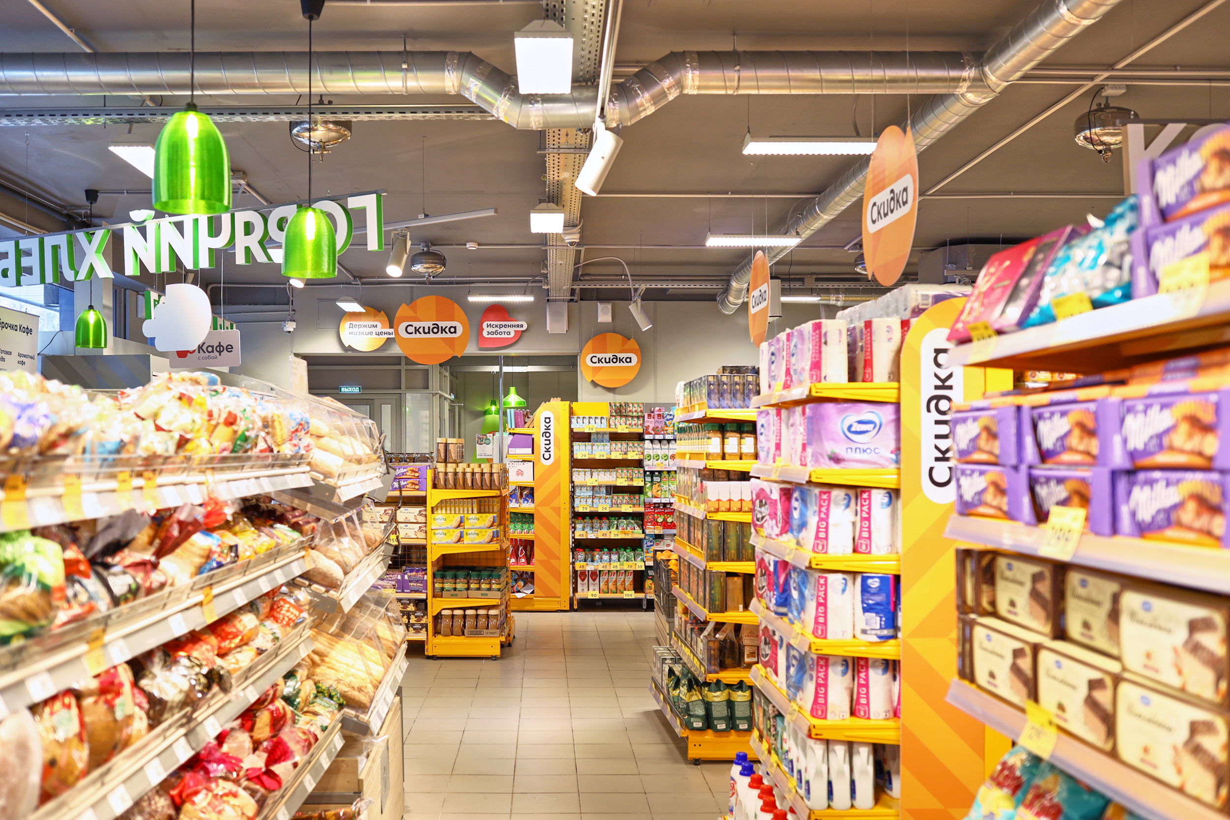
A circle cut in half resembles the percent symbol and draws visitors to discounts.

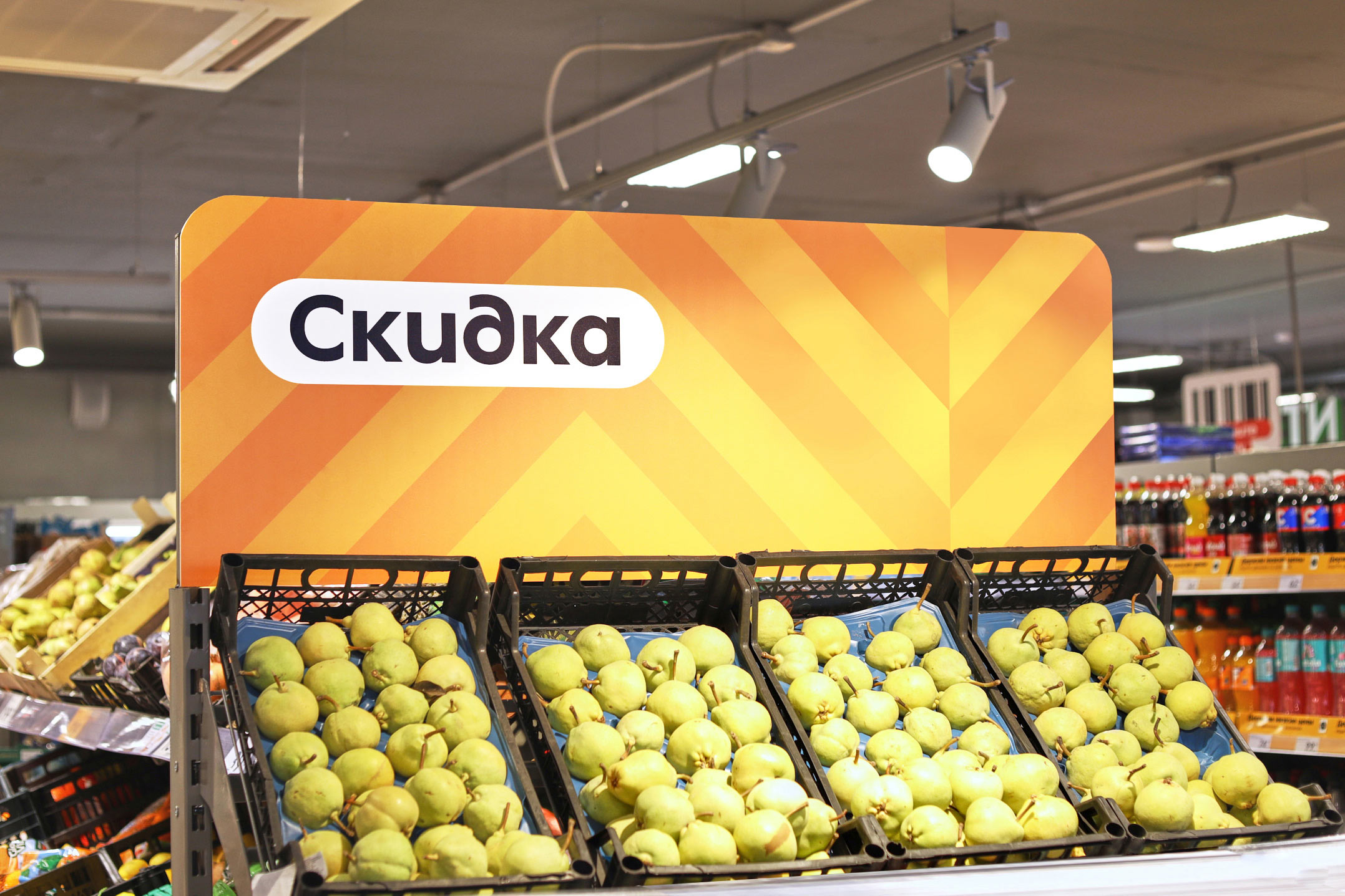
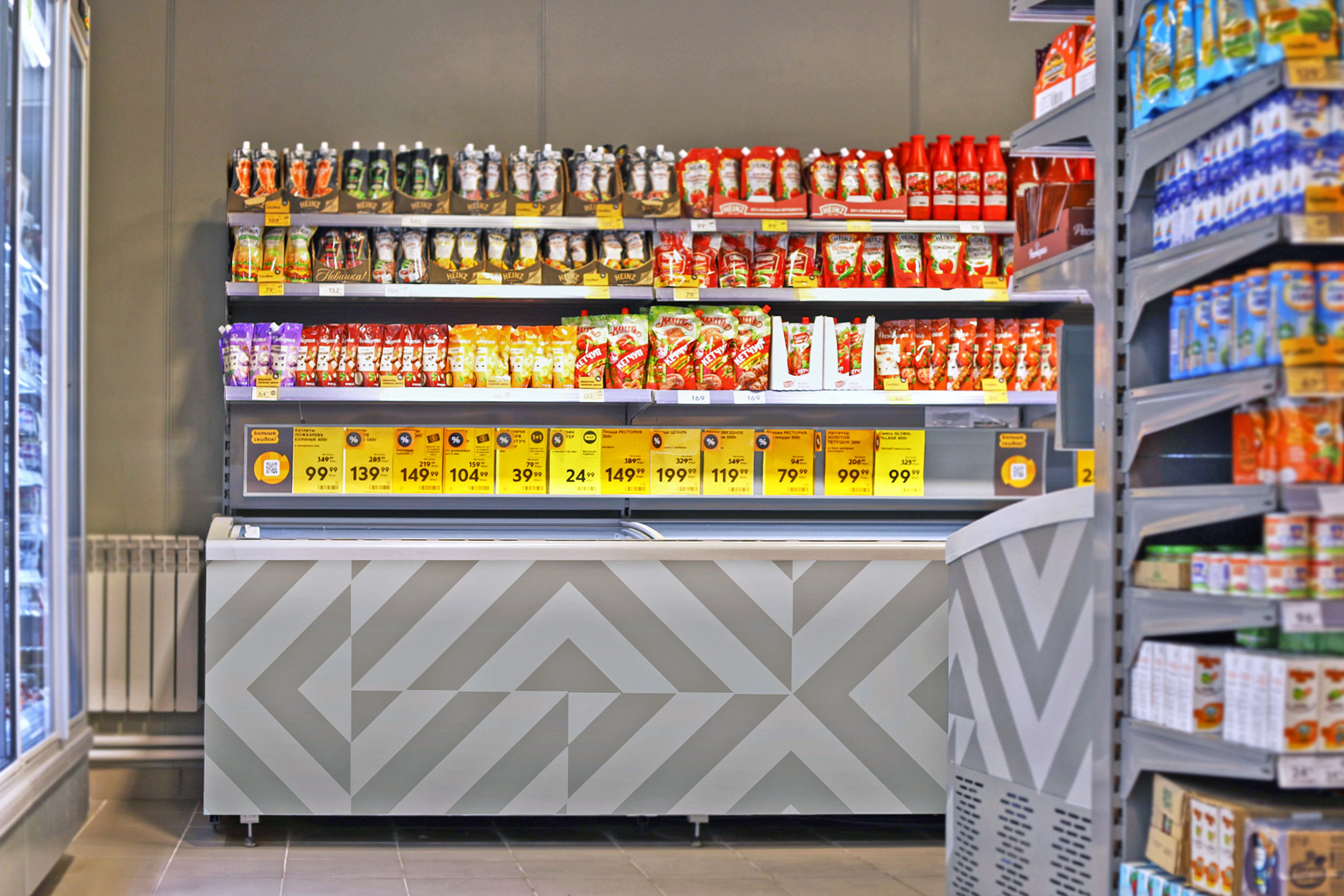
Side surfaces of discount racks help find the way around when you can’t see the hanging signs.
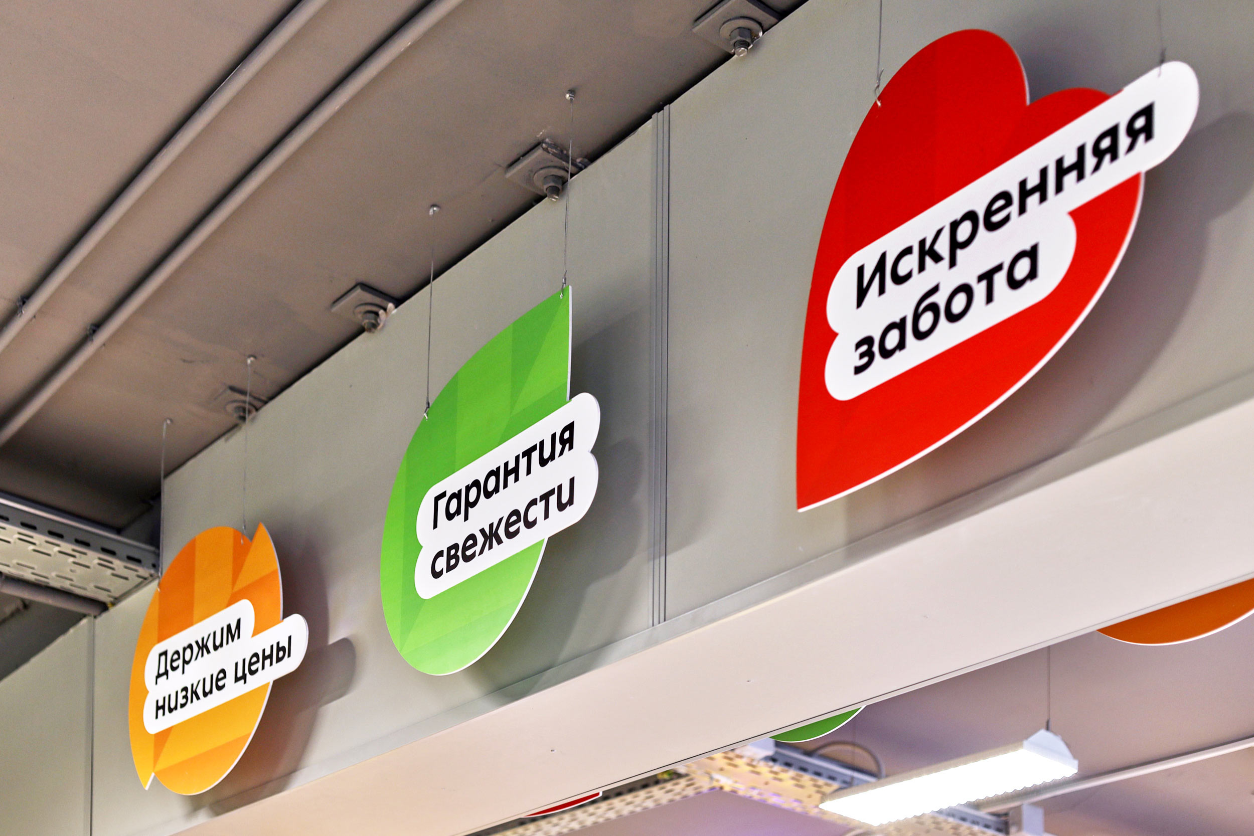
Messages about the quality and freshness of products are given on a green leaf.

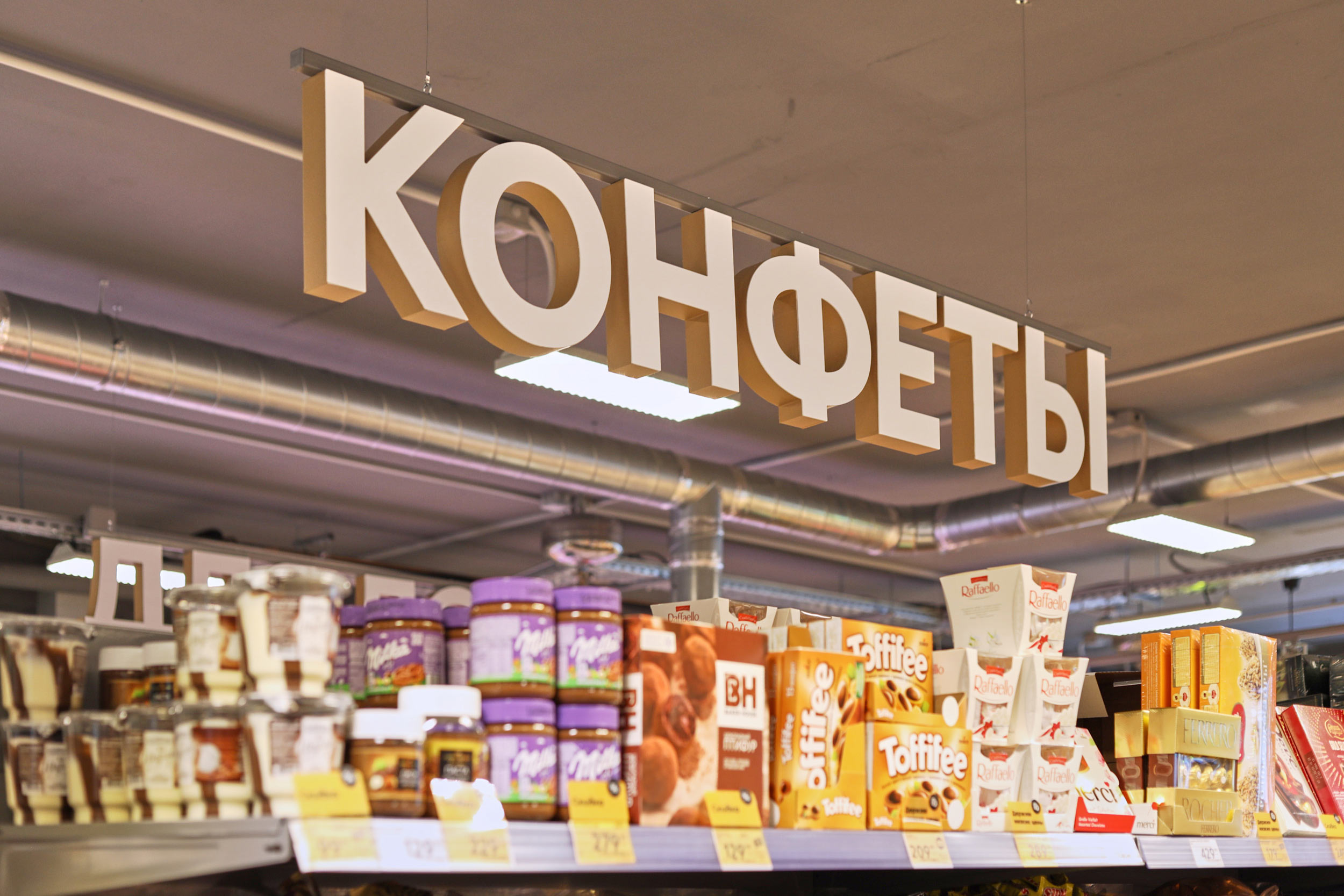
Sides of volumetric signs are painted in the same color and support the visual code.
Some of them are beige in color, which adds warmth and coziness to the interior.
Service messages are deliberately austere and use only two colors. Simple layouts help quickly convey useful information, while red accents attract attention.

A large-scale and unobtrusive pattern is applied to trade equipment to maintain the identity.
All elements add up to a concise and easy-to-read system of signs that remain highly visible in the active visual environment of a store.
typesetters
- Ella Dovnar
