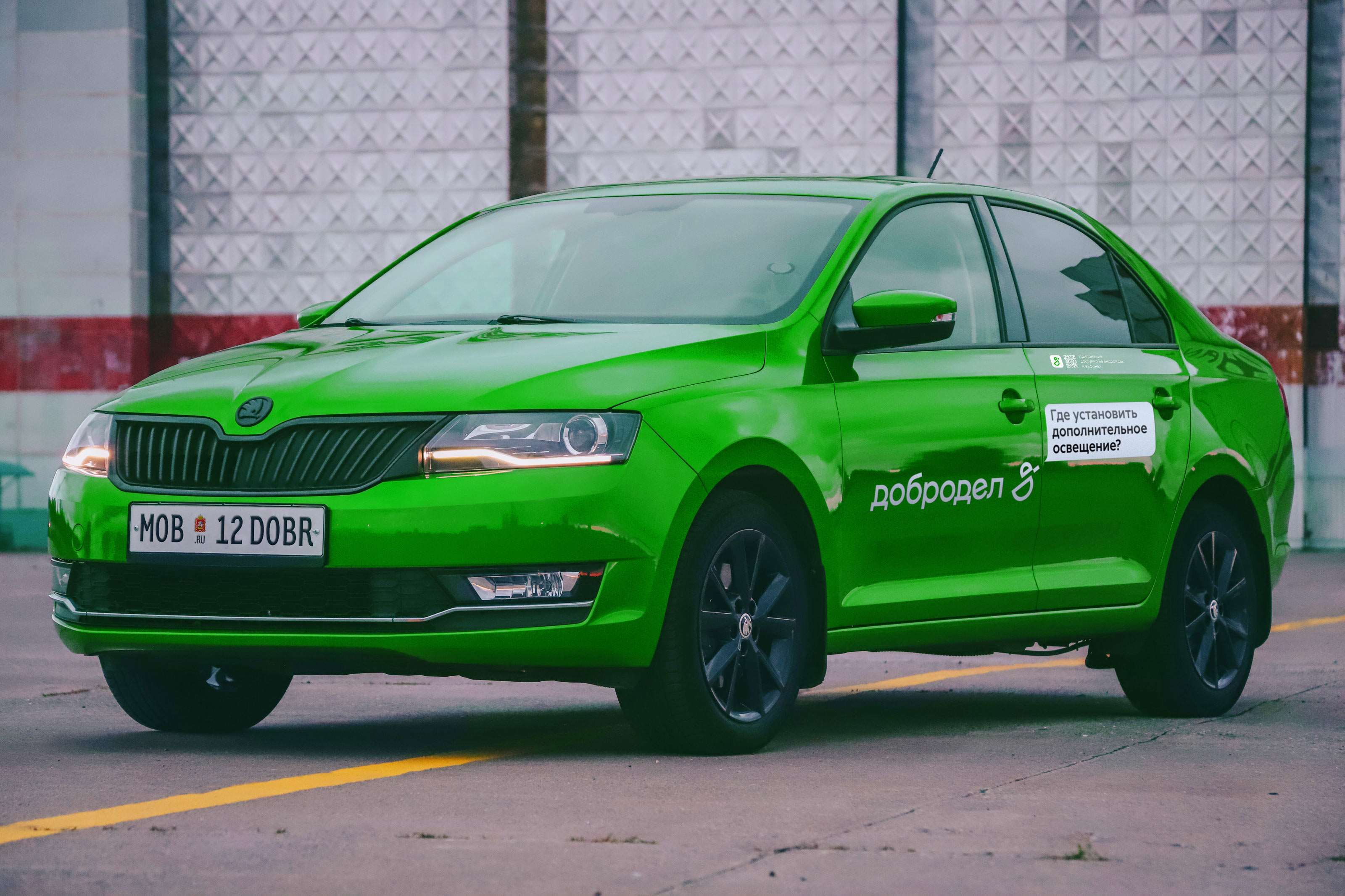
The Dobrodel project was launched in 2015. Its initial goal was to enable residents of Moscow Oblast to communicate with executive authorities without bureaucracy getting in the way. Starting out as a book of complaints and suggestions, the website has grown into a full-fledged one-stop-shop service for any urgent issues. A friendly logo for the useful and modern service was designed in the studio.
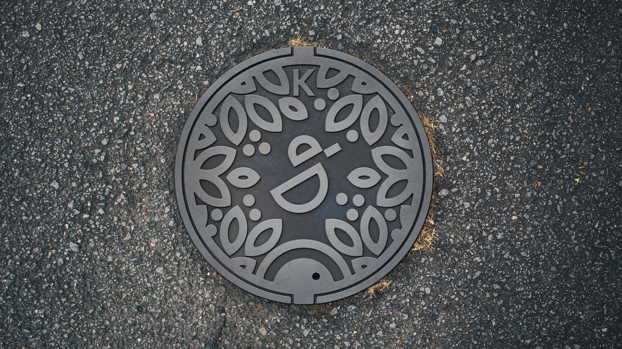
The main task of the Dobrodel team is to improve the quality of life of people in Moscow Oblast with the help of public services. The duck in the logo looks high-tech, but also symbolizes care, friendliness and homeliness.
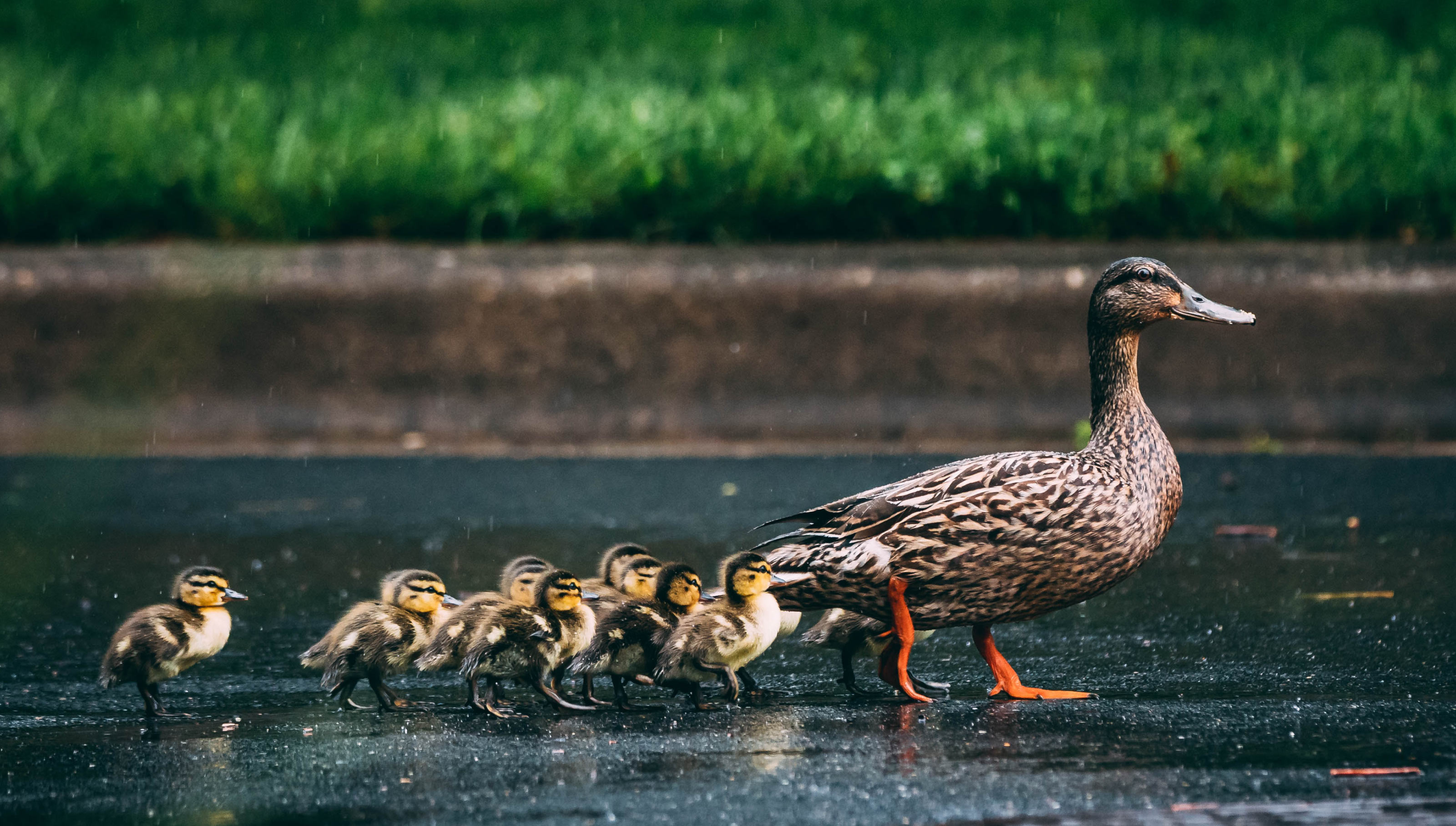
The symbol is simple and versatile: it’s eye catching, aesthetically pleasing and looks great in any environment and on any media.
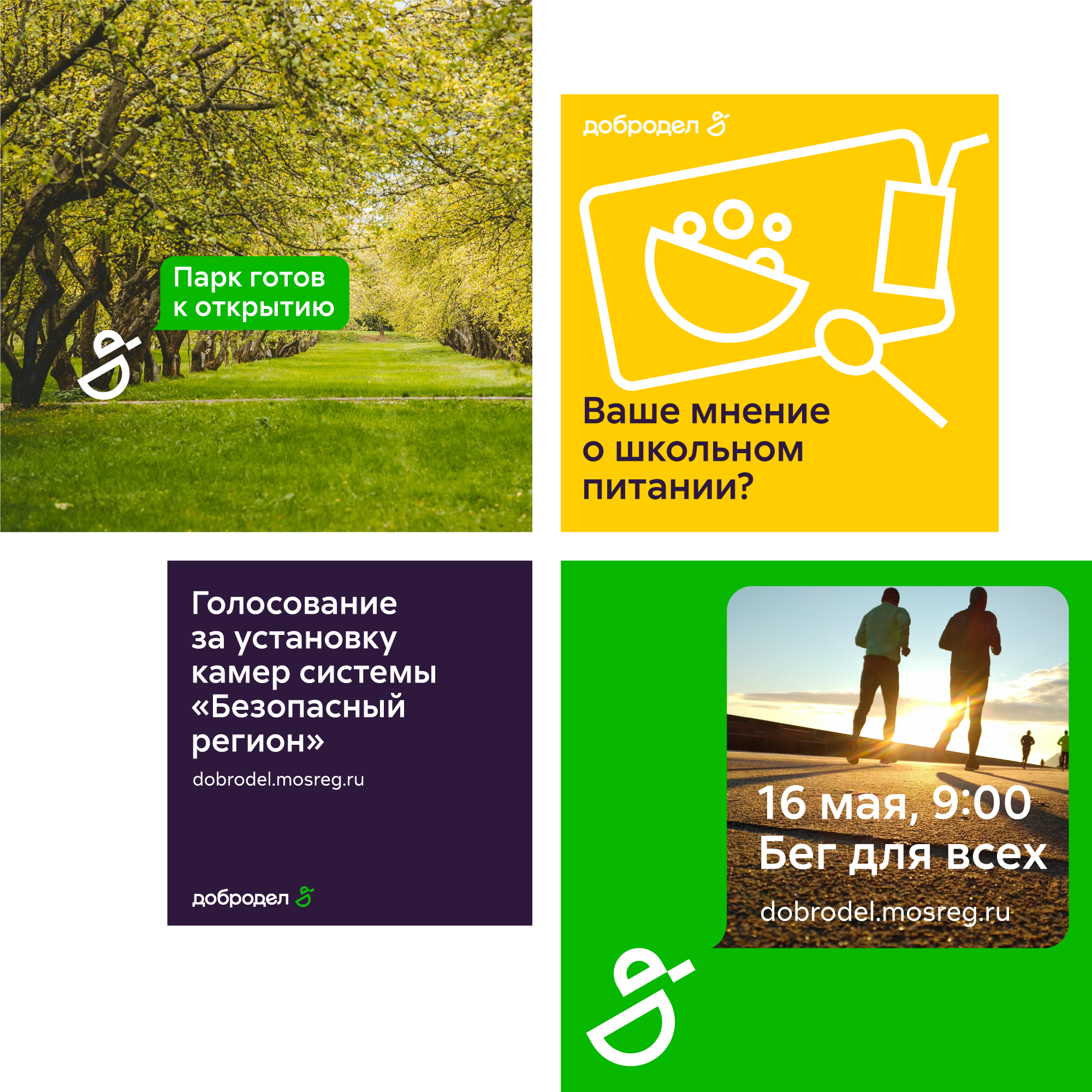
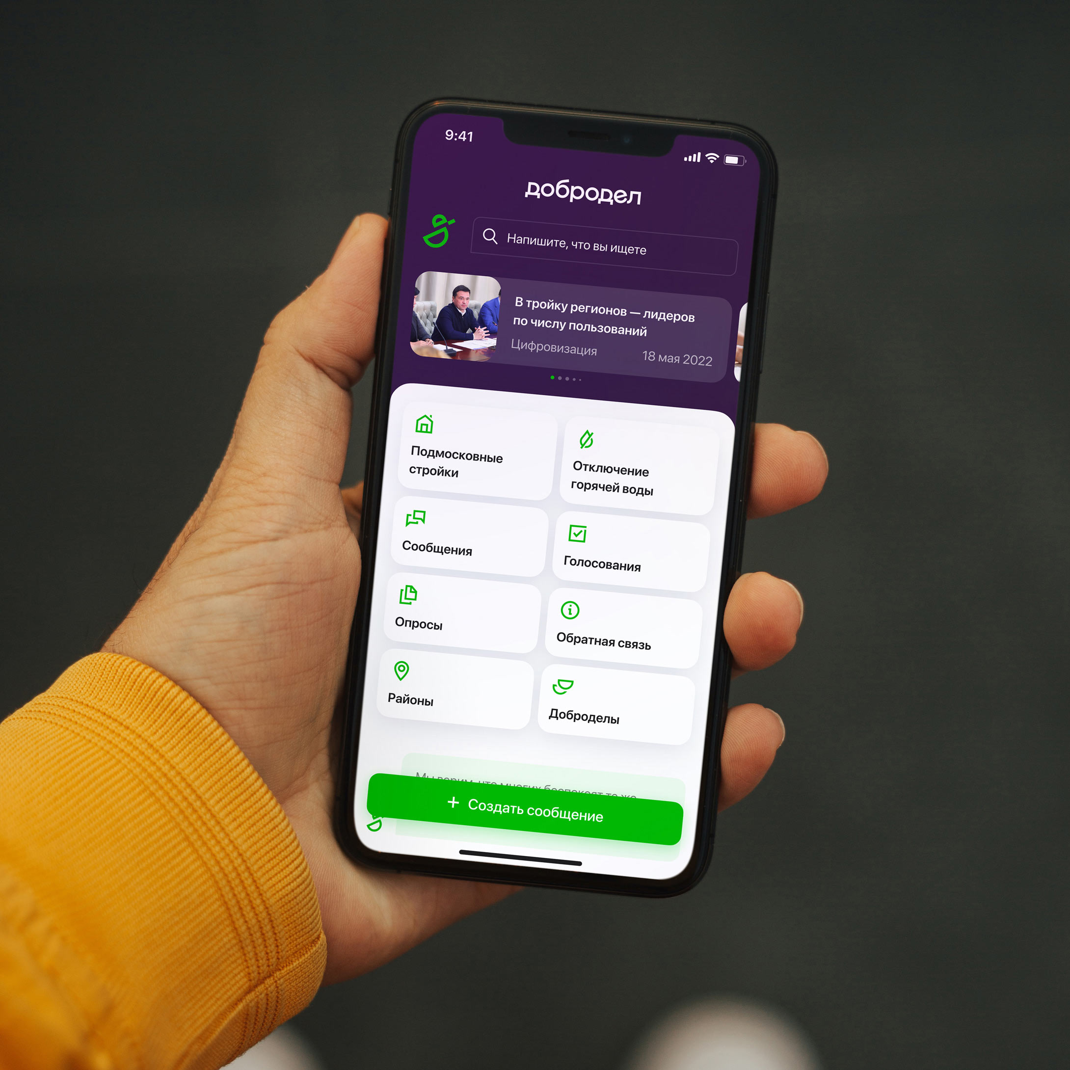
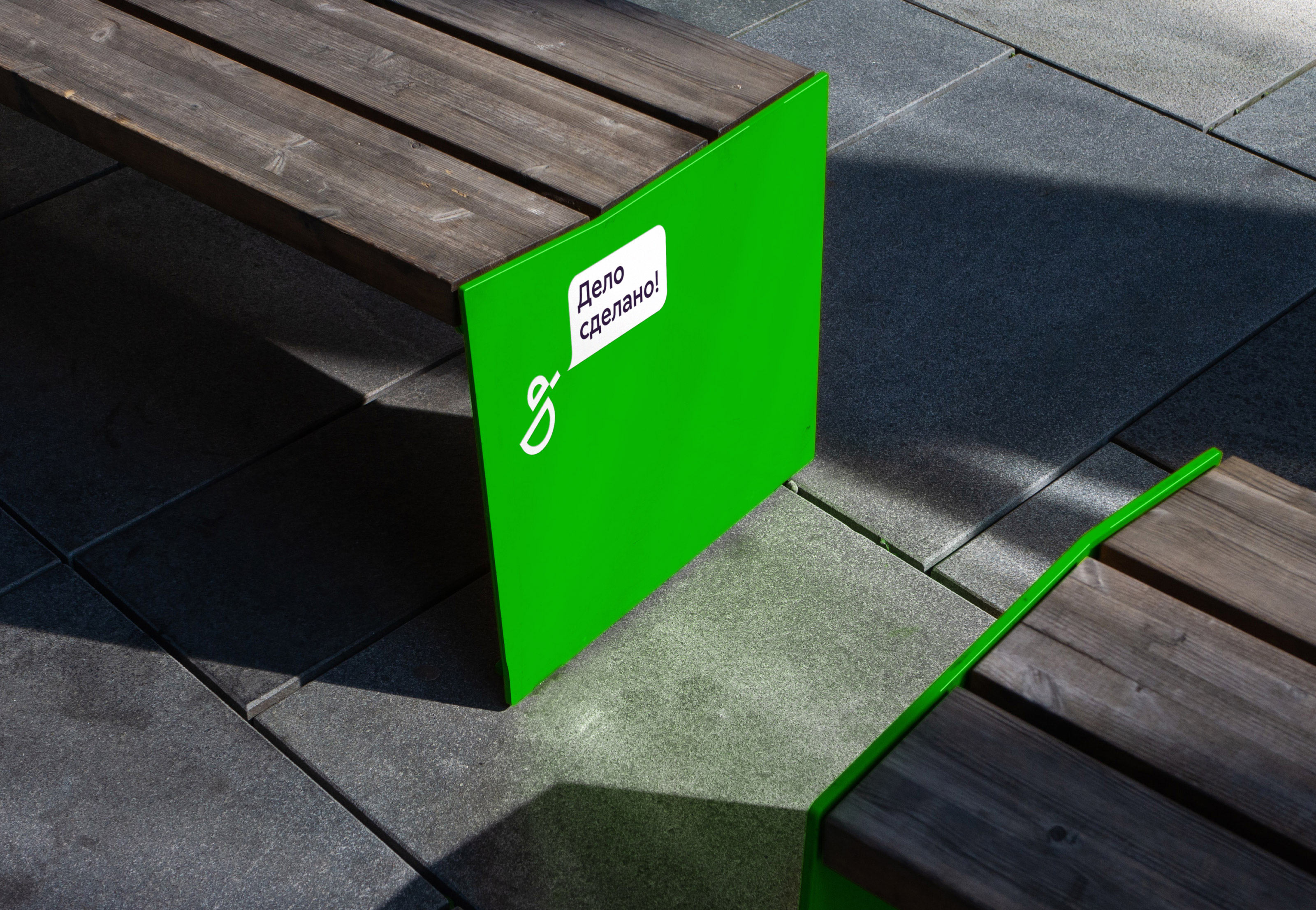
The attentive bird always keeps the dialogue going and enjoys talking about important things.





designer
- Valery Tolchanov
technical designers
- Vladislav Priluchniy