
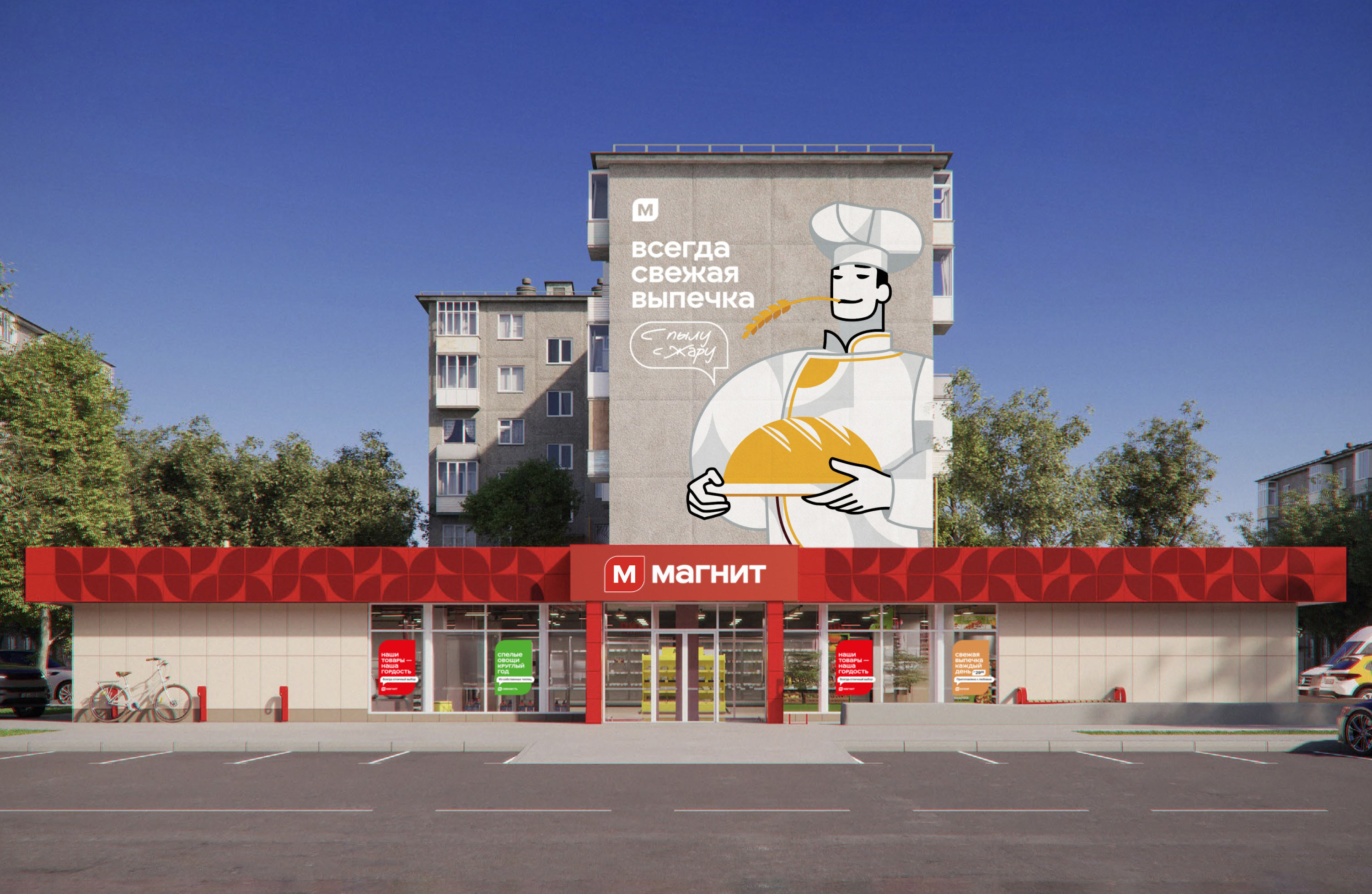
Magnit is one of the largest retail chains in Russia. Every day, people visit Magnit stores for groceries, drinks, baked goods, household chemicals and home essentials. Following a rebranding, the chain’s stores needed updated interiors, informative navigation and their own way of communicating with customers.

At the studio, we created a concept that highlights Magnit’s core values: clarity, reliability and friendliness.
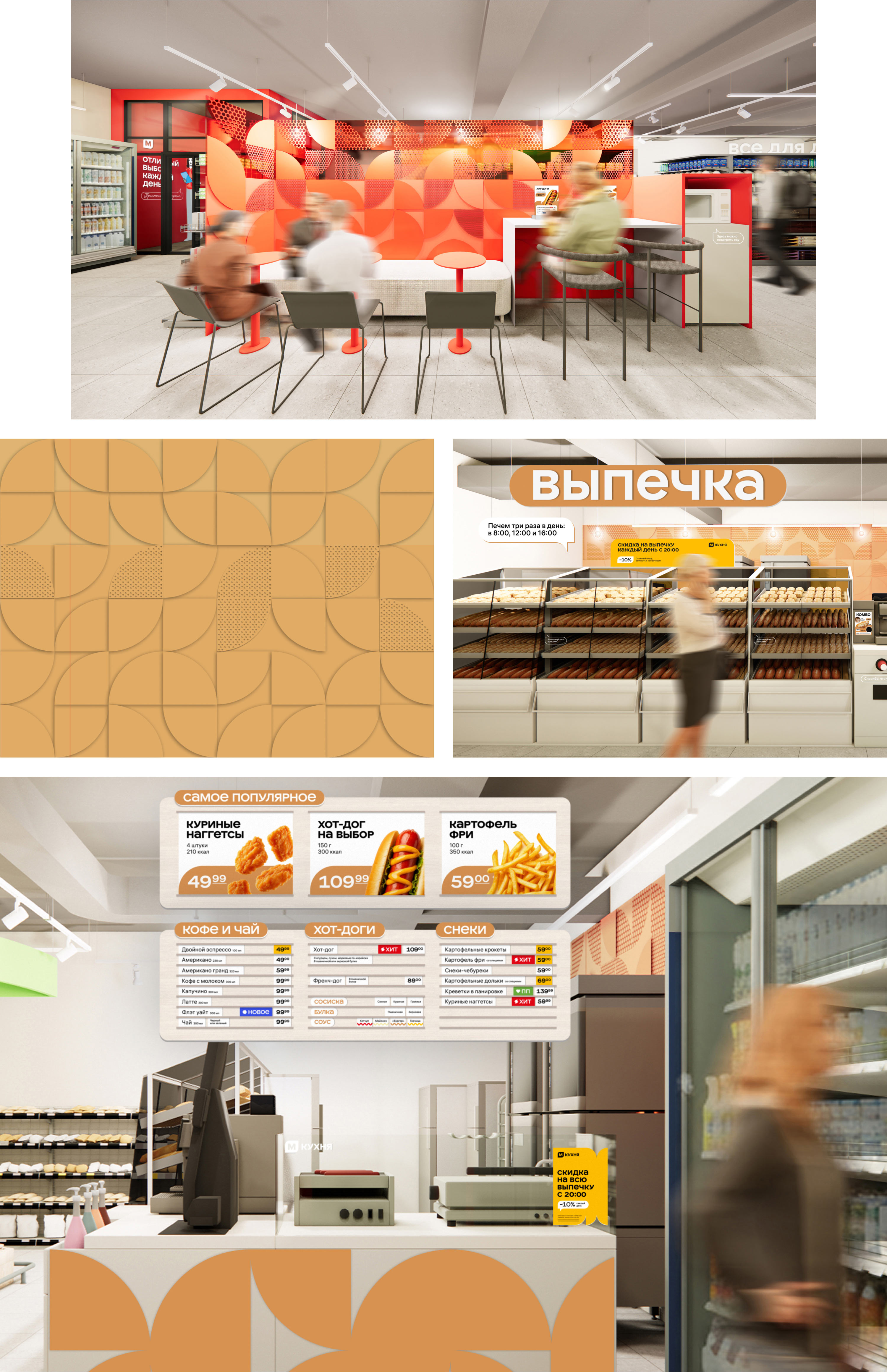
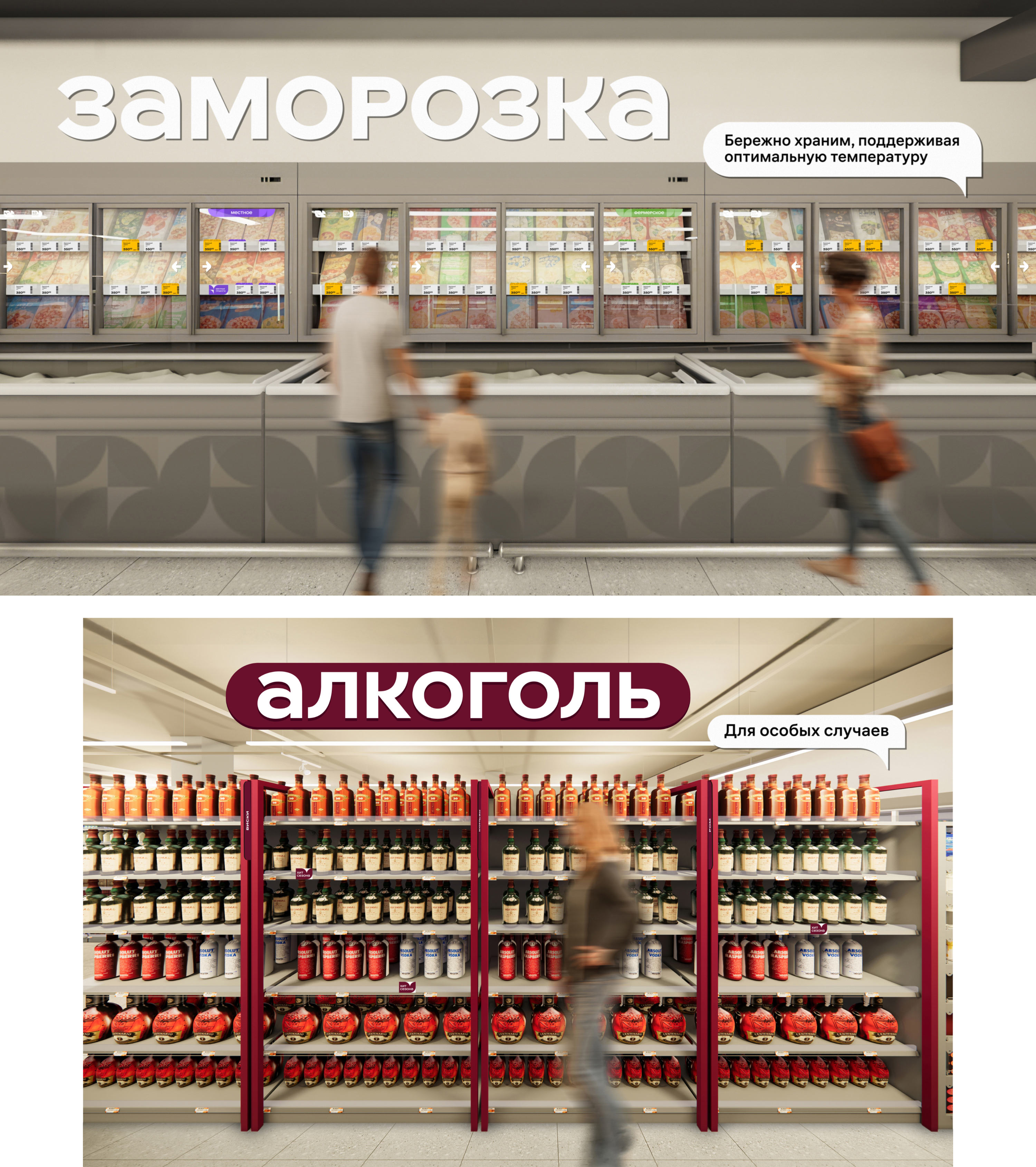
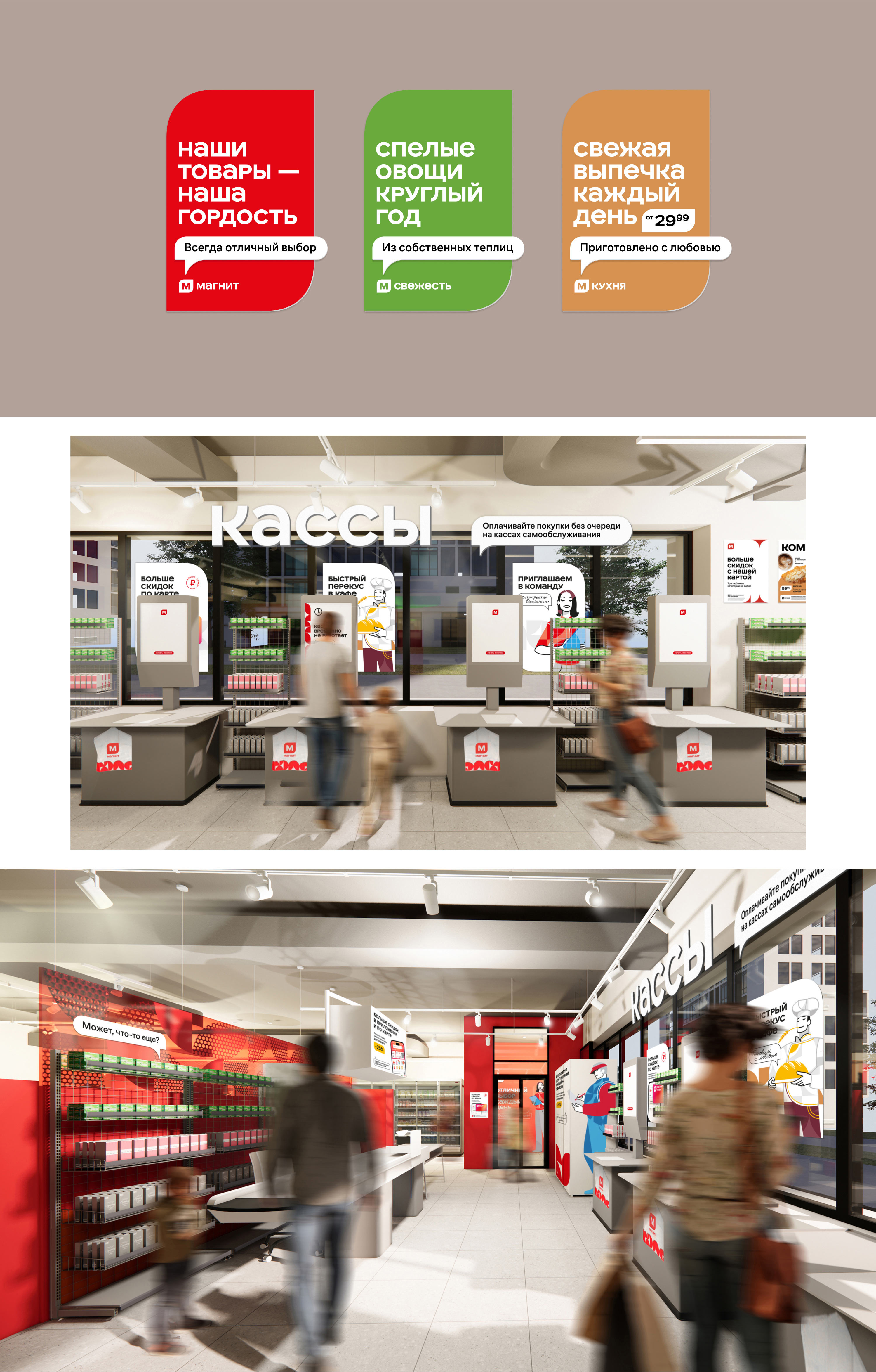
We developed the store zoning, designed the interiors and selected convenient and functional furniture. In the café and bakery areas, we introduced partitions featuring a signature pattern that reflects the logo’s curves. This made the spaces feel cozier and gave them clearer boundaries.
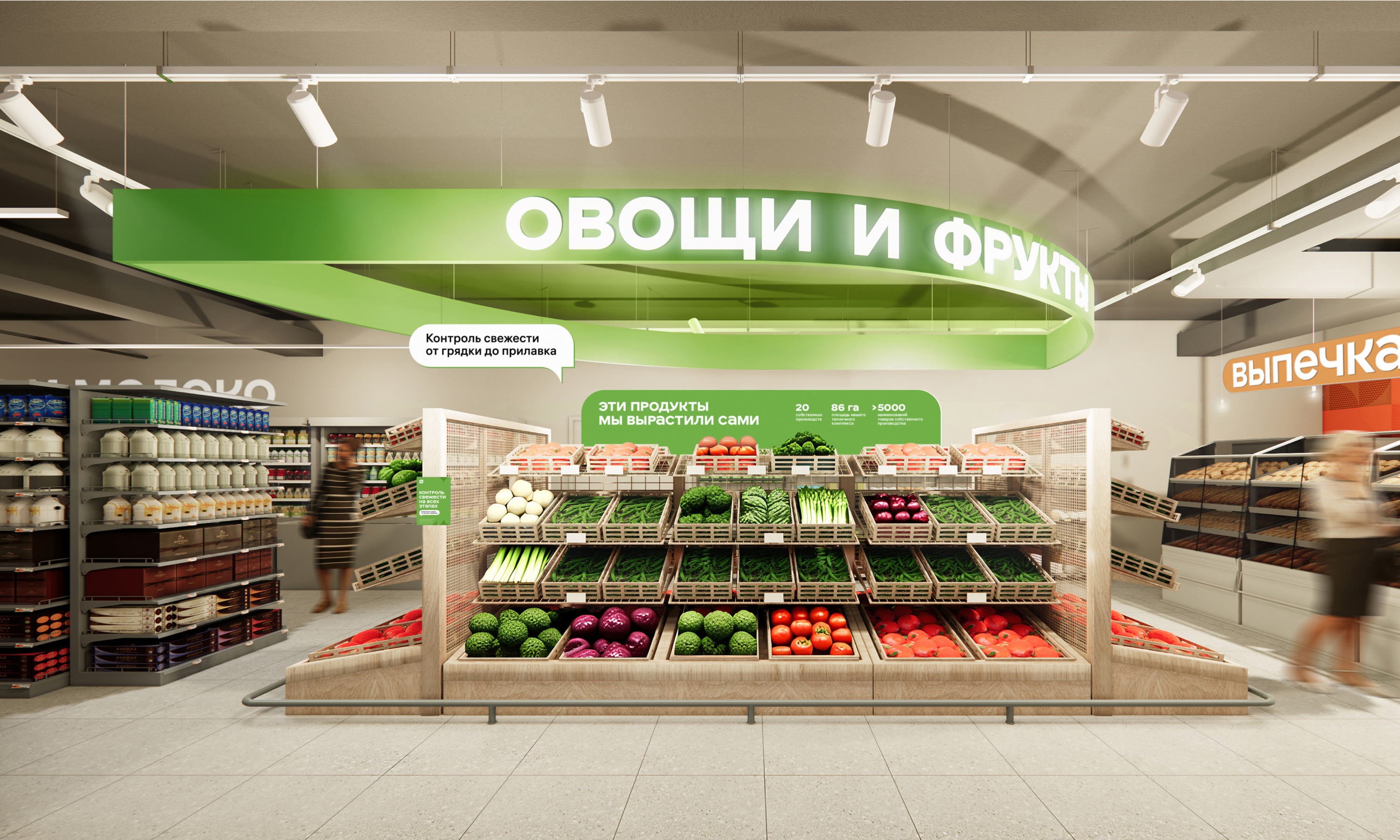
The fruit and vegetable section is marked with a vibrant sign. When viewed from below, it reveals the outline of the chain’s signature “petal” shape.
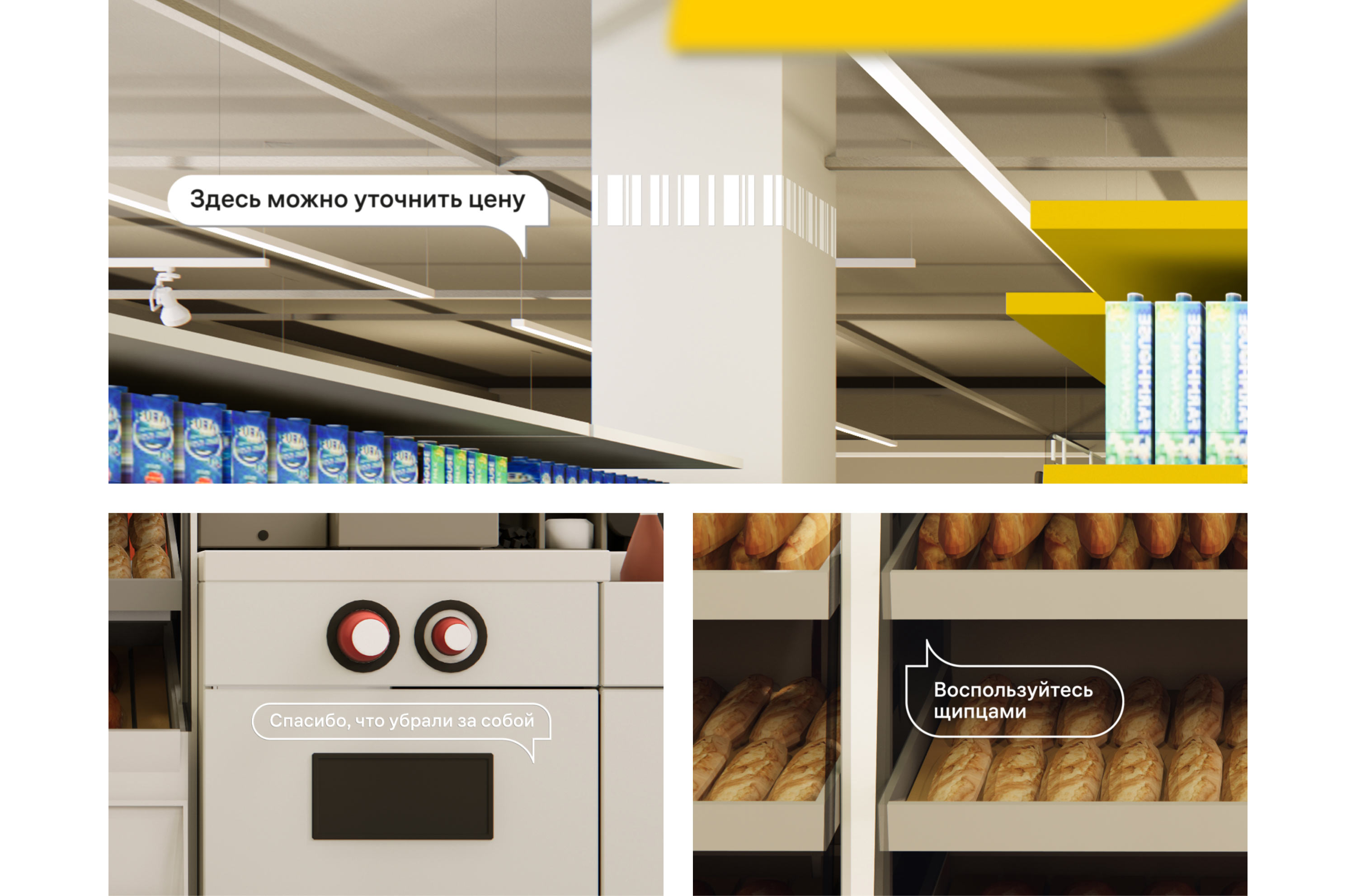
Thoughtfully designed wayfinding makes shopping faster and easier. Subtle bubbles with messages support the main wayfinding system and inform visitors about Magnit’s benefits.
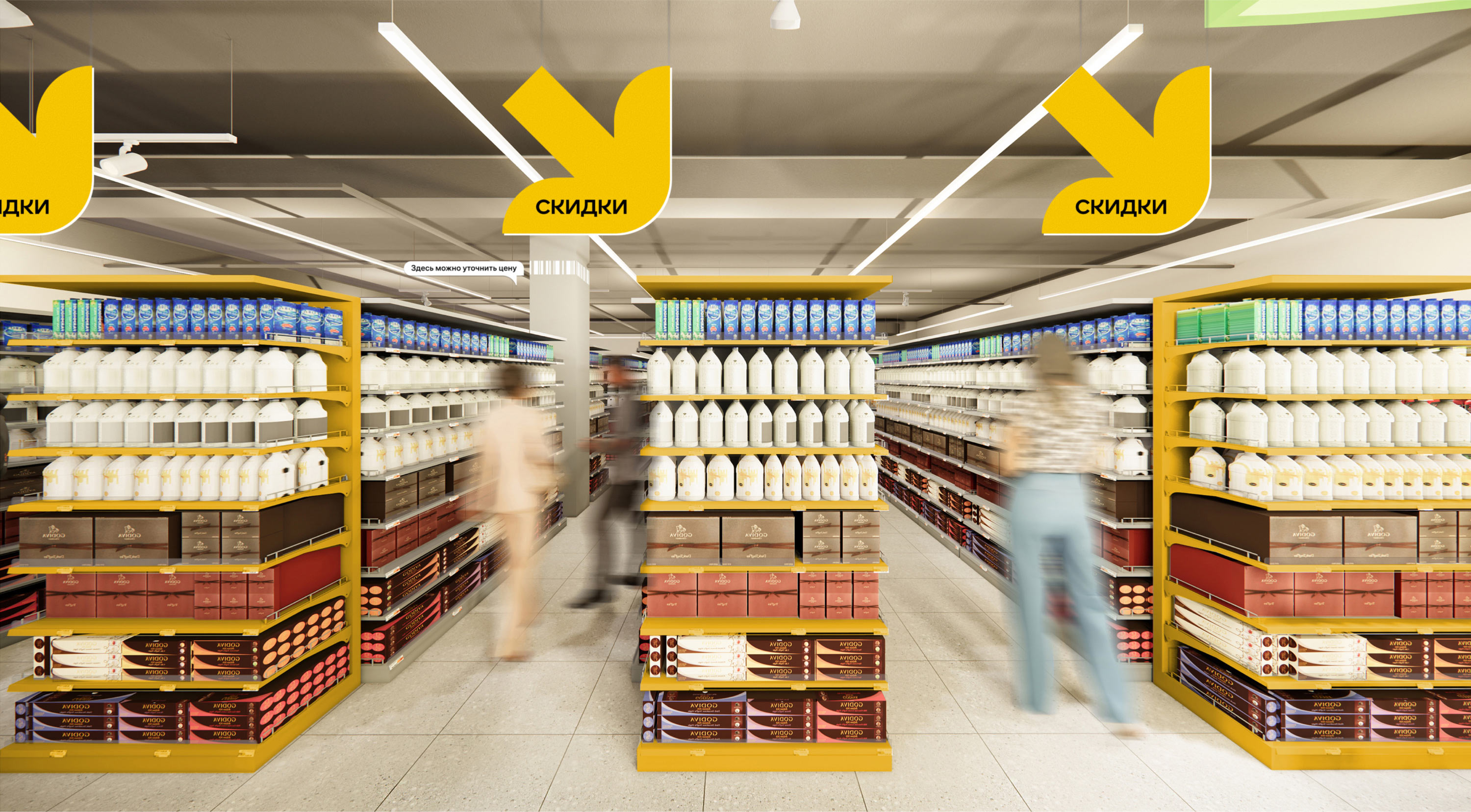
Attention is drawn to discounts and promotions through large hanging arrow signs.
In addition to the primary wayfinding, customers are guided by prompt signs placed throughout the store, visible precisely when they’re needed.
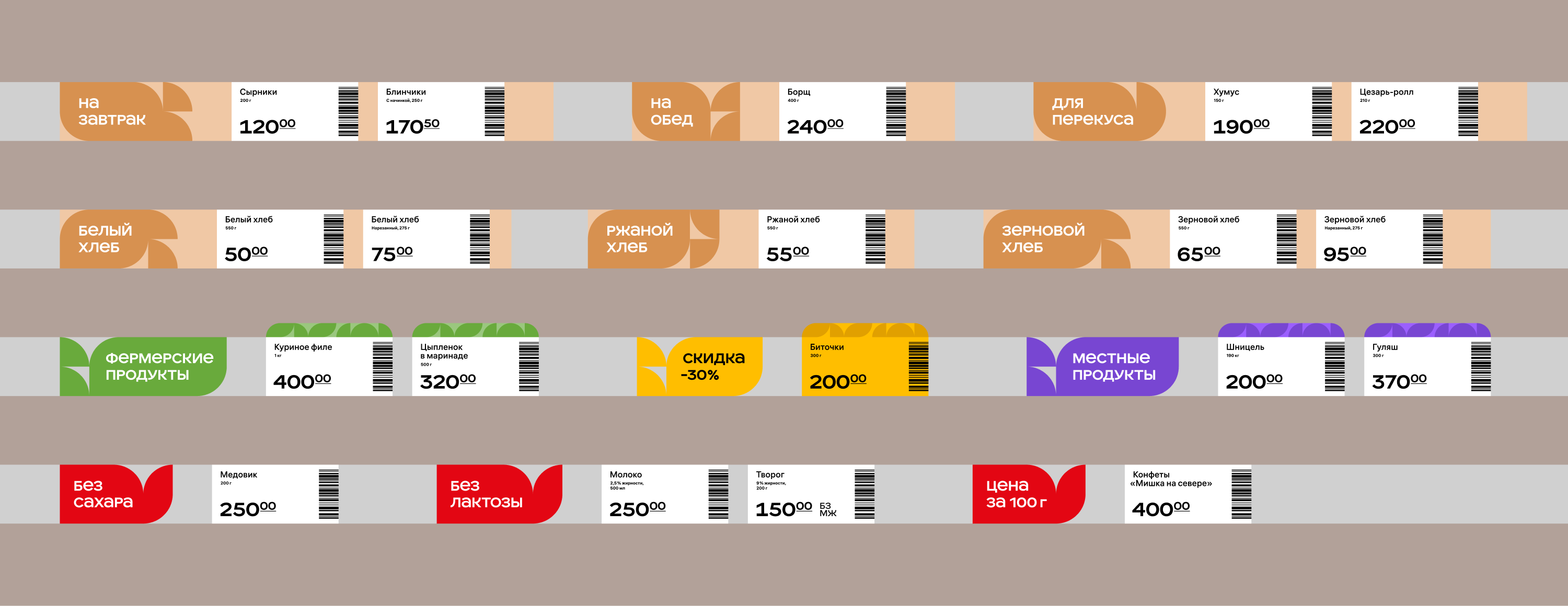
Shelf labels are accompanied by a signature pattern that harmonizes with the typeface and follows the established color-coding system.

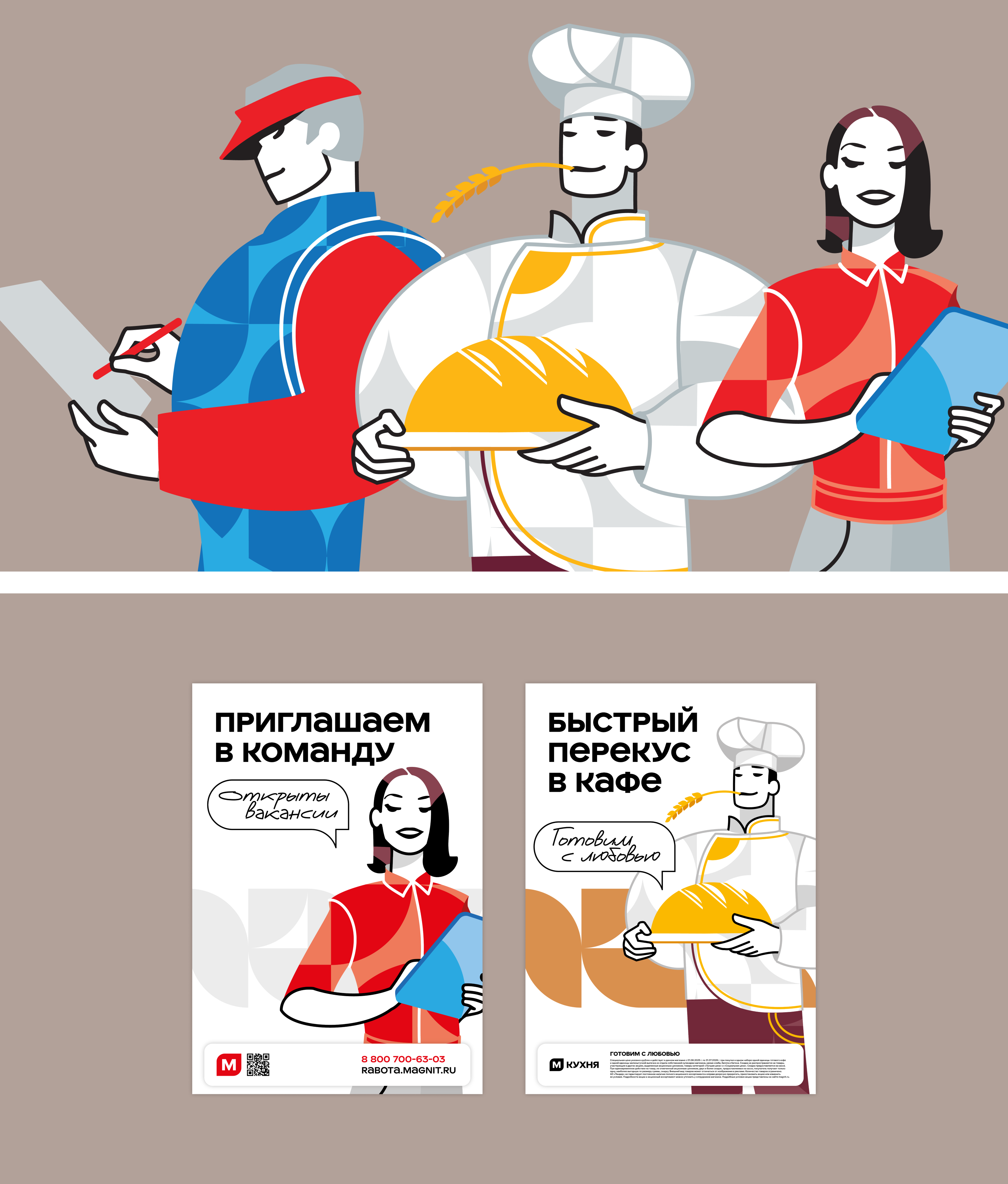
To decorate the interiors and print posters for various occasions, we created a set of brand characters: a craftsman, a baker and a manager. They appear in different scenarios, taking on fitting roles.
The developed design principles come together into a cohesive visual system used by designers, layout artists, architects, planners, merchandisers and store managers.
art director
designers
- Vadim Musatov
- Anastasiya Moskalenko
