“Sestroretsk Resort” is located in a coniferous forest between the Gulf of Finland and the Sestra River. The navigation system created in the studio allows tourists to quickly orient themselves on the large territory, does not interfere with enjoying nature, and complements the overall feeling of lightness.
Territory
Laconic steles help find the path to the desired building, an interesting place, or the exit to the beach.
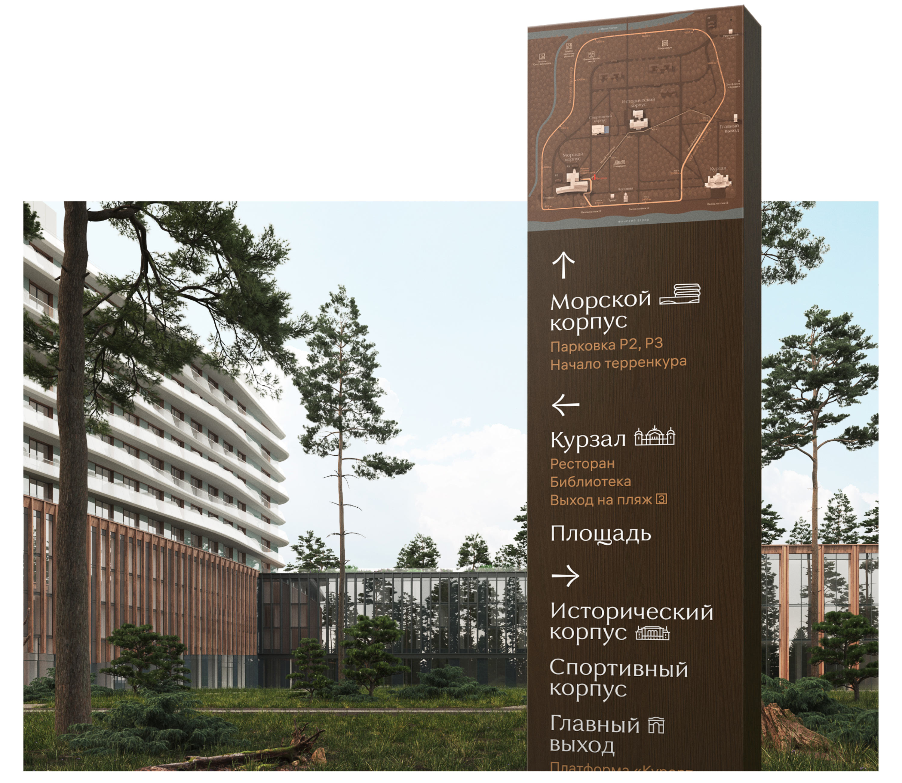
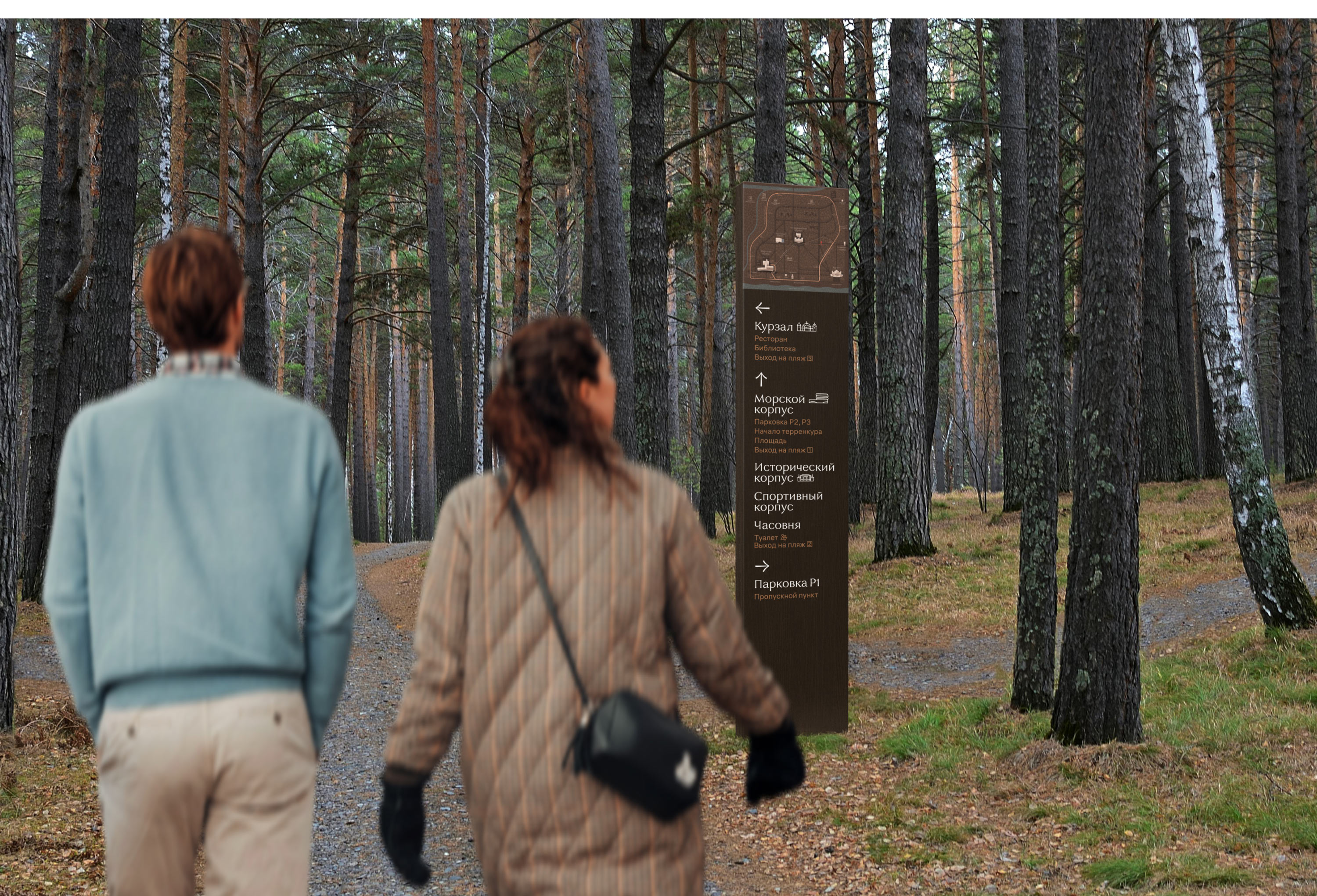
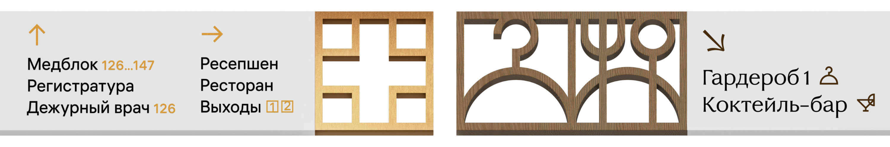
For clarity, direction signs are accompanied by recognizable pictograms.
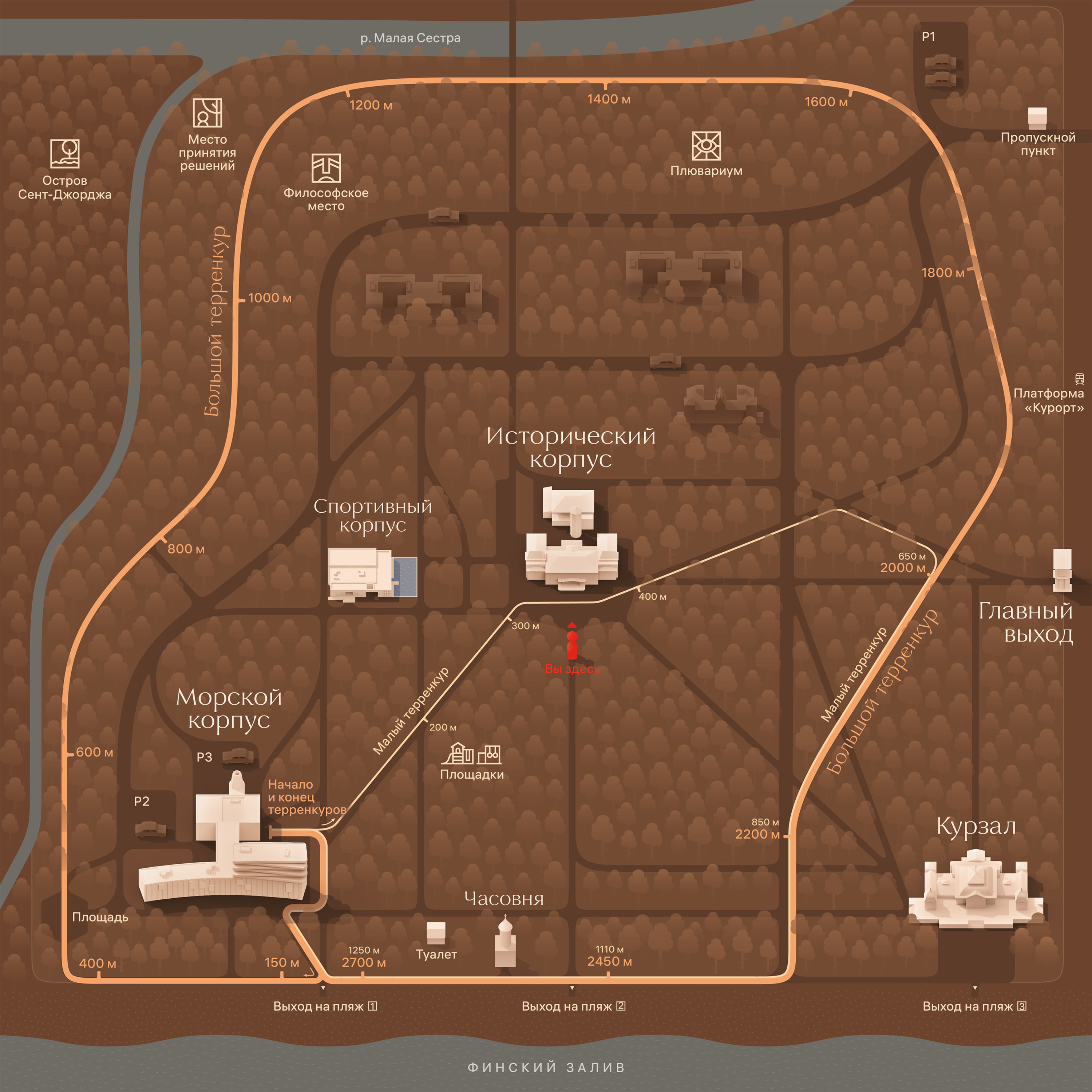
The detailed map shows the buildings of the sanatorium and all the most important points. The paths connecting them suggest how to walk around the entire resort faster, without forgetting to enjoy the picturesque landscapes.
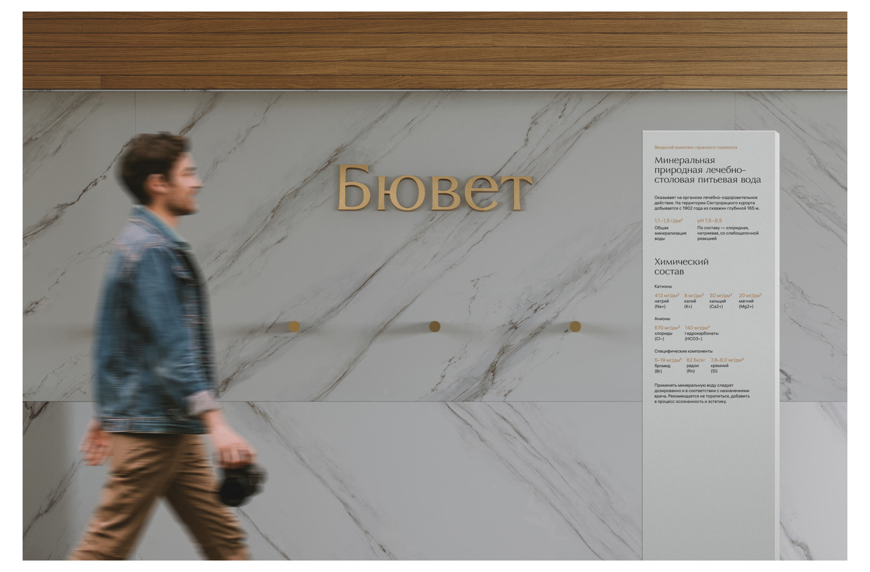
At each landmark there is a stand with interesting information about this place.
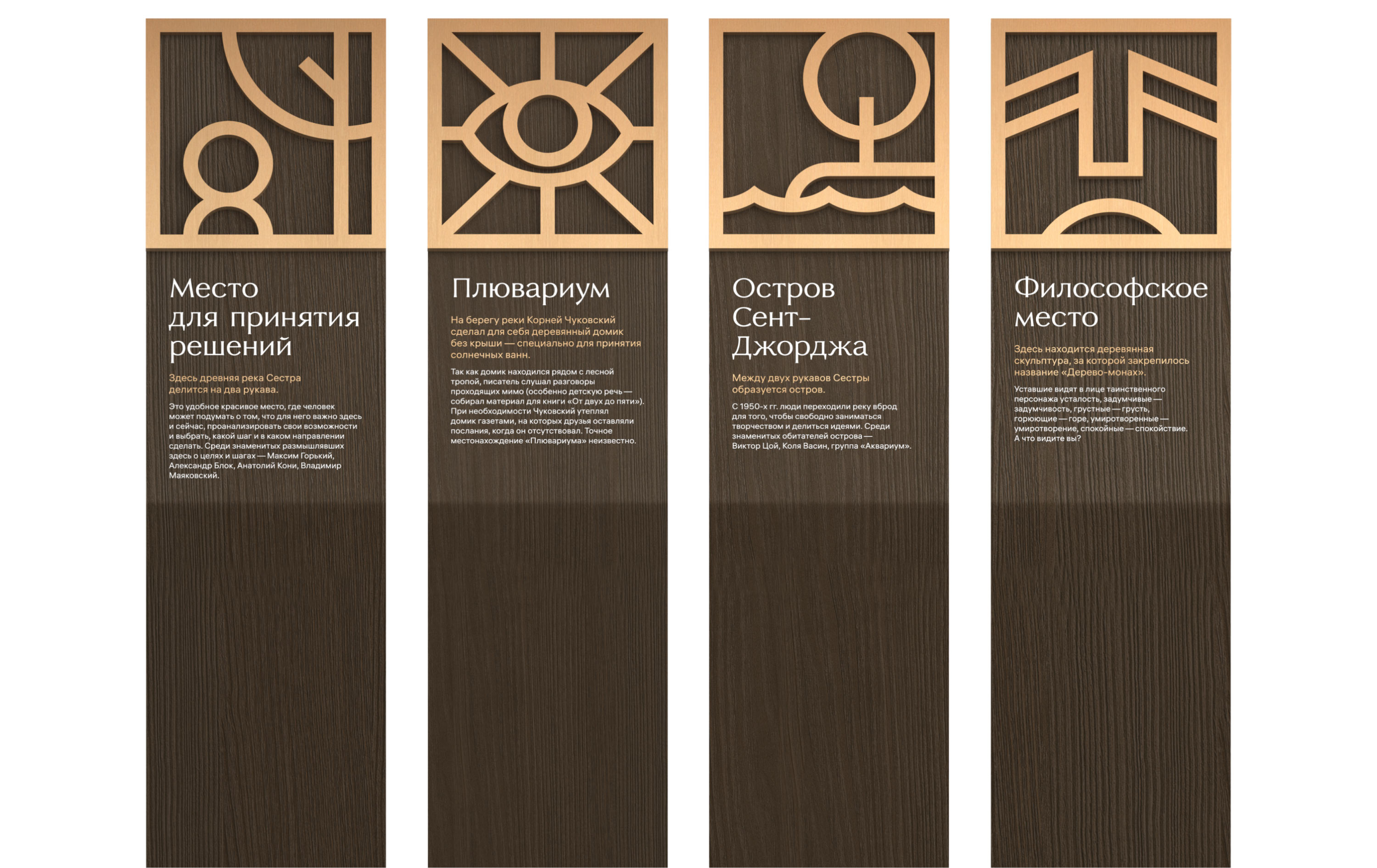
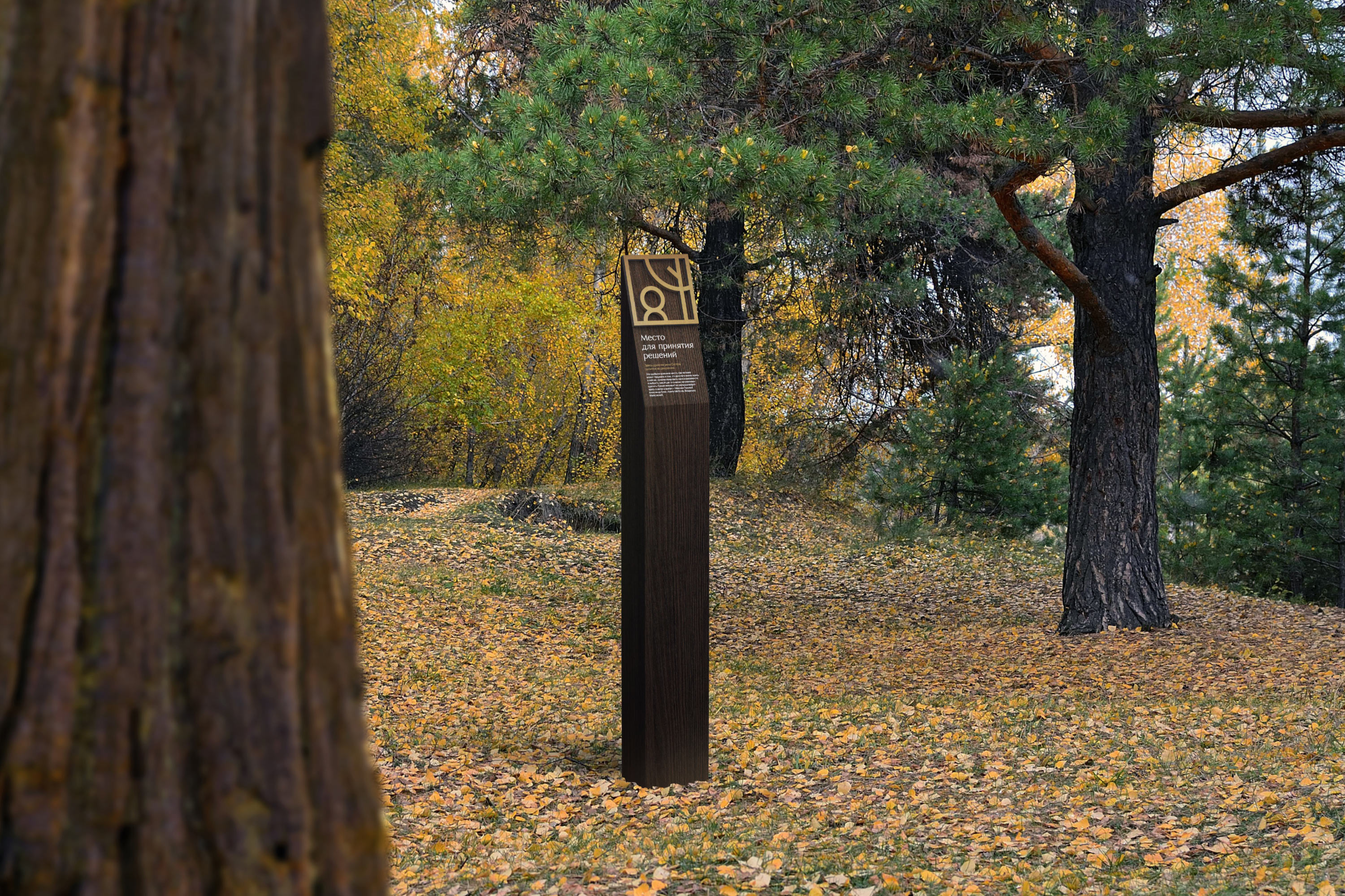
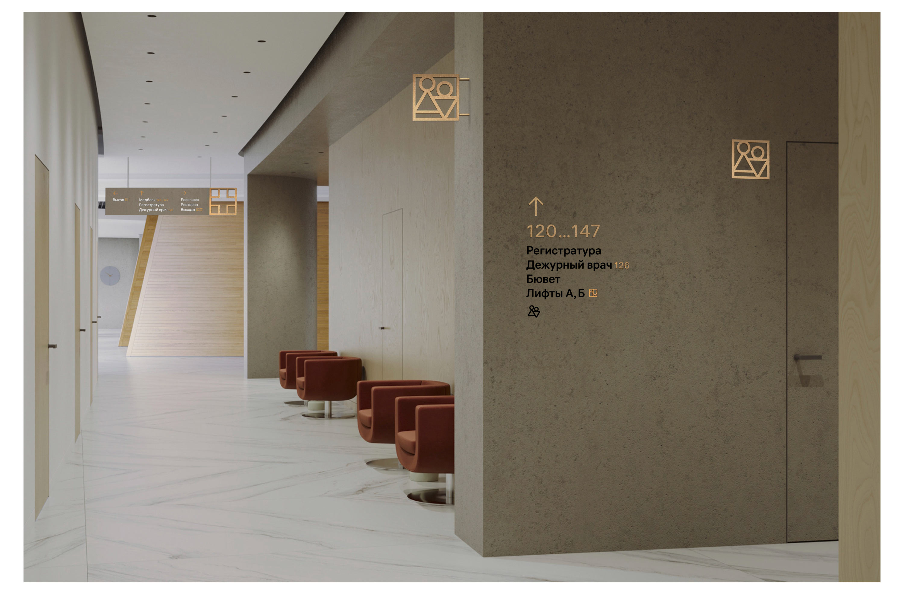
The pictograms on the signs are made in full accordance with the resort’s identity. They are minimalist, but at the same time occupy the most space on the signs.
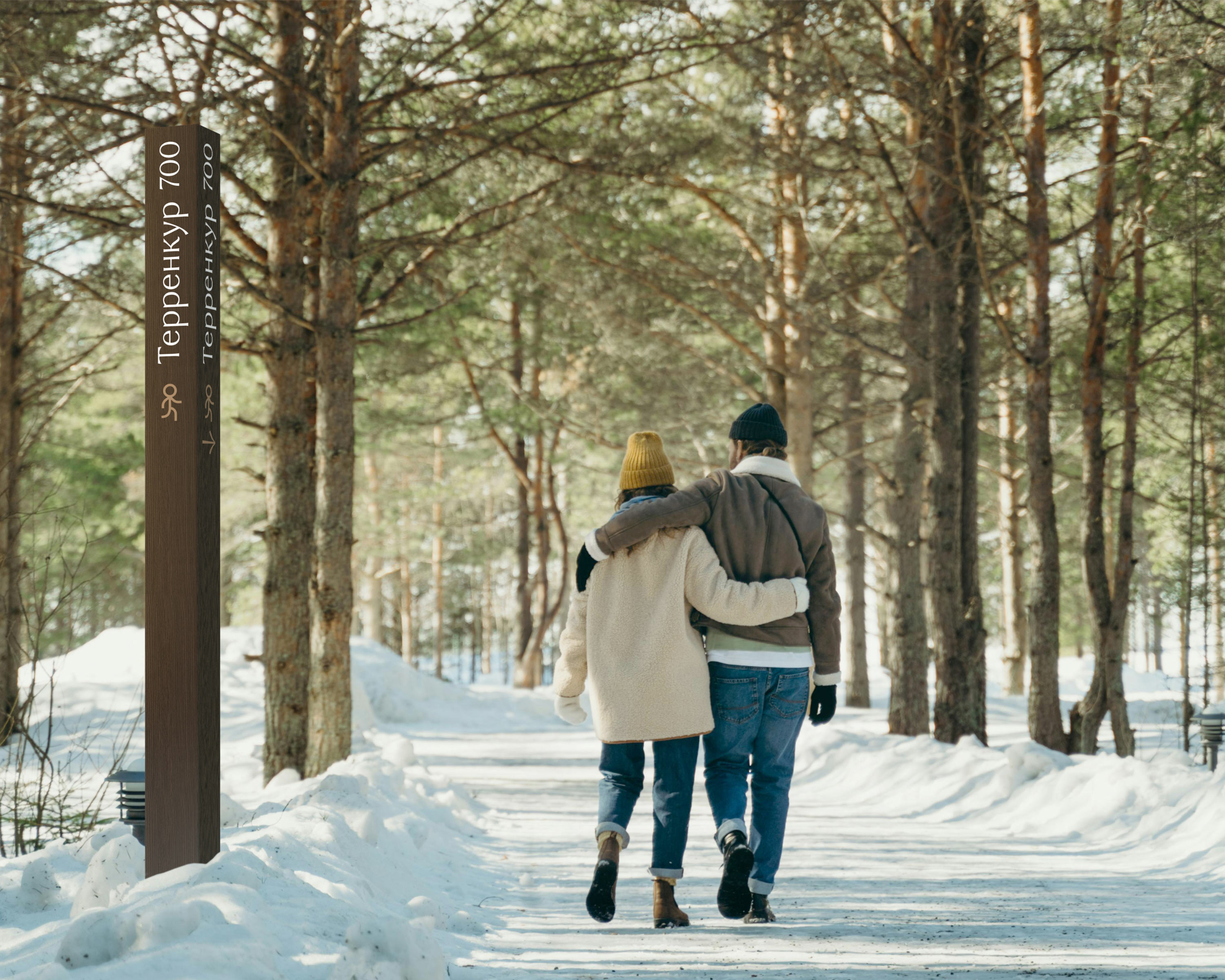
On the territory of the resort there is a trail for therapeutic walking — a terrainkur. Posts with an indication of the distance covered, installed along the entire route, delicately blend into the forest area, do not distract from the walk, and show the way where guests have doubts.
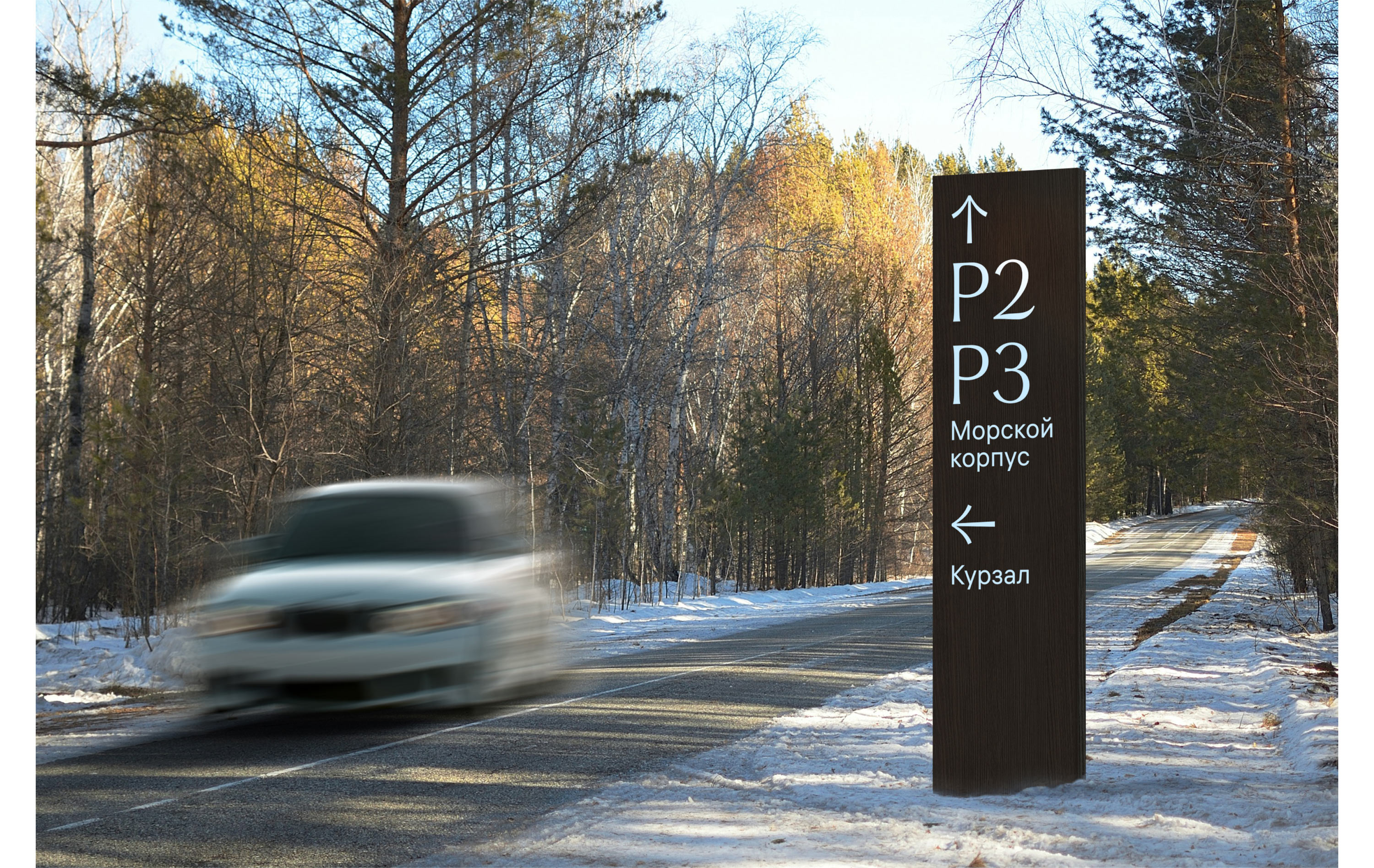
For motorists, their own signs were devised to indicate the way to the nearest parking lots.
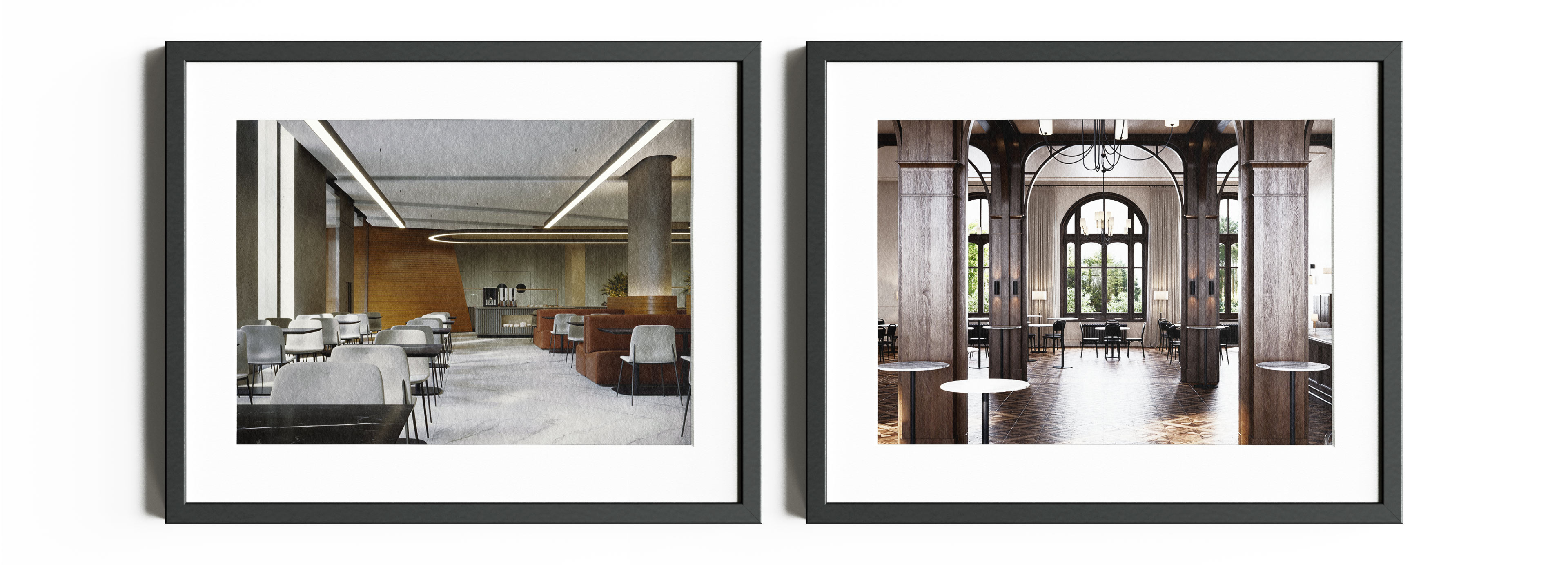
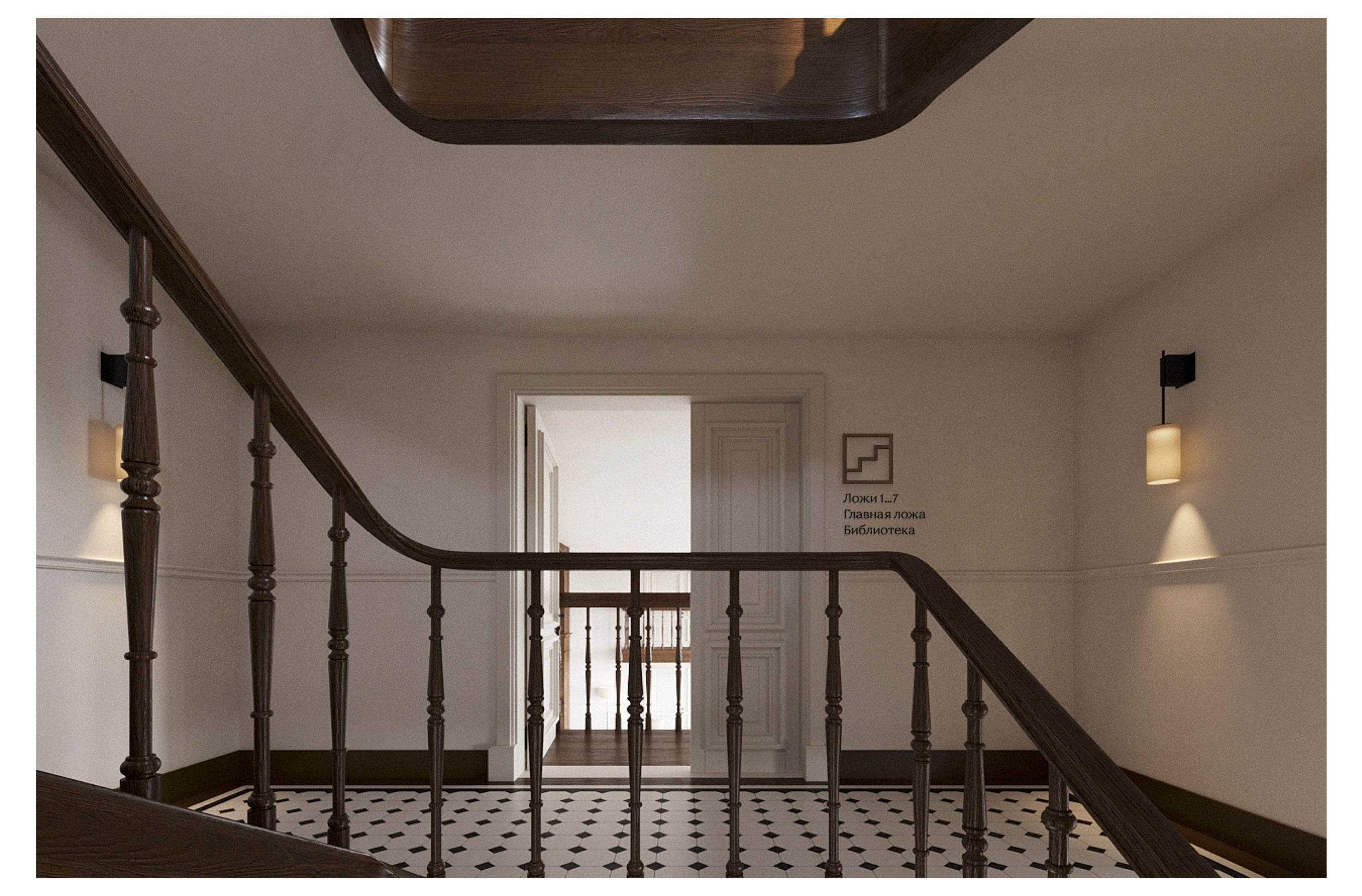
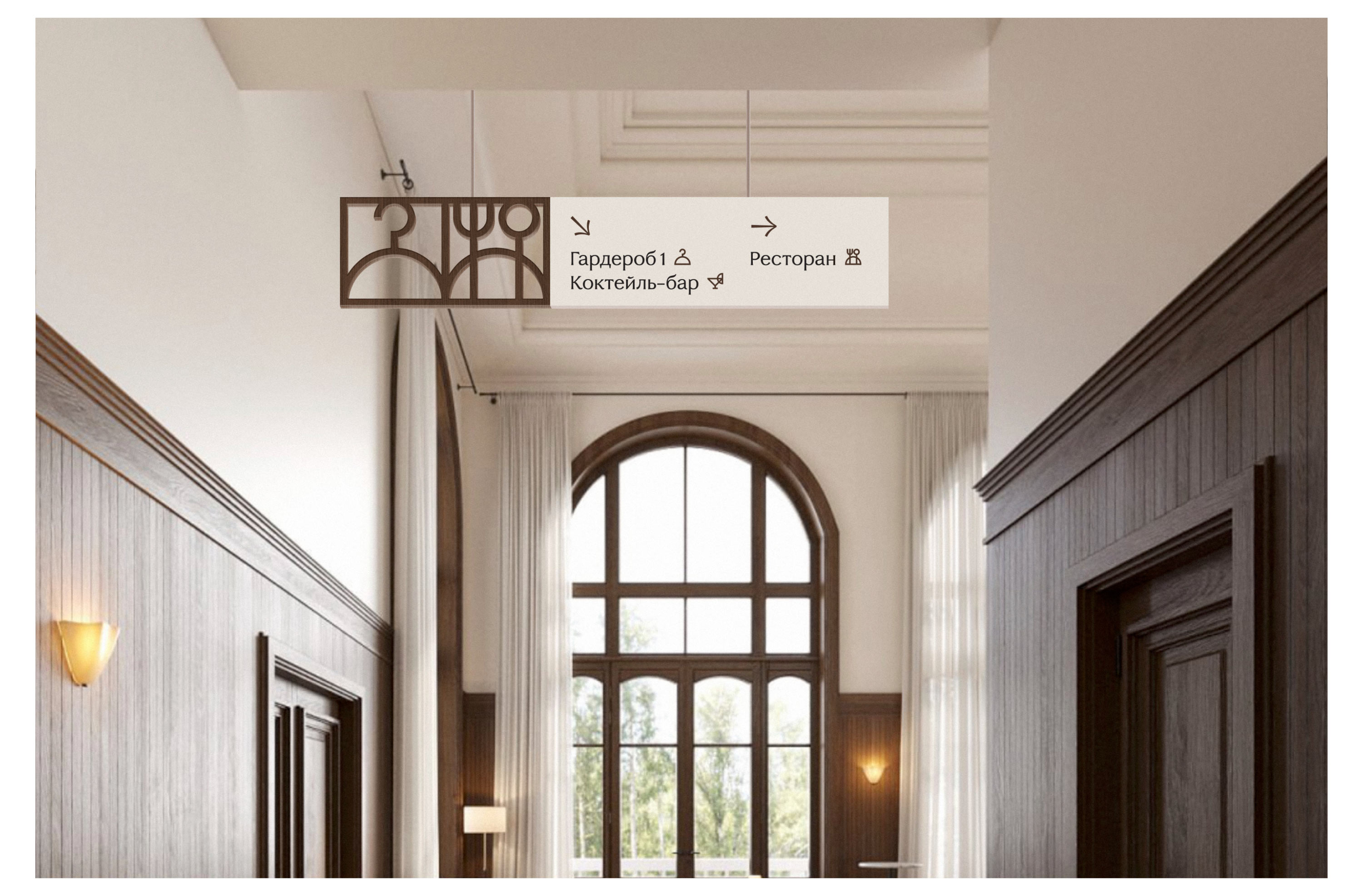
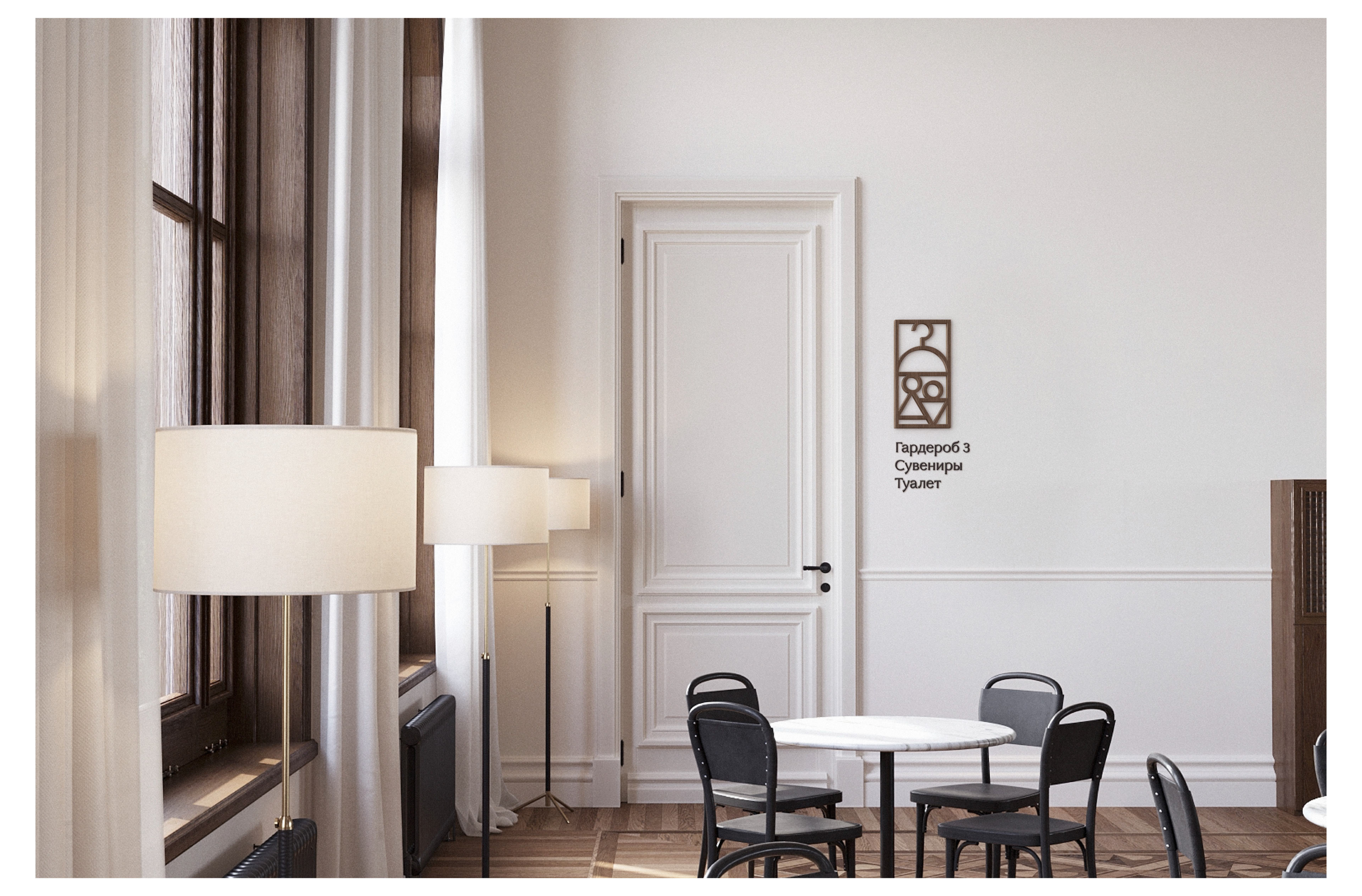
The sea building of the sanatorium was originally created in an ultra-modern style, while the kursaal is a true embodiment of retro. The navigation unites the two buildings, showing that they are parts of a single complex.
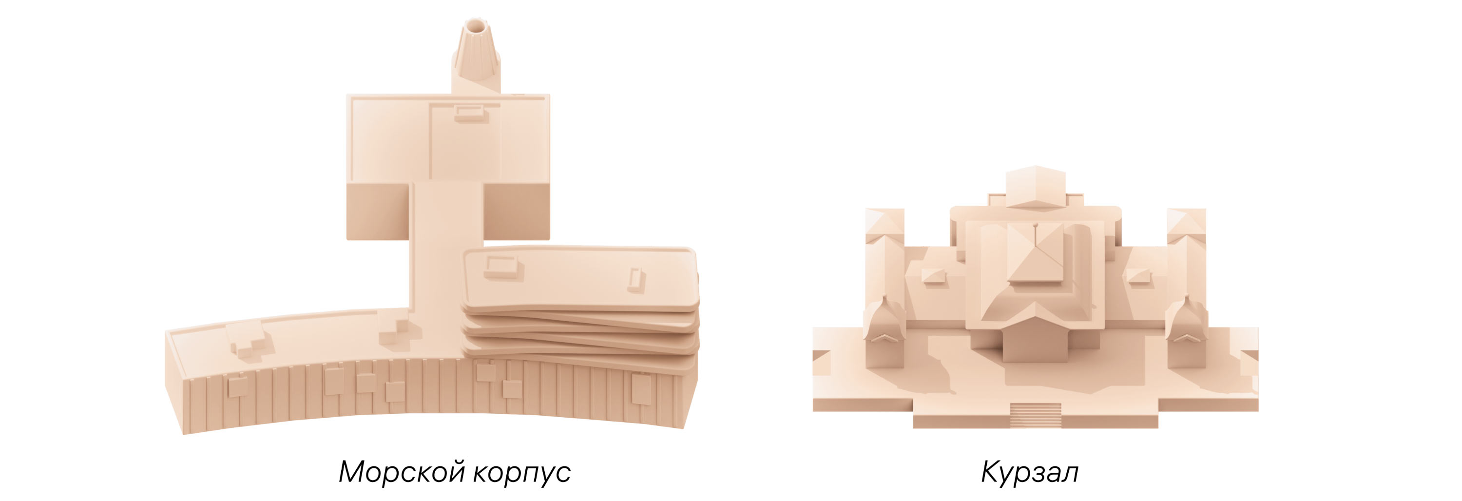
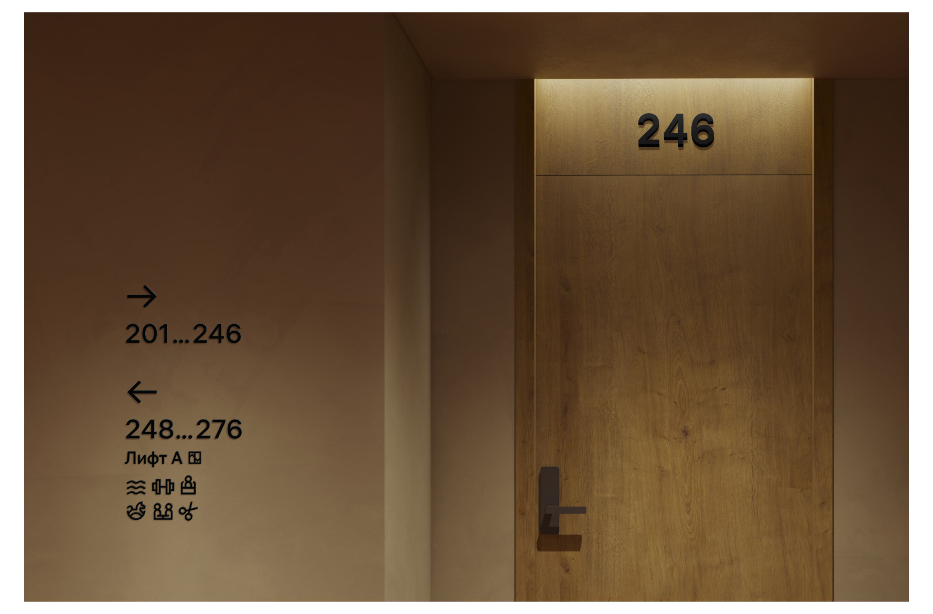
The signs for both buildings are designed according to a unified logic, but at the same time a modern grotesque typeface and copper pictograms were chosen for the sea building, and an old-style typeface and wooden designations for the kursaal.
Sea building
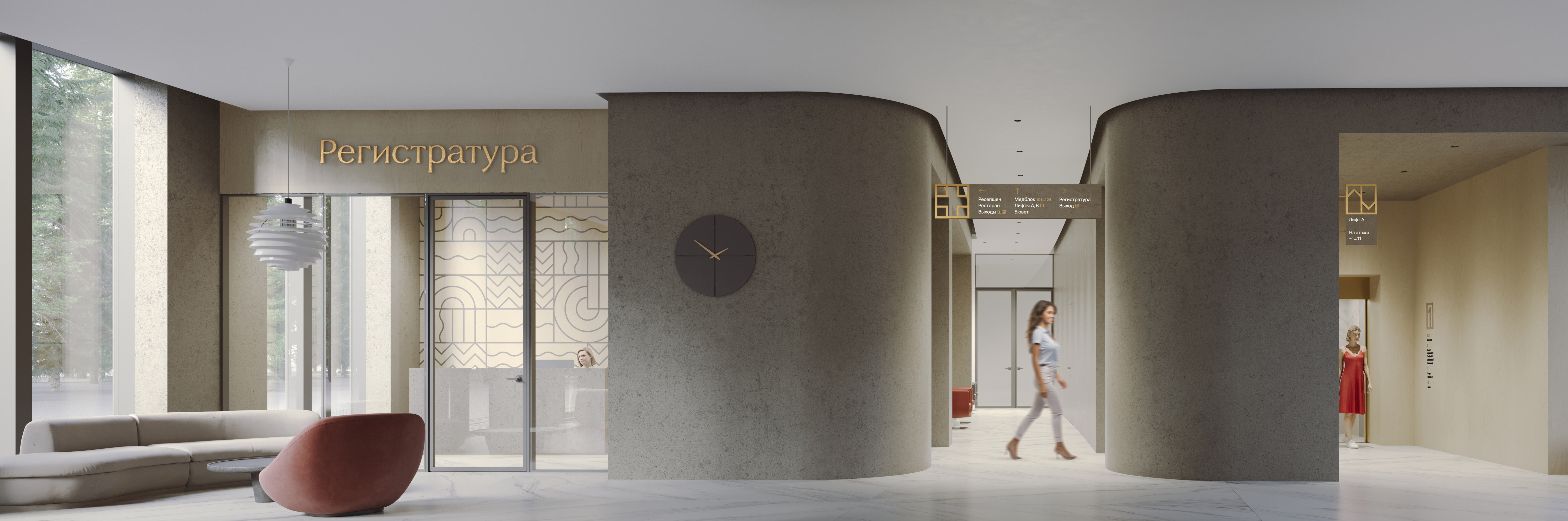
The building of the sea wing is literally cut through with long corridors, so to simplify orientation in them, brackets and suspended signs that are visible from afar are used. They are mounted across the corridors and are clearly visible along the way.
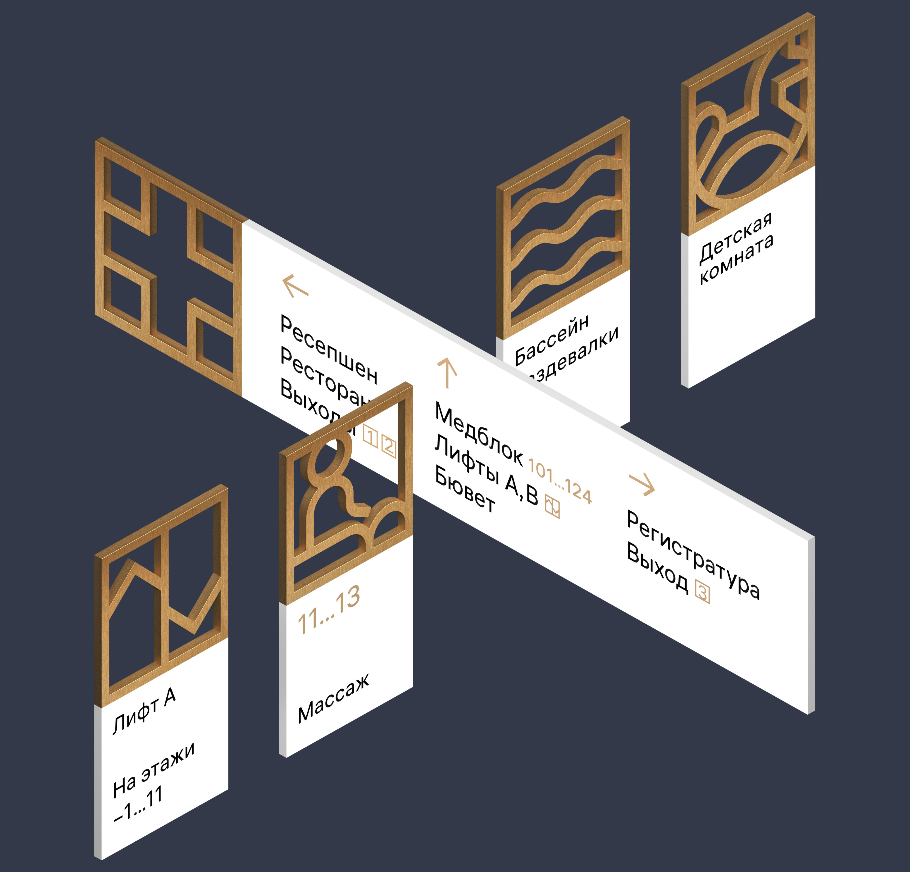
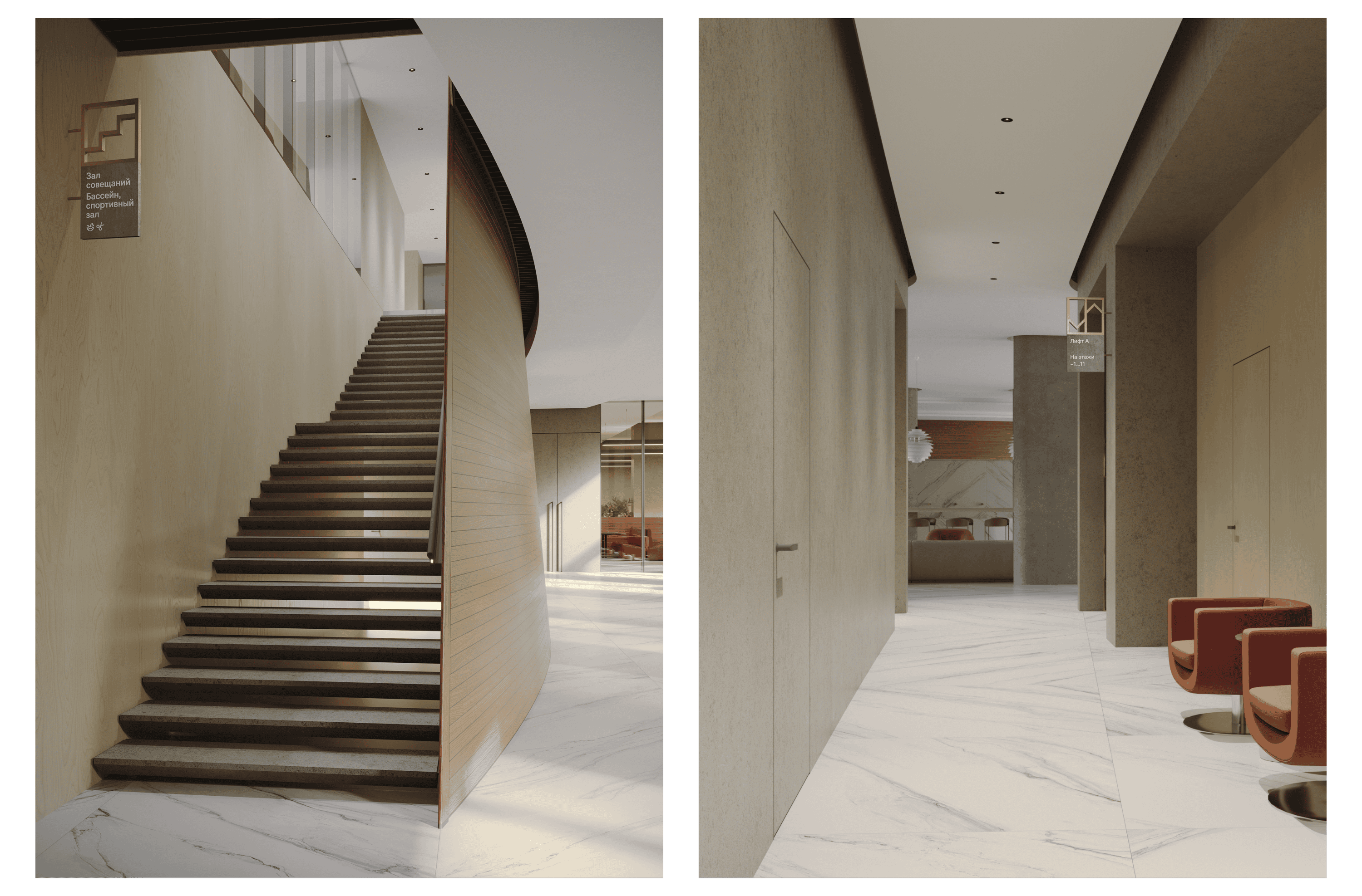
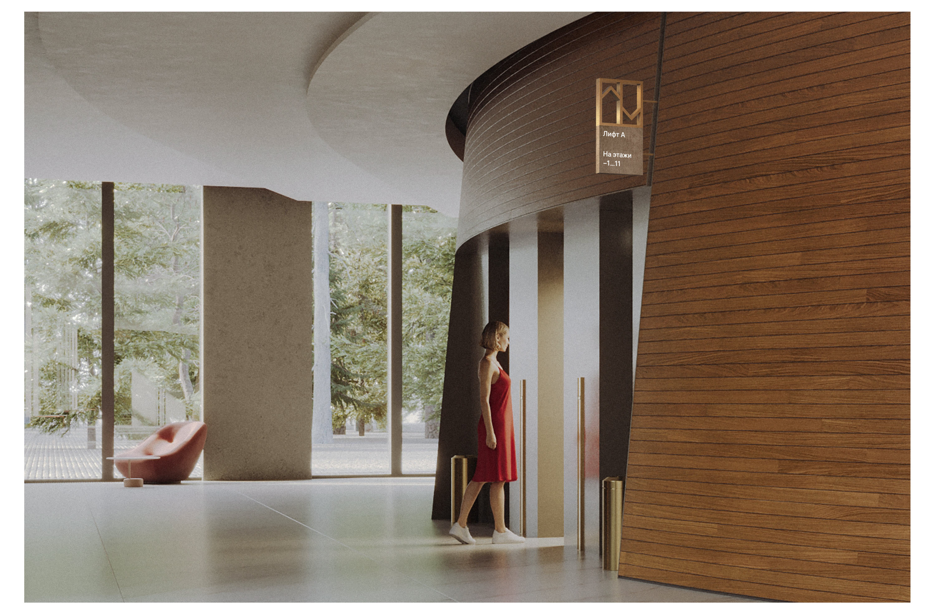
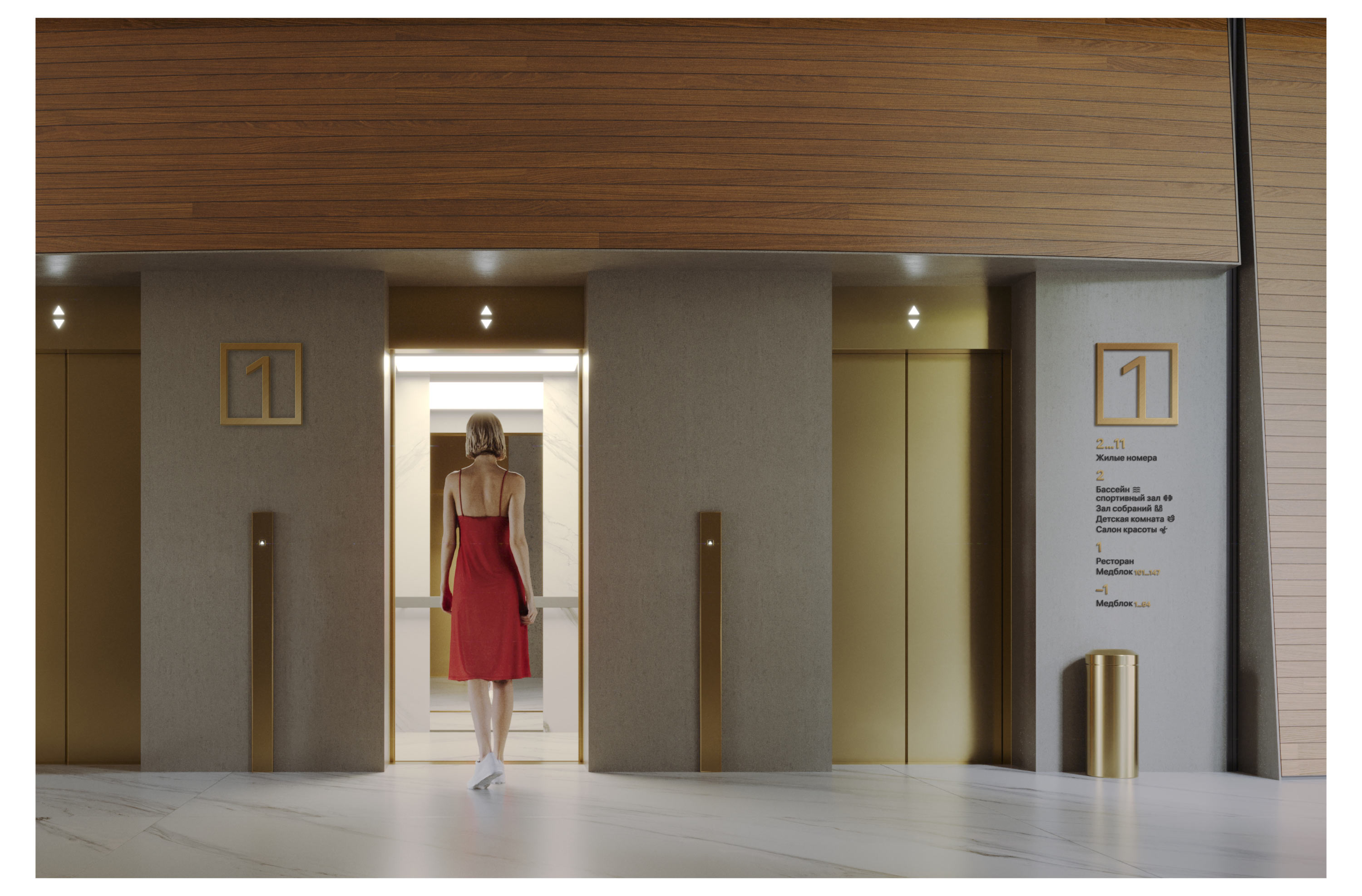

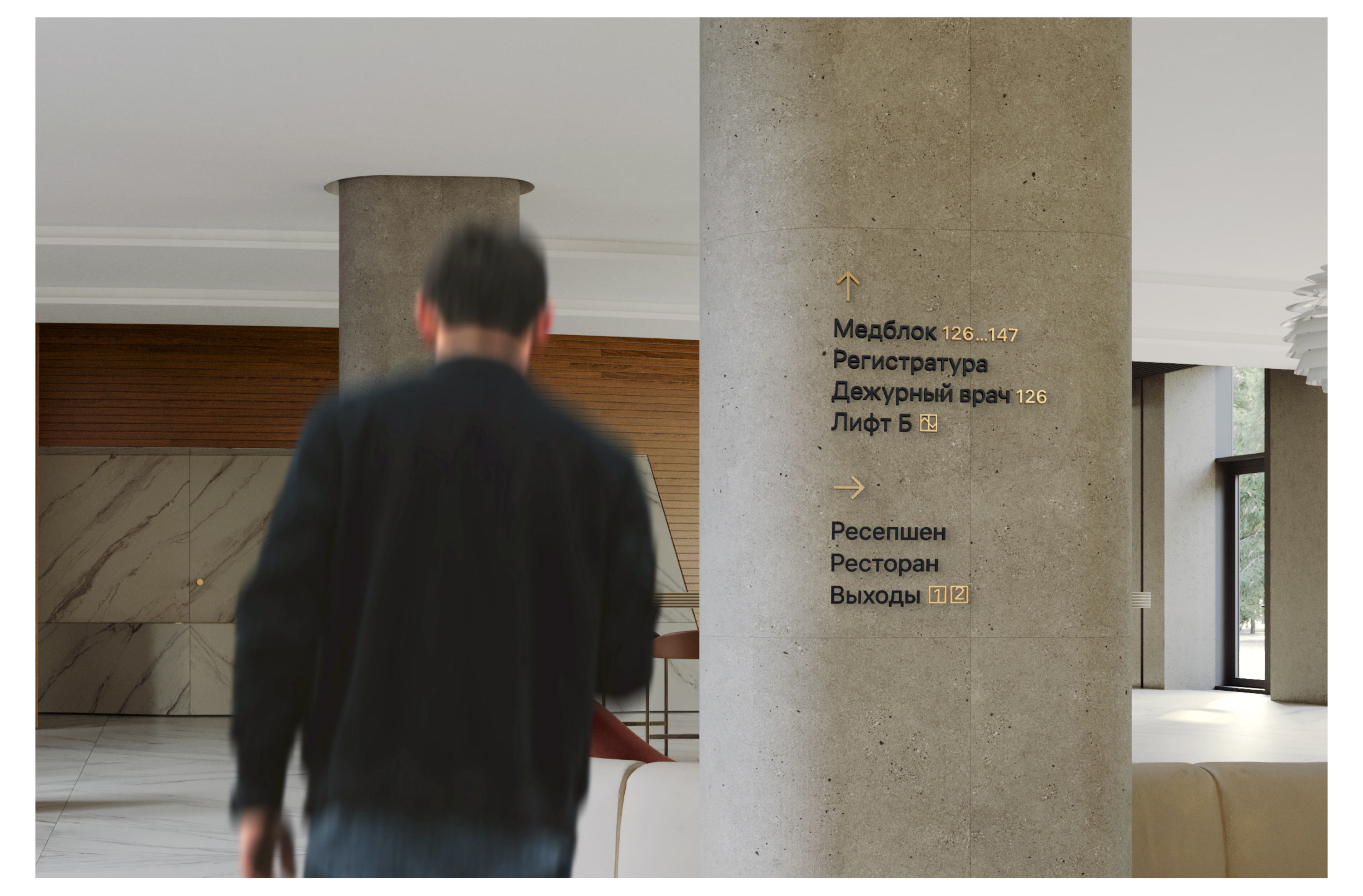
Unobtrusive navigation in the medical and residential areas harmonizes with the entire surrounding environment. Information on the media is presented neatly and restrainedly.
Kursaal
Noble white signs with wooden elements support the aesthetics of the forest resort, match the other interior details, and correspond to the style of the early 20th century recreated in the kursaal.

- The location and content of the objects are preliminary; changes are possible in the final project of the resort
