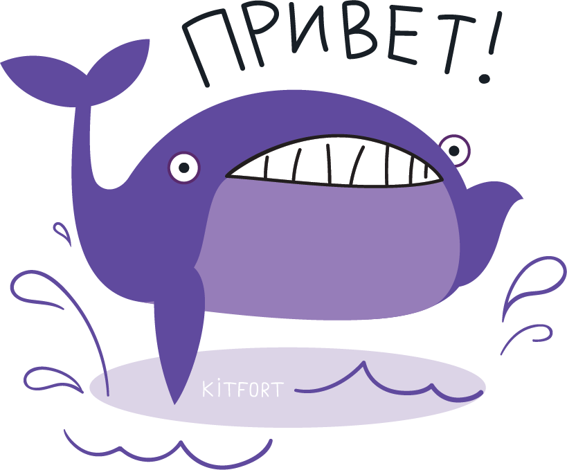
Kitfort produces and sells home appliances. The new logo keeps the company’s signature symbol, a whale, and adds a quotation mark that invites to a dialog.
Main logo
The logo became more minimalist, modern and bright. The whale of course is pretty abstract, but still remains recognizable.
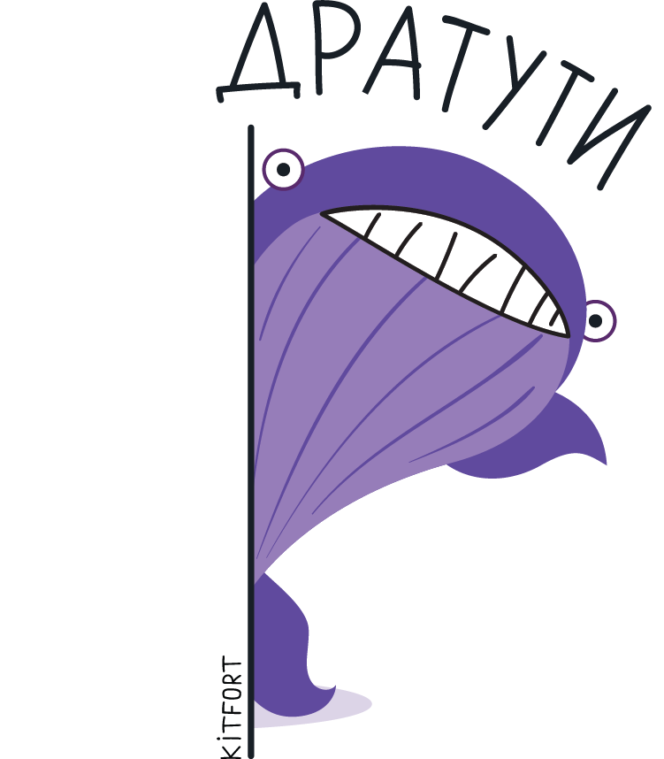
The logo now also acts as a speech bubble that can contain any text. All you have to do is come up with something cute and you’ve got a message for your clients.
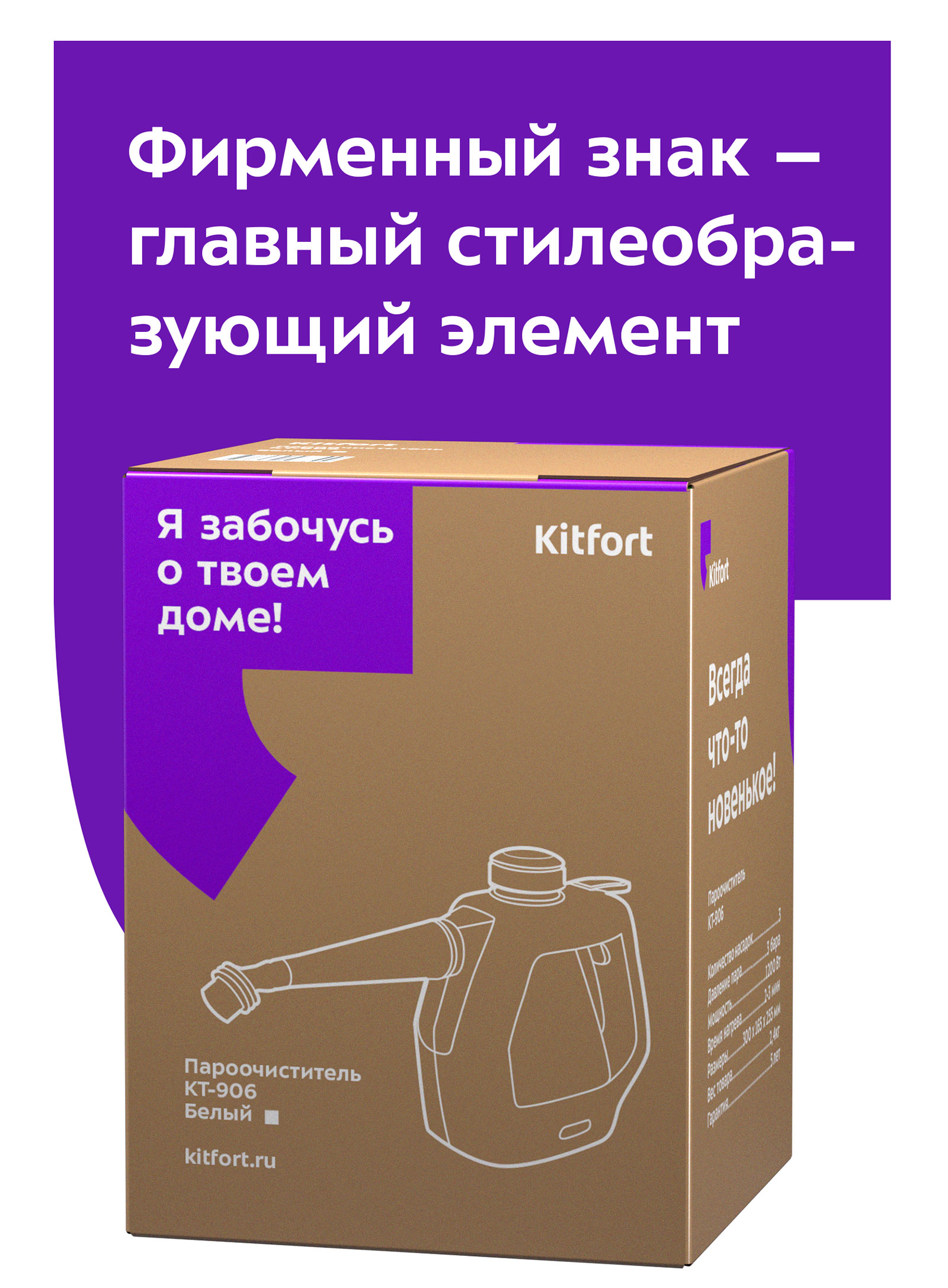
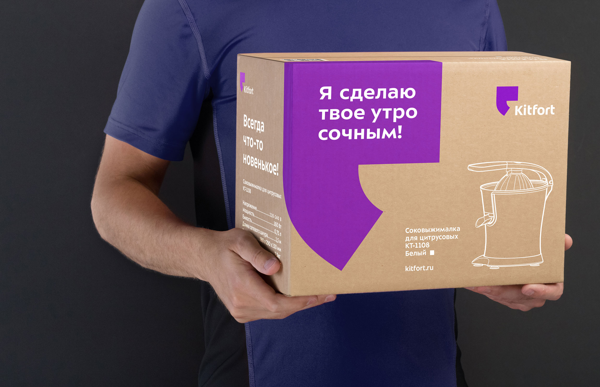
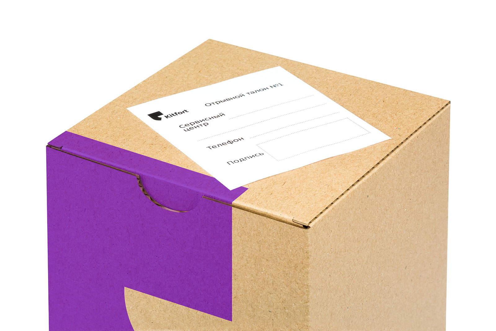
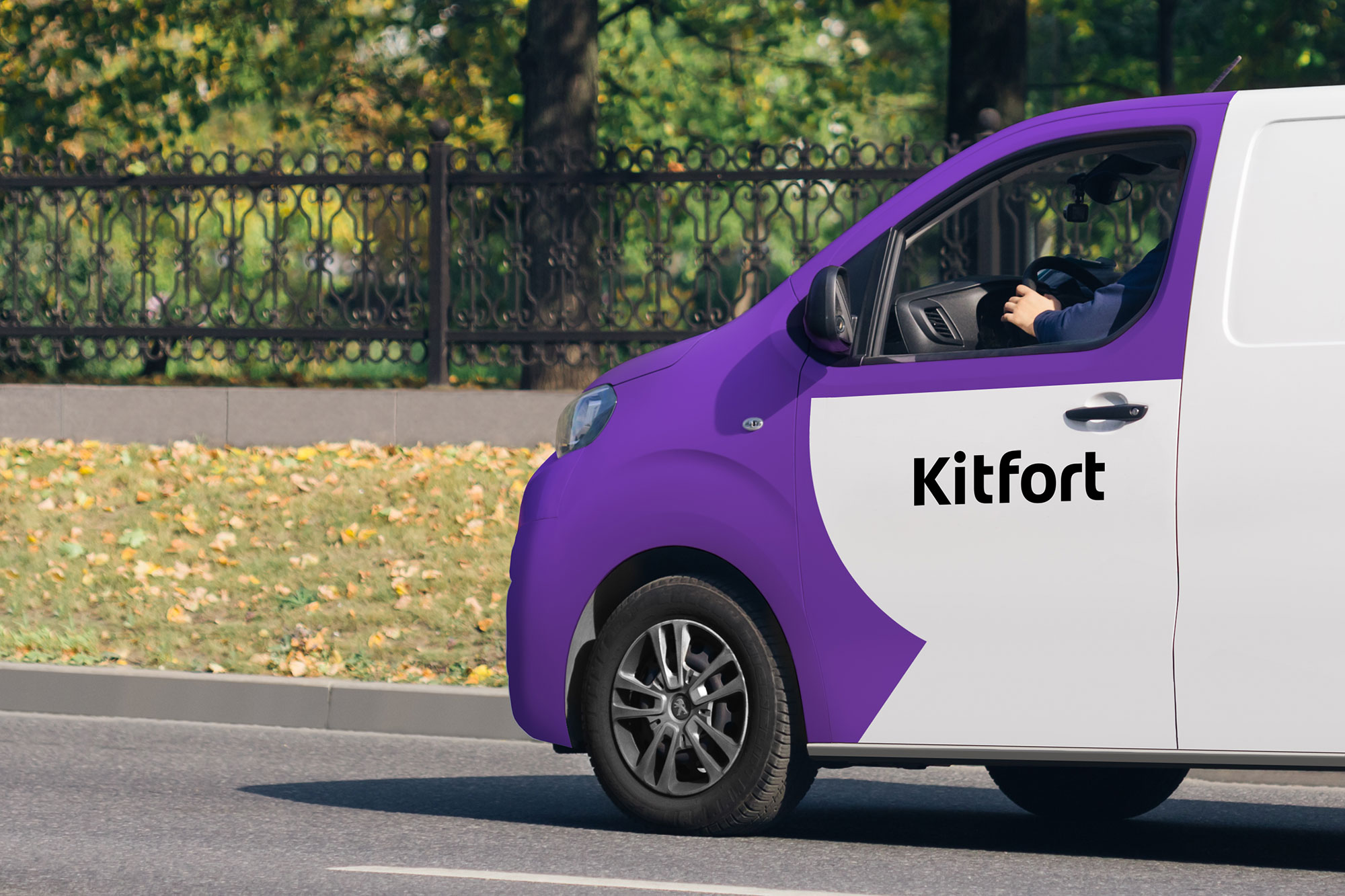
Only the text part of the logo is placed on products—it looks stricter and can be combined with any design.

The new identity uses Sector typeface. It has an elusively technological feel to it and is well suited for a manufacturer of household appliances.
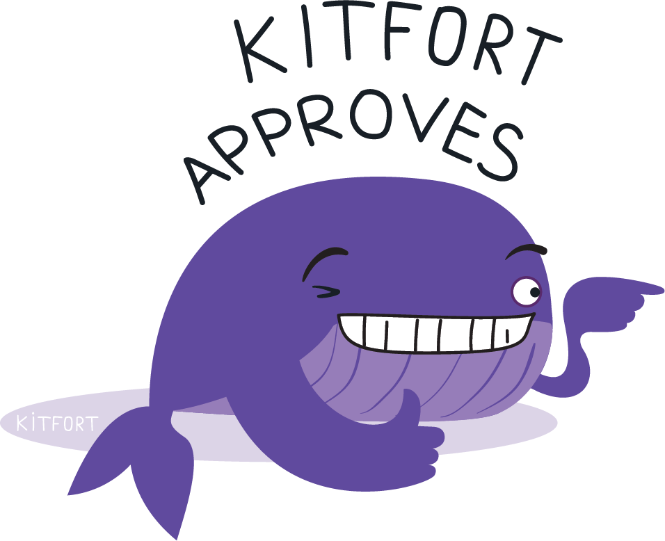
We also came up with Kitfort’s mascot, a friendly whale that can be seen in a variety of situations: winking, giggling, drinking a glass of wine. Magnets with the whale are included with every purchase.
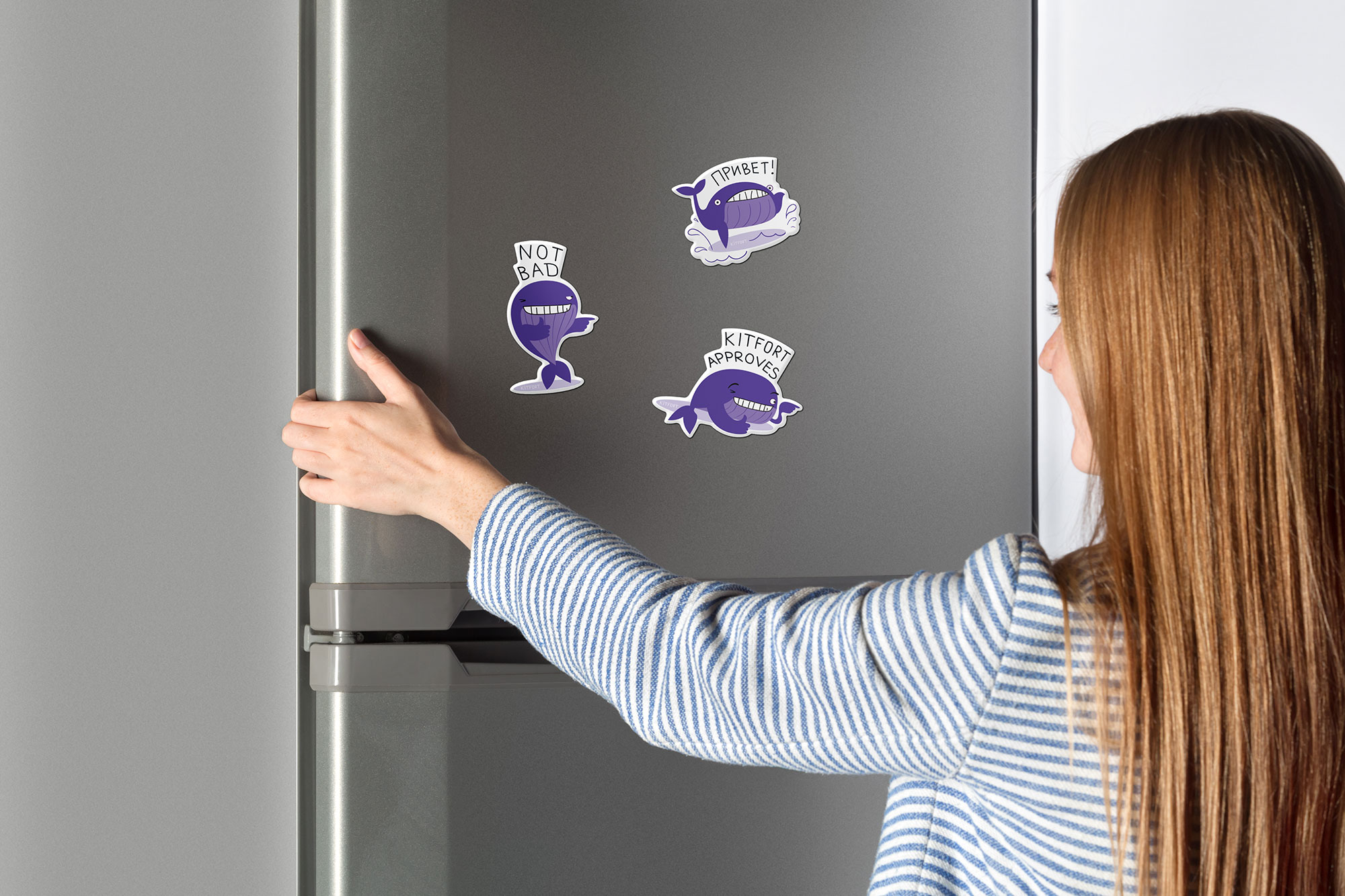


The whale is incredibly cool and stickers with it are wonderful on their own.