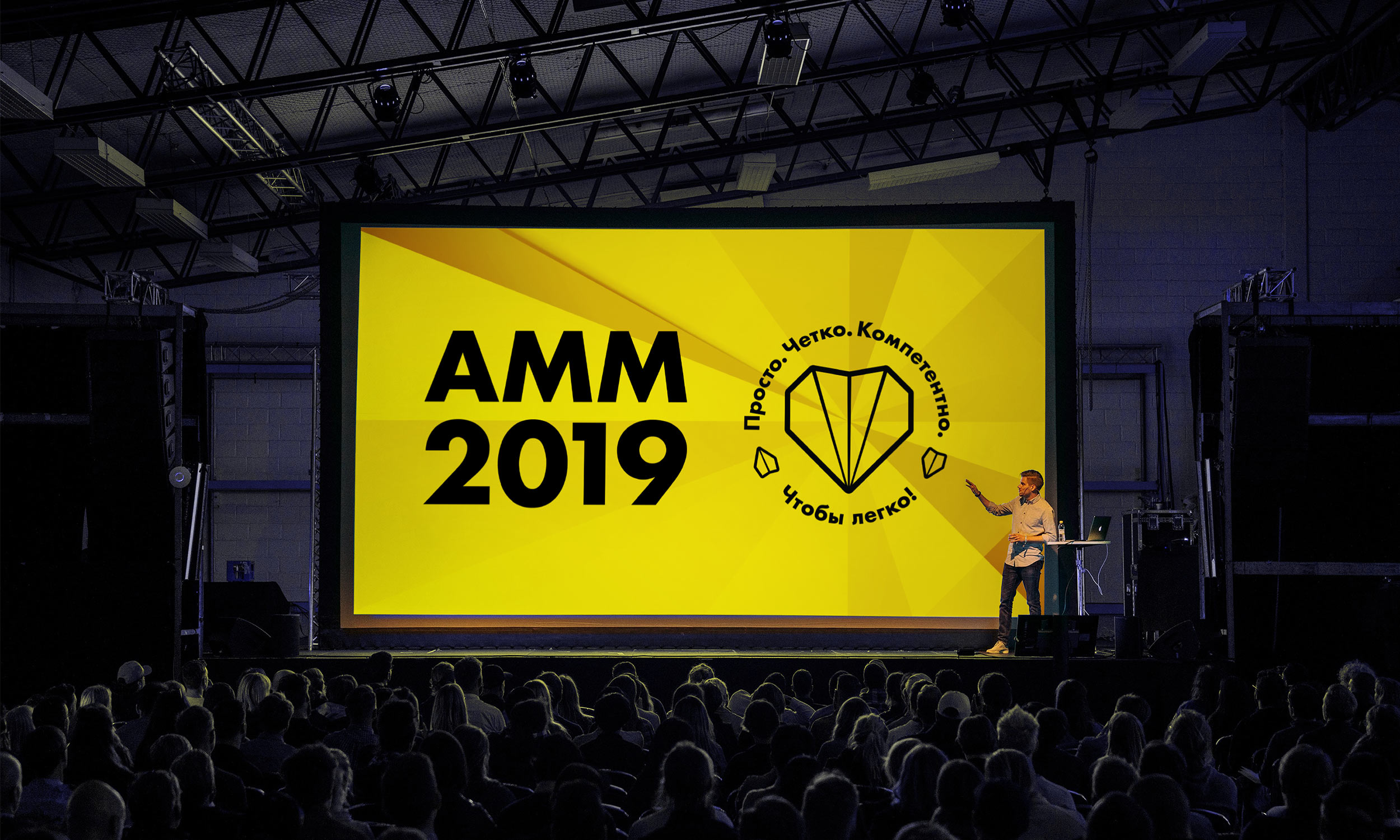
Raiffeisenbank has an internal motto: “Simple. Clear. Professional. To make it easy!” It inspires the bank’s employees to work in a way that would make customers feel comfortable. To reinforce this motto, a logo was created at the studio that combines several images and reflects the company’s philosophy.
Paper airplanes became the symbol of how easy it is to work with the bank. The image of the heart, already familiar to the bank’s staff, symbolizes the involvement of employees and the pleasure they get from work, while the lively and dynamic symbol shows how the bank’s well-coordinated processes are transformed into the convenience of its clients.
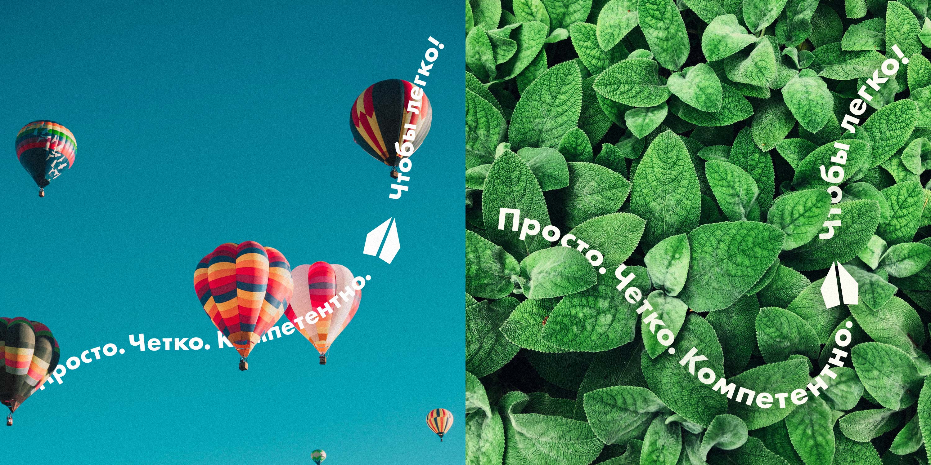
The new symbol is complemented by a striking background inspired by a paper plane template. It symbolizes the clear rules by which the bank operates and simply looks great.
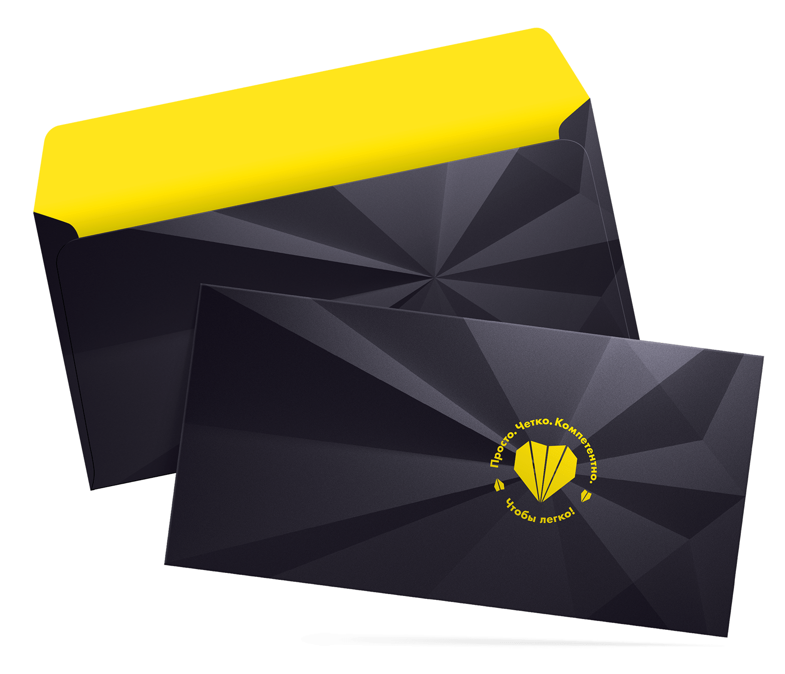
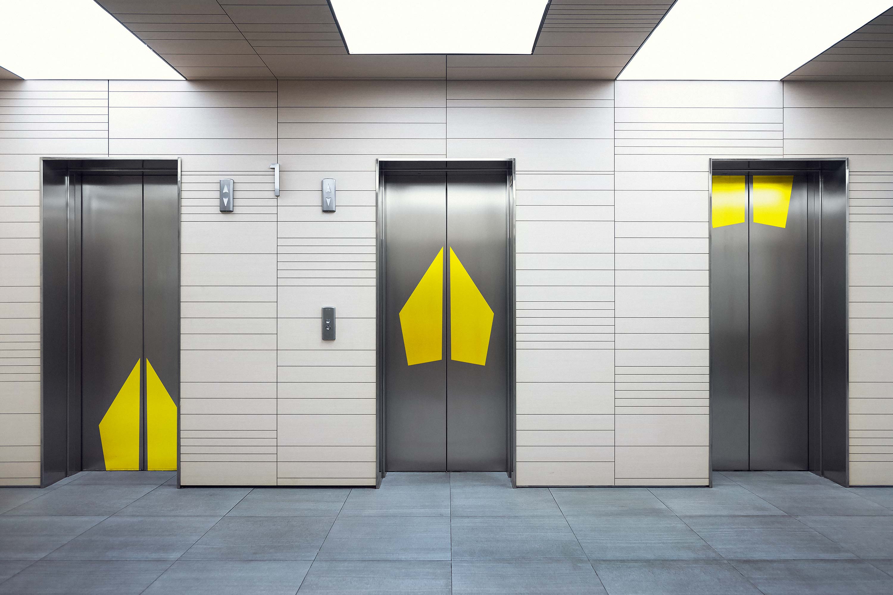
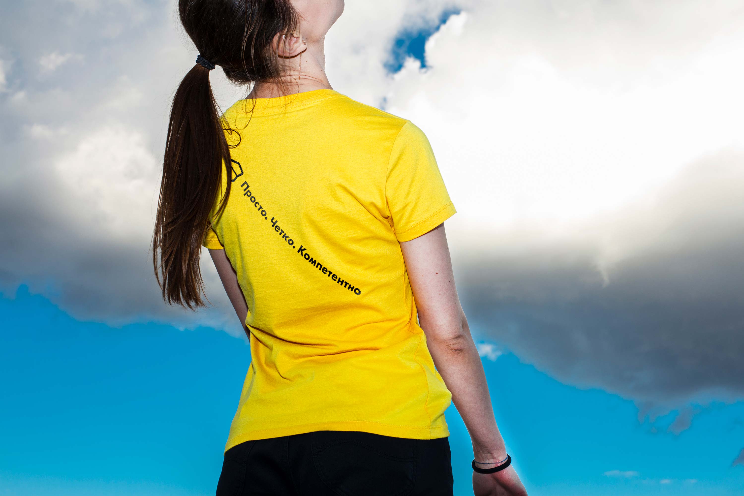
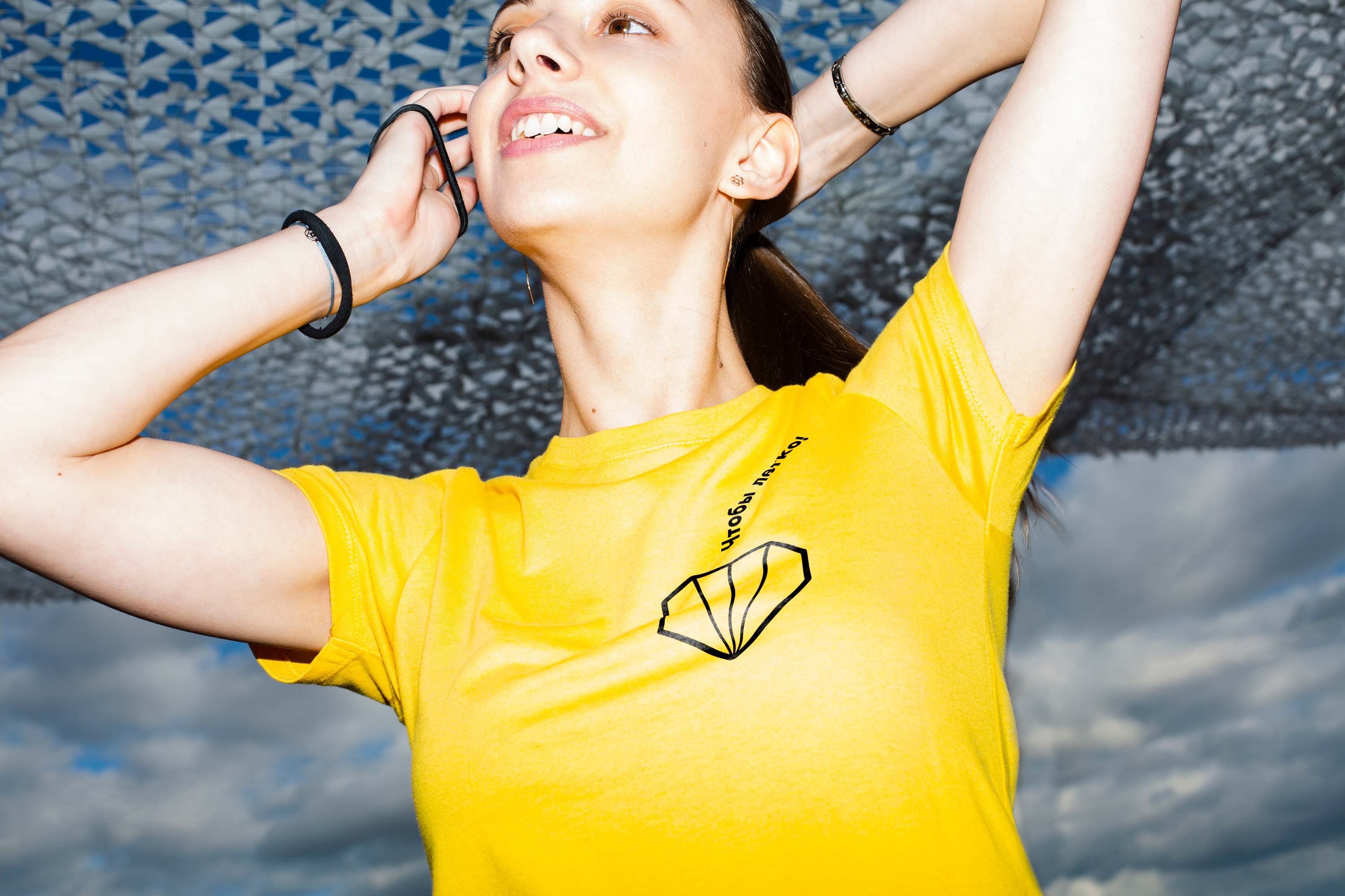
The transformer logo can be broken down into individual components that work well independently and invite to simple and informal communication with employees. Elements of the logo and the typography look great on any surfaces and in any proportions.

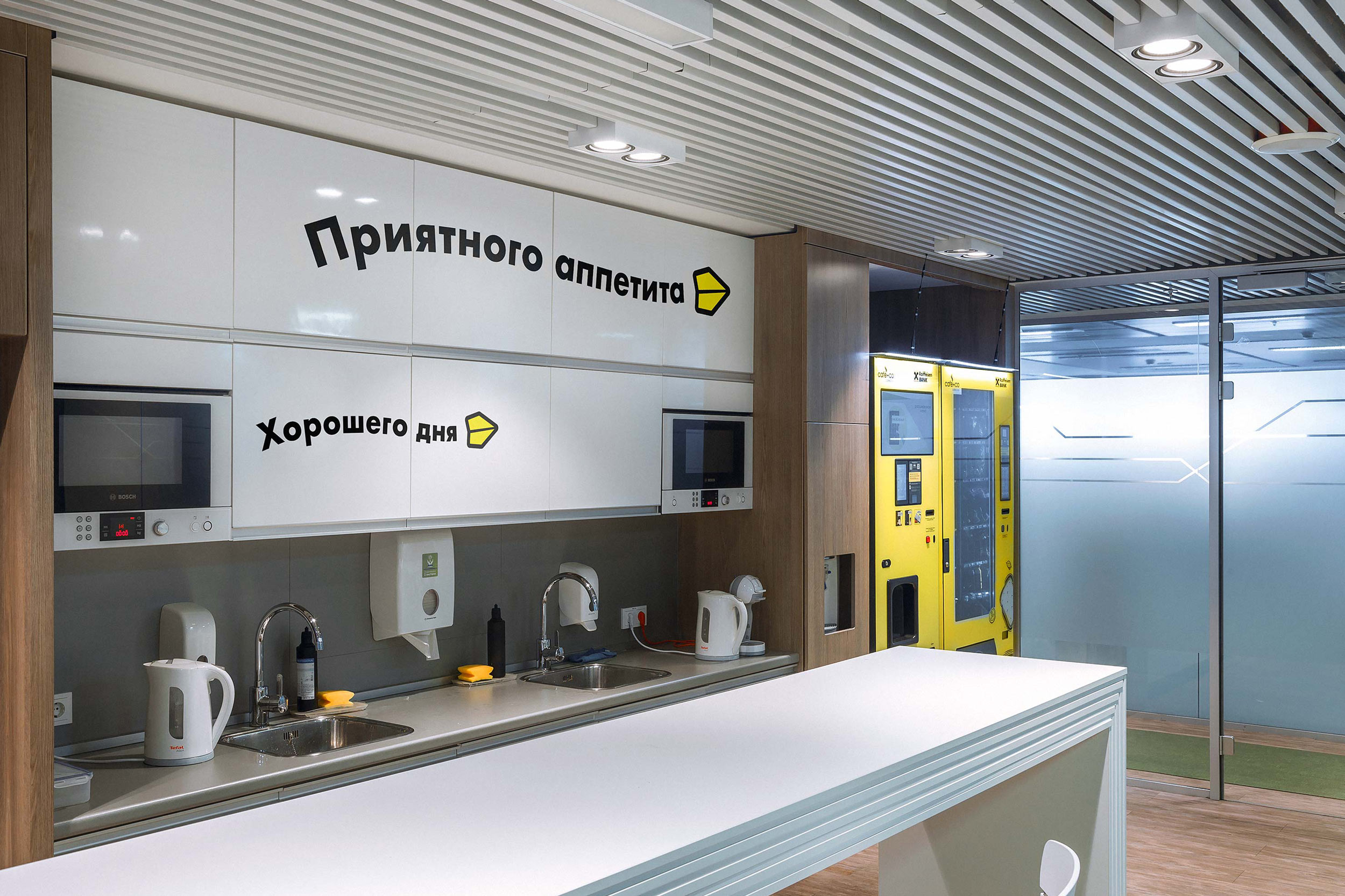
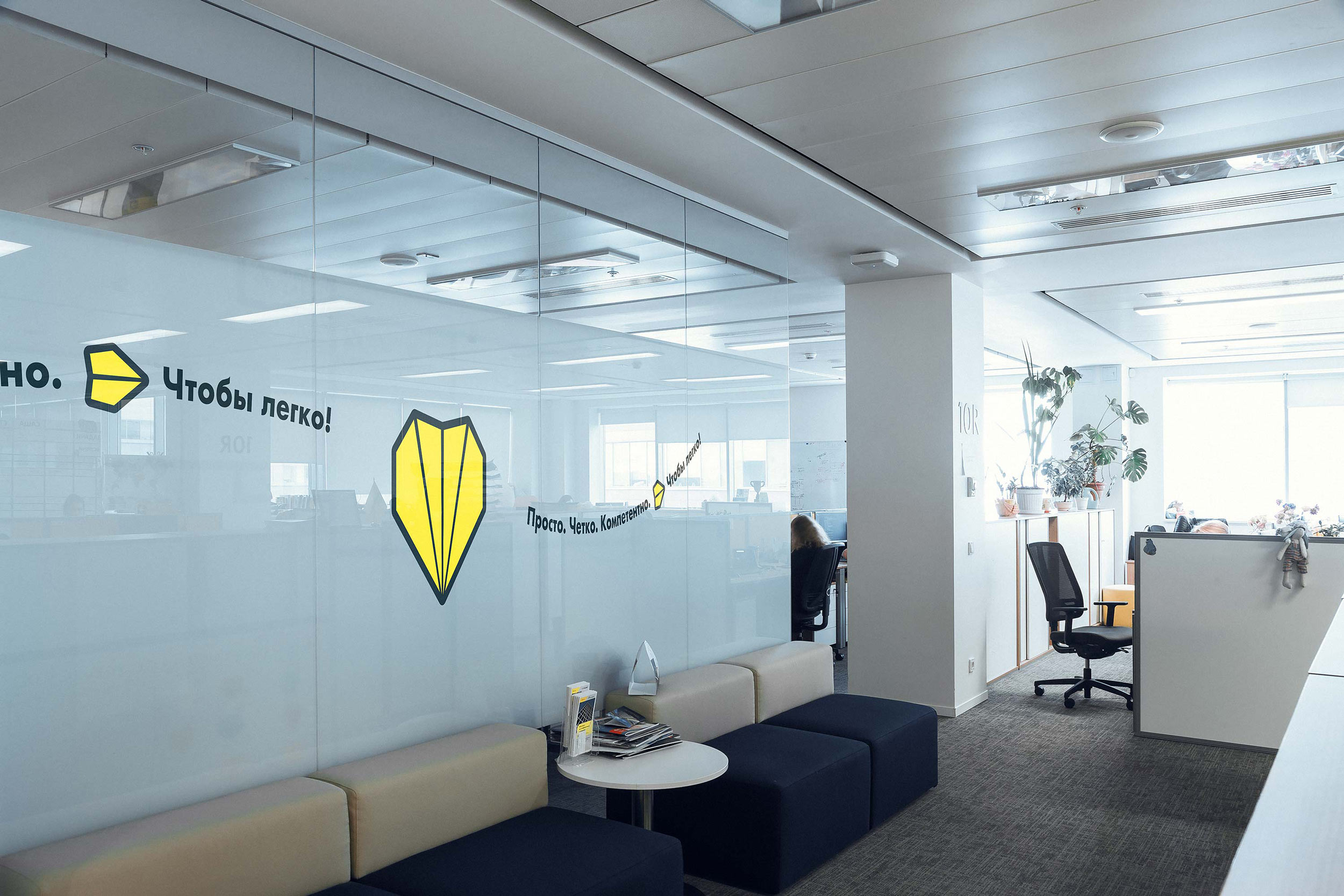
The paper airplanes can be coupled with inspiring texts to create a positive atmosphere in the office.
The symbol looks great on any branded products.

art director
technical designers
- Valery Tolchanov
