
[This work is in the museum]
Raiffeisenbank’s identity is a collection of design elements that can be used for any purpose. Pictograms, mock-ups, photos, typefaces and corporate colors are all laid out on the brand system website in a way that makes finding the right one quick and easy.
The website is divided into two large parts: external and internal.
The purpose of the external part is to demonstrate the essence of Raiffeisenbank in a beautiful way. In addition to showcasing key design elements, it affects the visitor on an emotional level. It can be visited by anyone interested in studying the philosophy of the brand and getting acquainted with its visual style.

The internal part is more utilitarian and follows a strict hierarchical catalog structure. Bank employees get access to this area on an individual basis, visit sections with the necessary elements and download files.
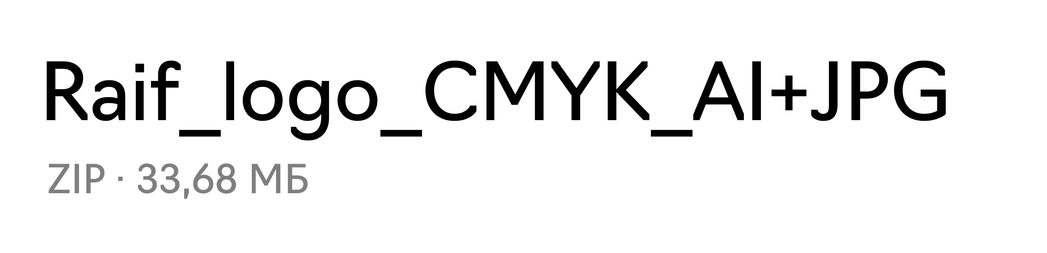
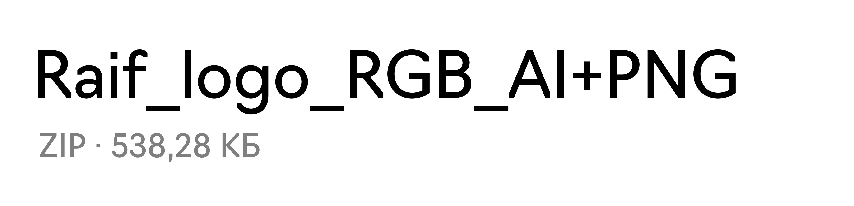
The materials are stored with clear names that prevent them from getting lost among other files. A special naming convention was created for this purpose.
Color combinations of a future layout can be chosen with an interactive visual tool. The test illustration is immediately repainted in selected colors showing how they would work in real life.
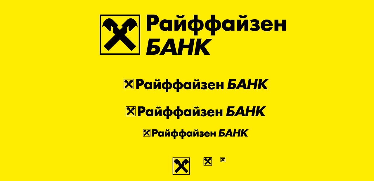
Complex graphic elements are arranged logically and beautifully presented to the users.
3D designer
- Misha Grin
