Vnukovo Airport Terminal A is a huge complex with its own infrastructure that serves thousands of passengers every day and millions every year. Wayfinding in the terminal and the adjacent area should be fast and convenient, which is why a new system was developed in the studio for the airport.
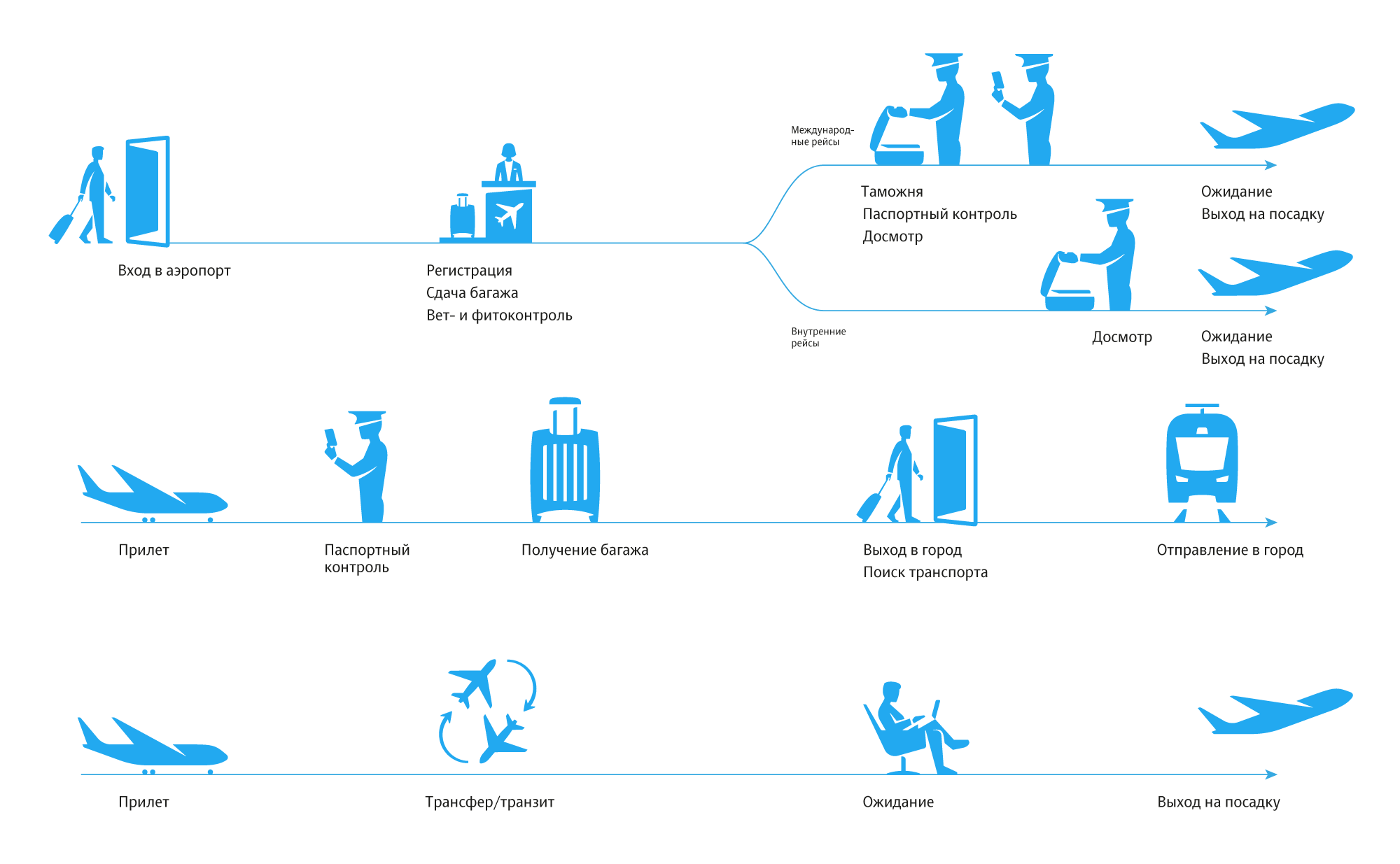
To take into account all the nuances and situations, we created a simplified diagram of all possible scenarios that shows key decision points and helps understand passenger needs depending on where they are headed.
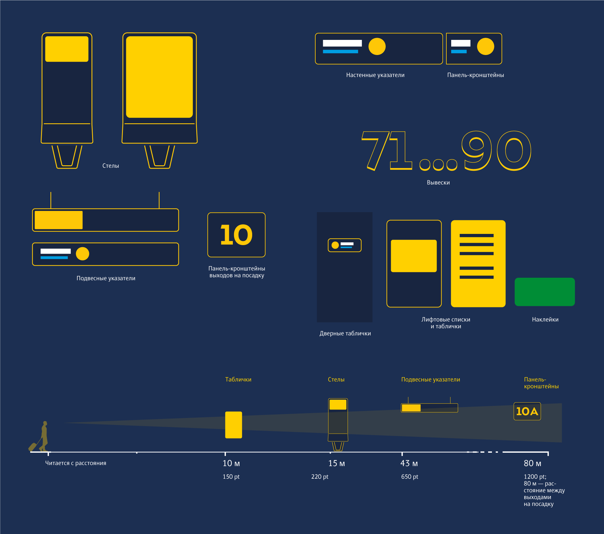
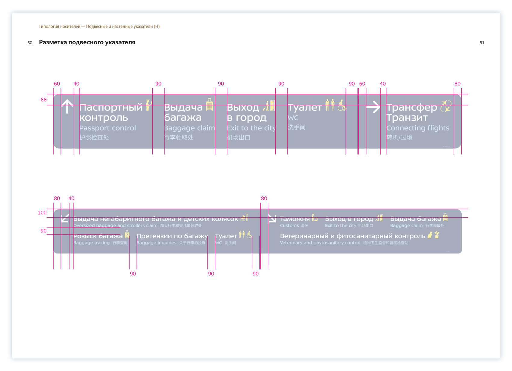
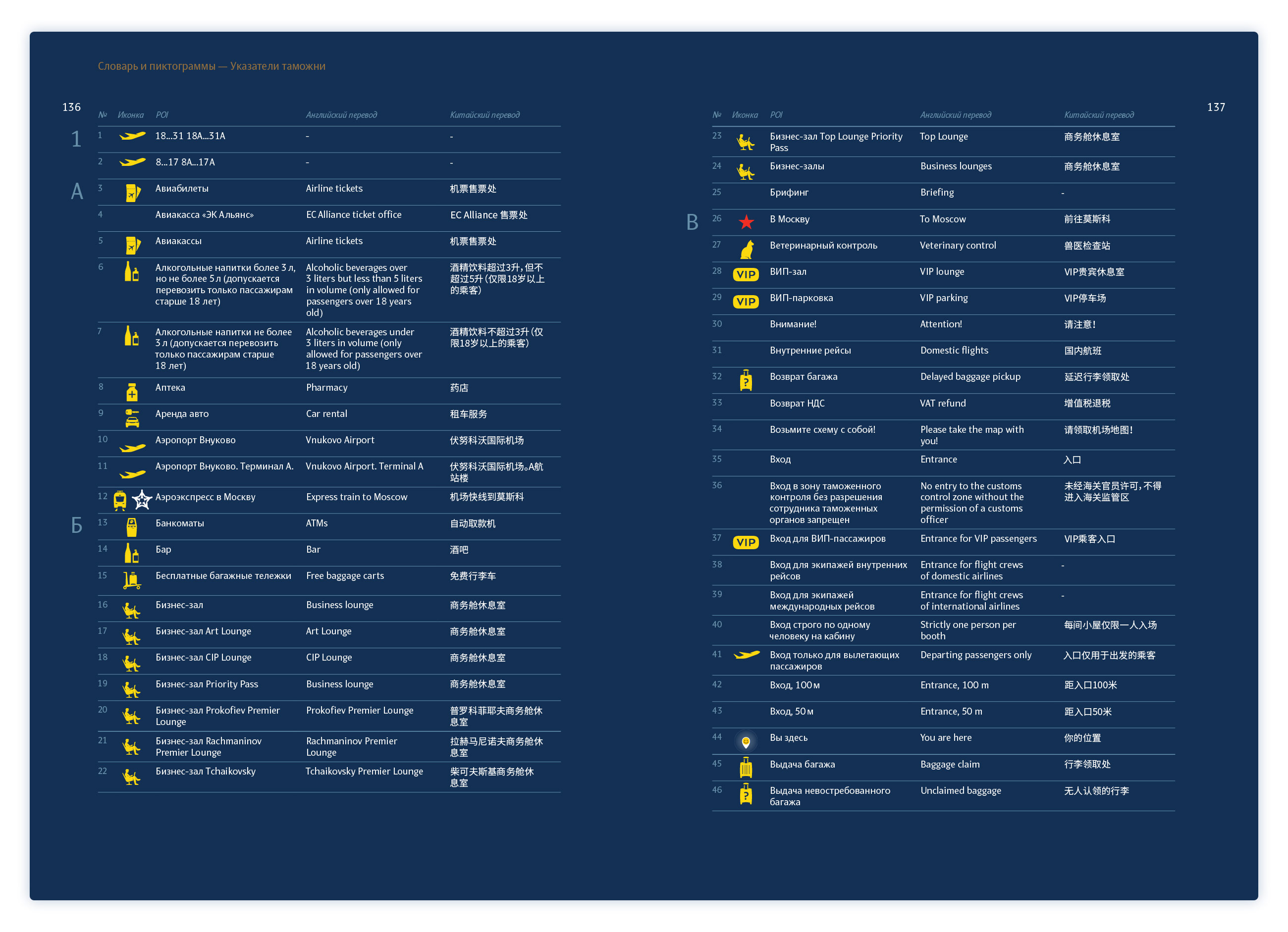
All types of media are divided based on their type, purpose and reading distance, while automation tools help eliminate errors during sign generation.
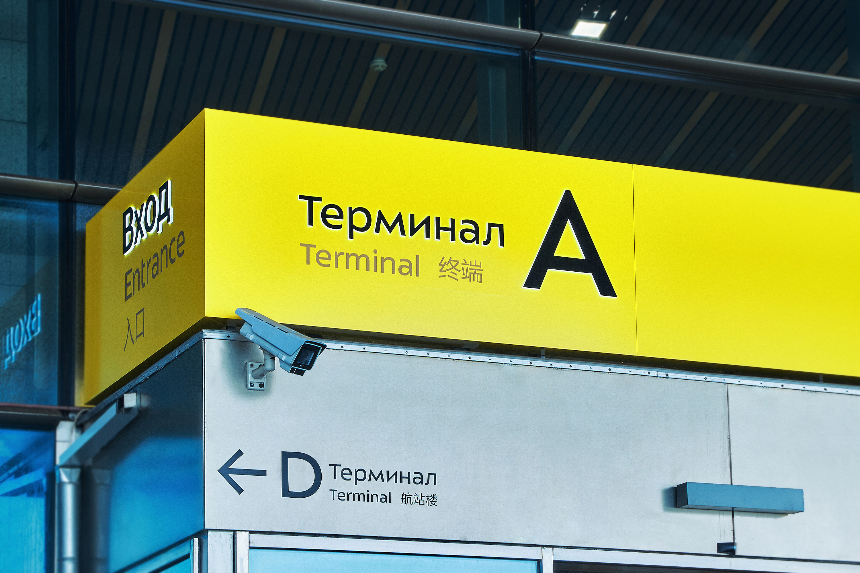
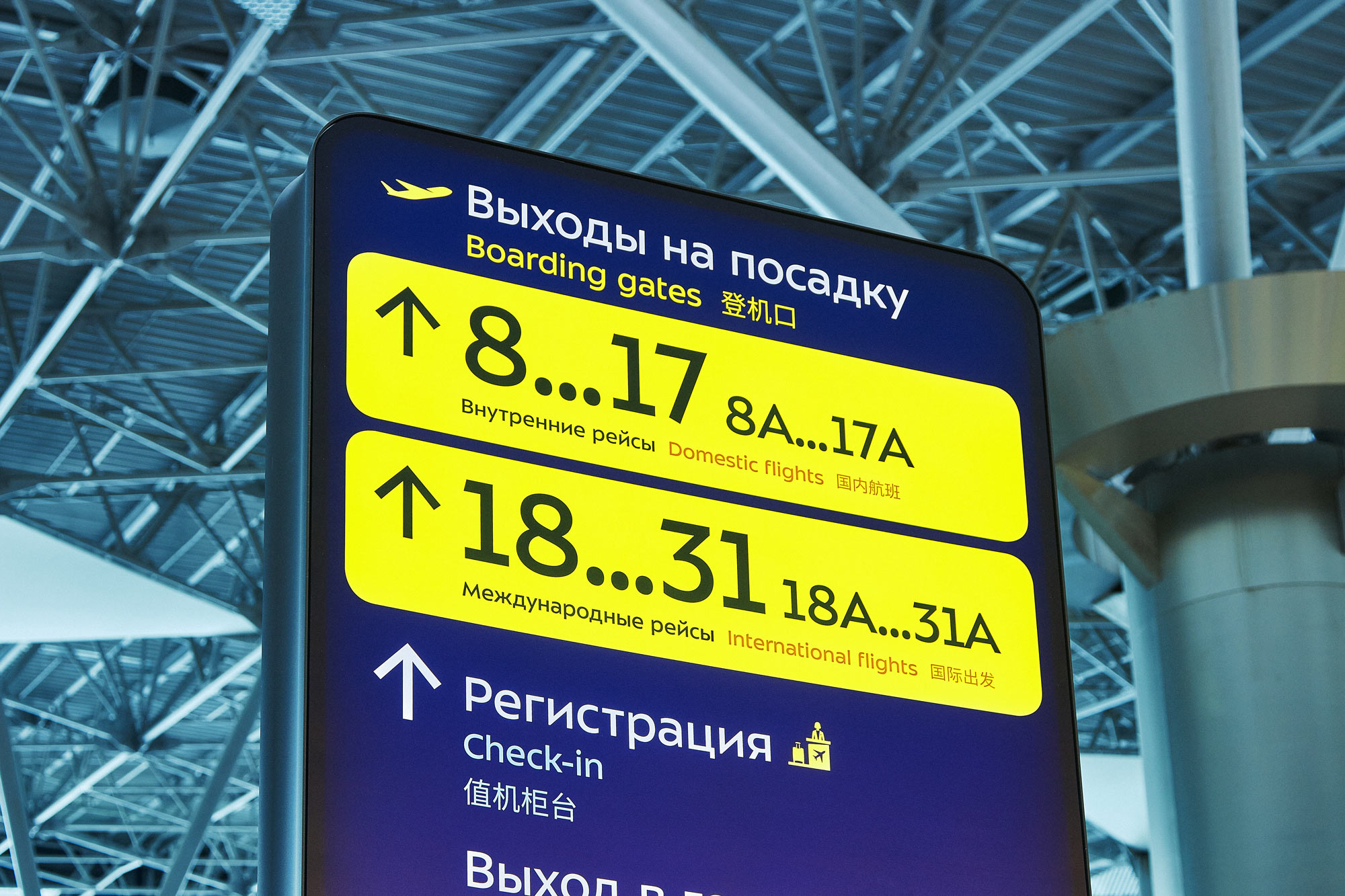
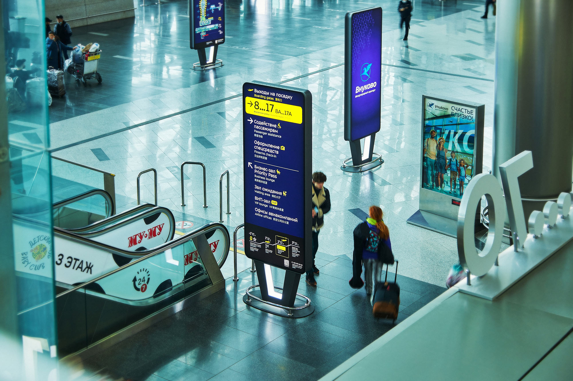
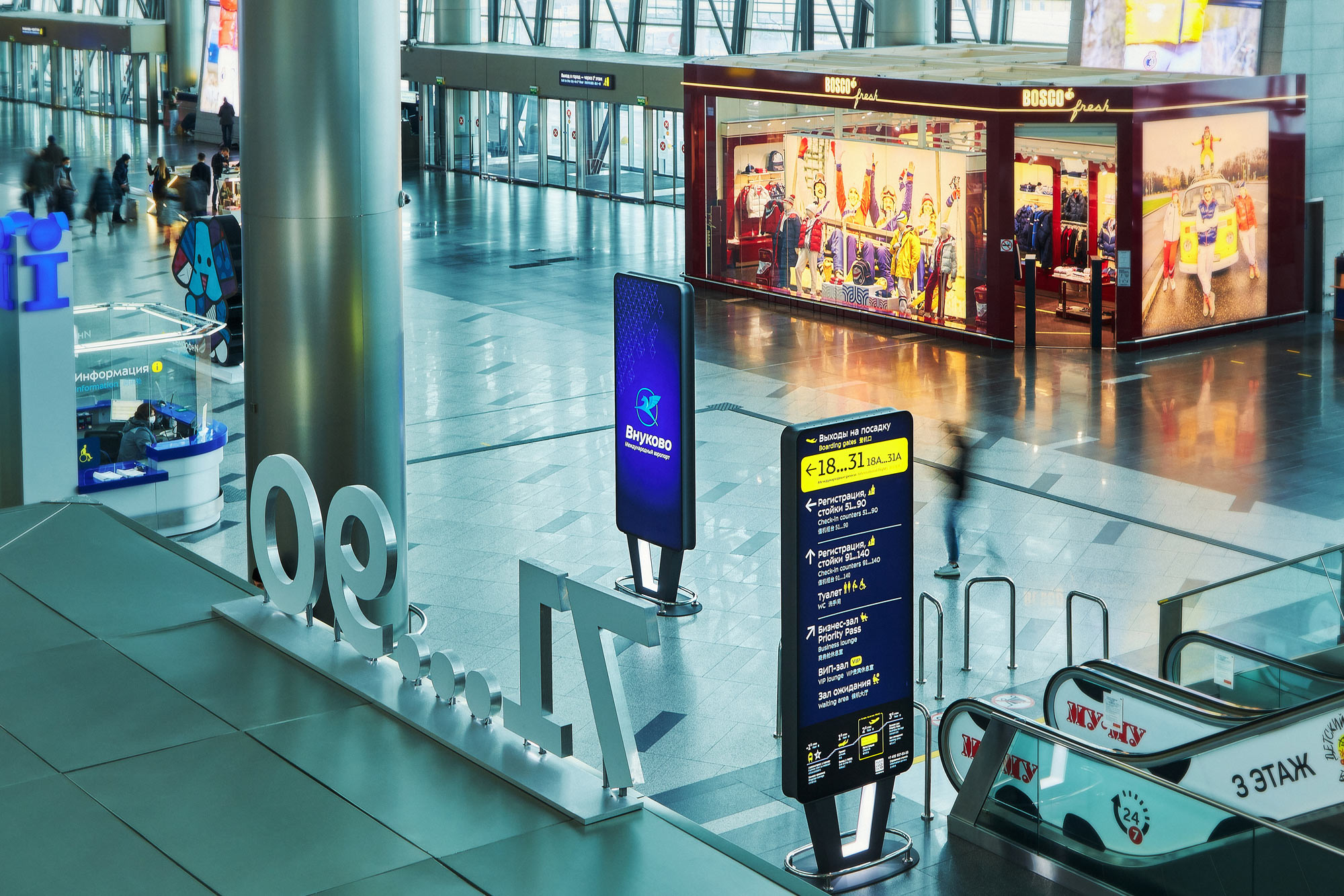
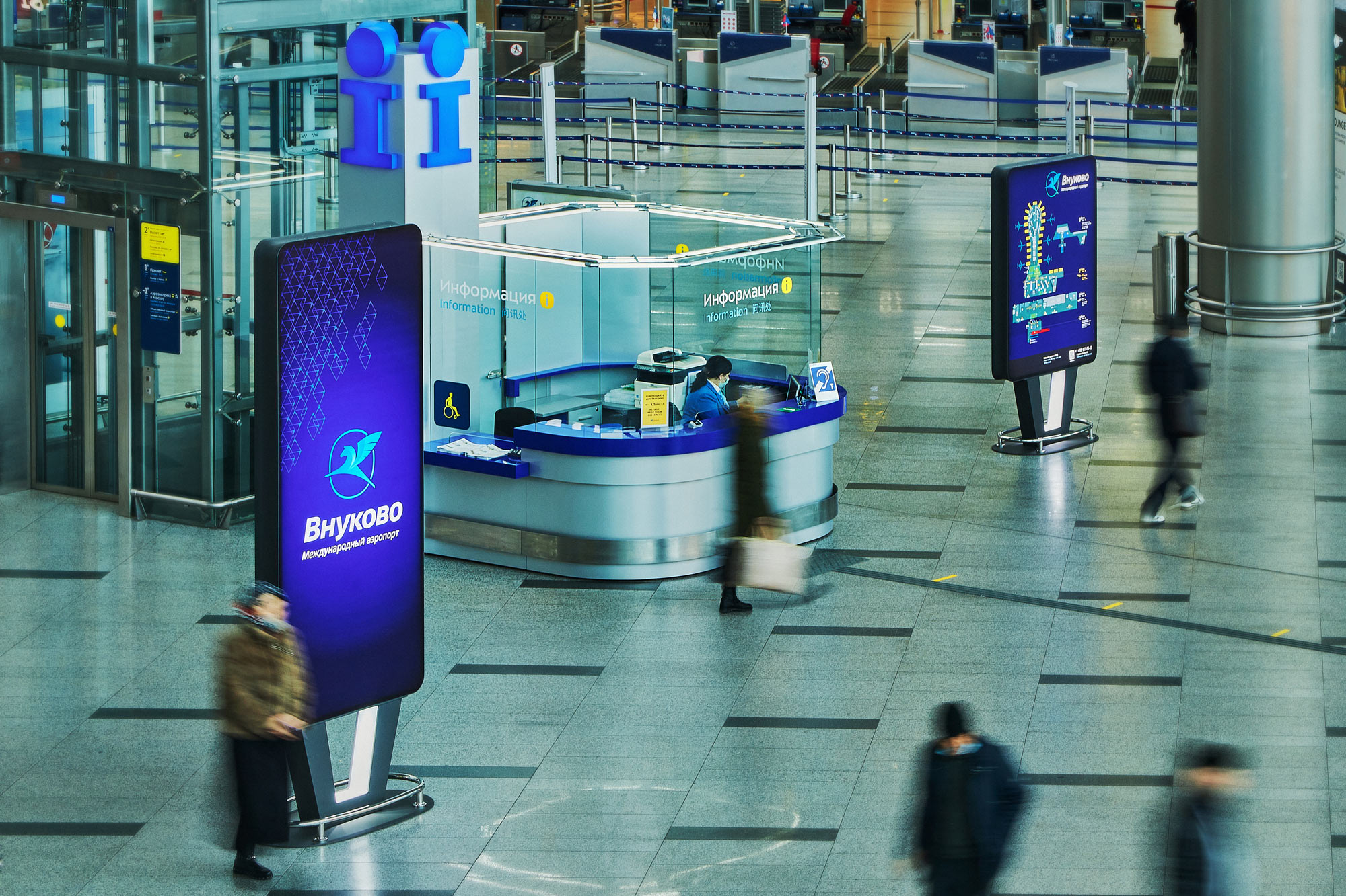
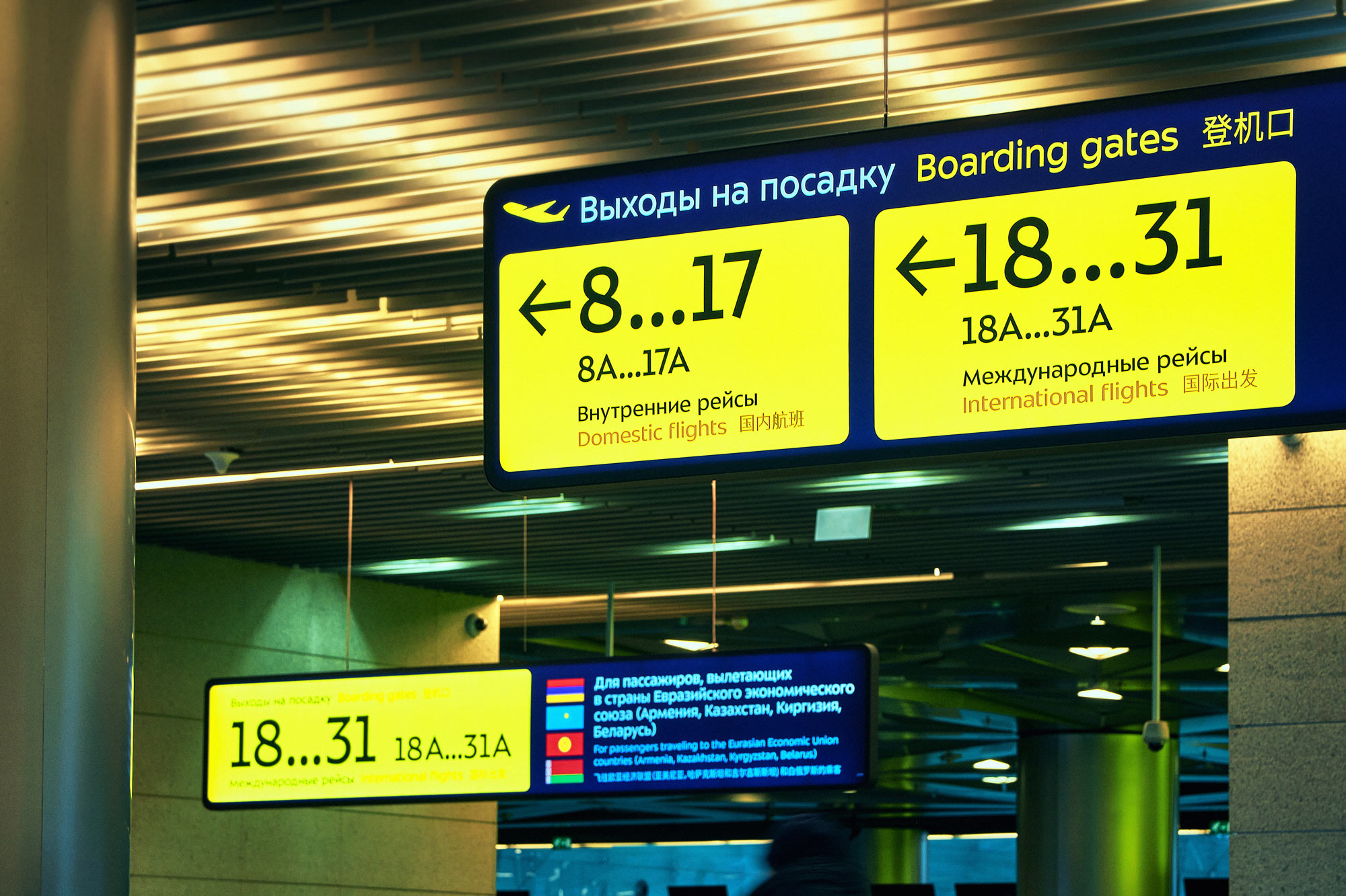
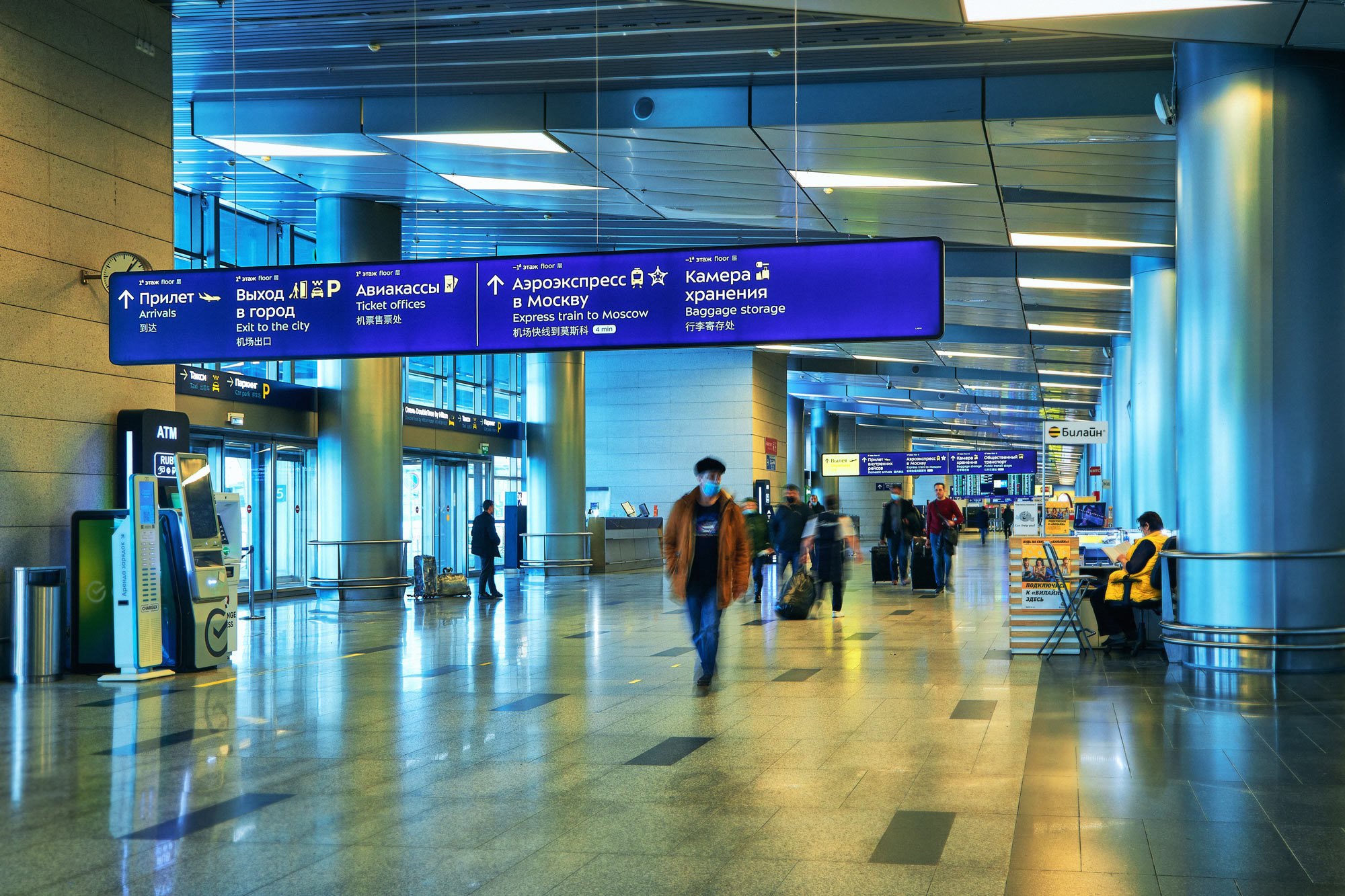
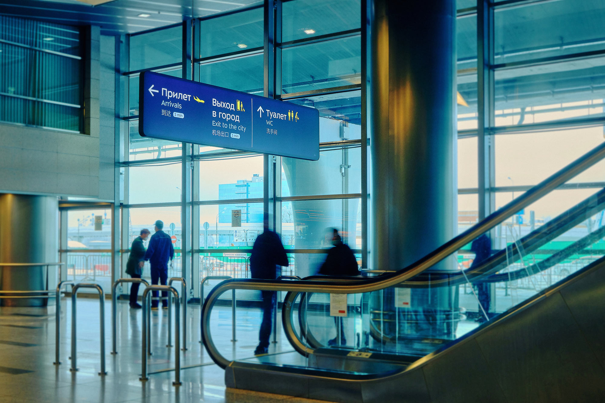
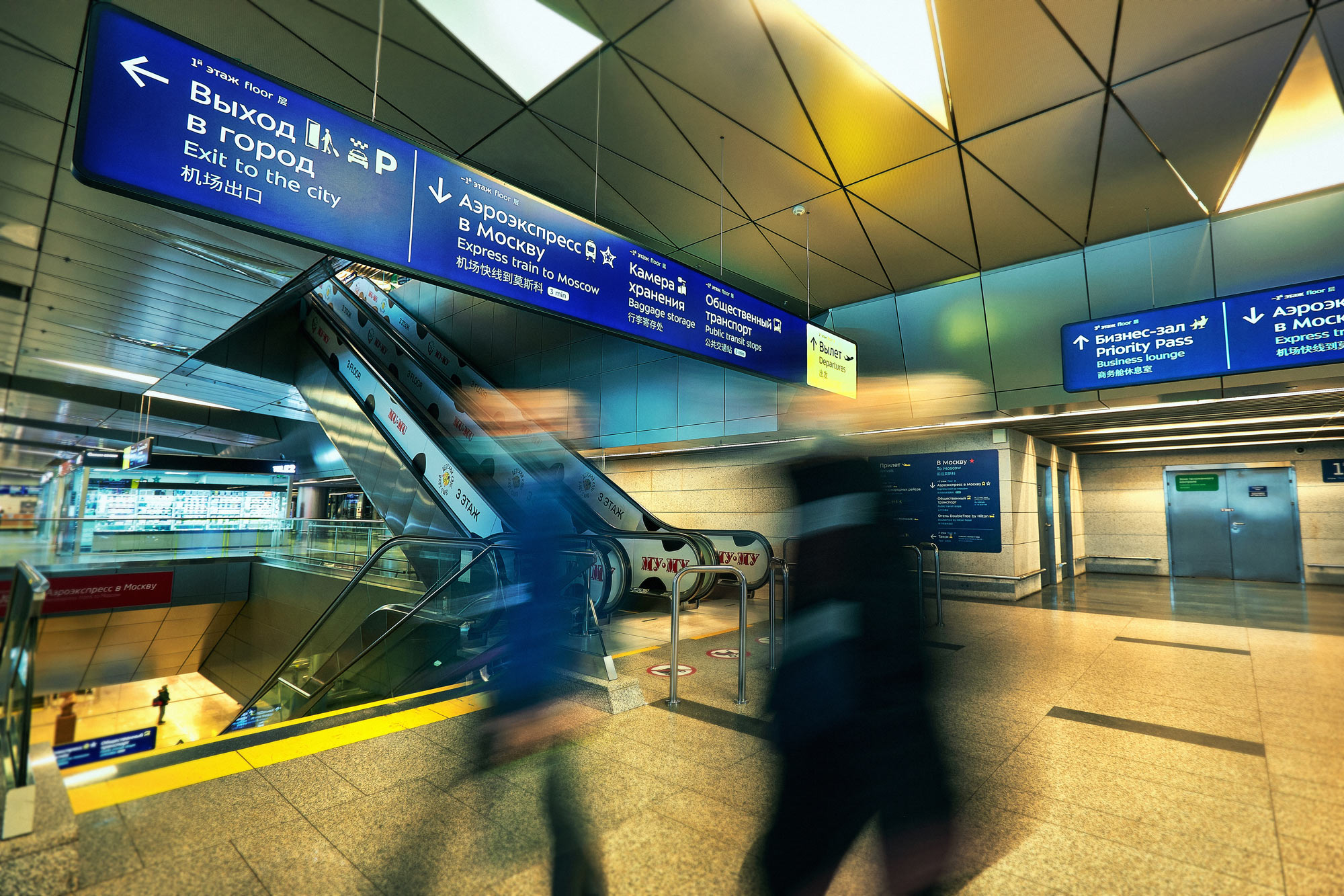
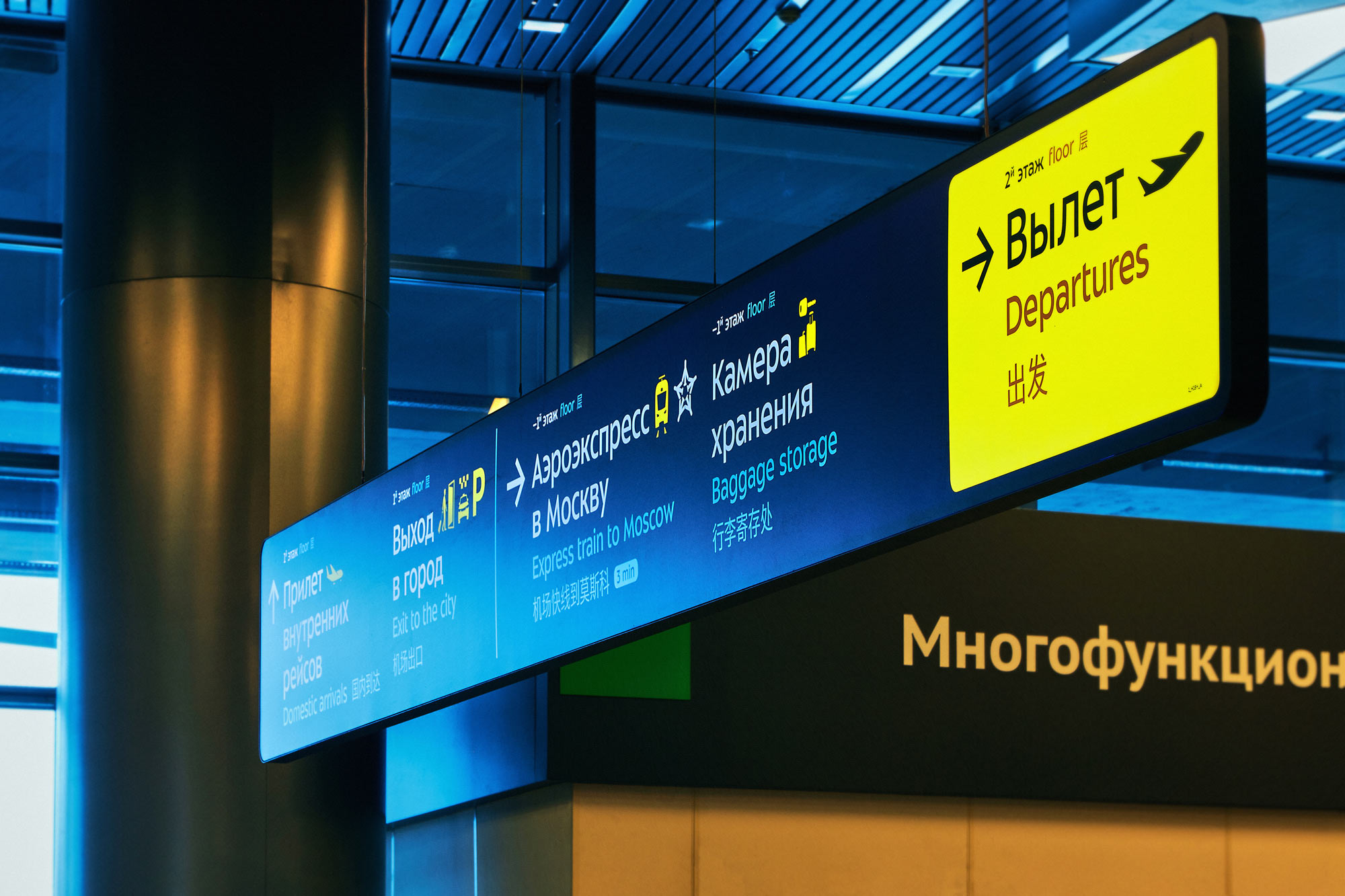
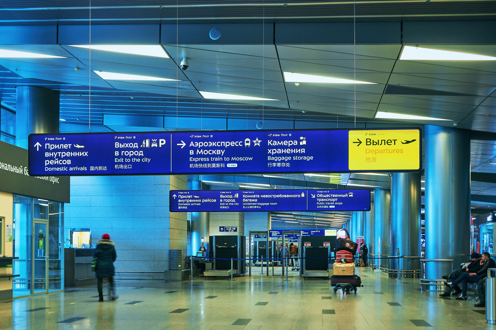
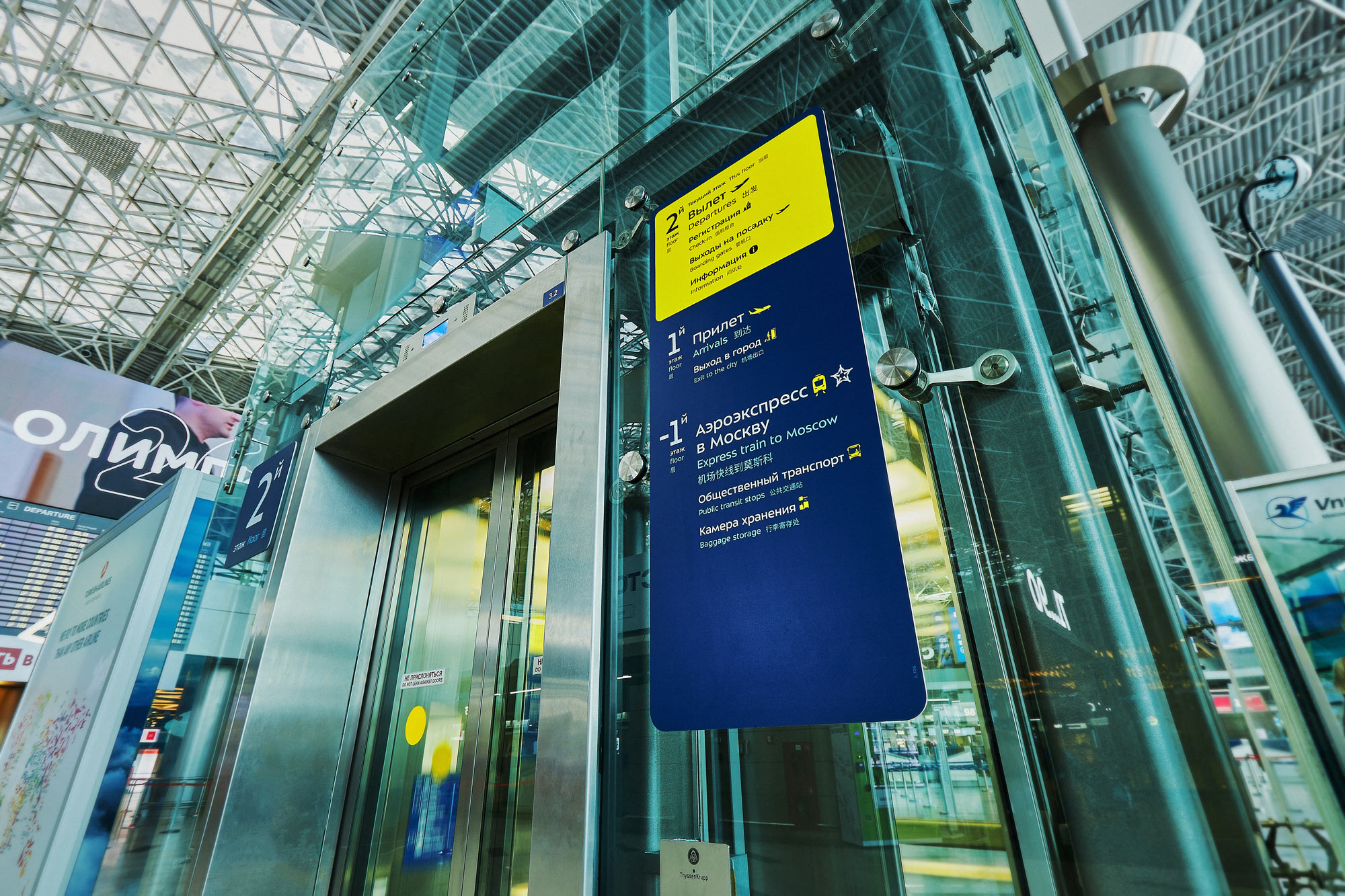
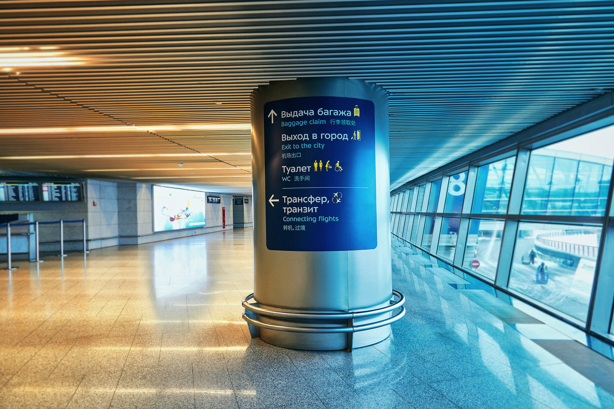
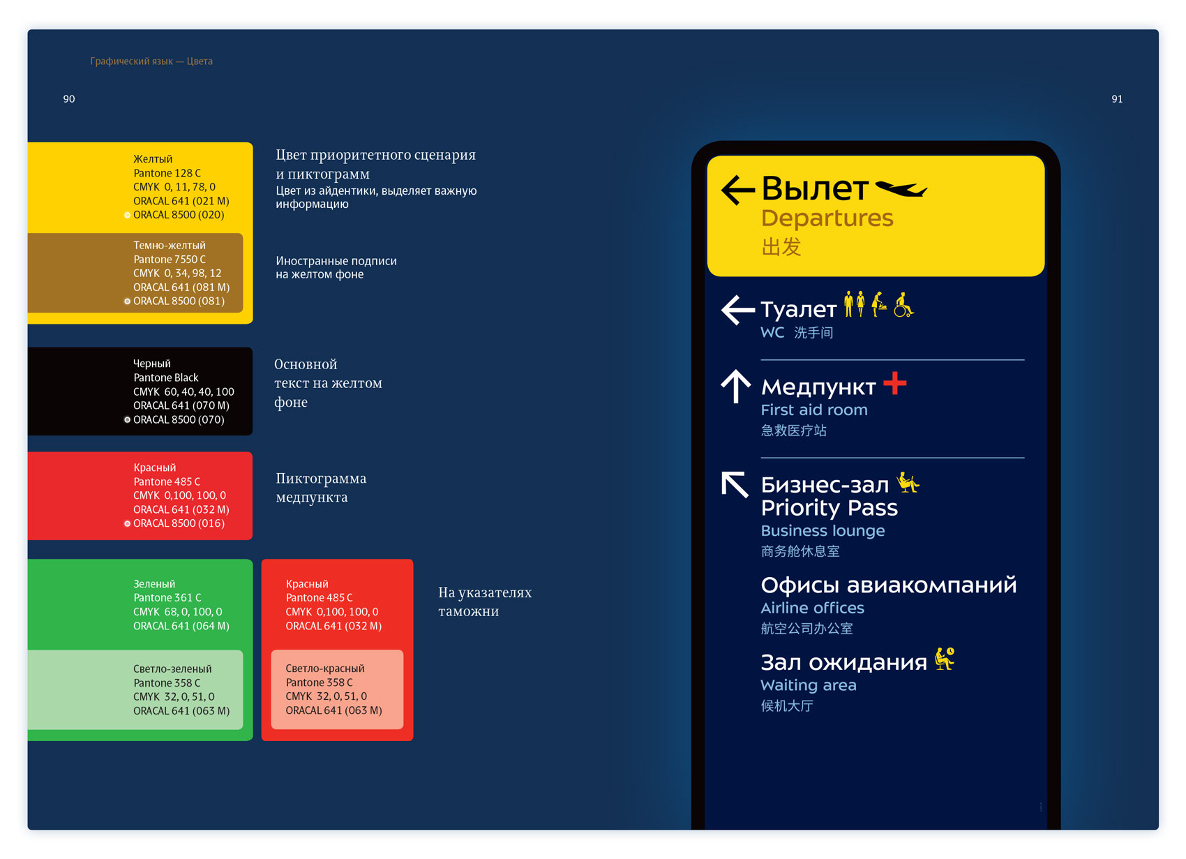
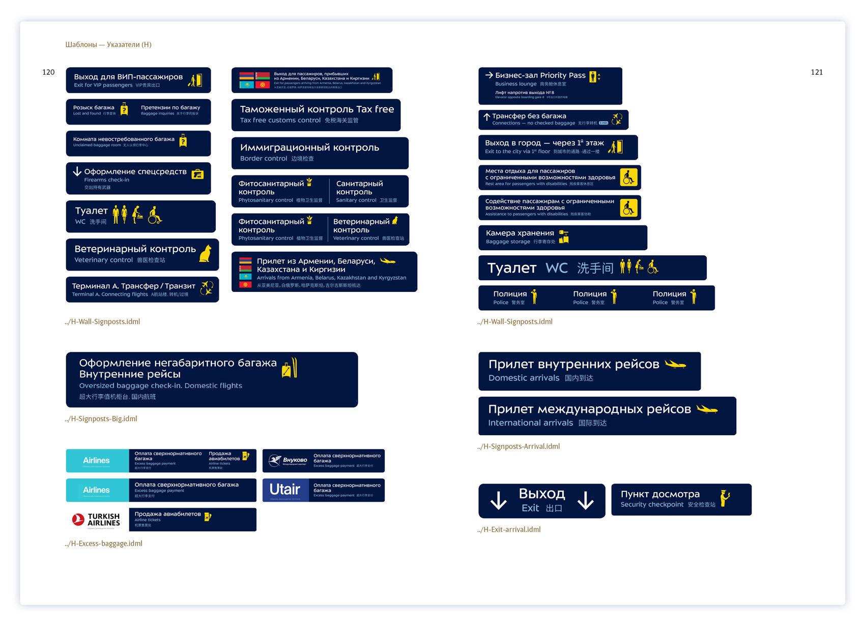
The corporate blue color is used to distinguish wayfinding from advertising. Priority information is highlighted with yellow bars and large text, with the rest of the data grouped according to the direction of travel.
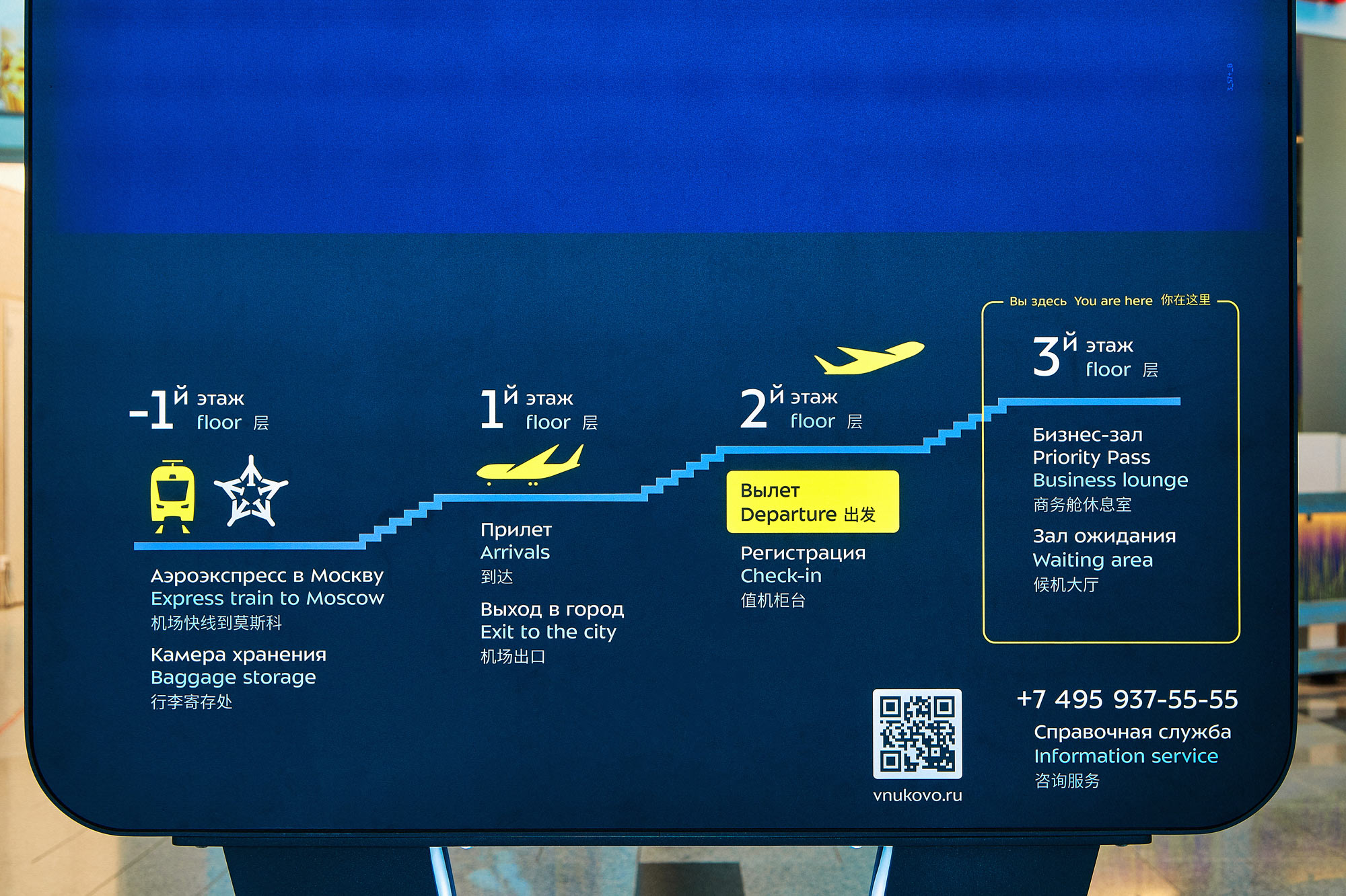
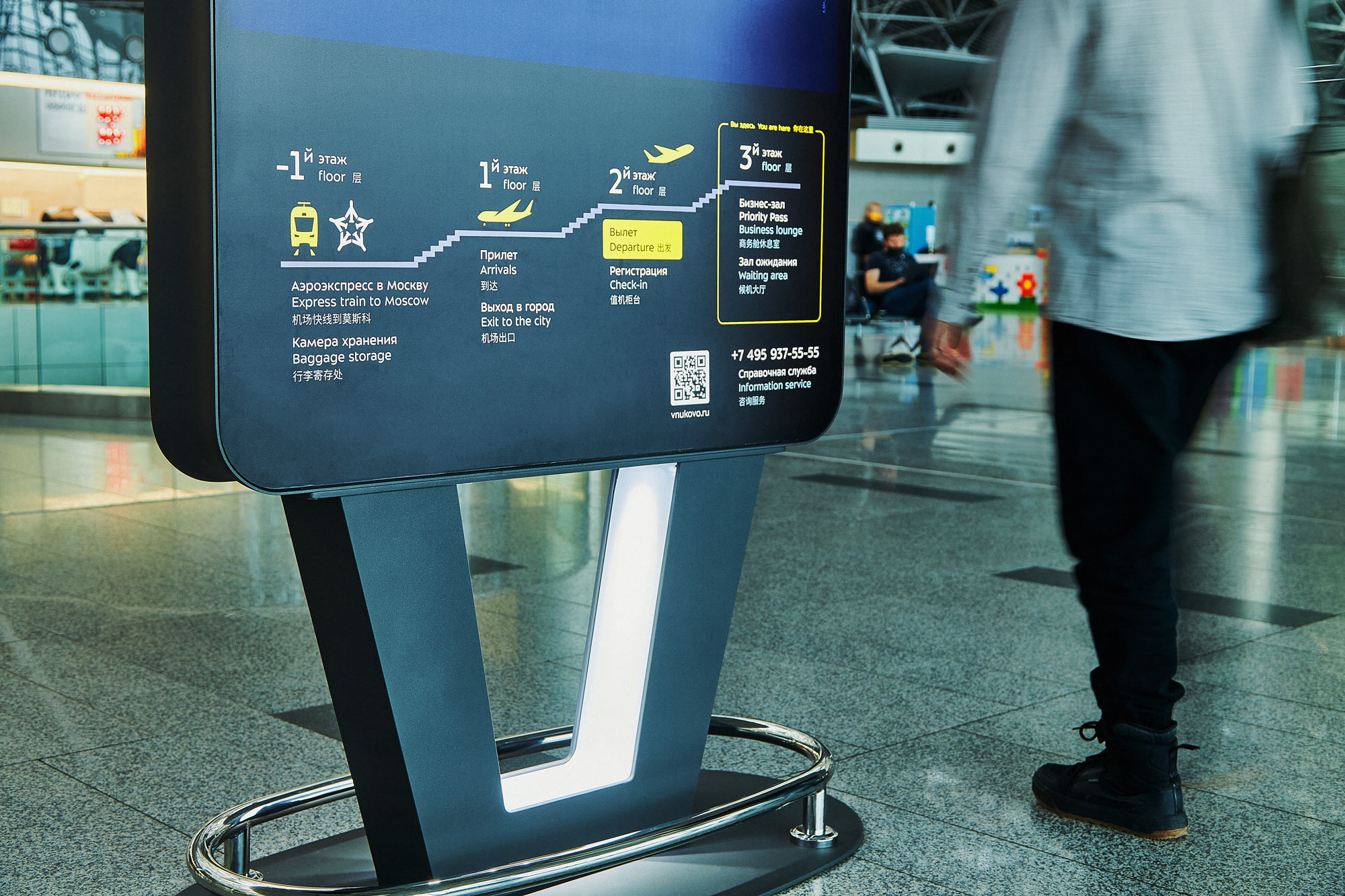
Pylons are the primary media type. At the bottom of each one there is a miniature floor plan which has the current location of the passenger: it helps them quickly find their bearings instead of wasting time on studying the large map.
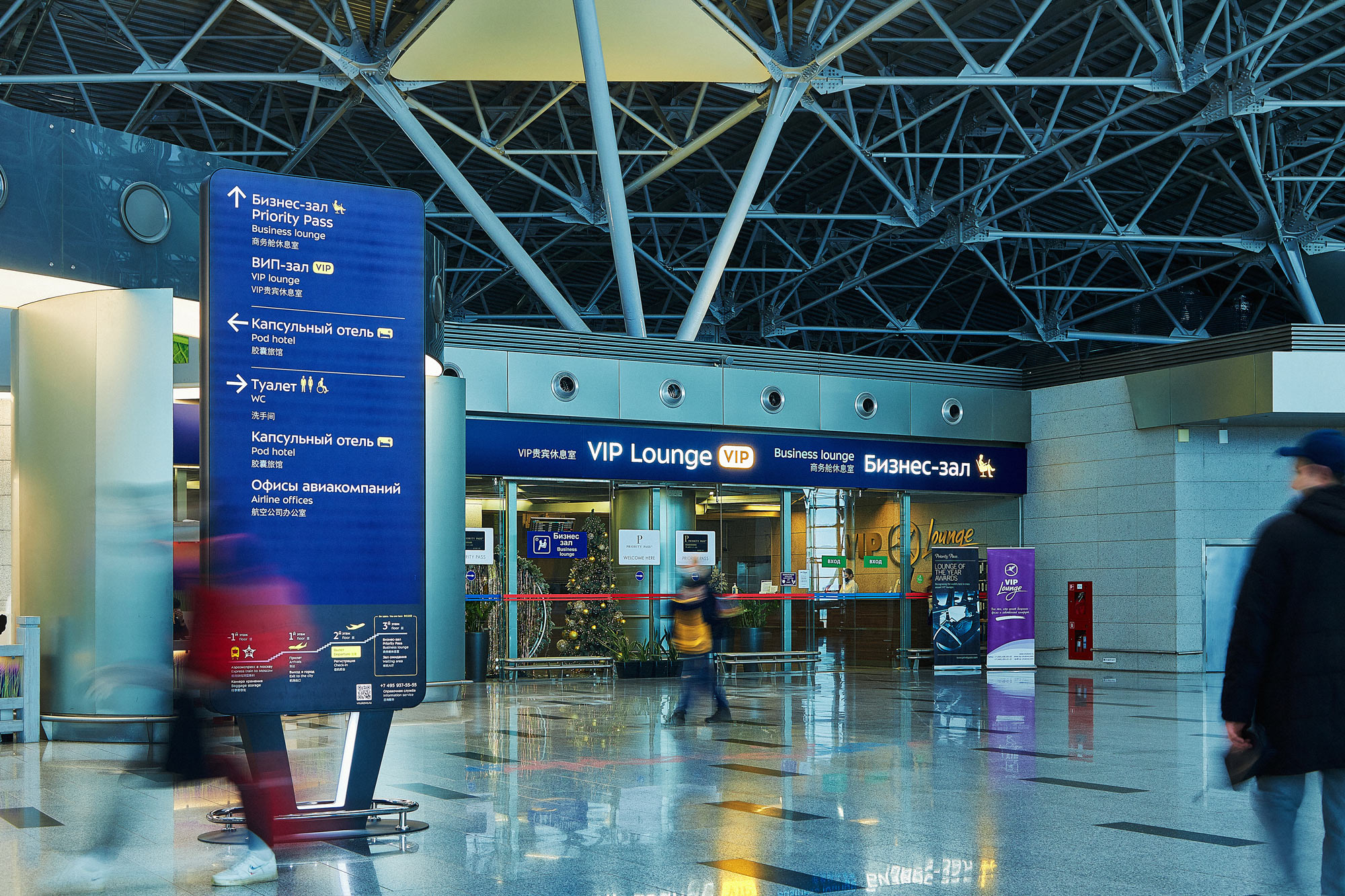
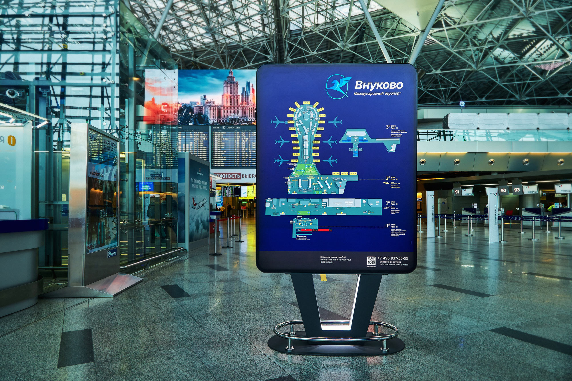
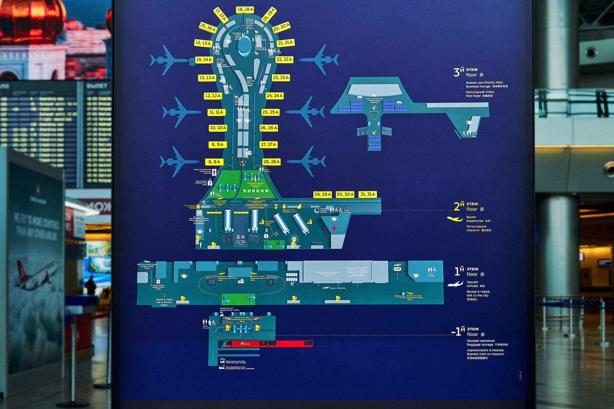
The full airport map helps plan your route in advance and find places that are not marked on other signs.
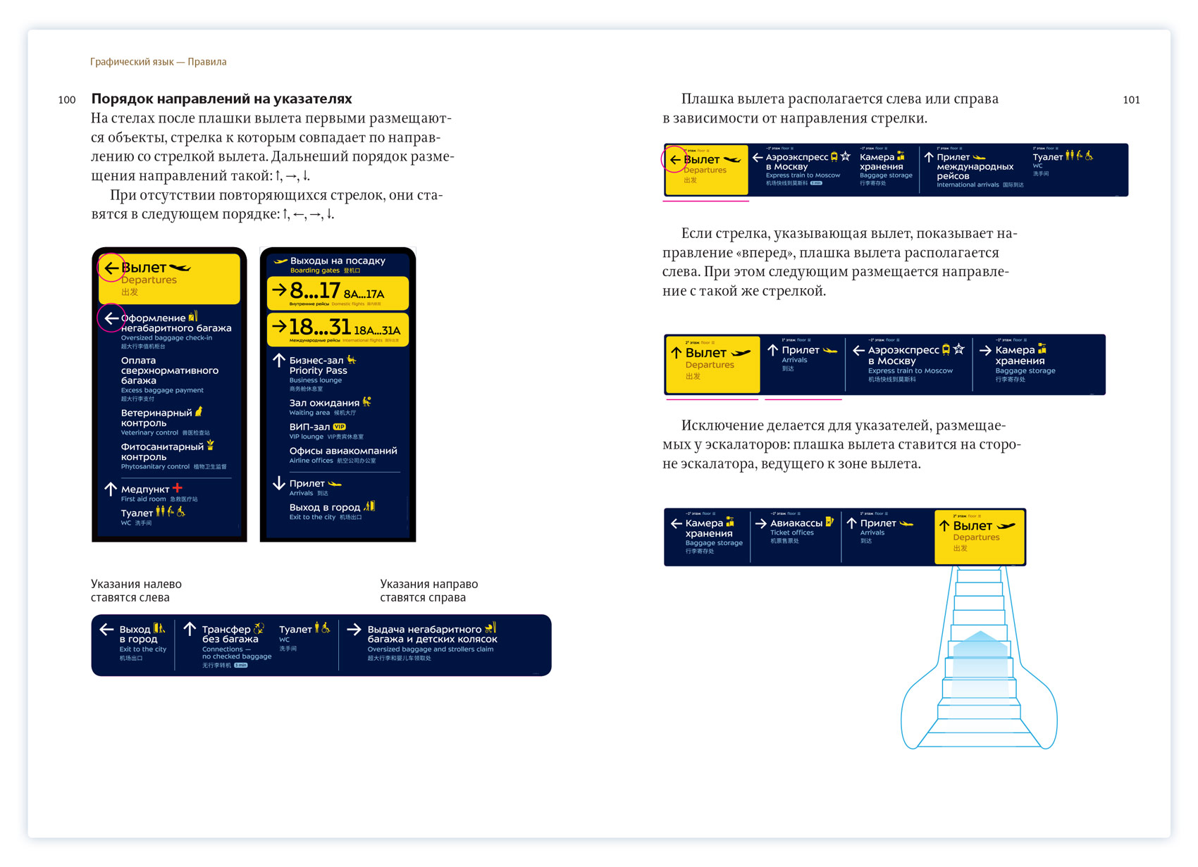
Placement of wayfinding media takes into account passenger flows: large pylons do not obstruct the way and are placed so that passengers can see them while standing on escalators.
Large numbers are installed on the roofs of check-in desks where they are visible from afar.
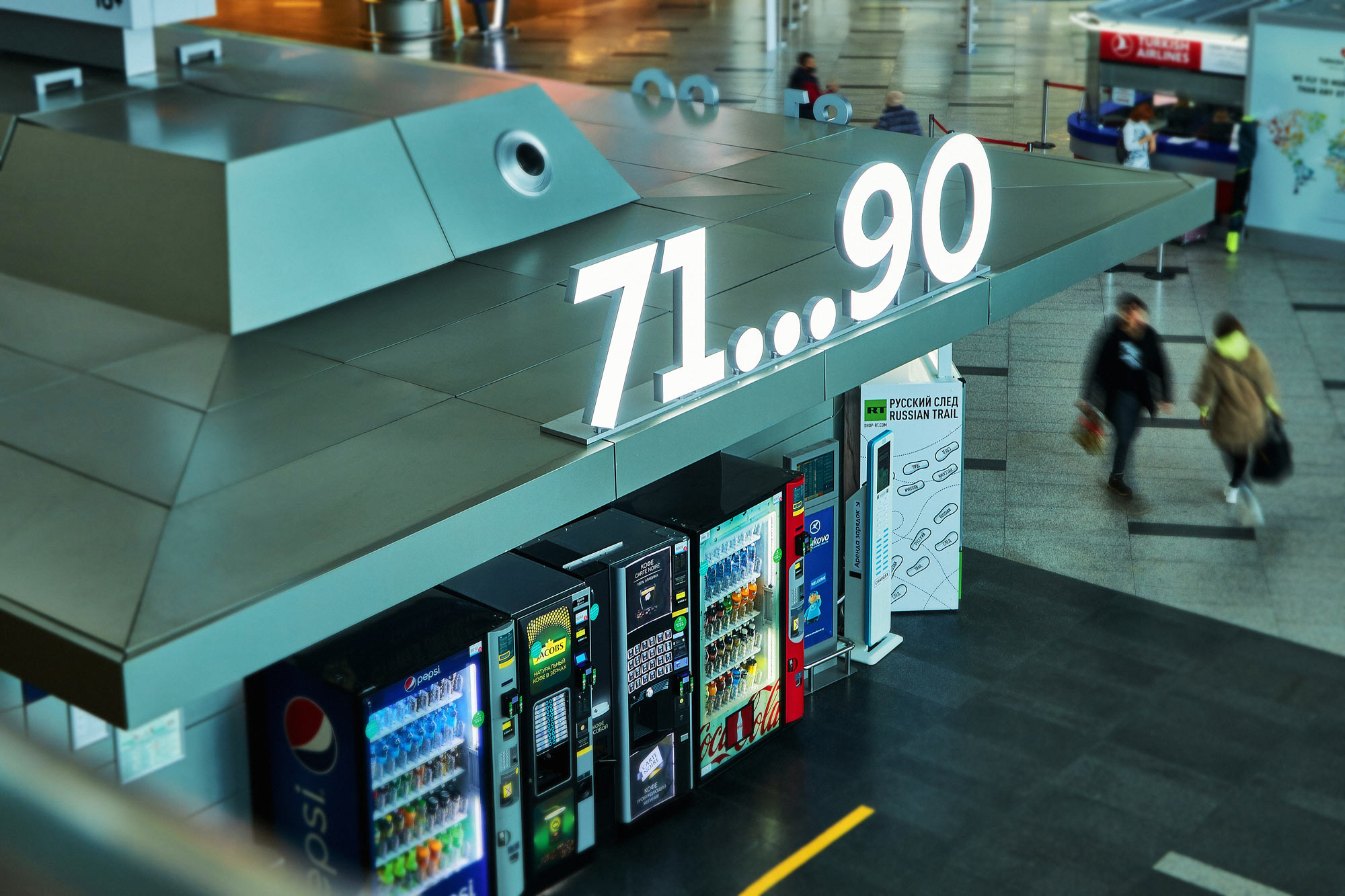
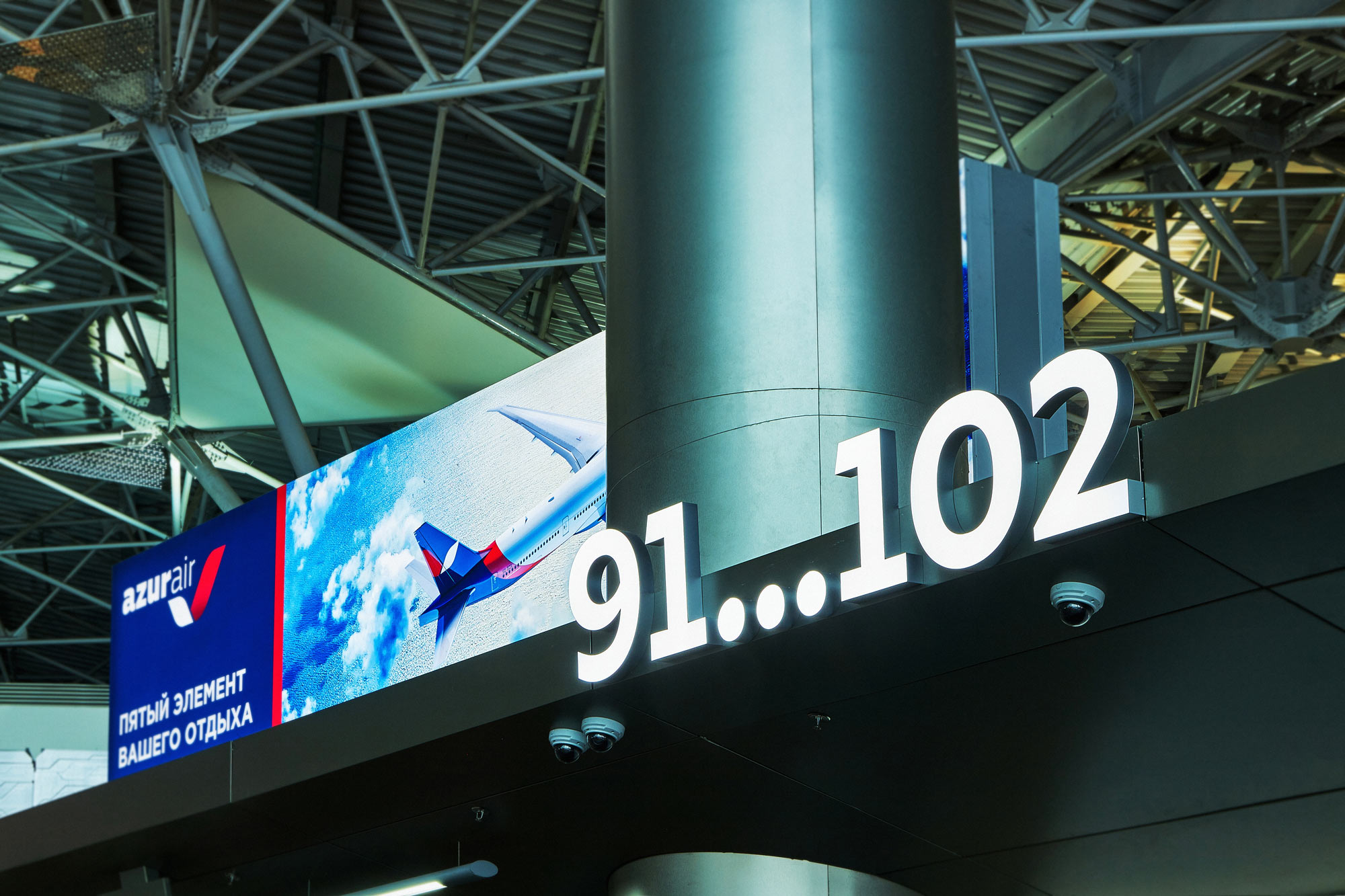
Big luminous signs visually support the architecture and are placed where other structures would look bulky and inappropriate.
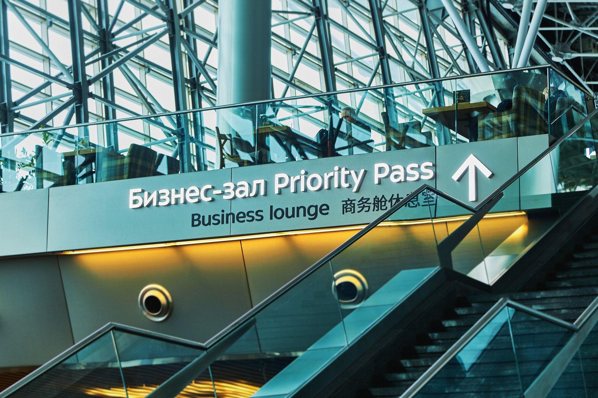
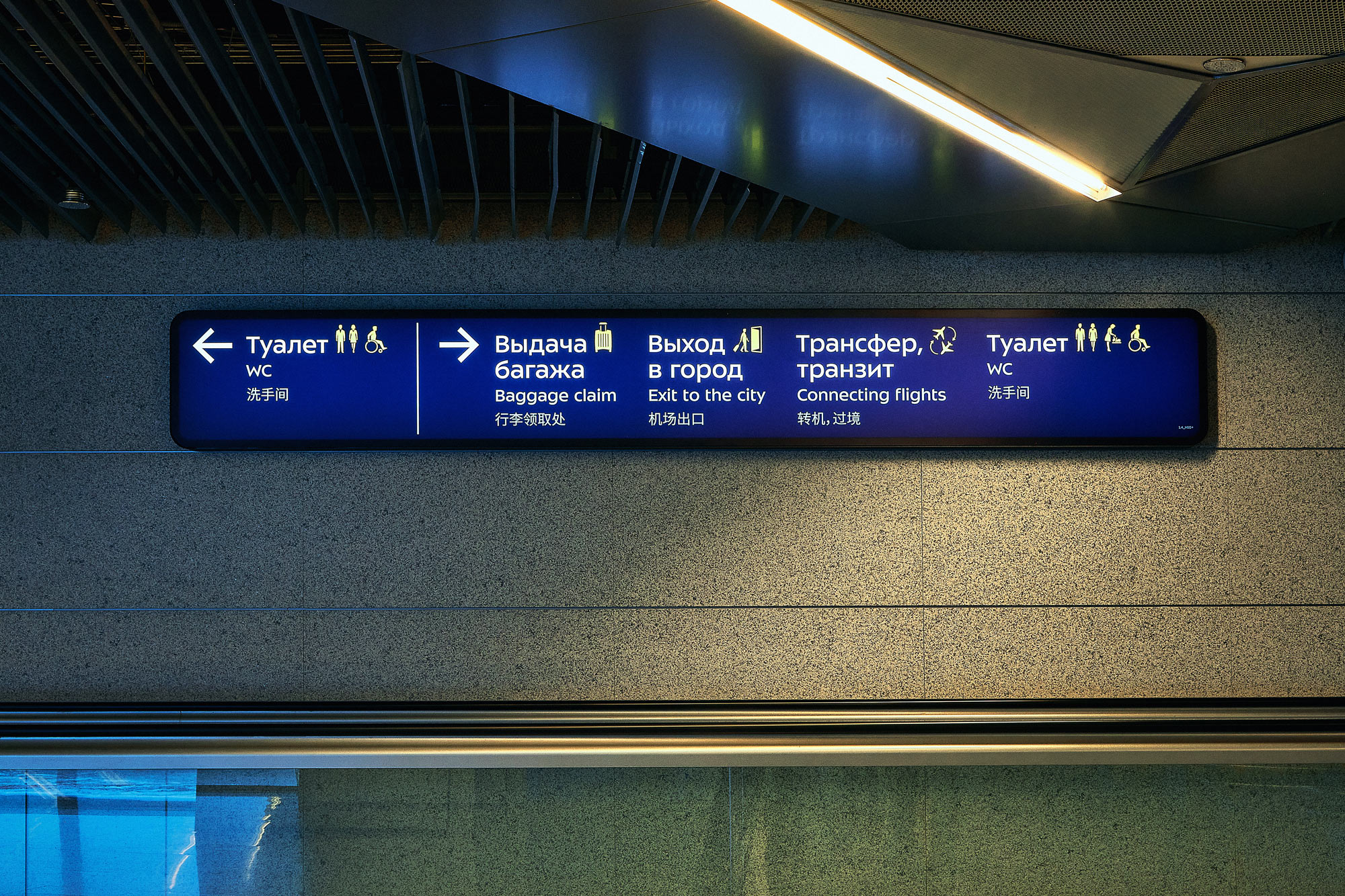
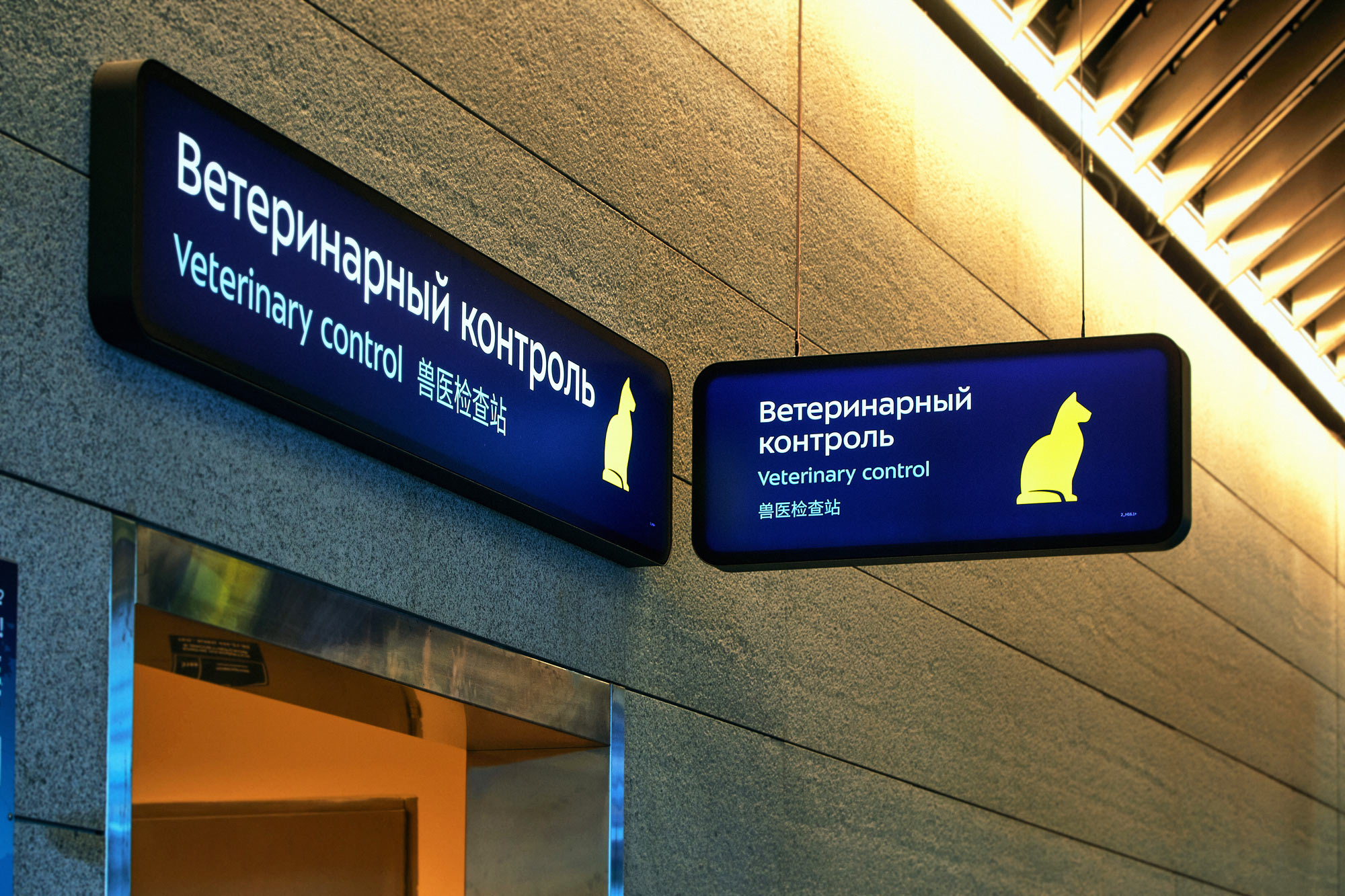
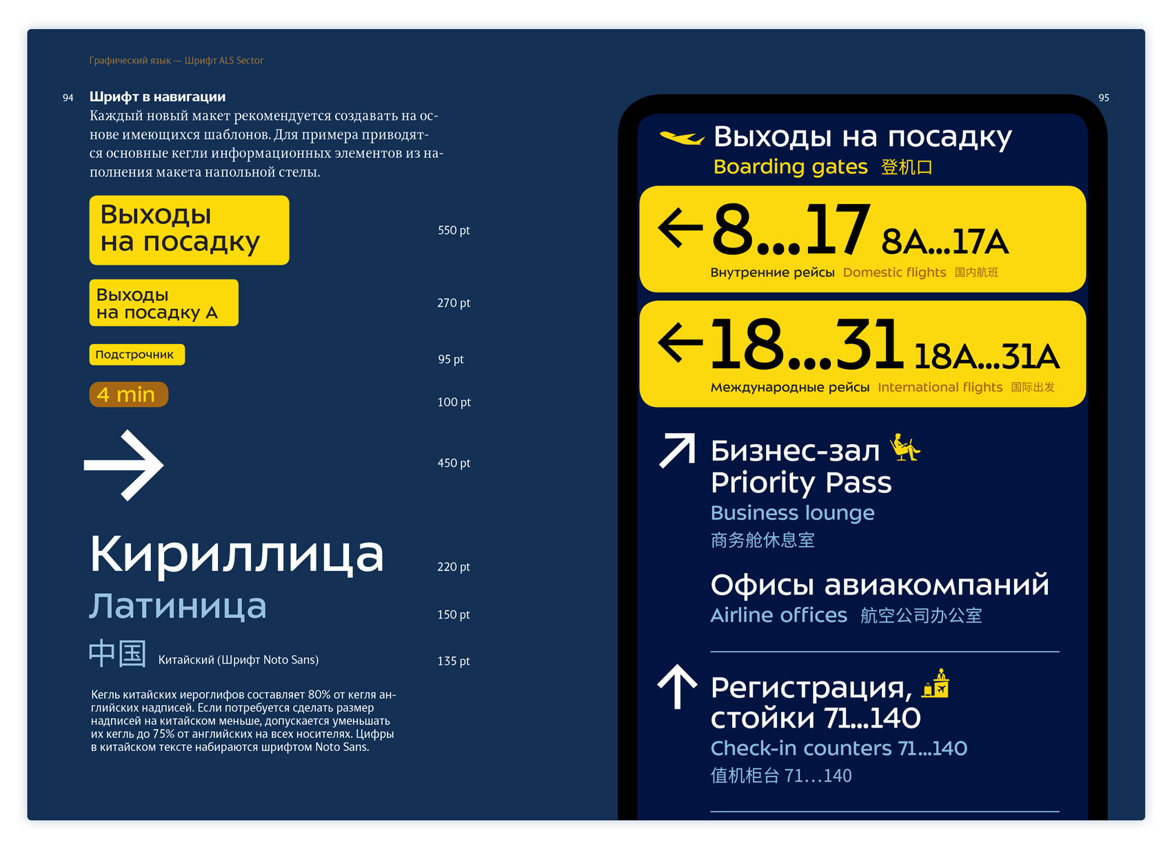
All wayfinding is rendered in three languages: Russian, English and Chinese.
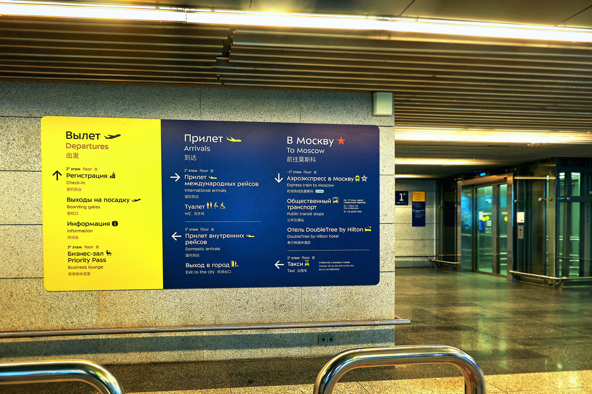
In places where pylons are not sufficient, hanging signs are installed. Information on them gets more detailed as needed, so as not to overwhelm passengers with messages.
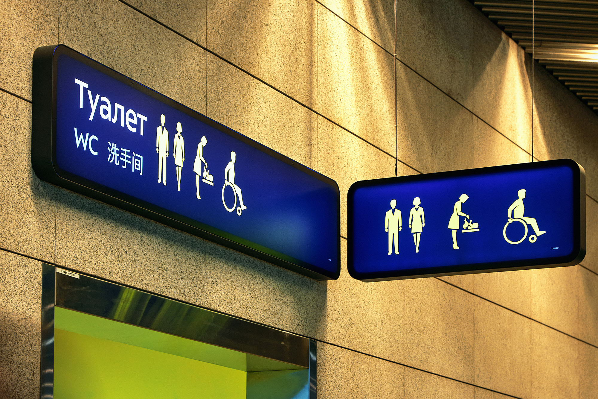
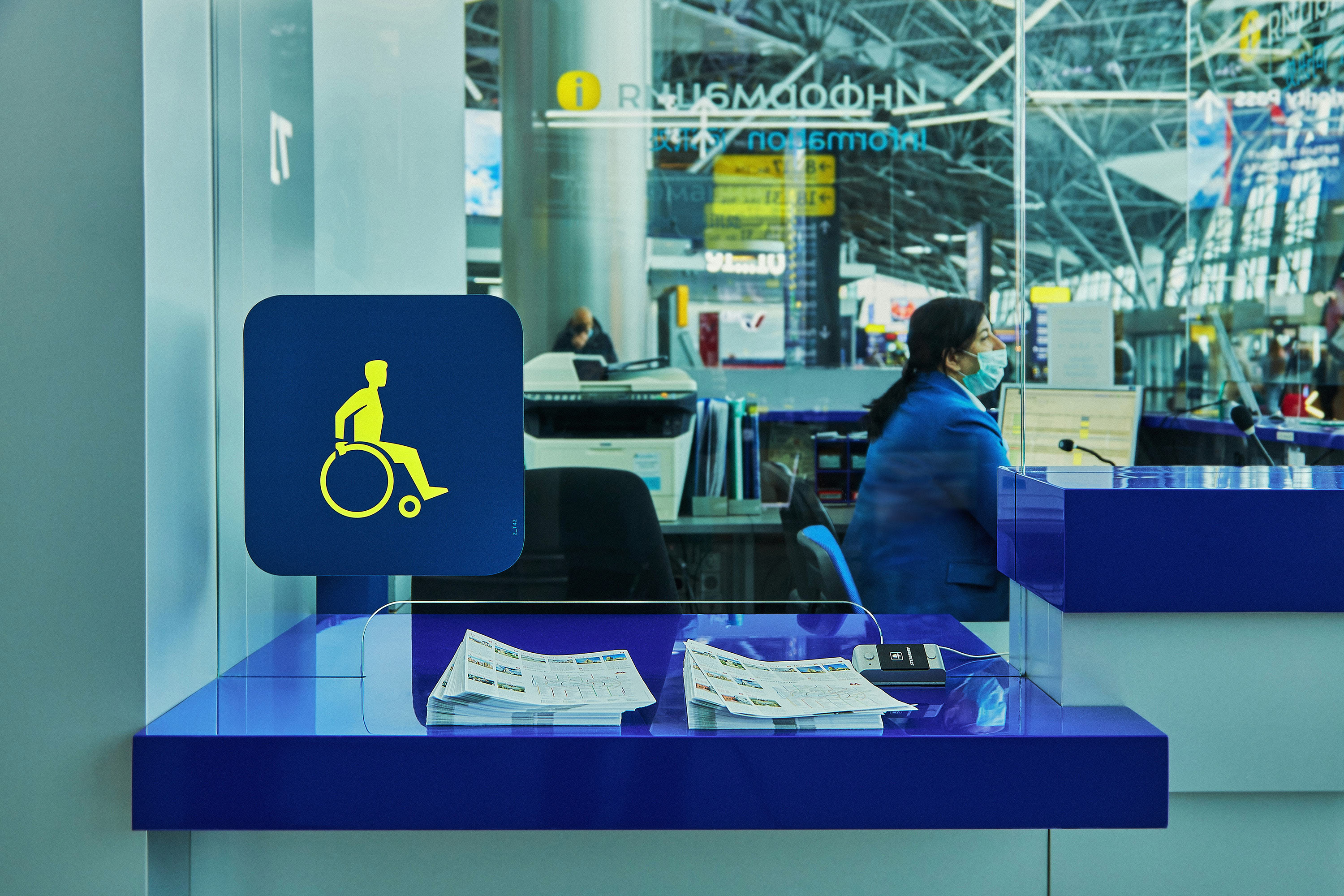
Wherever passengers are, they are always accompanied by a set of pleasant and recognizable pictograms that let them know they’re on the right path.
Wall signs are added in areas where it’s impossible to install a pylon or a hanging sign. They are also used to mark entrances to rooms.
Easily replaceable auxiliary decals and stickers take into account features of the surfaces.
There are ready-made mock-ups with correct dimensions of elements and spacing between them created for each media type, all that’s left is to fill them with content. In addition to that, all main pictograms were added to the main typeface file which allows to type them in the right size along with text.
All the subtleties of working with the new wayfinding system were gathered in a detailed manual which helps airport employees create the necessary wayfinding media without errors.
technologists
- Alexander Volkov
- The studio wishes to thank Anastasia Galitskaya and AMS Group for the technical implementation of the project
