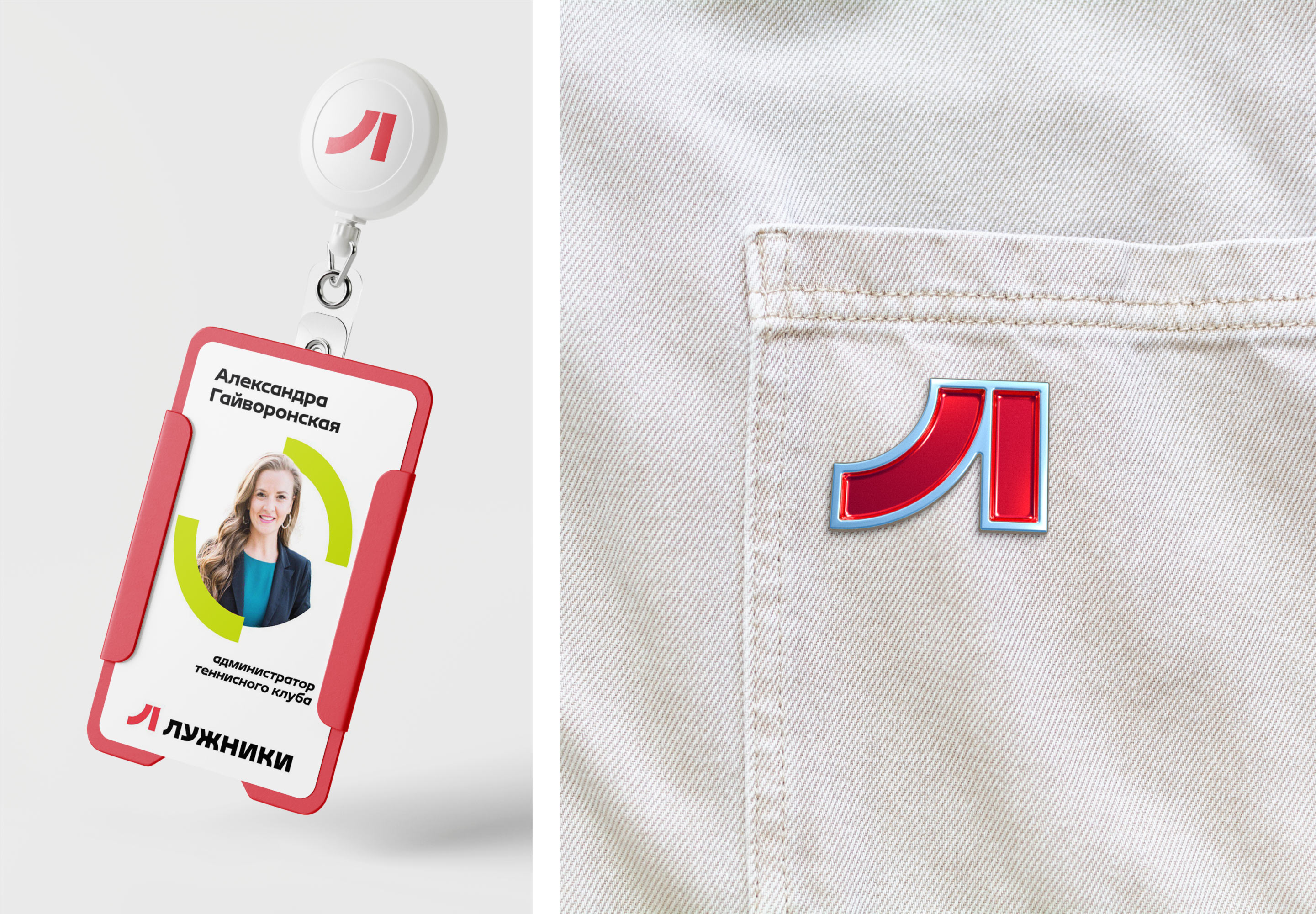
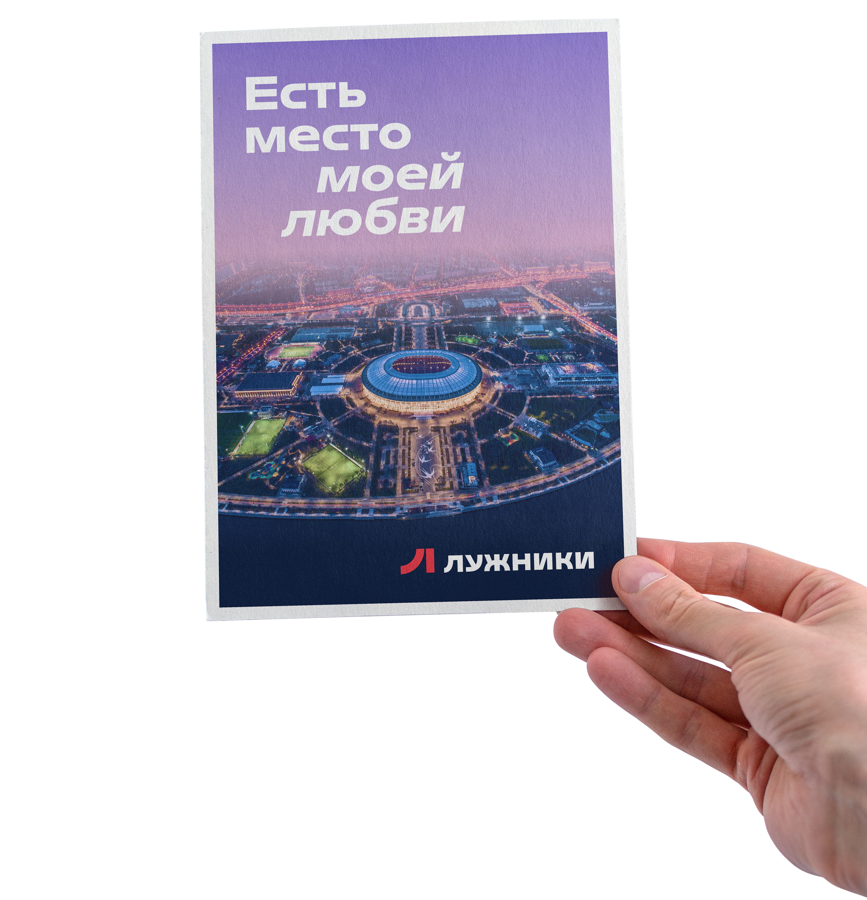
“Luzhniki” is one of Moscow’s landmark places. Here people stroll and get acquainted with the city’s history, cheer for their favorite teams and listen to concerts, attend master classes and play tennis. The park is constantly developing, offering visitors ever new types of entertainment — it has long been more than just a big stadium. In the studio, a brand platform, versatile identity, and creative framework for future advertising campaigns were developed for the renewed “Luzhniki.”
For a long time “Luzhniki” was associated only with the Grand Sports Arena.
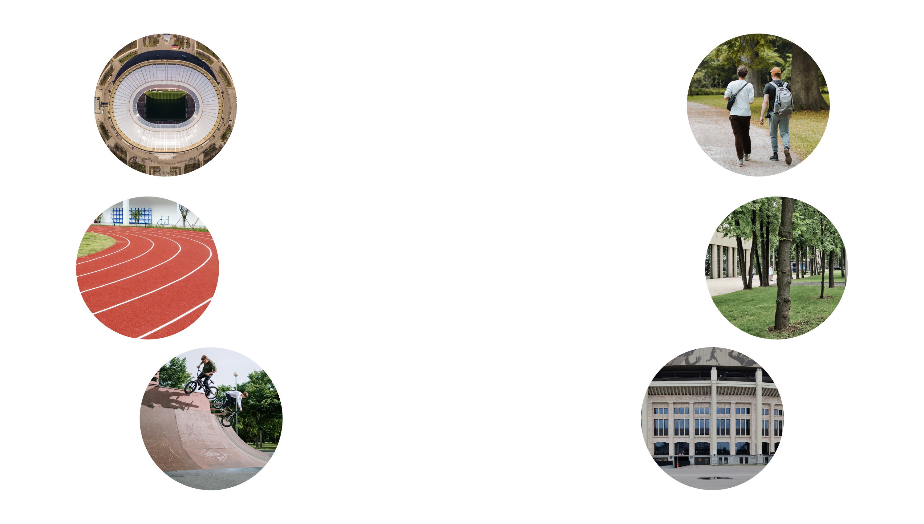
At the core of the renewed brand is a reflection of the multifaceted world of “Luzhniki,” in which resources and infrastructure for sports activities are combined with places for solitude and walks.
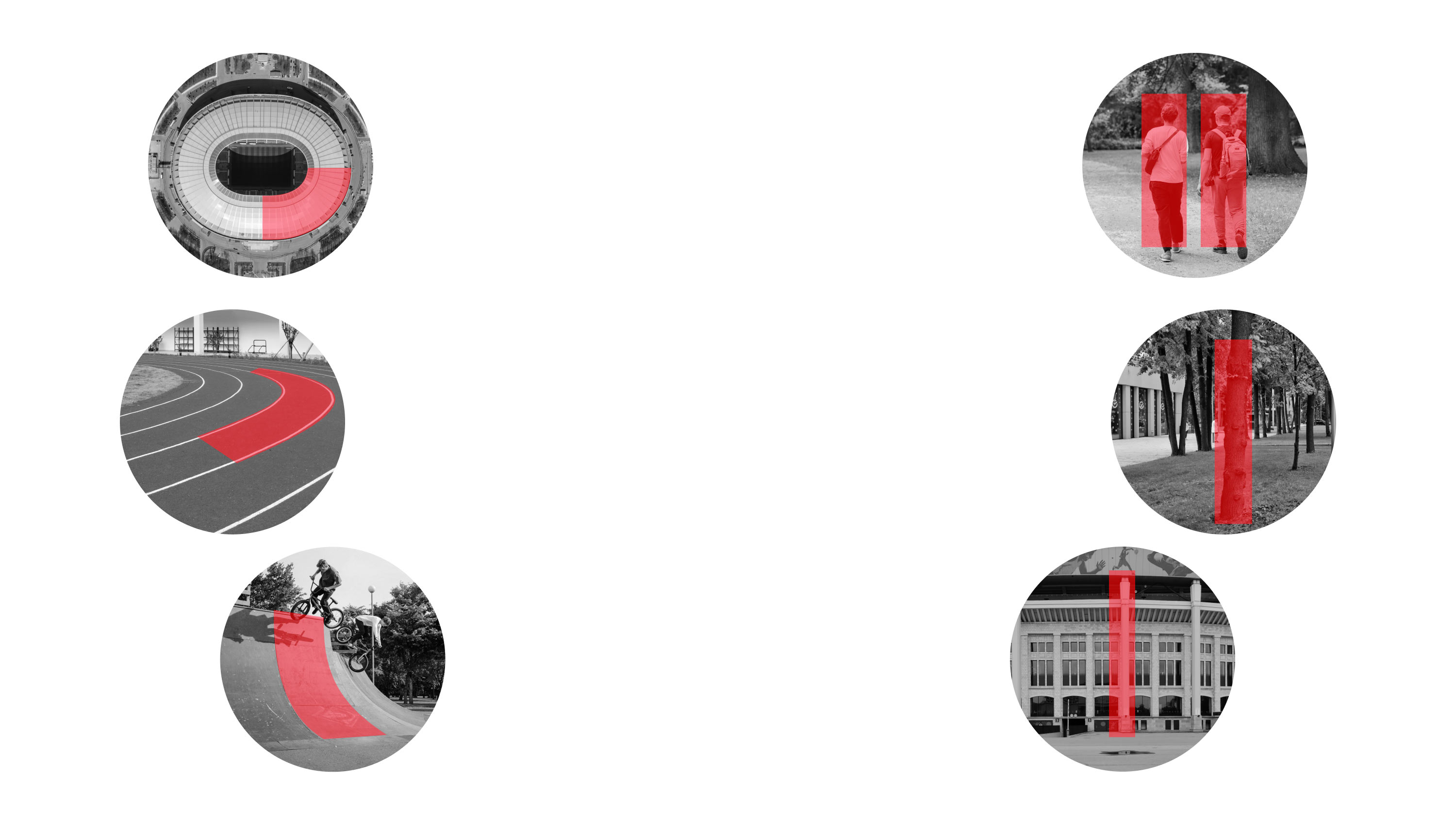
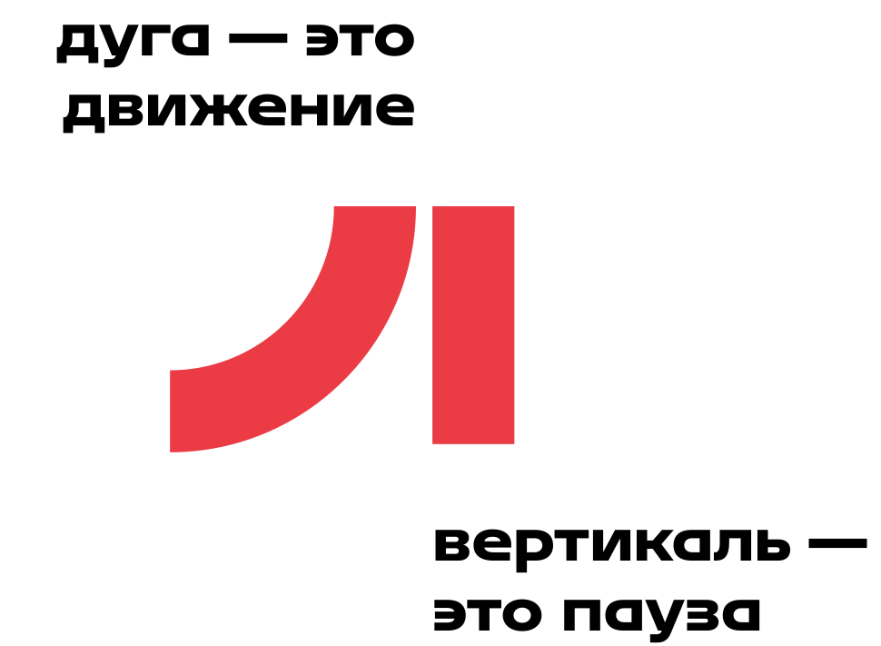
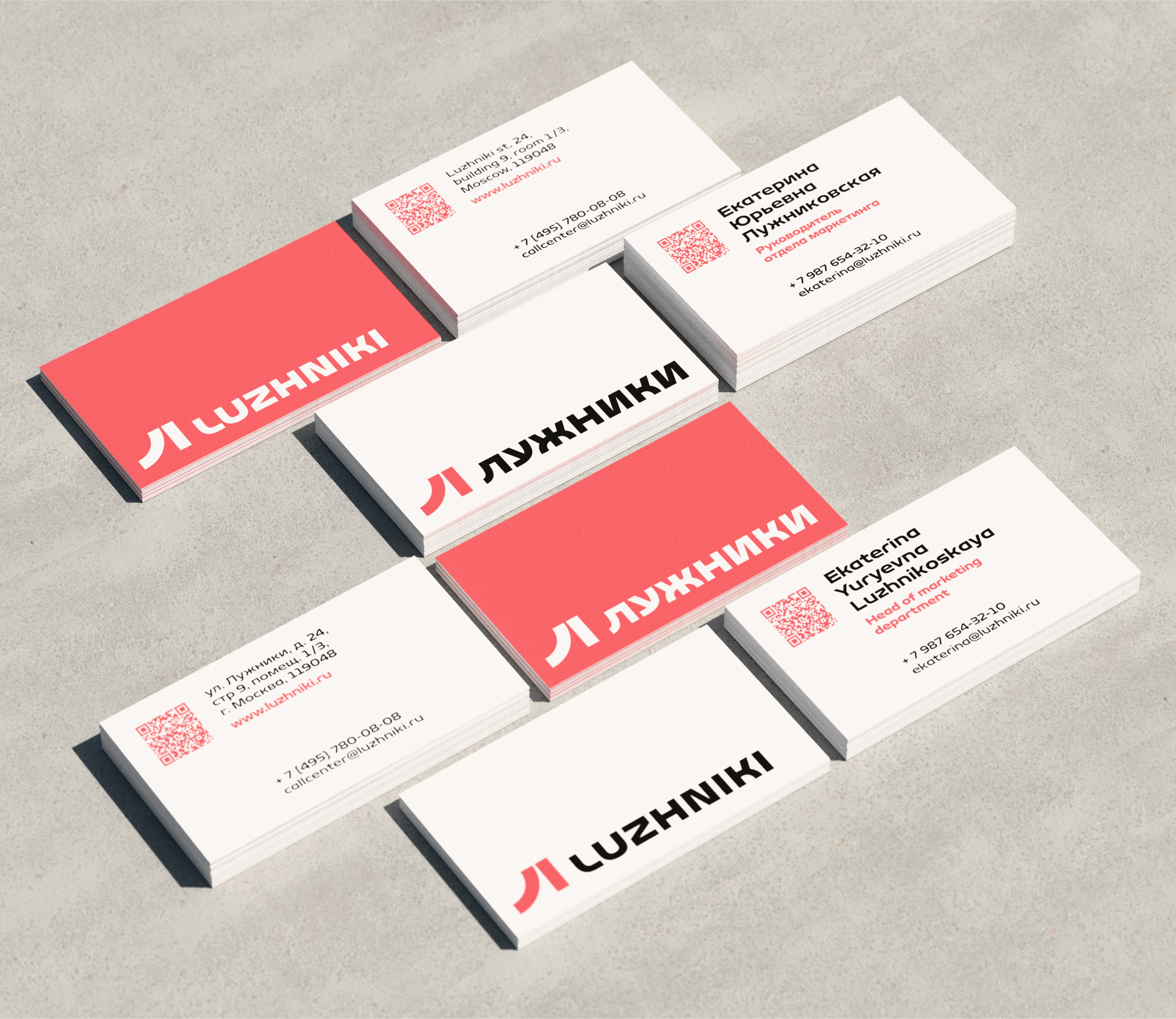
The sign is complemented by a unique typeface. It makes active use of the arc shapes that rhyme with the sign itself.


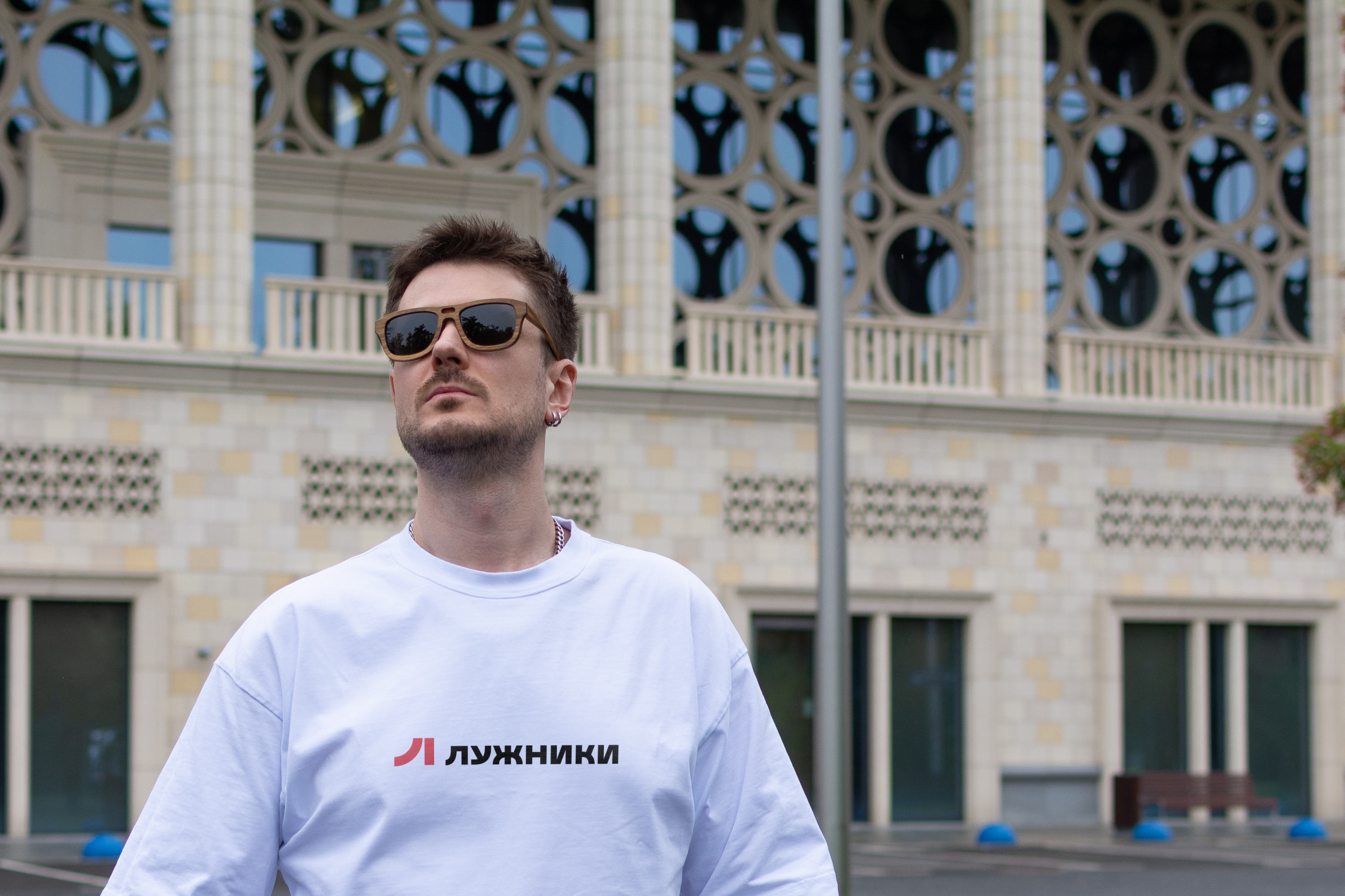
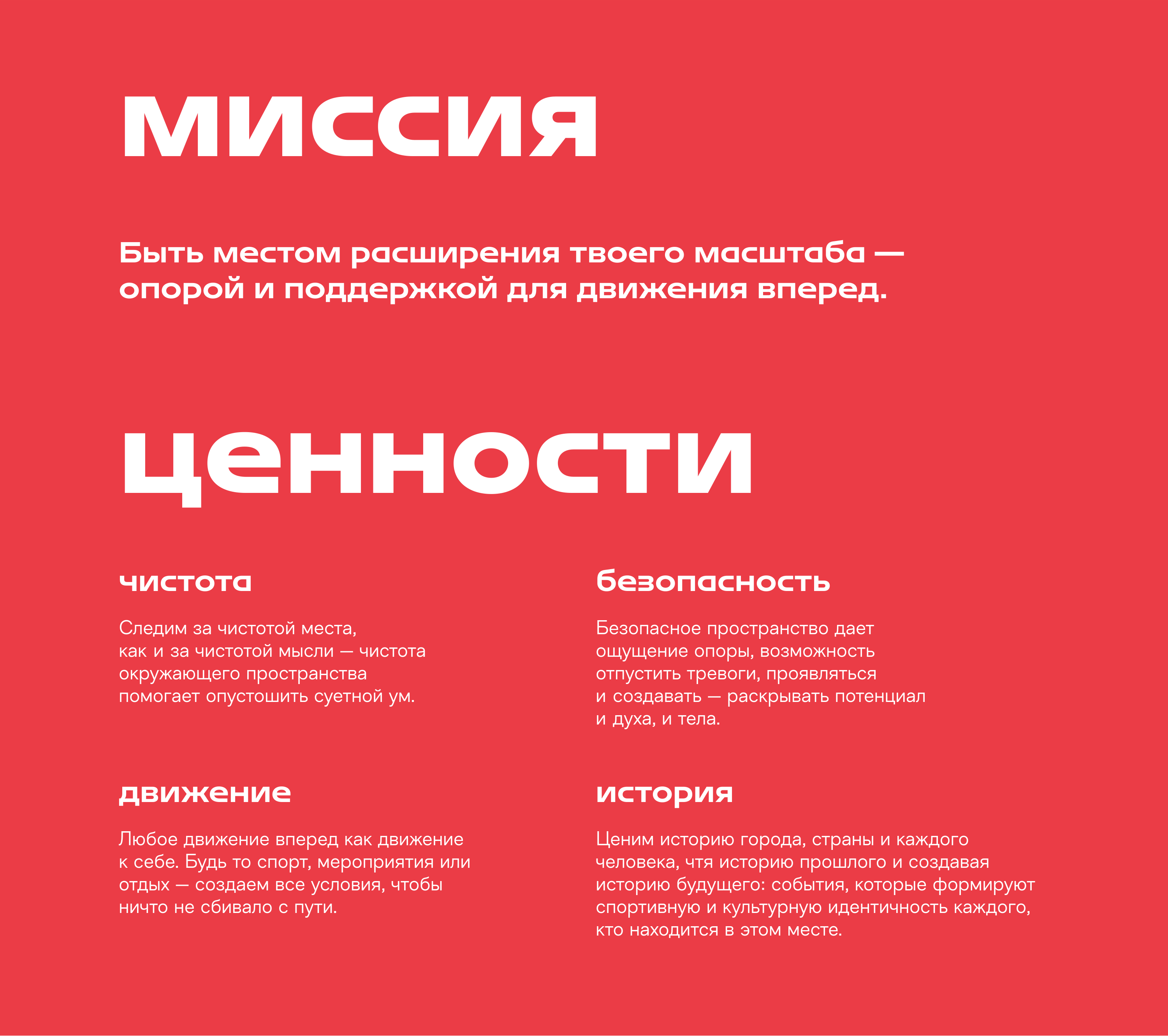
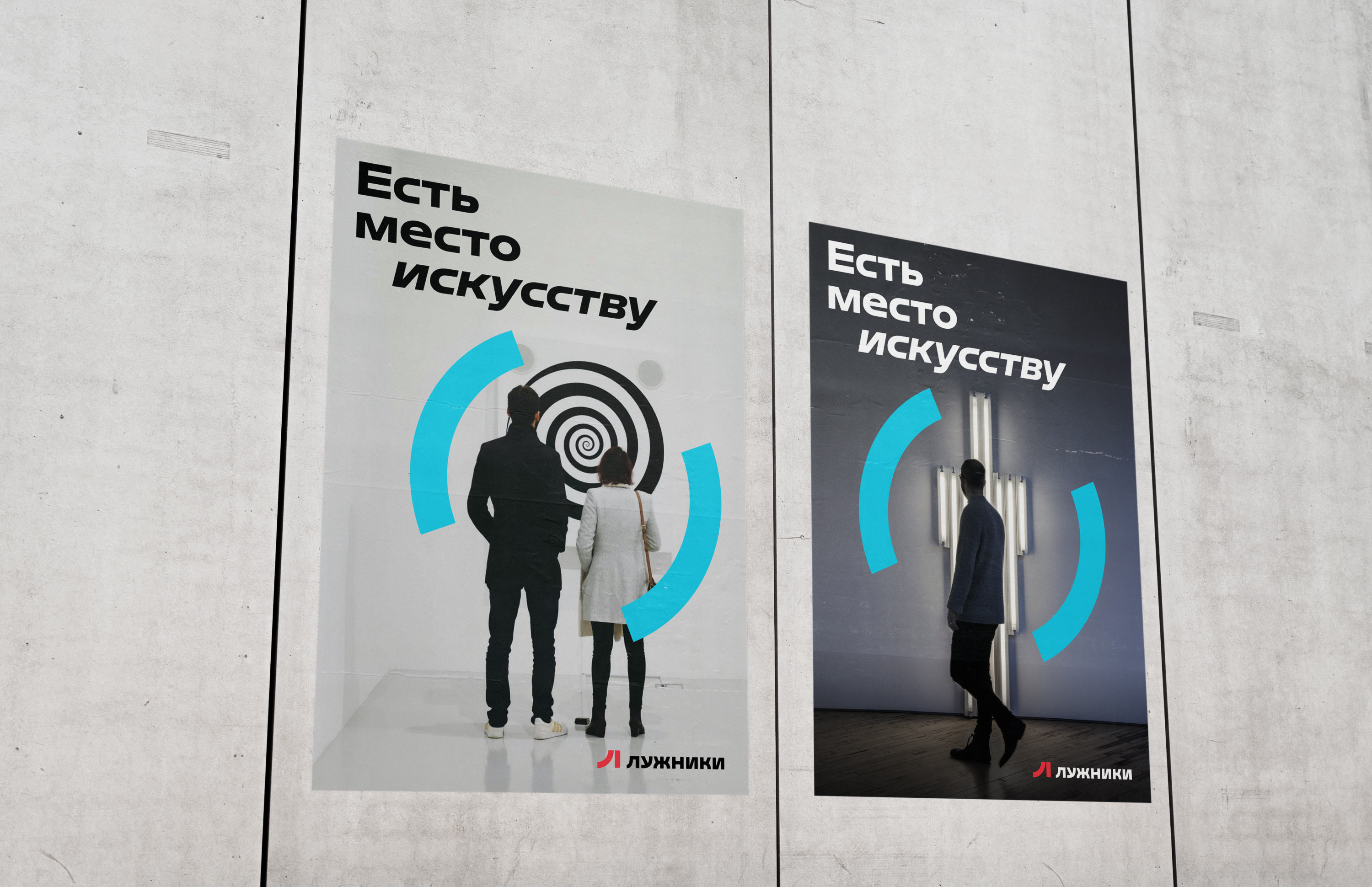
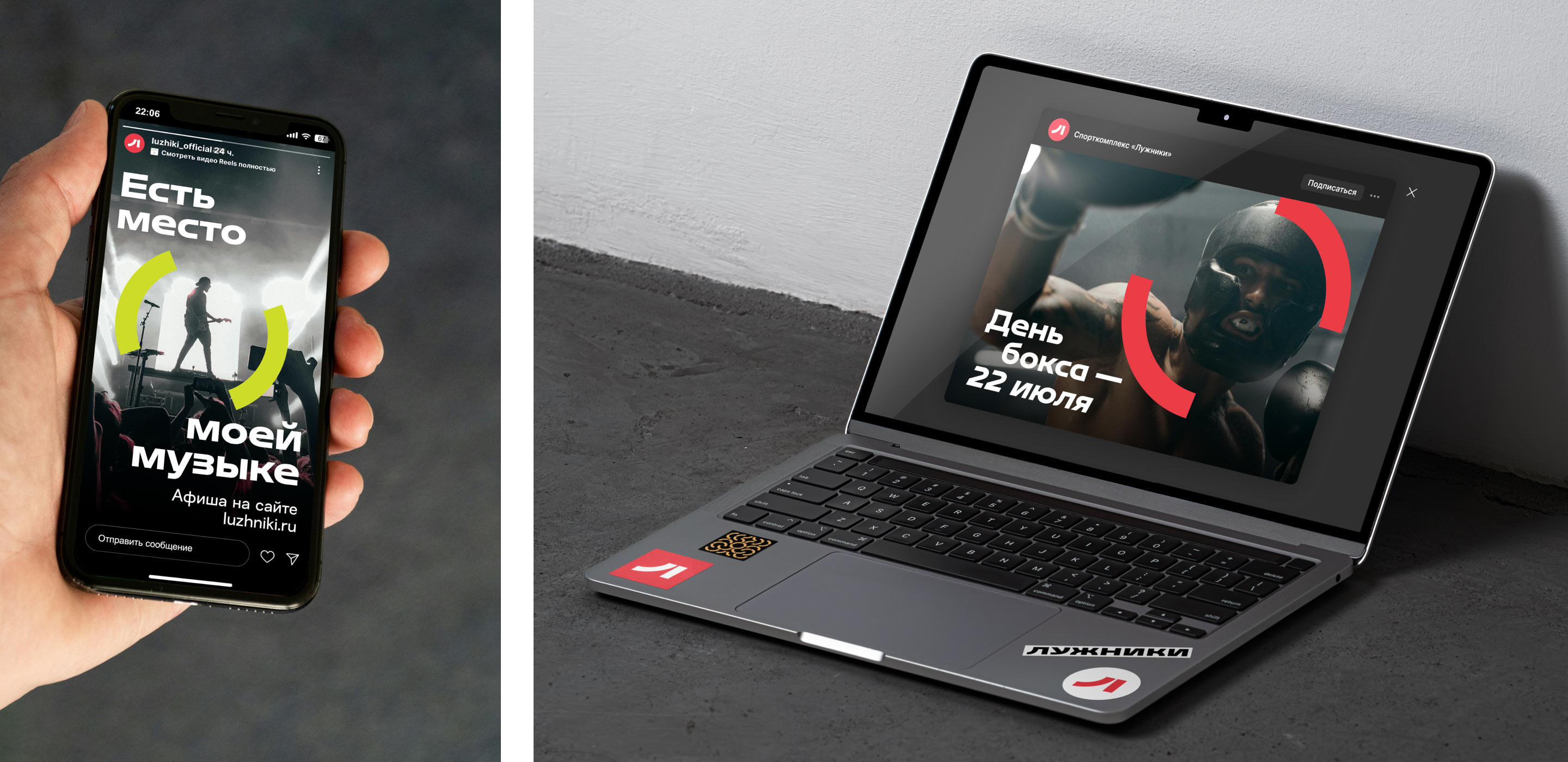
The variety of interesting activities available in “Luzhniki” is further emphasized by a creative frame: any activity, entertainment, and emotions can easily be placed inside it.


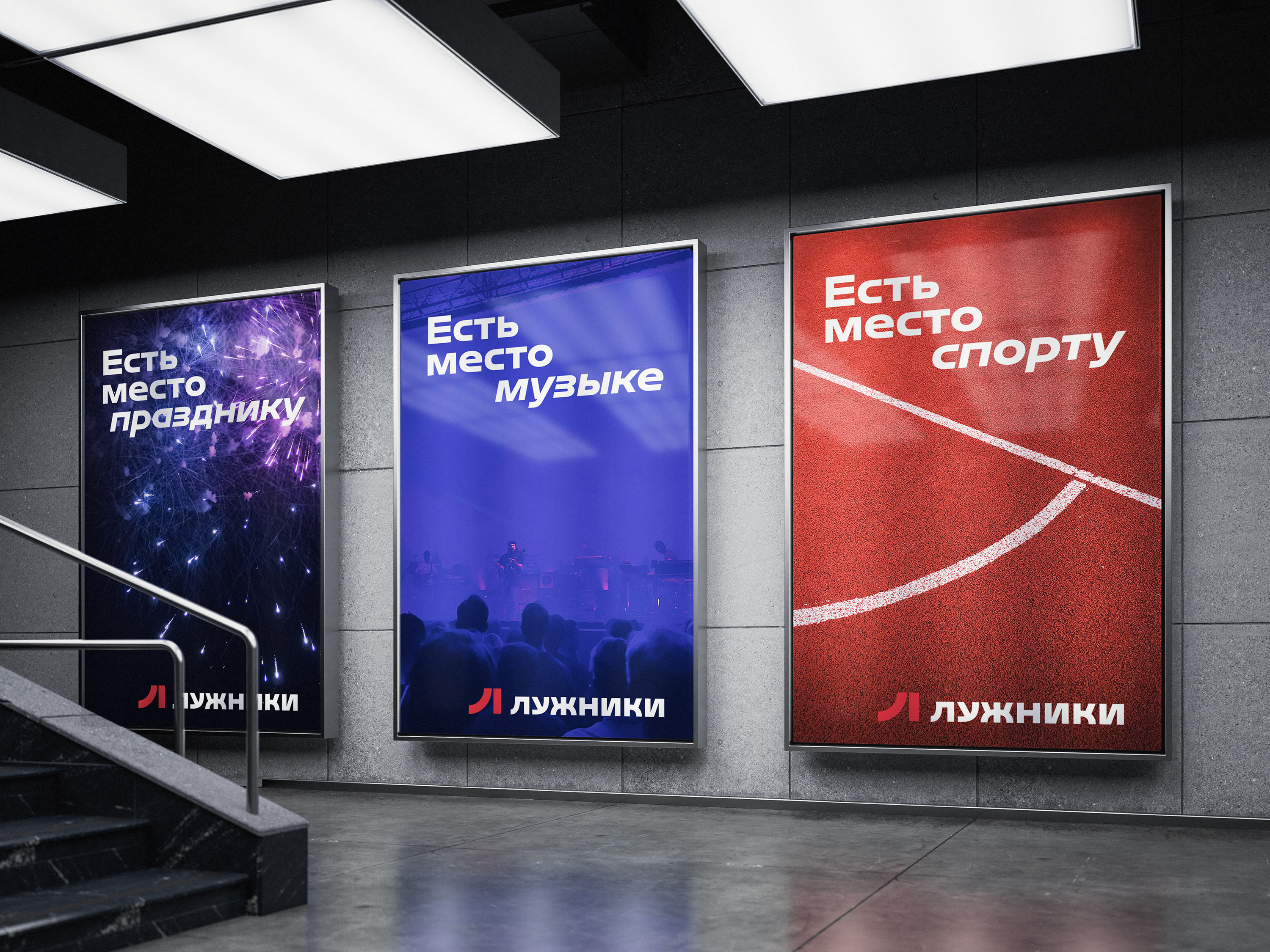
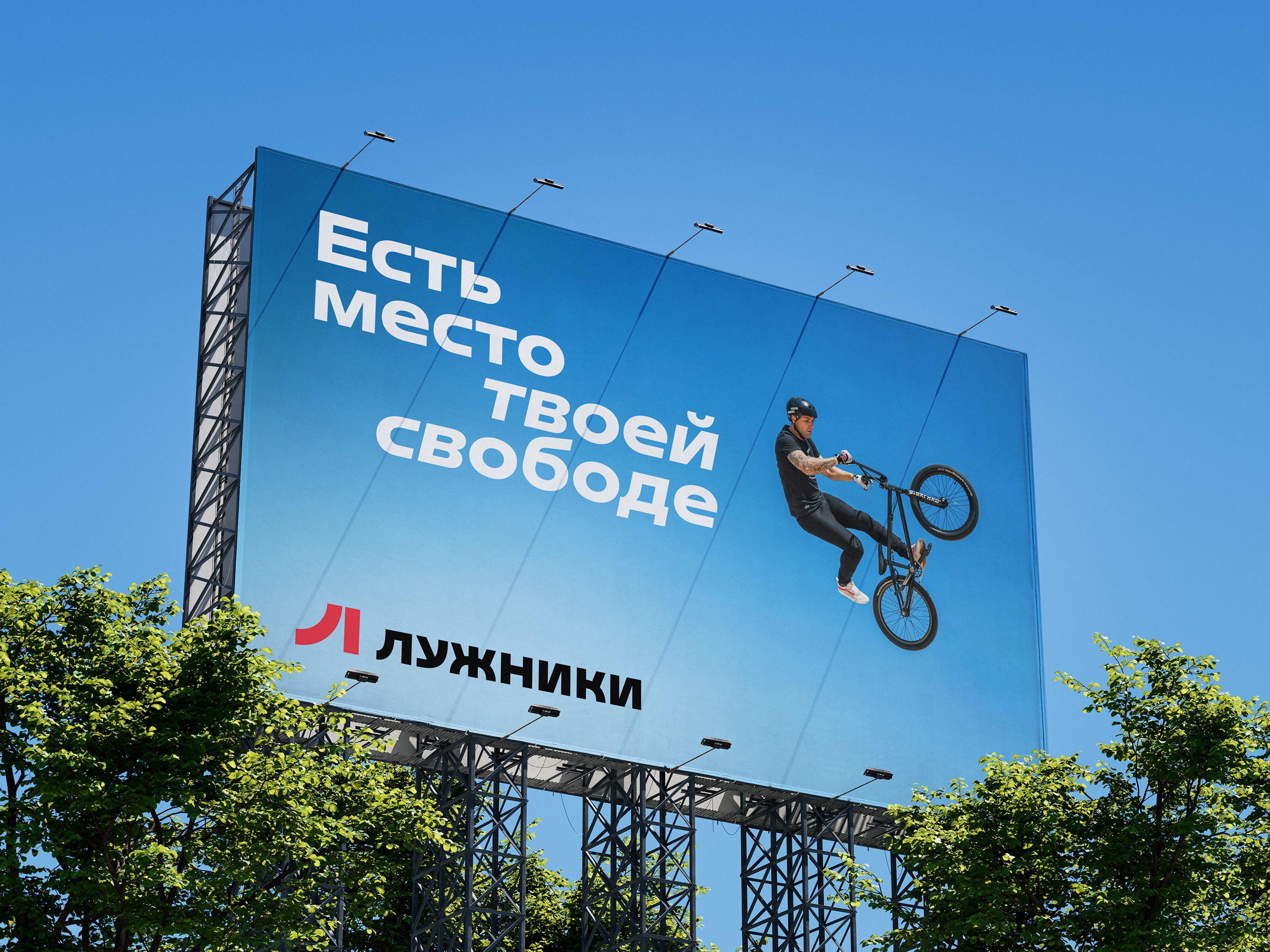

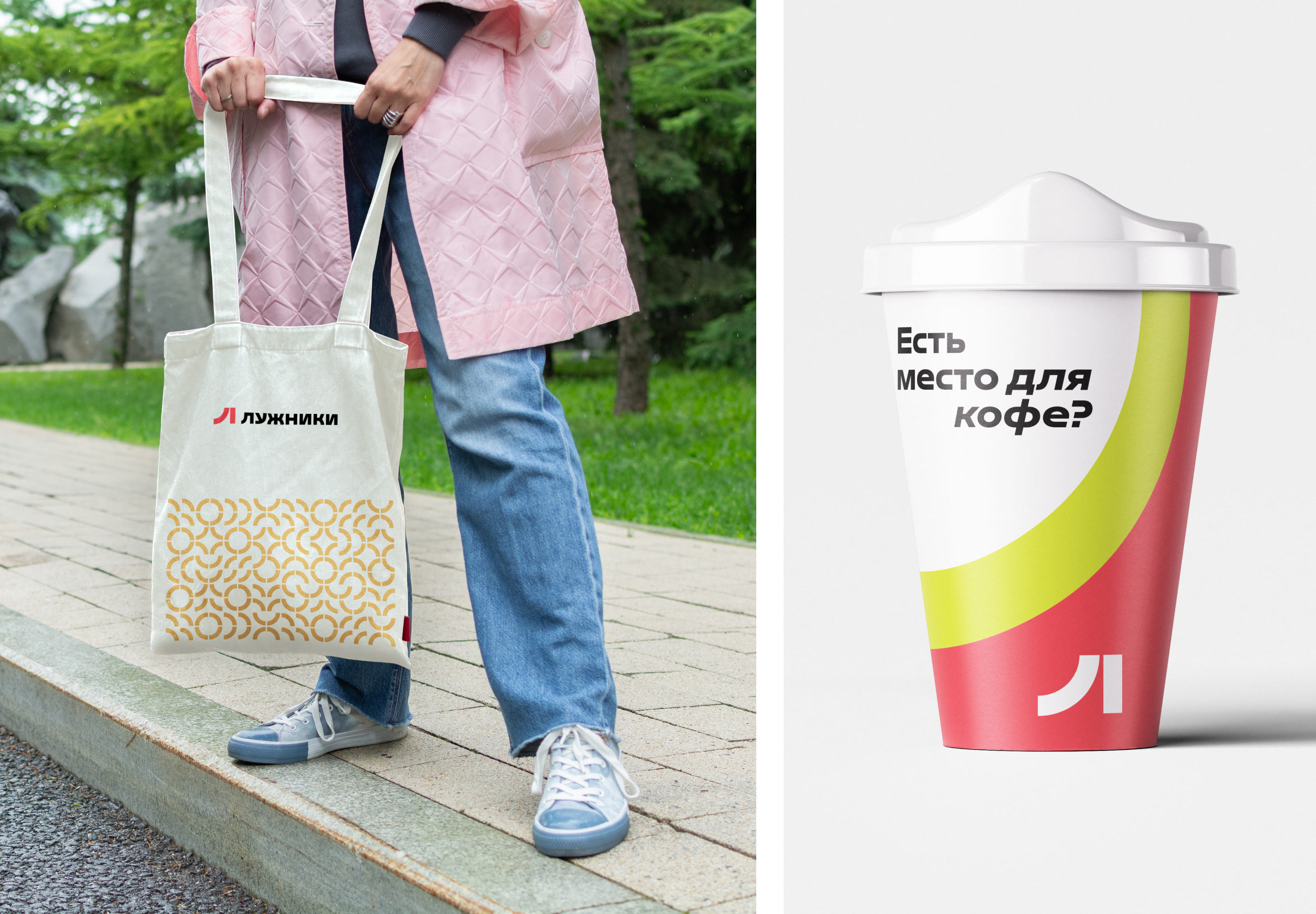
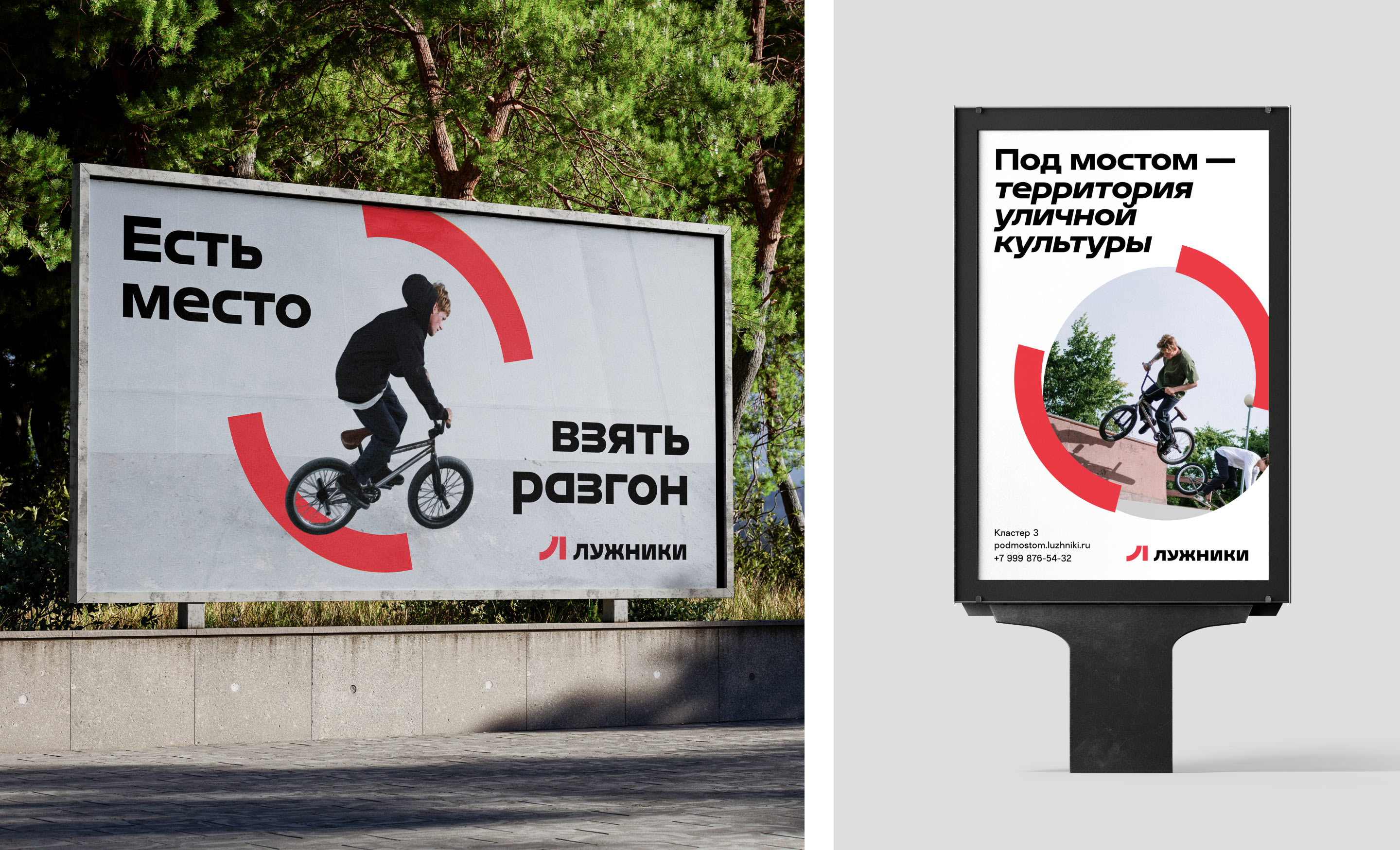
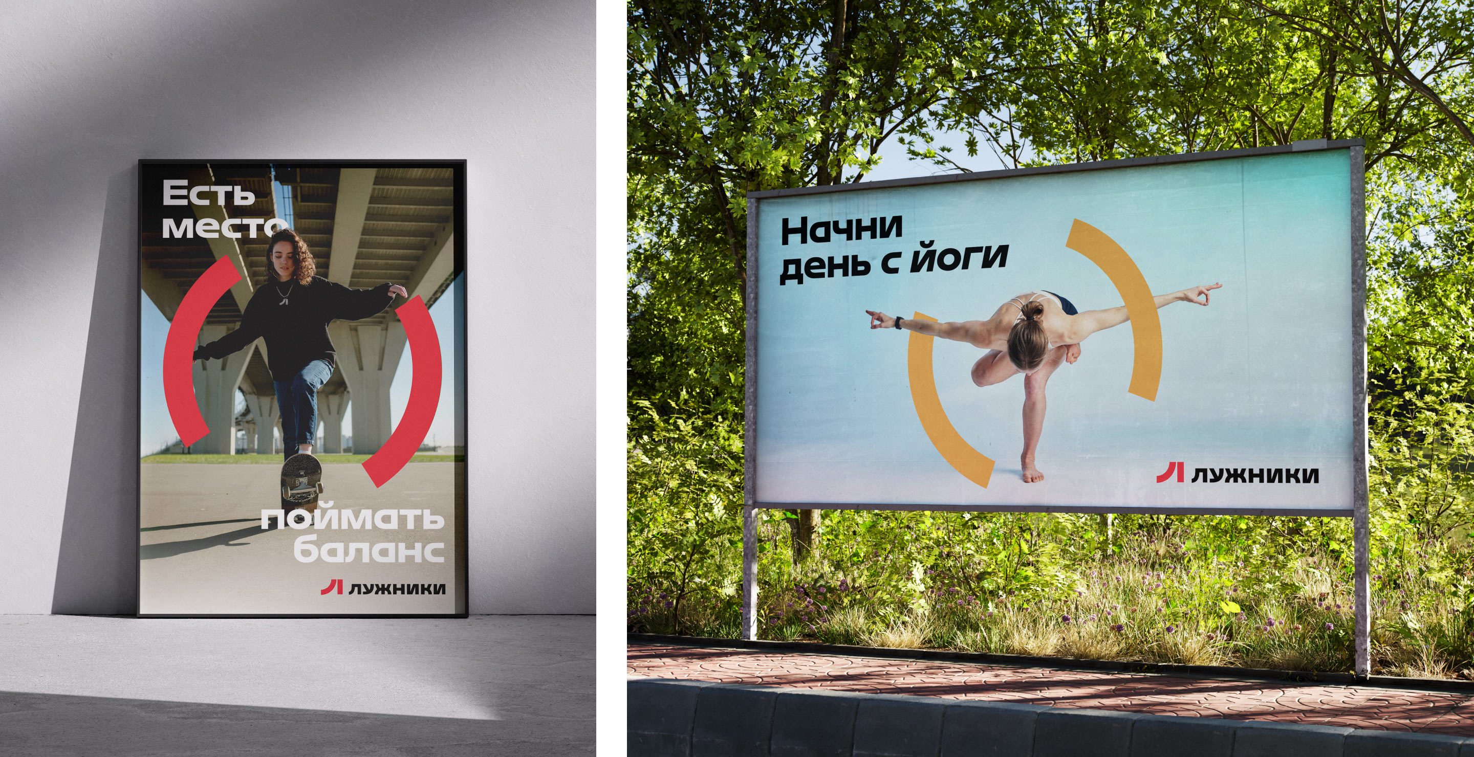
The arcs become the main signature element that focuses the viewer’s attention on different activities, helping to reveal the diversity of “Luzhniki.”
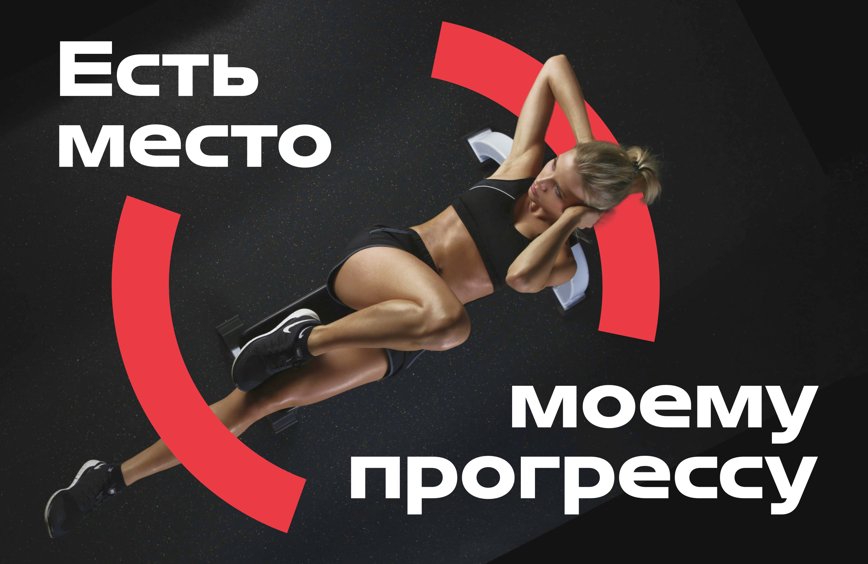
The combination of arcs, signature typography, and color palette creates a unique visual language.
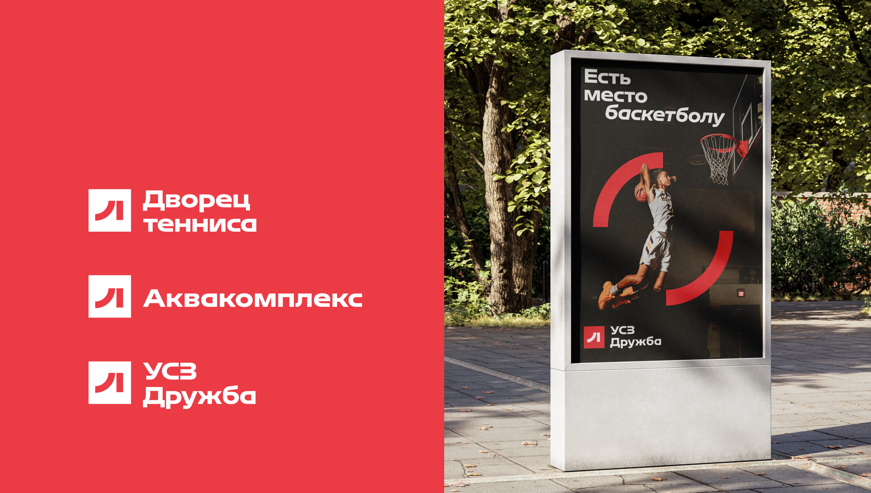
For each facility on the territory of the complex, a logo was created that supports the overall style.
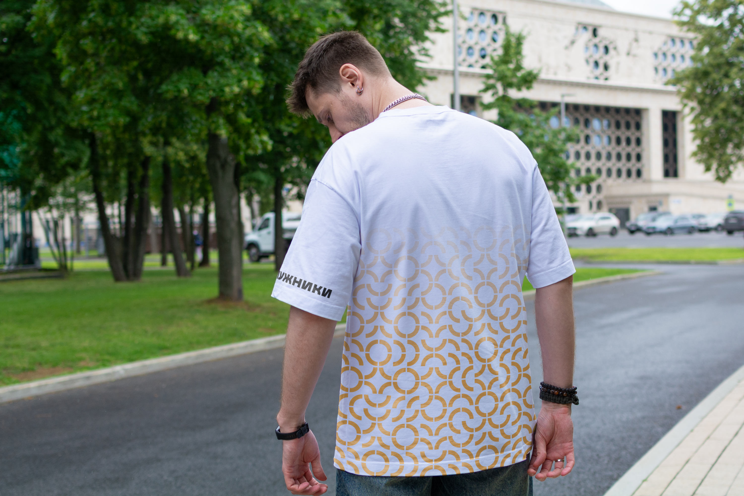
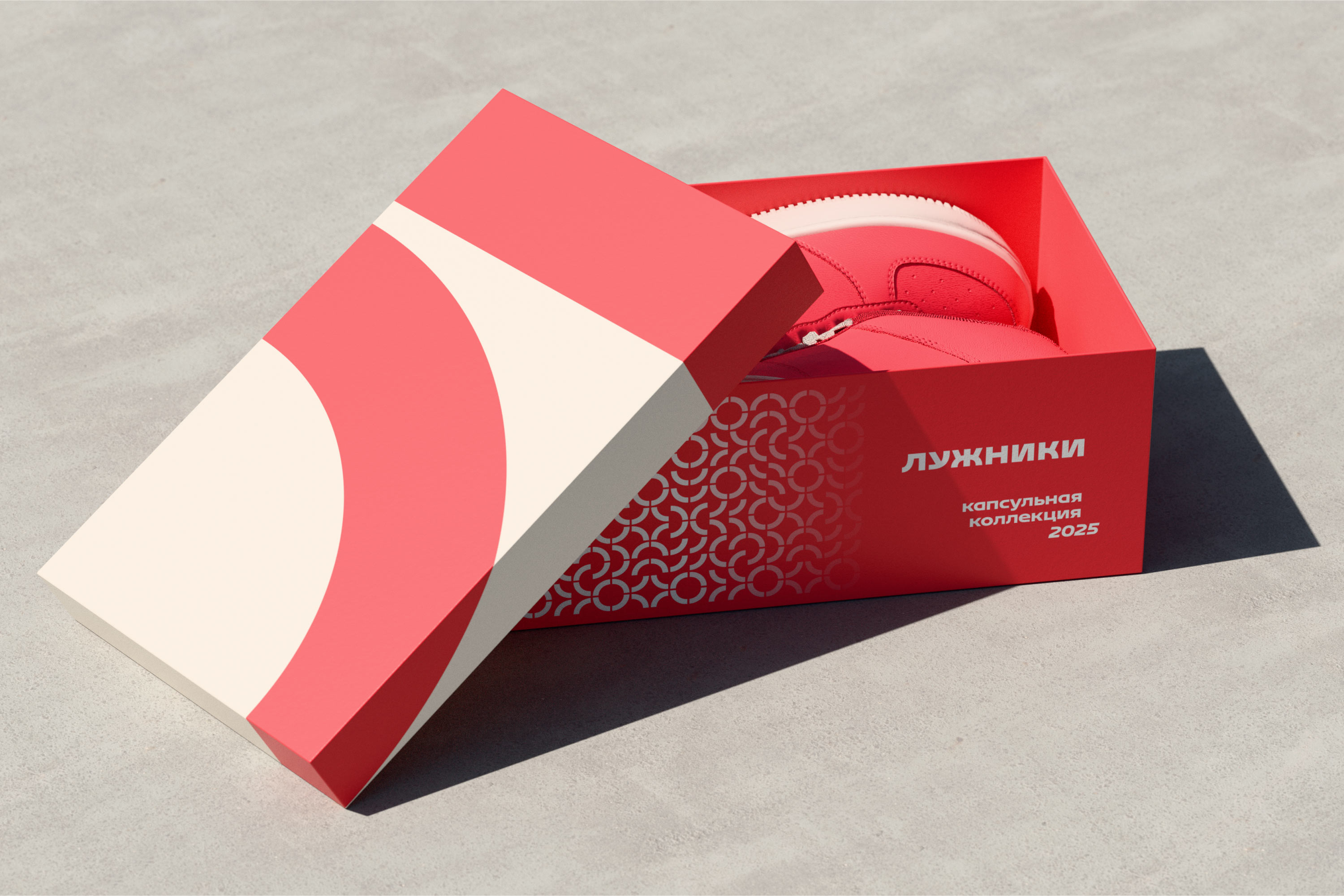
Another signature element formed by the arcs from the sign is an endless pattern.