After the FIFA World Cup, Luzhniki gradually turned from a specialized sports facility into a multifunctional area. Cultural events, exhibitions and festivals are held here, there are beauty studios and even an English kindergarten. For a multitude of diverse facilities, a maximally understandable navigation system is simply essential. That is exactly what was created in the studio.
Step 1. Functional division and color coding
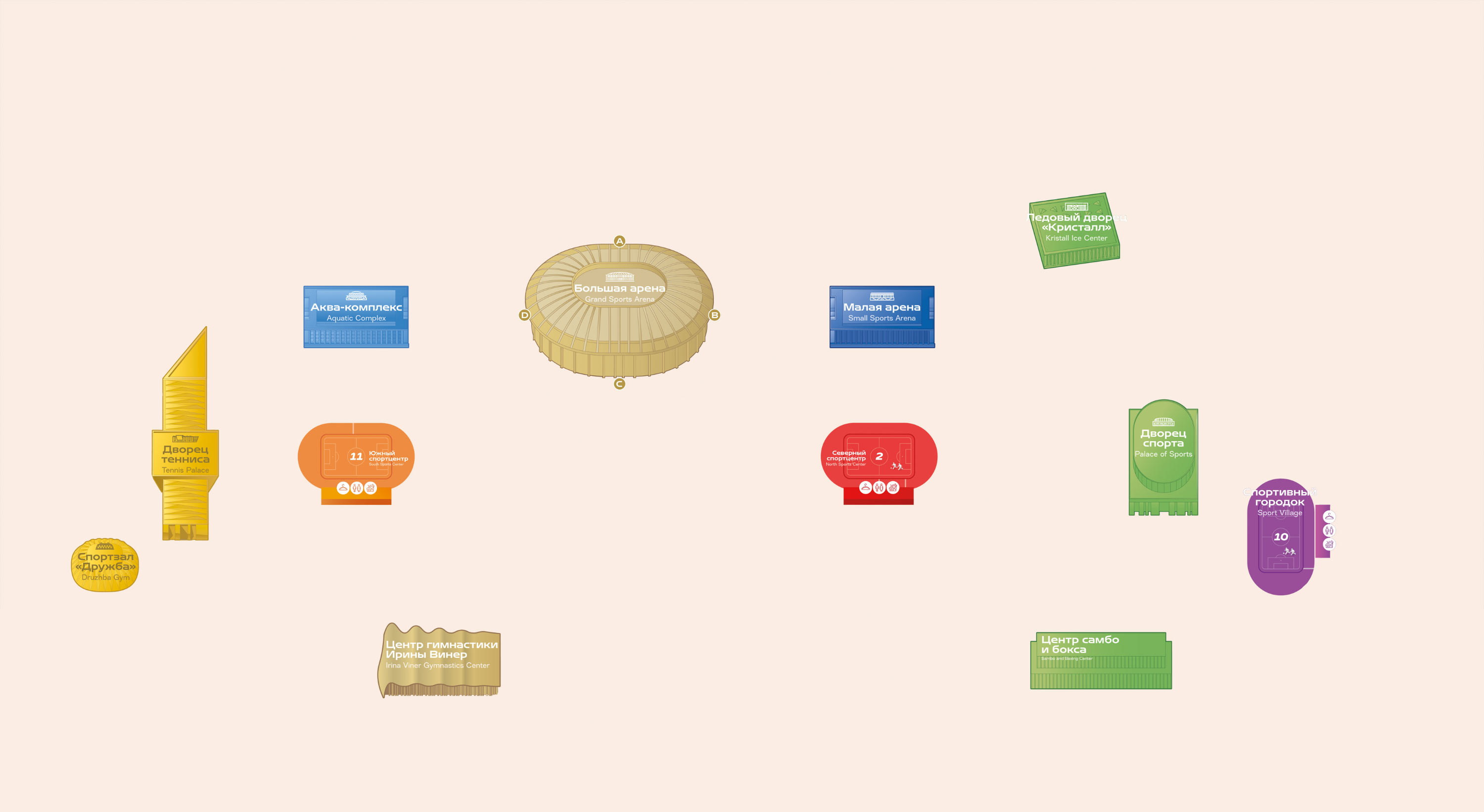
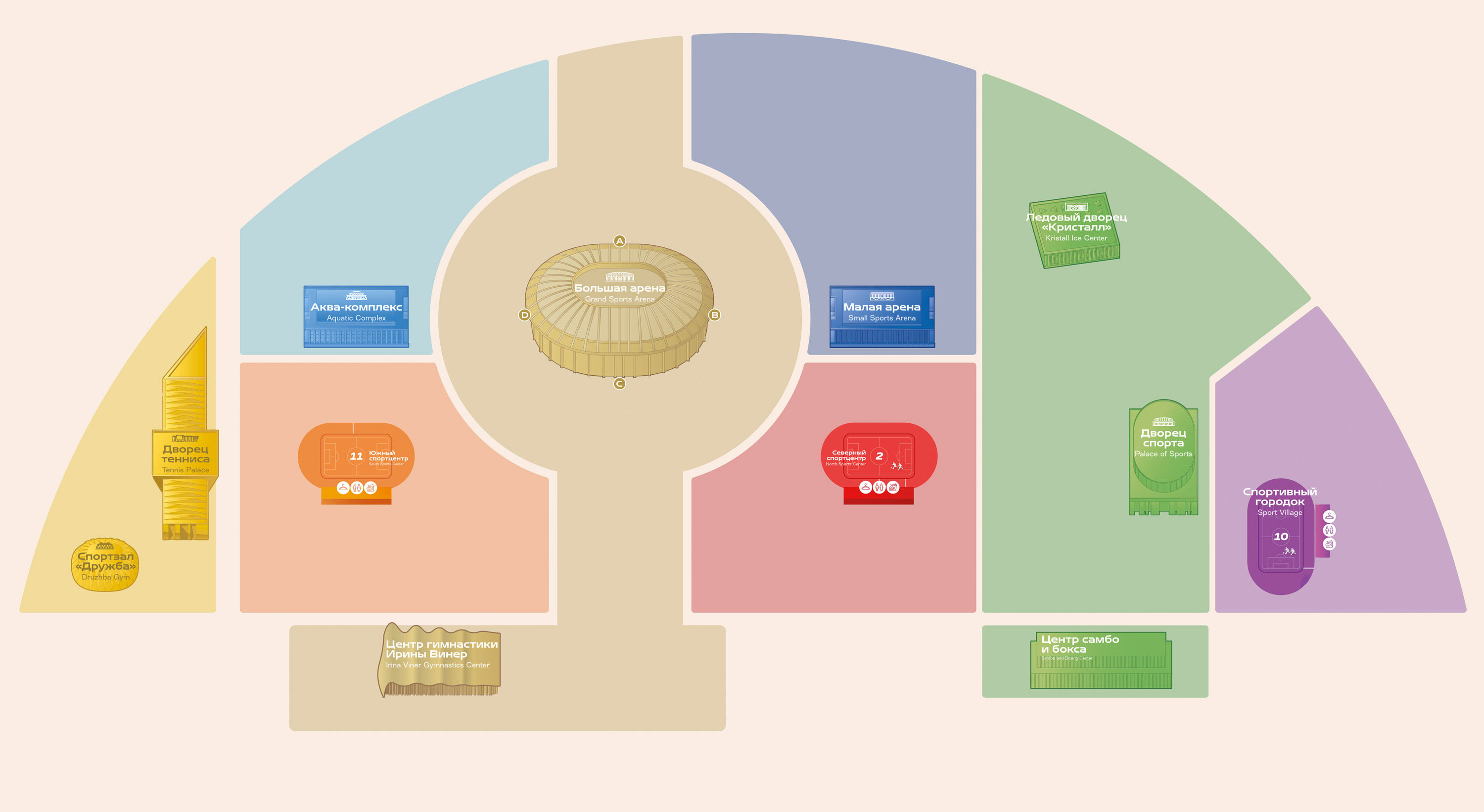
The new system helps to discover Luzhniki piece by piece. The entire area is divided into large clusters: car and pedestrian routes serve as natural boundaries for them. On the general map it is clear that the clusters are formed around the most significant facilities of the complex.

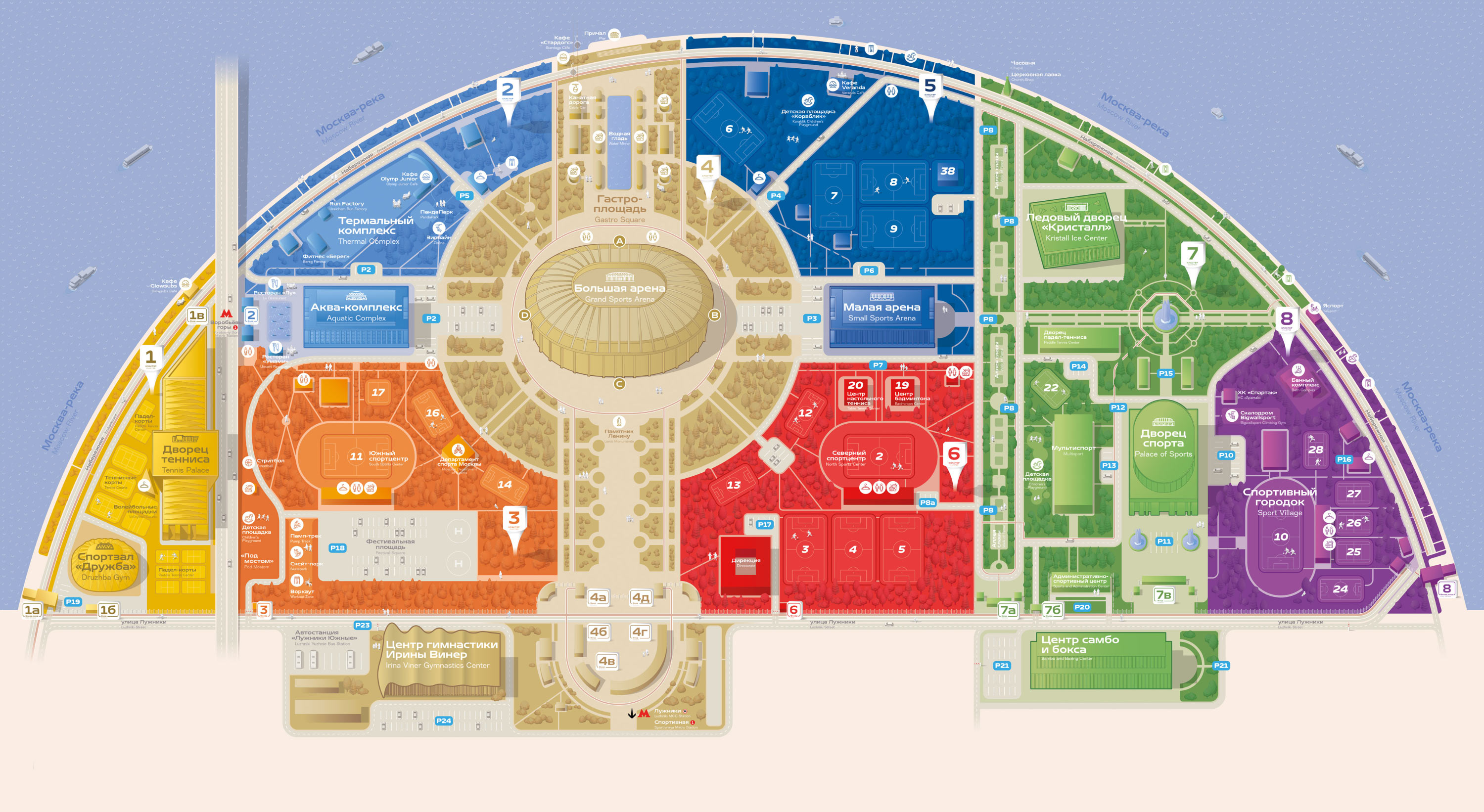
The numbering of entrances and driveways follows the cluster division. The numerical designation of an entrance coincides with the designation of the cluster. When there are several entrances, letters are added to the numbers.
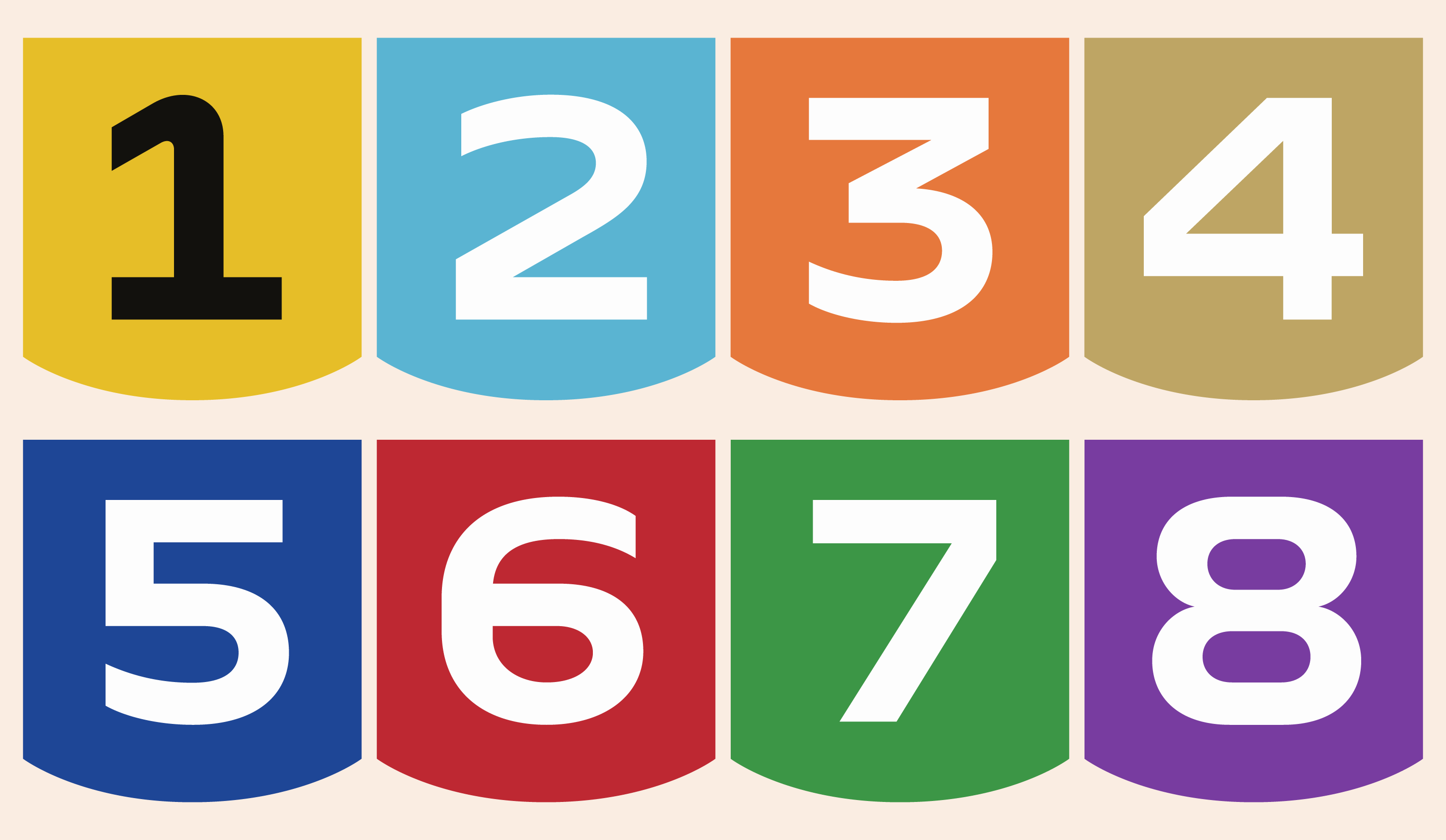
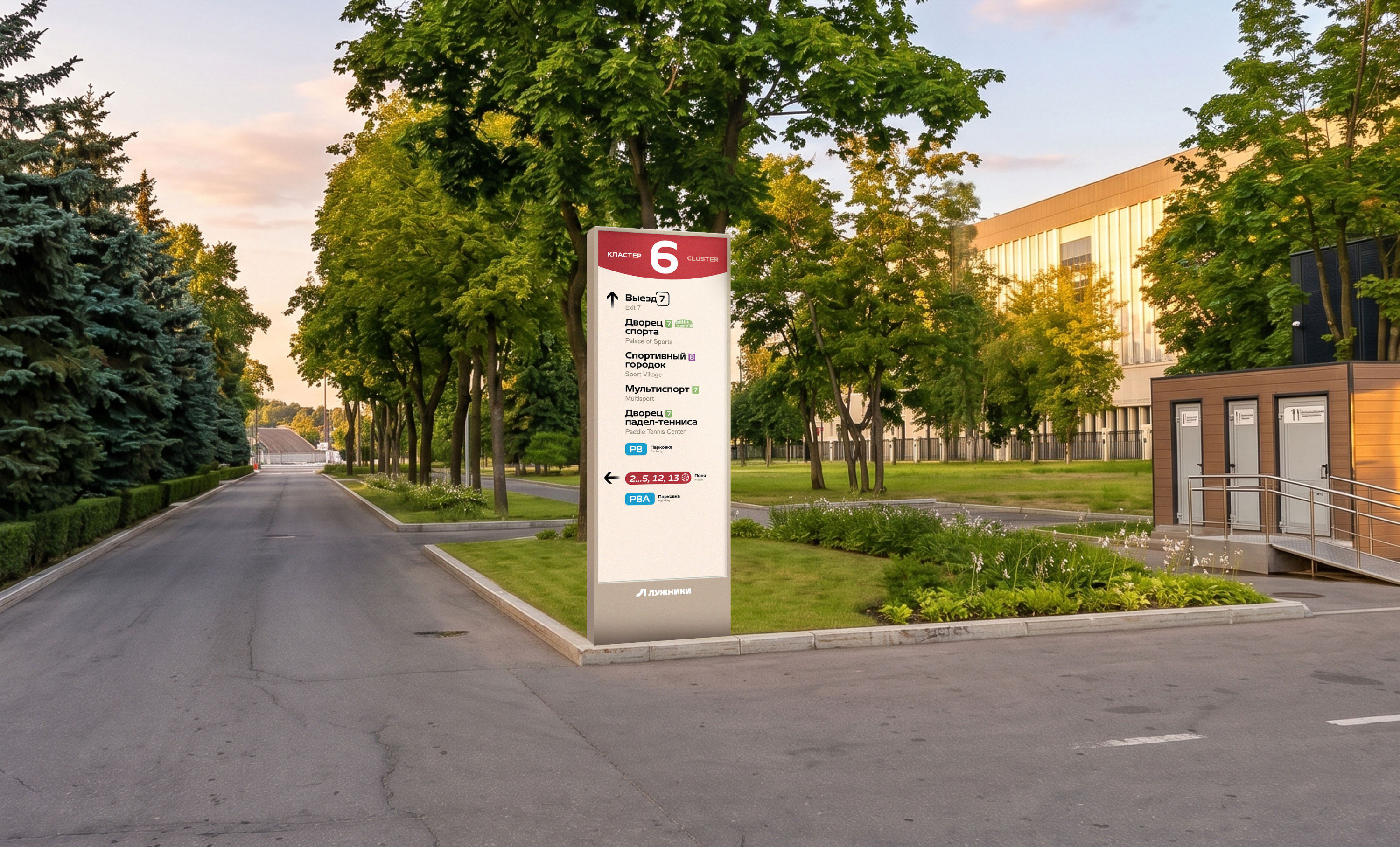
The header colors of navigation media in each cluster are different.
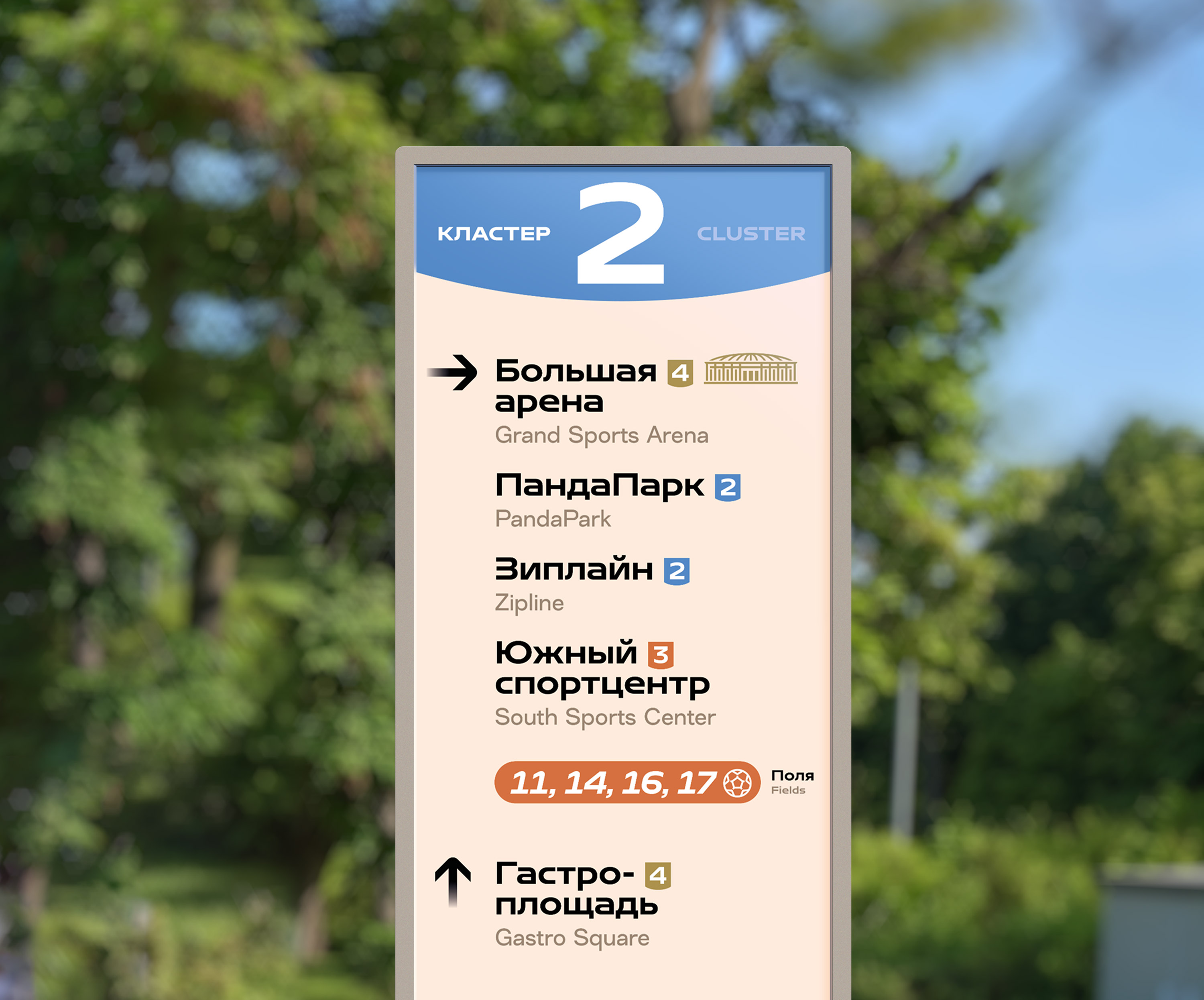
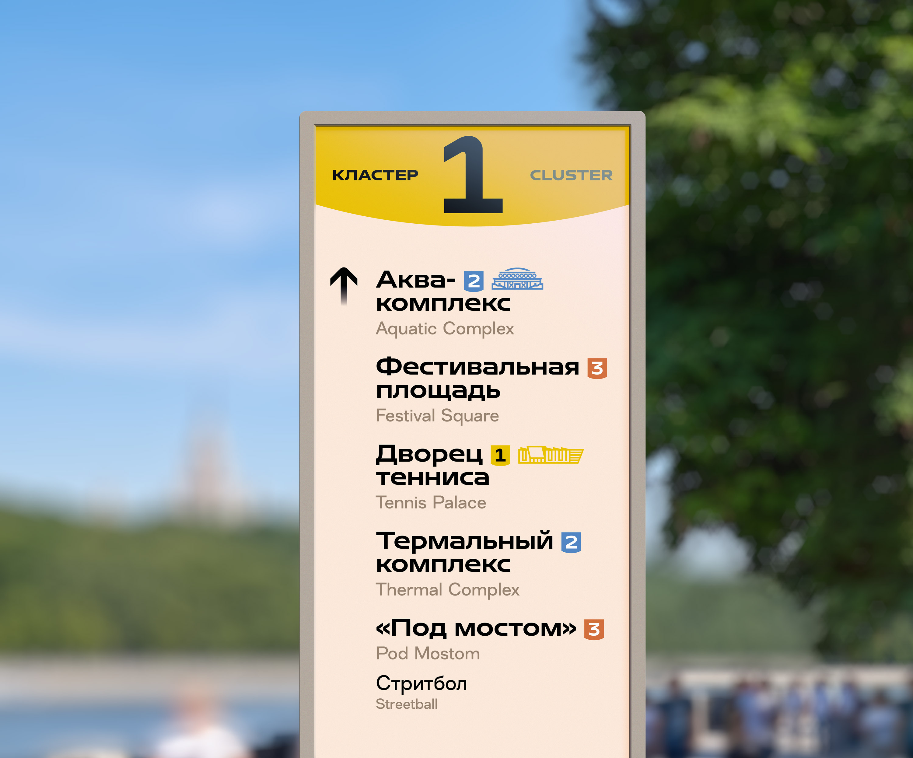
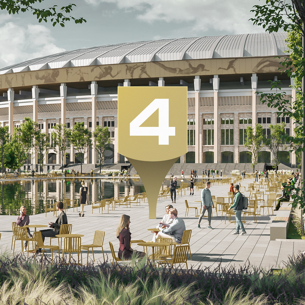
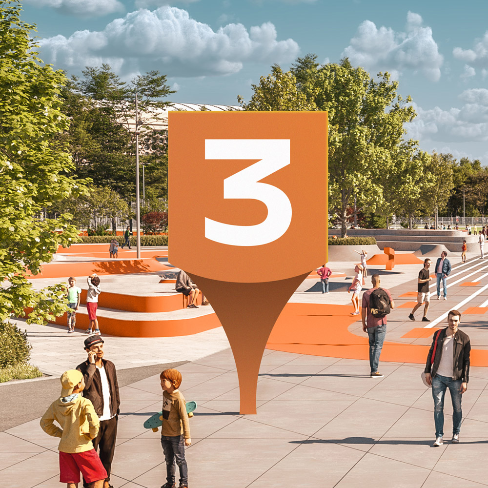
Landscaping elements are also painted in the corporate color of the cluster.
Step 2. Distribution of facilities by levels
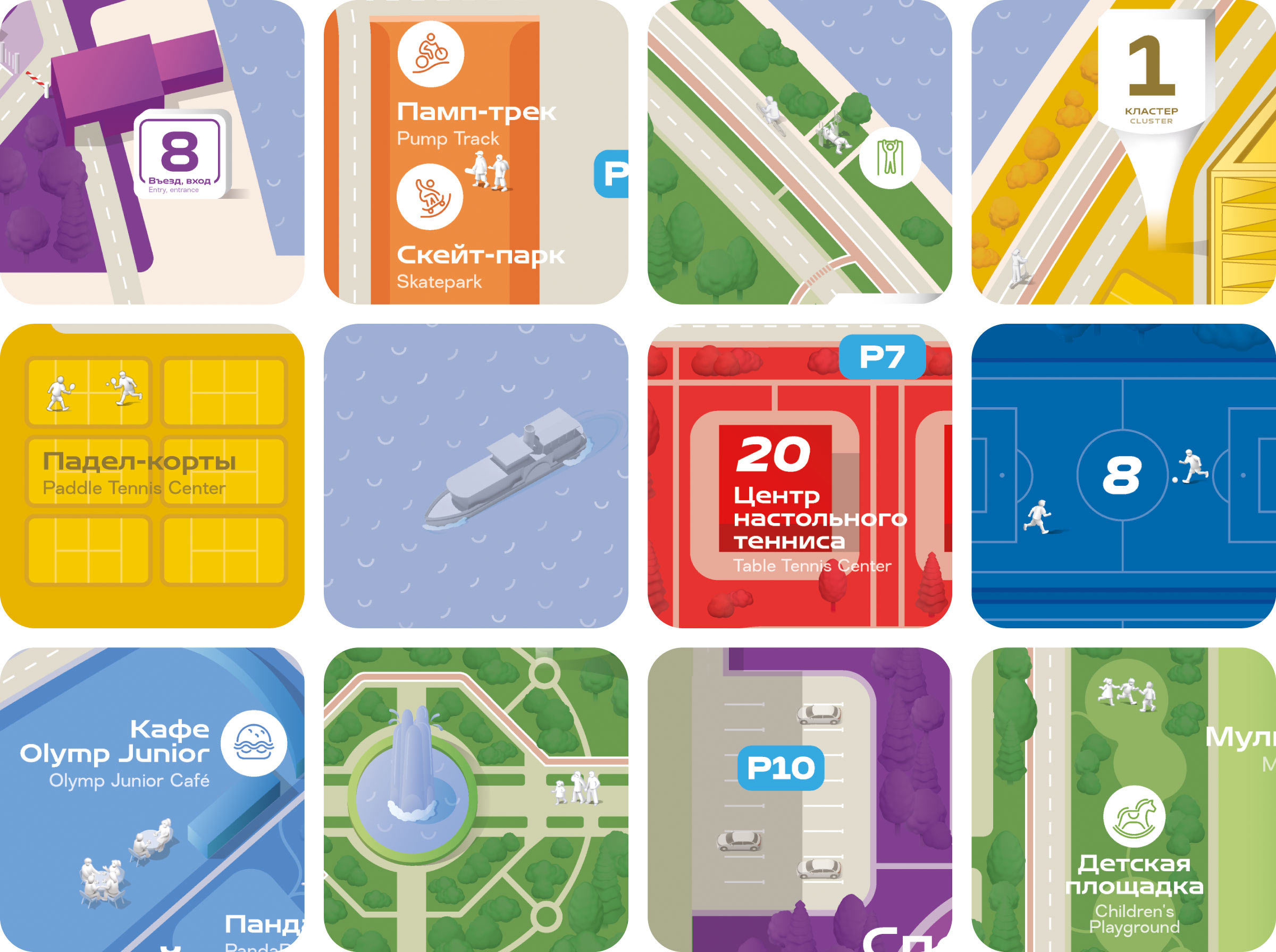
What is shown on a sign depends on the significance level of the facility. The largest of them are drawn in great detail.
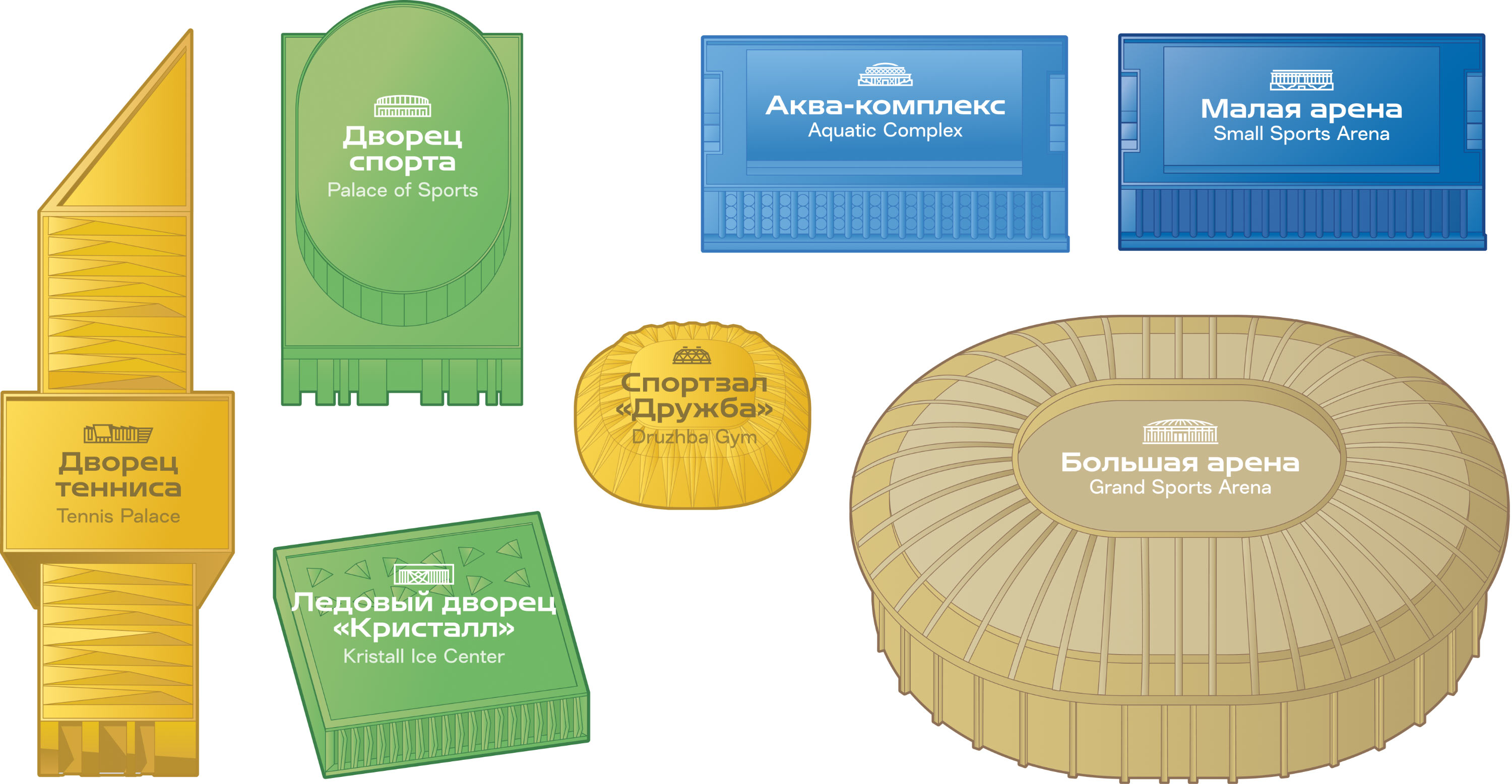
On the signs such designations are colored in the cluster’s color and are recognized instantly.

Smaller facilities are provided with pictograms.

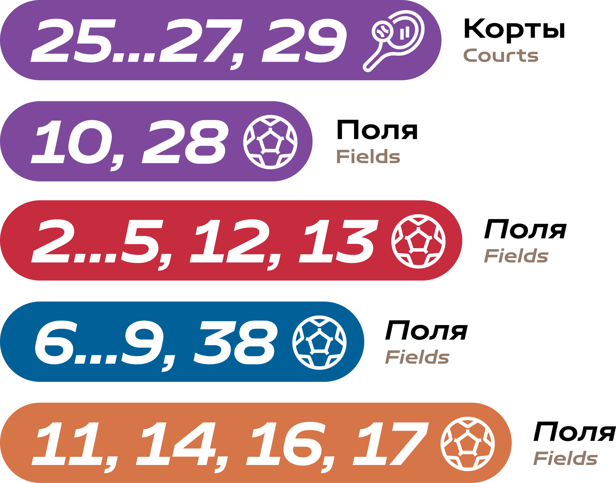
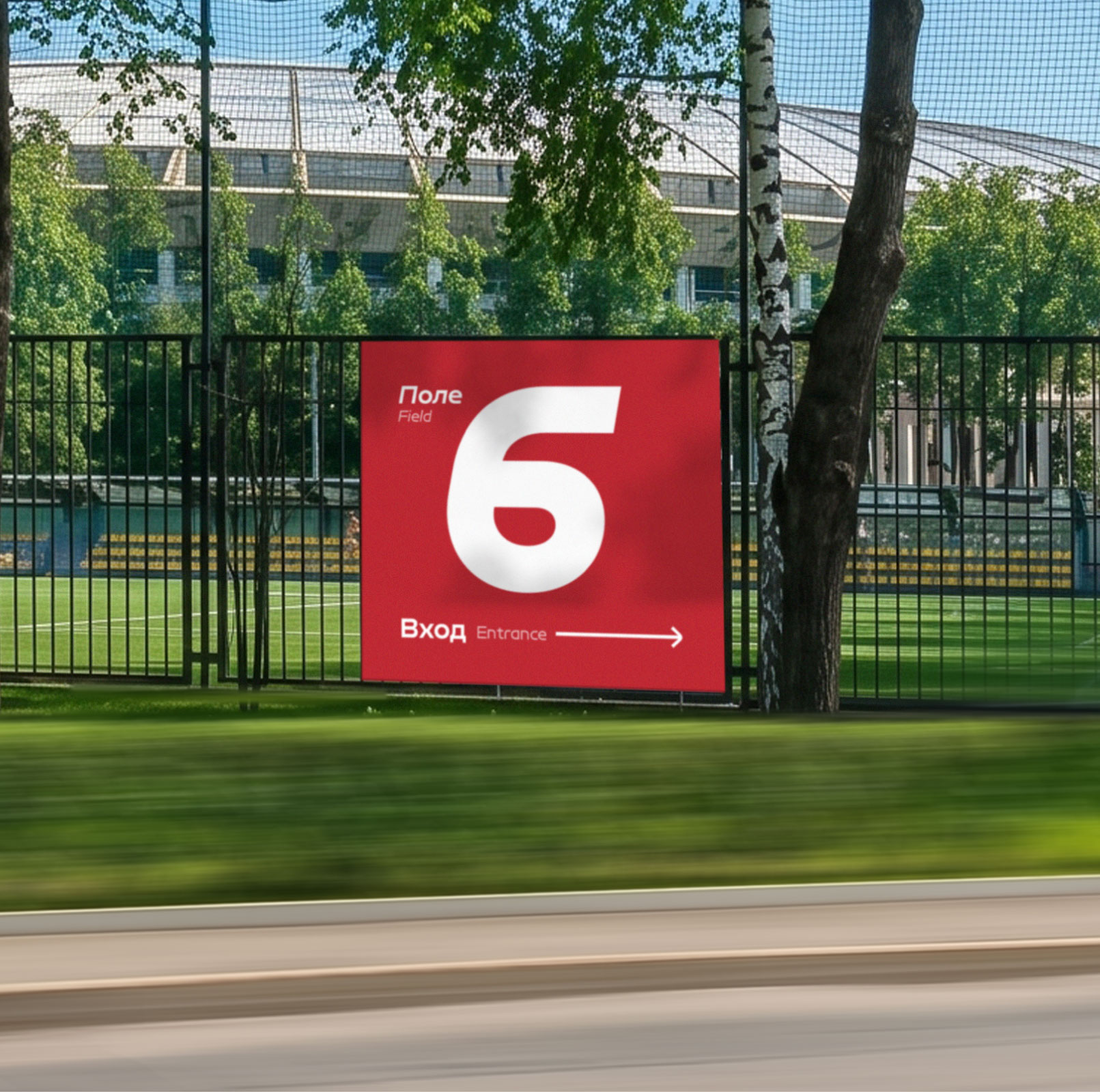
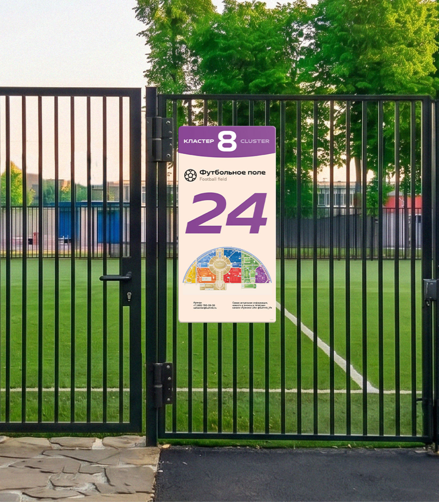
Football fields and courts are highlighted with colored panels and labeled in italics.
Step 3. Defining user scenarios
Ideal navigation covers all user needs. Having identified the most popular requests, we compiled several user scenarios. They depend on the type of visit.
Targeted visit
For successful search of a target facility, step-by-step detailing of information is needed. The visitor sees the general plan of the area, understands how it is divided, and reaches the desired cluster. There he finds a stele with a map of the cluster—and so on, more and more in detail, right up to indicating the required entrance. The differences between facilities and services at different levels become obvious.
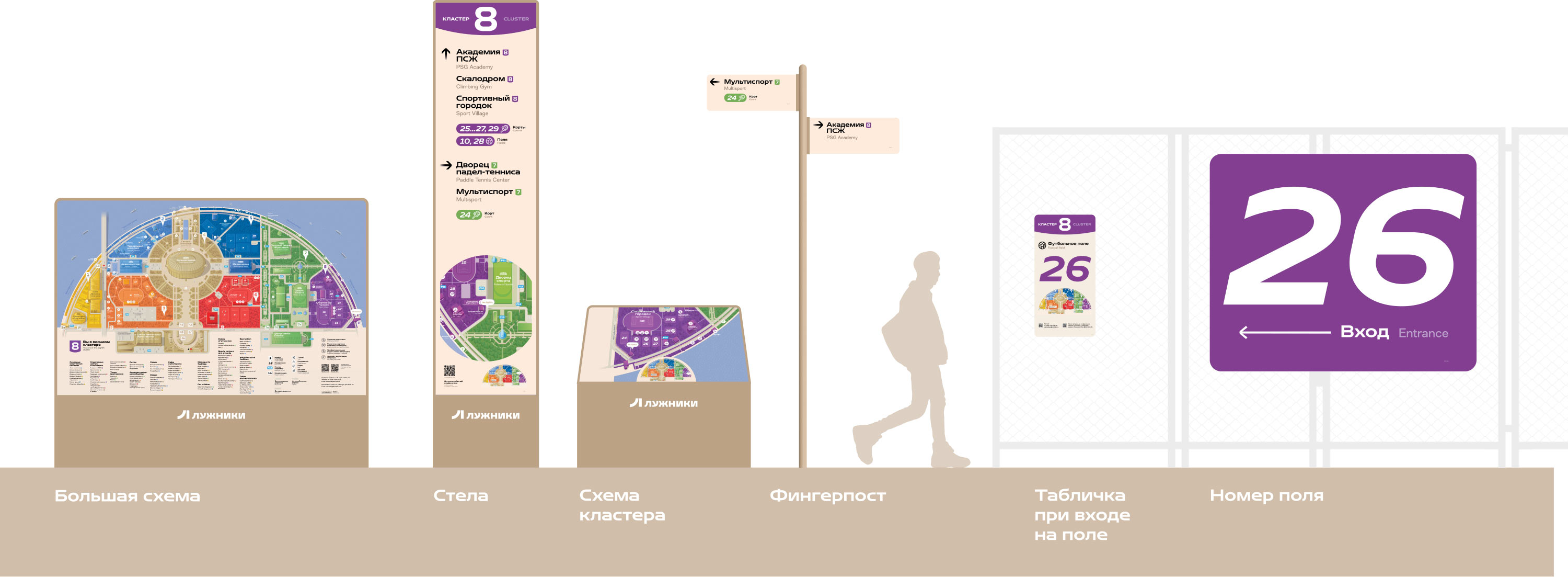
Large map
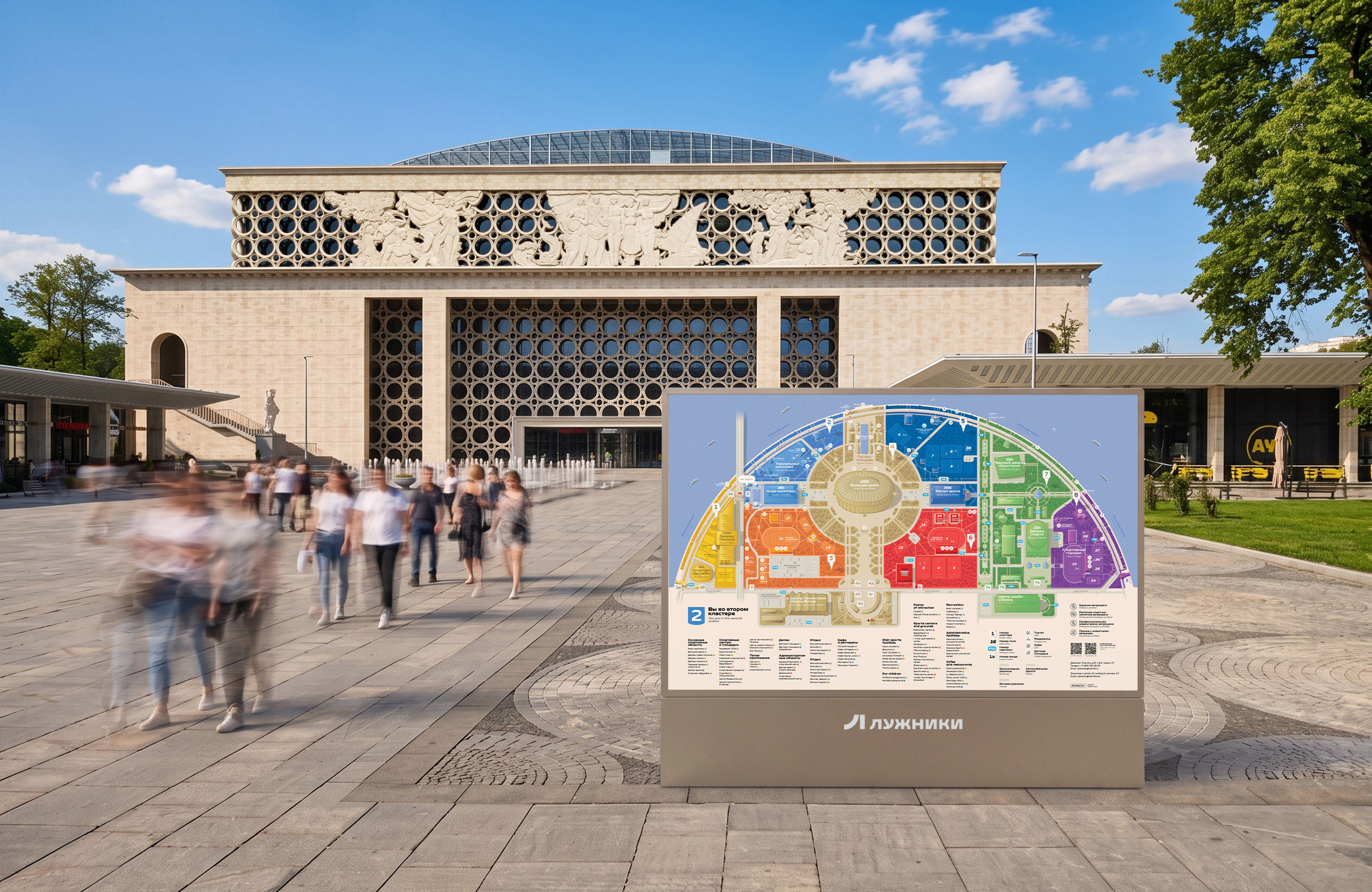
The main purpose of the large map is to help better understand the layout of the area and plan a route.
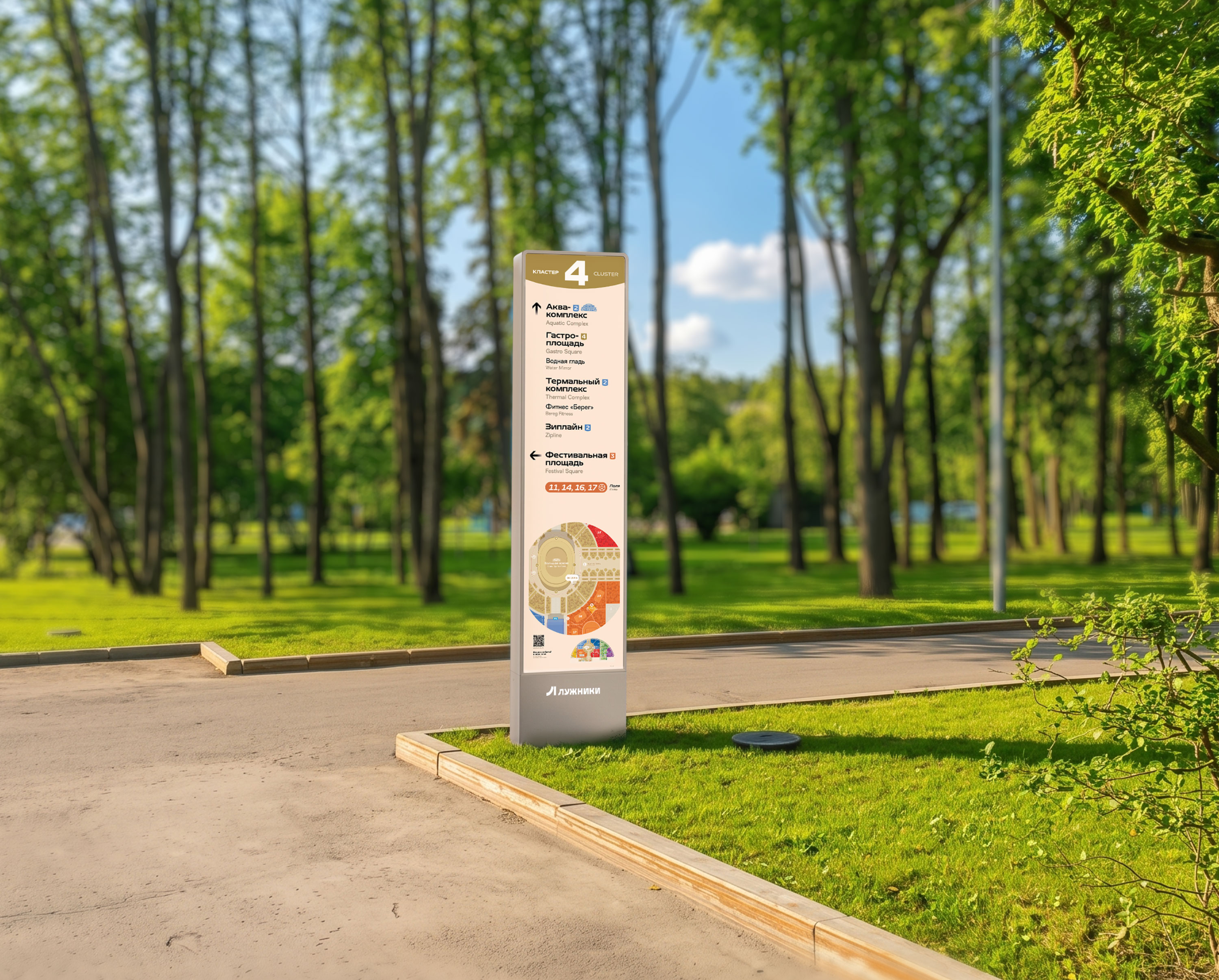
Steles
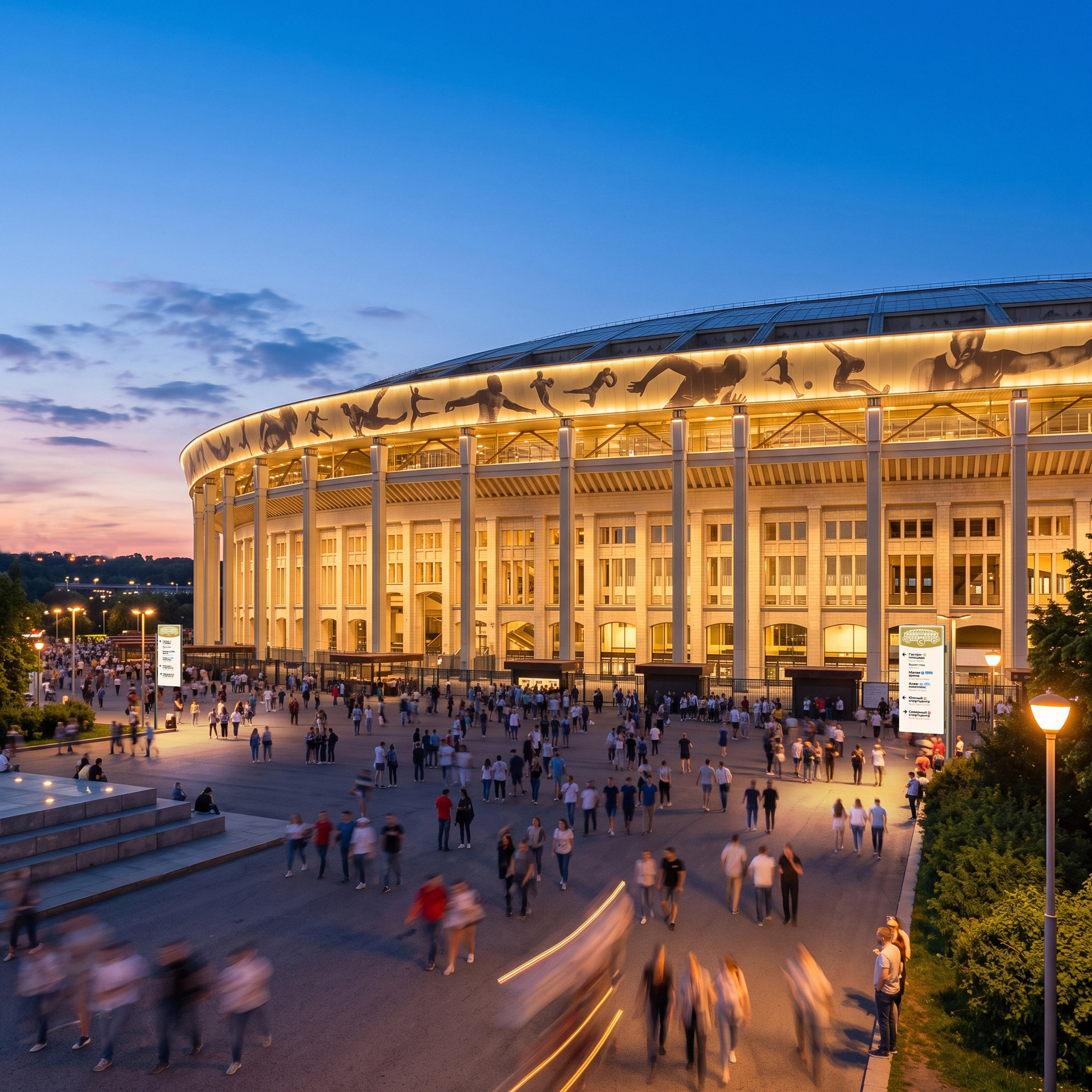
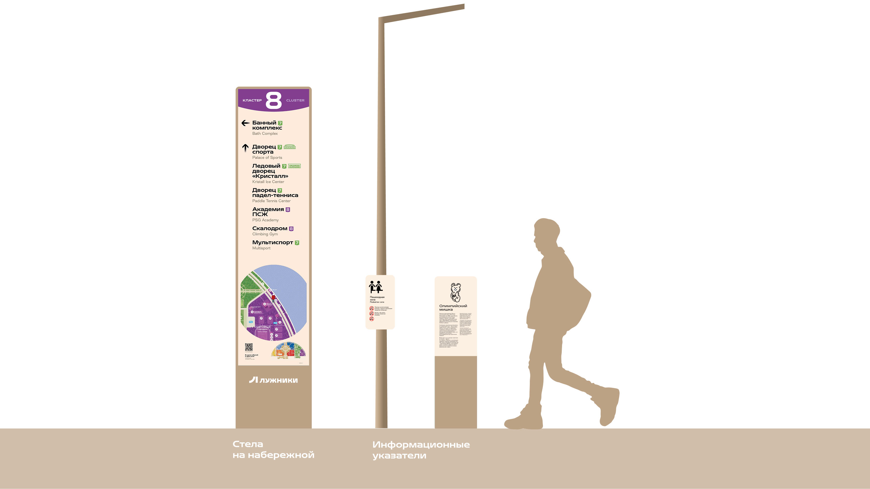
Steles are placed at major junctions—right where visitors decide where to move next.
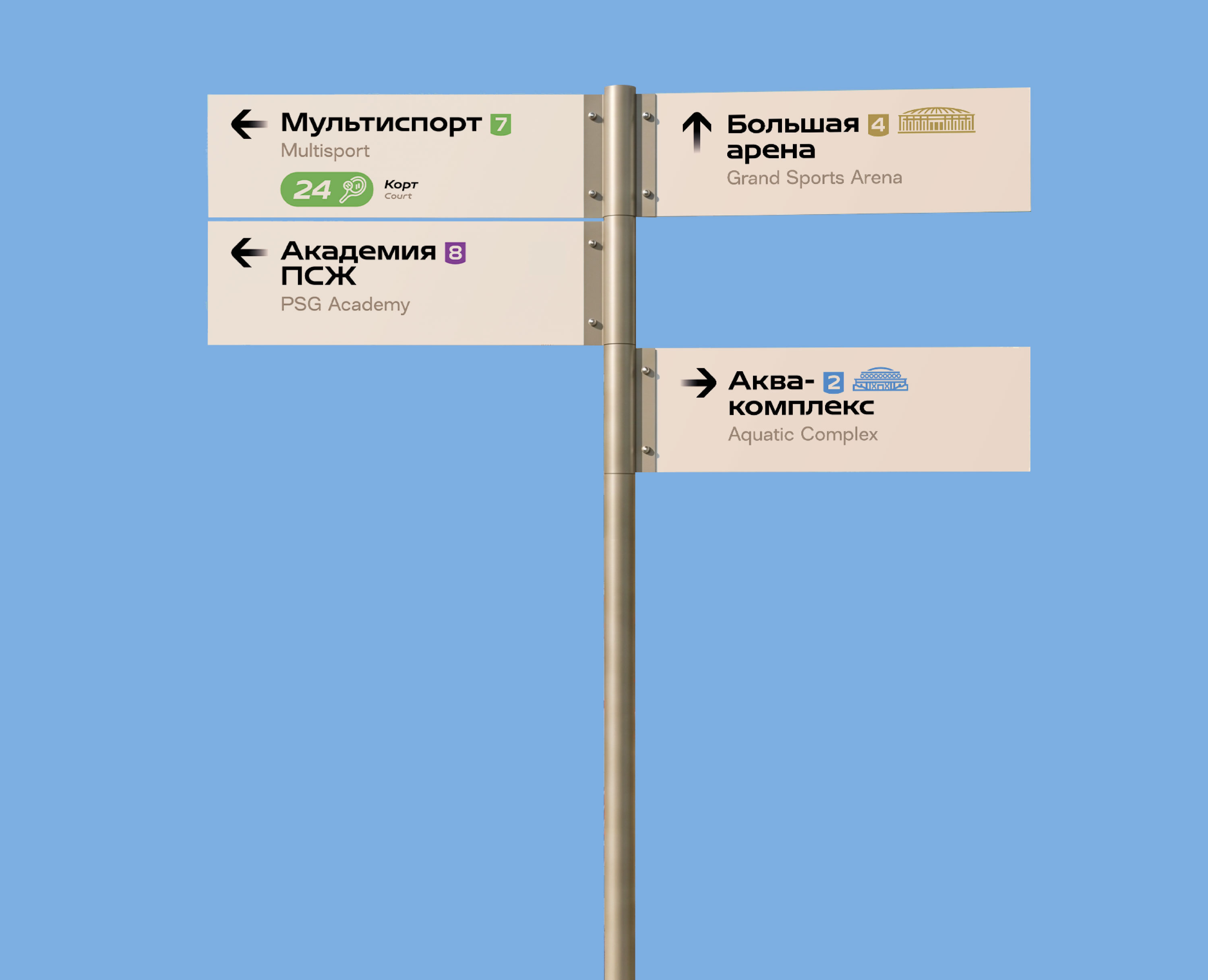
Fingerposts
At smaller junctions fingerposts are installed.
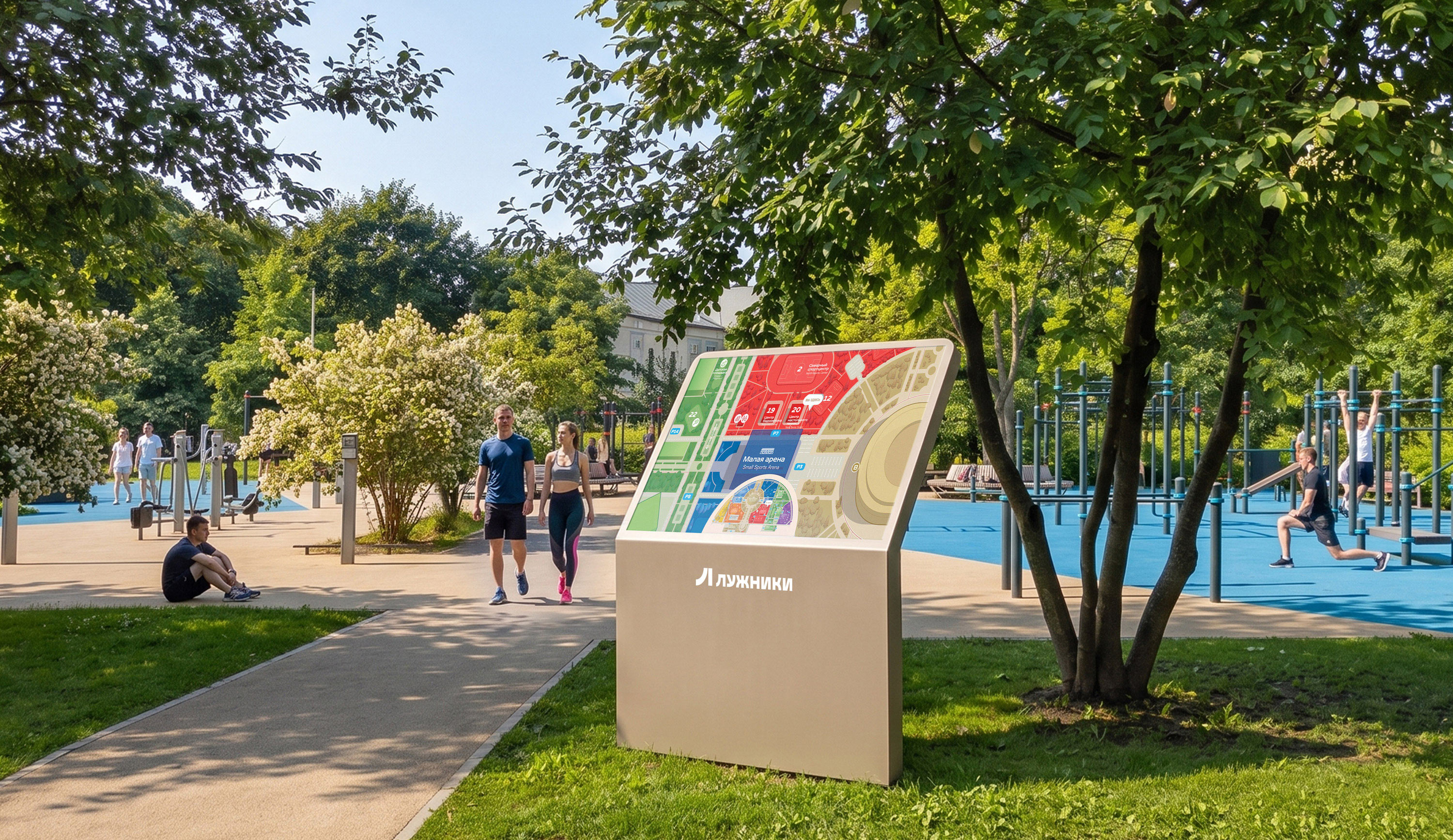
Cluster maps
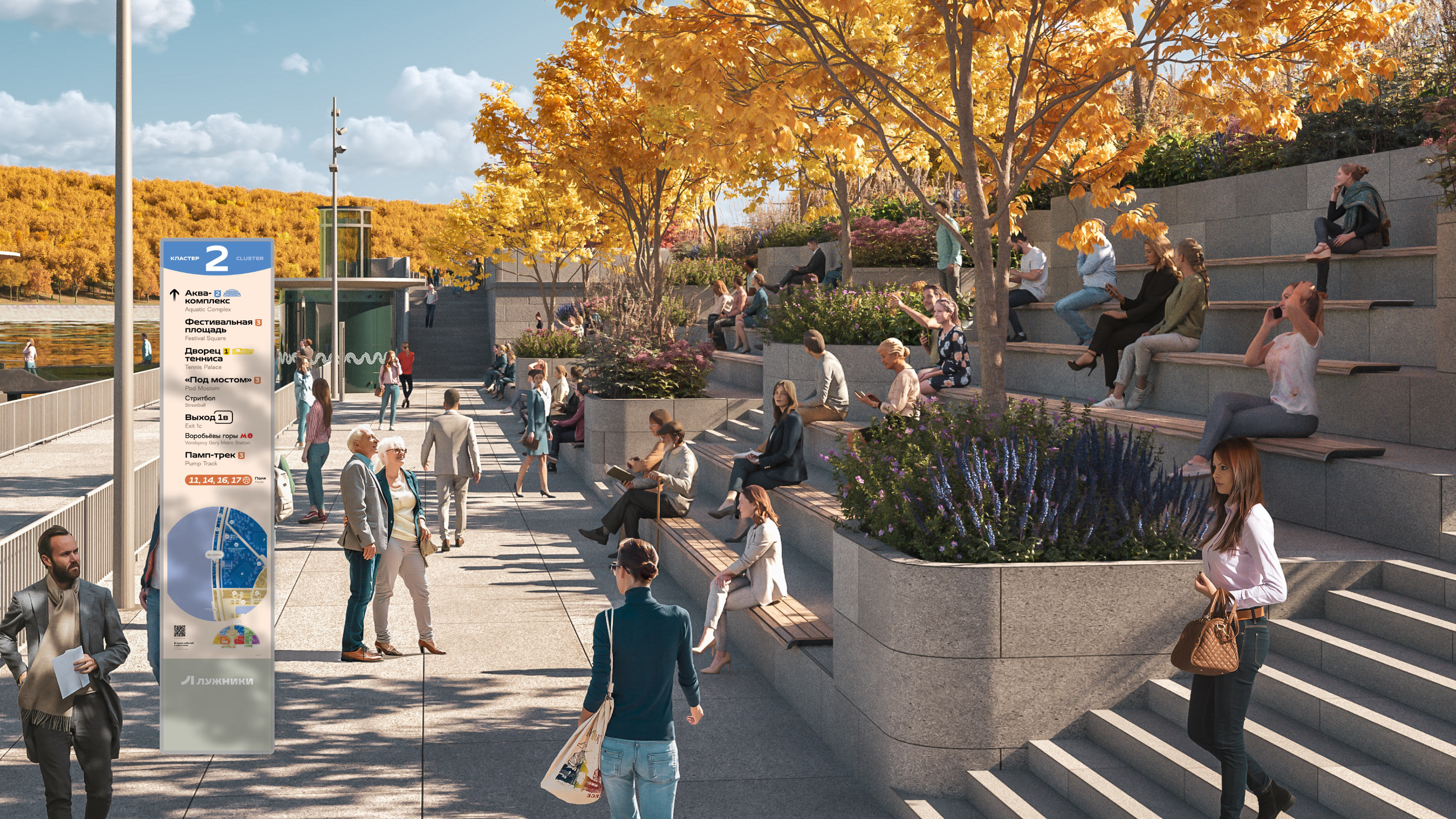
At the entrance to a cluster the visitor sees its enlarged map.
Facility numbers
And directly in front of the facility there is a plaque with its designation. For sports fields, these are numbers and small maps.
Mass visit
During major events crowds of people literally flock to Luzhniki. In such cases flags are necessary. For better visibility they are fixed well above human height and contain information presented in the simplest possible form.
Walk around Luzhniki
For those who prefer a leisurely walk through the surrounding parks, unobtrusive information signs are installed throughout the complex.
Visit by car
Large signs at entrances and junctions instantly orient drivers in the area and solve the problem of potential traffic jams.
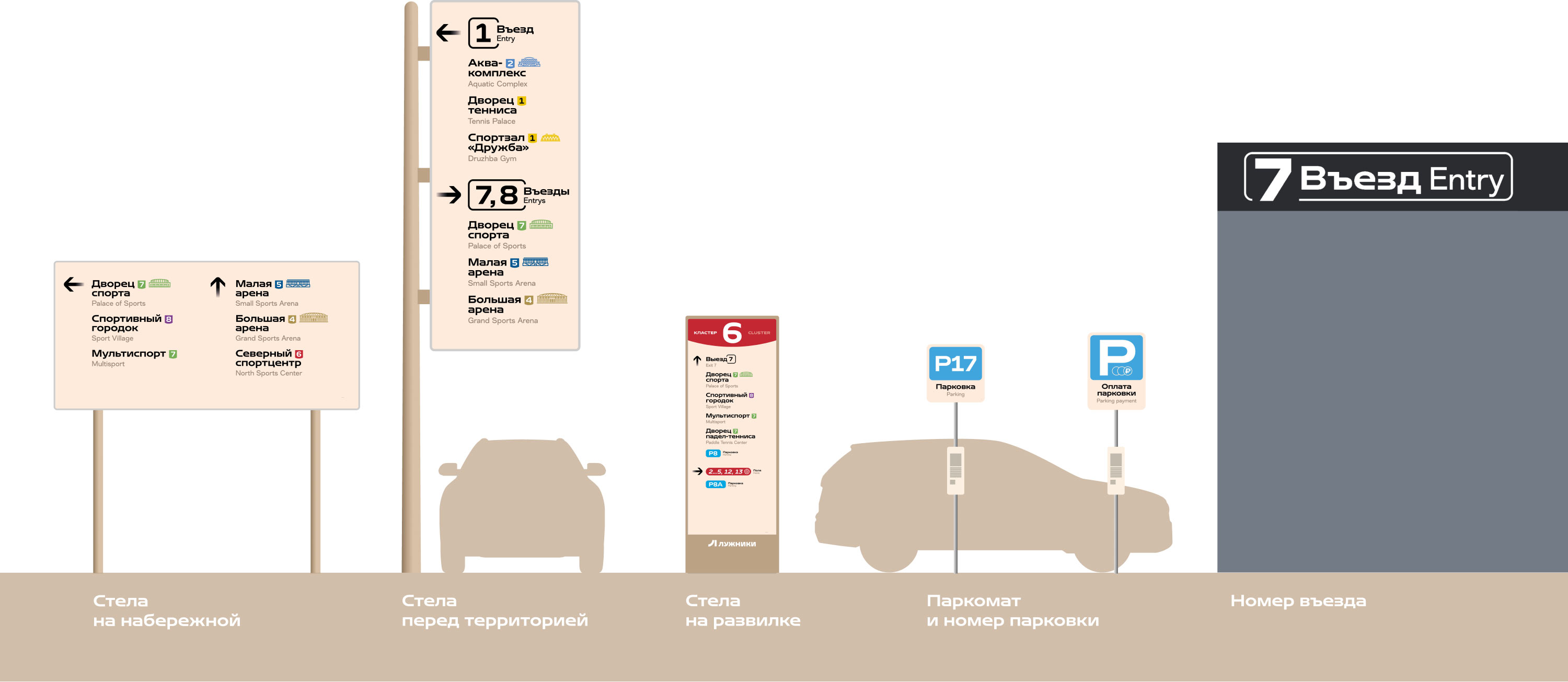
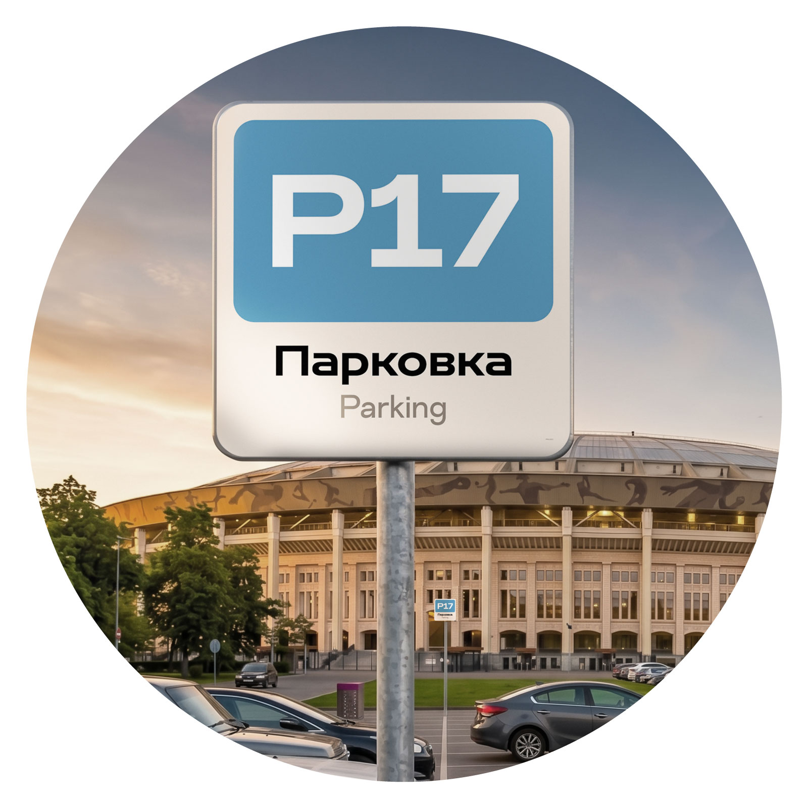
Dedicated large markings were created for parking spaces.
Jogging and cycling
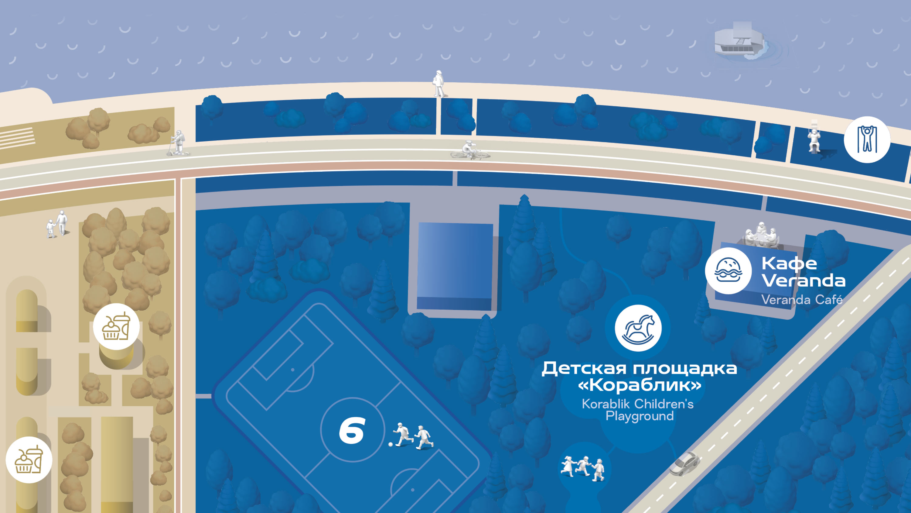
The jogging track and cycling route are marked on the map with bold lines and highlighted in different colors.
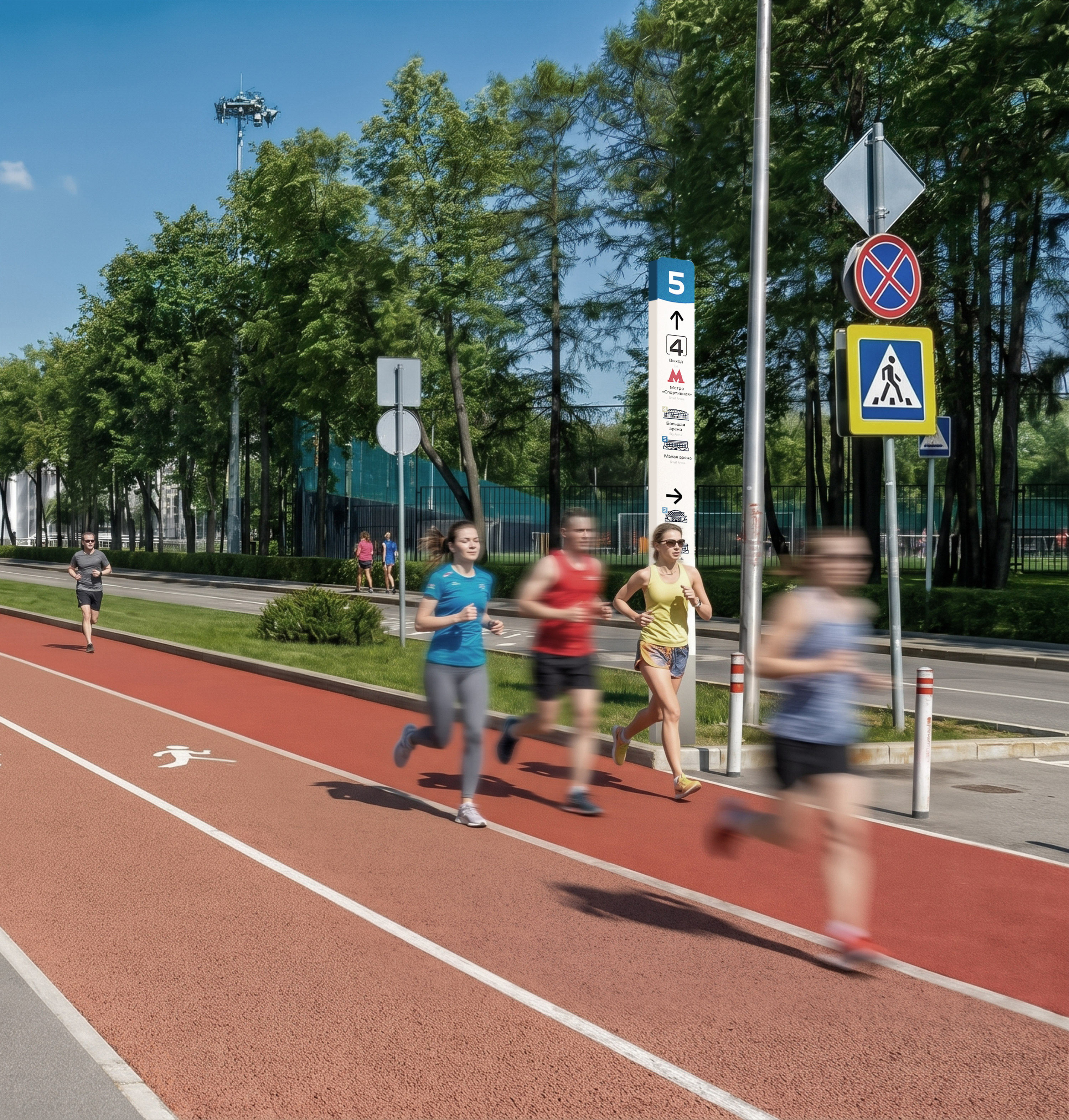
Along the entire length of the tracks, narrow signs are placed that tell the runner the main things: the cluster number and the location of the nearest facilities with labels. Text here is kept to a minimum.
Special situations
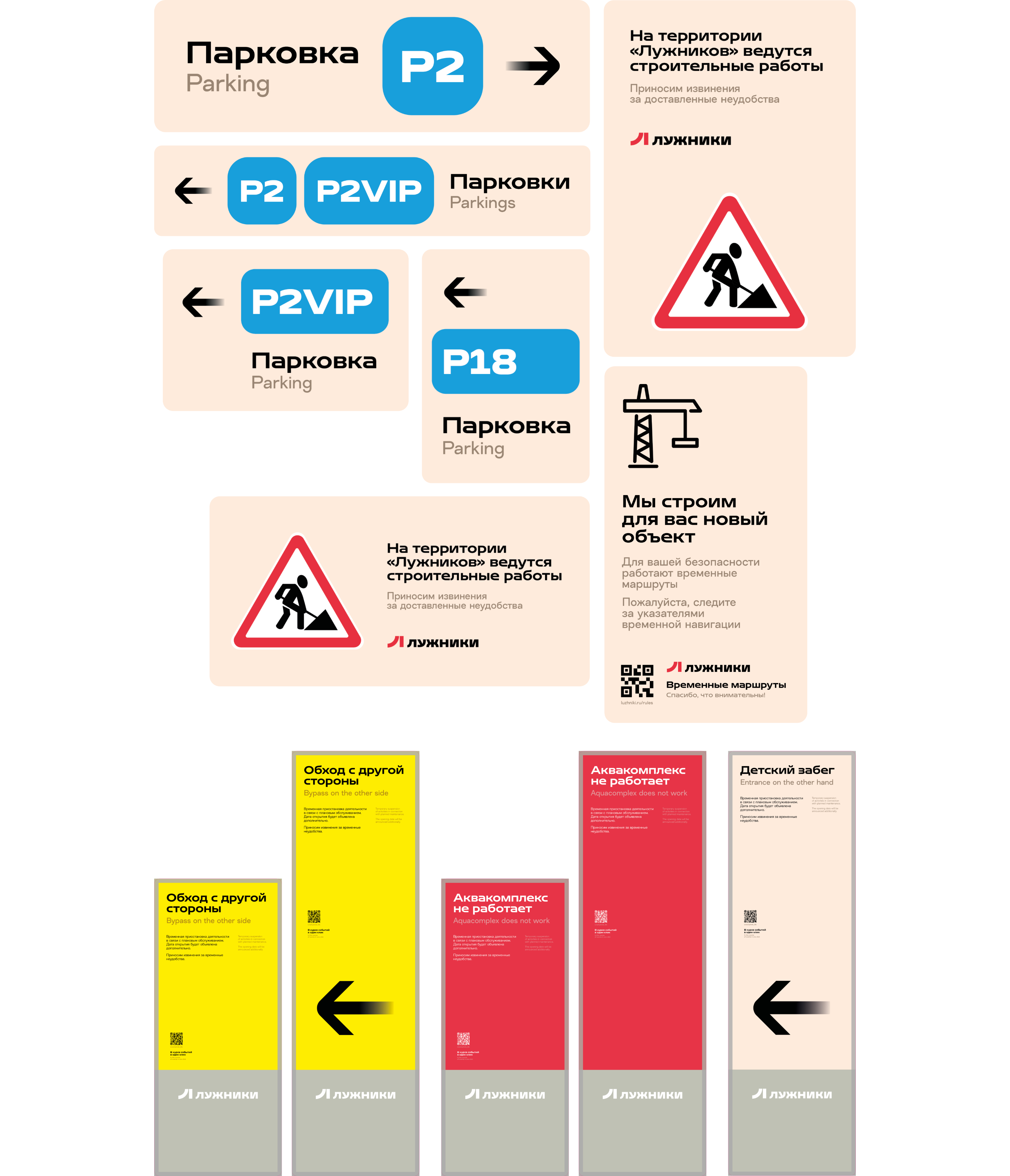
During periods of construction work, road closures or major events, temporary signs are put up.
art director
designers
- Valery Tolchanov
- Stepan Girich
